Same but different:
Porté is an image consulting firm that understands the importance of diversity, identity and the characteristics that make us particular as individuals or institutions.
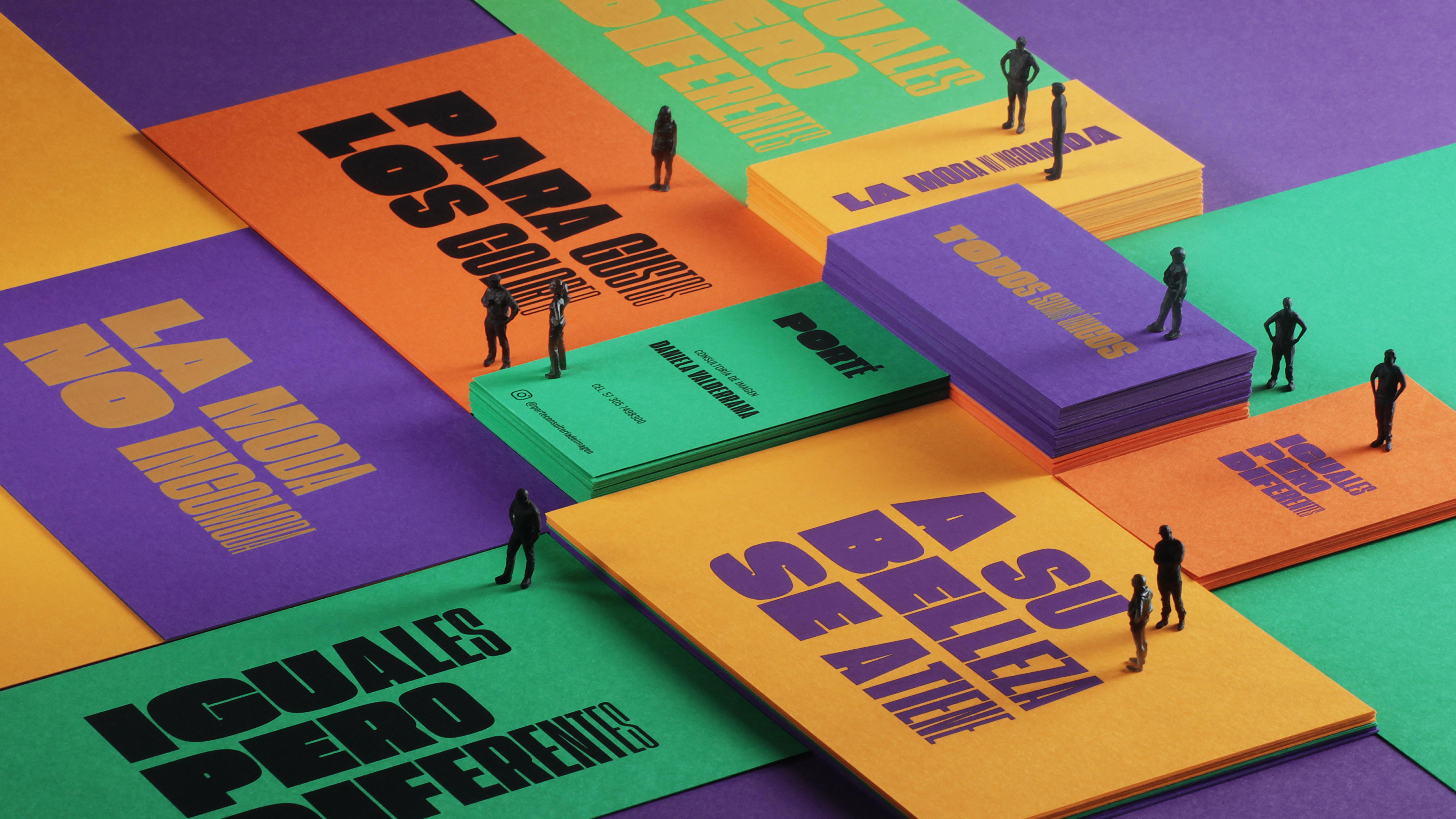
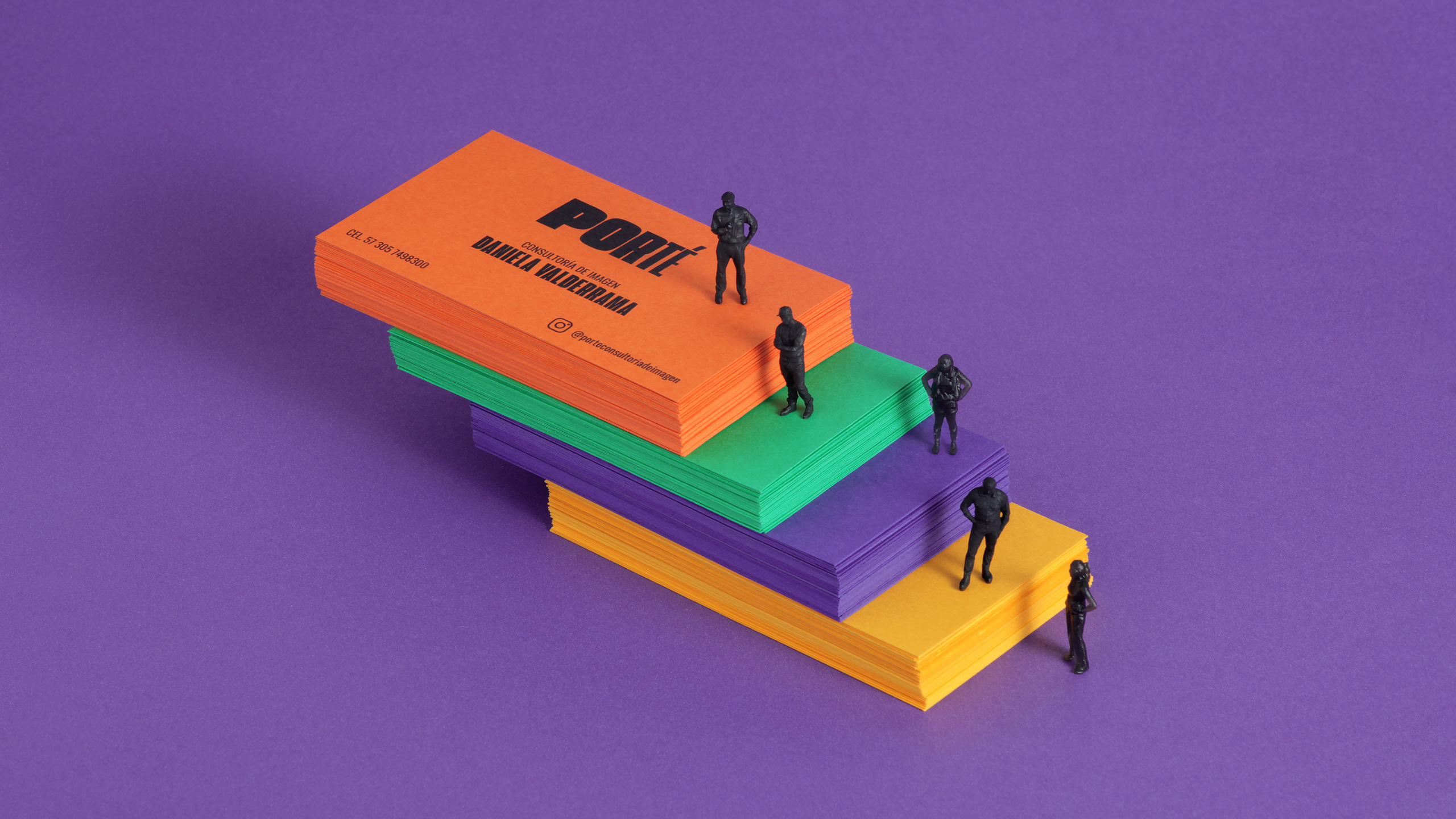
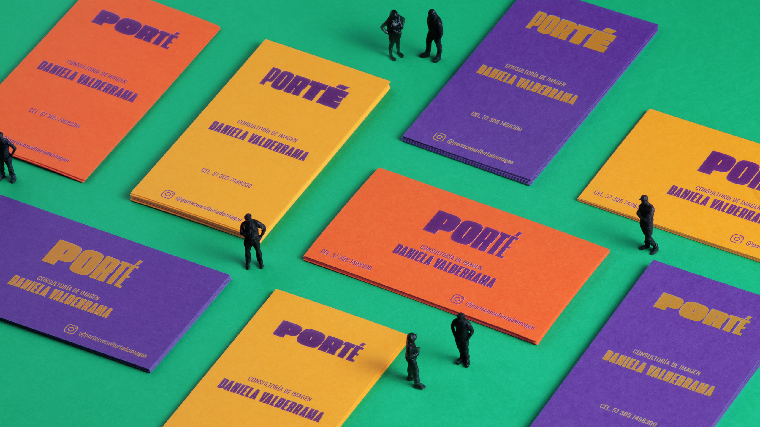
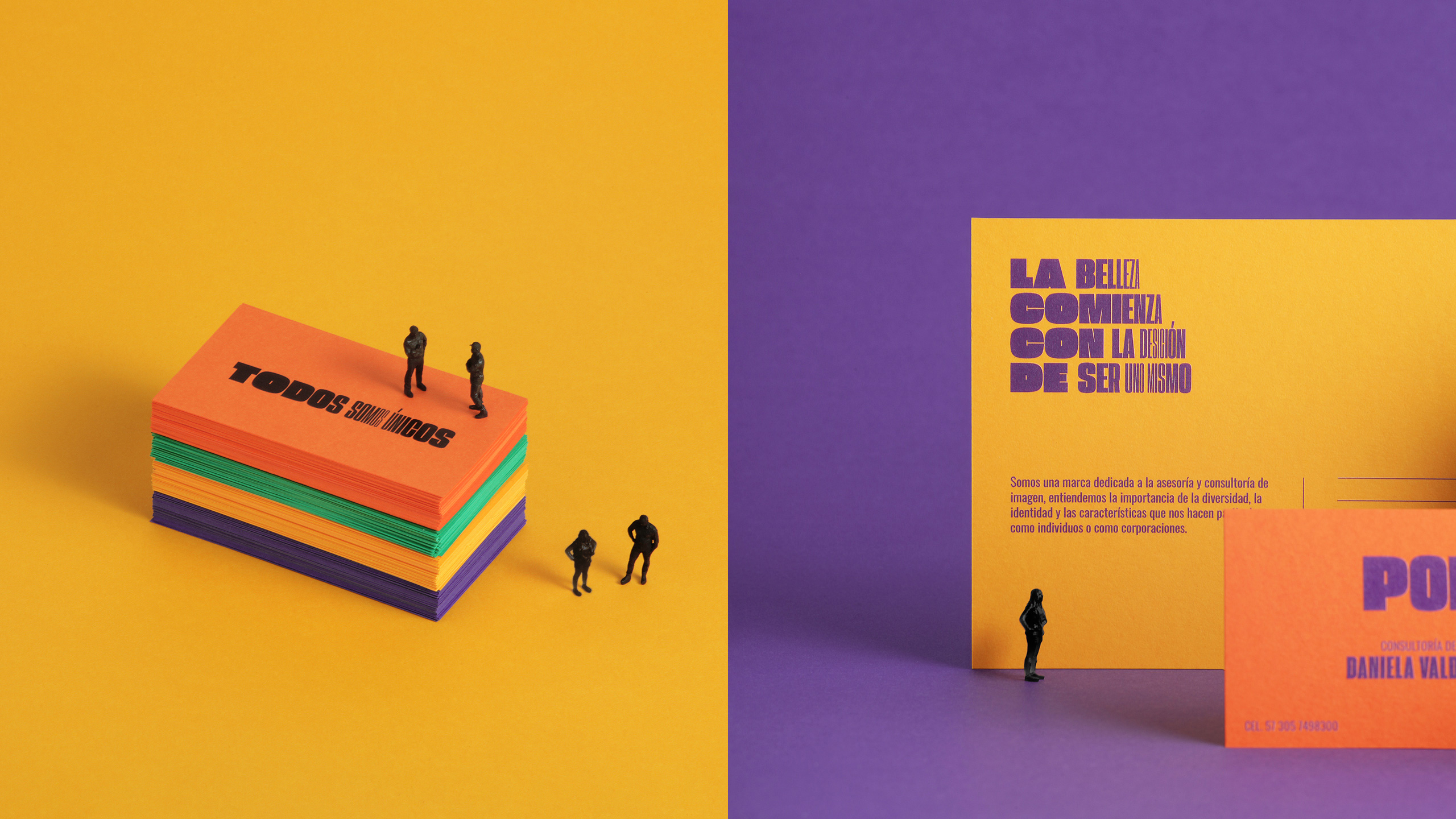
The concepts that are regularly associated with this category are related to glamour, sobriety and elegance. However, for this case we decided to build a cheerful, dynamic and colorful image that contrasts with a sophisticated and evocative name: Porté.
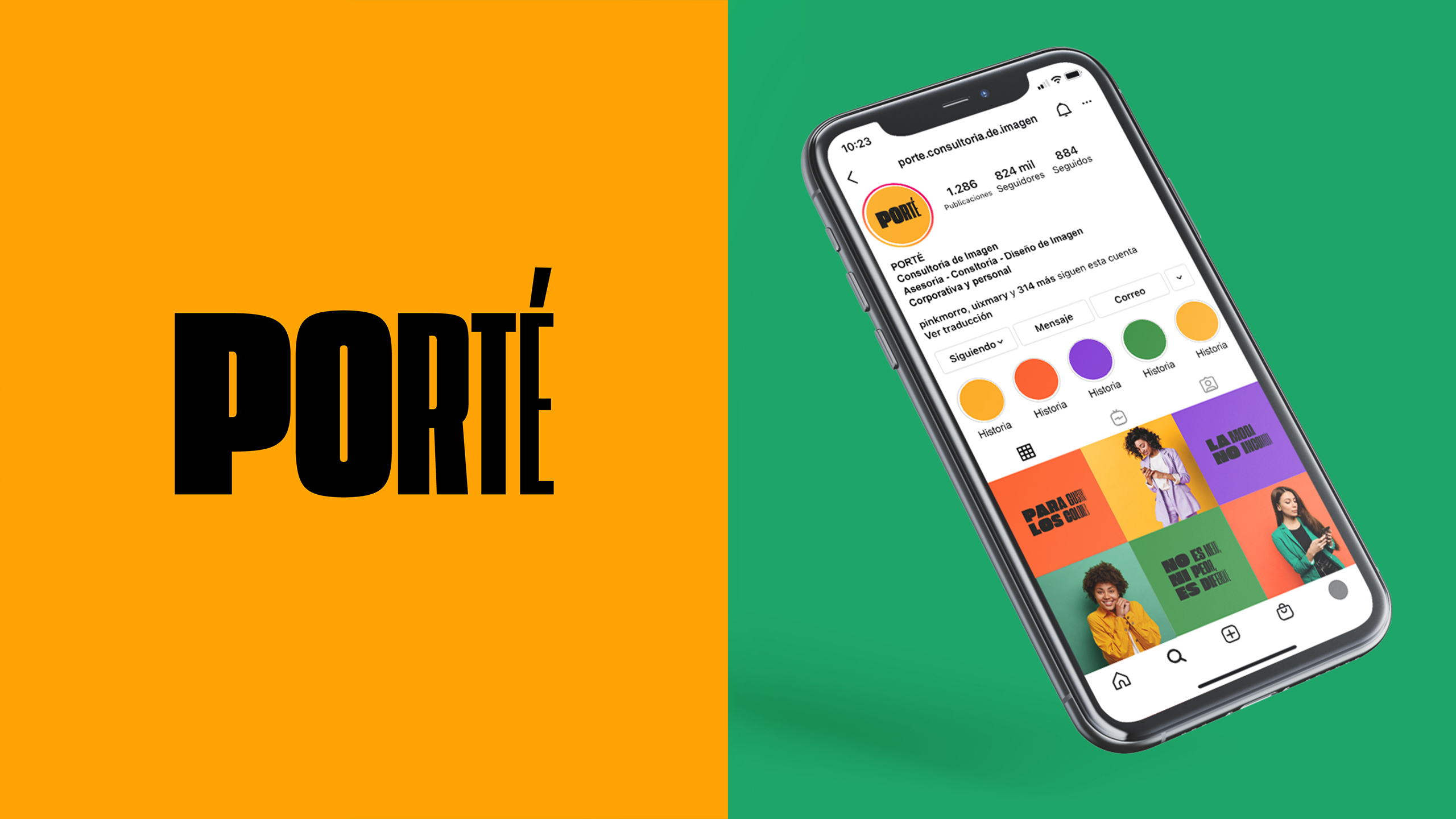
Its name relates the brand to the concepts of clothing, image and fashion, and together with its visual system, creates a different and easily recognizable brand within its market.
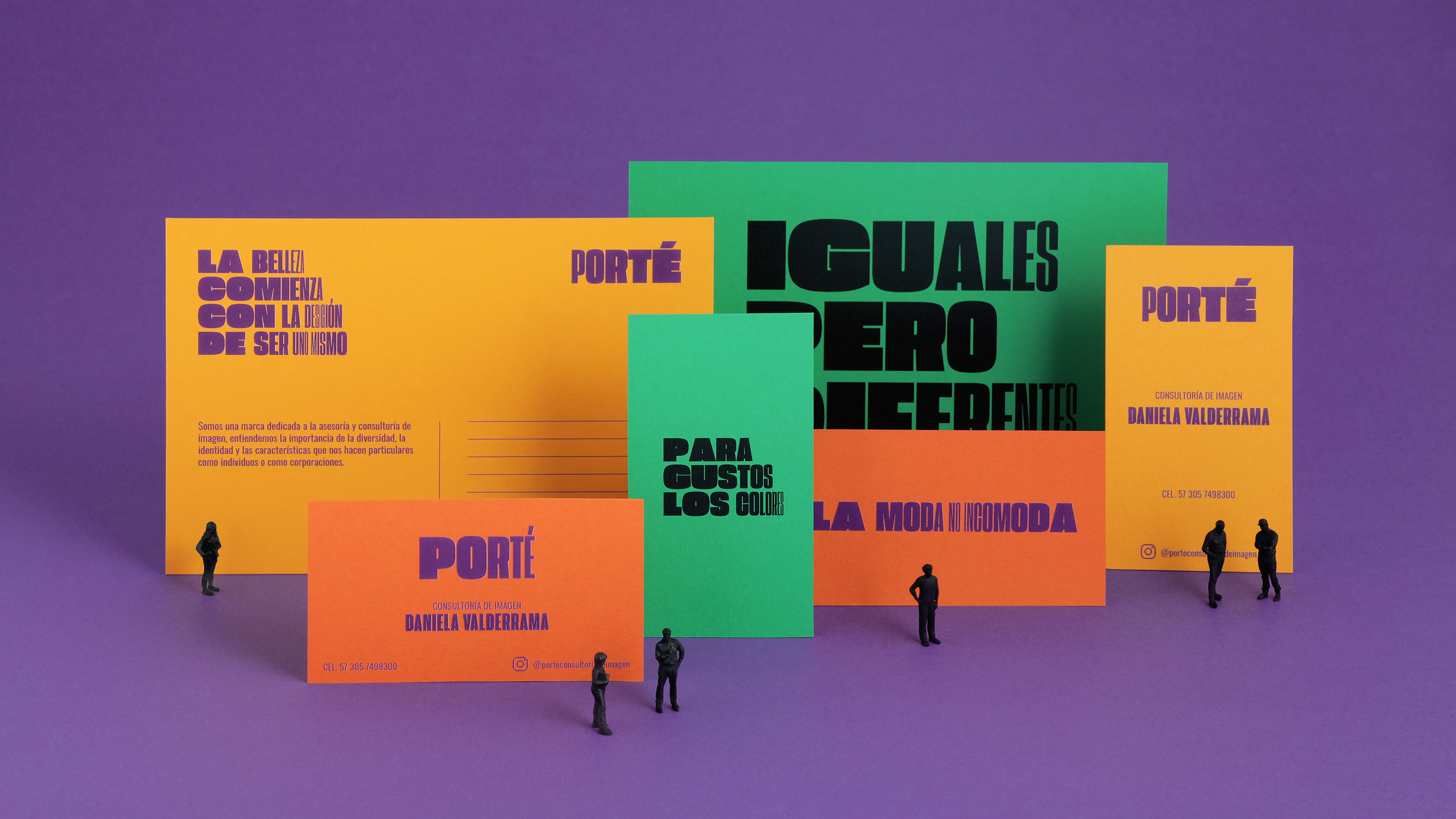
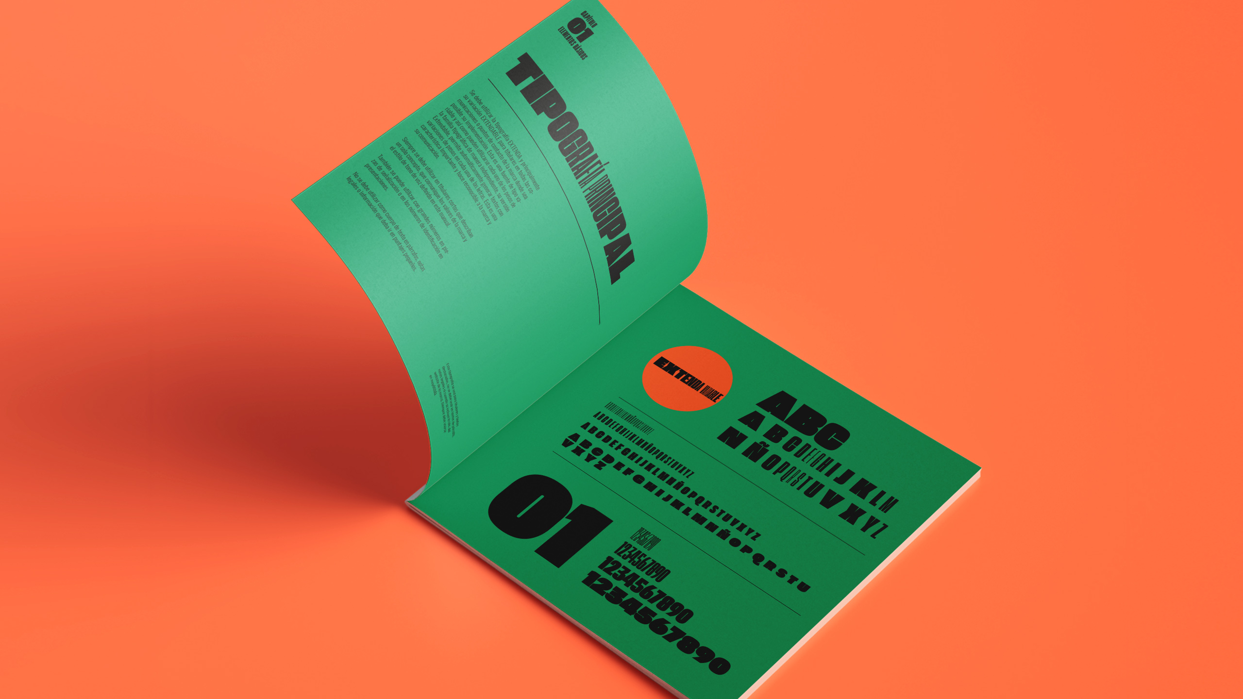
The logo is designed with a variable typography where, sometimes its letters can be strong and robust and other times subtle and delicate, representing with its versatility how we all have different tastes and styles.
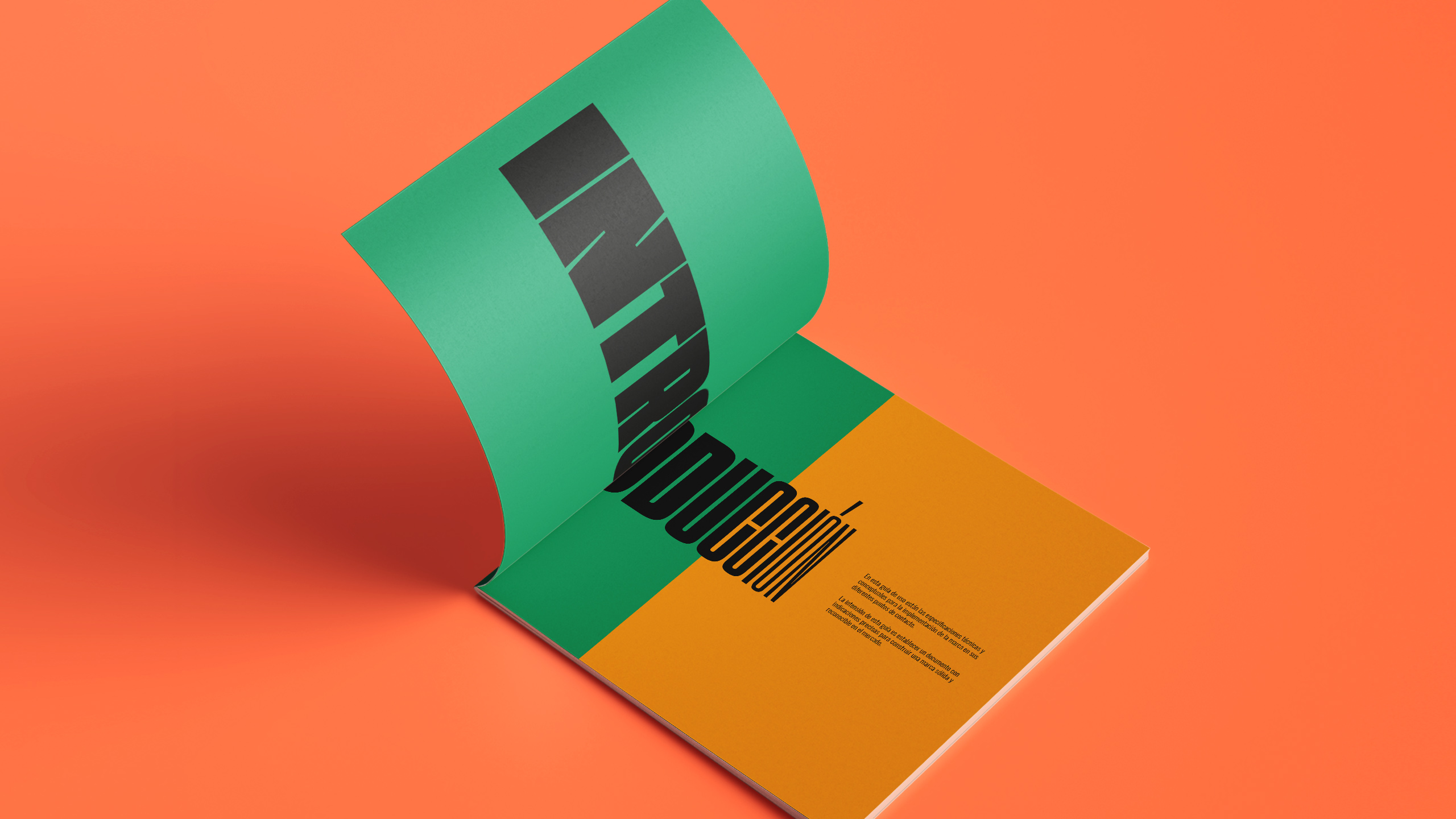
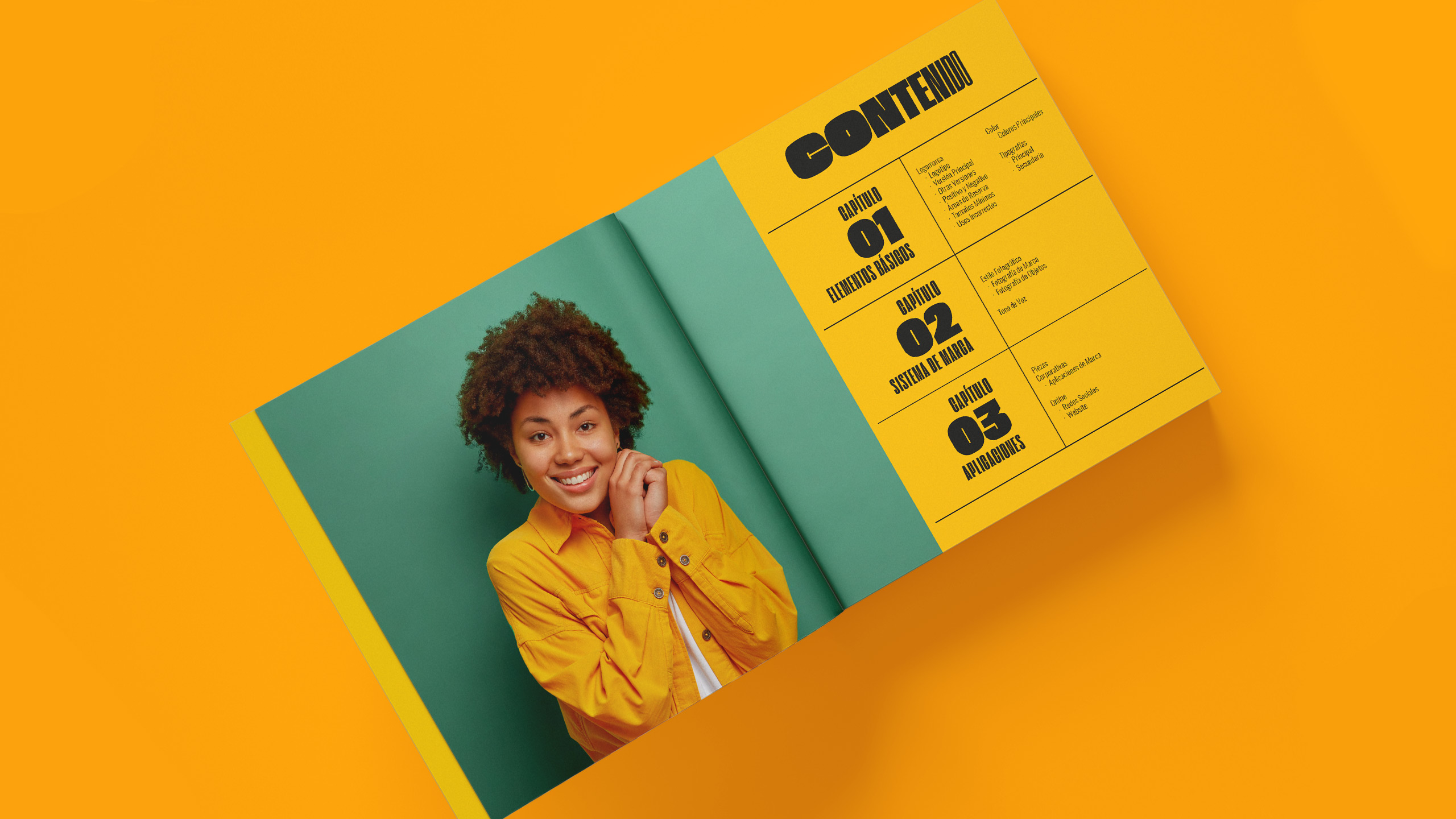
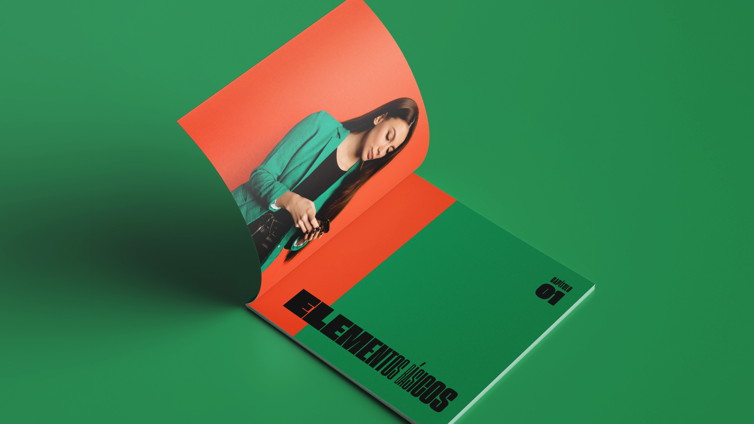
Likewise, we developed a visual system with a vibrant dynamic palette, with many variations of formats in its applications and messages that represent diversity. The brand concept, logo and applications are designed to convey a key idea to your customers: We are the same, but different!
CREDIT
- Agency/Creative: VorticeEstudio
- Article Title: Porté Image Consulting Branding
- Organisation/Entity: Agency
- Project Type: Identity
- Project Status: Published
- Agency/Creative Country: Colombia
- Agency/Creative City: Bogota
- Market Region: South America
- Project Deliverables: Animation, Brand Creation, Brand Design, Brand Guidelines, Brand Identity, Brand Mark, Brand Naming, Brand Tone of Voice, Branding
- Industry: Fashion
- Keywords: Branding Colombia, consultoría de imagen, diseño bogota, diseño de logo, Diseño de logotipos, manual de marca, Diseño de marca, Diseño Gráfico, Guía de uso, logotipo, Manual de marca, Renovación de marca, Sistemas de identidad visual, tono de voz, visual identity, brand book, colorful, diversity, Variable Font, Consulting,stylist, fashion logo, inclusion
-
Credits:
Creative Director: Javier Casallas
Graphic Director: Mayra Castillo


