


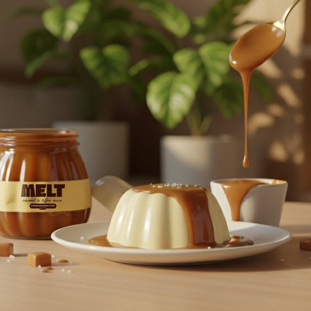
Melt is a small-batch caramel and toffee sauce brand built on the belief that sweetness should be slow, intentional, and deeply comforting. Every jar is treated like a tiny ritual-patient heat, gentle stirring, and ingredients coming together the way butter melts into sugar: softly, warmly, and with purpose. Nothing rushed, nothing loud, just quiet craftsmanship that lets the richness speak for itself.
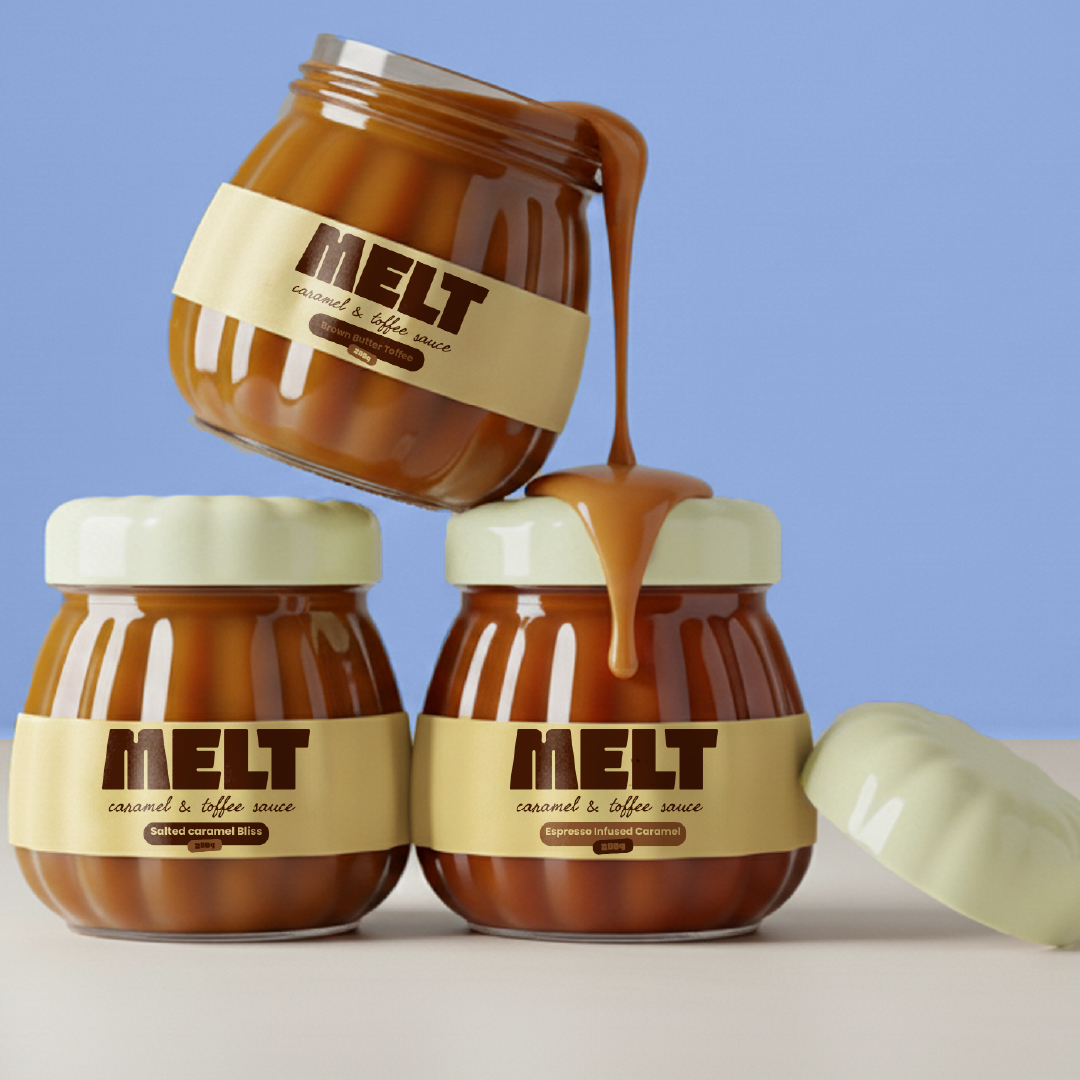
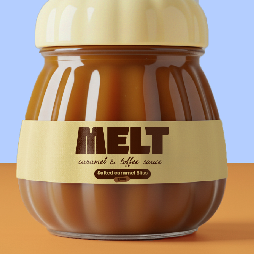
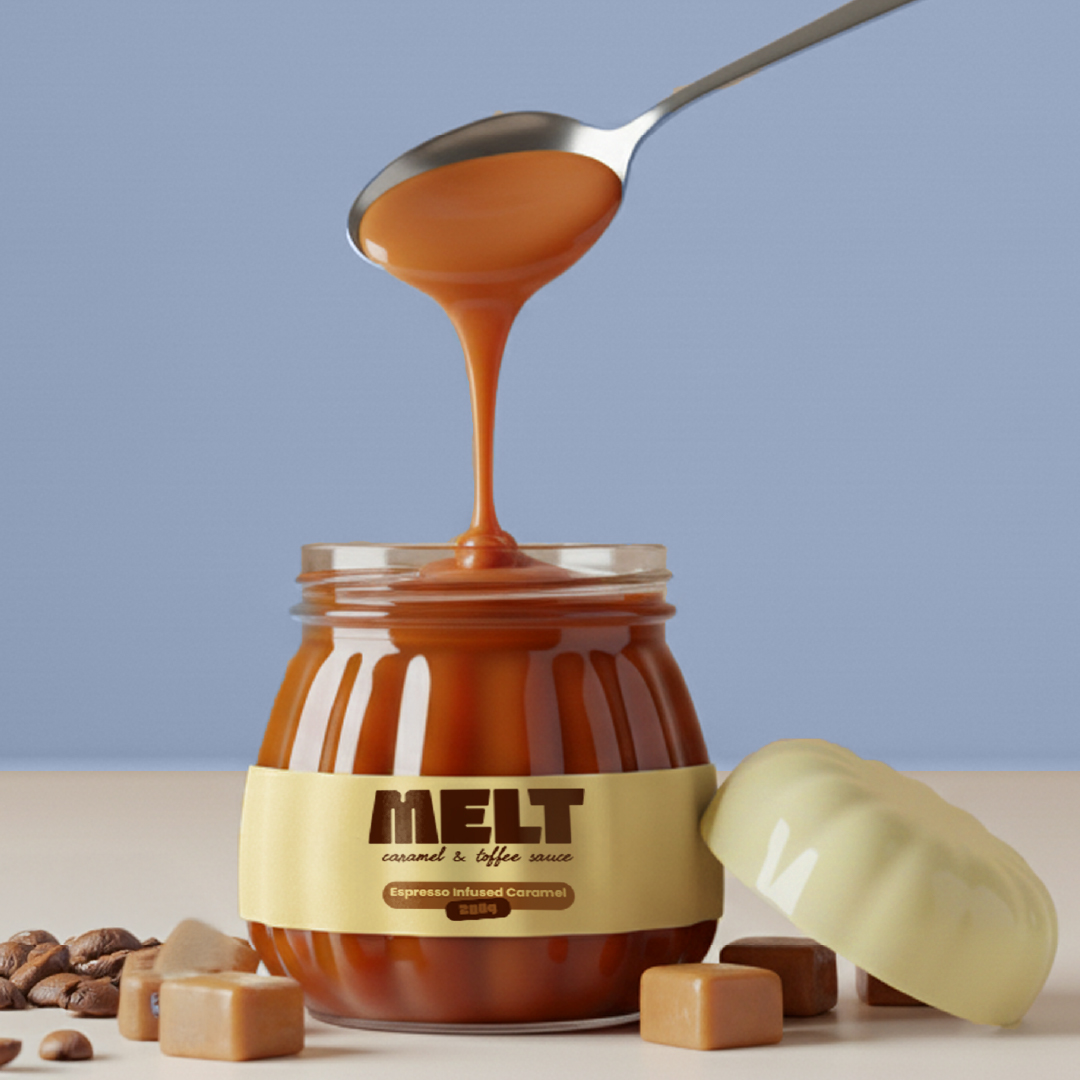
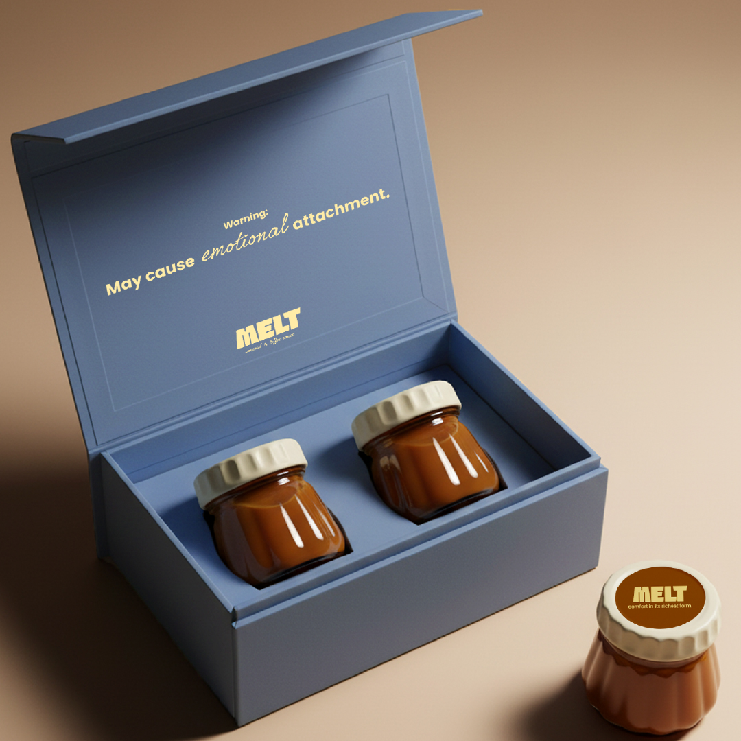
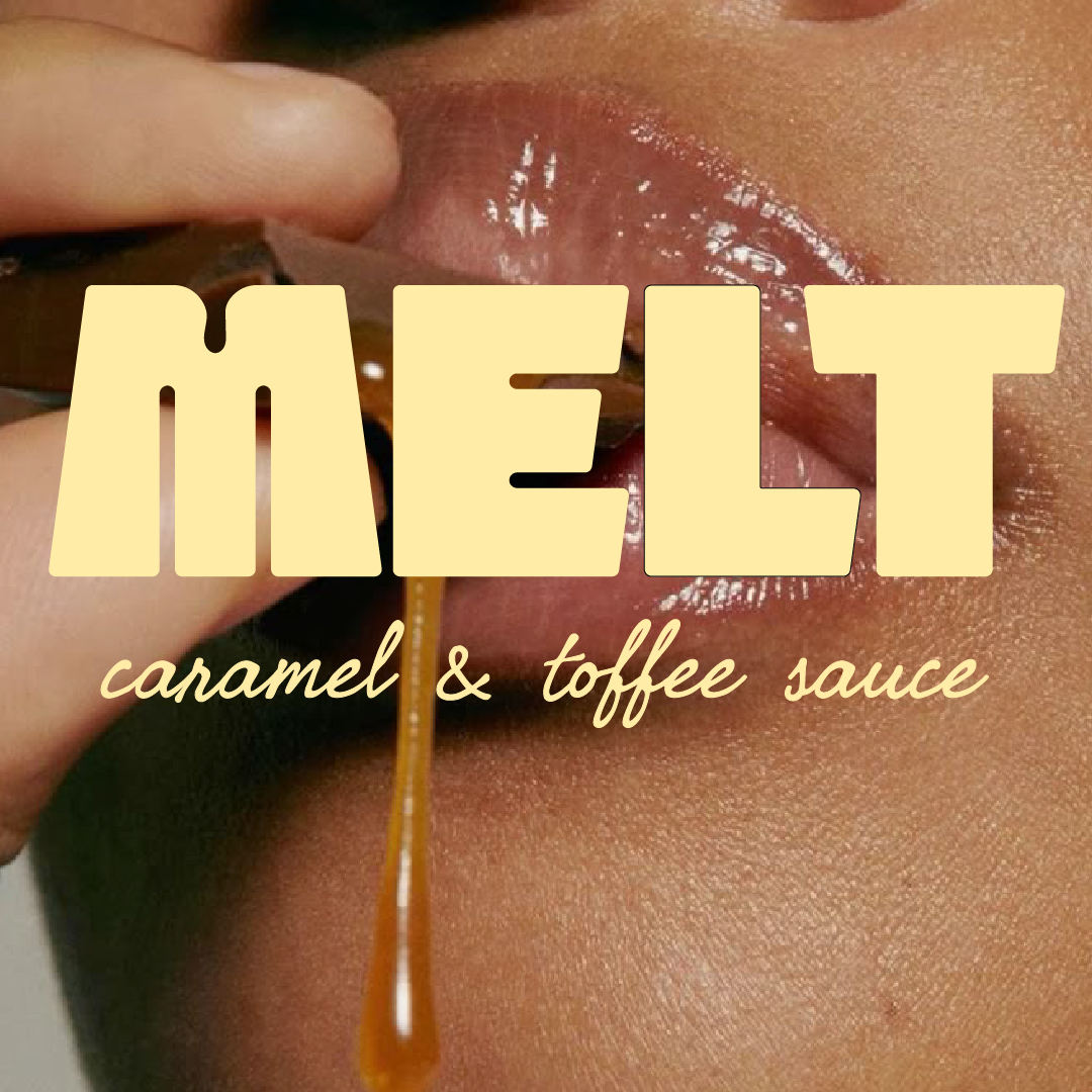
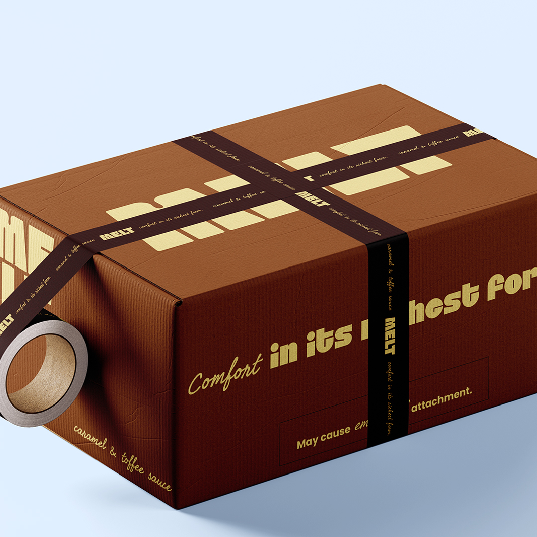
For this brand identity, I wanted to bottle that exact feeling of slow comfort. The visual direction leans into warmth and softness, creating an experience that feels like homemade caramel wrapping itself around you. Warm tones, tender textures, and subtle gradients mimic the swirl of caramel as it moves from pan to jar. The packaging is intentionally minimal and uncluttered, echoing the brand’s handcrafted nature-simple labels, gentle typography, and a premium touch that feels intimate rather than flashy. Everything is designed to evoke the cozy, nostalgic moment you feel when caramel first hits your tongue.
The identity balances home-style charm with modern refinement, making Melt feel both familiar and elevated. It’s not trying to impress you with noise; it’s inviting you into a moment.
Because Melt isn’t just a sauce; it’s comfort in its richest form. A spoonful of softness. A slow exhale. A warm hug disguised as caramel. And the identity needed to taste exactly like that-soft, rich, quietly indulgent, and emotionally warm, the way only small-batch sweetness can be.


CREDIT
- Agency/Creative: Pooja Shah
- Article Title: Pooja Shah Shapes Melt Into a Quietly Indulgent Brand
- Organisation/Entity: Freelance
- Project Type: Packaging
- Project Status: Published
- Agency/Creative Country: India
- Agency/Creative City: Delhi
- Market Region: Global
- Project Deliverables: Brand Design, Label Design, Packaging Design
- Format: Bottle, Jar
- Industry: Food/Beverage
- Keywords: caramel Sauce, sauce jar, dessert Packaging
-
Credits:
Graphic Designer: Pooja Shah


