Lumin is a successful start-up with a premium skincare range for men, available on the global market. As they were to expand their distribution from online to retail, they needed a new design to ensure shelf impact. The goal was to get listed at America’s biggest department stores, Walmart and Target. In this scale-up, they seized the opportunity to improve the entire consumer experience.
The Lumin team had done work on the brand strategy, refining the brand positioning, and defining the main target consumer. The brief was detailed – 200 pages covering everything from focus group sessions to competition scouting and visual stimuli.
As we approached the project, we started analysing the material and narrowing down the scope to find crucial key insights:
– Men are ready to embrace skincare as a core part of their grooming routines, but the current landscape leaves them overwhelmed and unsure where to even get started. They’re like strangers. So, we made it our job to change that.
– From our point of view, it was not just about improving the consumer experience for Lumin – we needed to change the narrative for the entire category. Instead of fitting in, it opened a door to stand out and disrupt.
– But how? We dug deeper into the competition with store checks and desktop research. Wherever we looked, the impression was dark, blue, razor-sharp, almost like a chainsaw ad. No wonder men don’t feel included in the cultural context around skincare, since it’s so clearly retrofitted, rather than made for them from the beginning.
– We wanted to find out what would make them feel welcome into the category. The target group was defined as “Growth Seekers”. Urban men in the age range from 25-35. From Lumin’s focus group sessions, we narrowed down three main consumer drivers: appearance, solution focus, and wellbeing. With these drivers, we started mapping out the competitors. All leading us to find a unique spot for Lumin, where they could reach into the minds of the target group – and make skincare more approachable and attractive to the male audience.
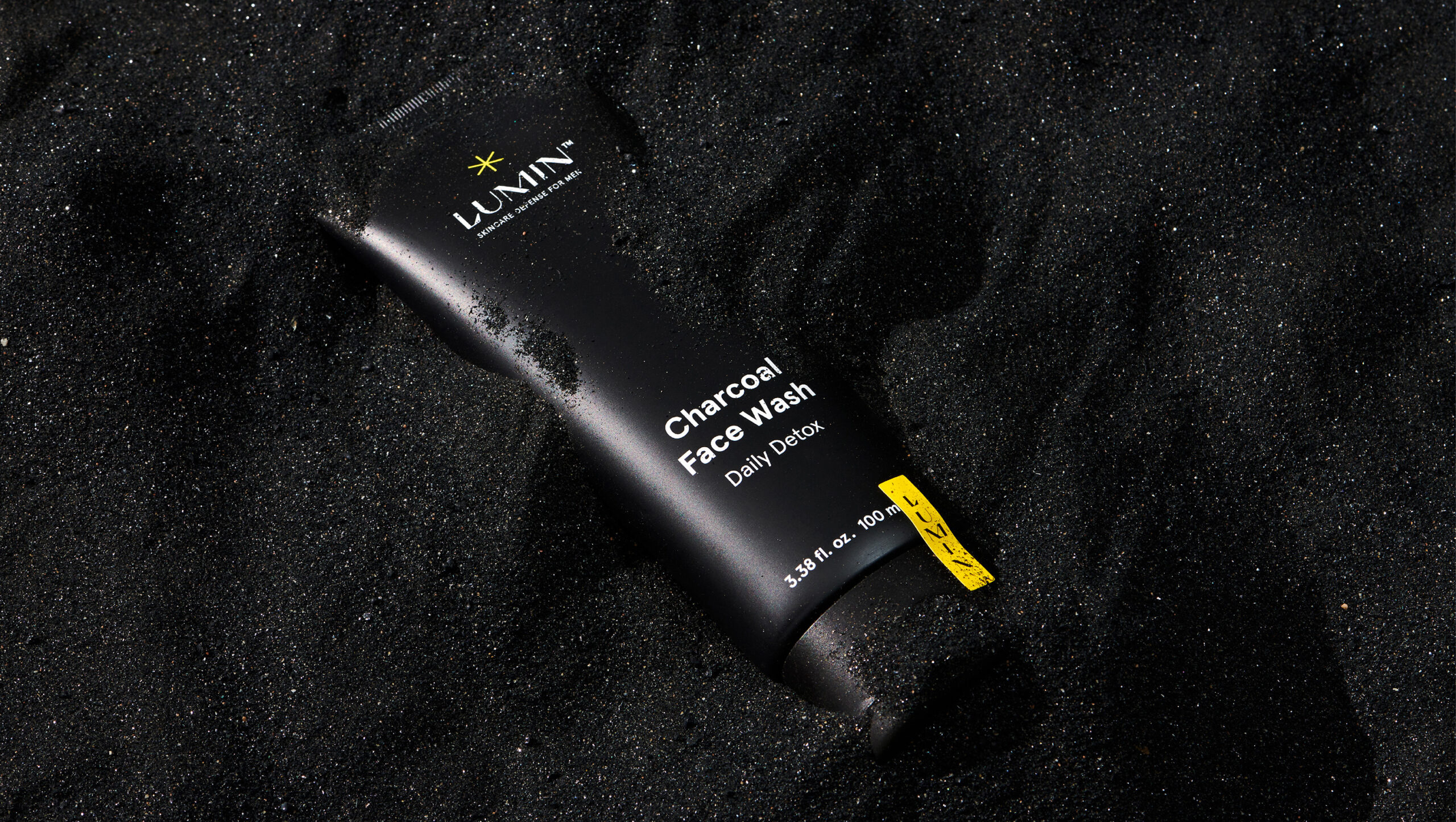
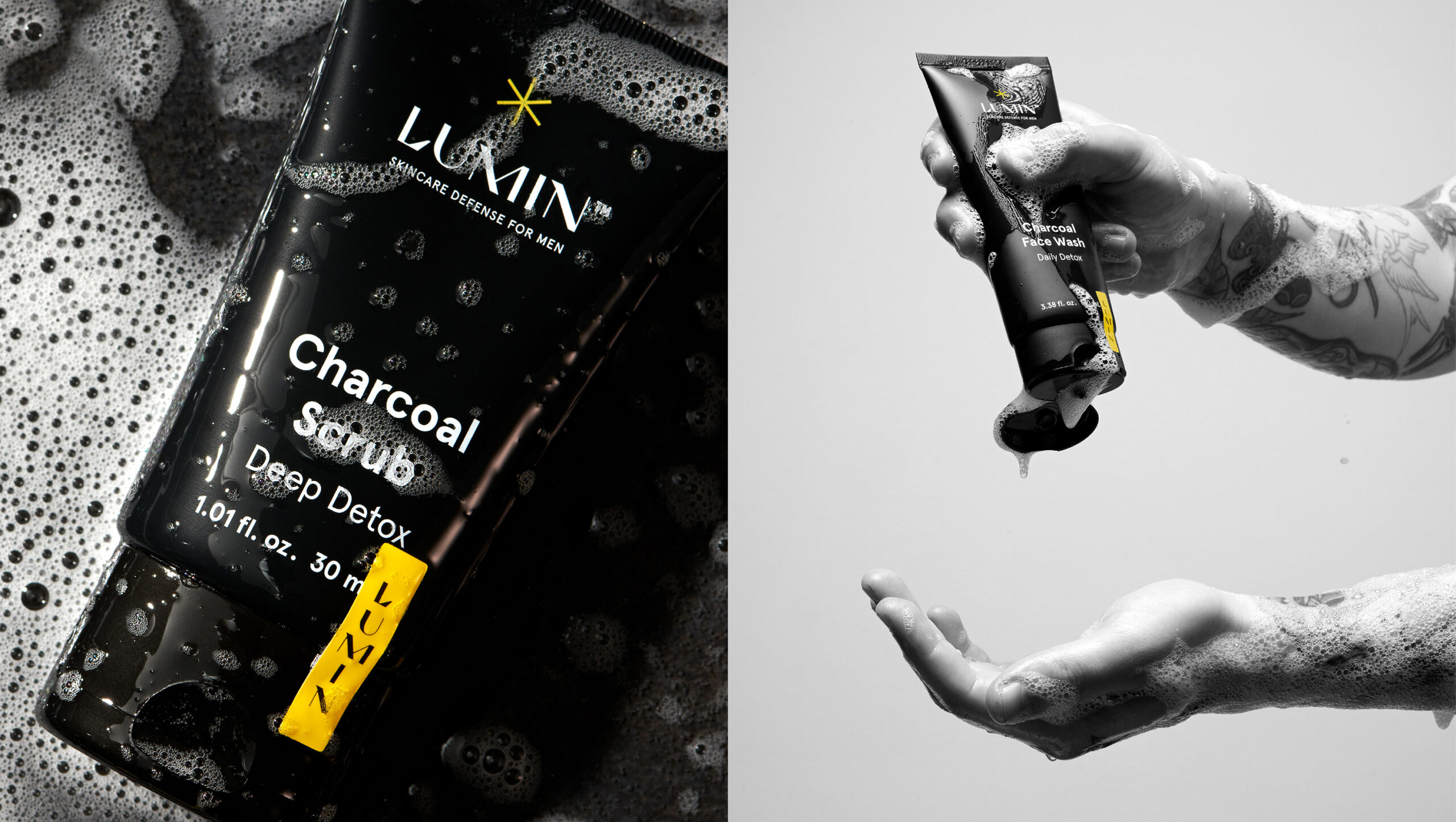
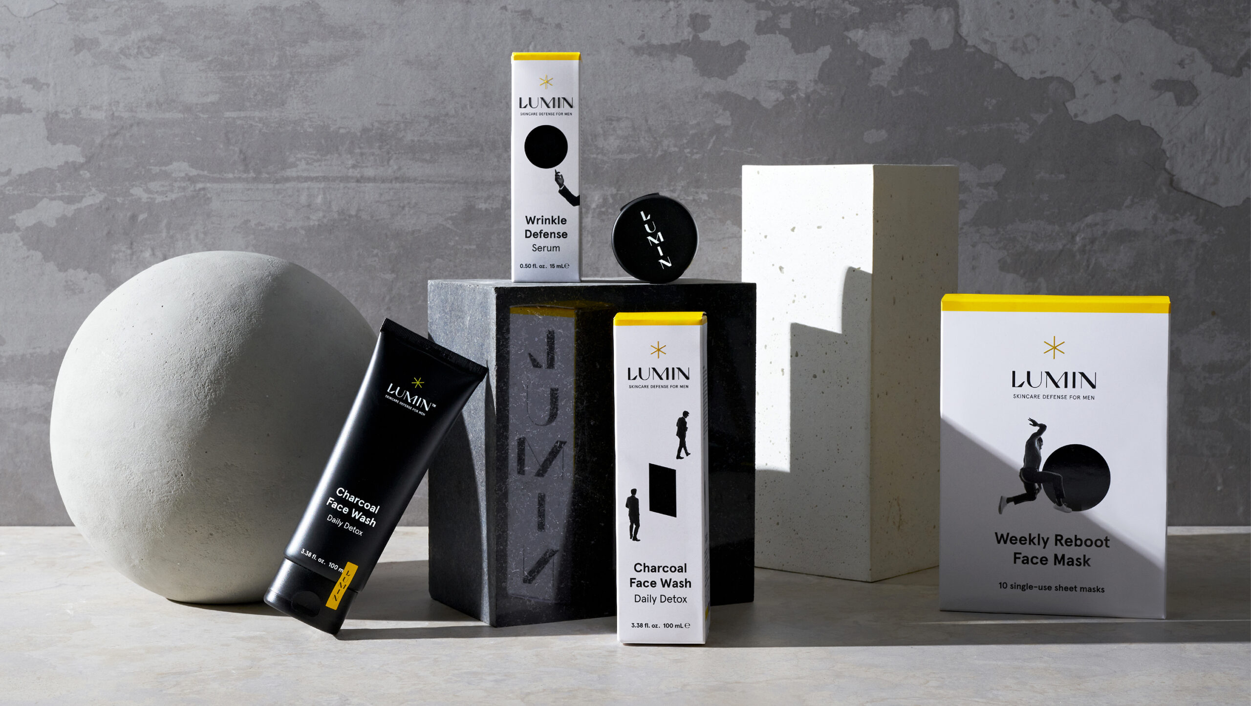
This initial exploring process left us with a question: what would skincare look like if it had been created for men from the start? We simply wanted to make it right this time. It led us to design a whole new universe. Made just for men. The identity is consistent yet dynamic. It’s eye-catching and impactful both online and offline. And it took Lumin to both Walmart and Target – a successful launch enabling the brand to scale up and continue to grow.
A Reimagined Male Skincare Universe
Recent studies show that modern men know that they would feel more confident if they invested in self-care. In surveys, they also confirm that they are ready to embrace skincare as a core part of their grooming routine. Unfortunately, the current landscape of products and ingredients leaves them overwhelmed and unsure where to even get started. They often feel excluded from the cultural conversation around skincare. Lumin, an American skincare brand, is on a mission to change that perception – and they invited us to help.
For the redesign, we reimagined the category from the ground up. What would skincare look like if it had been created for men from the start? Would it rely on retrofitted, stereotypically “masculine” aesthetics like dark blue packaging? Or adopt a narrative so razor-sharp it resembles a chainsaw ad? Probably not. Instead, we envisioned a universe where skincare for men is approachable, fun, and boldly disruptive.
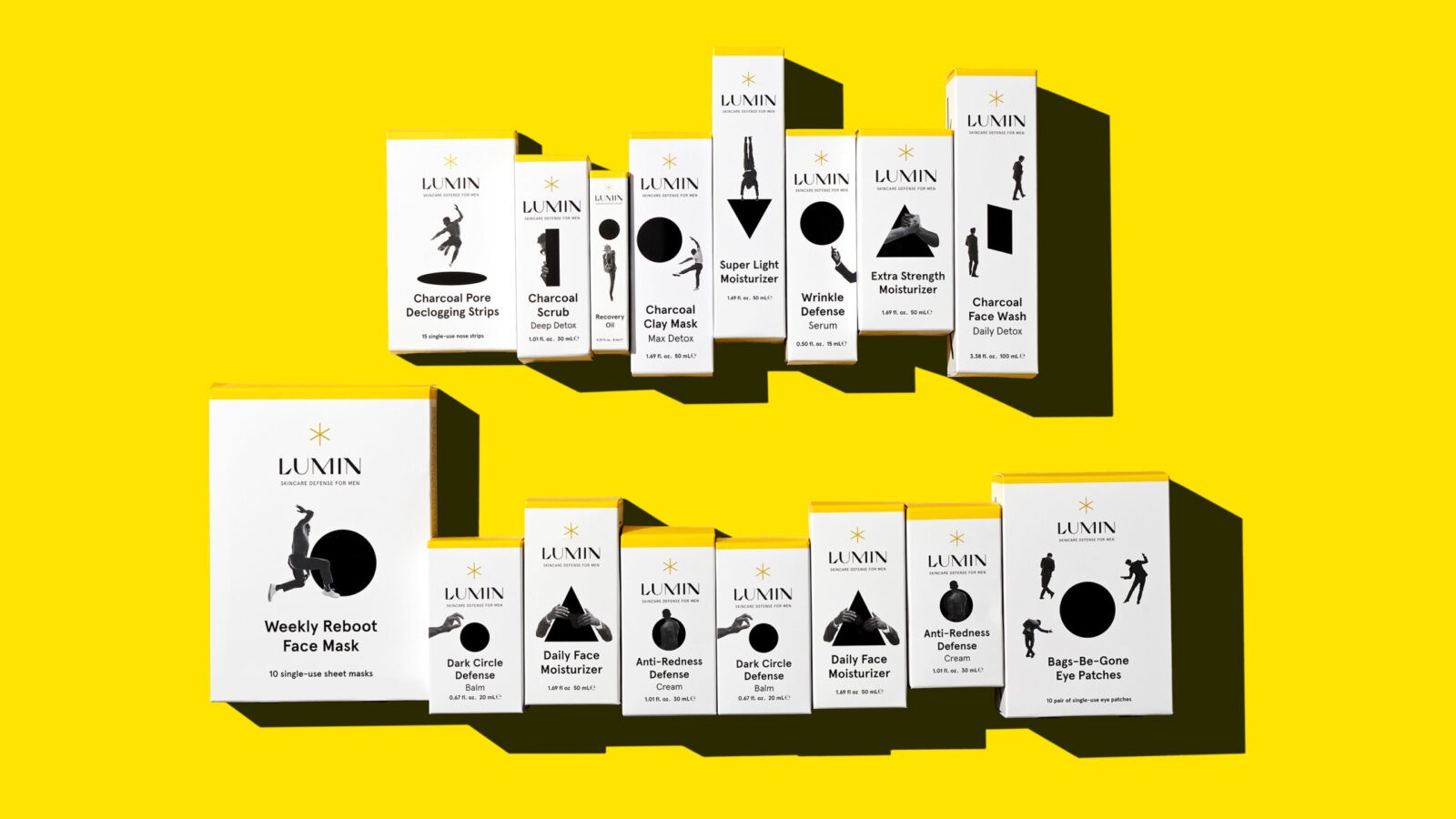
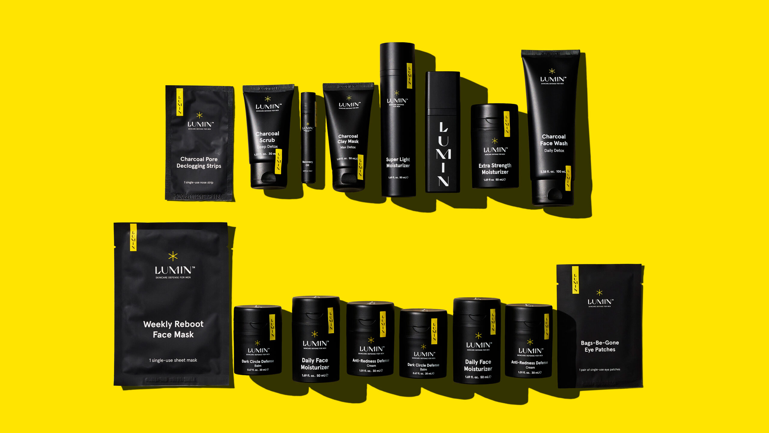
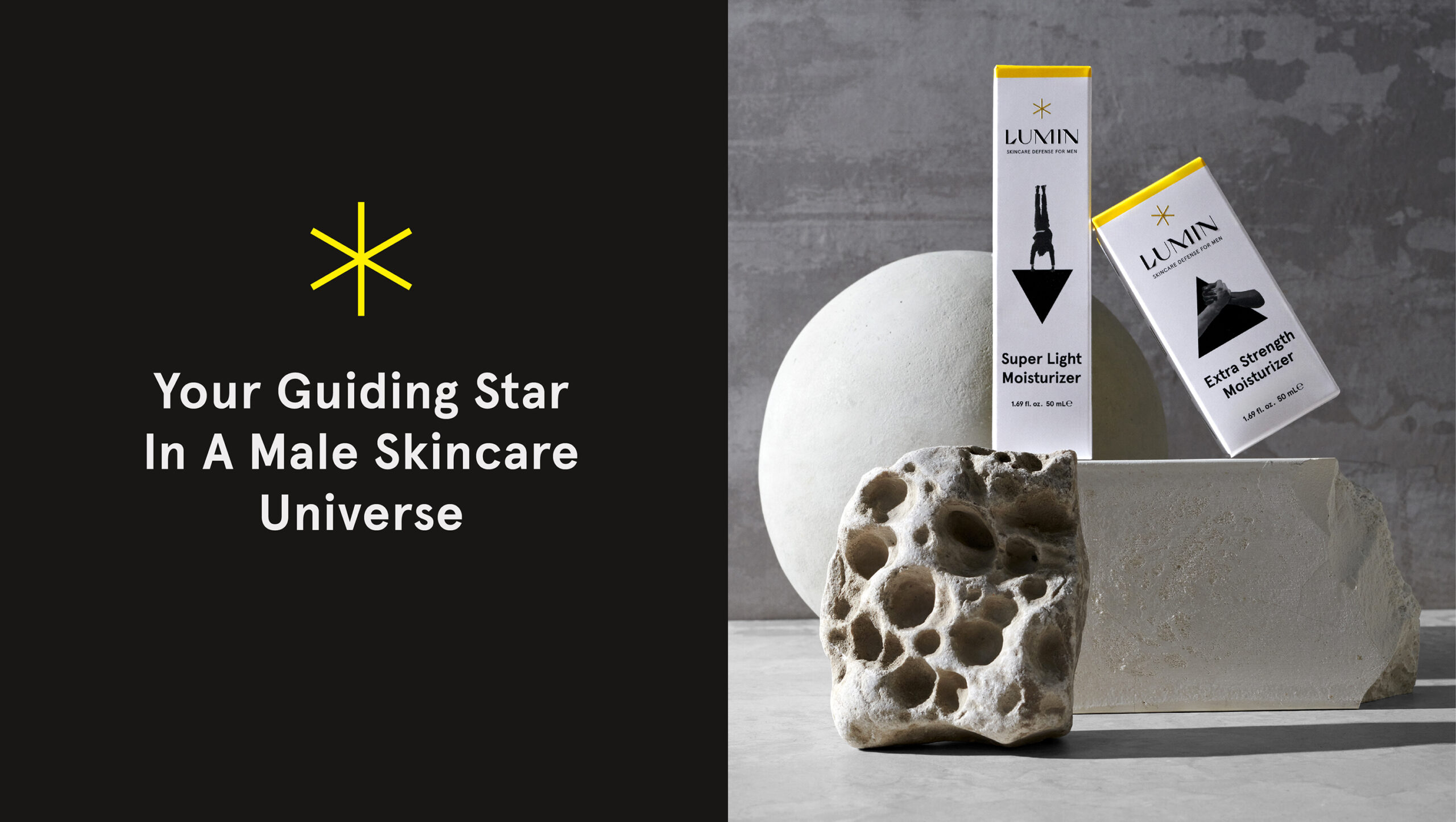
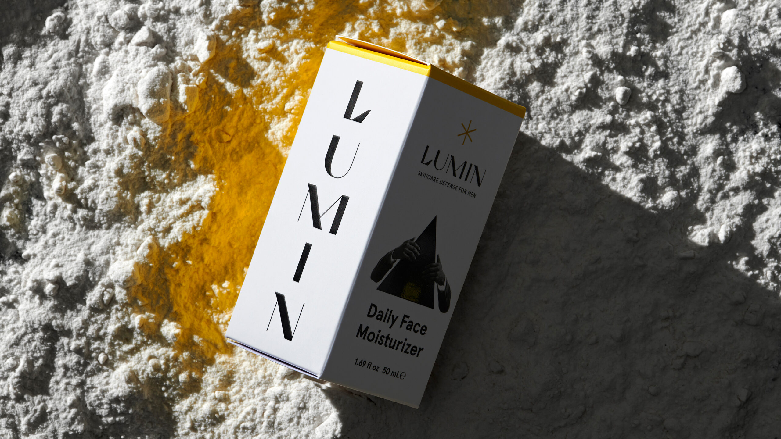
This creative journey led us to a space-inspired expression that totally breaks from category norms. A minimalistic black-and-white colour scheme, paired with a guiding yellow star, sets the tone – both distinct and surprisingly familiar. The design evokes cinematic science fiction, incorporating imagery and humour that bring character to daily routines. Phrases like “defence,” “super light,” and “reboot” subtly flirt with sci-fi, while bold typography and geometric shapes provide clarity, charmingly guiding the complexity in how, when, and what to use.
The result? Lumin has successfully landed in American retail and global online stores. The brand’s new design doesn’t just stand out – it illuminates the space, inviting men to explore self-care with confidence, curiosity, and excitement. Lumin’s space-age approach redefines male skincare, making it the guiding star of its own universe and setting the benchmark for a new era of inclusive and innovative grooming.


CREDIT
- Agency/Creative: Pond Design AB
- Article Title: Pond Design Reimagines Male Skincare with Lumin’s New Brand Identity
- Organisation/Entity: Agency
- Project Status: Published
- Agency/Creative Country: Sweden
- Agency/Creative City: Stockholm
- Industry: Beauty/Cosmetics
- Keywords: WBDS Agency Design Awards 2024/25 , A Reimagined Male Skincare Universe
- Keywords: WBDS Agency Design Awards 2024/25 A Reimagined Male Skincare Universe
-
Credits:
Client Director: Johanna Augustin
Production Manager: Niclas Hemlin
Senior Designer: Viktoria Hamberger
Design Strategist: Mattias Cederfeldt
Designer: Elvira Jacobi
Final Art: Anna Johansson
Visualiser: Johan Svedelius


