


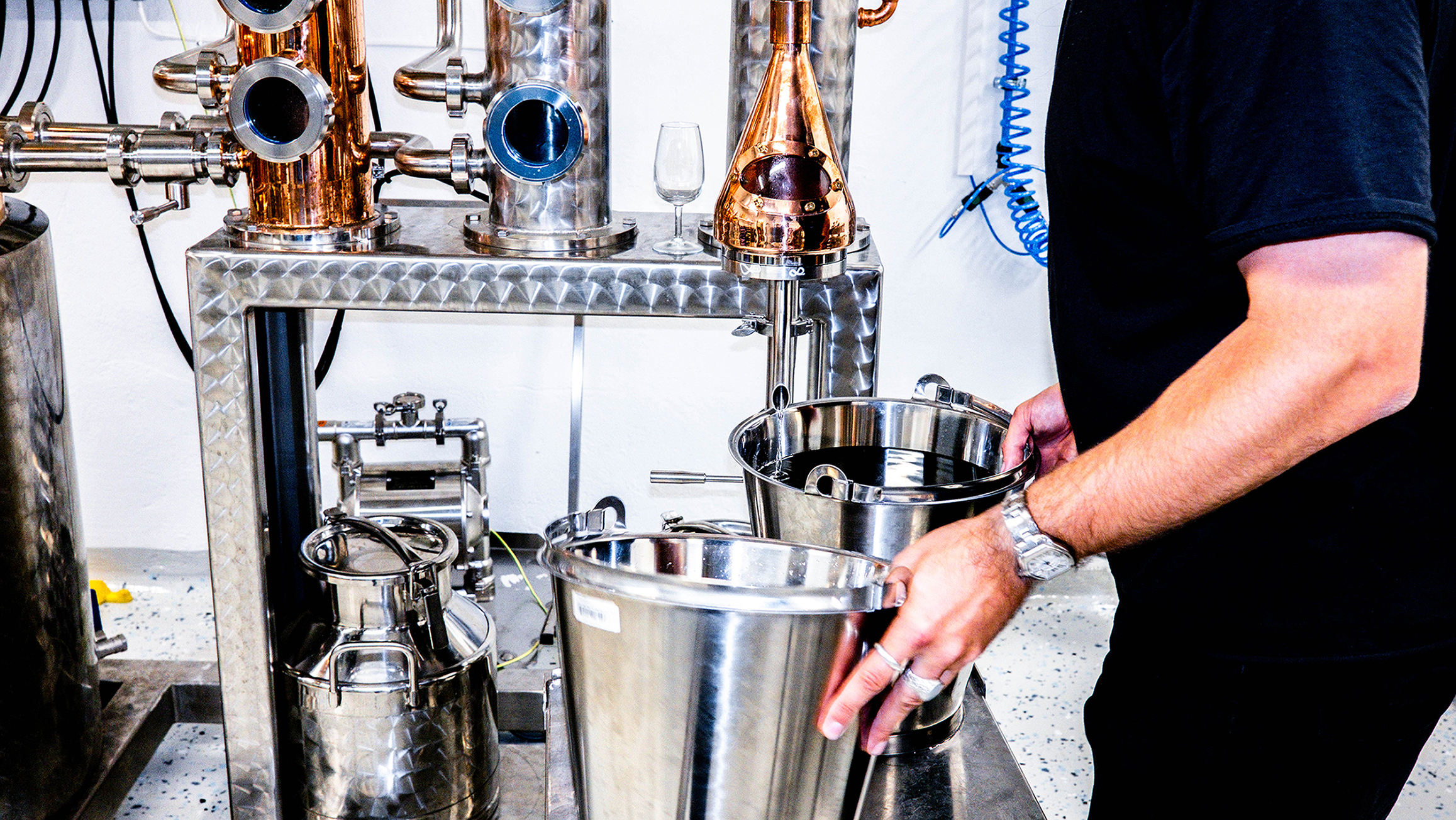
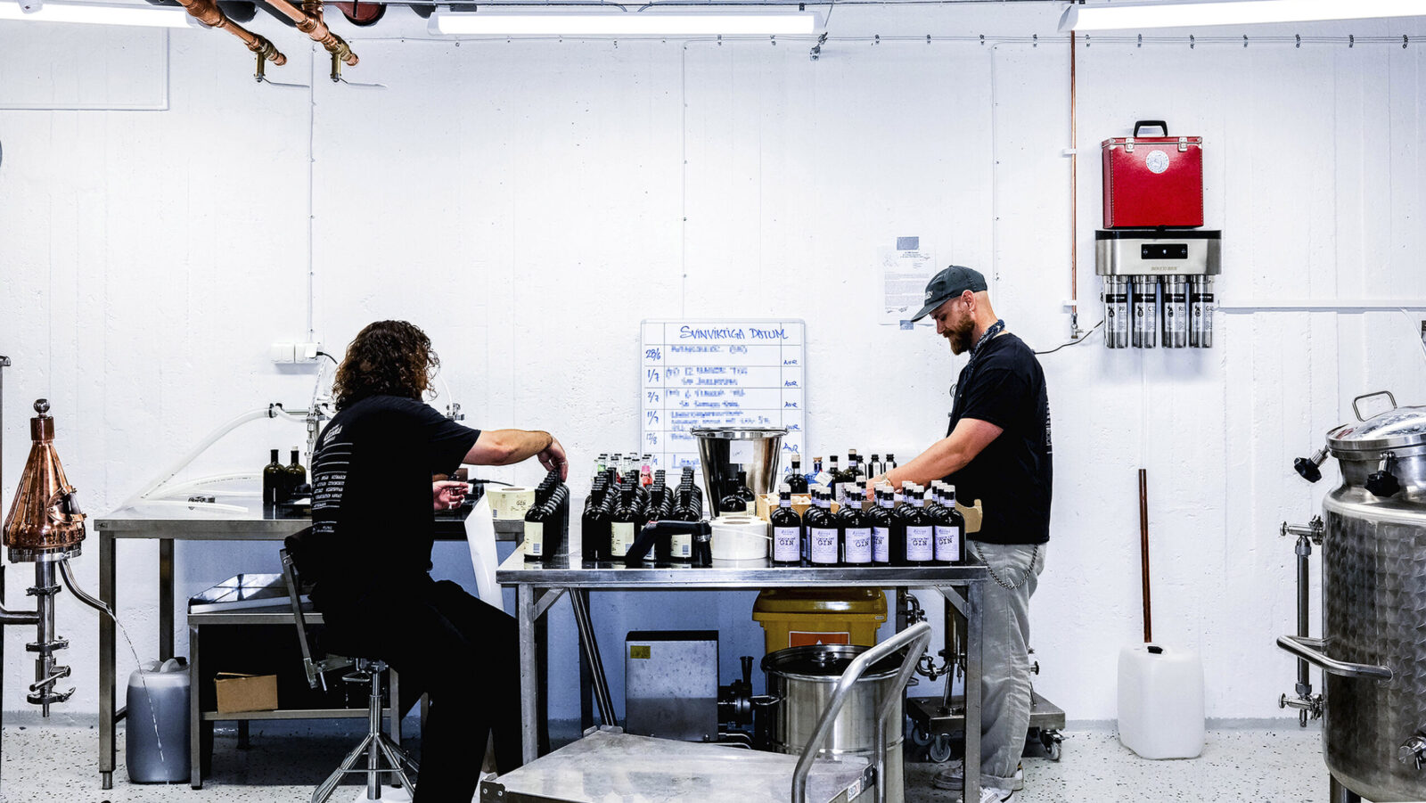
“Don’t Try This Gin”: How hard can it be to make quality craft gin? With the right attitude, all it takes is a basement distillery, Swedish tap water, a dash of anti-mentality, and a healthy dose of hubris. Call it the signature mix of the team behind Cliff Barnes, a cult-favourite Stockholm restaurant with personalities as refreshing as their approach.
This story began when the team approached us with a million ideas on how to expand their restaurant brand. What they needed was a creative vent for their restless energy. The team’s immediate response to the idea of turning their basement into a gin distillery was as we’d expected: “Why not. We’ll probably fail the first batch and make the next one even worse. If we’re lucky, maybe slightly better. How hard can it be? Let’s do it.”
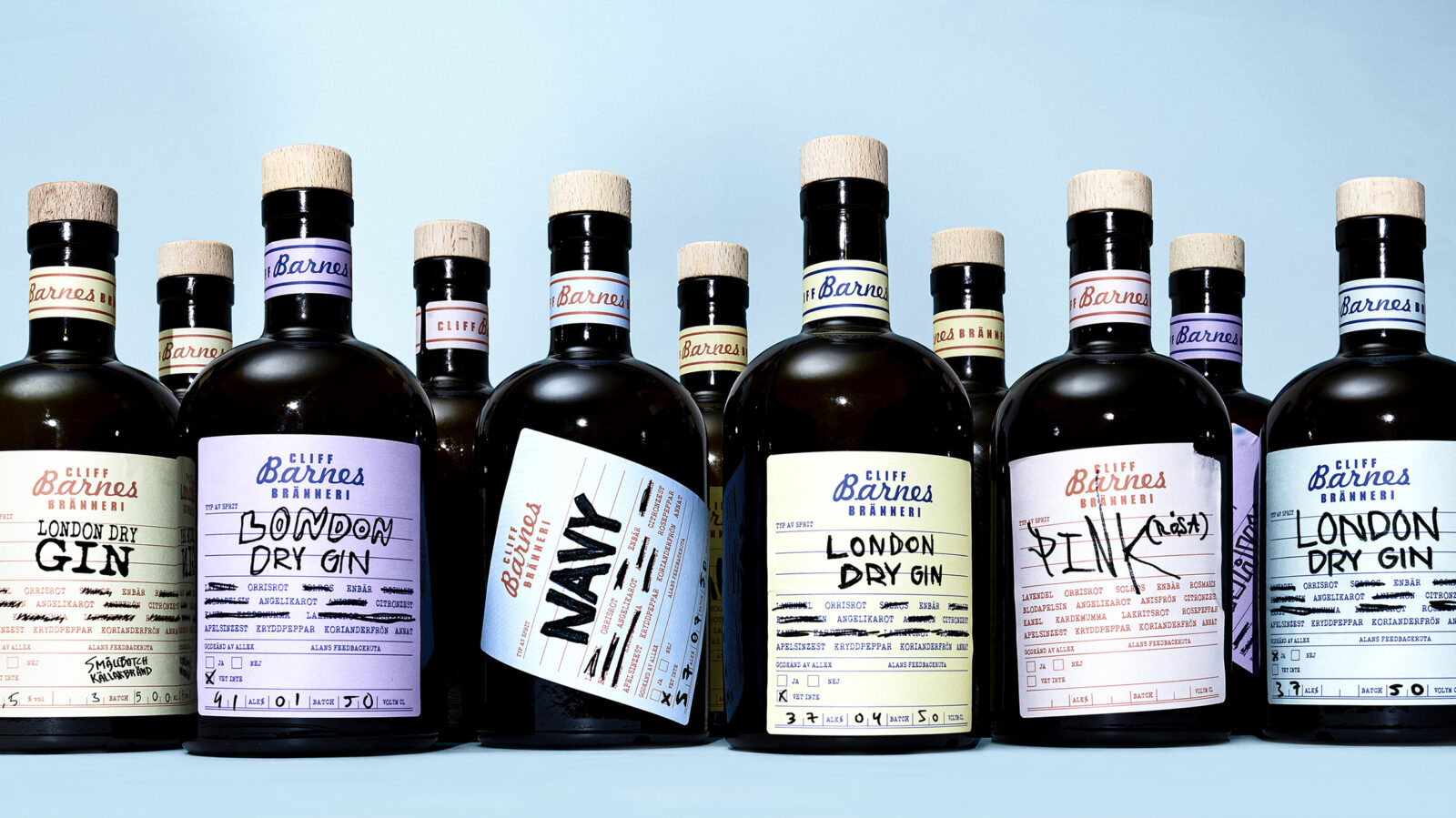
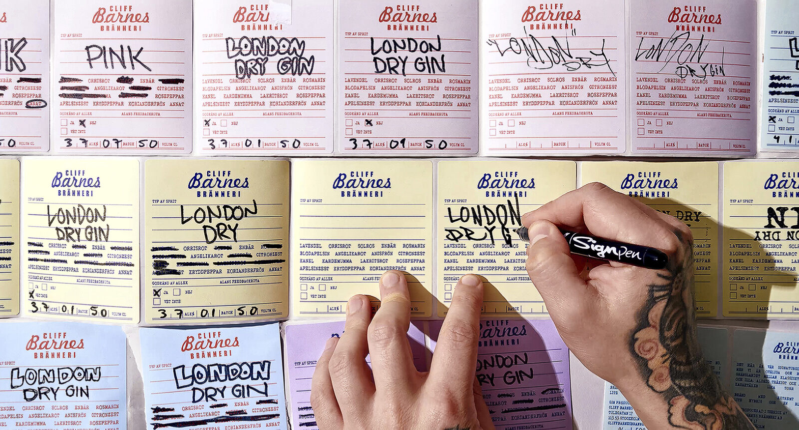
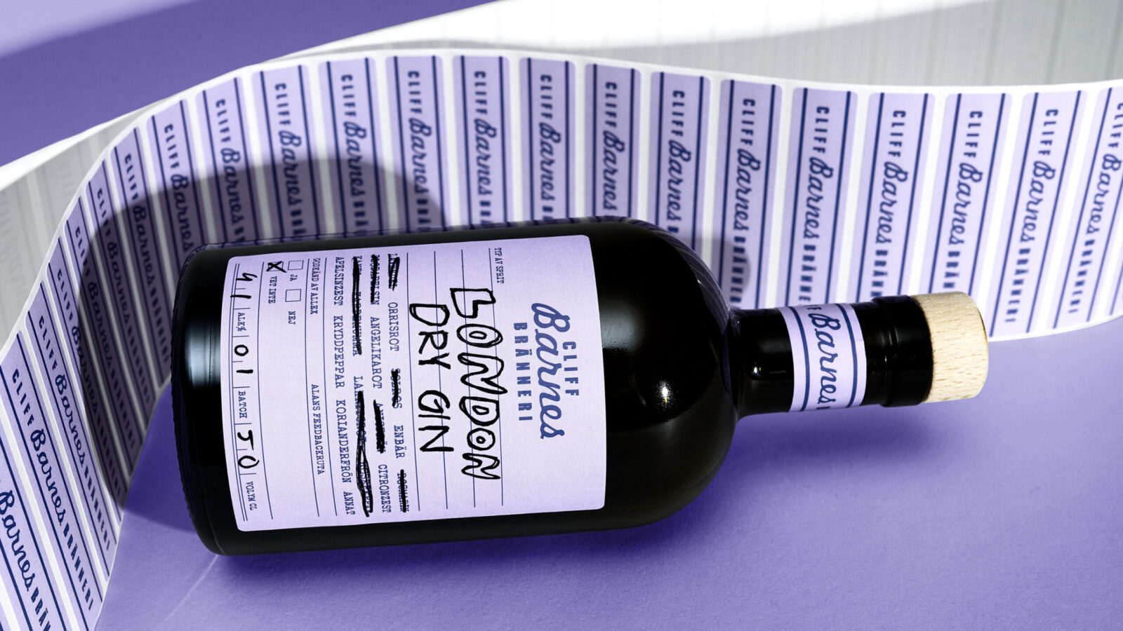
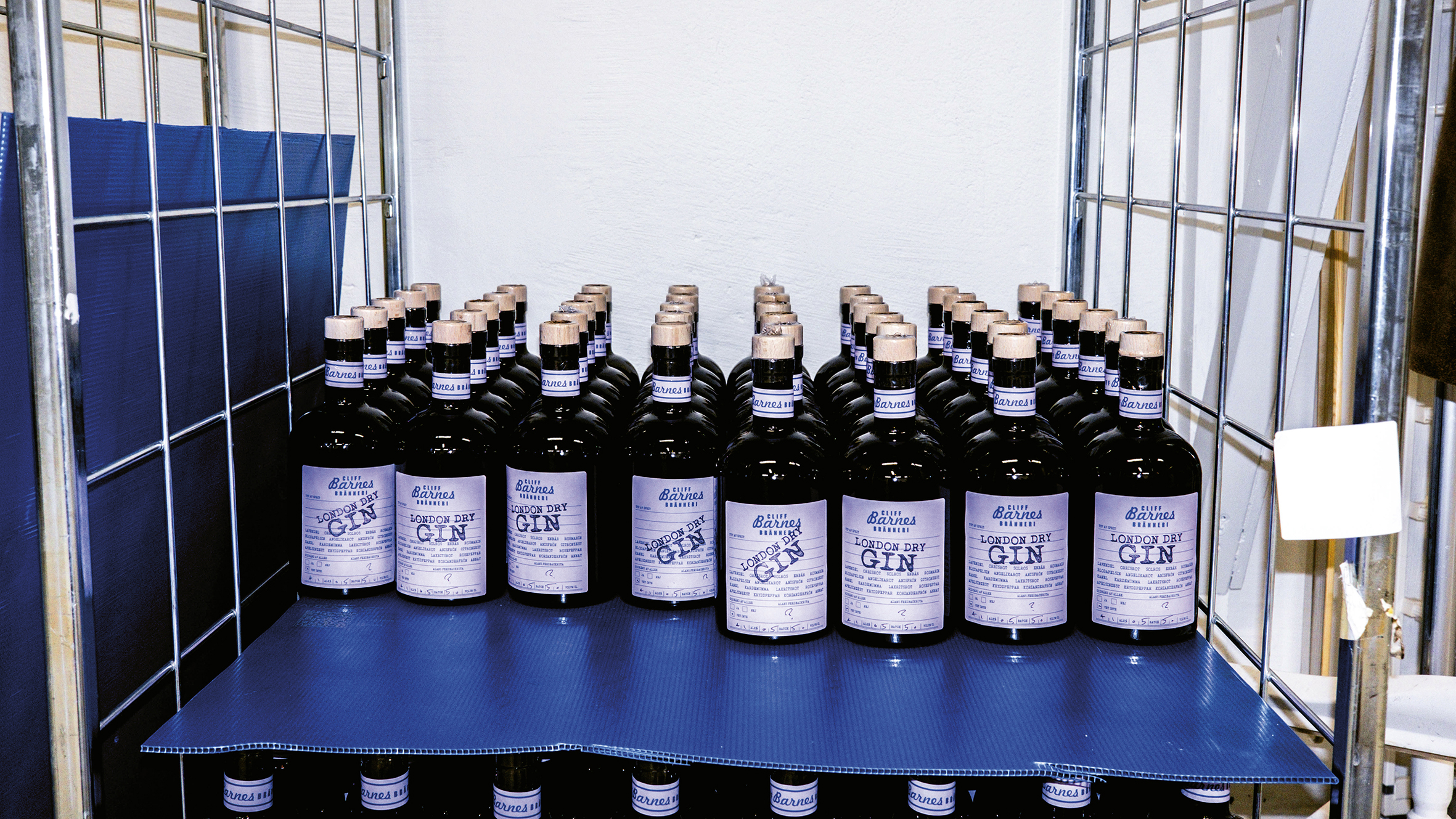
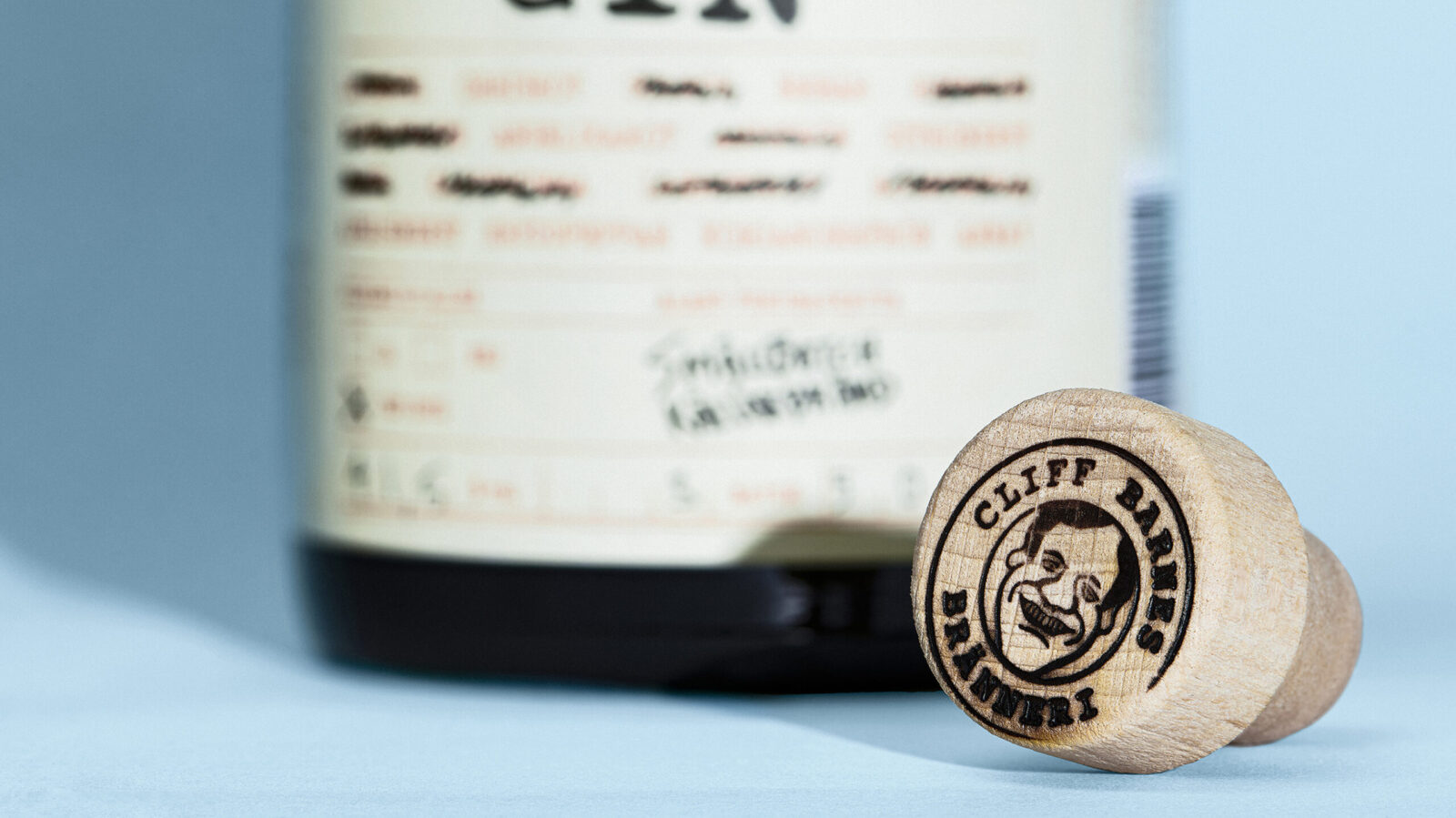
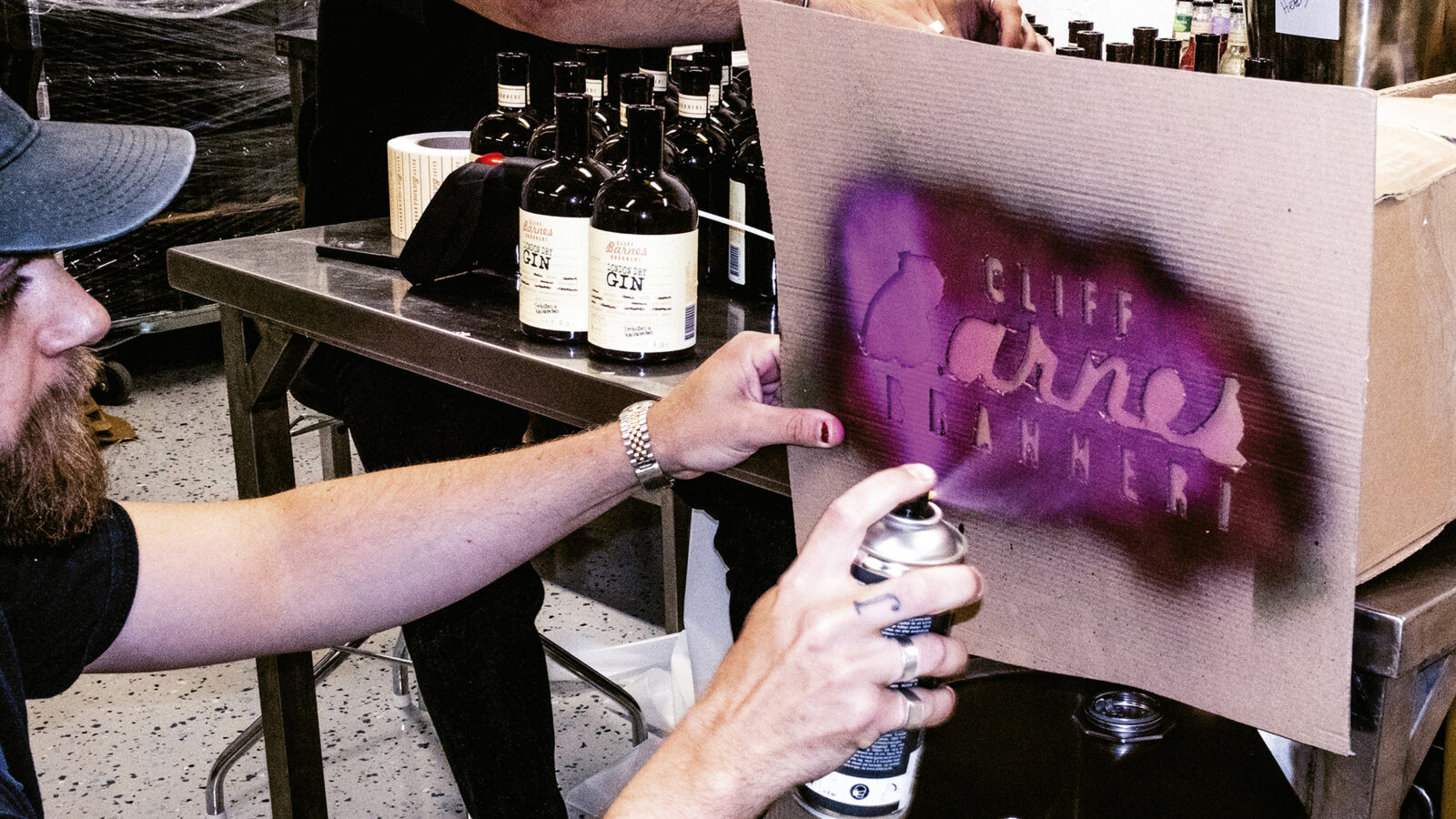
Their contagious humour had to shine through in the design. A dry-cleaner inspired tag as a label proved the perfect canvas for capturing their sparkling personality and innumerable gin ideas as it’s tailor-made for customisation. The labels, printed as stickers in various colours, stay true to the dry-cleaner aesthetics. Each one is handwritten and brutally applied onto a brown bottle. Some neatly put, others haphazard. The result in an odd gin collection as charming as its makers, all tied together by a distinct label framework.
The first batch carried the disclaimer: “Don’t try this gin. The next batch will probably taste better.” It became a conversation piece and favourite among Stockholm restaurateurs, as did every batch that followed. Now, they’ve even earned a spot on the shelves of Sweden’s notoriously bureaucratic liquor stores. Without heritage story, gimmicks or an exaggerated craft vocabulary, the gin stands out – and sells better than competitors. Proving that passion and personality beat perfection – authentic, offbeat, and a success for everyone involved.
CREDIT
- Agency/Creative: Pond Design AB
- Article Title: Pond Design AB Creates a Rule-Breaking Visual Identity for Don’t Try This Gin
- Organisation/Entity: Agency
- Project Status: Published
- Agency/Creative Country: Sweden
- Agency/Creative City: Stockholm
- Project Deliverables: Architecture, Art Direction, Brand Strategy, Brand Tone of Voice, Copywriting, Craft, Creative Direction, Design, Graphic Design, Identity System, Insight, Label Design, Logo Design, Packaging Design, Packaging Guidelines, Rebranding, Structural Design, Tone of Voice, Typography, Writing
- Industry: Food/Beverage
- Keywords: WBDS Agency Design Awards 2025/26 , Basement Distillery, Gin, Cliff Barnes, Pond Design, Swedish, Disruptive, Craftsmanship, Micro Distillery, Custom made
-
Credits:
Senior Designer: Viktoria Hamberger
Senior Designer: Mattias Cederfeldt
Junior Designer: Måns Rydh
Copywriter: Emma Hagberg
Visualizer: Johan Svedelius
Final Art & Retouch: Anna Johansson
Senior Client Director: Fredrik Svalstedt
Production Manager: Niclas Hemlin


