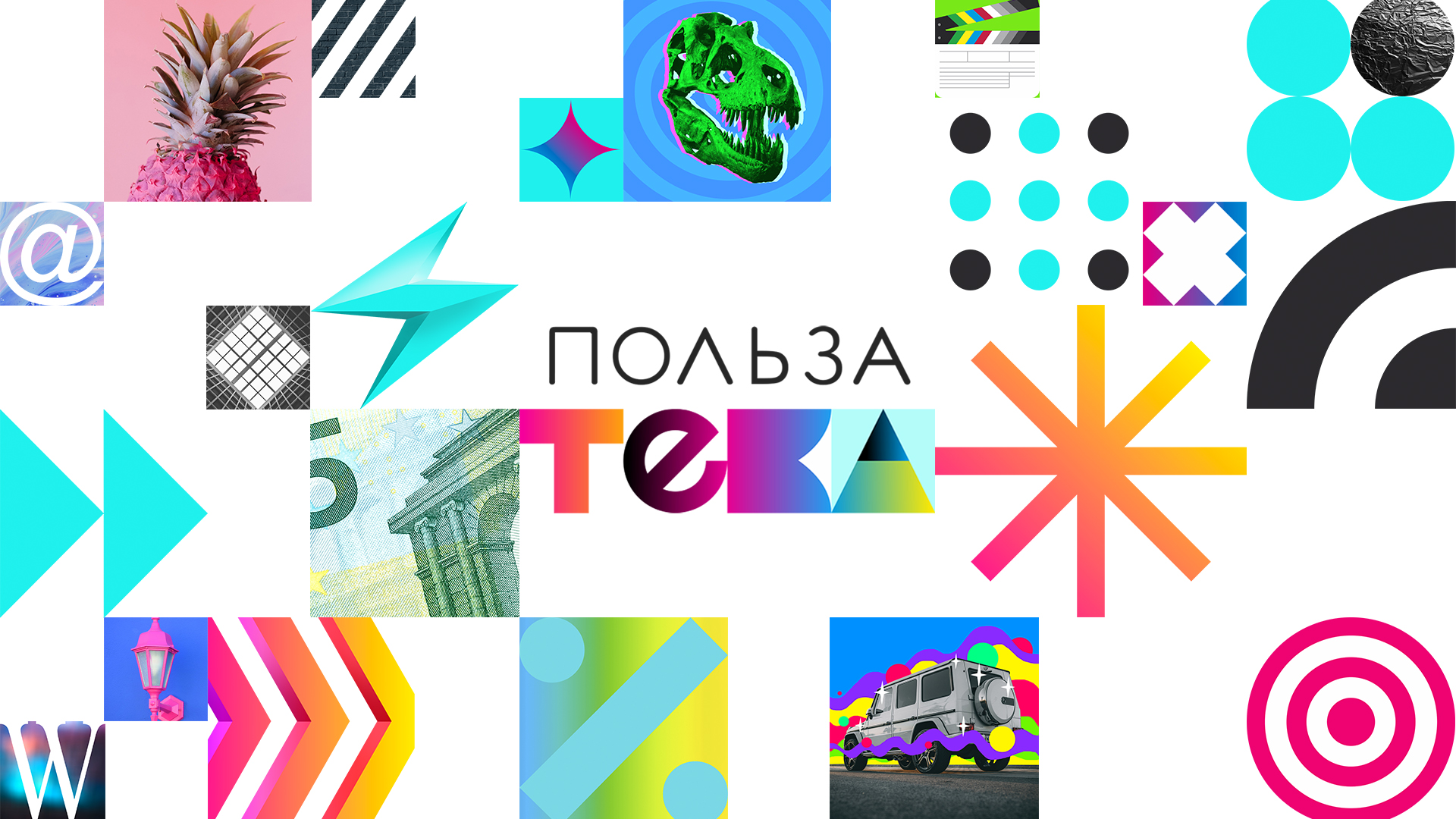
We’ve created a story for people who want to useful from online education. The name, logo and corporate identity help the useful experience platform Polzateka to stand out from competitors and convey an attractive image to people.
The client turned to us at the stage of the birth of a business idea He decided to launch an online education platform with educational, cognitive and entertaining content. A mix of directions and formats for different audiences. There are business courses, about the origin of the universe, and even 20 ways to cook a poached egg.
The challenge is daunting and challenging given the competition. But we really wanted to compete for a share of the growing market. At the briefing stage, we acted as moderators. Together with the client’s team, we analyzed the online education market in Russia and the world, segmented the audience, formed requirements for the product. Close integration and the right questions at the right time allowed the client to translate the desire into the goal and describe the product. We caught one wave and established ourselves that we are making history.
To develop an organic image and name for the product, we researched the opinions and judgments of different target audiences. As a result, we found a single value for them – usefulness. The product that the client created fully met this request because it was based on the practical experience of experts. How does this offer differ from competitors? A variety of course directions and presentation. High-quality study of the material in terms of teaching and learning methodology, good picture and sound. Competitors do not have this.
Our platform – a collection of useful experience. Such a virtual library, a warehouse. The name combined the value to people and the essence of the product. This is how Polzateka was born. Polza = usefulness, teka = storage. The literal translation of the name is the storehouse of useful.
Polzateka gives people usefull. This theme supports the brand language: learn usefully, have fun with the usefully, communicate with usefully, live usefully.
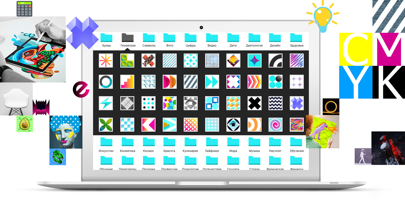
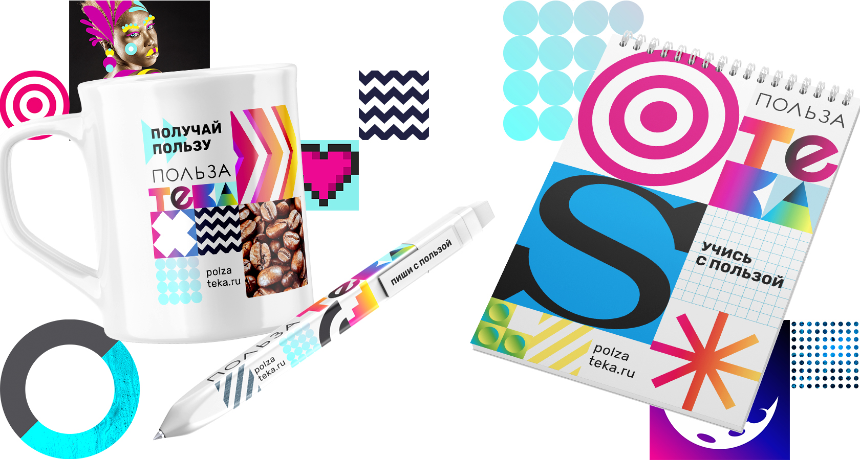
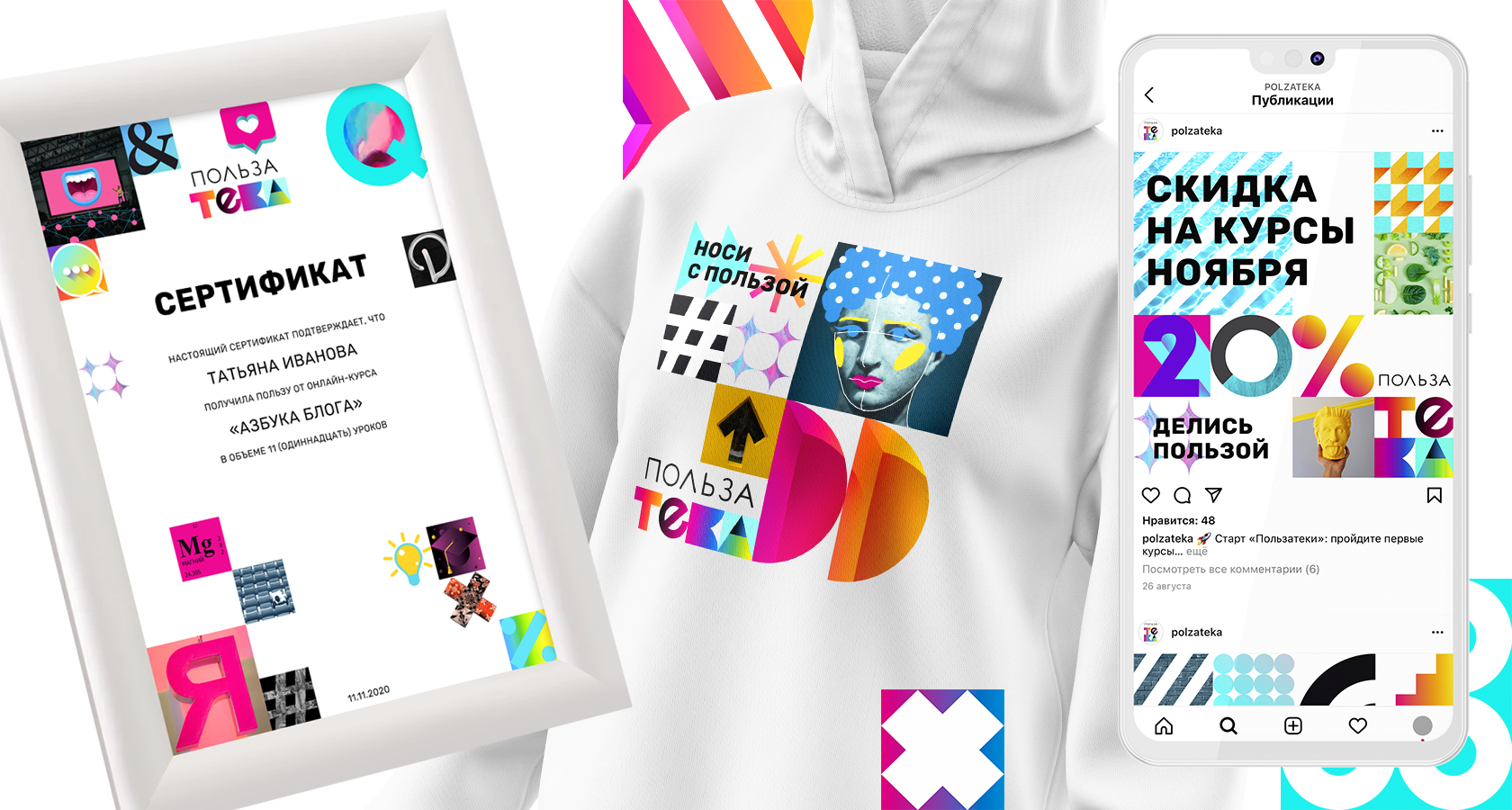
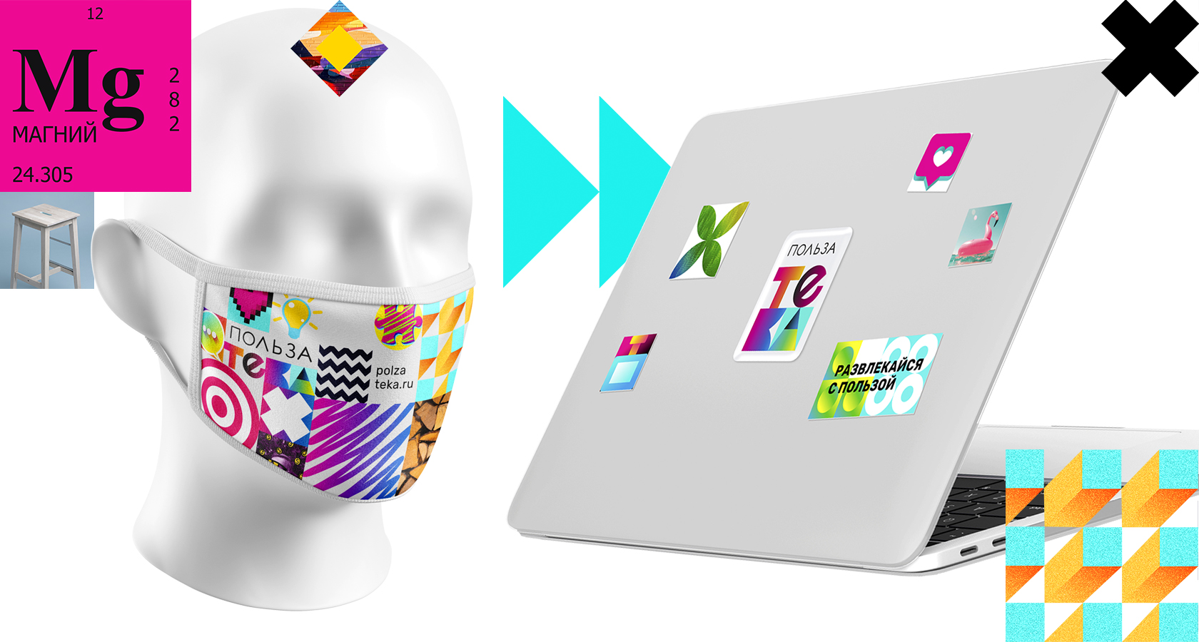
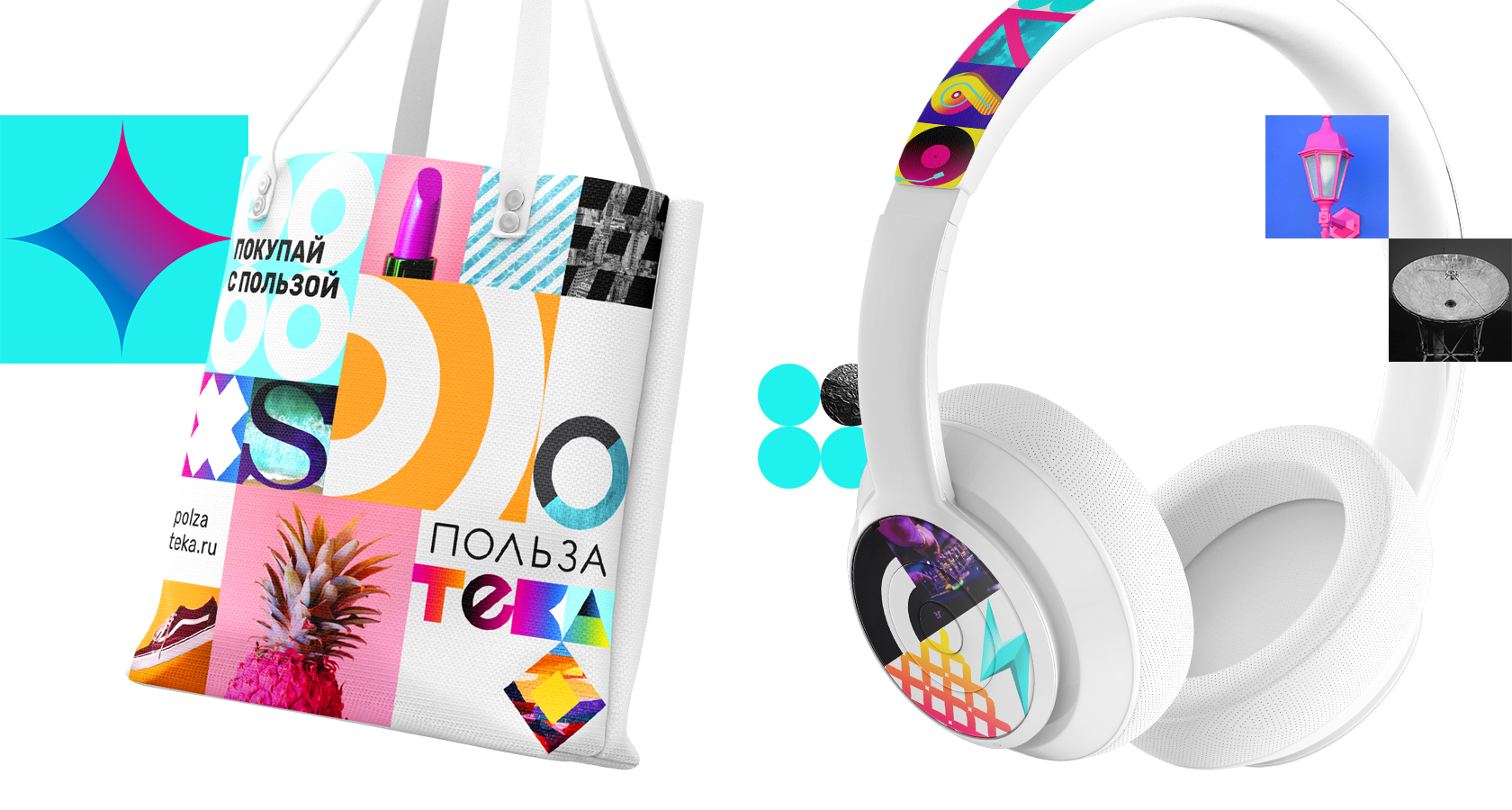
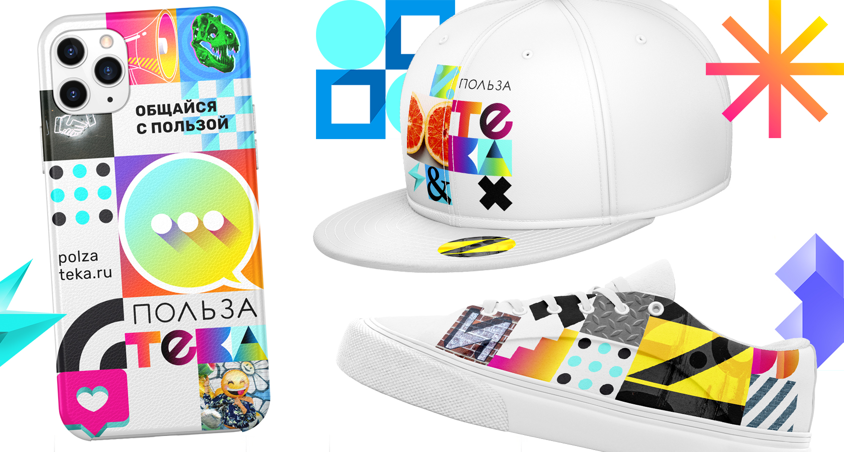
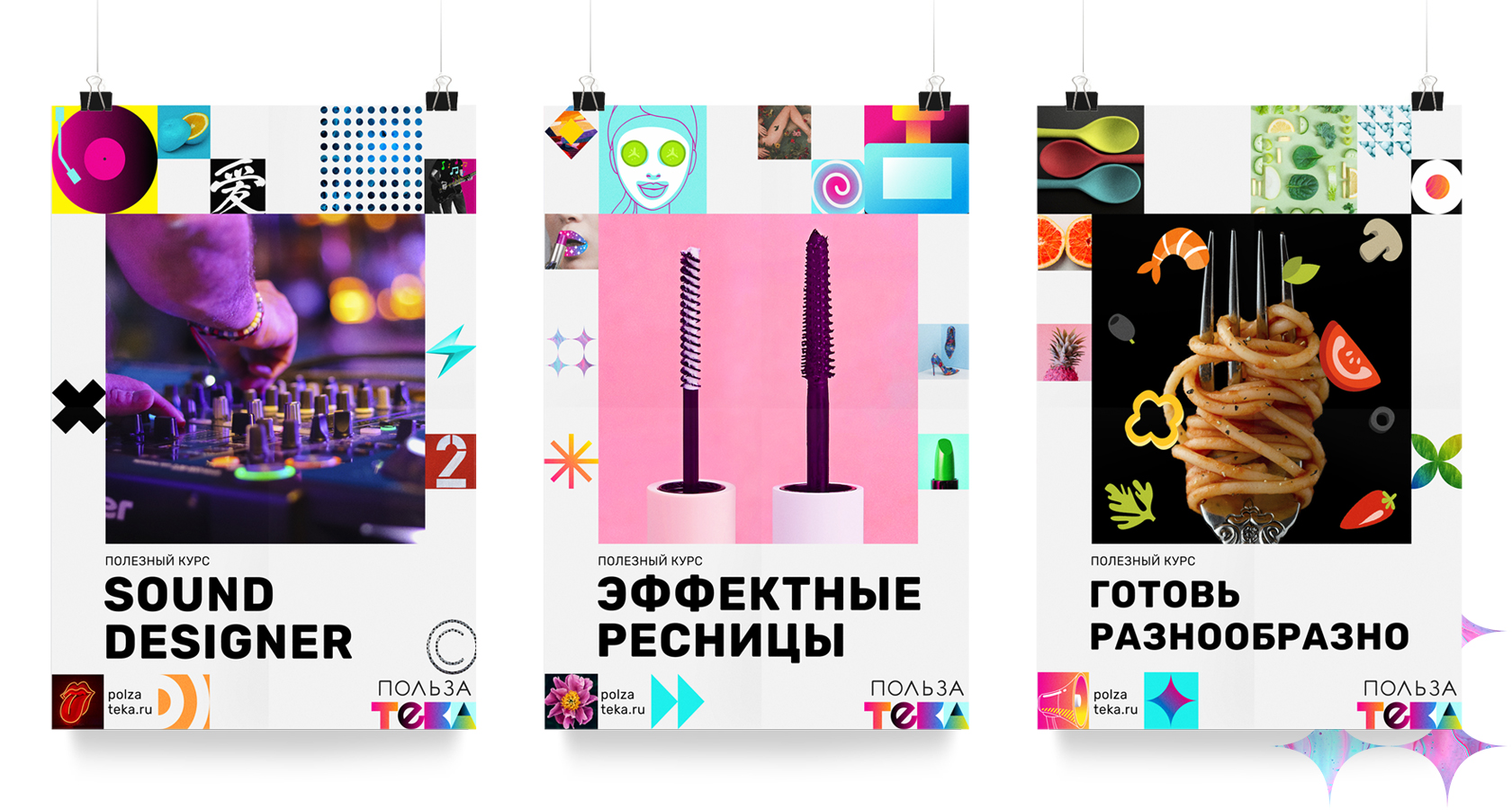
The visual identity of the brand is based on a system of modules. On the one hand, it conveys a structured approach to learning, and on the other, it demonstrates the variety of courses. We have created a thematic library of modules for 33 directions on the basis of which the website, video courses, social networks, merch are designed.
CREDIT
- Agency/Creative: CLUBNIK
- Article Title: Polzateka Online Education Platform Created by Clubnik
- Organisation/Entity: Agency, Published Commercial Design
- Project Type: Identity
- Agency/Creative Country: Russia
- Market Region: Europe
- Project Deliverables: Brand Architecture, Brand Creation, Brand Design, Brand Identity, Brand Naming, Brand Strategy, Branding, Graphic Design, Identity System, Illustration, Research, Tone of Voice
- Industry: Education
- Keywords: branding, naming, logo, identity, graphic design, online education, useful, visual communication


