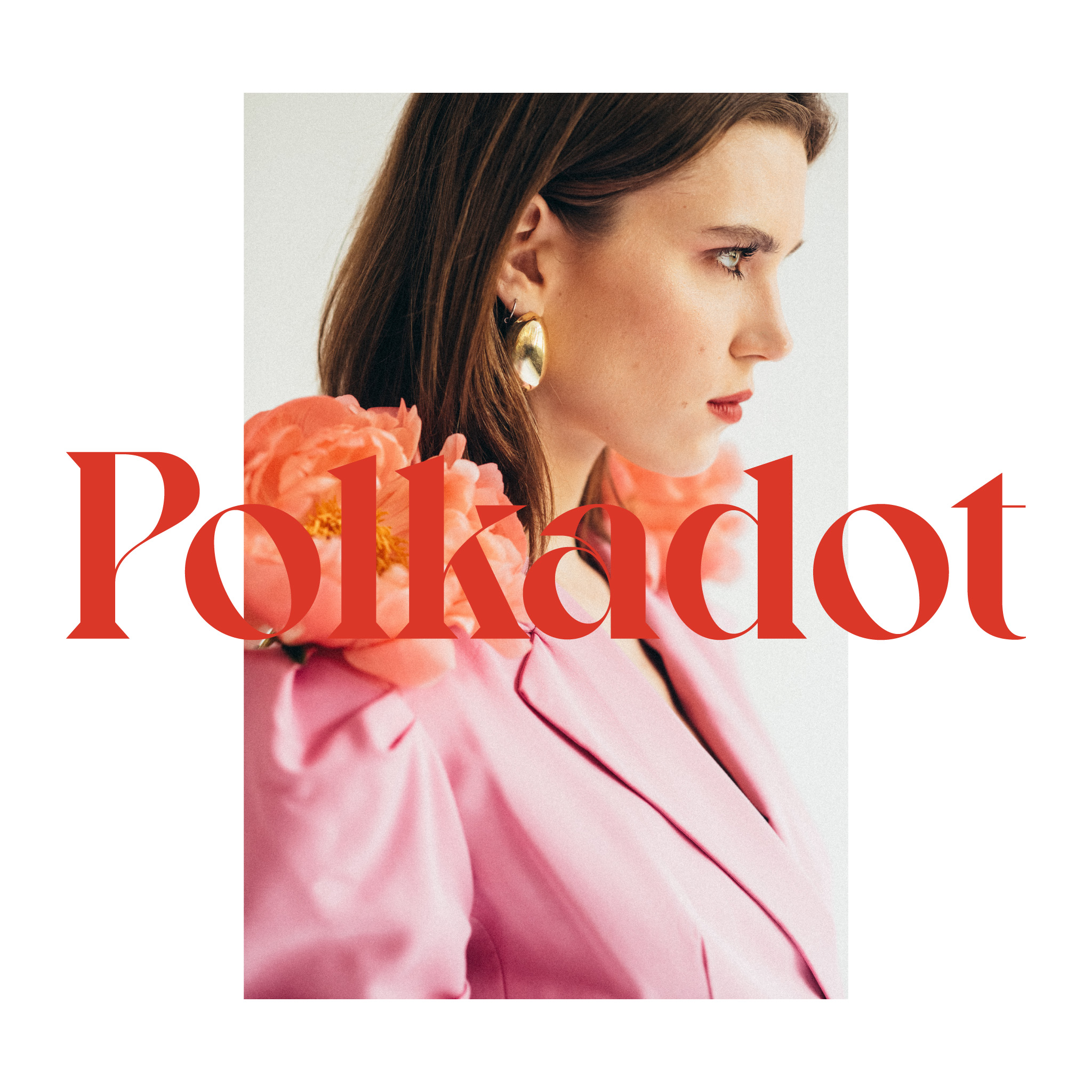
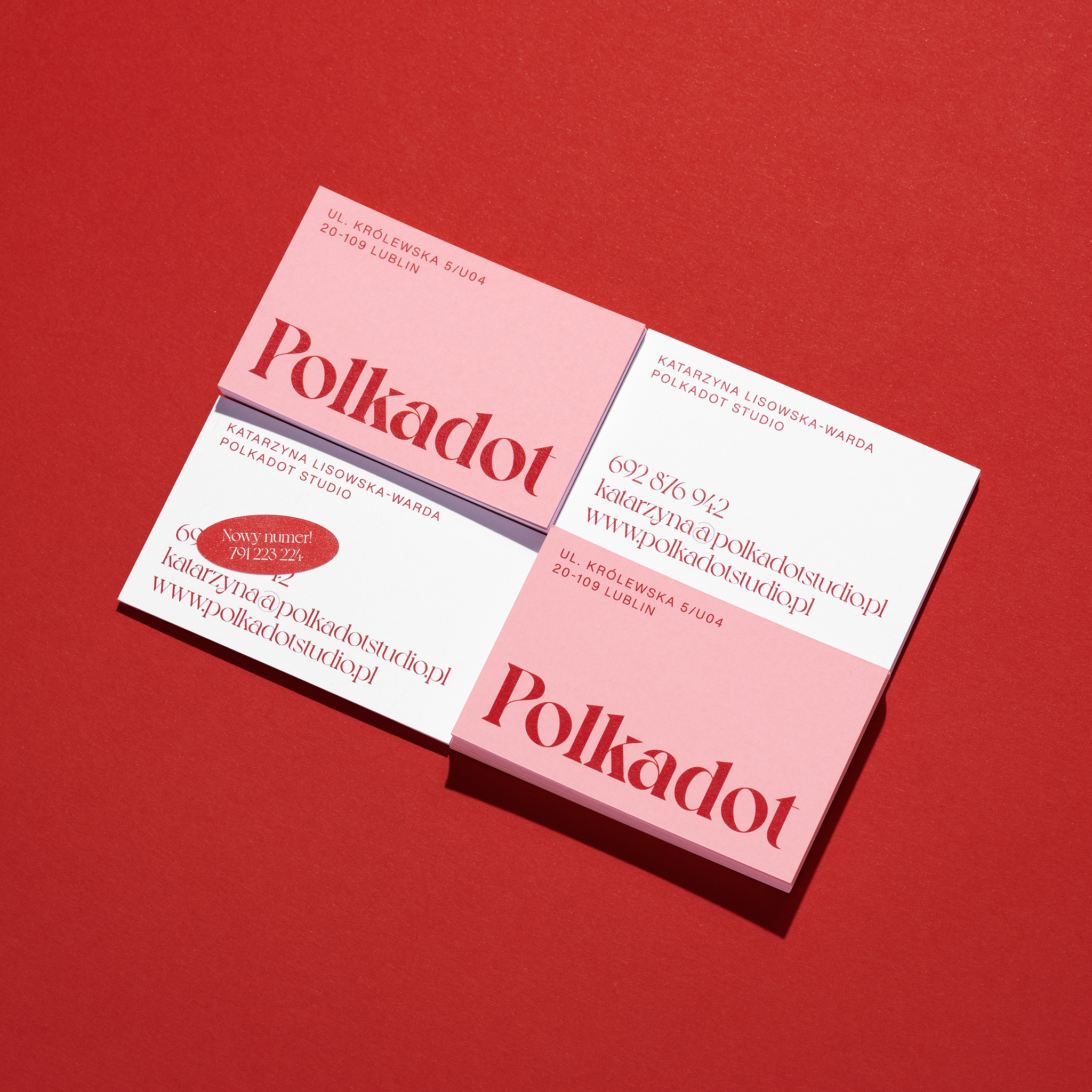
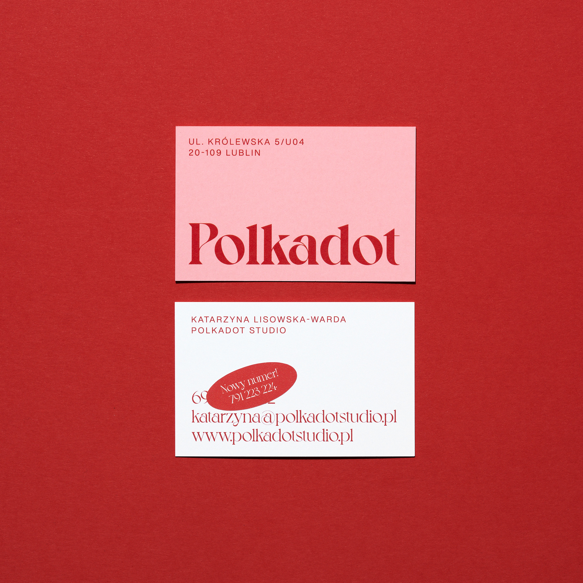
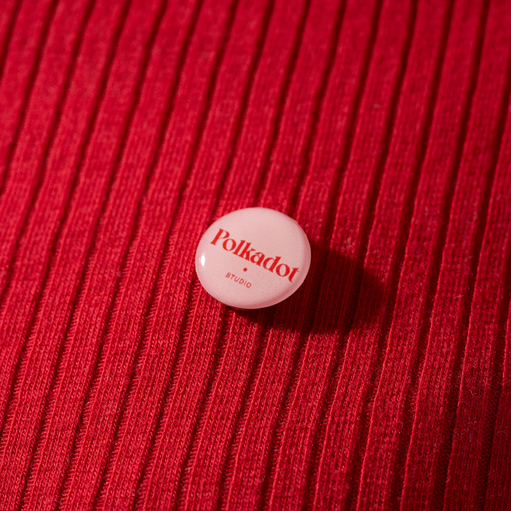
Simple branding for Polkadot Studio, make up artist and stylist offering wedding and fashion makeup, body and color analysis, makeup events and lessons. The selection of good quality fonts and papers are key elements of this project.
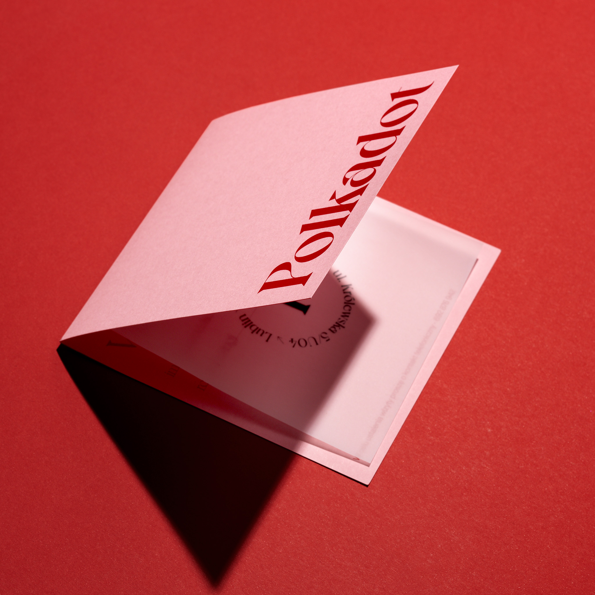
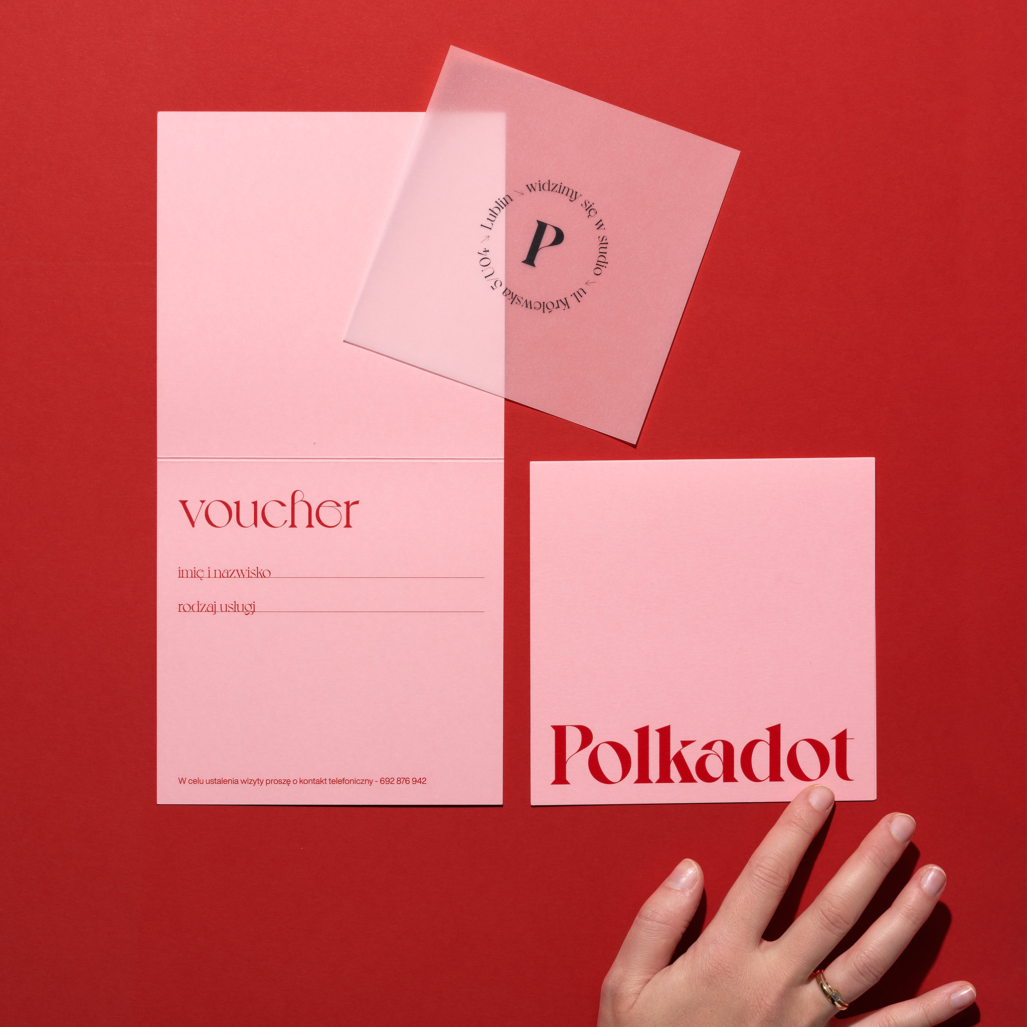
The combination of the Pop’set Sweet Rose paper and red printing refers to femininity. Noble Voyage typeface refers to the way of work of Katarzyna Lisowska, the owner of the studio. An interesting element of customer experience is odorized Curious transluscent paper placed inside the voucher.
CREDIT
- Agency/Creative: Motyw Studio
- Article Title: Polkadot Studio Branding Designed by Motyw Studio
- Organisation/Entity: Agency, Published Commercial Design
- Project Type: Identity
- Agency/Creative Country: Poland
- Market Region: Europe
- Project Deliverables: Brand Creation, Brand Identity, Branding, Tone of Voice
- Industry: Fashion
- Keywords: make up, stylist
FEEDBACK
Relevance: Solution/idea in relation to brand, product or service
Implementation: Attention, detailing and finishing of final solution
Presentation: Text, visualisation and quality of the presentation


