We refined and polished the look of a renowned international school.
Suzhou Singapore International School (SSIS) has a long history of successfully serving expat families. With over 25 years of quality education, they are a well-established school, synonymous with academic success. Their logo had garnered recognition in the community, but they lacked an established visual system for the brand. The logo design felt clunky and disjointed. It was also limiting in its functionality. They lacked a unified visual system, wanting refined typography for their logo, along with a fuller logo family for different usages.
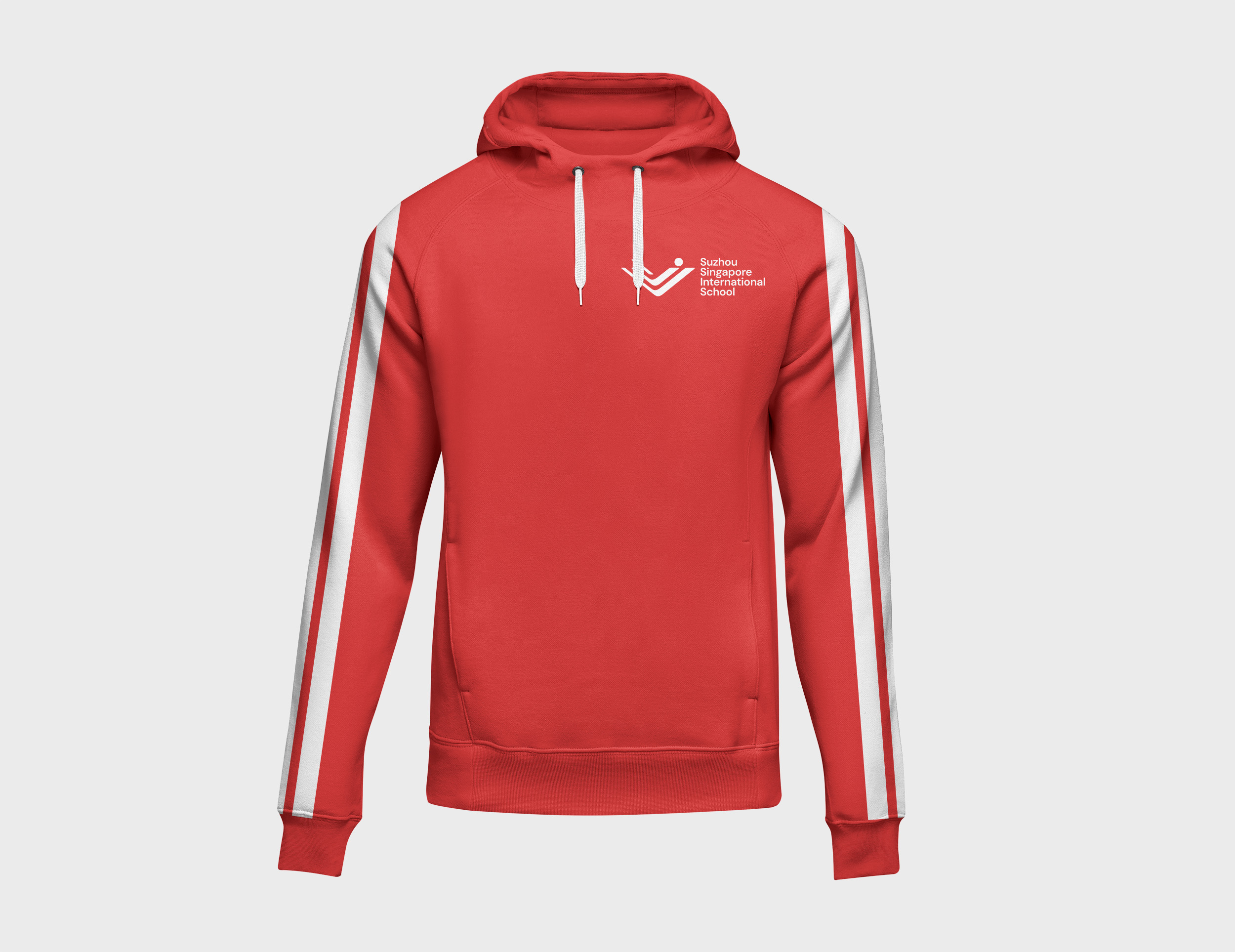
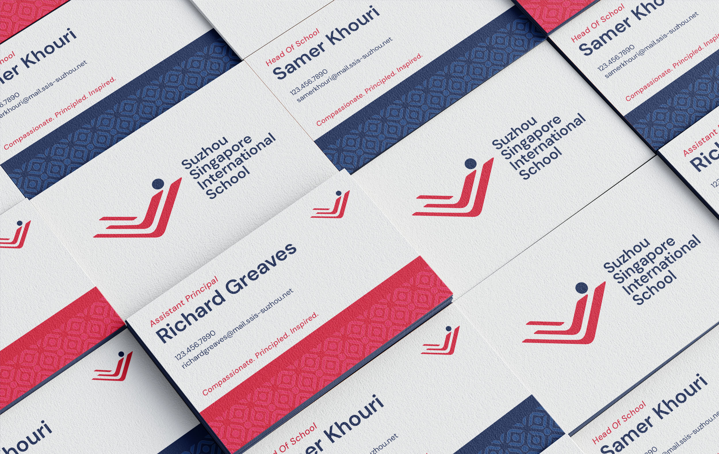
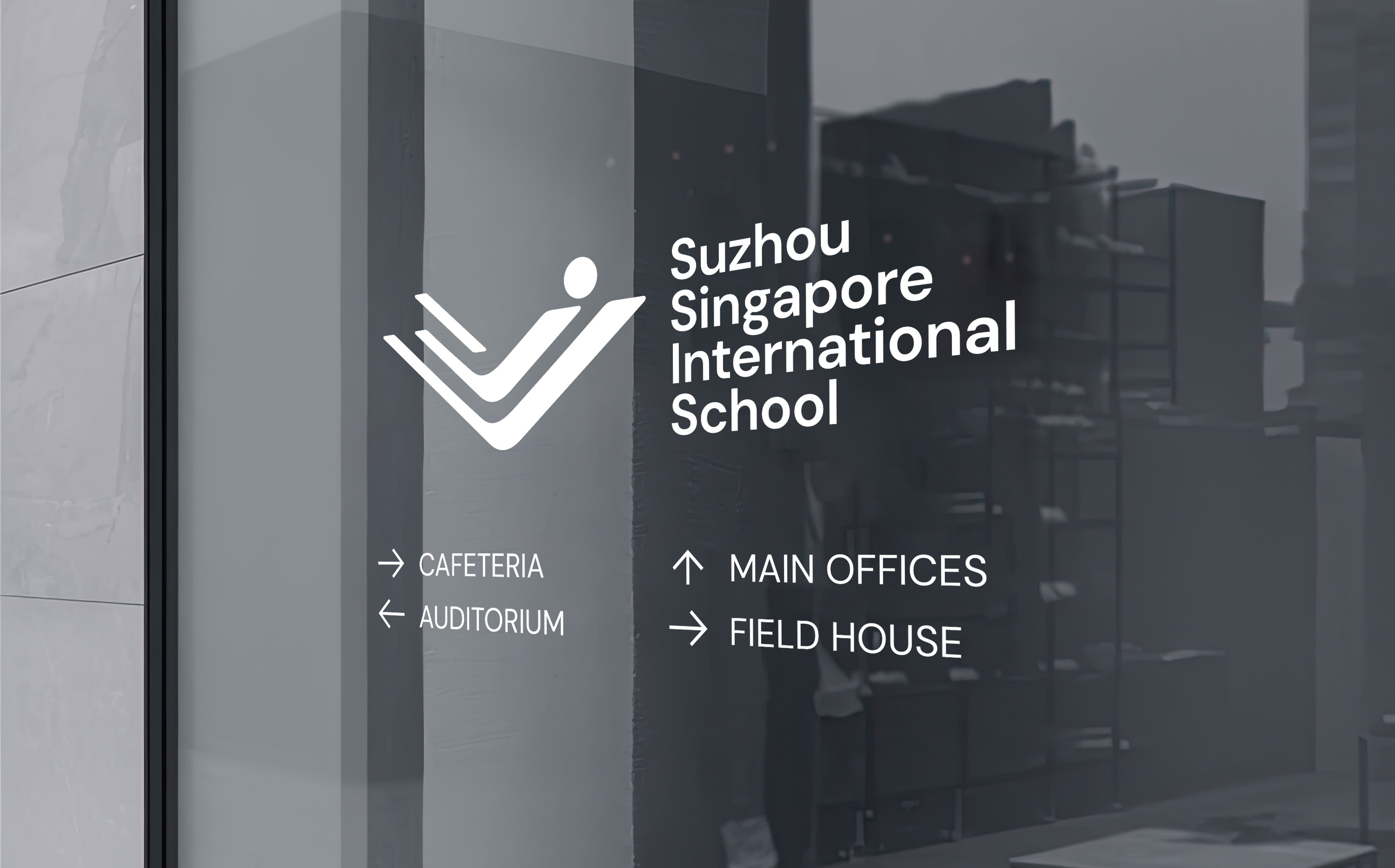
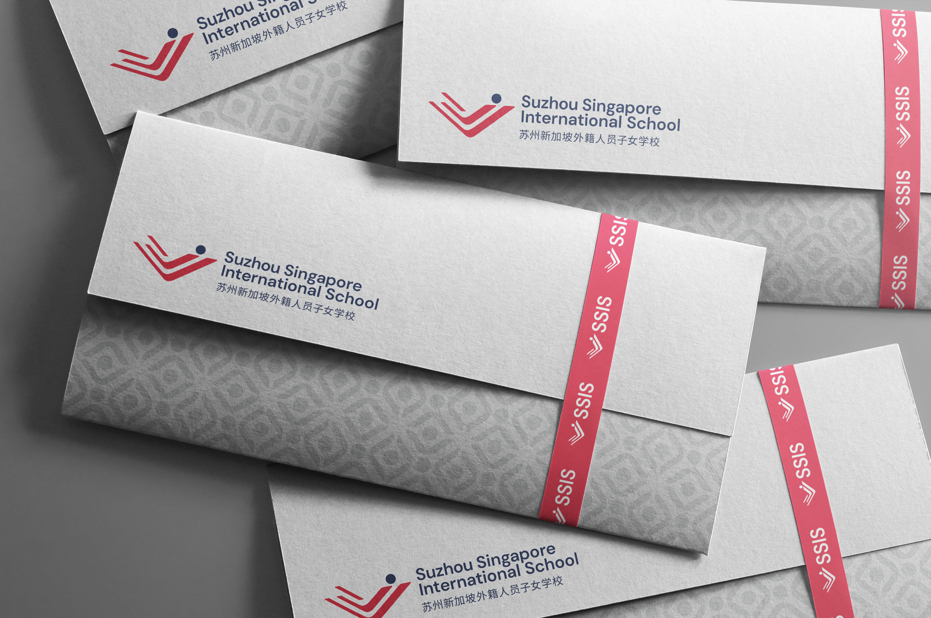
SSIS engaged with Creative Chameleon to look at their current brand and identify the ways it could be evolved and polished. We started with their logo. The icon had too much equity to abandon it, but it was unbalanced and clunky. So we carefully cleaned it up, aligning angles and balancing weight until it was polished without loosing its essence. The wordmark also was in need of help, with the school’s long and multi-language name posing usability problems. Leveraging a cleaner, more modern font family, we set to work balancing out the icon with the wordmark. We also designed a handful of variations, from a stacked to a multi-language to an abbreviated logo. This logo library will help them maintain consistency in all the areas that a school uses a logo.
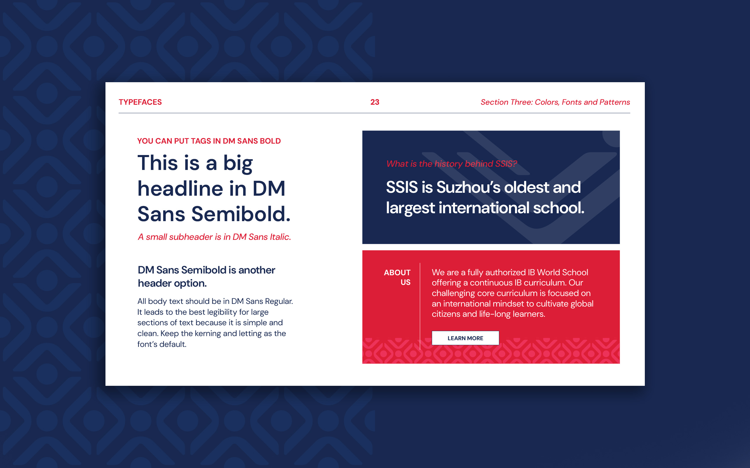
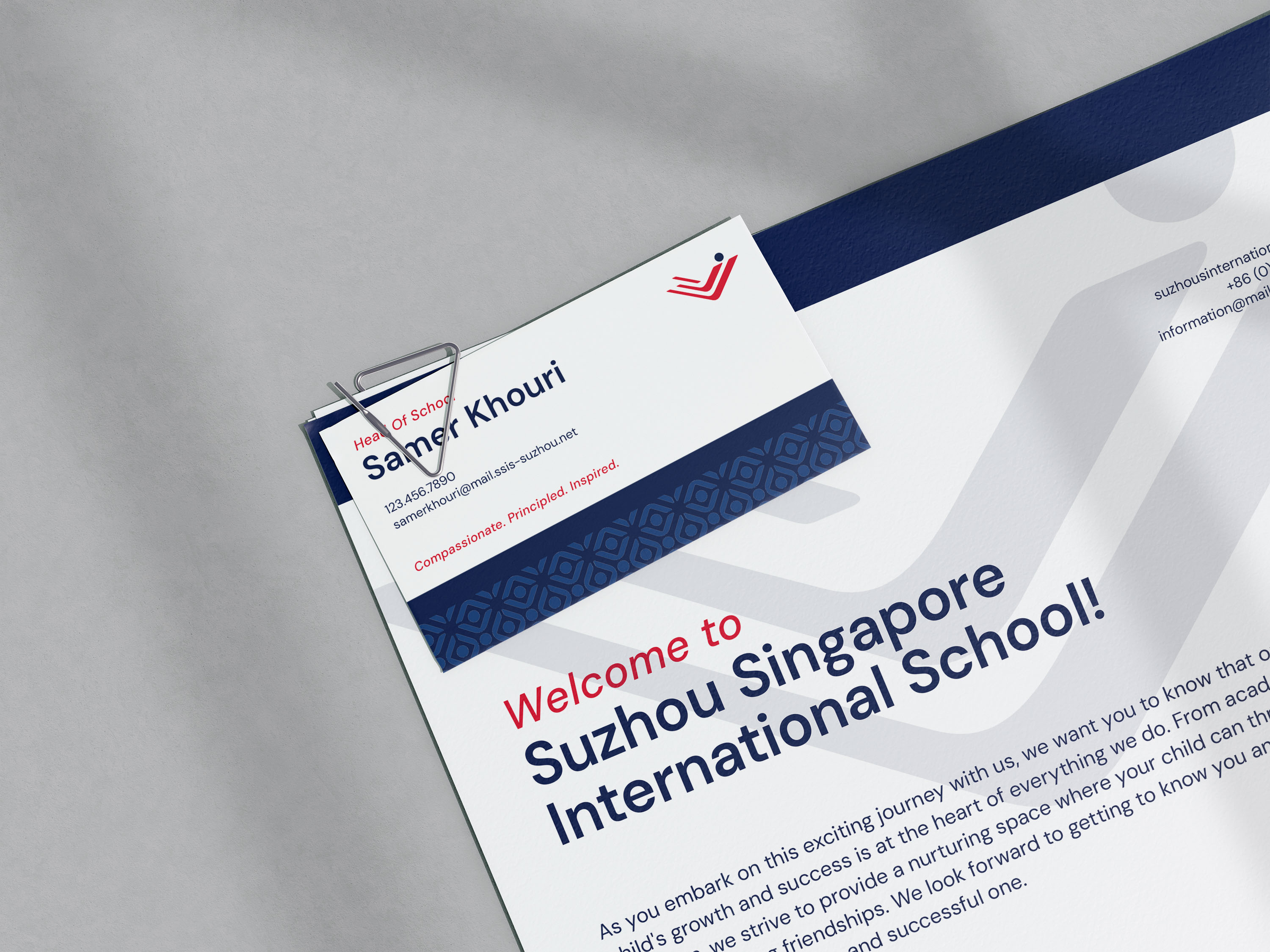
Once the logo was refined, we made sure there was a polished visual system to support it. From defining colors to font hierarchy, we wanted to make sure the new look of the logo would impact every corner of the brand. We refreshed their house system logos and developed a new brand pattern. Taking all the approved creative work, we design brand guidelines that defined the new visual system for SSIS, from logo usage to new typography to patterns and colors.


CREDIT
- Agency/Creative: Creative Chameleon Studio
- Article Title: Polished Brand Identity For An International School
- Organisation/Entity: Agency
- Project Type: Identity
- Project Status: Published
- Agency/Creative Country: United States
- Agency/Creative City: Cleveland, Ohio
- Market Region: Asia
- Project Deliverables: Brand Design, Brand Guidelines, Brand Identity, Brand Mark, Brand Redesign, Logo Design
- Industry: Education
- Keywords: international school, logo design, rebrand, school brand
-
Credits:
Creative Director: Madison Carr


