


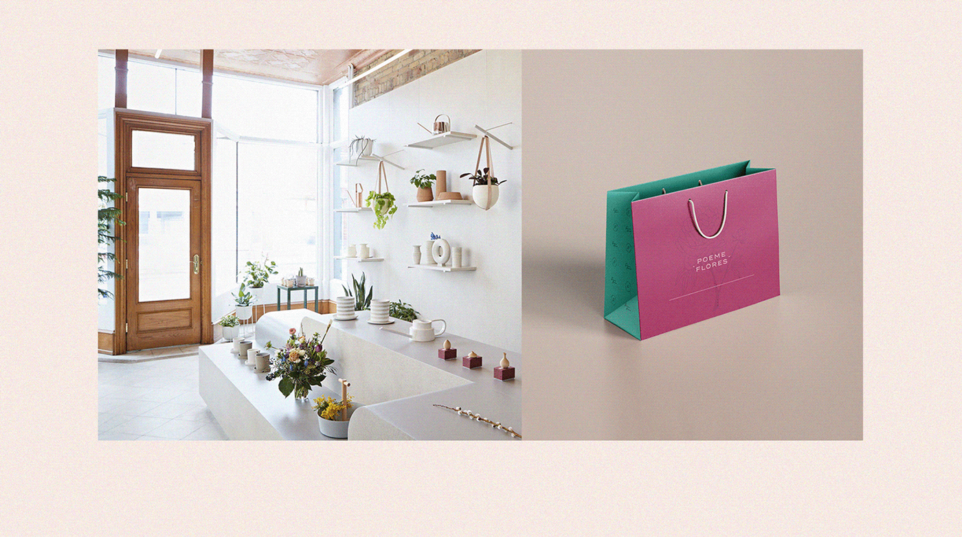
Poeme Flores is a flower shop, located in the city of Jundiaí/Sao Paulo, where differentiated works are made, such as flower signatures, personalized arrangements, as well as vases and accessories for decorating various environments.
The idea of developing a new way of bringing personalized floral arrangements to people was born due to the love of the owner (before acting as a banker) for several species of flowers and this completely changed the focus of her life, leading her to have her own business. Noticing the need for a differentiated visual standard for her company, she decided to invest in a visual identity project, where the main focus was how she would like to be remembered by her clients, allowing them to reach the main resources of the community.
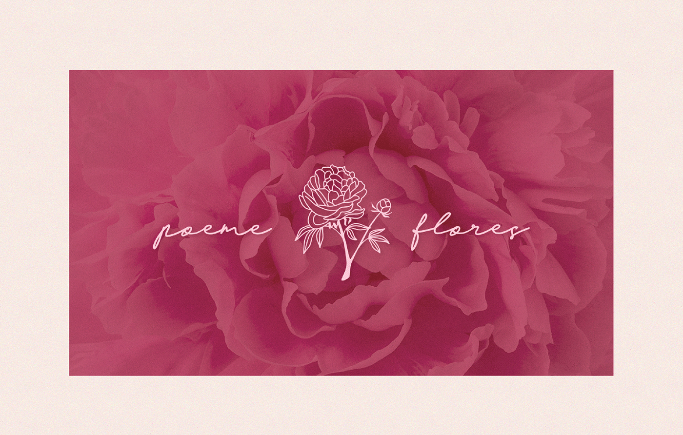
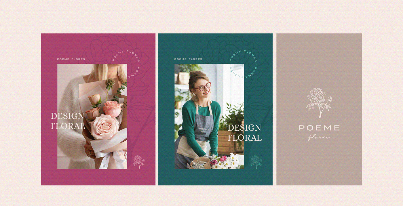
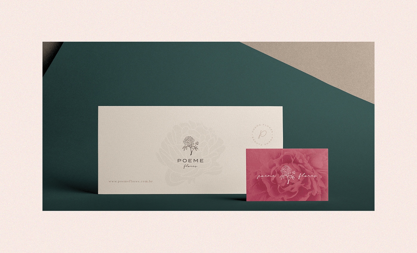
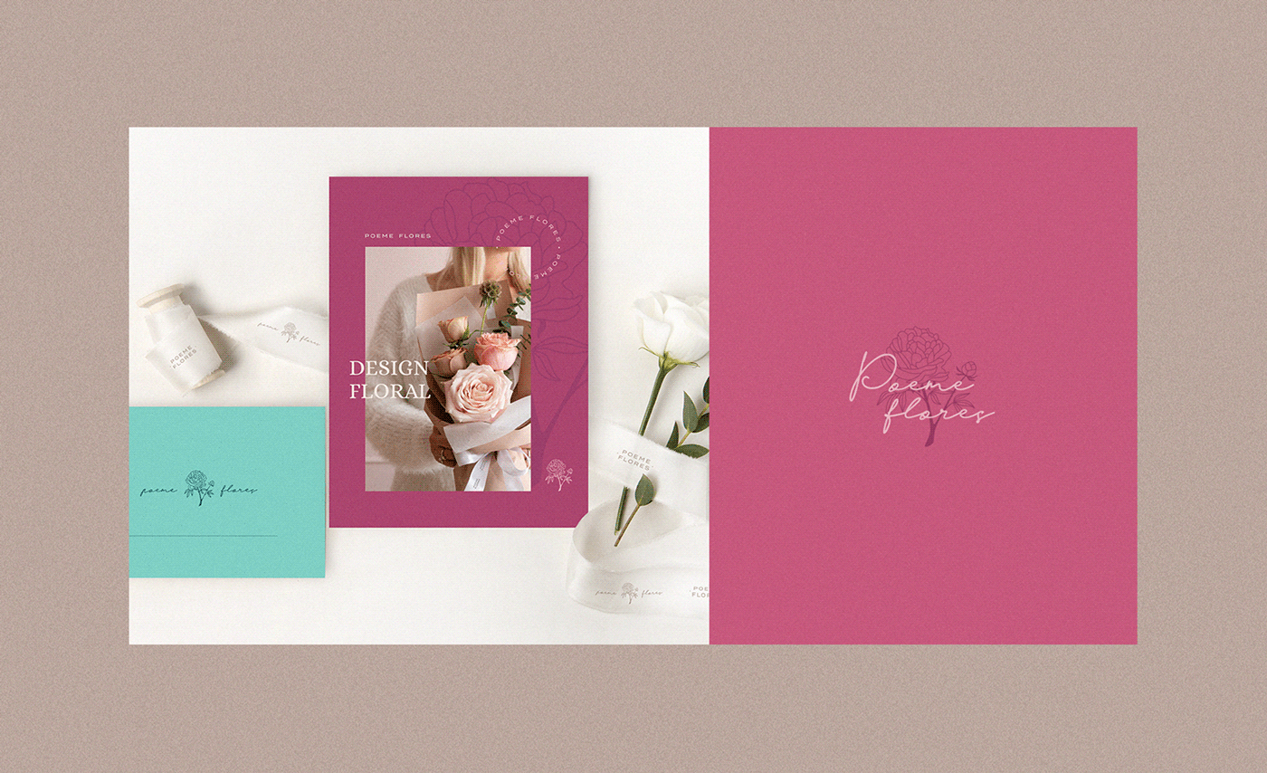
The project consists of exhibiting an essence of the company, seeking to explore shapes and cores that represent something delicate, intimate and transforming. The colors used to bring this brand to life have tons of pink, which conveys a passionate and welcoming air, and blue-green, which conveys peace and tranquility, in addition to being related to the ocean, seeking to cause emotions of welcoming, tenderness and care.
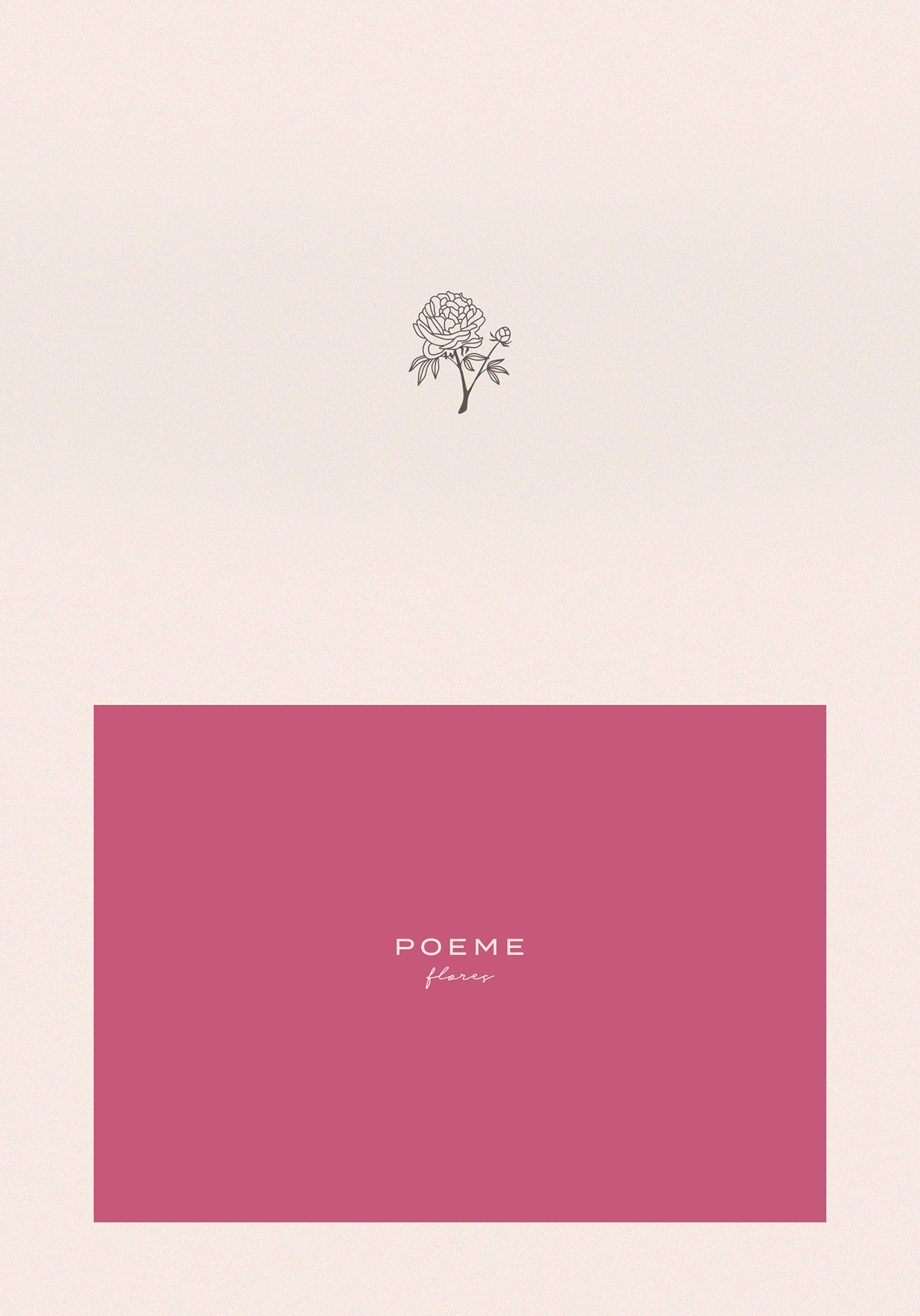
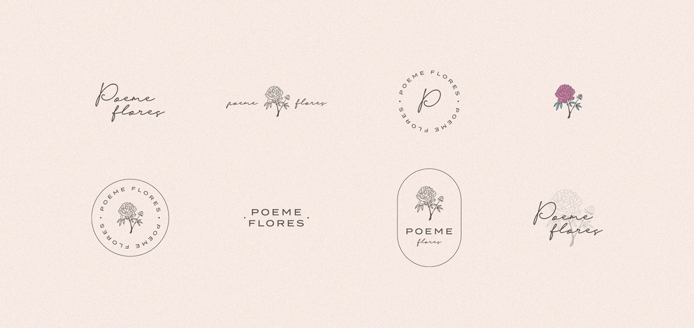
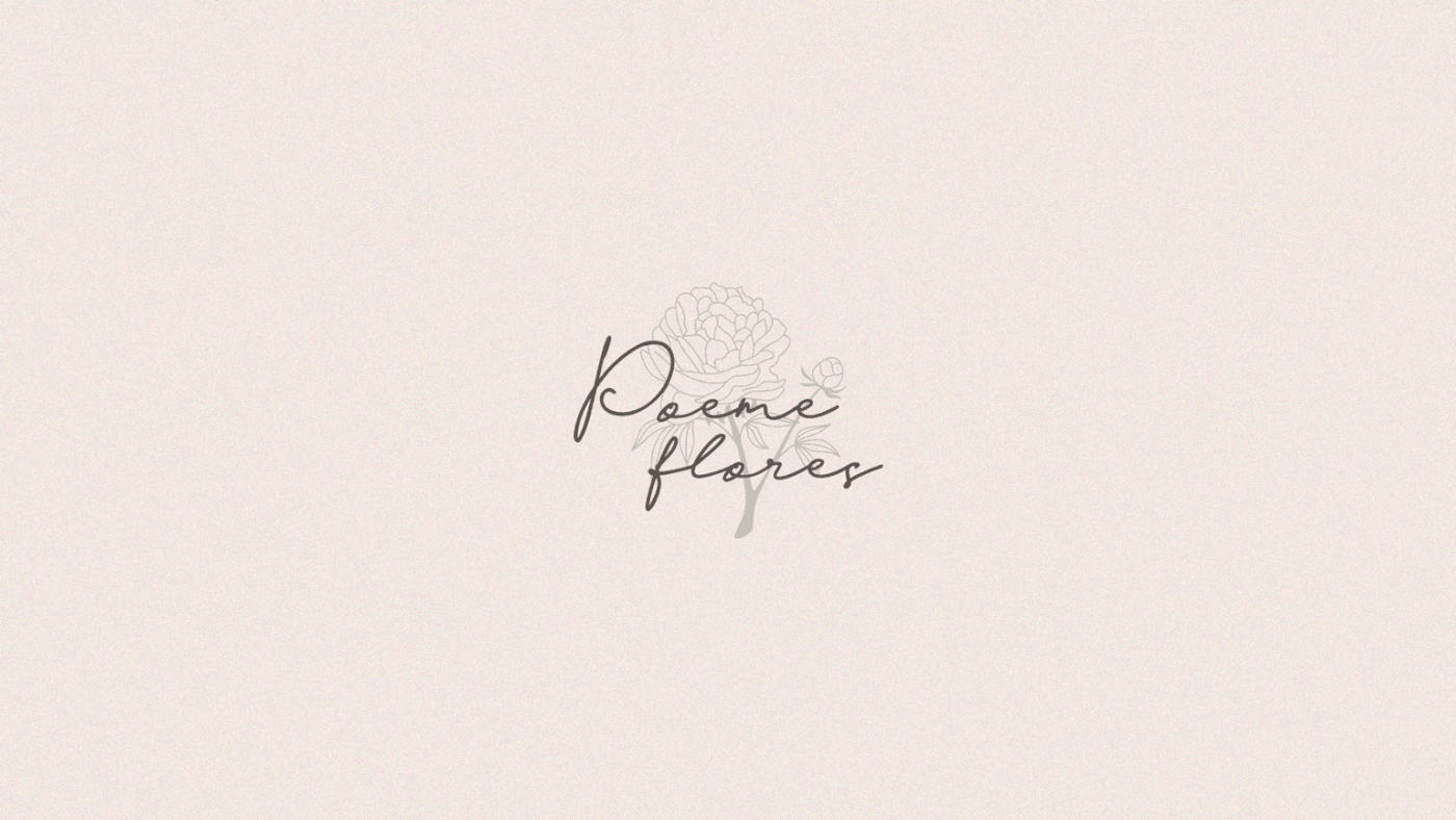
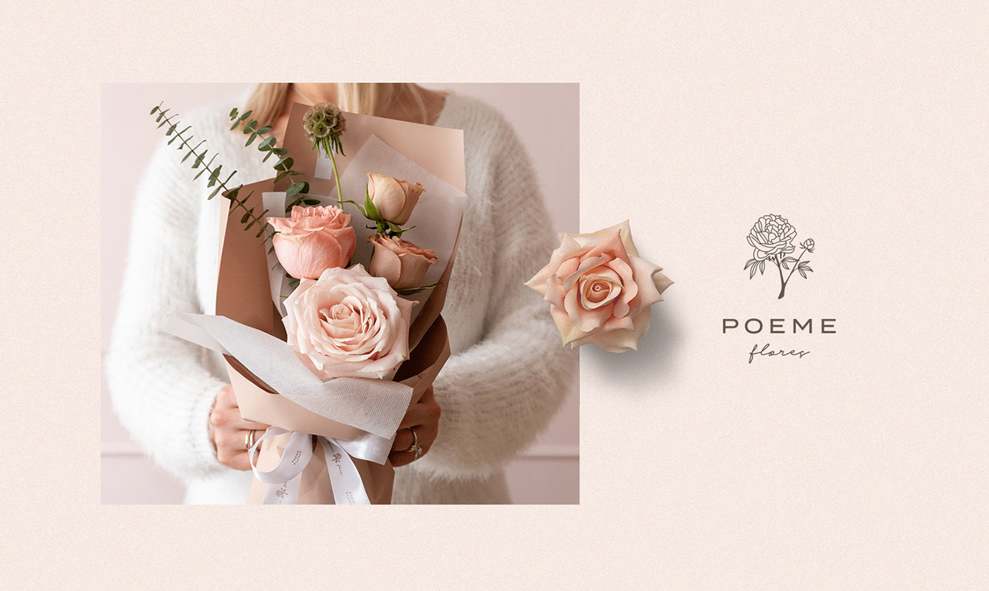
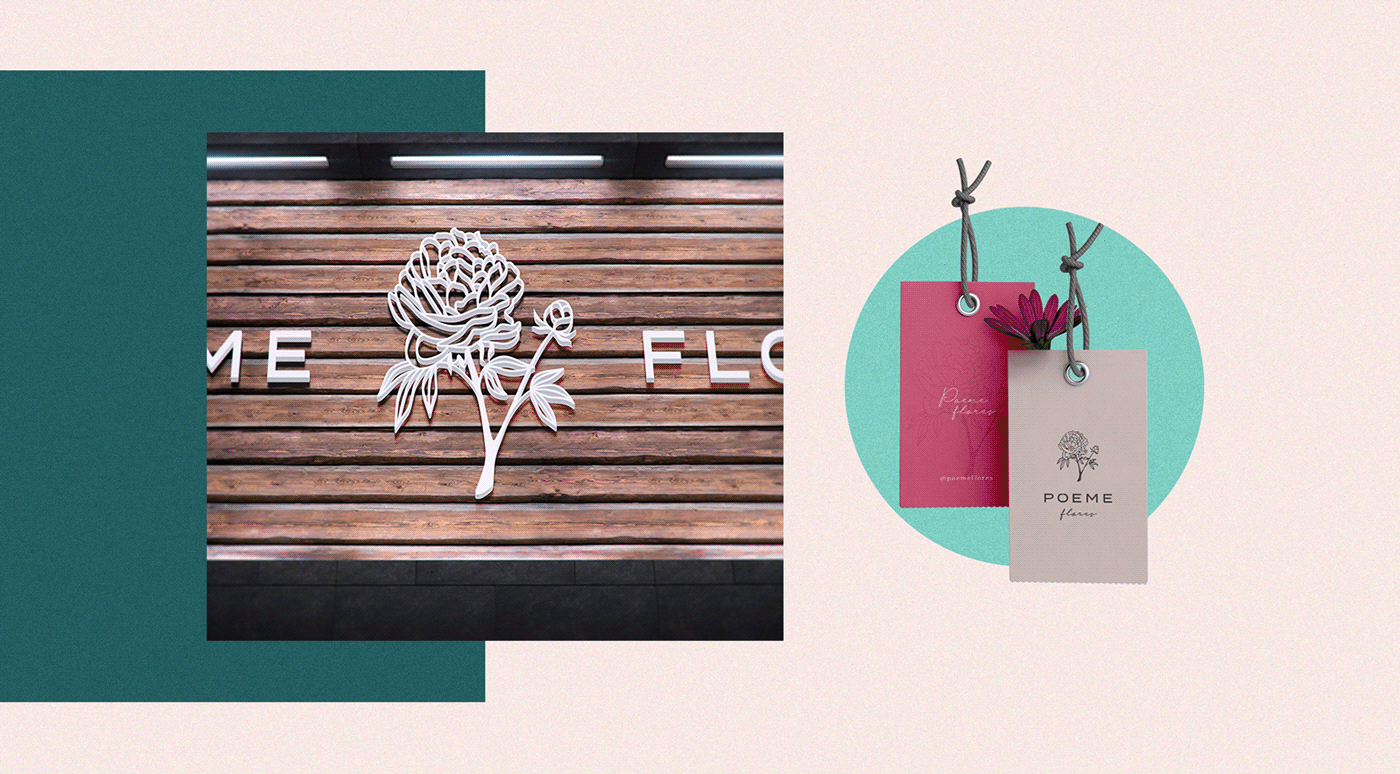
For the symbol, an illustration of the Peony flower was developed, which is linked to a happy life and is also associated with an affective, romantic and loving bond. Using as basic organic forms for a more natural representation and work developed and delivered to the public.
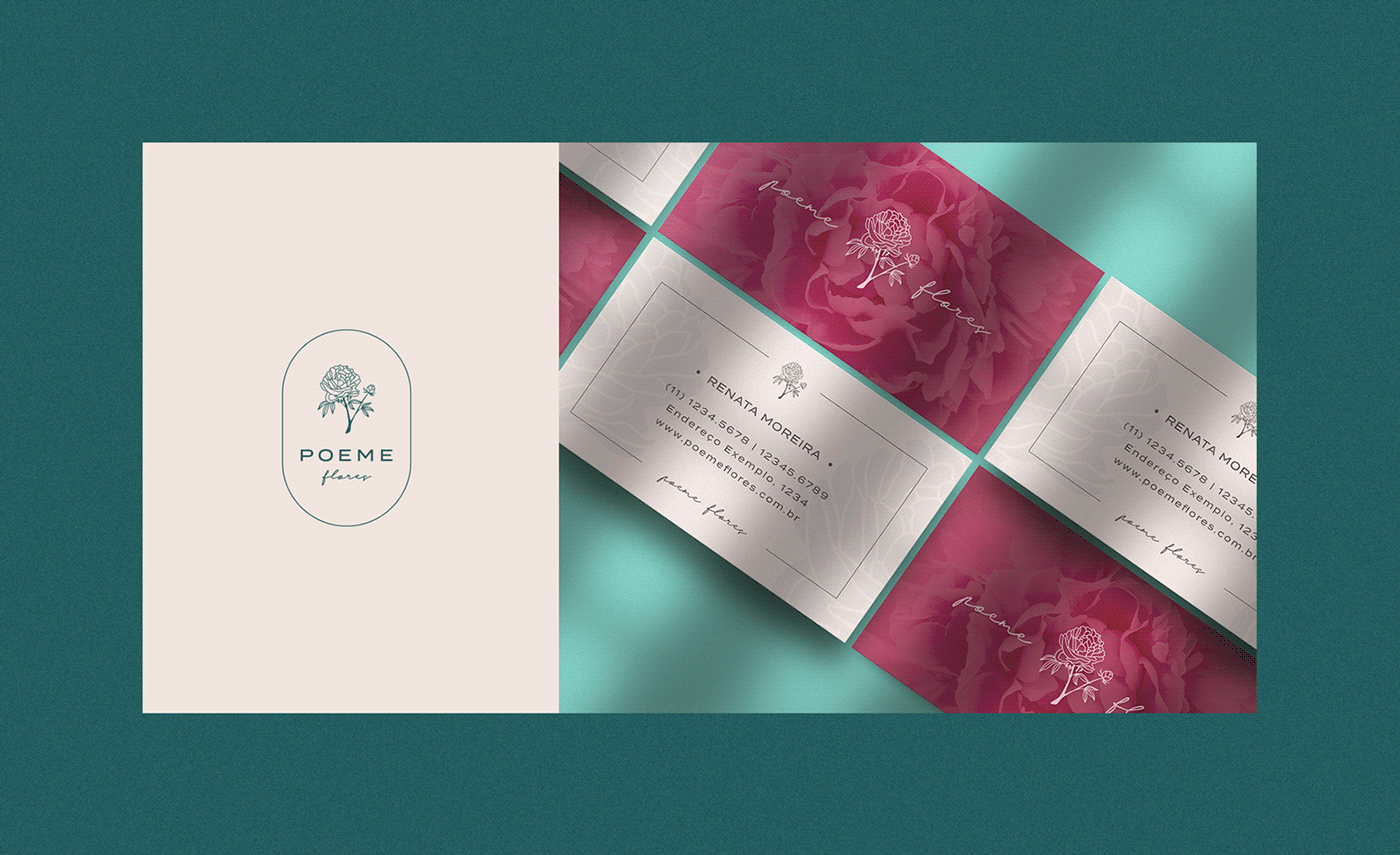
The cursive typography that was chosen, which supports the brand, refers to the brand name “Poeme”, simulating handwritten letter traces, like they were written by poems and letters in the past.
To draw the rose, the main symbol of the brand, the Adobe Illustrator program was used. A real photo of a peony flower served as the basis for the design, however, some adjustments were made to the leaves and proportions, so that it arrived in a pleasant and visually harmonious result.
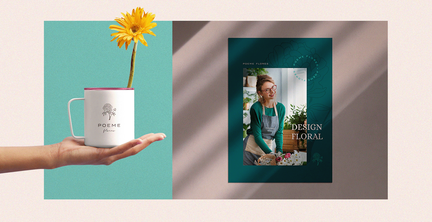
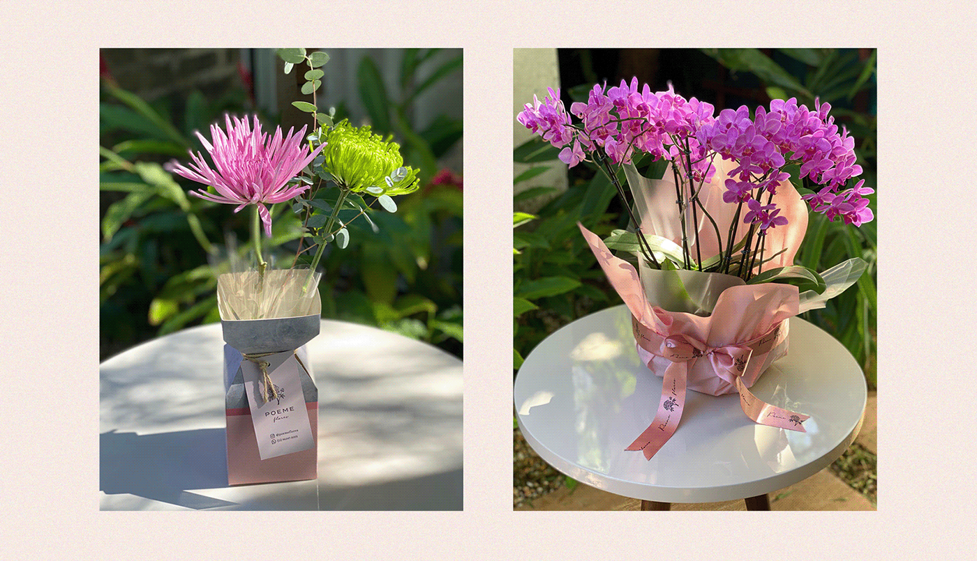
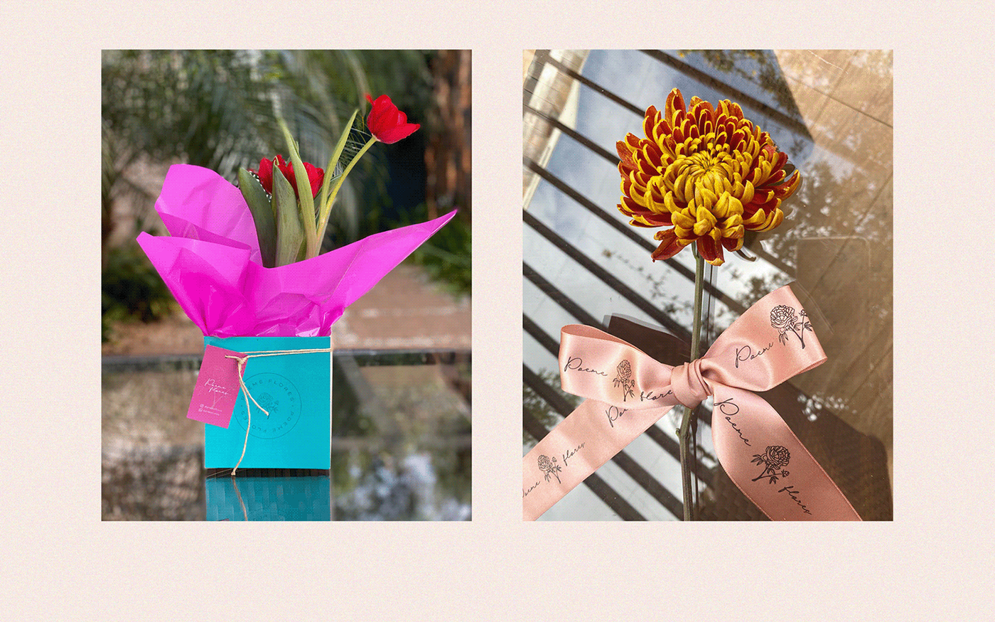
However, a visual identity application was made on business cards, packaging, store front, decorative ribbons and other support elements used during the customization of floral arrangements. Within social networks, the application is also being executed and both had an acceptance and achievement of these good results in relation to the target audience, affecting the company’s expectations.


CREDIT
- Agency/Creative: Vitor Linhares Design
- Article Title: Poeme Flores Visual identity and Packaging Design
- Organisation/Entity: Freelance, Published Commercial Design
- Project Type: Packaging
- Agency/Creative Country: Brazil
- Market Region: South America
- Project Deliverables: Brand Identity, Brand Strategy, Graphic Design, Identity System, Packaging Design, Research
- Format: Bag, Basket, Box, Pouch, Tag, Wrap
- Substrate: Plastic, Pulp Paper, Wood


