


Most Elements—science based and data-driven brand
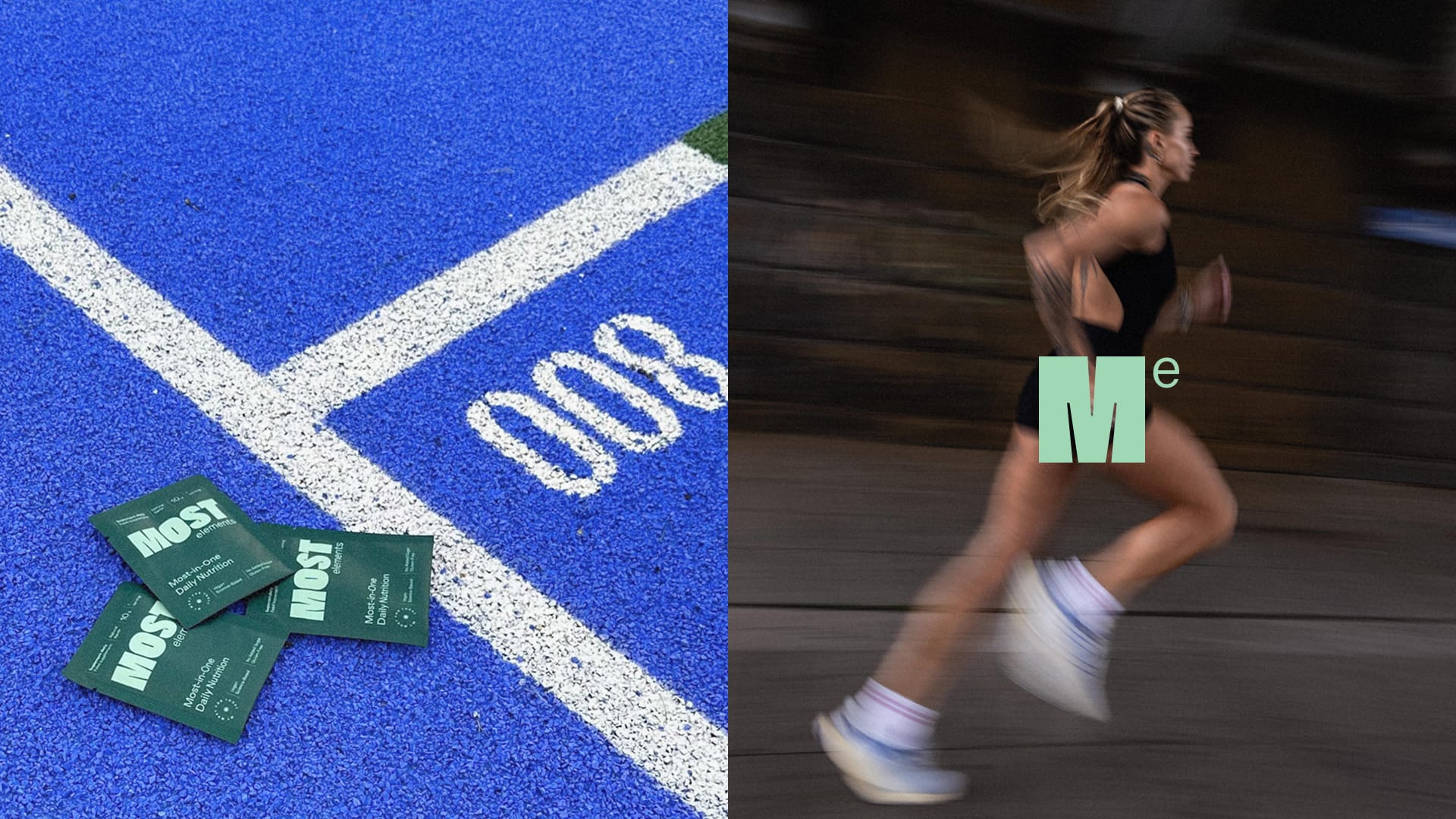
Most Elements is a dietary supplement for “lifeletes”—non-professional athletes. It gives your organizm most of what it needs for your day-to-day active life.
We were responsible for bringing the brand to market identity-wise. We co-created the naming and copy, created the tone of voice, key visual and idea for how Most Elements tells its story. We designed functional and beautiful packaging and the brand’s social media presence.
Tone of Voice
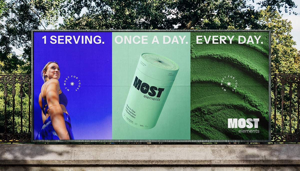
Most—not all. It’s up to you to take the last step.
Most Elements is a brand that tells it like it is. It’s created by “lifeletes”, born out of need and understanding. It’s a product developed meticulously, based on science and a respect for nature.
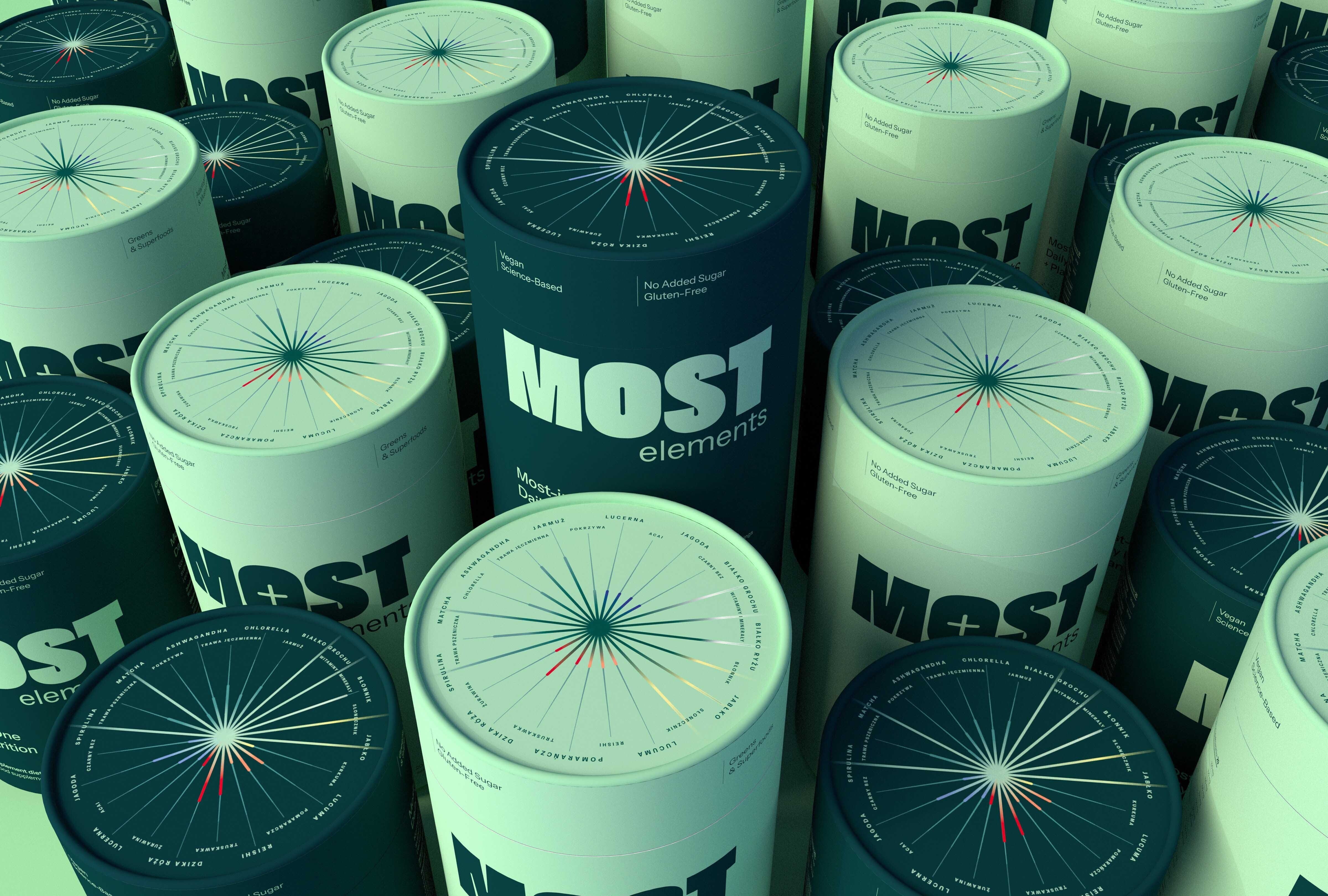
We created a brand identity that gives you the facts: infographics that show what the product is made of. A legible and flexible typographic system, which enables to go into details about the contents. Direct and honest copywriting—for a lifestyle brand that lives the life it sells.
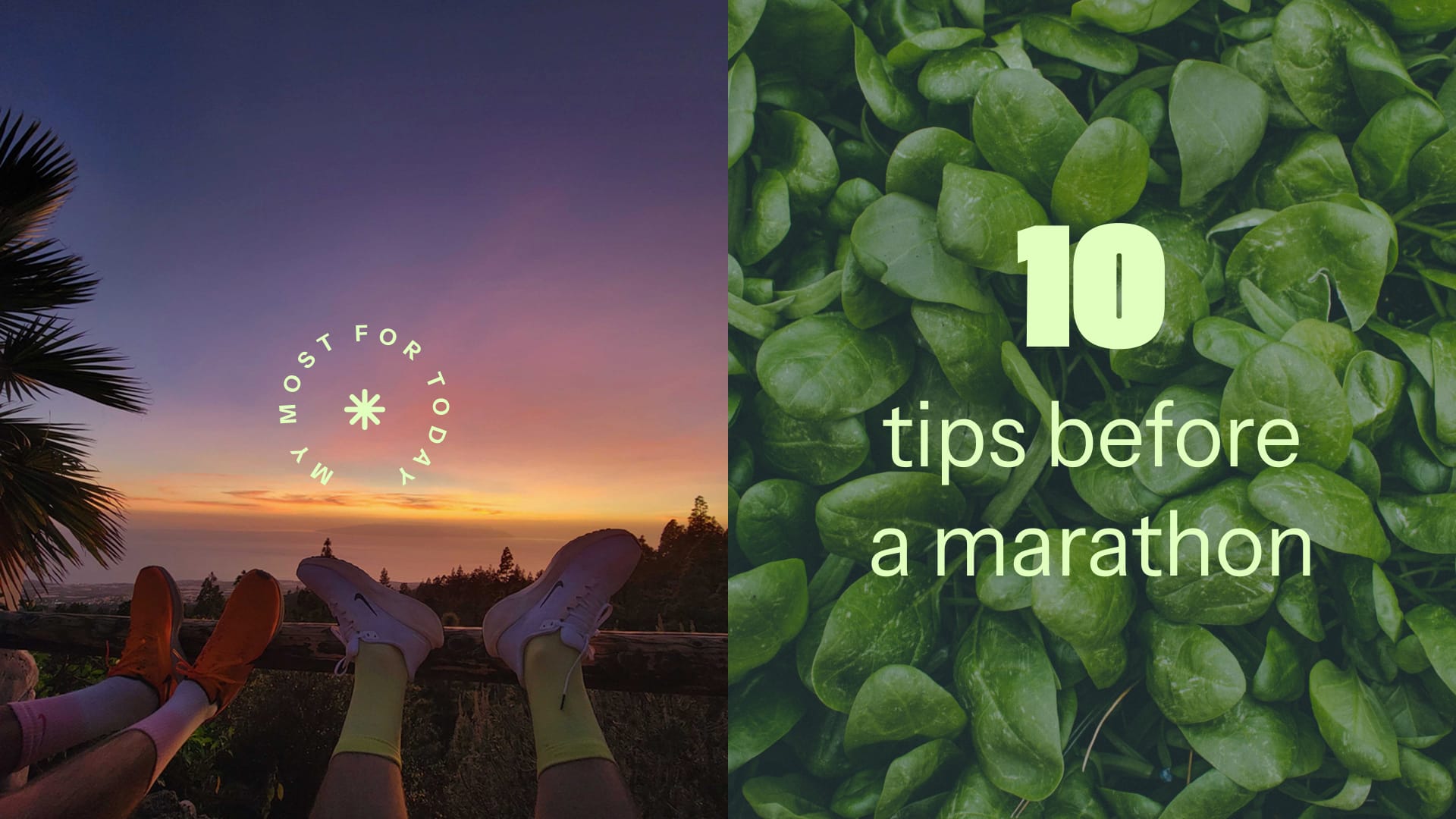
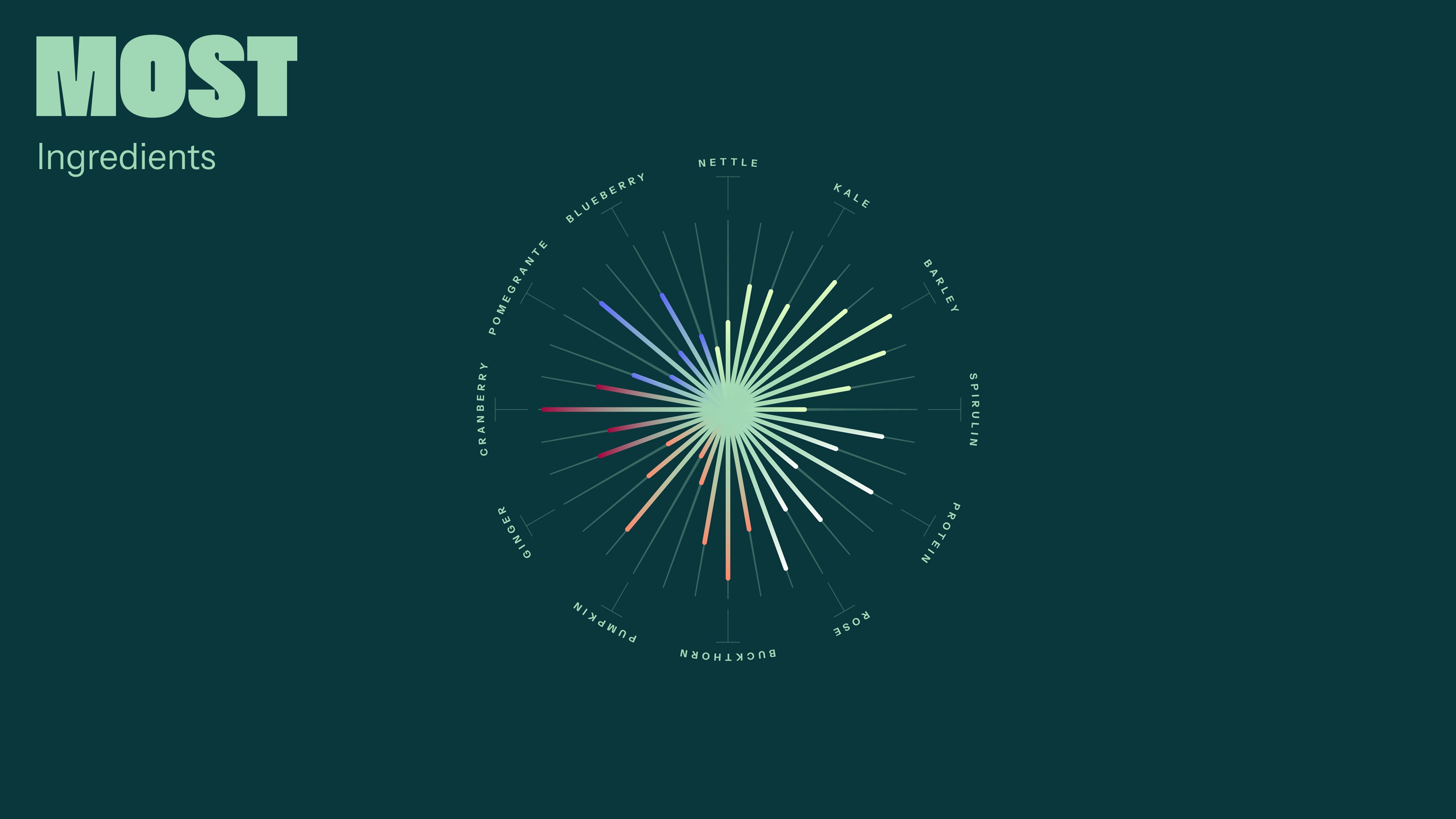
A set of illustrations and icons based on the dynamic, circular & sun-like charts convey the bursting energy and activity cycle connected with sports and supplements.
And, of course, these are greens. So we went totally green!
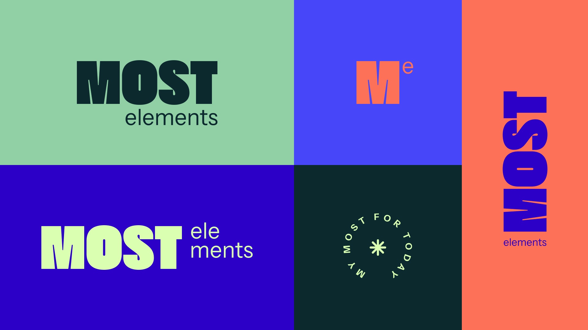
Logo & Icon
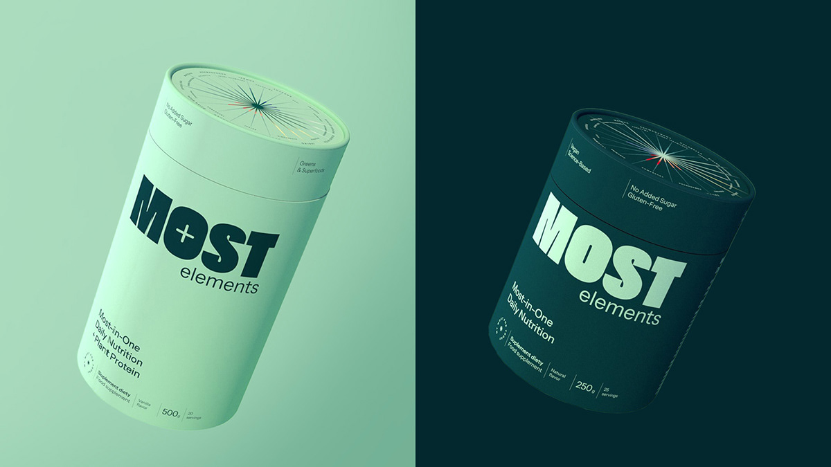
The logo is strong and bold. It comes in two versions: for the basic and enriched formula. The brand icon is inspired by chemistry and physics—a “molecule” for an every-day active life.
Infographics
Most Elements is science based and data-driven. And it loves to share information!
That’s why quirky infographics are a pillar of the brand identity. Each product comes with a chart showing the main active ingredients and their proportions.
Packaging
Most Elements comes in many forms… Tubes big and small, travel packets, gift sets—you name it, we designed them!


CREDIT
- Agency/Creative: Podpunkt studio
- Article Title: Podpunkt Studio Fuses Infographics and Functionality in Most Elements’ Packaging Design
- Organisation/Entity: Agency
- Project Type: Packaging
- Project Status: Published
- Agency/Creative Country: Poland
- Agency/Creative City: Podpunkt studio / Warsaw
- Market Region: Europe
- Project Deliverables: 3D Design, Art Direction, Brand Creation, Brand Design, Brand Identity, Brand Naming, Brand Strategy, Brand Tone of Voice, Copywriting, Creative Direction, Design, Graphic Design, Logo Design, Packaging Design, Visualisation
- Format: Tube
- Industry: Food/Beverage
- Keywords: Packaging, Branding, Logo design, Tone of voice, 3D
-
Credits:
Creative Direction: Emilka Bojańczyk / Podpunkt
Strategy: Emilka Bojańczyk / Podpunkt
Data Visualizations: Emilka Bojańczyk / Podpunkt
3D: Jan Pająk / Podpunkt
Motion: Ewa Najnigier-Galińska & Jan Pająk / Podpunkt
Design: Emilka Bojańczyk & Diana Makulska / Podpunkt
Business: Magdalena Dobruk / Podpunkt


