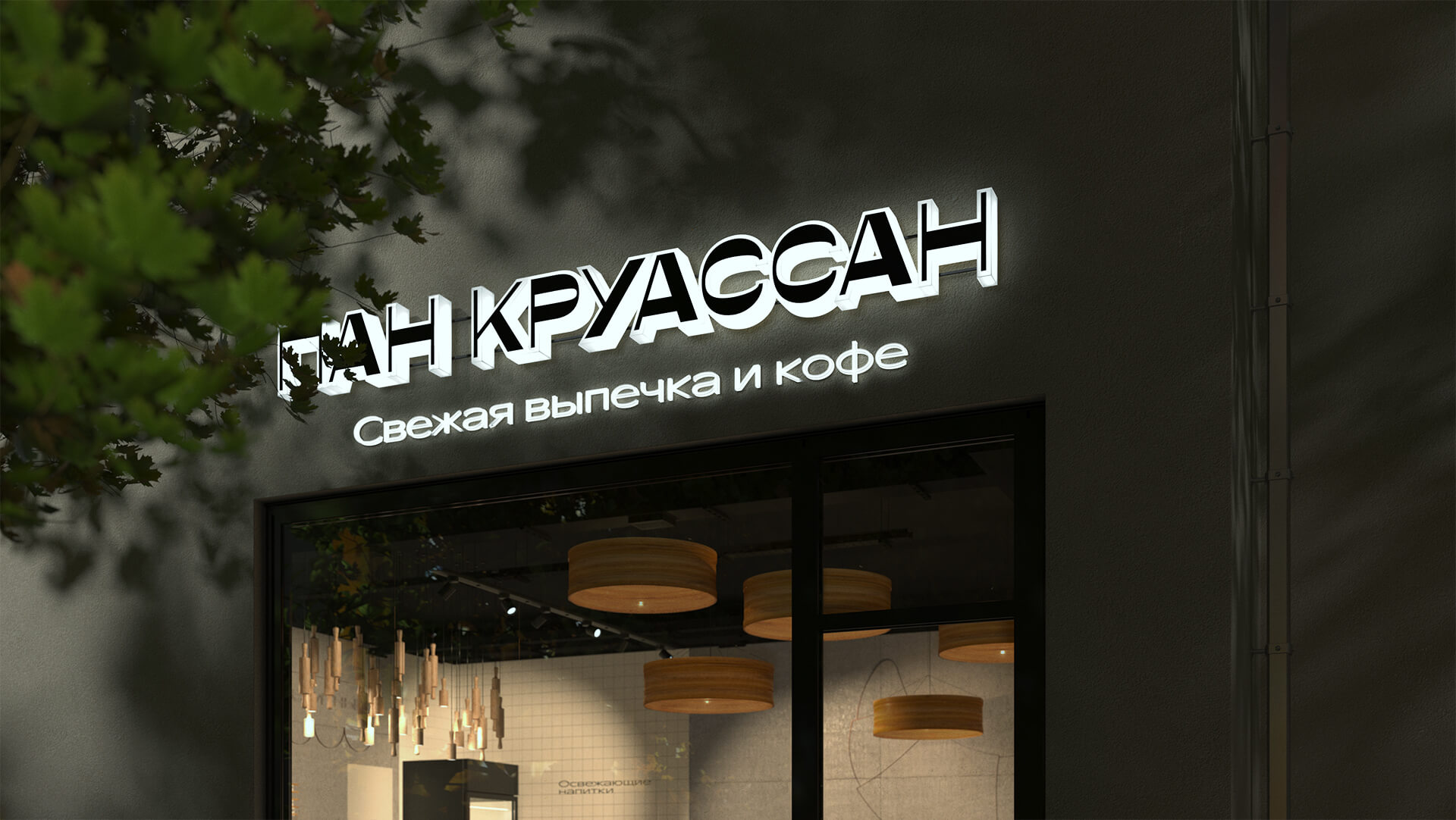
Pain Croissant is a new cafe that is selling the freshest and puffiest croissants and coffee in Moscow. The client commissioned us to create a visual system and a stunning retail design for their first sales point.
They already had a name and a concept for the new place – Pain Croissant, a cafe with the best croissants in the city with various fillings.
The name Pain Croissant had a traditional feel to it, so upon discussion with the client we decided to focus on trends rather than tradition. After we presented the concepts, we went for the minimalist and stylish ecobakery for young and active hipsters of the new residential areas of Moscow.
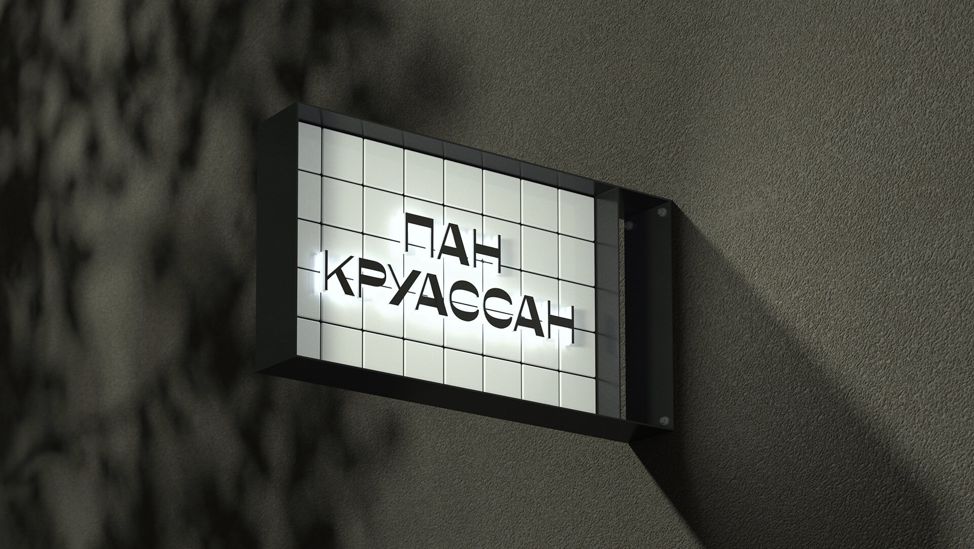
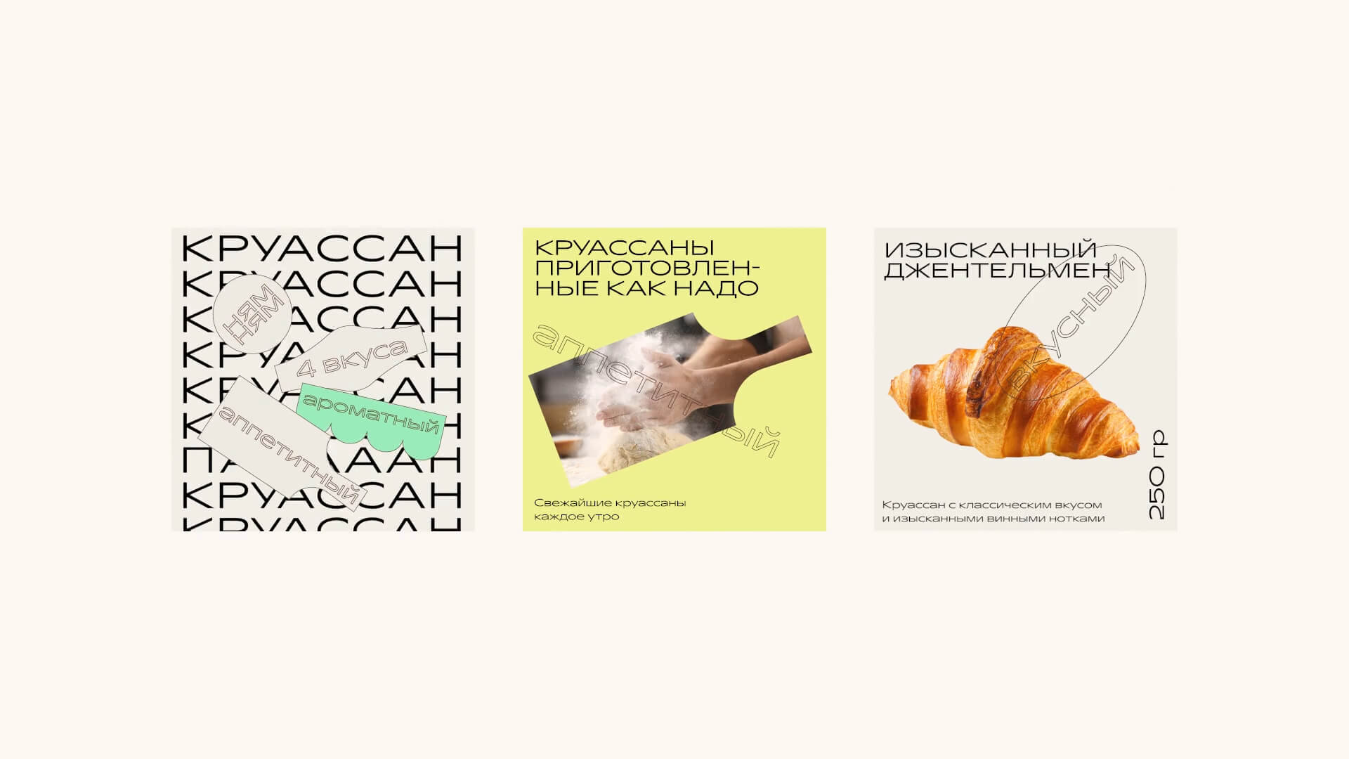
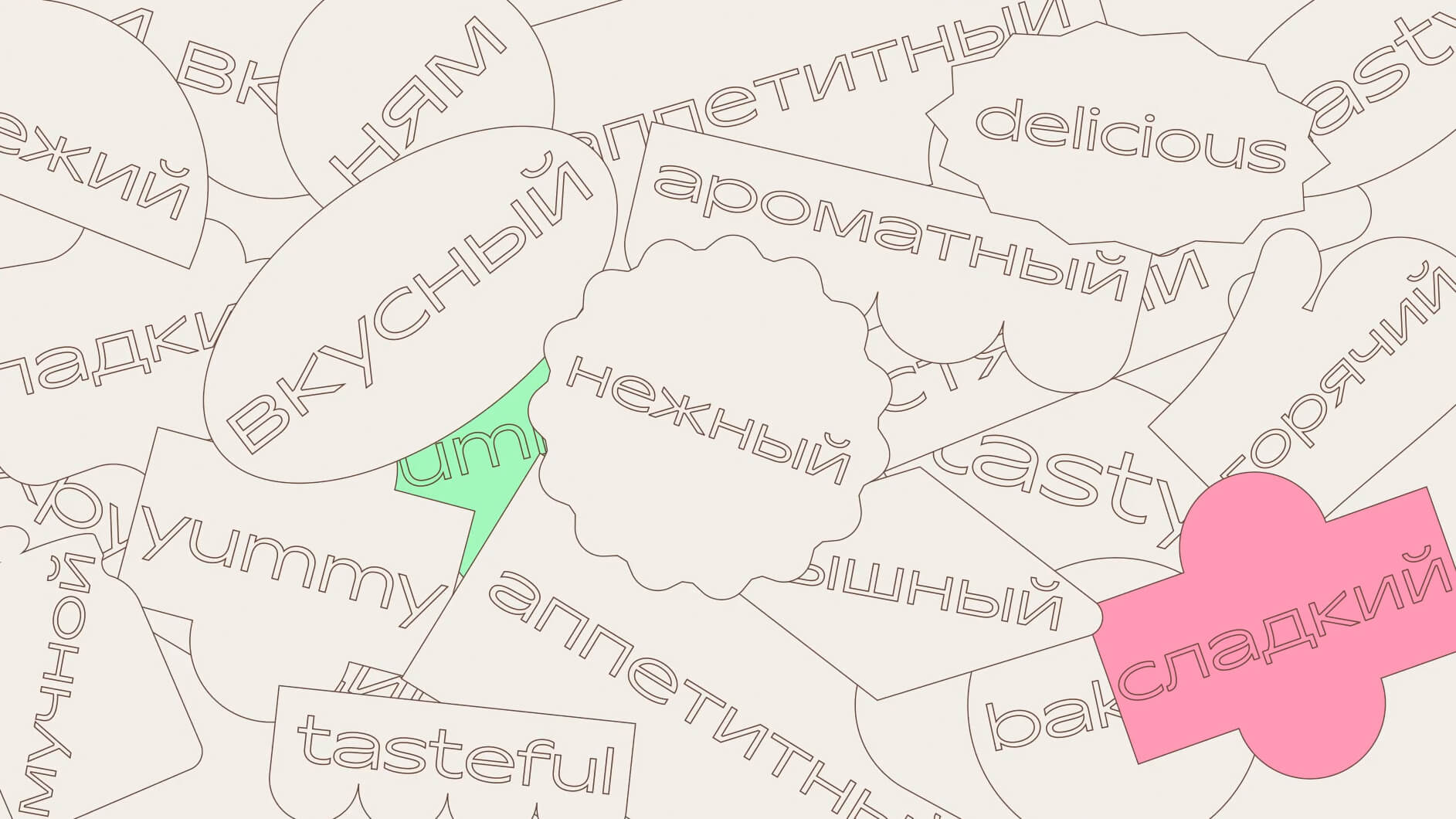
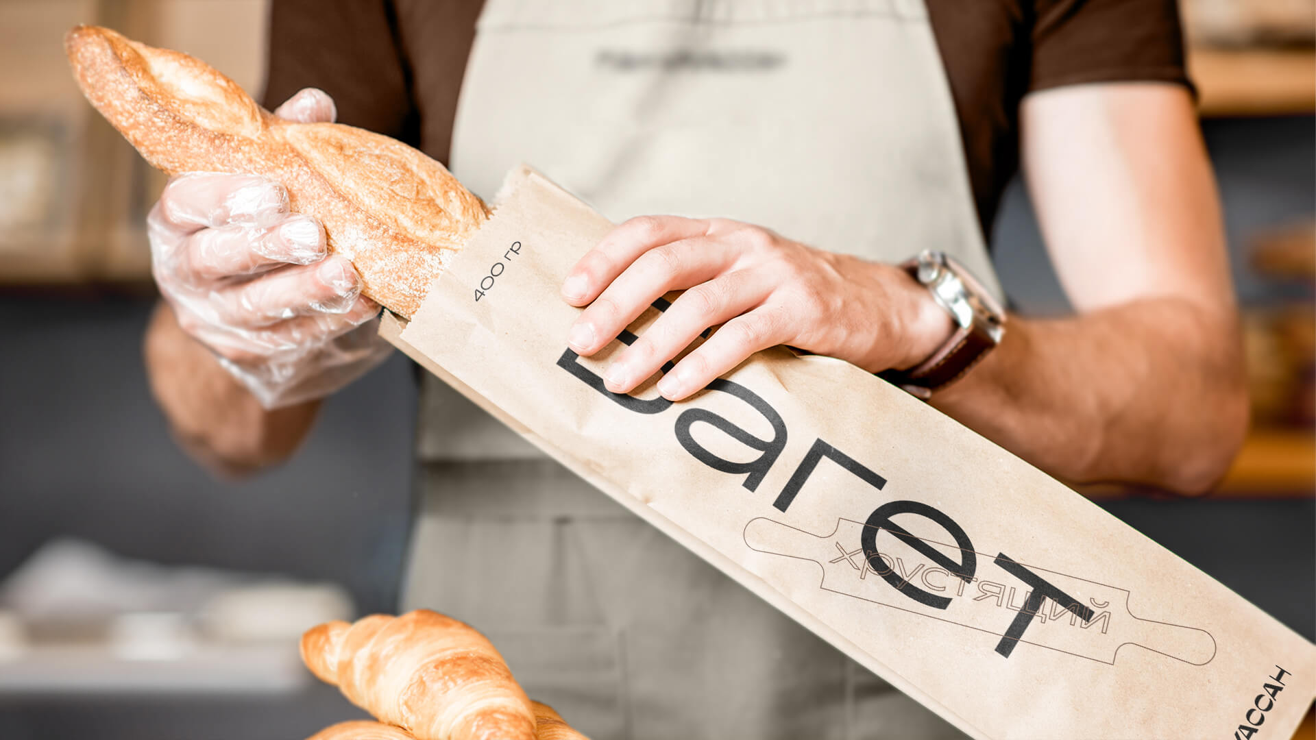
In order to support the chosen mood we created a minimalist but lively logotype with a reverse stroke. The visual system as a whole demanded to keep a little bit of tradition. The traditional feel was added to it by stickers with claims shaped as baker’s utensils and related stuff: old signs, rolling pins, boards, sieves, etc. We added yummy adjectives to them and suggested using these shapes with words in communication with customers to become more unique and recognizable.
The concept stated that Pain Croissant was a simple but honest bakery next door that was committed to taste and quality of their product. So, we decided to openly communicate our recipes and ingredients using bold typography and a trendy wide font with smooth and recognizable character.
To add emotions and play around with different fillings for croissants, we added a few delicate but bright colours to the main colour palette. The overall layout design turned out minimalist but heartwarming.
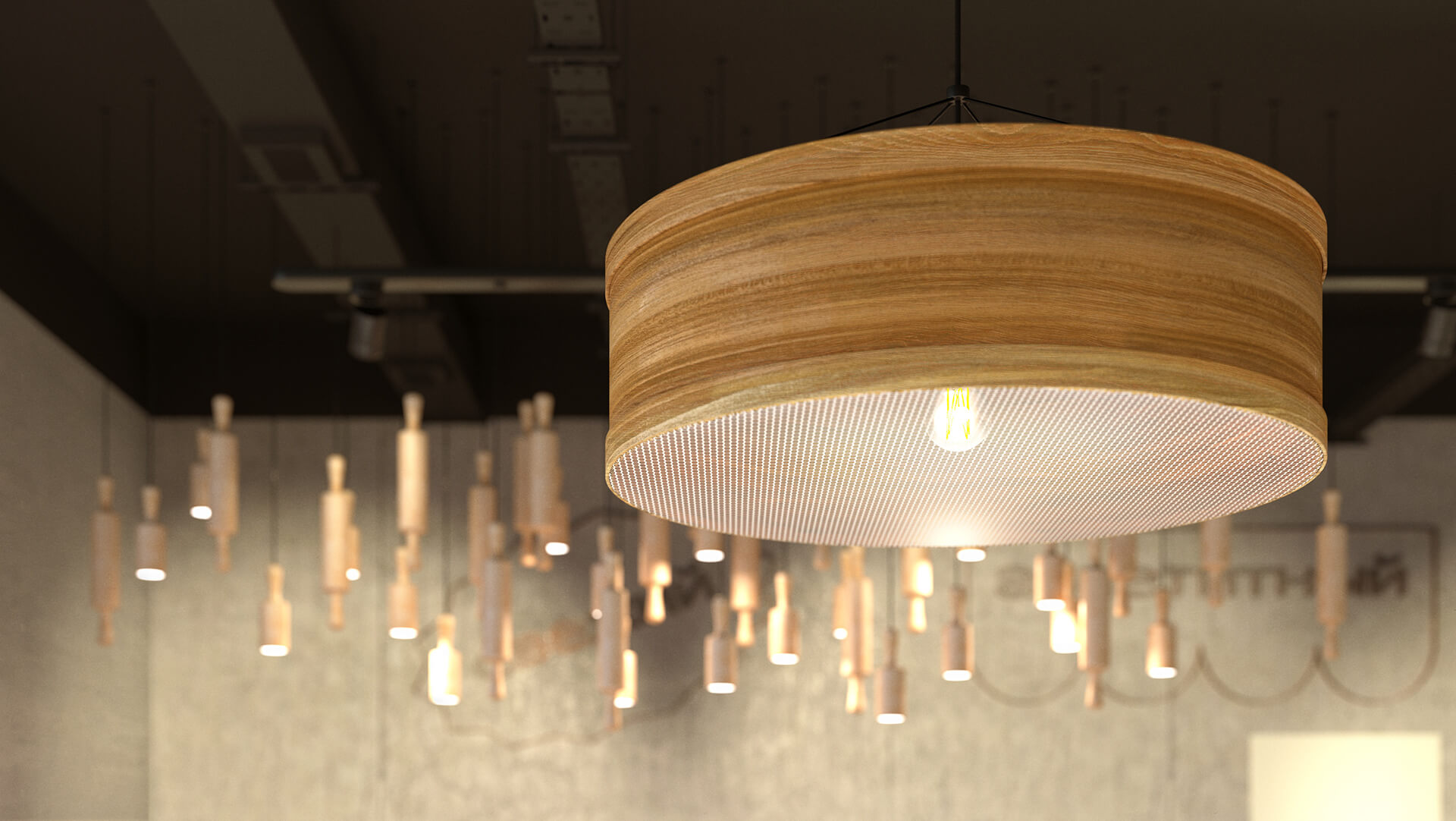
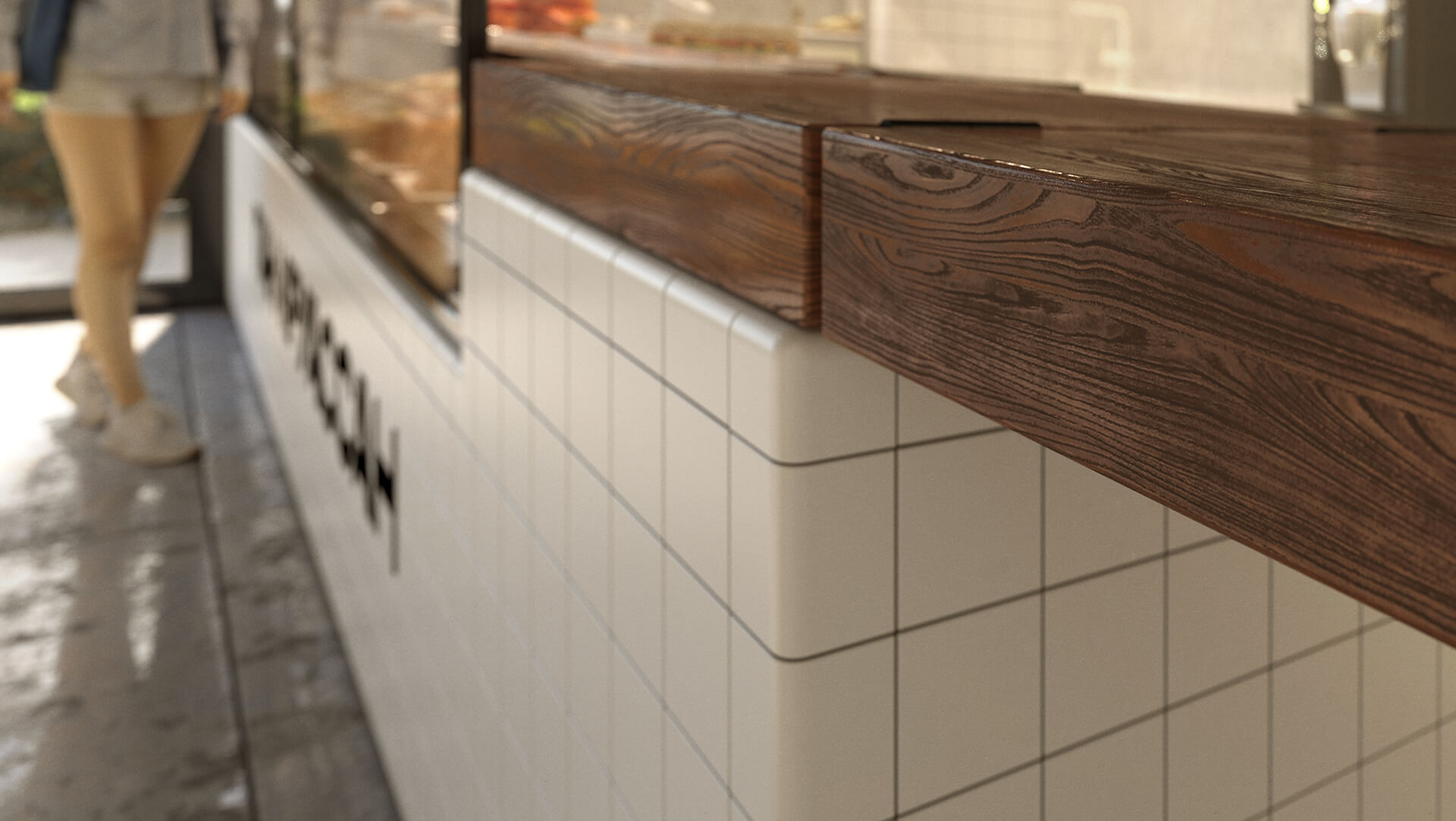
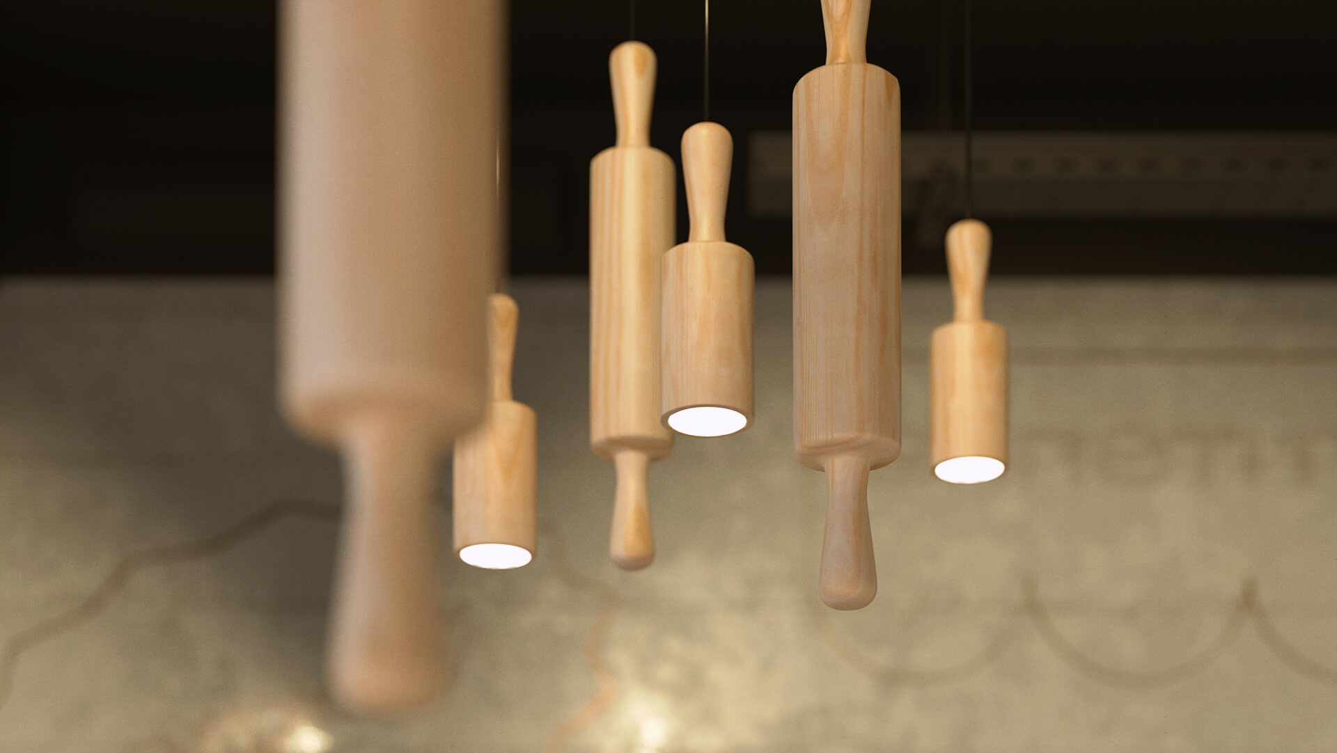
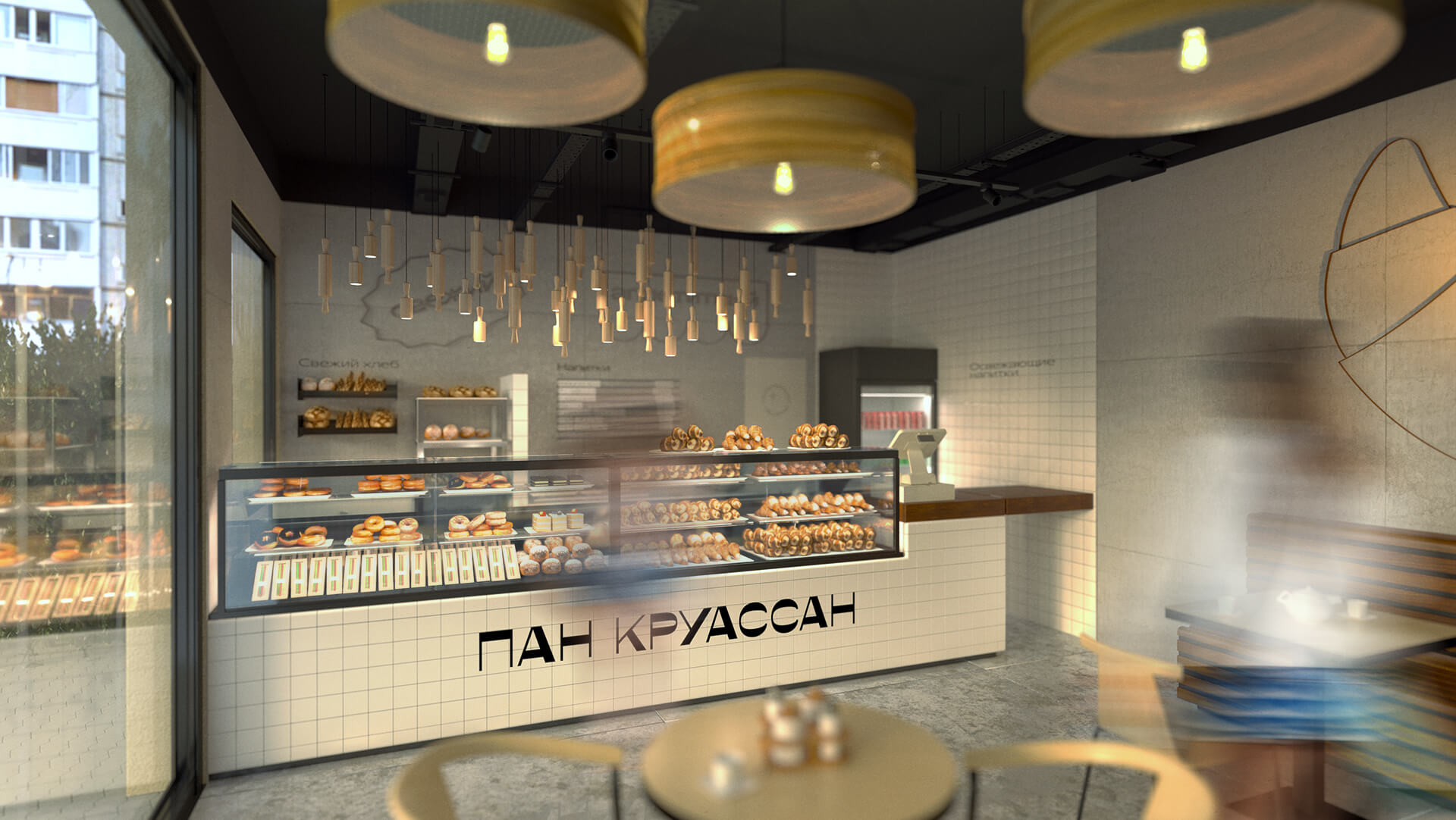
The same simple but hearty story was used as our retail concept inspiration. White tiles with rounded angles together with concrete walls and a bit of wood carried this story on in the interior. We also added some details with a traditional feel: lighting shaped as rolling pins above the counter, sieve-shaped lighting seating area and copper claims on the walls. The interior was so delicately lowkey, it made the customers focus on the product and would be appealing to both hipsters and ordinary consumers.
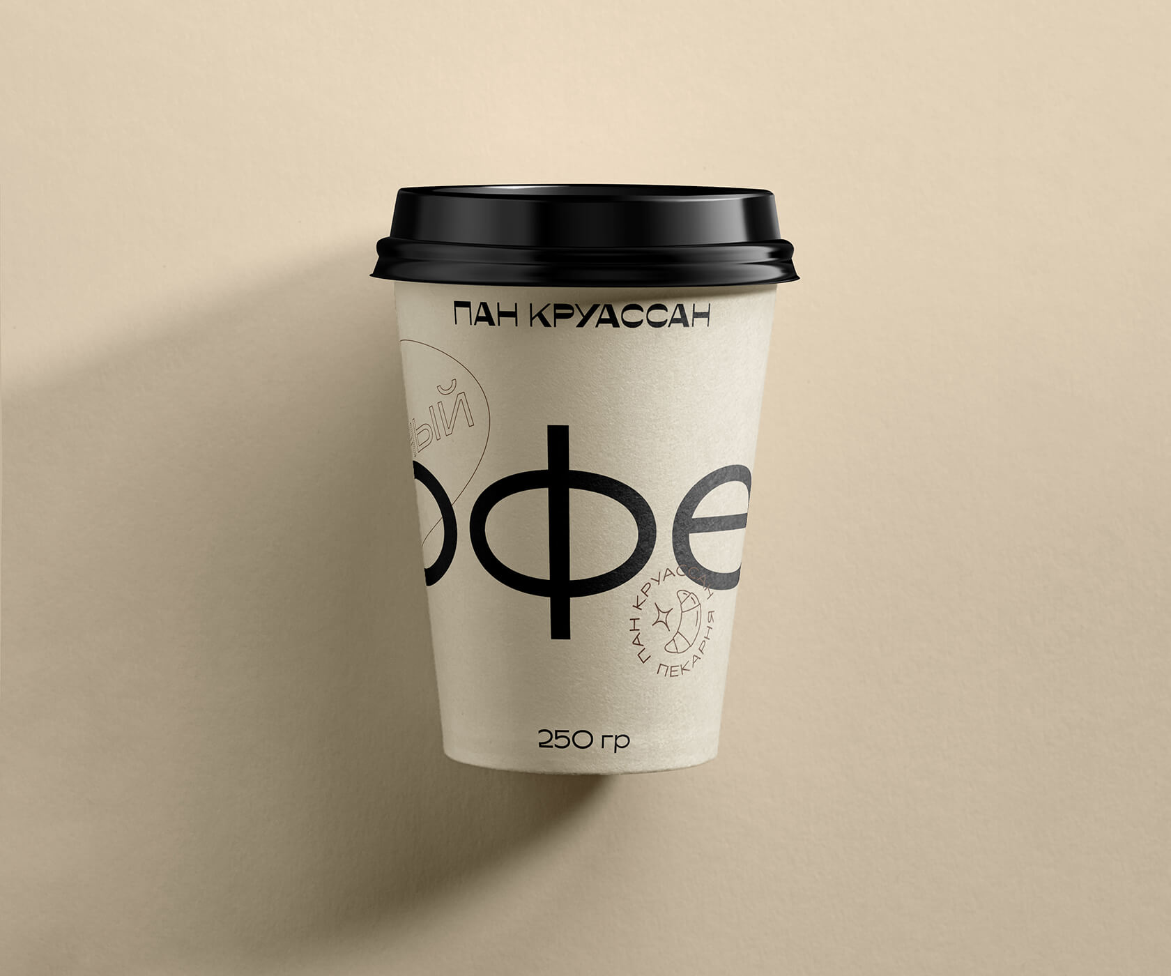
As part of the project we also developed a retail design concept for island format, created unique packaging design and staff uniforms. All the new brand elements and their description were put together in a short but convenient guide.
CREDIT
- Agency/Creative: Plenum
- Article Title: Plenum Design New Branding for Pain Croissant, a Cafe Based in Moscow
- Organisation/Entity: Agency
- Project Type: Identity
- Project Status: Published
- Agency/Creative Country: Russia
- Agency/Creative City: Moscow
- Market Region: Europe
- Project Deliverables: 3D Modelling, Architecture Concept, Brand Design, Retail Design, Visualisation
- Industry: Food/Beverage
- Keywords: cafe, croissants, brand identity, design
-
Credits:
Creative Director: Egor Myznik
Art Director: Andrey Zhaglin
Art Director: Maria Pechkurenko
Designer: Anna Volkova
Architect: Nikita Boldyrev


