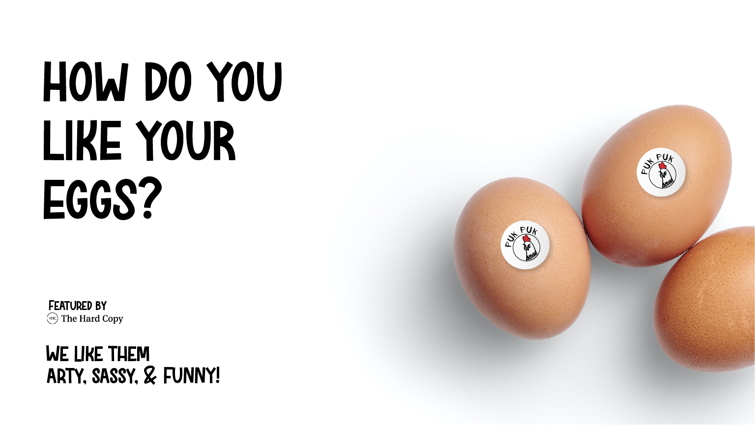
From the farms of Punjab to the hearts of Indians nationwide, we are on a mission to serve eggs that are healthy, pure, and natural. Our commitment goes beyond just delivering quality; it’s about creating a unique and engaging brand experience that brings a smile to every customer. We believe that our products should not only be nutritious but also bring a sense of joy and delight. That’s why our brand identity is built around a playful, artistic style that truly captures the spirit of our brand—quirky, fun, and full of life.
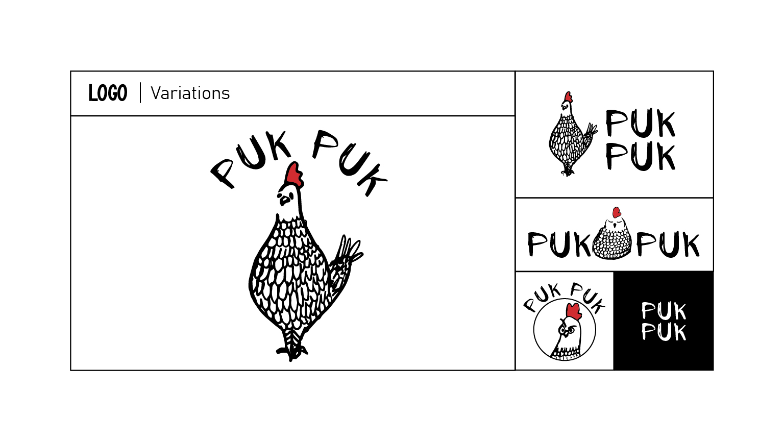
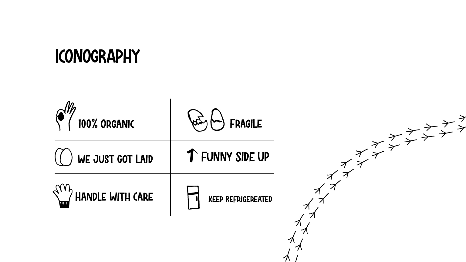
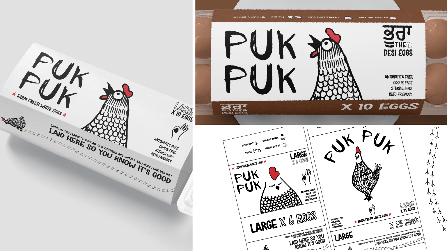
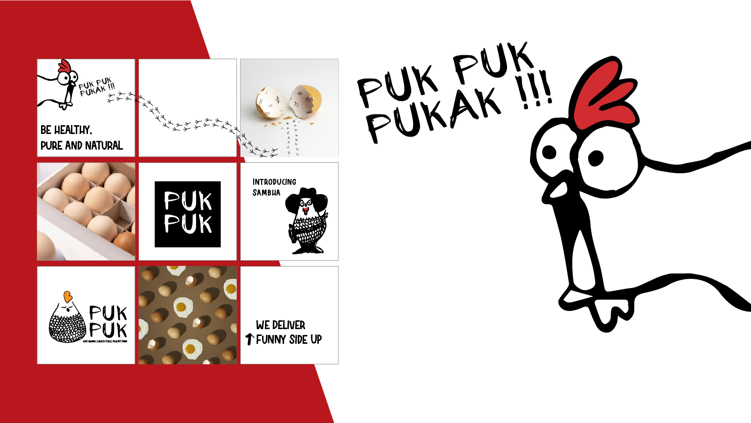
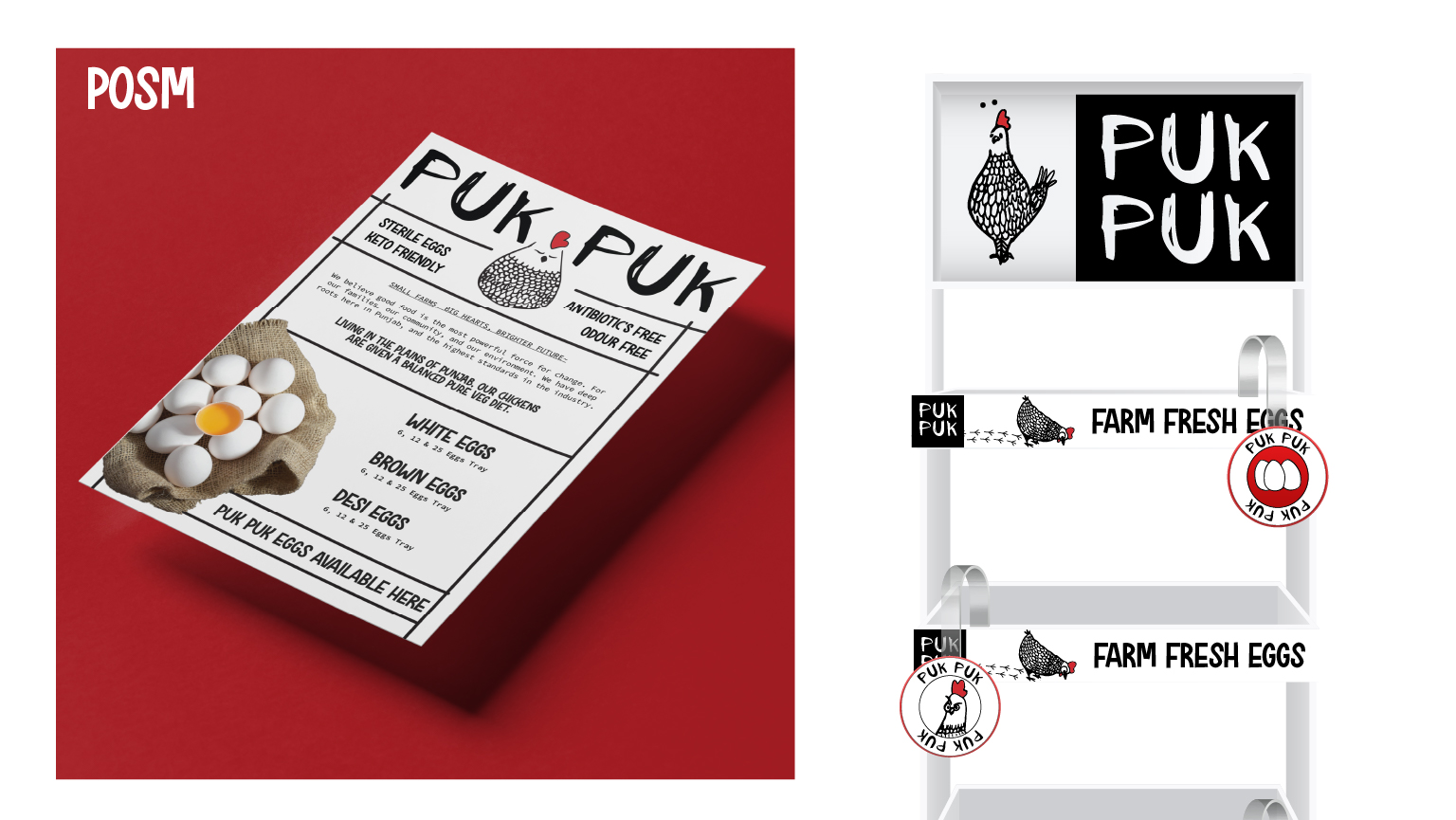
Our distinctive approach is beautifully expressed through an aesthetic brand identity that combines hand-drawn illustrations of chickens with a whimsical, handwritten typeface. This unique combination creates a lively and approachable personality for our brand, sparking curiosity and inviting people to explore our world of “sassy chickens.” The hand-drawn illustrations add a touch of authenticity and craft, reflecting our commitment to natural and pure products. These elements work together to tell our brand story in a way that feels fresh and personal.
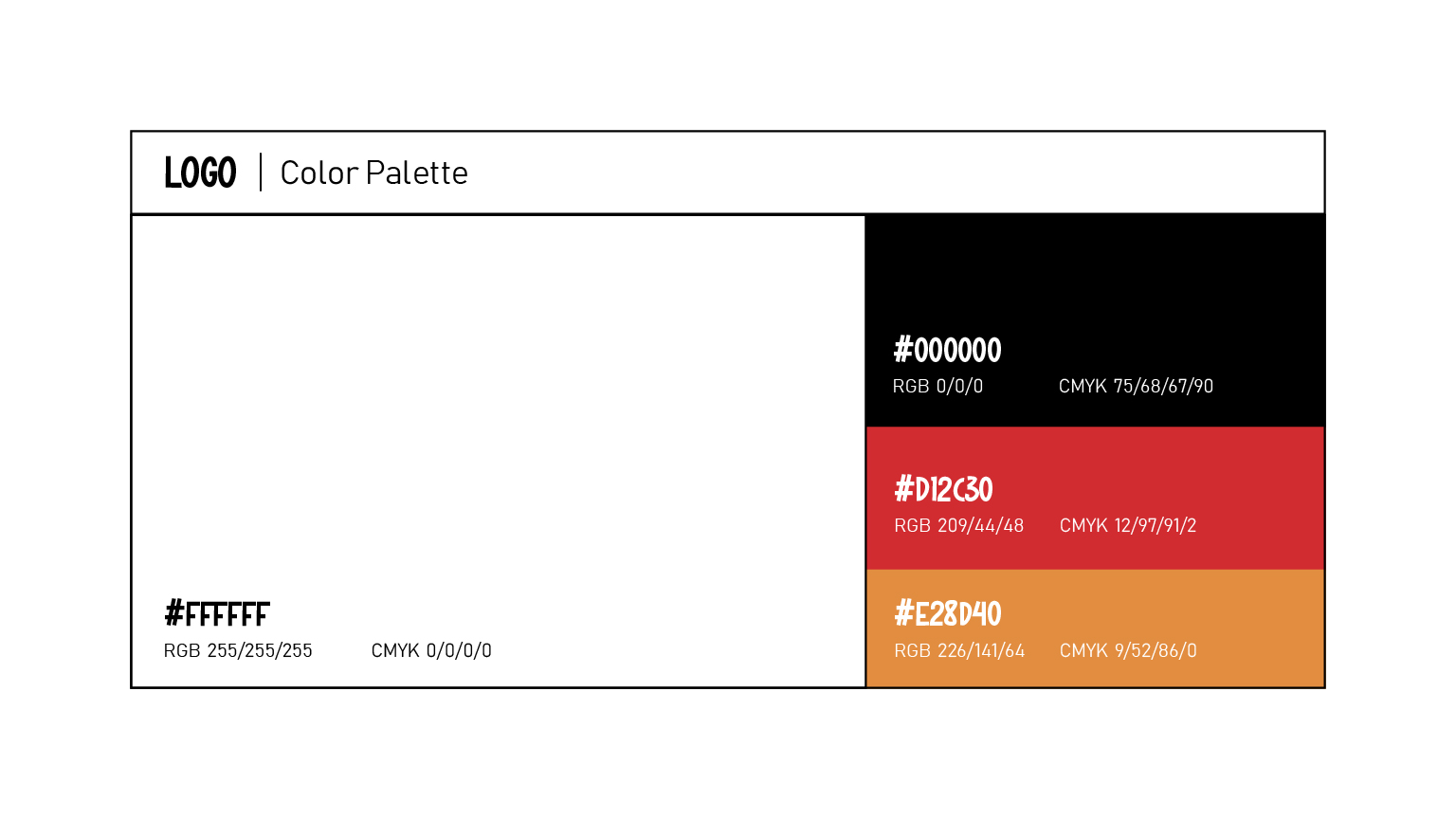
Our visual identity is not just about being eye-catching; it is about creating a cohesive and memorable experience. The vibrant, illustrative designs feature chickens engaged in a variety of activities—whether it’s a chicken dancing, reading, or simply chilling out. These creative depictions bring an element of fun, laughter, and light-heartedness to our brand, making it memorable and easily recognizable. We use a minimalist color palette of black, white, and strategically placed red accents. This choice not only enhances visual appeal but also ensures a clean, modern, and sophisticated look that stands out on shelves and in digital spaces.
The red accents are thoughtfully integrated to add pops of color that draw the eye and highlight key elements, without overwhelming the design. This careful balance between simplicity and vibrancy allows us to maintain a refined aesthetic while still being fun and approachable. It also makes our packaging and marketing materials instantly identifiable, reinforcing brand recall every time a consumer sees our products.
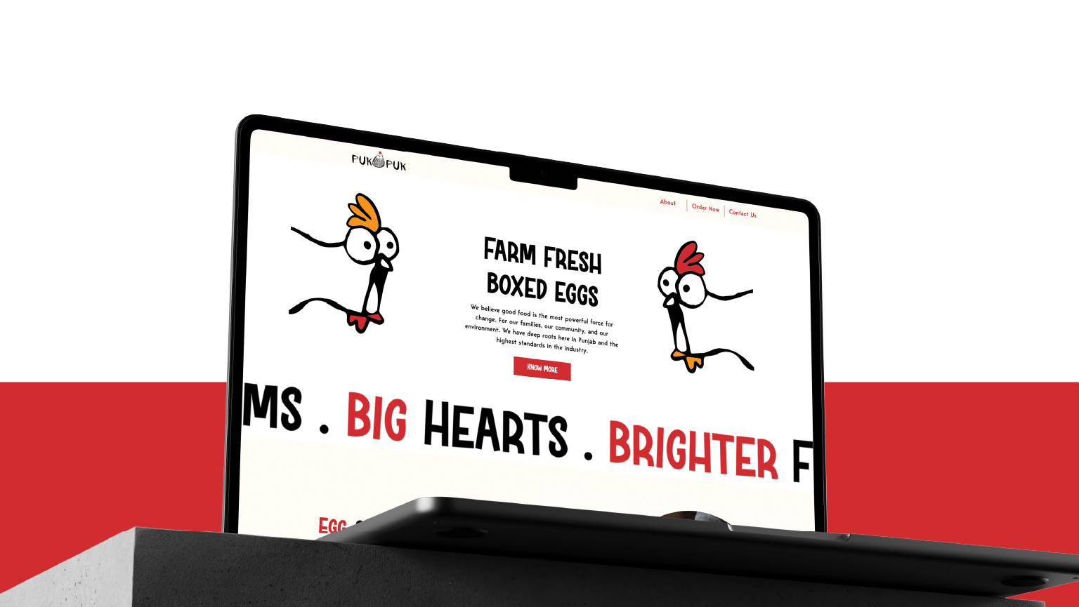
Moreover, our verbal and visual identities are crafted to be in perfect harmony, ensuring that every interaction with our brand feels seamless and engaging. Our playful tone of voice matches our visual style, creating a unified experience that resonates across all touchpoints—from packaging to social media. We talk to our audience in a way that feels like a friendly conversation, adding warmth and personality to everything we do.
Our goal is to create more than just a product; we aim to build an experience that attracts, entertains, and connects with our audience on a deeper level. We want our customers to feel that they are part of our quirky chicken world, where there’s always something to smile about. By combining quality products with a distinctive and enjoyable brand experience, we strive to foster loyalty and build a community that loves our eggs as much as we love bringing them to the table. Whether it’s through our fun designs, playful language, or the pure taste of our eggs, we are dedicated to delivering happiness, one egg at a time.

CREDIT
- Agency/Creative: Bifrost Studios
- Article Title: Playful Brand Identity with Hand-Draw Illustrations and Whimsical Fonts Captures the Spirit of Sassy Chickens
- Organisation/Entity: Agency
- Project Type: Packaging
- Project Status: Published
- Agency/Creative Country: India
- Agency/Creative City: New Delhi
- Market Region: Asia
- Project Deliverables: Brand Identity, Branding, Design, Packaging Design, User Experience, User Interaction
- Format: Bowl
- Industry: Food/Beverage
- Keywords: Branding, Packaging , UI/UX
-
Credits:
Creative Director: Tejal Tunge
Art Director: Rishabh Pahuja


