Worldcoin approached Play to build a visual identity for a new kind of global cryptocurrency: one with a highly ambitious mission of universal equality, achieved through advanced biometric technology. We collaborated closely with the founding team to design a system that would be simple enough to be understood globally, while also communicating the depth of engineering and technical knowledge required to craft a highly secure solution for the world’s first Universal Basic Income.
Design System
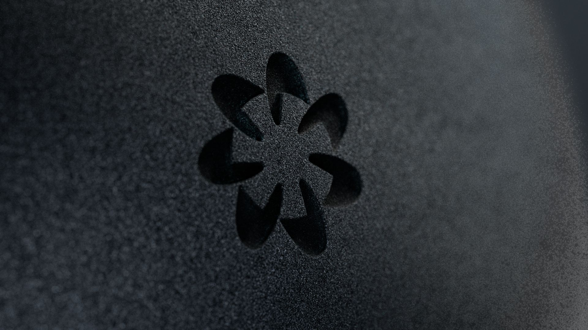
The Mark: Three visual elements define the Worldcoin logo mark. First, seven stylized hands represent the continents of the world and the common humanity of the people living on it. Together, they share in holding the second visual element of the logo: a circular negative space, representing a coin. As one of the first physical forms of currency in our modern world, coins continue to symbolize how we exchange goods and services, even as the methods for this change and decentralization. Lastly, each hand within the logo is angled at a slight rotation to create a feeling of movement and momentum through the mark, representing the advanced technology and monumental ambition Worldcoin has to positively impact the world.
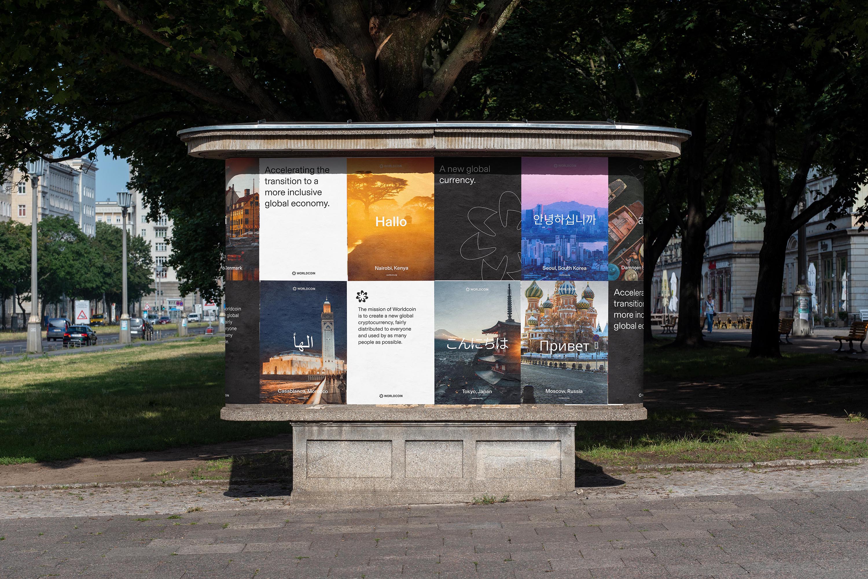
Colour System: The colour palette needed to convey strength and reliability, but also feel approachable and friendly. Utilizing a clean, simple website layout with generous white space and minimal UI elements meant that color became a means of establishing sections, containers, and focus. The final palette of black, white, greys, teal, and lilac are contrasted by bright accent colors in orange and purple, which also form saturated and faded gradients. The overall effect is a balance of institutional sincerity and futuristic optimism.
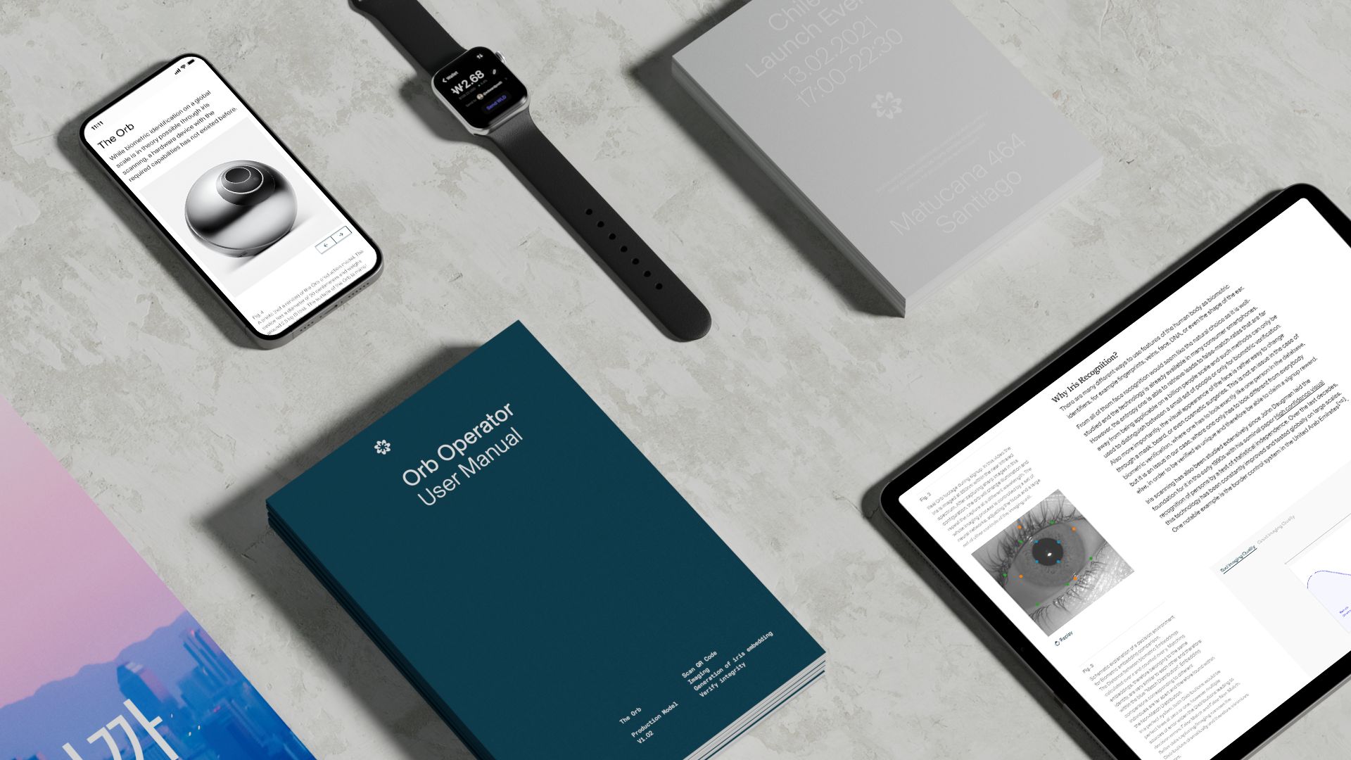
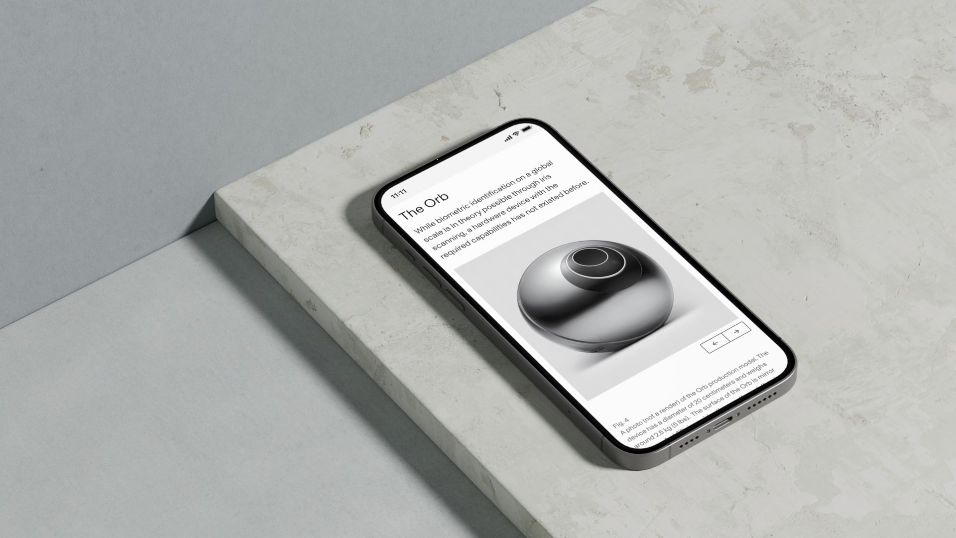
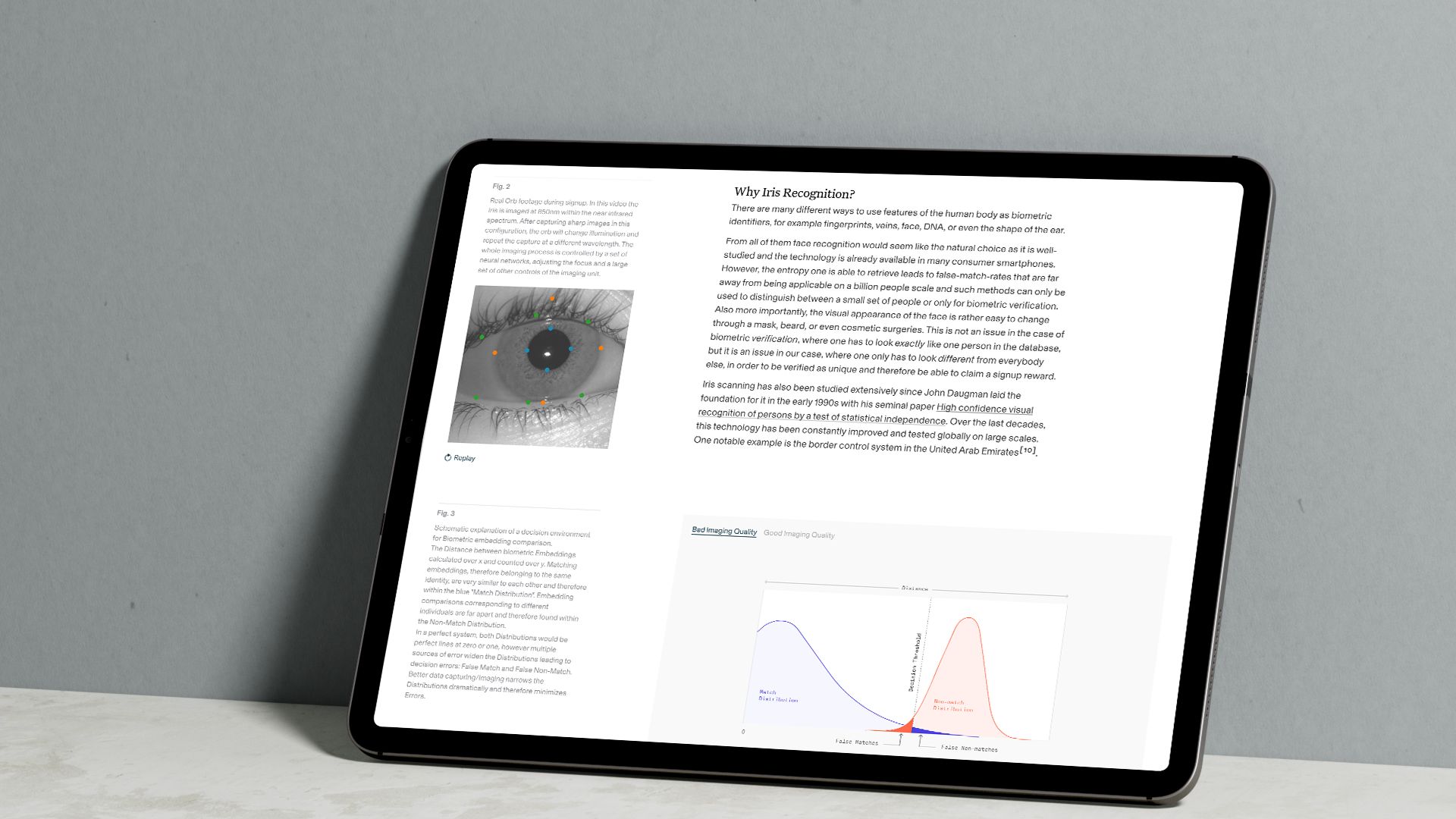
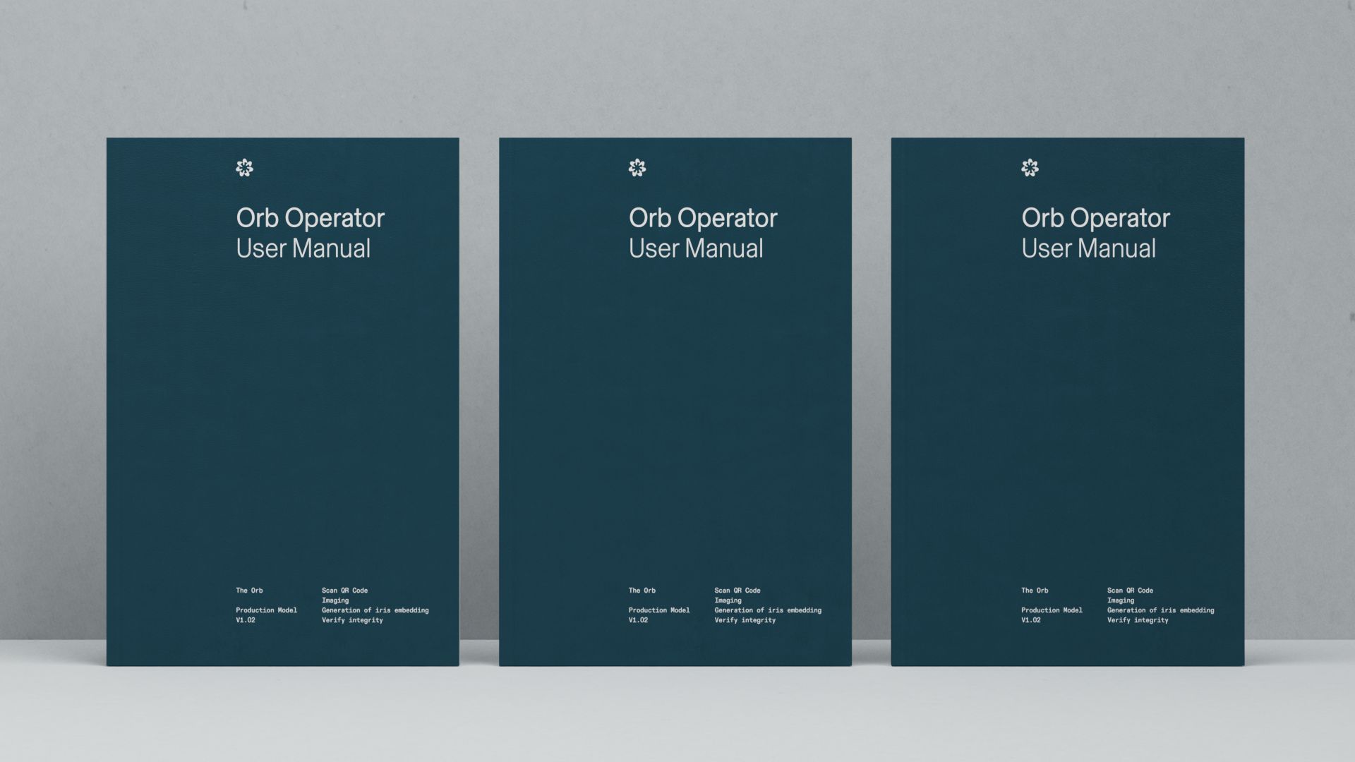
Illustration: To communicate the depth of engineering and technical know-how for Worldcoin’s physical touchpoint (the Orb), we introduced 3D rendering and exploded CAD linework as the primary form of illustration. We scaled the complexity of this style from highly detailed and mechanical to simplified line drawings when less detail was required. Secondary forms of illustration include diagrams for charts and graphs, as well as simplified layman’s illustrations, which help make plain some of Worldcoin’s more complicated technical processes. The range of these styles will evolve as they take on communicating different subject matters.
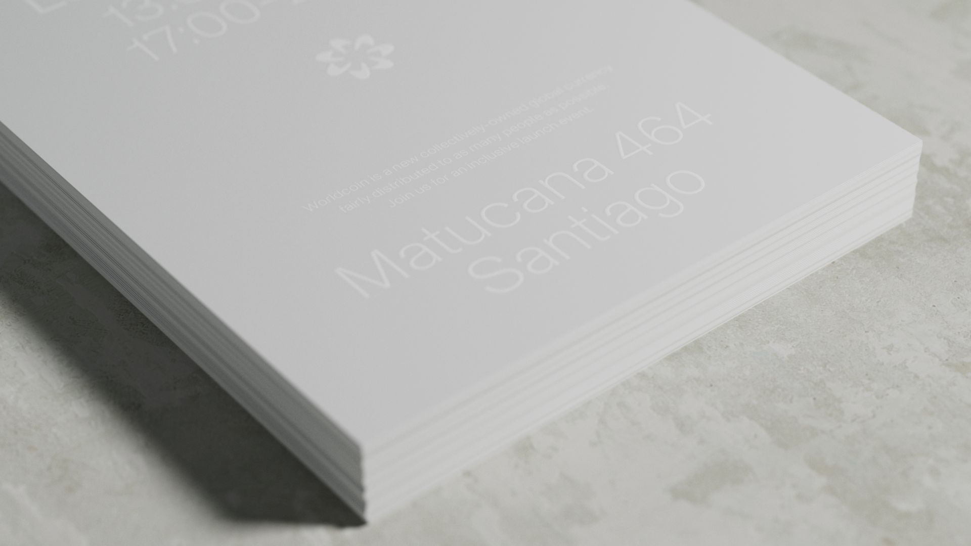
Typography: Worldcoin’s typographic system is composed of three typefaces. The primary font, Basel, is a sans serif with an international feel that provides high legibility at a variety of scales, as well as in long form. The secondary font, Untitled Serif, adds authority in select instances for special subhead treatments or other unique callouts. Lastly, ABC Diatype Mono is used only for labels or diagrammatic elements within infographics and data visualization. As a system, the three typefaces establish the foundation for a trustworthy and institutional tone, and create flexibility for a variety of scenarios.
CREDIT
- Agency/Creative: Play
- Article Title: Play Create Design Brand System for Worldcoin Crypto
- Organisation/Entity: Agency
- Project Type: Identity
- Project Status: Published
- Agency/Creative Country: United States
- Agency/Creative City: San Francisco
- Market Region: Global
- Project Deliverables: Brand Design, Brand Guidelines, Brand Identity, Brand Mark, Brand Tone of Voice, Creative Direction, GIF Animation, Graphic Design, Identity System, Infographic, Logo Design, Typography
- Industry: Financial
- Keywords: Crypto, Cryptocurrency, Defi, ETH, Worldcoin
-
Credits:
Creative Director / Founder: Casey Martin
Program Director: Brion Nuda Rosch
Design Director: Nate Baltikas
Senior Designer / Illustrator: Ellis Latham-Brown
Product Designer: Emerson Ward
Senior Designer: Kelly Scheurich
Design Director: Kyle Beck
Designer: Claire Whitman
Designer / Art Director: Alli Berk
3D Motion Designer: Jonathan Corriveau
Motion Designer: Lauren Konig
Design Intern: Sammy Al-Asmar
Designer: Albert Mestres


