


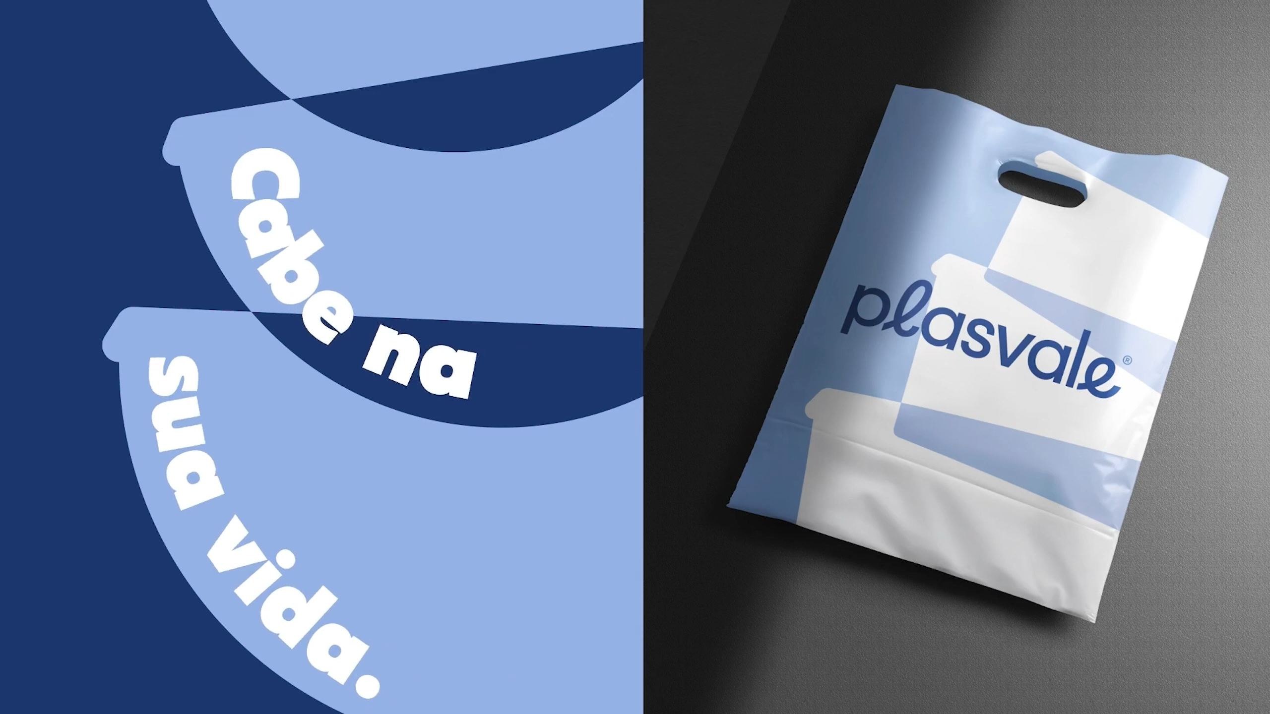
Fits your life.
How can we differentiate a 47-year-old company in a traditionally ordinary market? That was the question that guided the rebranding project for Plasvale, one of the main Brazilian brands in the housewares segment. To redefine the strategy of an organization with more than 500 employees, 2,200 products, 30 countries served, and 30,000 points of resale, we had the declared intention of putting the brand at the center of attention, to the point of influencing in an useful and conscious way a symbolic, cultural, and commercial positioning change at Plasvale.
A collaborative action plan.
With the premise of contributing to strategic decision-making in different areas of the company, the previous institutional communication made room for a new Plasvale. Based on an action plan developed in collaboration with 10 company leaders, Plasvale’s repositioning and visual identity project brought together employees, clients, partners, suppliers, and consumers.
We carried out internal and external research, creative immersions, strategic workshops, and in-company experiences, besides multiple other interactions. Collecting a wide range of information and qualitative data allowed us to draw a parallel between Plasvale’s internal and external contexts, connecting the essence of the business to the latent needs of the market.
Findings that shape strategies.
After analyzing what the company has as most authentic and confront its truth with existing gaps in the market, we found out that: (1) a Brazilian “lovemark” was missing in the housewares segment; and (2) Plasvale — with its reputation, market breadth, and desire to protagonize — had the technical and emotional potential of filling this position.
We noticed, therefore, a promising path for building a differentiated brand positioning, aligned with the company’s strategic planning. More in-depth studies led us to believe that Plasvale’s main differentiating attribute wasn’t in the formal characteristics of its products (like some people estimated), but in the countless everyday needs that can be met with them.
When we asked “what was the most emotional moment you’ve ever experienced while using a product of Plasvale?”, one of the directors promptly recalled — with nostalgia and tearful eyes — of a sunny day when he bathed his newborn in the backyard with a Plasvale basin.
Moments like this are extremely valuable in the brand-building process with Molde. We realized that, in a segment where most companies encourage “organizing and keeping your house tidy”, there was an opportunity for Plasvale to present a different perspective: “we believe that the real things in life happen when we take things out of place”.
A new positioning emerges.
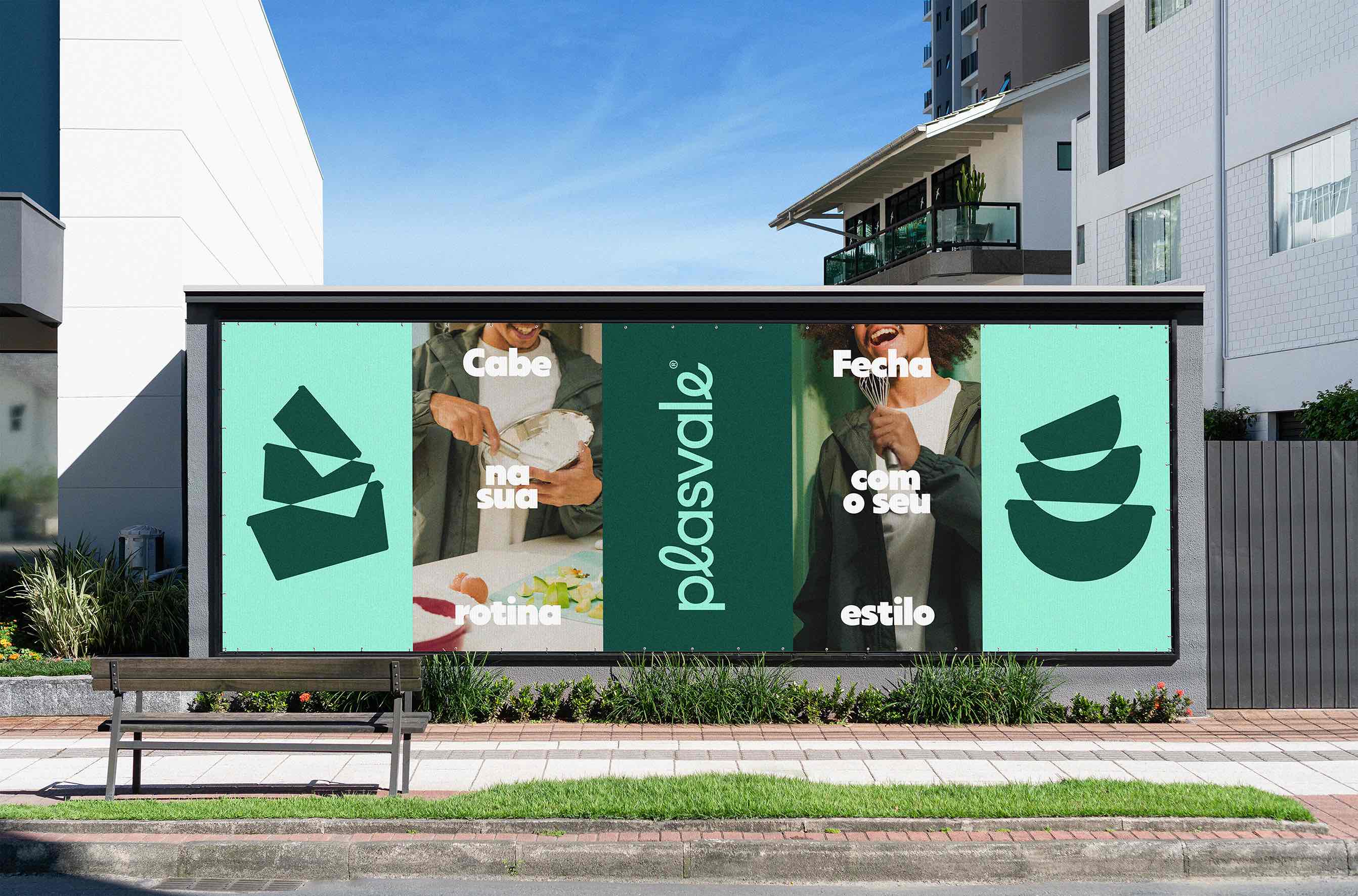
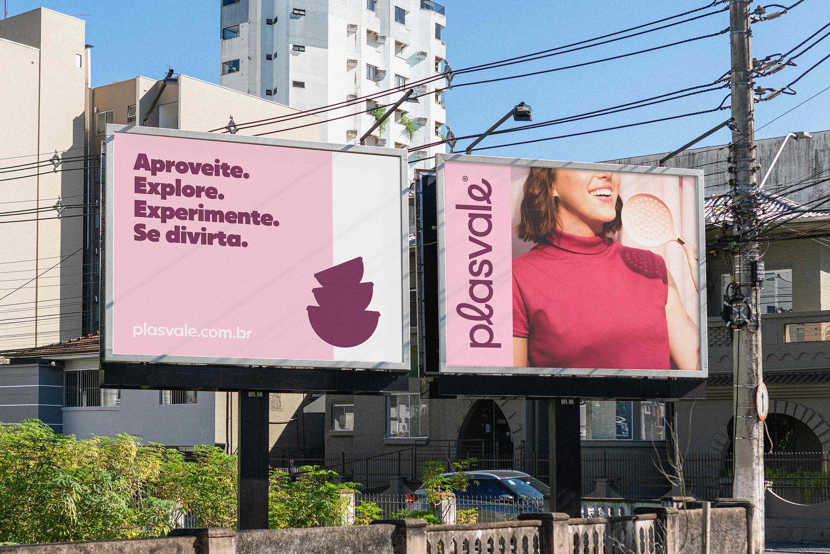
To differentiate and improve its perceived value, Plasvale has gone against the market to position itself as a company that seeks to free people from the pressure for organization, encouraging them to move, have fun, and make a mess. Therefore, its new positioning is based on real life, connecting to customers while saying: “move your wills”, “take things out of place”, “to be useful, it has to fit your routine”, and “life happens on ordinary days”.
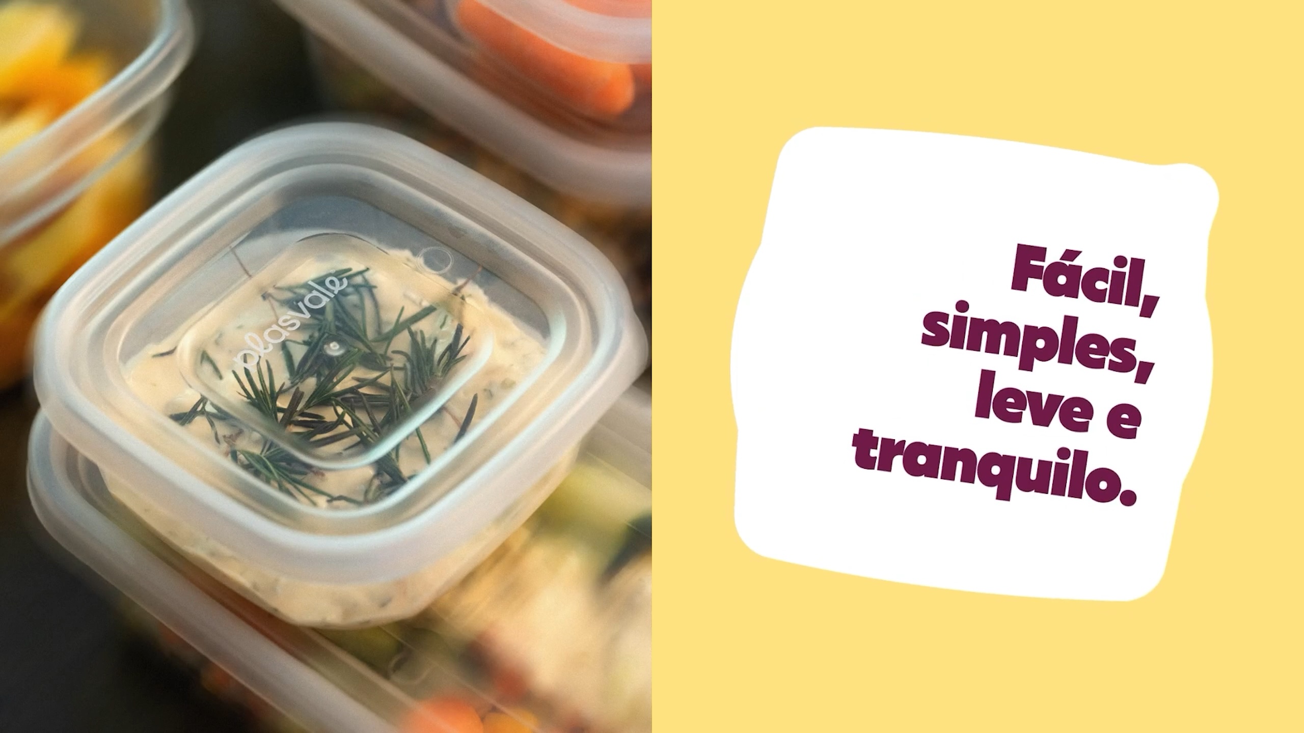
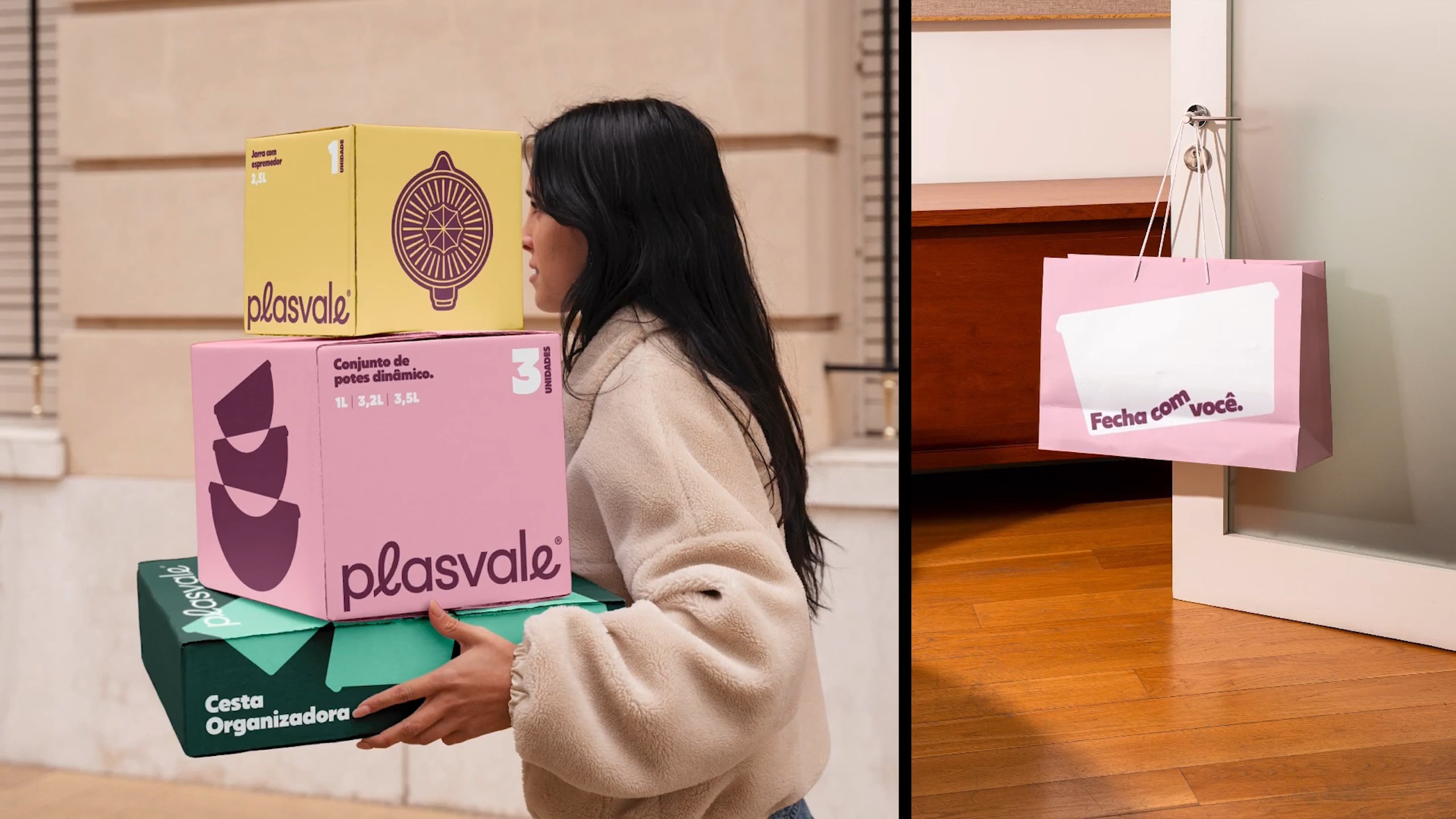
Helping simplify the routine and meet the needs of its customers, Plasvale creates products that fit into their realities, their pocket, their time, and their space — so it fits into their lives. After all, behind every houseware item, there can be countless wills: organizing, cleaning, cooking, storing, mixing, drinking, eating, playing…
But what people really like is to see fun in routine. That’s why, before organizing, Plasvale invites us to move our wills of ordinary days and take things out of place. To attract the attention of a broad and common public, found in small neighborhoods and cities around Brazil, the brand has adopted basic expressions from the segment in its new tagline: “Fits your life.”
Bringing the brand to life.
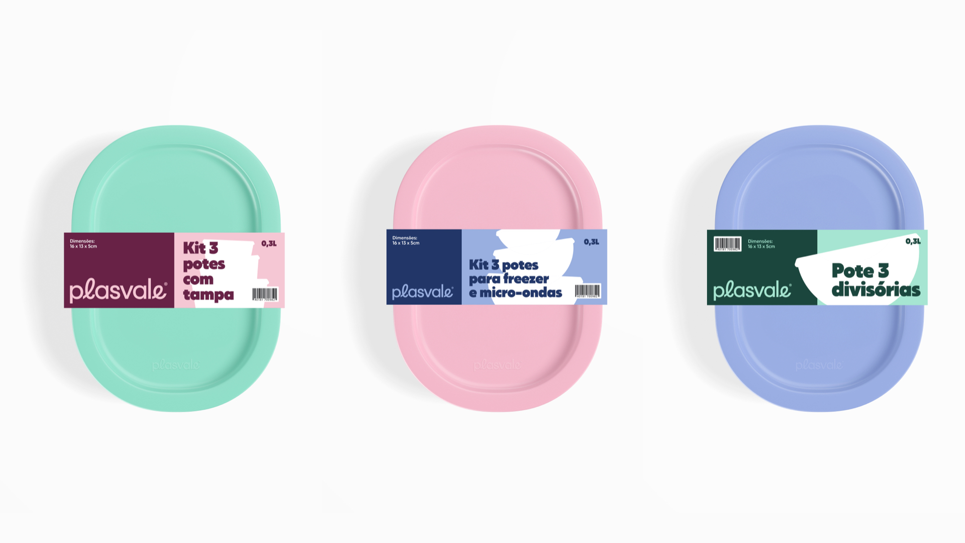
Based on the brand repositioning, the visual identity creation sought to maintain consistency and coherence throughout its touch points, communicating the idea of “taking things out of place”. To reflect this transformation, the new graphic system was inspired by the familiar image of jars disorderly piled up (very common in Brazilian homes), connecting movement and diversity.
Plasvale is now colorful and friendly. The classic and new products bring the brand to life through illustrations that capture its essence in a playful, fluid, and replicable way. Thus, we created dynamic visual elements to represent the real things in life — jumping, falling, and moving around organically and irregularly —, but with lightness.
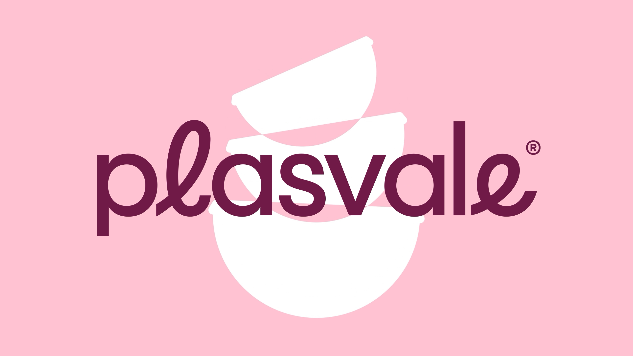
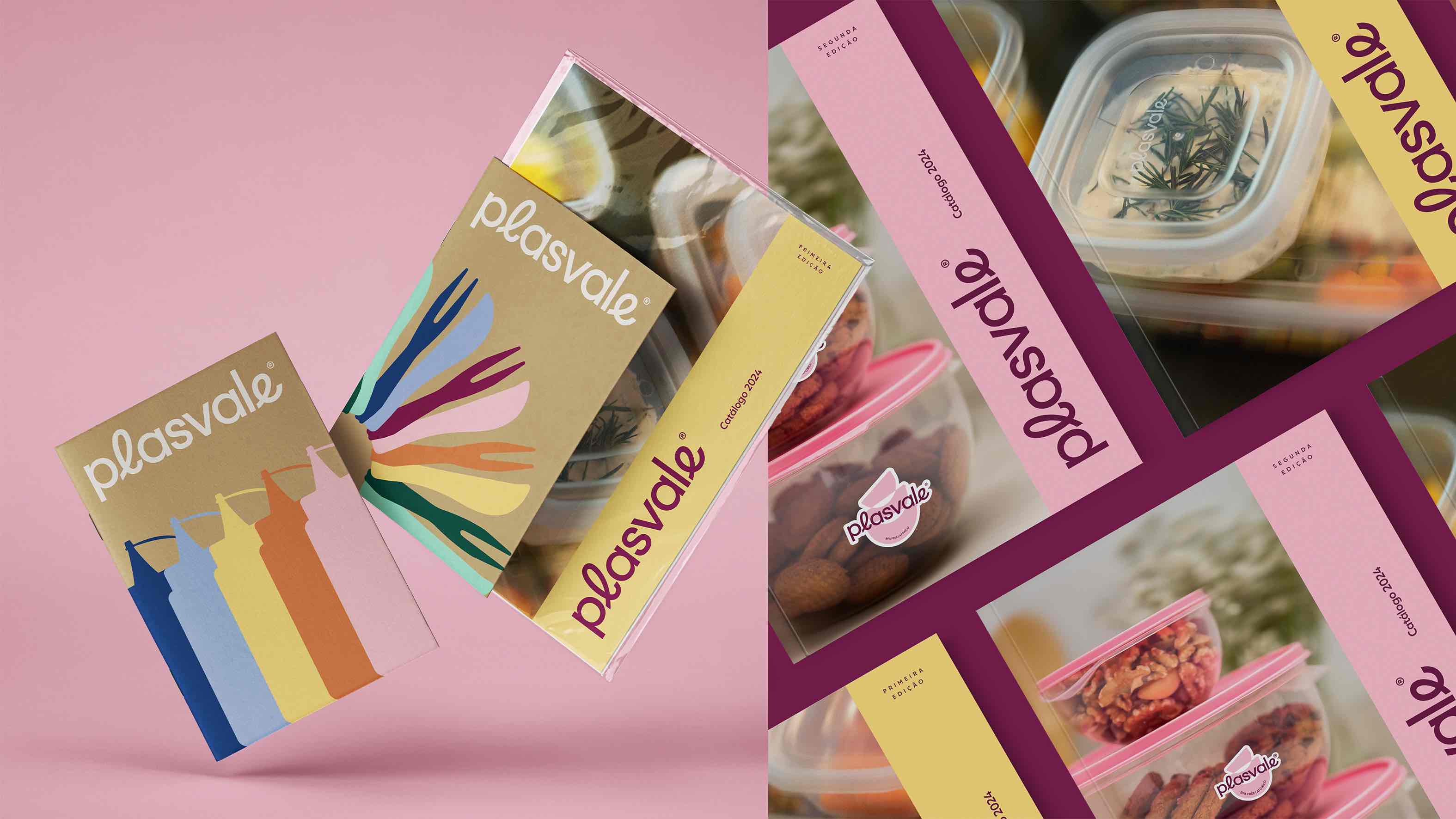
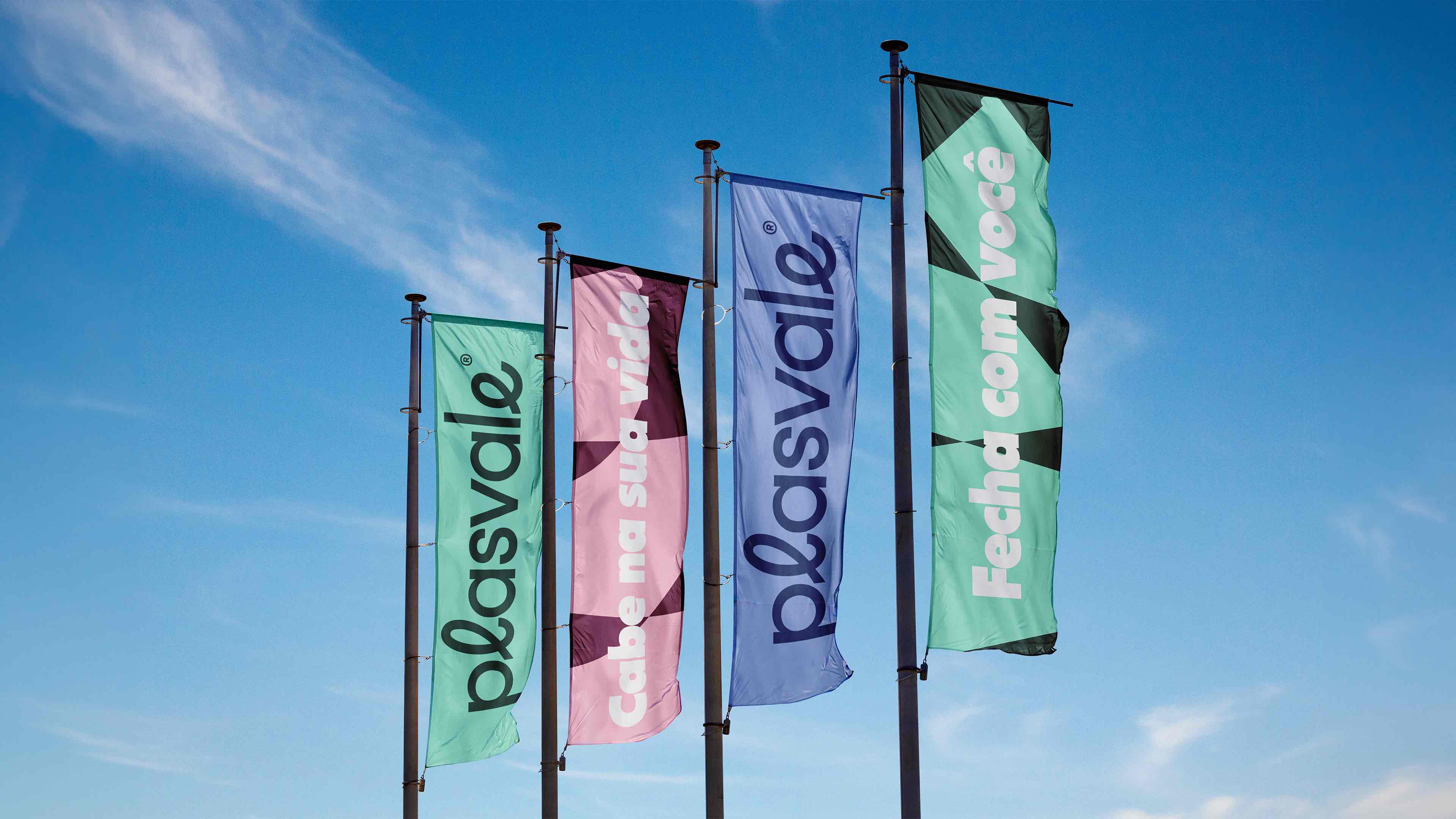
To reflect Plasvale’s strategy, we combined visual attributes that go against market standards, including a personalized typography. In this way, the logo expresses closeness and humanity in its details through the lowercase letter ‘p’ and some calligraphic touches.
Ensuring that Plasvale’s new visual identity is even more refined, we collaborated with the Fabio Haag Type typographic studio to design the logo. Also noteworthy is the Salin typography, used especially in bold to strengthen the graphic nostalgia that represents the company’s years of history.
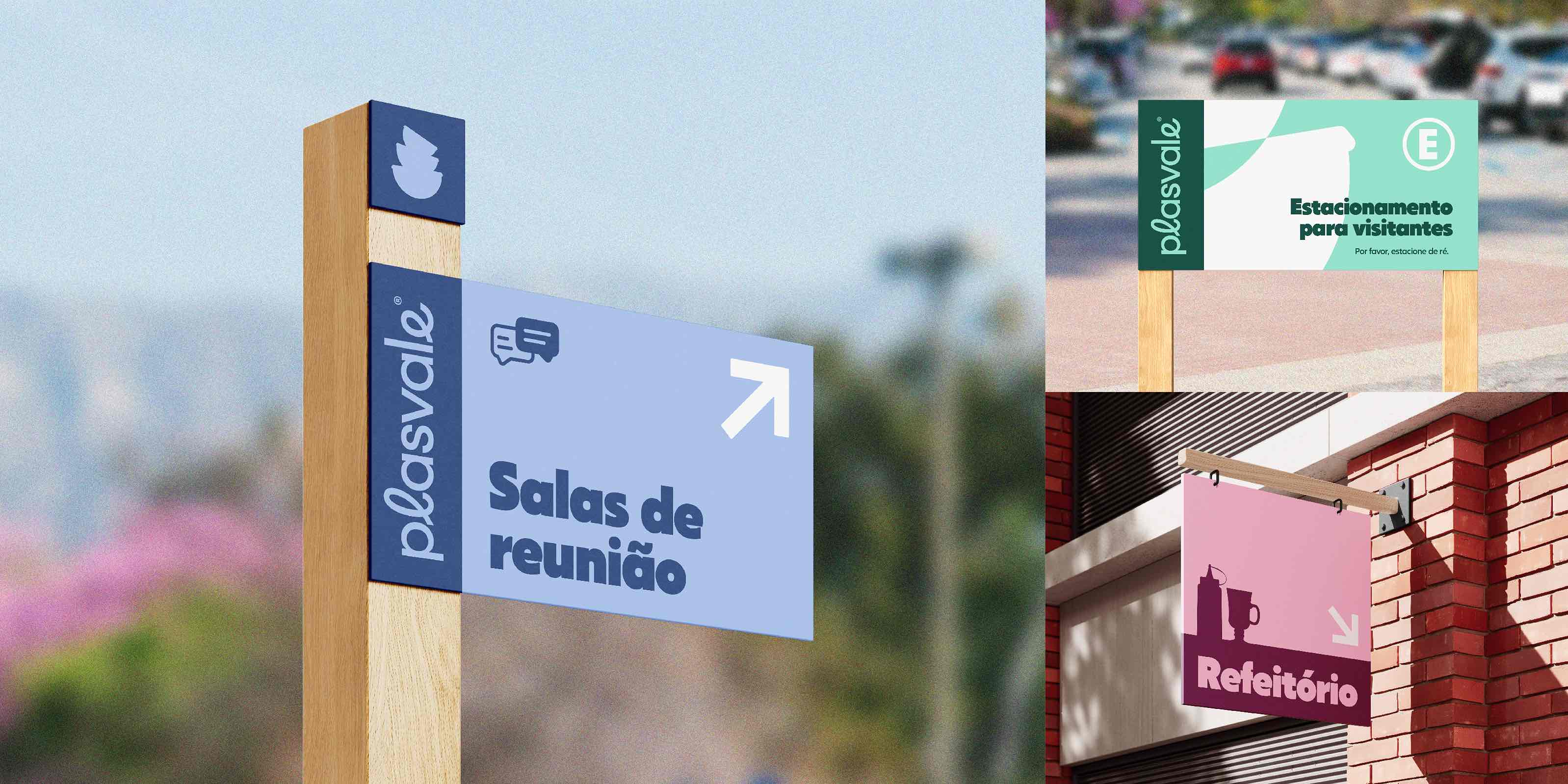
In accordance with what was suggested in the iconography style guide, Plasvale now has a rich graphic repertory that communicates the key messages of its new positioning, guaranteeing functionality and differentiation at points of sale with a diverse color palette, as well as expressive illustrations.
Plasvale’s new reality.
In order to help implement so many changes, the project’s final delivery included a manifesto movie and an advertising movie developed in partnership with the creative studio Veritae. Serving as a tool to communicate Plasvale’s new moment to the market, these materials not only reinforce the brand’s core idea but also enable the expansion of its visual elements.
Complementarily, we gave Plasvale’s institutional website a new look, ensuring that the brand communicates in a consistent way — both verbally and visually — throughout its touchpoints. Thus, we manifested what is authentic in the company to redefine its reality, intentionally and strategically expressing that the new Plasvale: “Fits your life.”
CREDIT
- Agency/Creative: Molde
- Article Title: Plasvale: Redefining Everyday Housewares with Authenticity and Movement by Molde
- Organisation/Entity: Agency
- Project Type: Identity
- Project Status: Published
- Agency/Creative Country: Brazil
- Agency/Creative City: Santa Catarina
- Market Region: South America
- Project Deliverables: Art Direction, Brand Design, Brand Guidelines, Brand Redesign, Brand Strategy, Brand Tone of Voice, Film, Logo Design, Motion Graphics, Rebranding, Writing
- Industry: Retail
- Keywords: branding, rebranding, housewares, brand positioning, visual identity, brand differentiation, Brazil
-
Credits:
Strategic Direction: Robson Stédile
Creative Direction: Alexandre Kumm
Art Direction: João Pedro Roncalio
Logo Design: Alexandre Kumm, Fabio Haag Type
Content Direction: Robson Stédile
Copywriting: Carla Mereles, James Döring, Robson Stédile
Animations: João Pedro Roncalio, Pedro Museka
Project Creative Team: Alexandre Kumm, Carla Mereles, Gabriella Prussak, Guilherme N. Hack, João Pedro Roncalio, Marlon Bruno da Silva, Robson Stédile, Zeca Day
Photography: Zeca Day, Victor Michelato, Plasvale Archive
Brand Film: Creative Direction: Molde Production: Veritae Direction: Zeca Day Cast: Enoi Santos, Gefferson Xavier, Jenifer Schlindwein, Marc Director of Photography: Victor Michelato Photography Assistant: Fernanda Duarte Production Assistants: Guilherme N. Hack and Vinicius Santos Sound Editing: Davi Carturani Voice-over: Paula Silvestre Original Soundtrack: Davi Carturani Graphic Design: Molde Animations: Pedro Museka Editing and Post-production: Zeca Day


