Many people who want to change their diet to a healthier one encounters the problem of a saturated market and a lack of clear information”. Plántate wants to be forceful in the message and clear when showing the ingredients of its products. We want to accompany the user on a journey where he can build his own story and conquer a vegetarian diet.
We do not want to waste time reading the ingredients in each container, we need a brand that gives us confidence and makes the shopping list a little easier and healthier.
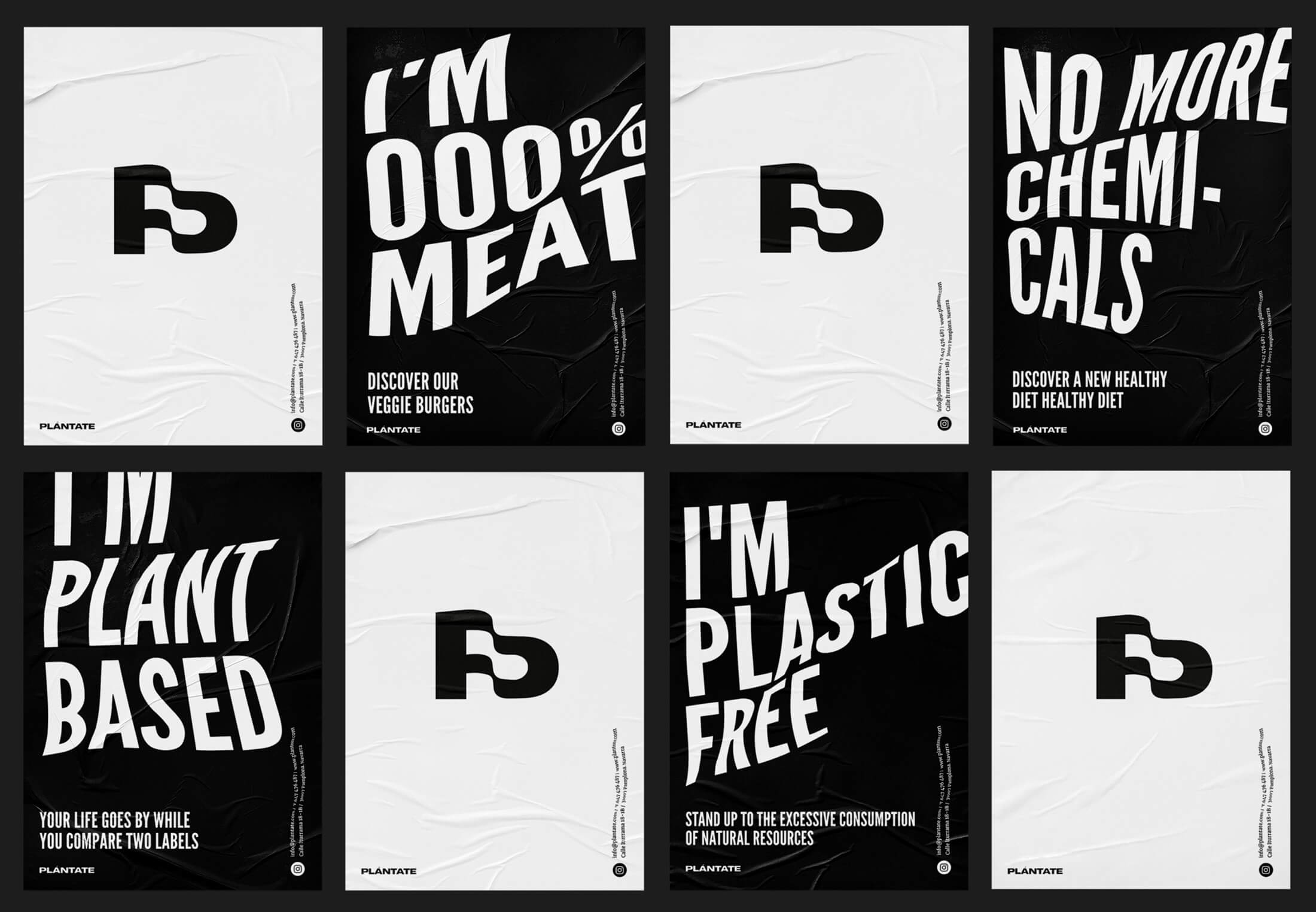
We feed ourselves in a healthier way when it costs us less effort and we know what we are consuming. We care about a healthy diet when we have more time to ourselves. The concept behind this brand is that of the flag on the “P”. When people conquer something or reach a place after a long journey, they pin a flag to identify or show their achievement.
In this case, it means: “I stand, I have come this far.” My aim was to eat healthier and thanks to Plántate I have succeeded. Plántate is a change of attitude towards healthy food.
Making a Healthy Purchase is Very Easy and We Say It Loud and Clear. That is why with Plántate, eating healthy is Plant Eaten.(Brand Tagline- Es Plant Comido).
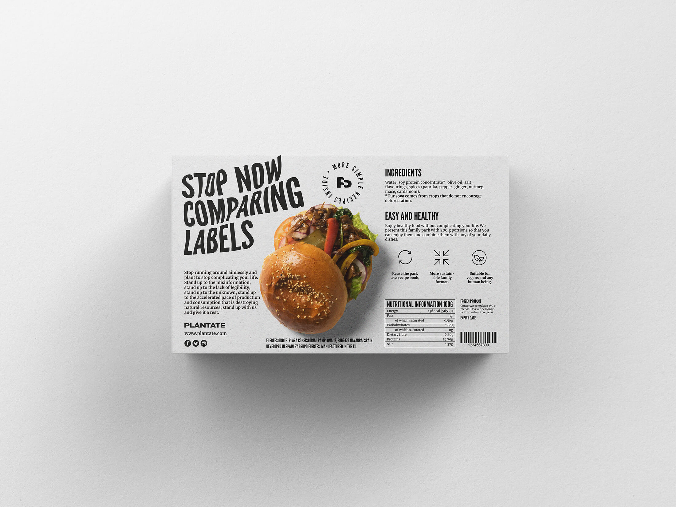
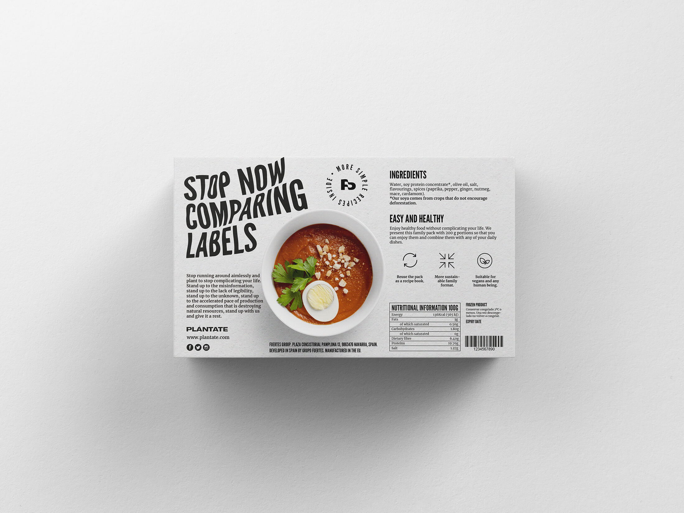
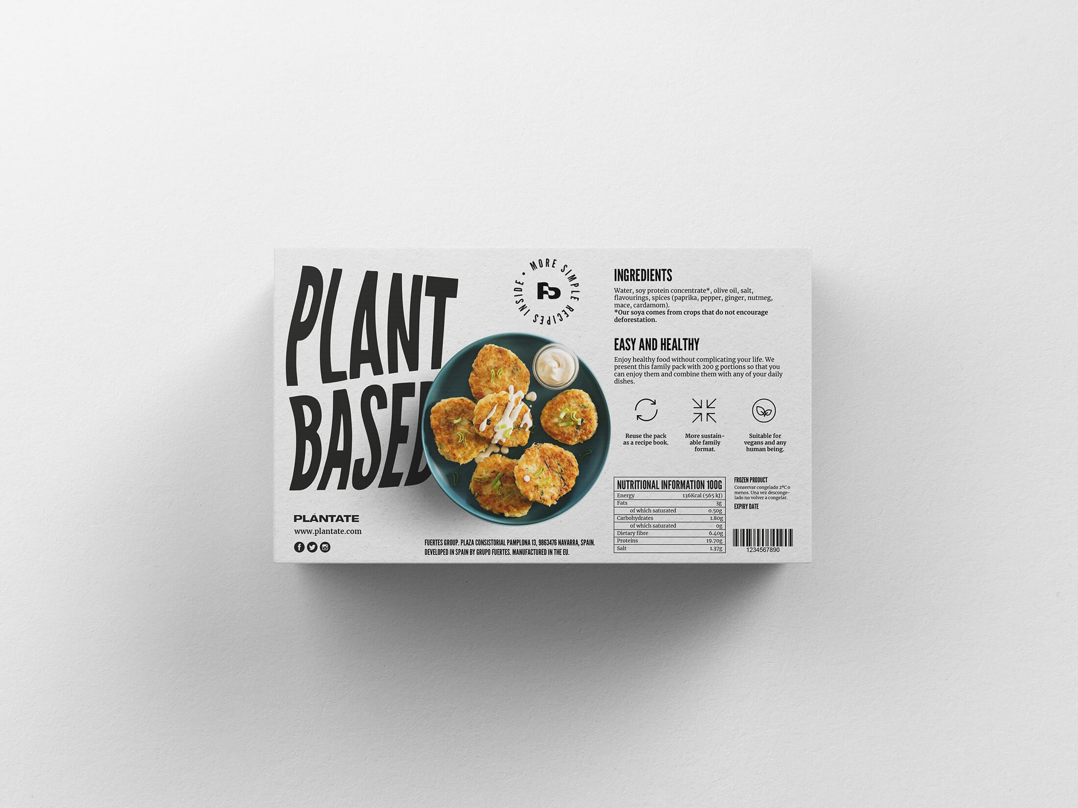
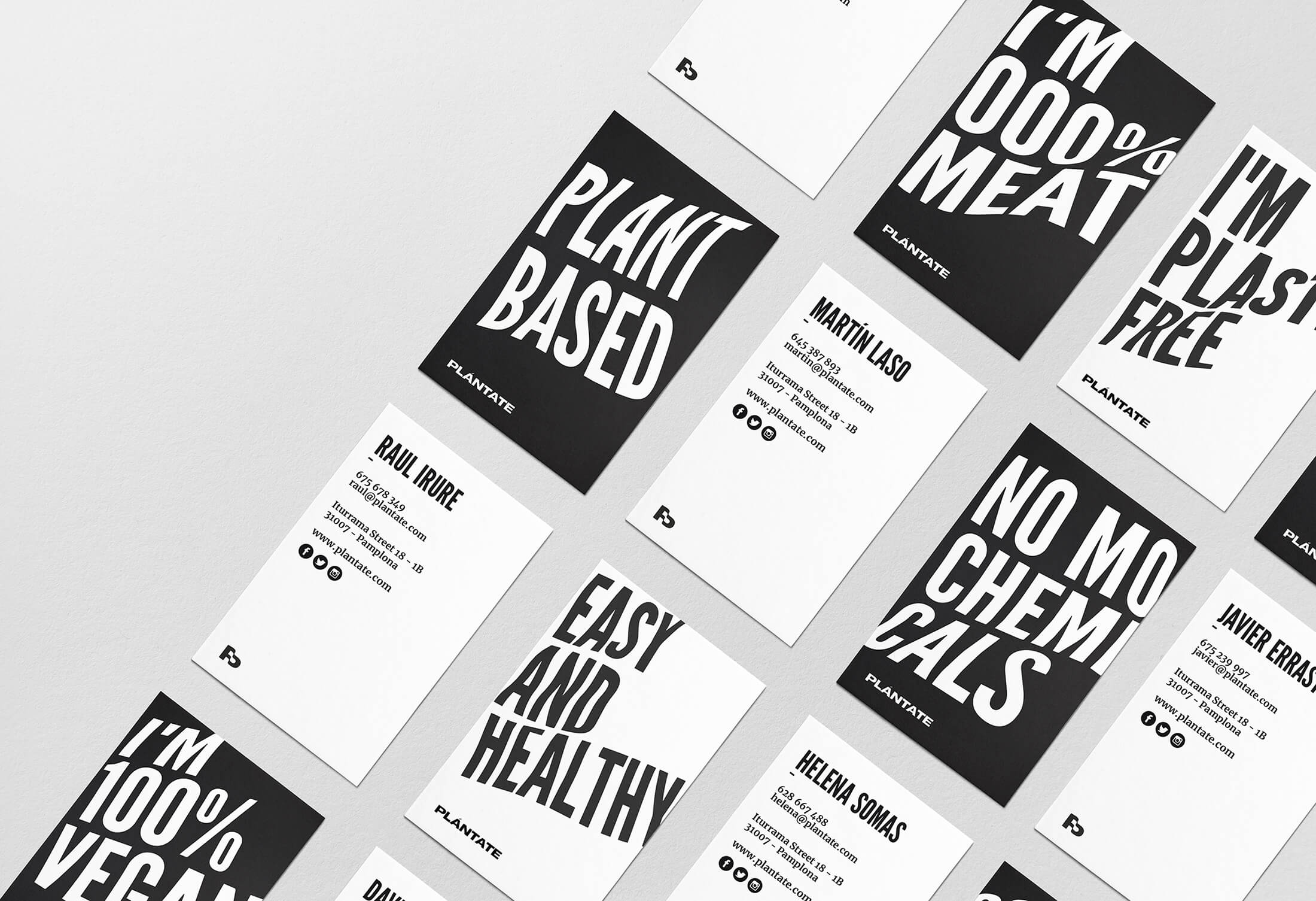
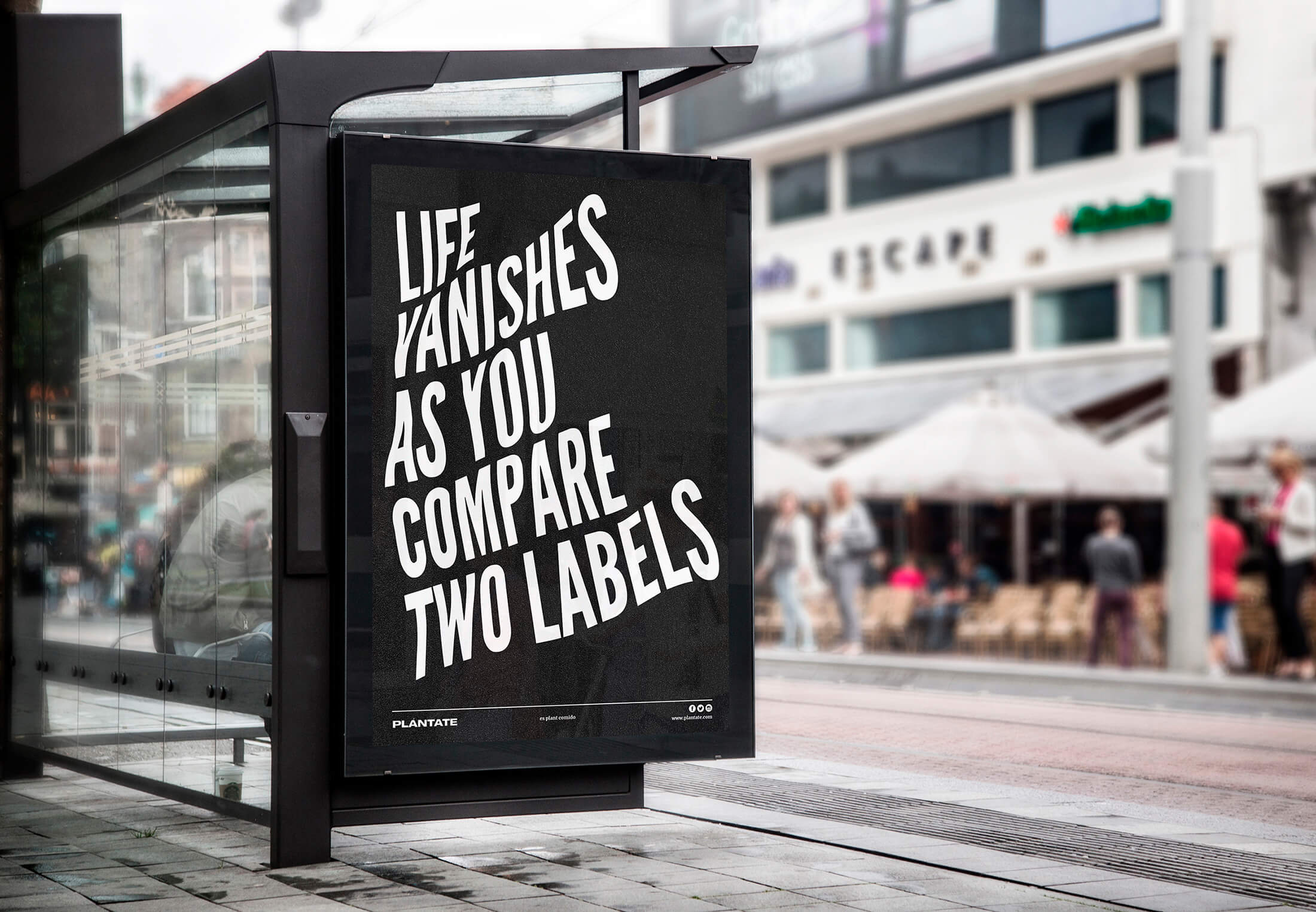
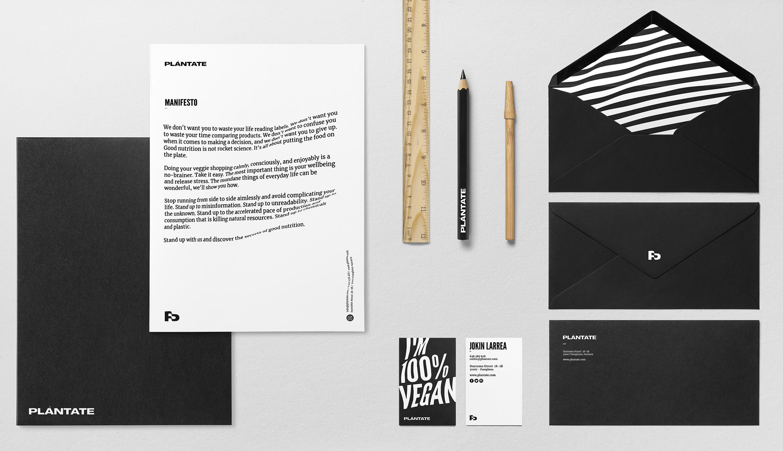
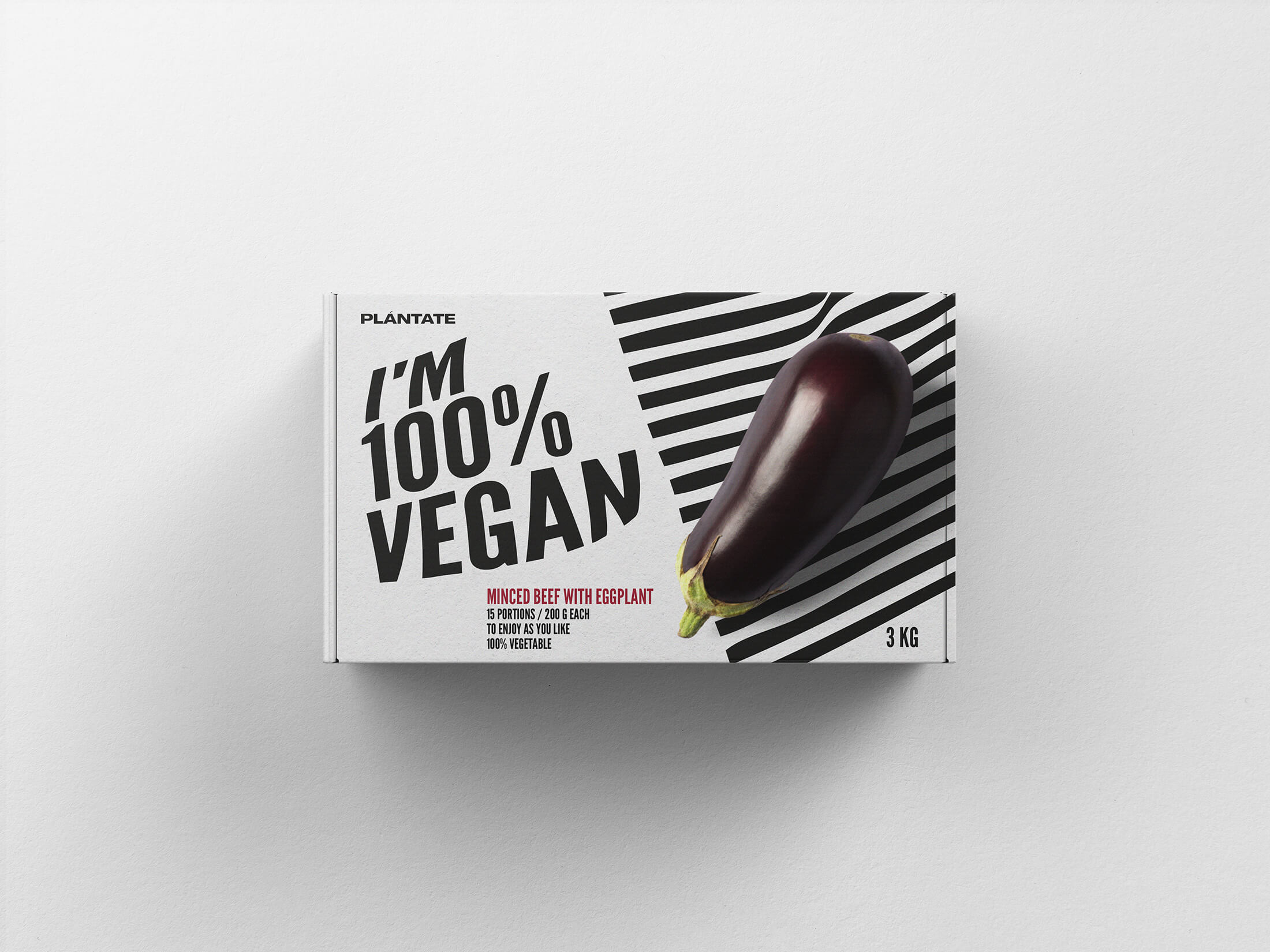
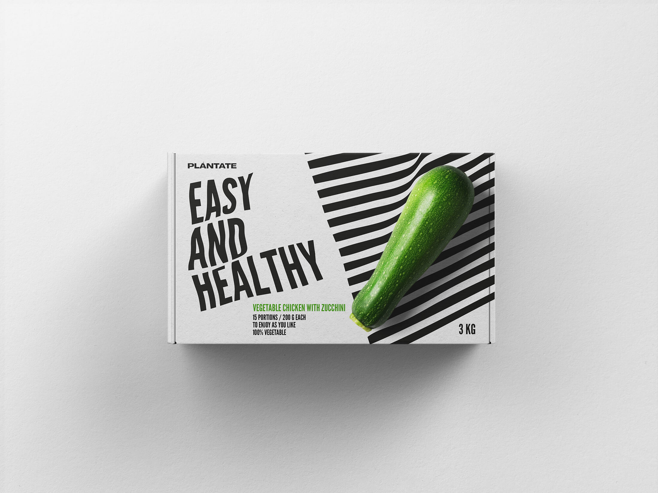
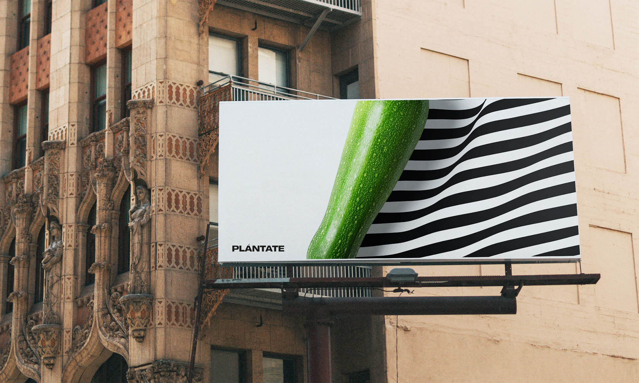
To develop the brand, a food brand identity system with an undulating effect like a flag that covers all aspects of brand communication has been generated. From business cards to packaging, they are defined with a blunt lettering that highlights the product qualities and invites us to reflect.
In this way, the packaging shows the essential ingredient of each product plus a strong message. The format has been developed in a 3kg family container, the idea is to always keep a meat substitute in the pantry at hand and, on the other hand, stop wasting so much material to make the packaging more sustainable.
CREDIT
- Agency/Creative: bov Design
- Article Title: Plántate Healthy Food Brand System by bov Design
- Organisation/Entity: Student
- Project Type: Identity
- Project Status: Published
- Agency/Creative Country: Spain
- Agency/Creative City: Pamplona
- Market Region: Europe
- Project Deliverables: Advertising, Brand Design, Brand Naming, Graphic Design, Type Design
- Industry: Food/Beverage
- Keywords: WBDS Student Design Awards 2022/23
- Keywords: #Health, #food, #vegan, #Packaging, #Creativity_Package, #brand_system
-
Credits:
Graphic Designer: Borja Viguiristi


