Extending Pizza Express’ No. 1 Market Position
Ambition
The PizzaExpress restaurant-to-retail transition delivered huge category growth and a fresh injection of brand experience to the chilled pizza aisle. However, over time, many new brand and private label players wanted a slice of the action, leading to t1he shelf fixture to become visually noise and populated with the same old visual category codes. The time was right for PizzaExpress to protect and stretch its lead in the grocery channel.
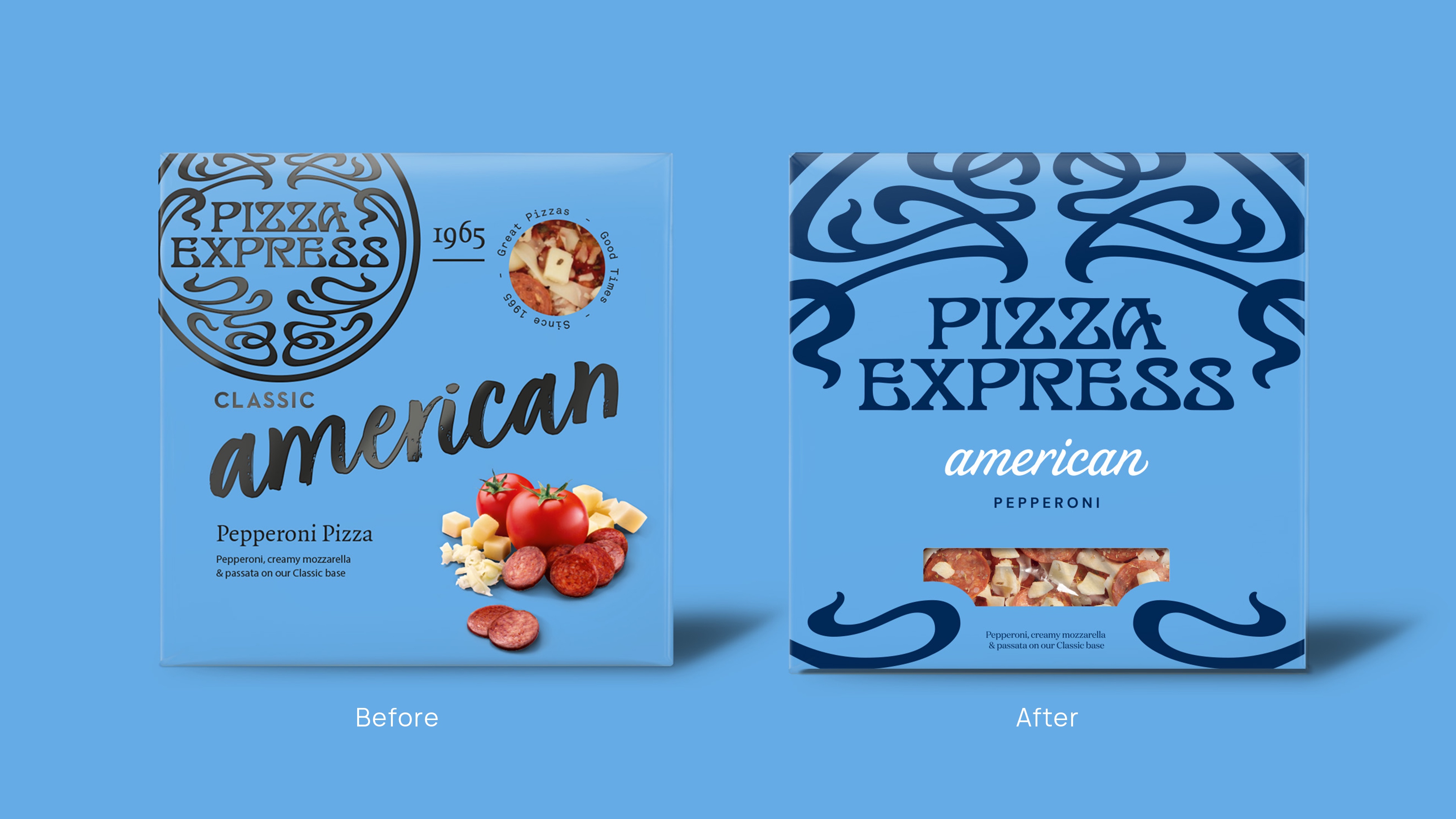
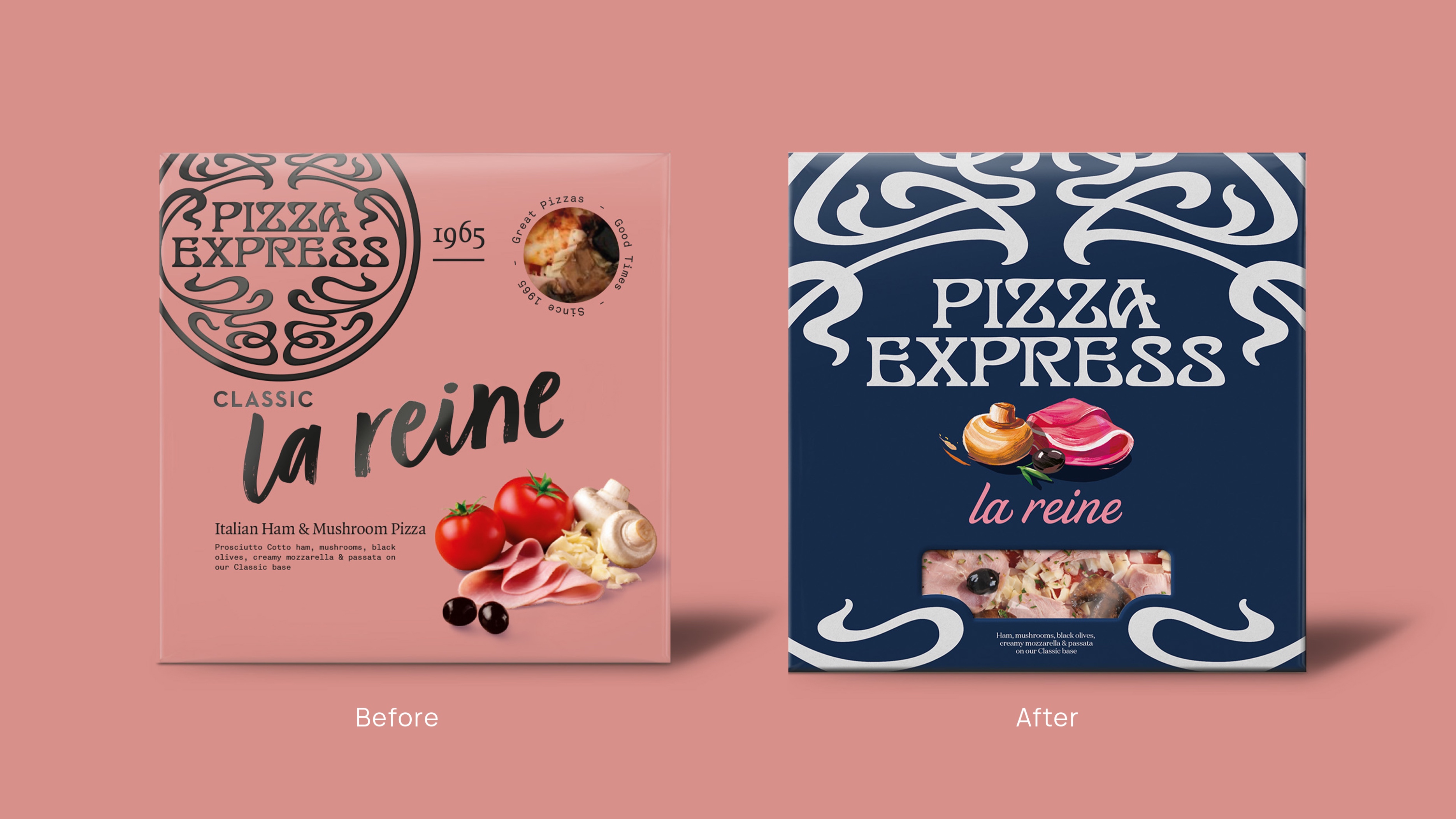
Our challenge was to cut through the noise, demonstrate brand leadership and regain iconicity across the entire PizzaExpress grocery range.
Insight
Born in 1960s Soho and rooted in creativity and artistic style & flair, PizzaExpress’ origins have shaped its identity into the nation’s best-loved pizzeria brand. Its rich history and roots in jazz and art have helped forge a strong implicit emotional connection that private label and competing brands simply can’t replicate.
Additionally, because PizzaExpress’ lead distinctive brand asset, the filigree roundel, is recognised by 79% of people, it had to be leveraged to lean into the brand’s unique history and go unapologetically all out with a masterbrand-centric design.
Idea
‘Timeless Iconicity with Pizzazz’ places pride and creativity at the heart of the identity and pack transformation.
Iconicity through ownability
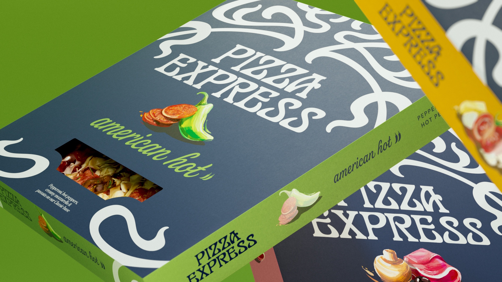
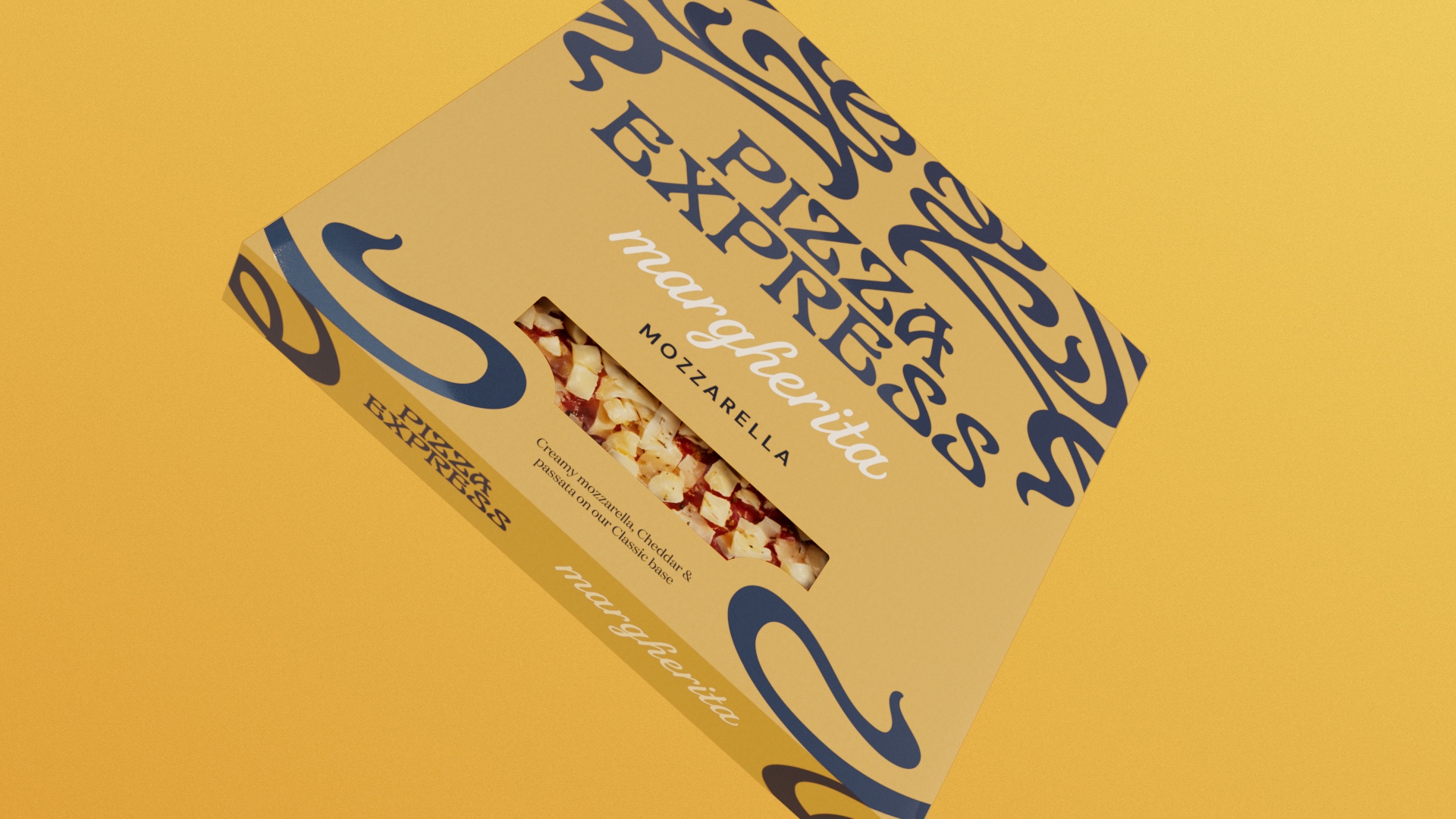
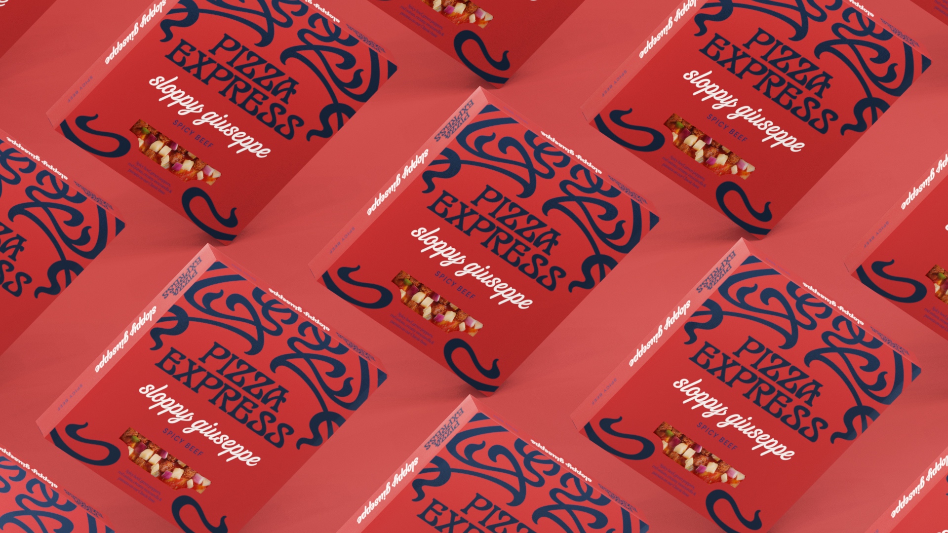
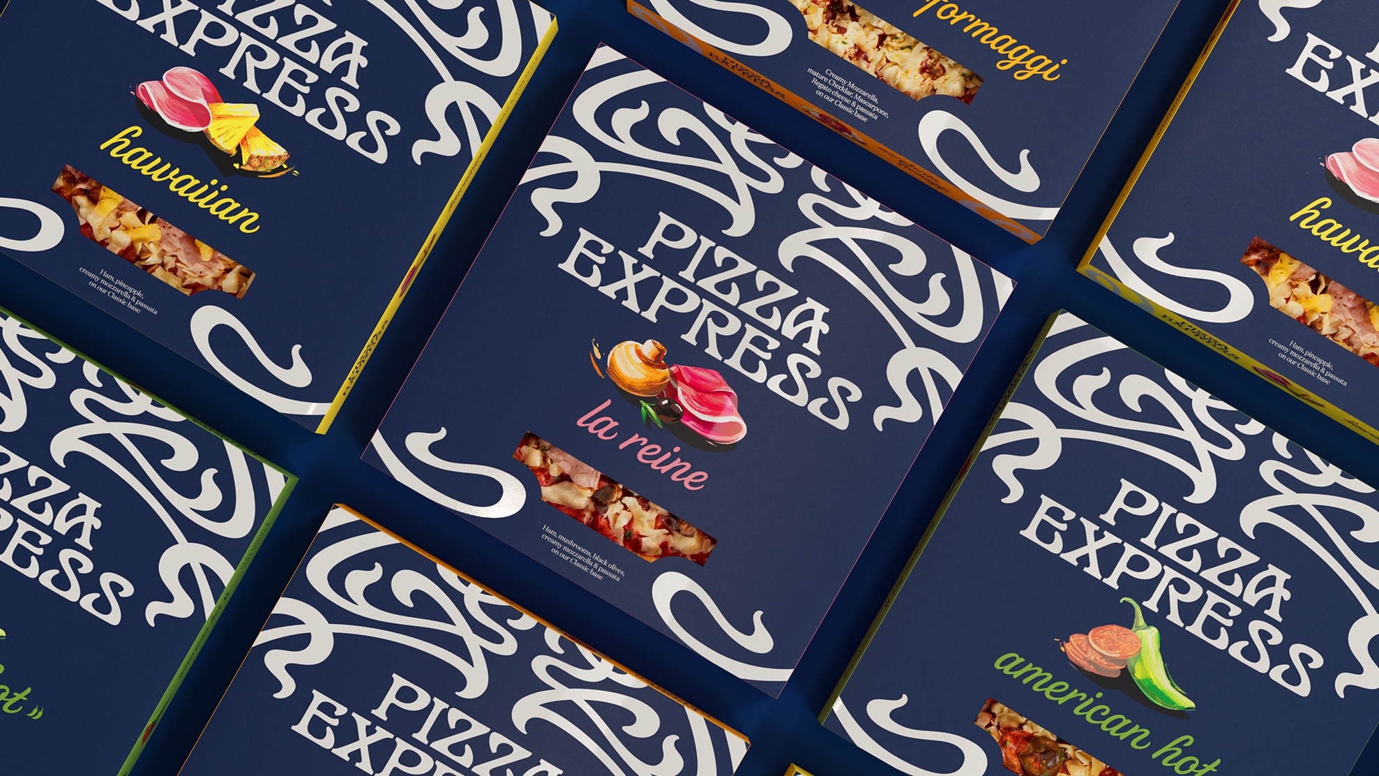
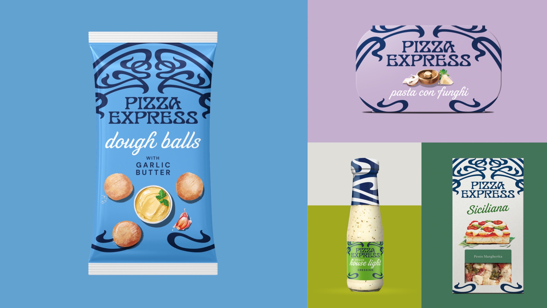
Because of its strong visual recognition, we simplified and amplified the brand mark to create a bold, yet simple statement of restaurant quality, passion and artistry. Which was carried through into the crafting of the logotype and illustrations.
Intending to capture the aura and sense of history of the first PizzaExpress, we refined the logotype to echo the cusps and shapes of the brand mark, creating a more distinctive and unique typography, while improving legibility on pack.
We explored a range of design concepts to find the perfect balance of characteristics, developing the type in a similar process to the Pizza Express wordmark typography. We made adjustments to individual characters to add more personality while working across all packaging formats, from house dressings across to the larger format pizzas.
Creative flair and vibrancy
Leaning into the brand’s history, we explored the essence of jazz, with the end result imbuing energy, rhythm, expression, and spirit. The intricate design of the word mark beautifully complements these characteristics, conveying a sense of movement and fluidity.
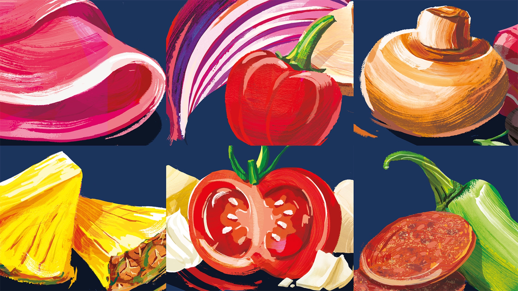
The brand’s origins in art have been captured in the new illustrative style and the way in which it mirrors how passata is traditionally spread on pizza bases, connecting back to the expressive nature of the brand.
An authentic base for consistency
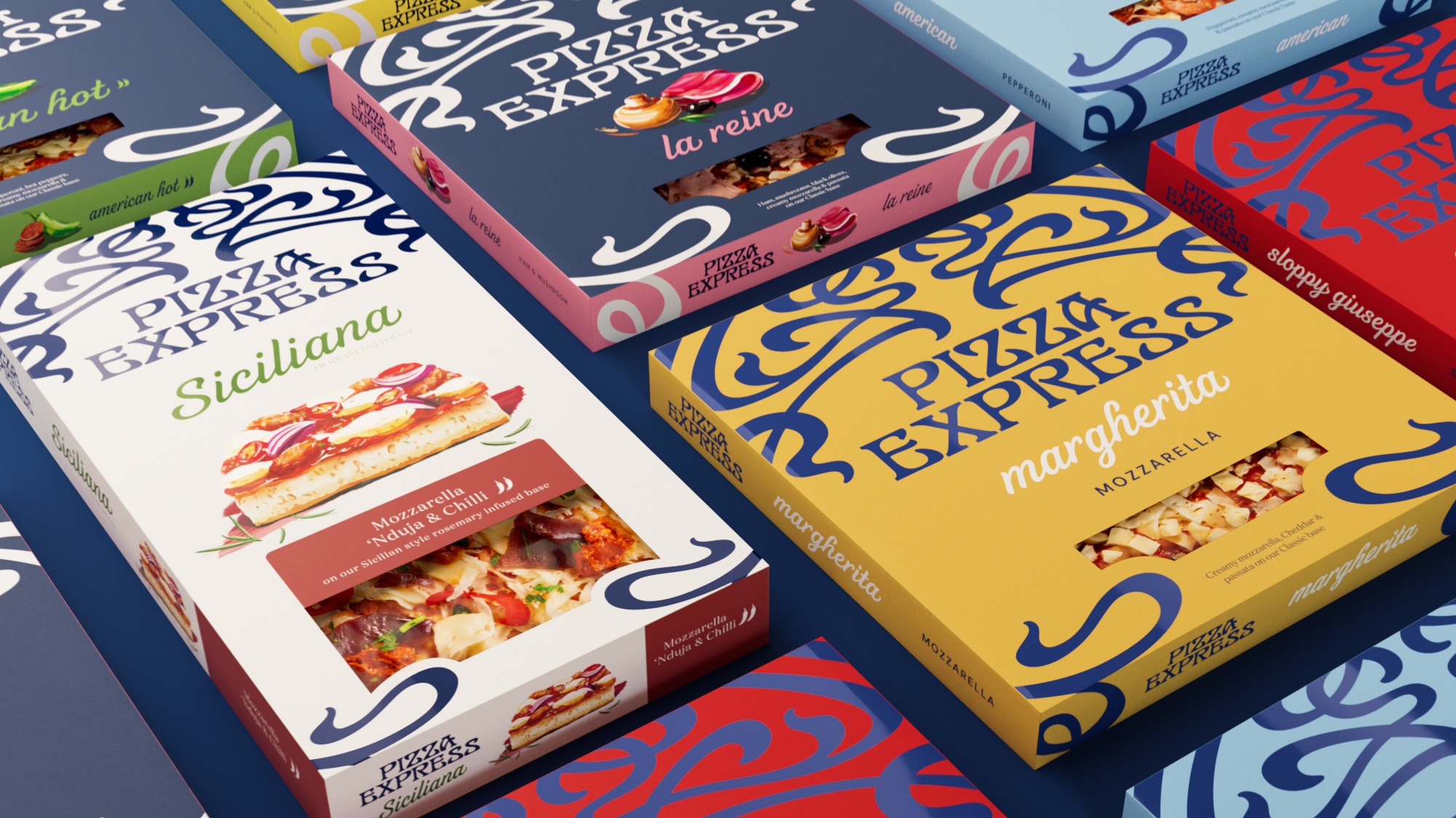
A clear and simple masterbrand design strategy allowed us to hero the brand and strengthen it across the chilled and ambient ranges, working through the three pizza tiers (‘The Icons’, ‘Restaurant Favourites’ and ‘Siciliana’). with an iconic design.
Impact
The new vibrant illustration infuses energy and flair to cut through the visual noise and bring the distinct PizzaExpress restaurant experience into homes across the UK. Free from visual clutter, the bold packs convey only what the shopper needs to find at warp speed. And it seems to be working. Initial results show that sales have grown across the board with less reliance on 9” pizzas and deep discounting.
With a lovingly recrafted brand mark seamlessly integrated across the entire product range, we’ve given the category back its icon, and protected and positioned the brand for future growth.
CREDIT
- Agency/Creative: Brandon
- Article Title: PizzaExpress Packaging Refinement
- Organisation/Entity: Agency
- Project Type: Packaging
- Project Status: Published
- Agency/Creative Country: United Kingdom
- Agency/Creative City: Manchester
- Market Region: Europe
- Project Deliverables: Packaging Design
- Format: Box
- Industry: Food/Beverage
- Keywords: WBDS Agency Design Awards 2023/24
- Keywords: Packaging Design, Product Refinement
-
Credits:
Design Agency: Brandon


