Background
Pixweld is 3D visualization studio based in Lithuania. Run by two brothers who share the same passion for architecture and interior design. Pixweld aims to redefine what beauty is by delivering pixel perfect evoking results that are more works of art than a just a pretty looking images.
Inspiration
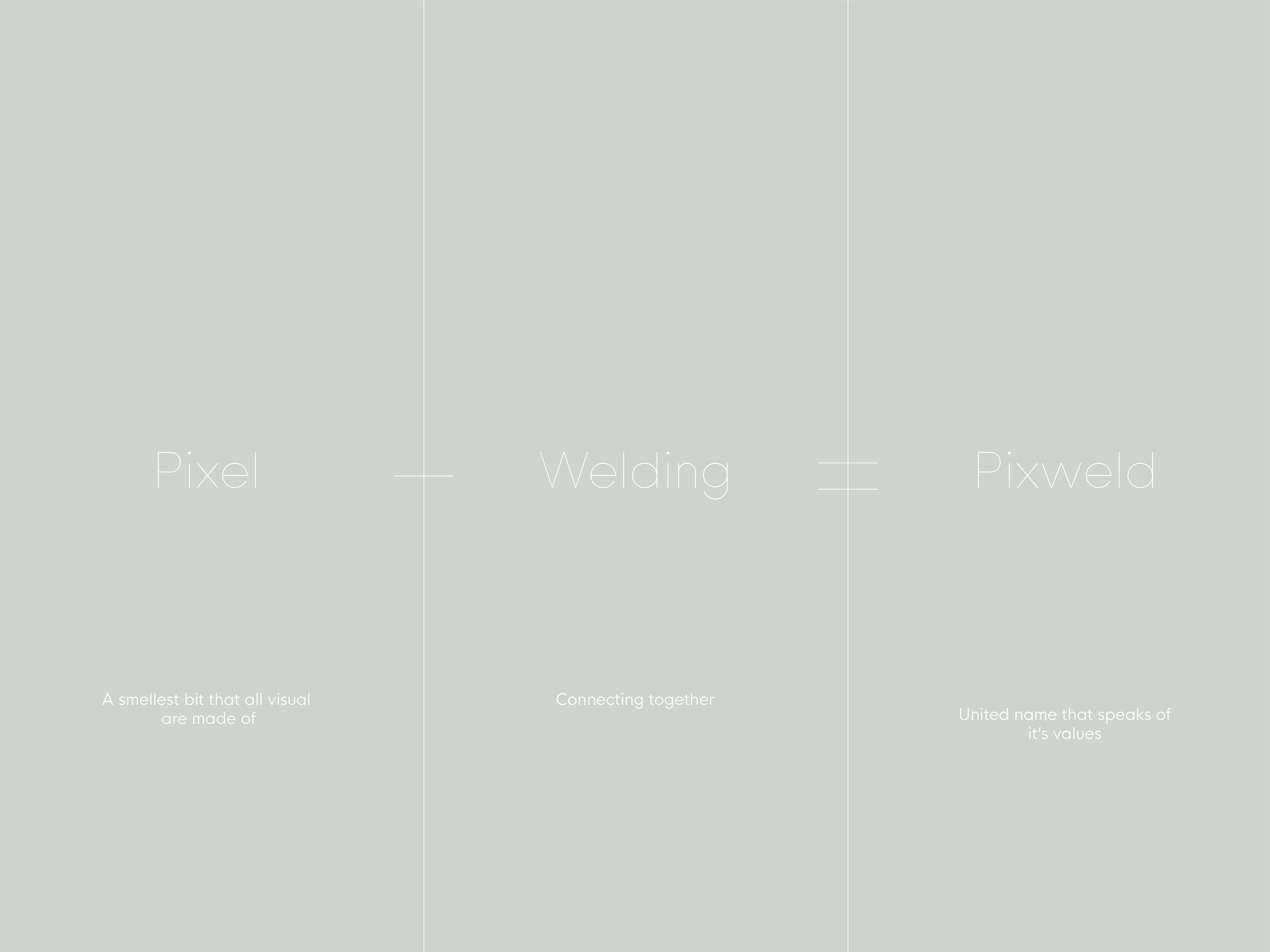
Spending time with Antanas, founder of Pixweld we was inspired by his intentions and point of view towards the world. After seeking his inspirations we defined a deck to go along with his ideas. Inspiration comes from perfection, details and noise. What Pixweld does is that welds one pixel at the time to produce a works of art for their clients. That what inspired us to create a whole brand identity surrounded by perfection and connectivity.
Approach
In designing new Pixweld identity we set ourselves to show company values in a simple yet memorable and structural way. An identity that can expand and grow when it’s needed without loosing core image of the brand itself. With pixweld it’s all about perfection and evoking results.
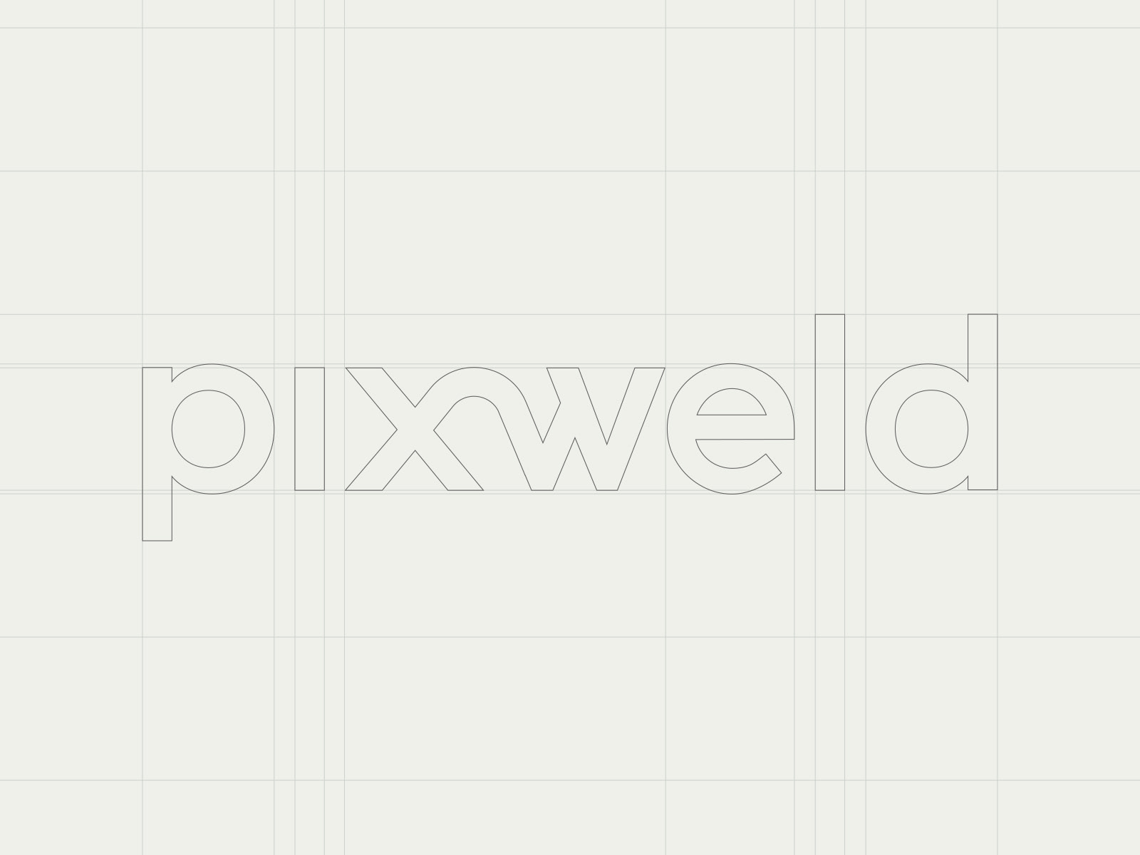
Wordmark Architecture
Spending time with Antanas, founder of Pixweld we was inspired by his intentions and point of view towards the world. After seeking his inspirations we defined a deck to go along with his ideas. Inspiration comes from perfection, details and noise. What Pixweld does is that welds one pixel at the time to produce a works of art for their clients. That what inspired us to create a whole brand identity surrounded by perfection and connectivity.
Signature Pattern
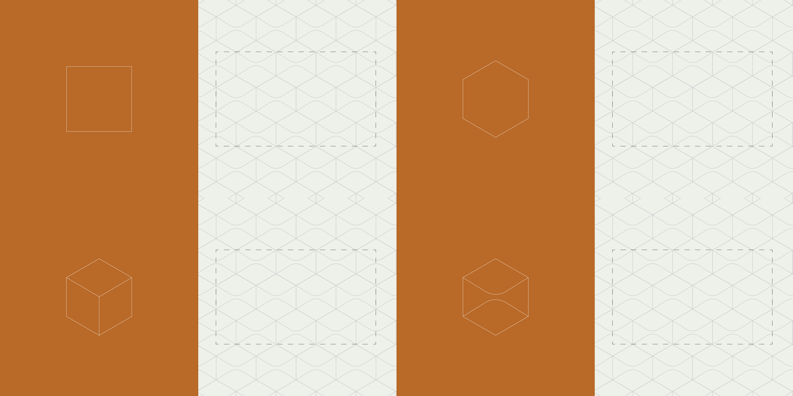
Our signature pattern is designed as a backbone of the brand. It holds and frames best understanding of perfection and structure. Flowing along with wordmark / identity concept Pixweld pattern highlights it’s own character. Scalable to any size and environment.
Primary Colors
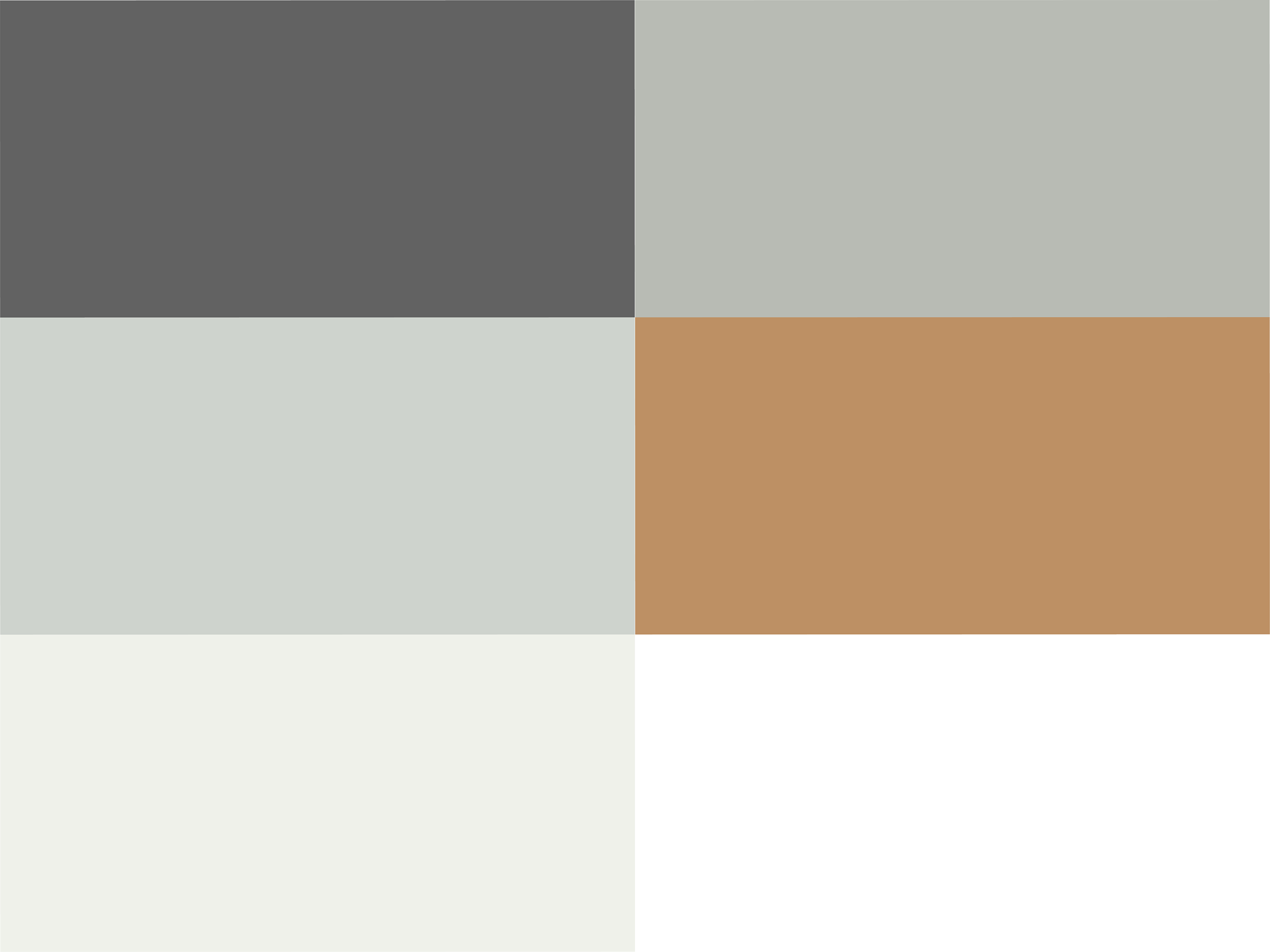
Our primary colors are named after eerie black and ash white. Two main colors represent inseparable aspect of Pixweld, colors that speaks simplicity. With such an approach on colors allowed us to highlight more of the content and keep ourselves simple yet memorable.
Accent Colors
Our accent colors maintains integrity of our primary colors. Color tones extended of our primary colors allows us to maintain a minimal and athletic appeal while core accent color is Egg Shell we highlight a natural appeal.
Typography
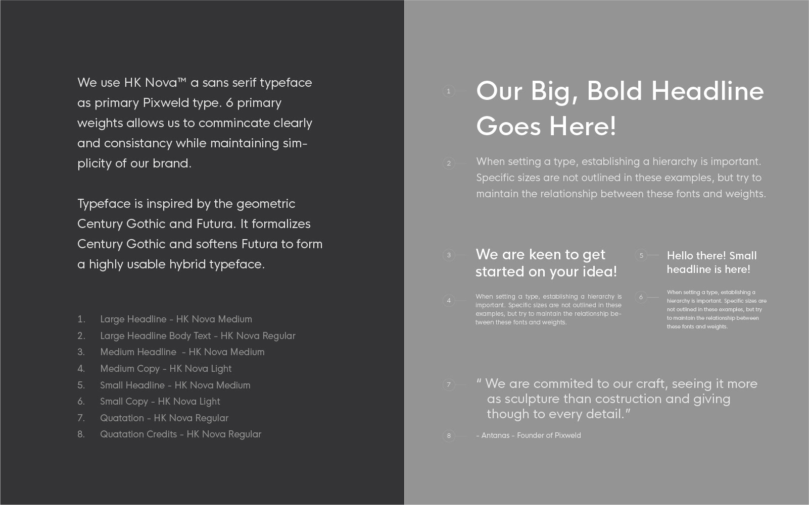
We chose a geometric typeface witch speaks of simplicity and has clear readability. It’s important for us to establish clarity through all channels of the brand one of very important is right typeface. Using HK Nova as primary brand type we manage to communicate our sense of approach.Typography We chose a geometric typeface witch speaks of simplicity and has clear readability. It’s important for us to establish clarity through all channels of the brand one of very important is right typeface. Using HK Nova as primary brand type we manage to communicate our sense of approach.
Print Identity
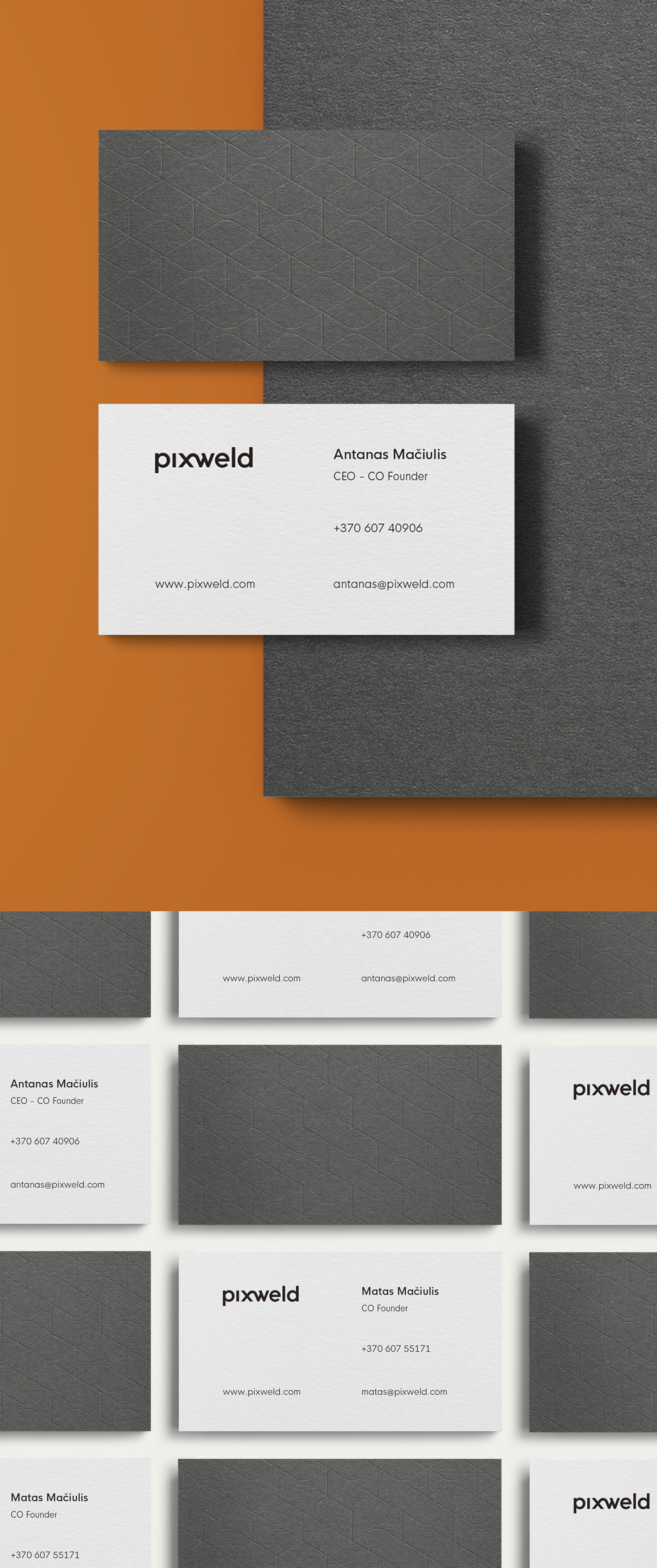
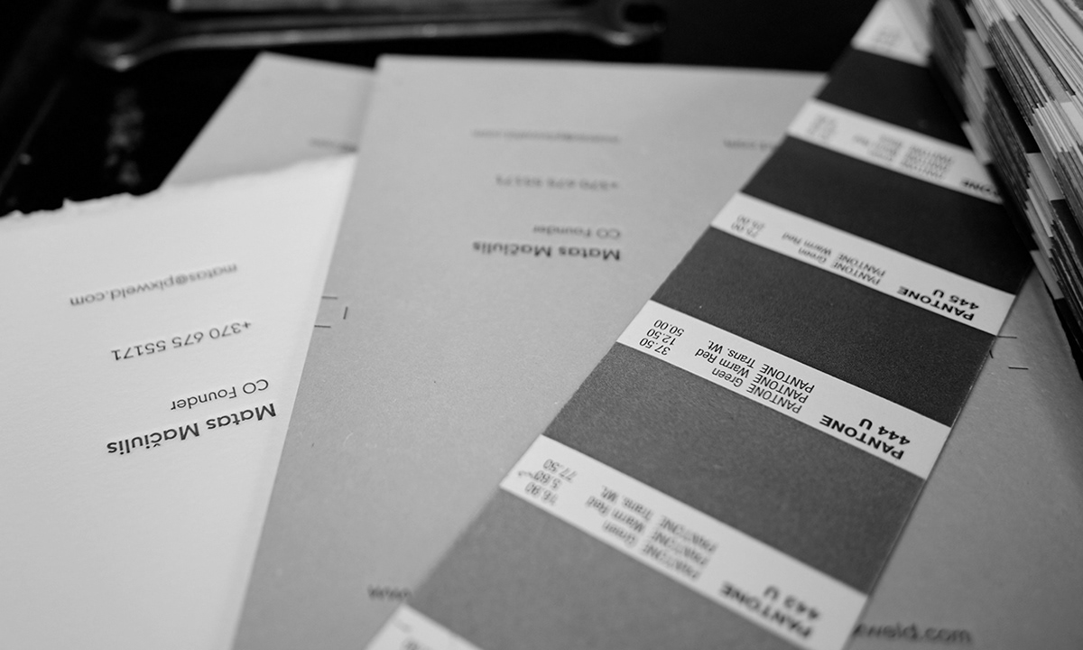
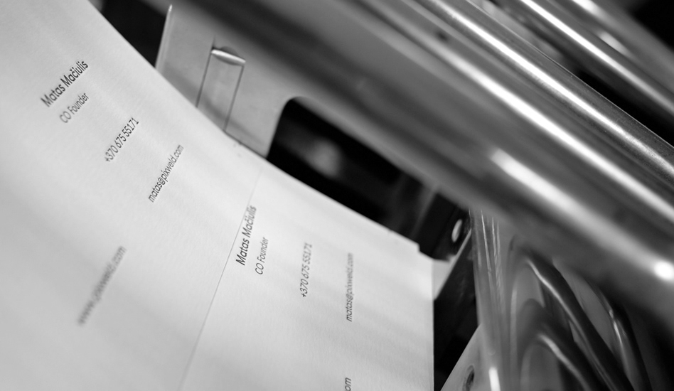
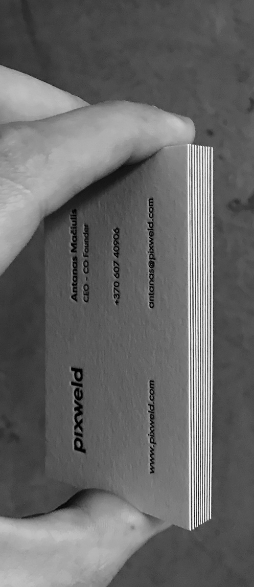
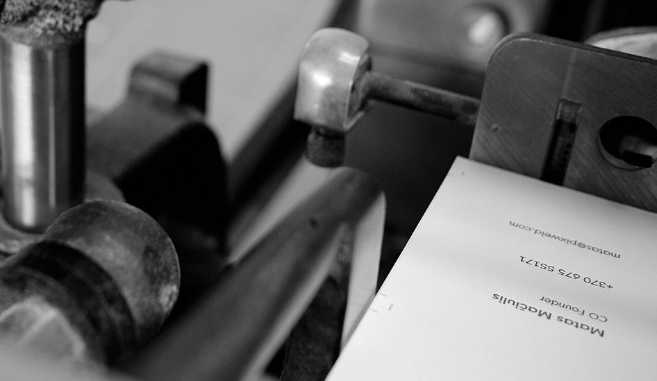
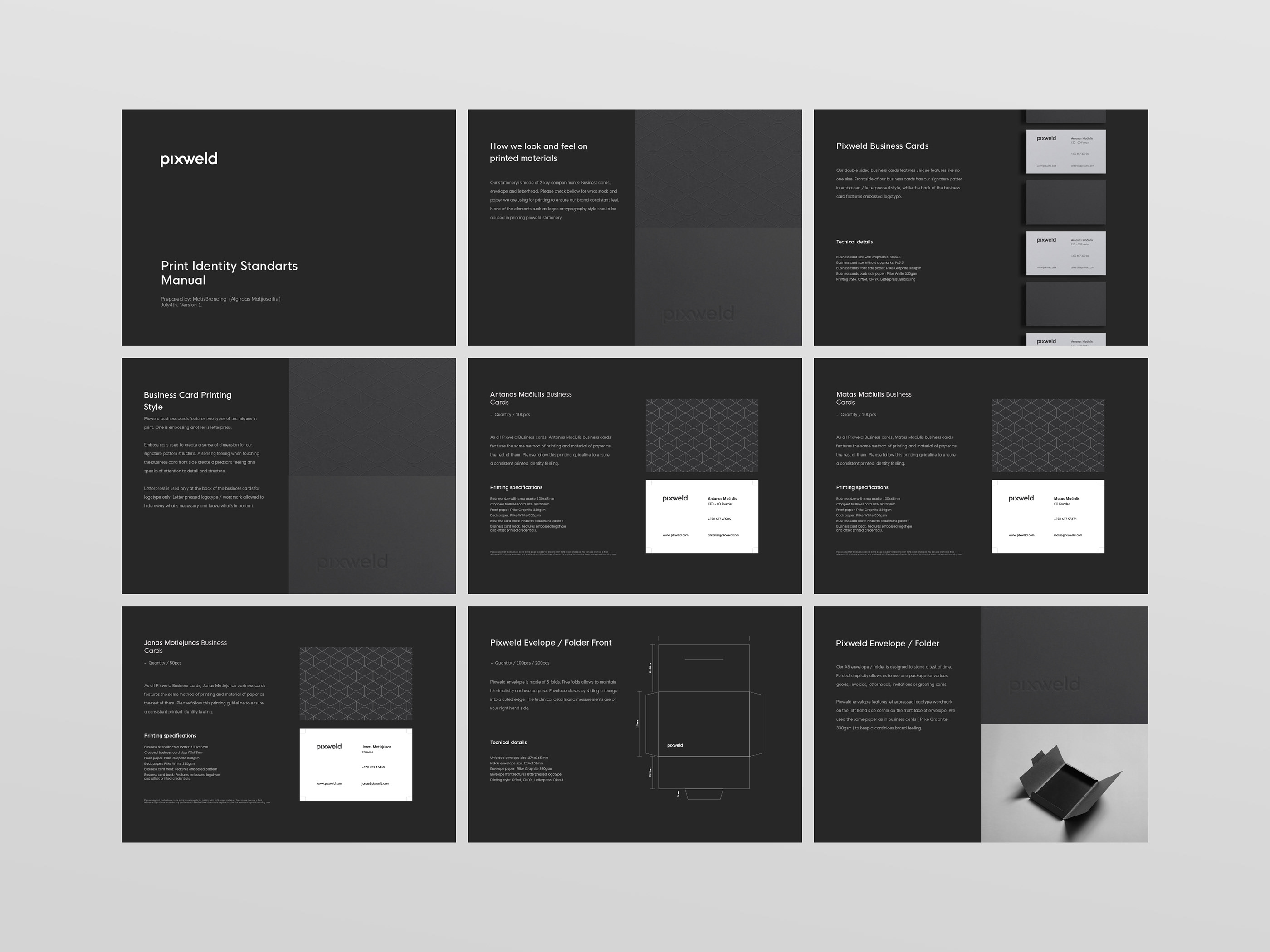
A new corporate identity speaks of minimalism and quality. Using only highest quality materials such as PlikeTM paper, paints we manage to deliver the brand promise through it’s new identity. We use two tone setup to establish clarity and techniques such as letterpress and emboss to give a sense of dimension to the real world, in other words ‘To feel an experience’.

CREDIT
- Agency/Creative: MatisBranding
- Article Title: Pixweld 3D Visualisation Studio Branding – Identity Design
- Organisation/Entity: Agency, Published Commercial Design
- Project Type: Identity
- Agency/Creative Country: Lithuania
- Market Region: Europe
- Project Deliverables: Brand Creation, Branding, Graphic Design, Identity System, Research, Tone of Voice
- Industry: Information


