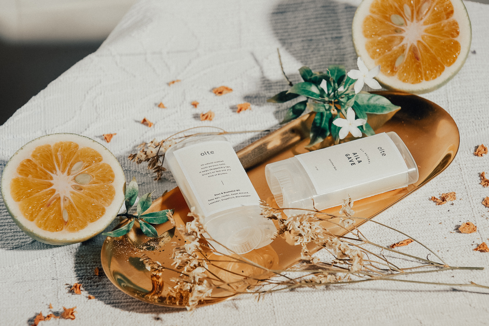
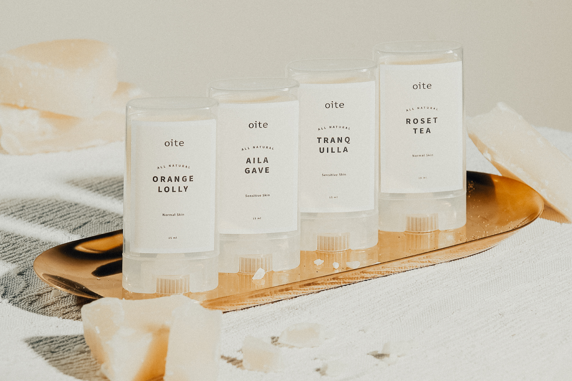
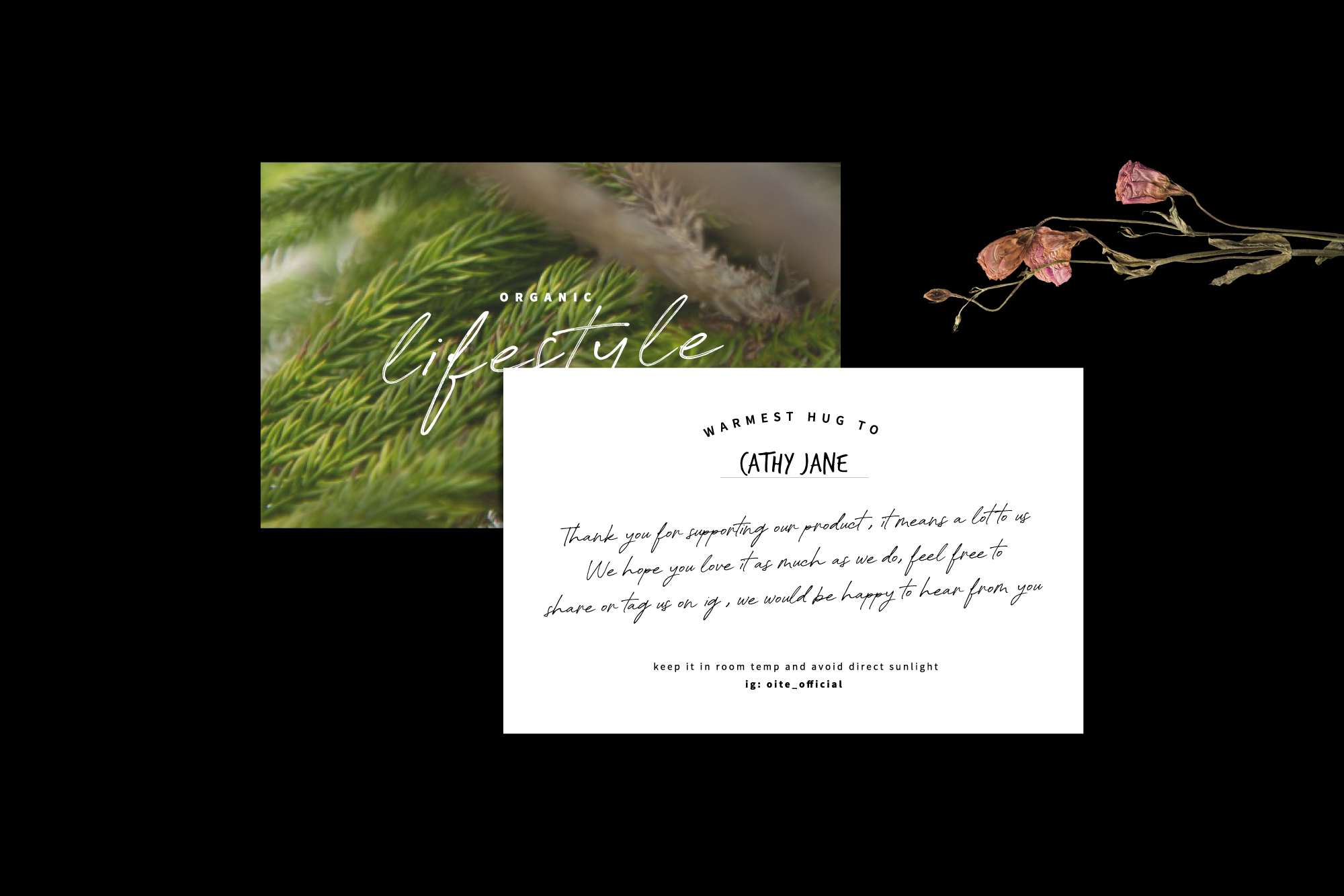
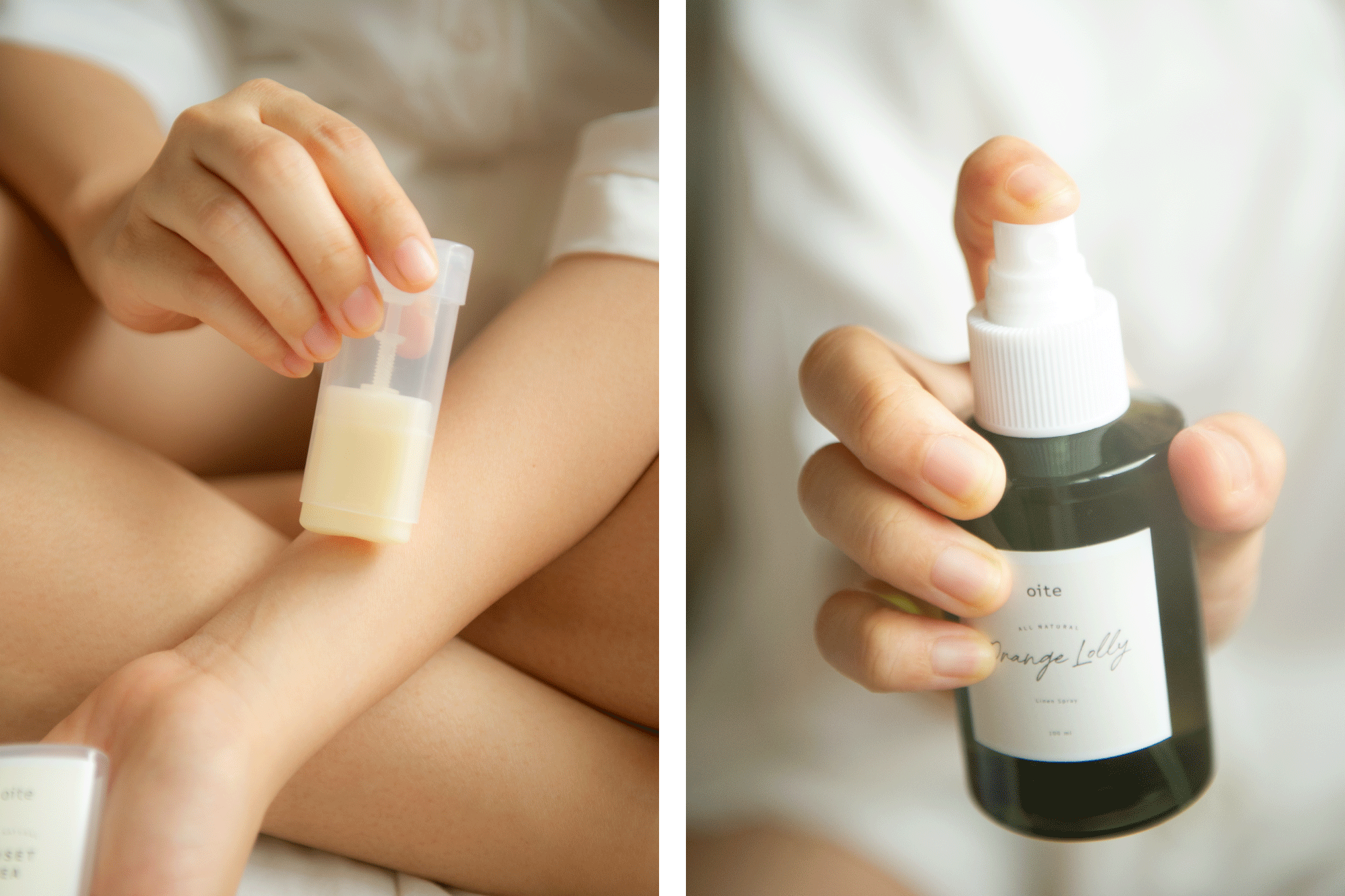
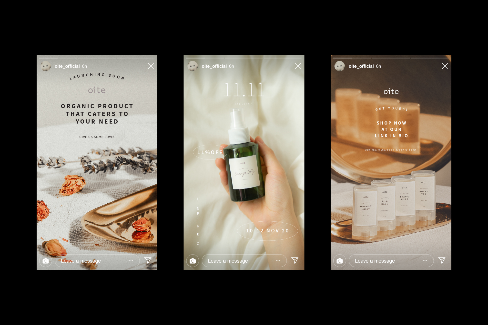
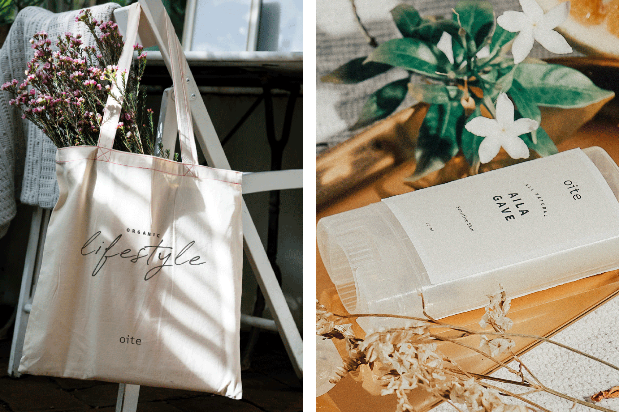
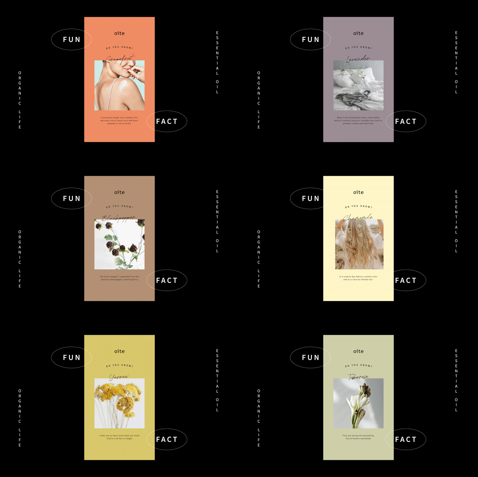
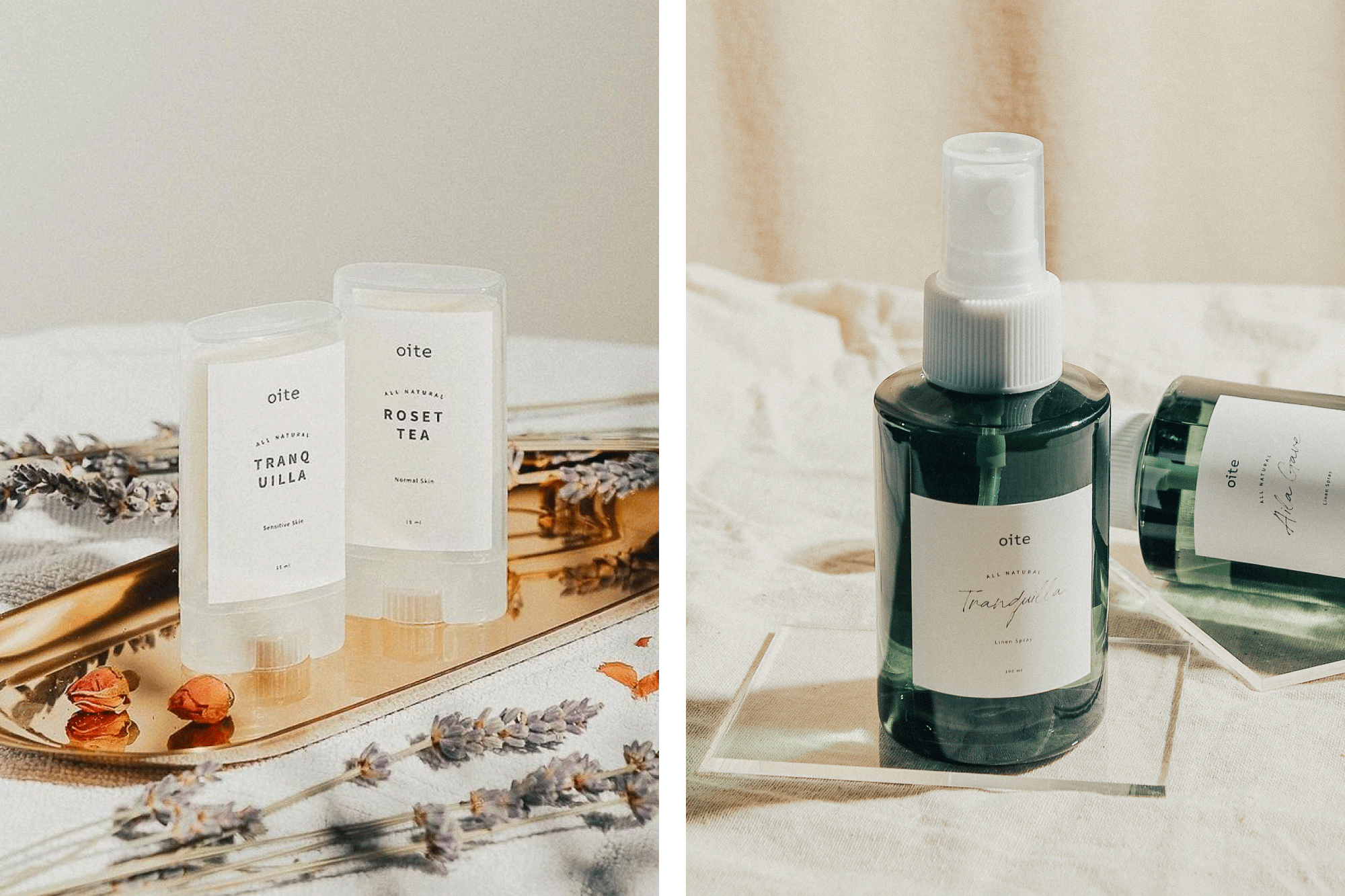
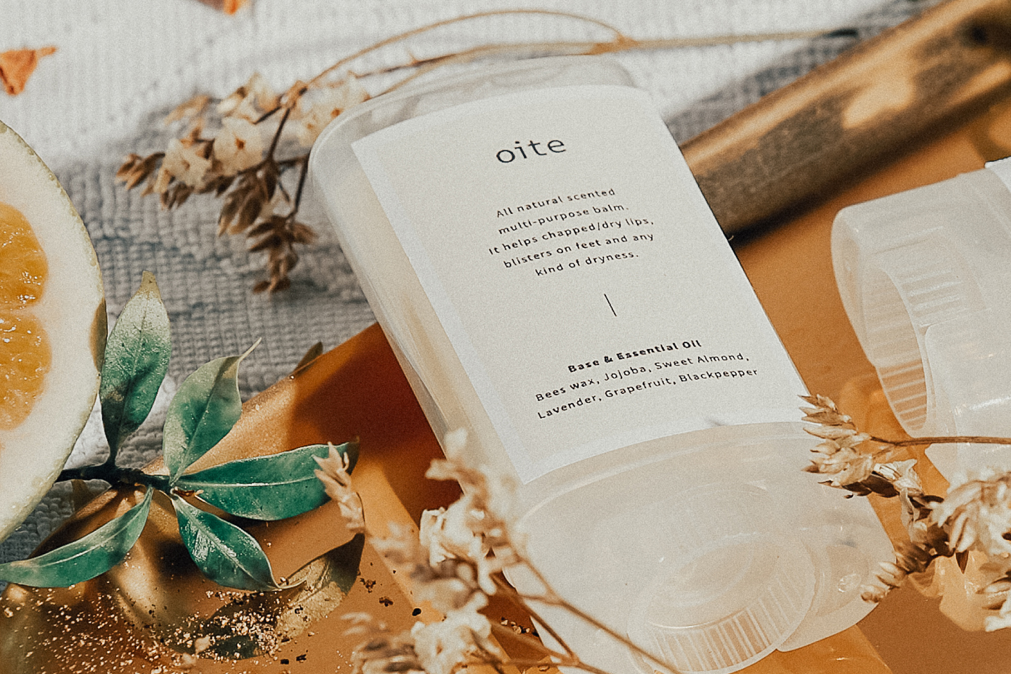
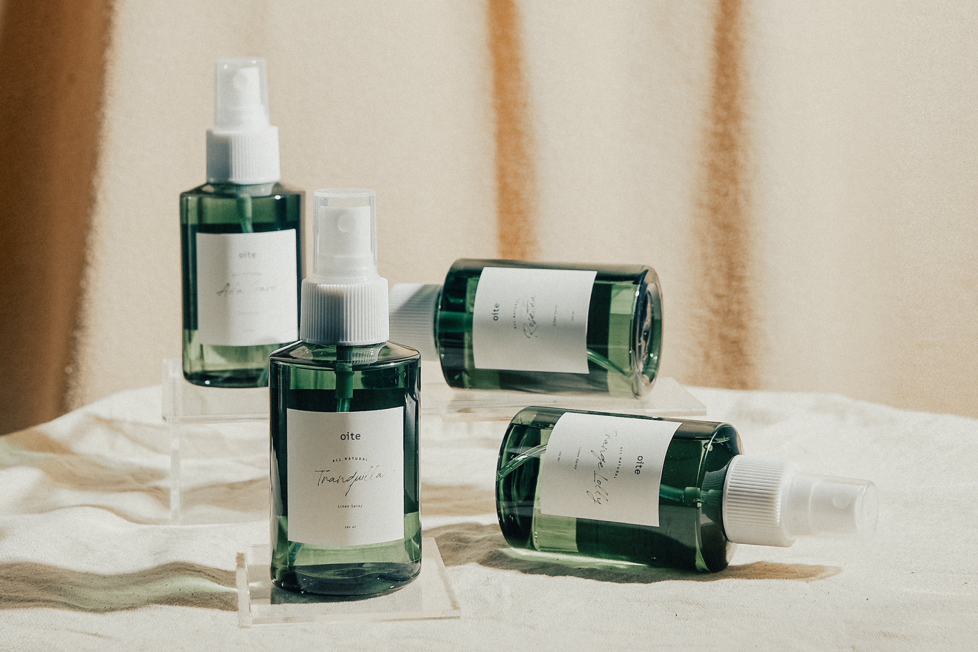
Oite: Japanese words for in, at, on. Inspired by the fascination of multi-purpose product, where it is not only applicable on one particular area, it is also applicable in anytime and at any places, the name Oite was born. Influenced on Oite believes in organic lifestyle, we keep the visual versatile and rustics but yet fresh and modern. Playful layouts and choices of typeface that convey warmth. A hint of personal touch are portray by using hand written elements on certain items.
CREDIT
- Agency/Creative: Pitustudio
- Article Title: Pitustudio Create Brand Identity and Packaging for Oite
- Organisation/Entity: Agency, Published Commercial Design
- Project Type: Packaging
- Agency/Creative Country: Indonesia
- Market Region: Asia
- Project Deliverables: Brand Identity, Brand Naming, Brand Strategy, Graphic Design, Packaging Design, Product Naming
- Industry: Health Care
- Keywords: Oite, Branding, Packaging, Identity, Logo, Skincare, Beauty, Organic, Natural, Lifestyle
FEEDBACK
Relevance: Solution/idea in relation to brand, product or service
Implementation: Attention, detailing and finishing of final solution
Presentation: Text, visualisation and quality of the presentation


