In 2021 Limerick Institute of Technology, in collaboration with Athlone Institute of Technology, formed Ireland’s first cross-regional technological university. We were tasked with developing a comprehensive brand identity system that would effectively communicate across digital, environmental, and print platforms.
An institution with such a wide network of stakeholders required in-depth and far-reaching research. This process took place remotely, allowing us to connect with students, staff, and industry leaders across the country. We conducted numerous workshops, branding sessions and open conversations, in order to better understand the values that people place on educational institutions. This work informed our creative process in developing a brand that could effectively operate in the digital age, while retaining enough flexibility to retain relevance across identified key demographics.
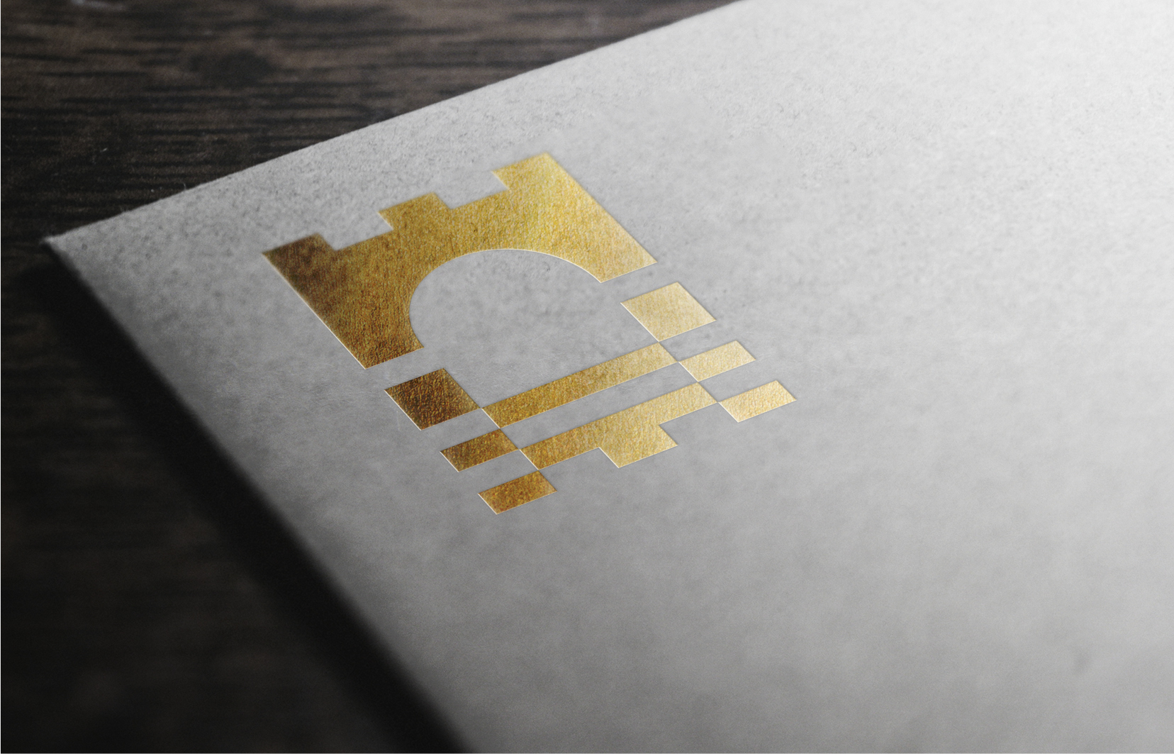
Taking from Irish folklore, we focused on the stories borne from the history of the River Shannon, in which the source of the river, Connla’s well, was said to be a well of wisdom that granted special properties to the water of the river. The two core elements of our emblem are the water of the river, signifying knowledge and information, and the bridge, which communicates structure and access provided by the university. These concepts, working in tandem, reflect the ethos of this new university.
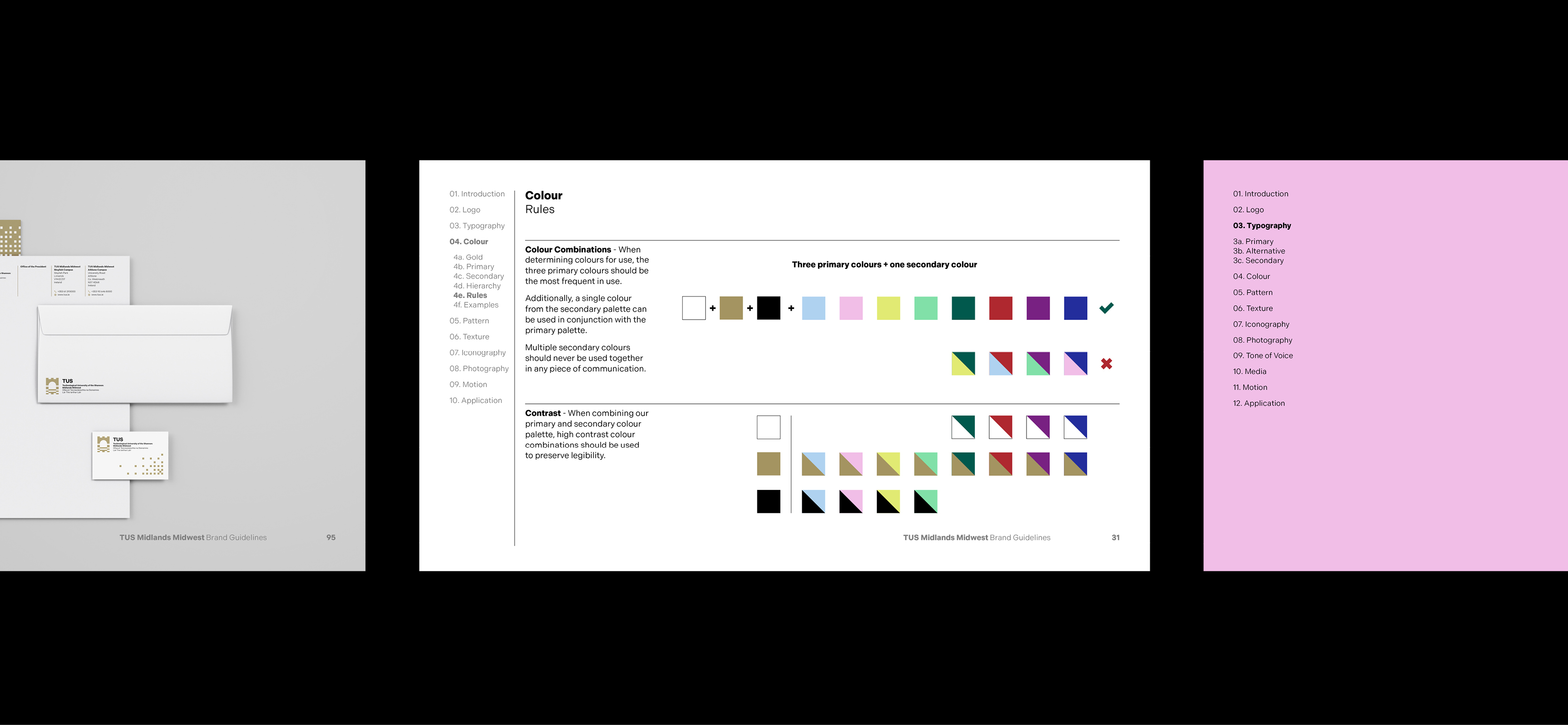
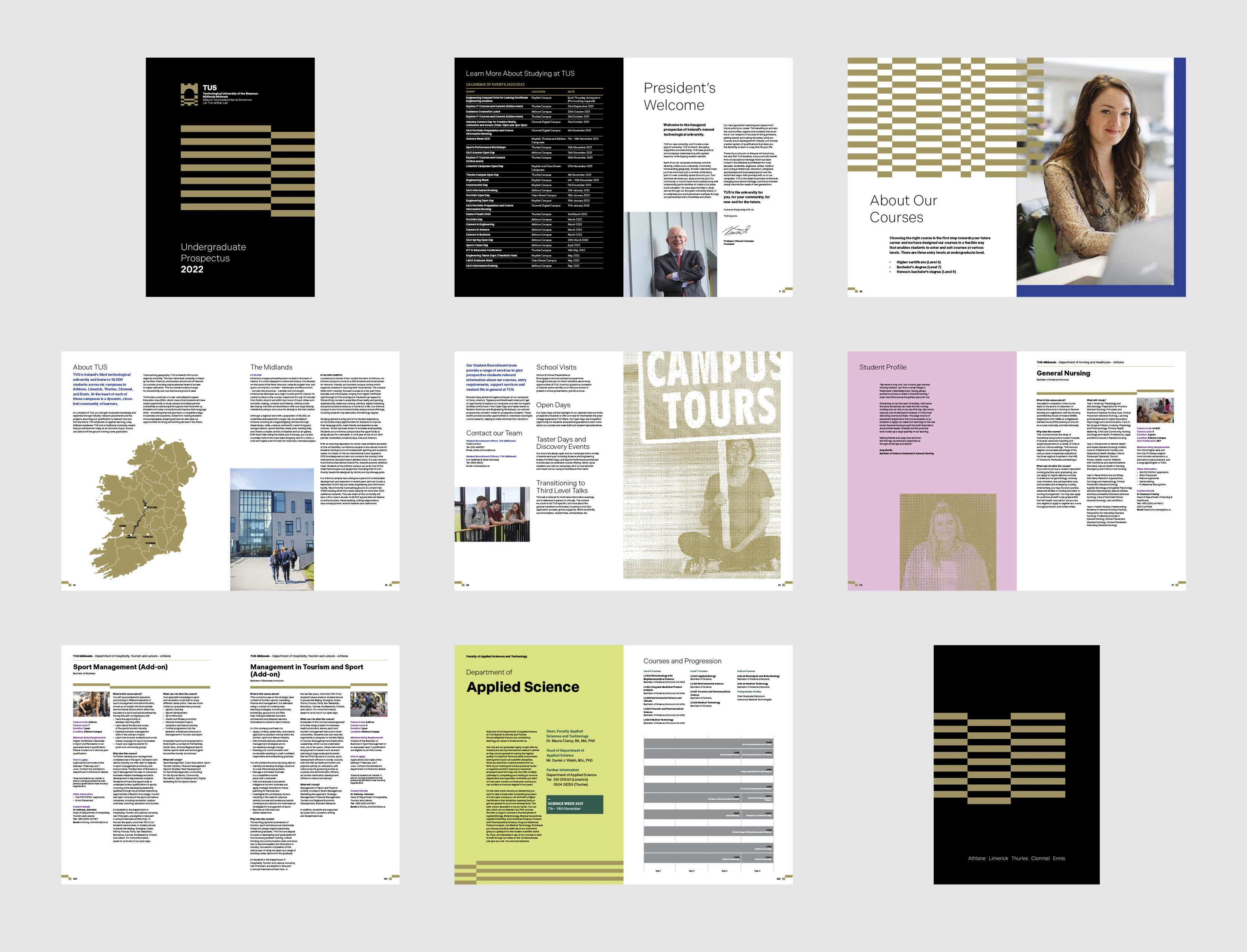
Using gold as a primary colour, and as a key asset in the development of brand recognition is an atypical decision. Gold is not a colour, but rather a material, the appearance of which differs from screen to foil to metallic inks. Gold as a primary colour immediately distinguishes this University from the rest of the domestic playing field. Used with consideration, gold is an elegant, timeless colour that is suggestive of excellence. Combined with our vibrant secondary colour palette, the result is a memorable and acerbic colour treatment that avoids typical tropes associated with gold usage.
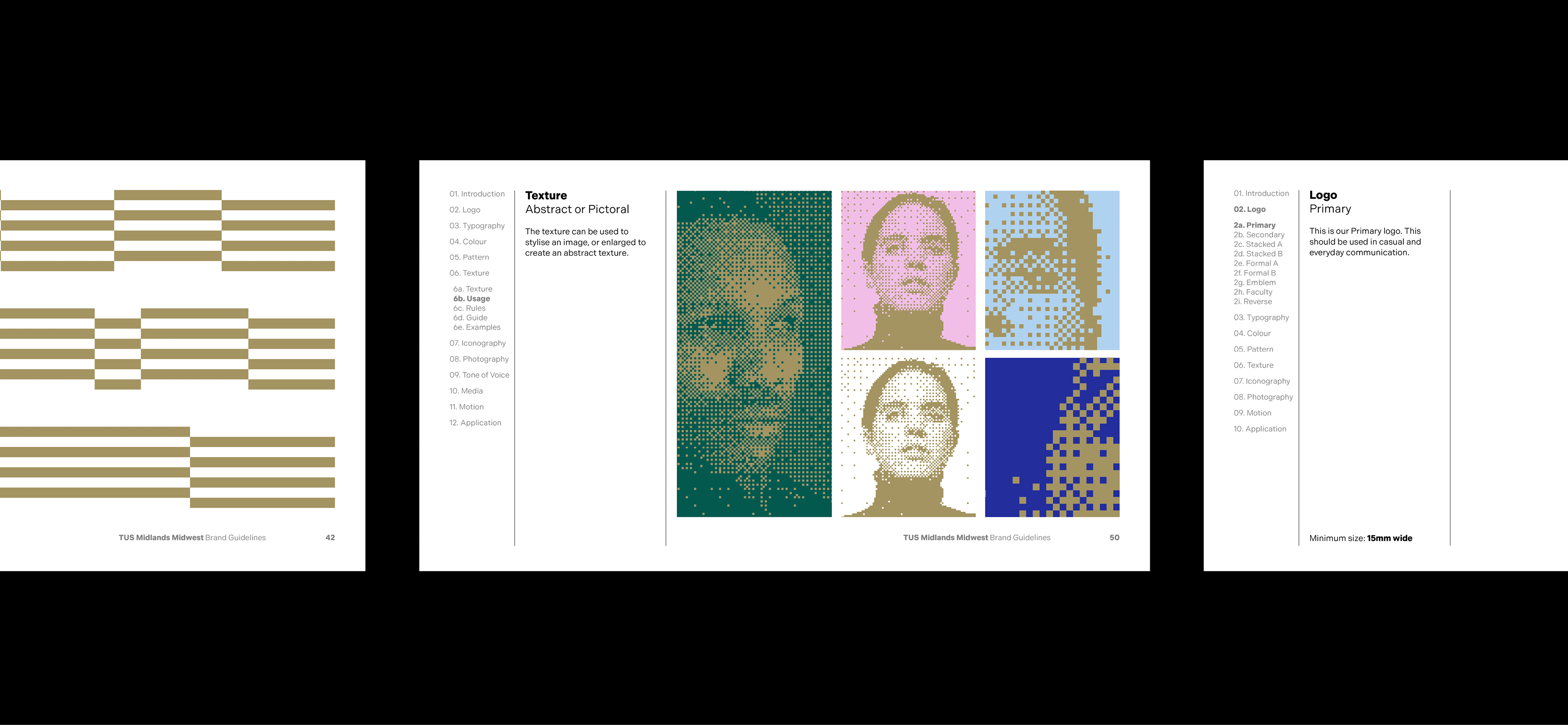
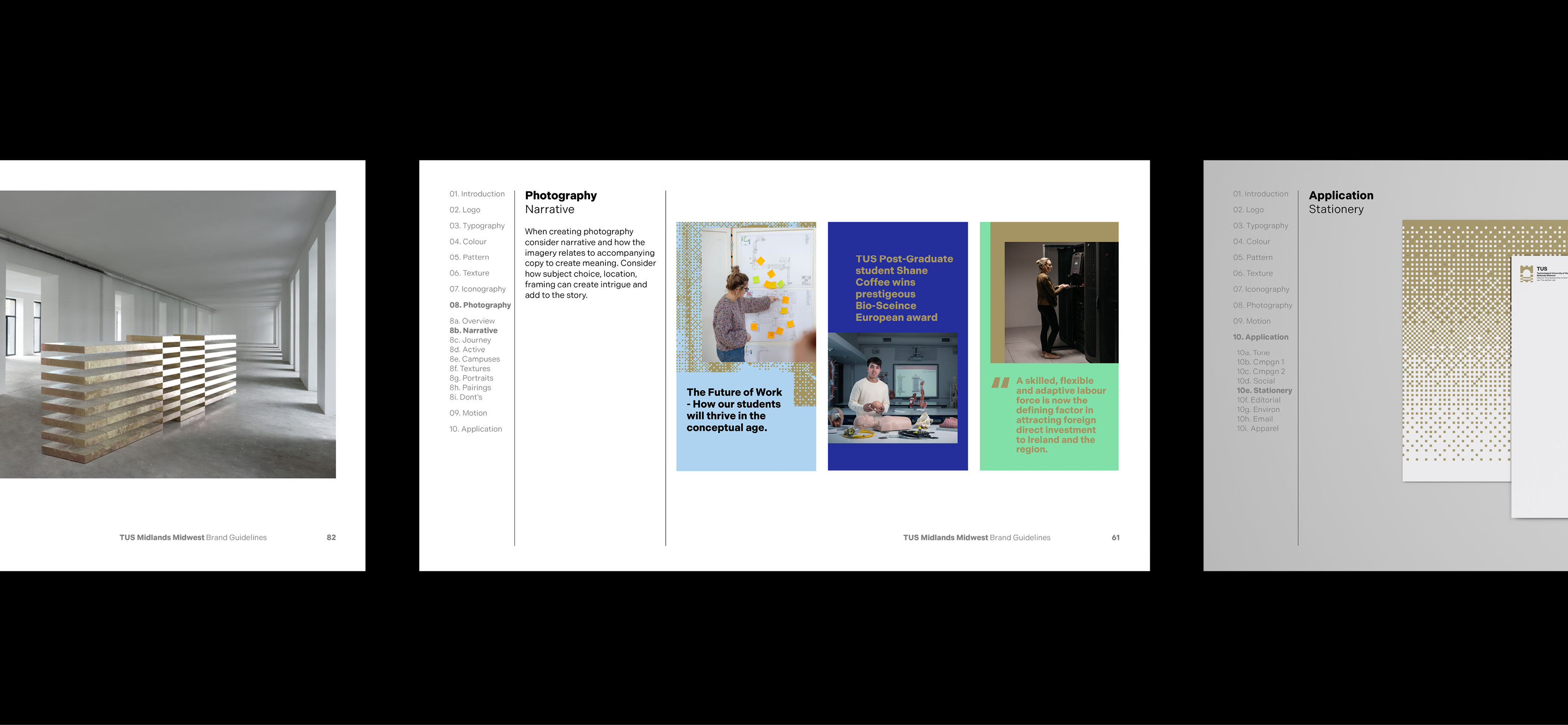
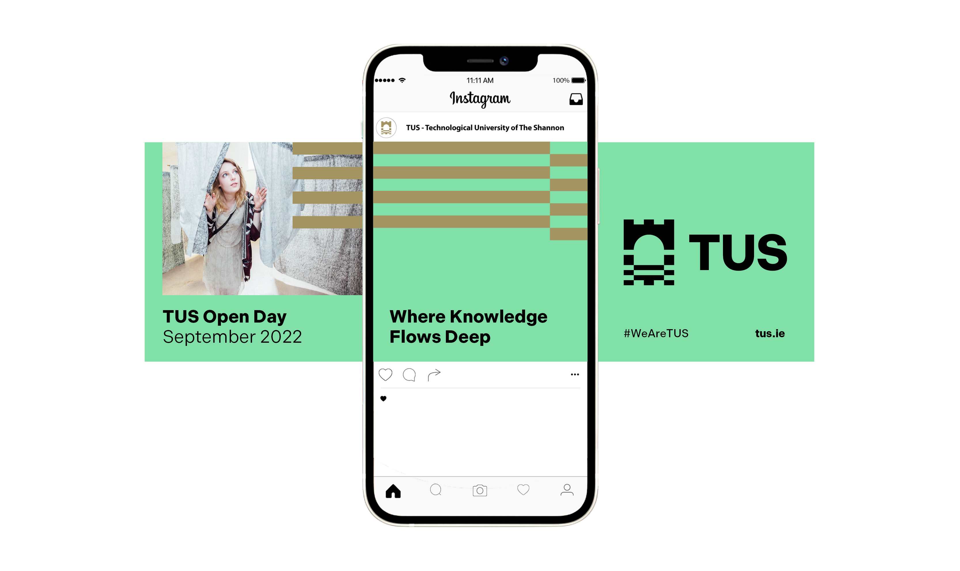
Alongside our core brand elements, we developed expressive brand elements, such as animated patterns, and textures which can be applied to a variety of photography and video. The character of these elements are distinctly digital in nature, in order to imply the forward-focused approach of the University. The adaptability of these elements allows for variety and unexpected moments when in application, keeping the university’s communications eye-catching, disruptive and memorable.
In anticipation of the brand unveiling, we were commissioned to produce a suite of videos demonstrating the brand in action and communicating the core values of the newly established technological university. The defined brand elements naturally adapt to motion design and video application. This results in an effective and recognisable brand presence that can cut through the clutter of social media feeds and connect with young audiences.
This brand was launched on Friday October 1st and is still being rolled out in various print and digital formats.



CREDIT
- Agency/Creative: Piquant Media
- Article Title: Piquant Media Branding for Technological University of the Shannon
- Organisation/Entity: Agency
- Project Type: Identity
- Project Status: Published
- Agency/Creative Country: Ireland
- Agency/Creative City: Limerick
- Market Region: Europe
- Project Deliverables: Brand Creation, Brand Design, Brand Guidelines, Brand Identity, Brand Mark, Design, Editorial Design, Film, Graphic Design, Logo Design, Motion Graphics, Typography
- Industry: Education
- Keywords: Techological, University, Shannon, Ireland, Brand, Education, Motion Graphics
-
Credits:
Head of Branding: Hugh Heffernan


