


The Challenge
Our task was to design packaging for the Wine Melody range of affordable wines—packaging that would instantly convey the brand’s essence: lightness, musicality, and emotional appeal. The key objective was to create a design that stands out on the shelf, evokes warmth and likability, clearly differentiates between varietals, and yet maintains a cohesive visual identity. It was essential not to overload the label, but to make it expressive and “speaking” even without words.
The Solution
The visual concept is built around the brand’s central metaphor: wine as music, a mood that plays in every glass. We created a label that feels emotional yet visually light—clear, expressive, and easy to read.
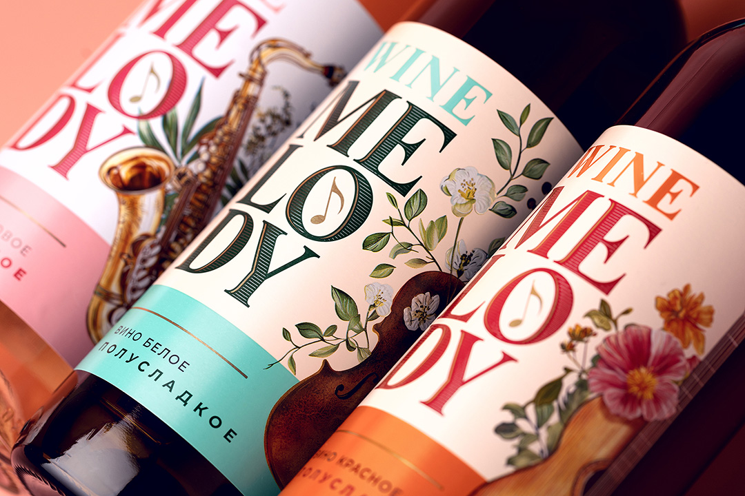
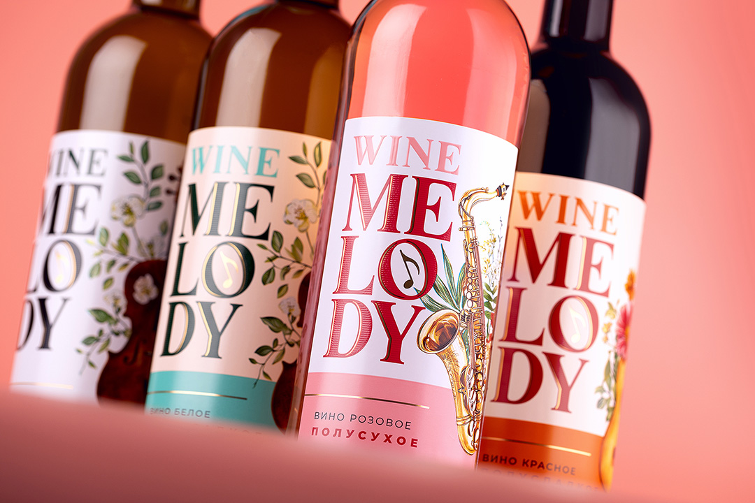
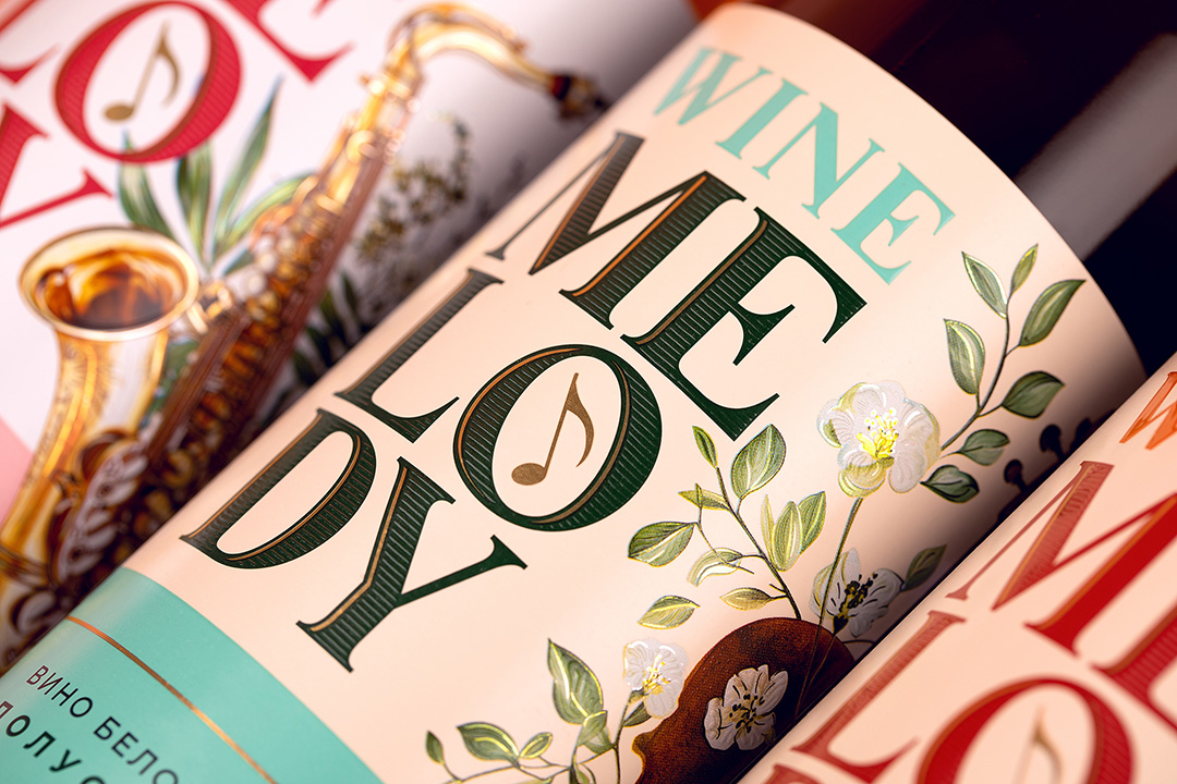
At the heart of the design is bold, rhythmic typography: the large WINE MELODY logo, set in a composition that echoes musical cadence. Inside the letter “O,” we placed a golden musical note—a minimal yet memorable symbol that reinforces the product’s lyrical character.
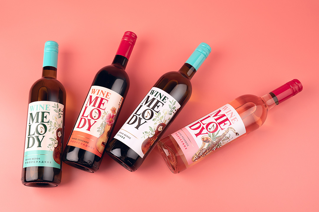
Each varietal in the line received its own color palette and featured musical instrument, creating both a strong emotional impression and intuitive visual navigation:
– The white wine is presented in fresh turquoise tones with a violin, evoking lightness and purity.
– The rosé features soft pink shades and a saxophone, suggesting romance and a gentle mood.
– The red wine uses a rich, warm palette with a guitar and bright floral accents, symbolizing intensity and passion.
The balance between typography and illustration, between clean background and vivid detail, gives the label a sense of airiness—crucial for this category of light still wines. The packaging works on both an emotional and functional level, creating not just a look but a feeling.
The Result
The final design truly “plays” on the shelf—bright, expressive, and memorable. Each varietal feels like a distinct melody, yet together they form a harmonious, unified line. With clear visual cues and thoughtful storytelling, the packaging speaks directly to the consumer, making the brand easy to recognize and naturally likable from the very first glance.
CREDIT
- Agency/Creative: PinotAgency
- Article Title: PinotAgency Turns Wine into Music with a Rhythmic Identity for Wine Melody
- Organisation/Entity: Agency
- Project Type: Packaging
- Project Status: Published
- Agency/Creative Country: Russia
- Agency/Creative City: Санкт-Петербург
- Market Region: Asia, Europe
- Project Deliverables: Brand Creation, Brand Design, Packaging Design
- Format: Bottle
- Industry: Food/Beverage
- Keywords: label, label design, wine, wine label, wine design,
-
Credits:
Creative Director: Dmitrii Ivancenco


