


Task.
To develop a distinctive and emotionally resonant visual identity for a premium Armenian brandy aged 10 years, one that would not only reflect the exceptional quality of the spirit but also pay homage to the country’s rich historical and cultural legacy. The inspiration behind the concept was Queen Tamara — a powerful and revered female figure who embodies nobility, dignity, and timeless strength. The challenge was to bring this narrative to life in a way that would feel both authentic and relevant for today’s global spirits market.
Solution
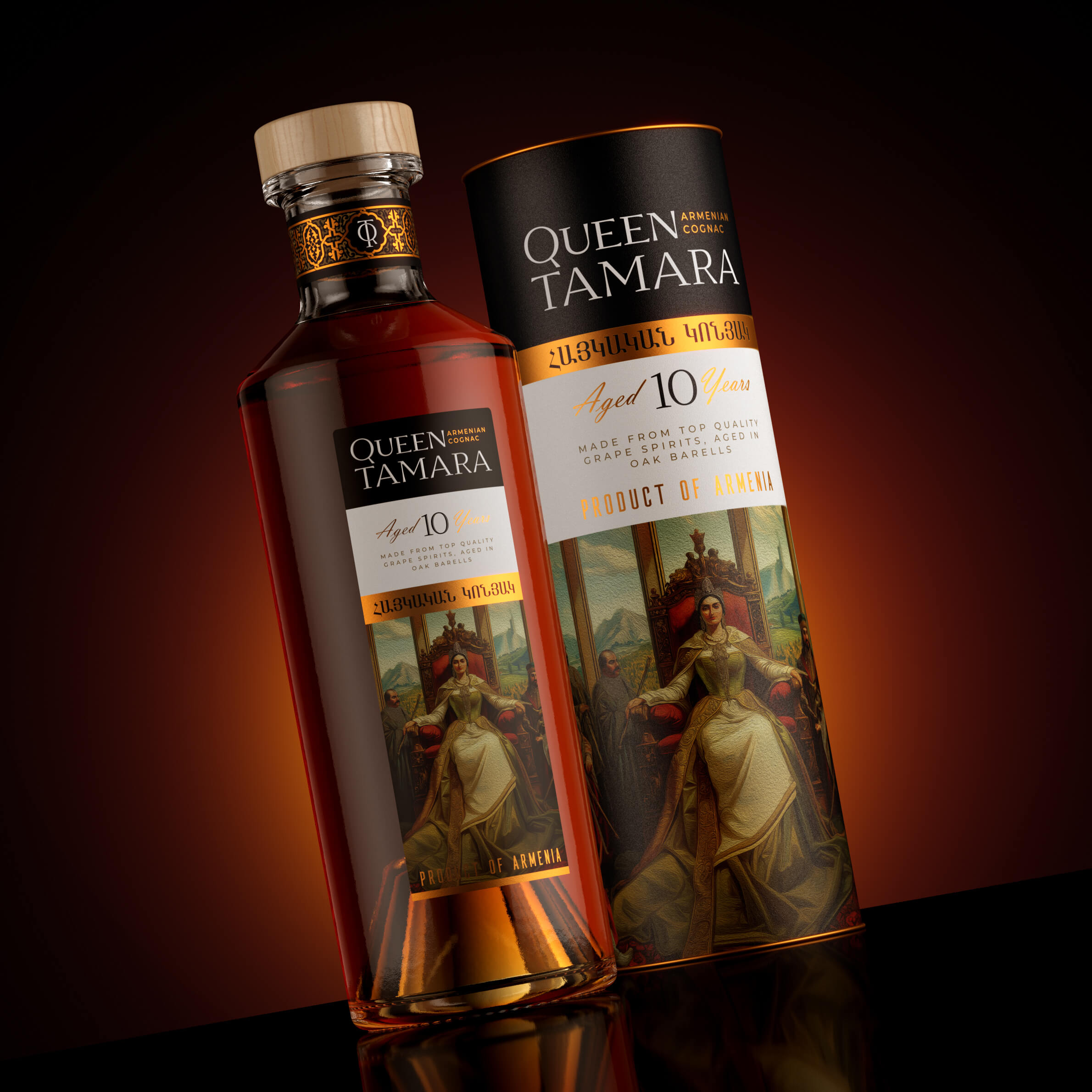
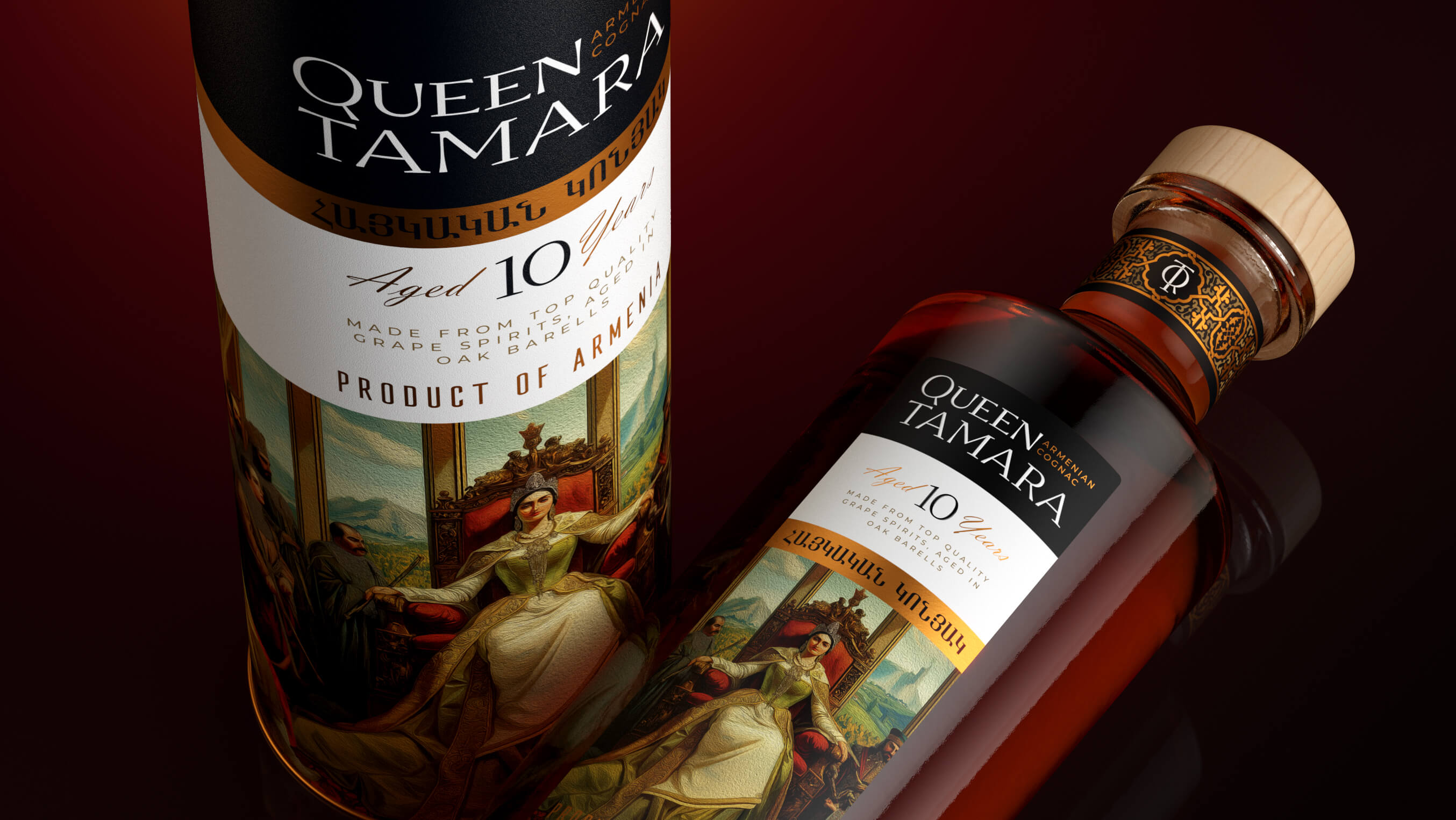
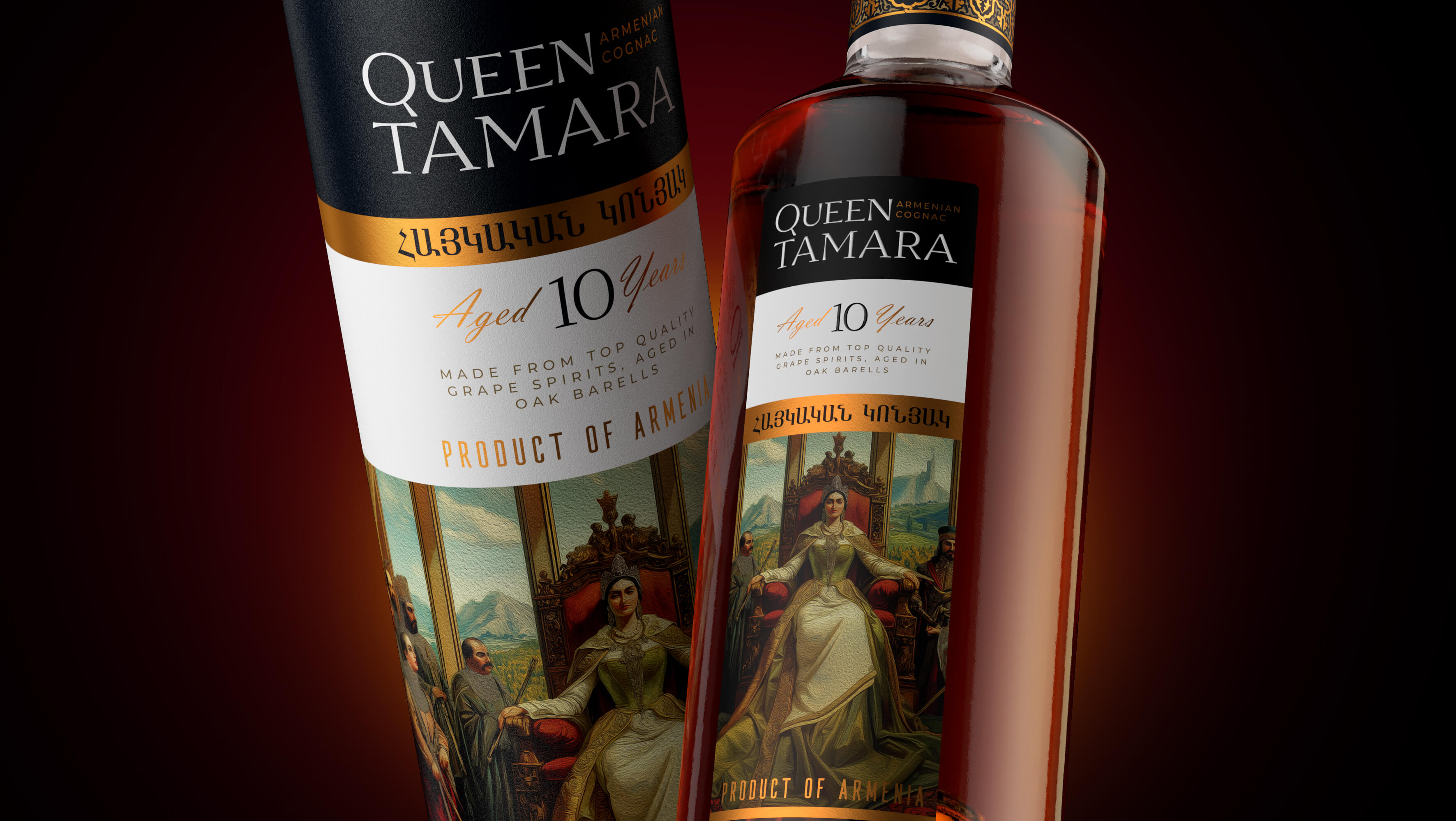
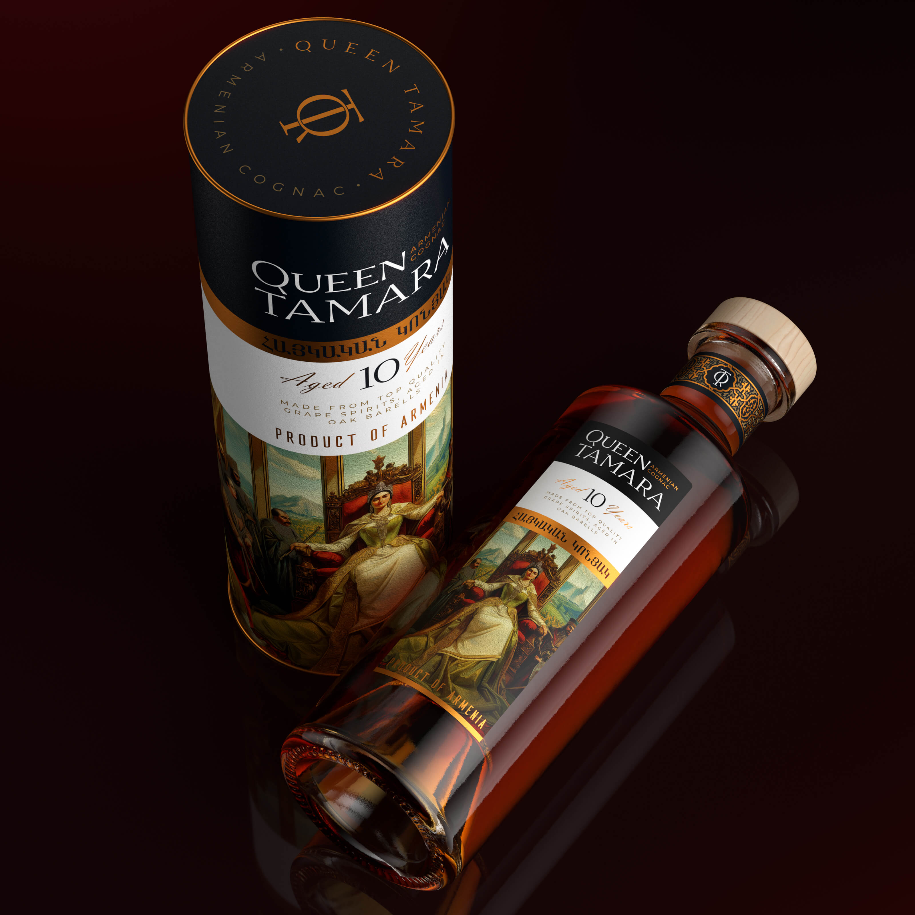
At the heart of the visual concept is the image of Queen Tamara — serene yet commanding, seated gracefully on her throne. This central artistic illustration became the anchor point of the packaging, featured prominently on both the label of the bottle and the accompanying gift tube. Through this image, the design immediately communicates a sense of legacy, craftsmanship, and cultural pride.
The packaging harmoniously blends tradition and modernity. The deep black background represents depth, maturity, and strength — key characteristics of a well-aged brandy. In contrast, accents of red-tinted gold speak to opulence, aged richness, and regal heritage. The color palette was carefully chosen not just for aesthetic impact, but for its symbolic resonance with the story of Queen Tamara and the aged character of the brandy itself.
Typography plays a vital role in reinforcing the premium positioning. The name Queen Tamara is set in a sophisticated serif font, combining classic elegance with contemporary clarity. The inclusion of both English and Armenian text reinforces the authenticity of origin while positioning the product confidently for international markets.
Additional tactile and decorative elements complete the impression of a high-end, collectible product. A natural wooden cork embossed with the brand’s mark lends a handcrafted feel, while the neck of the bottle is adorned with a collar bearing traditional Armenian ornamental motifs — a respectful nod to national aesthetics. The result is packaging that not only tells a story but feels like a treasure.
Results
The final design for Queen Tamara stands apart from conventional Armenian brandy packaging, introducing a bold and dignified female image into a category historically dominated by generic symbolism. It transforms a bottle of brandy into a cultural artifact — something that carries meaning, memory, and status.
The packaging elevates the perception of the brand far beyond the typical. It creates strong shelf impact while also holding deep emotional value for consumers familiar with Armenian heritage. For international audiences, it serves as a beautifully crafted invitation into the world of Armenian brandy — authentic, powerful, and unforgettable.
Queen Tamara is not just a brandy. It is a story bottled in amber, sealed with dignity, and crowned with heritage.
CREDIT
- Agency/Creative: PinotAgency
- Article Title: PinotAgency Redefines Armenian Heritage With The Queen Tamara Brandy Identity
- Organisation/Entity: Agency
- Project Type: Packaging
- Project Status: Published
- Agency/Creative Country: Russia
- Agency/Creative City: Санкт-Петербург
- Market Region: Asia, Europe
- Project Deliverables: 3D Design, Brand Creation, Design, Packaging Design
- Format: Bottle, Tube
- Industry: Food/Beverage
- Keywords: cognac, alcohol design, PinotAgency, label deign, Armenian
-
Credits:
Creative Director: Dmitrii V Ivancenko


