


Pinklab.Co is a proud beauty brand that believes that nature is the solution to every skin problem, especially for women. One of its most popular products is the Dead Sea Mask, which is sourced from the finest quality Dead Sea for the benefit of beautiful skin.
Over time, Pinklab.Co experienced the challenge of lacking brand strength in a visual identity that represented Pinklab Co as a whole. Where this makes Pinklab.Co easily rivaled by other brands even with lower selling prices.
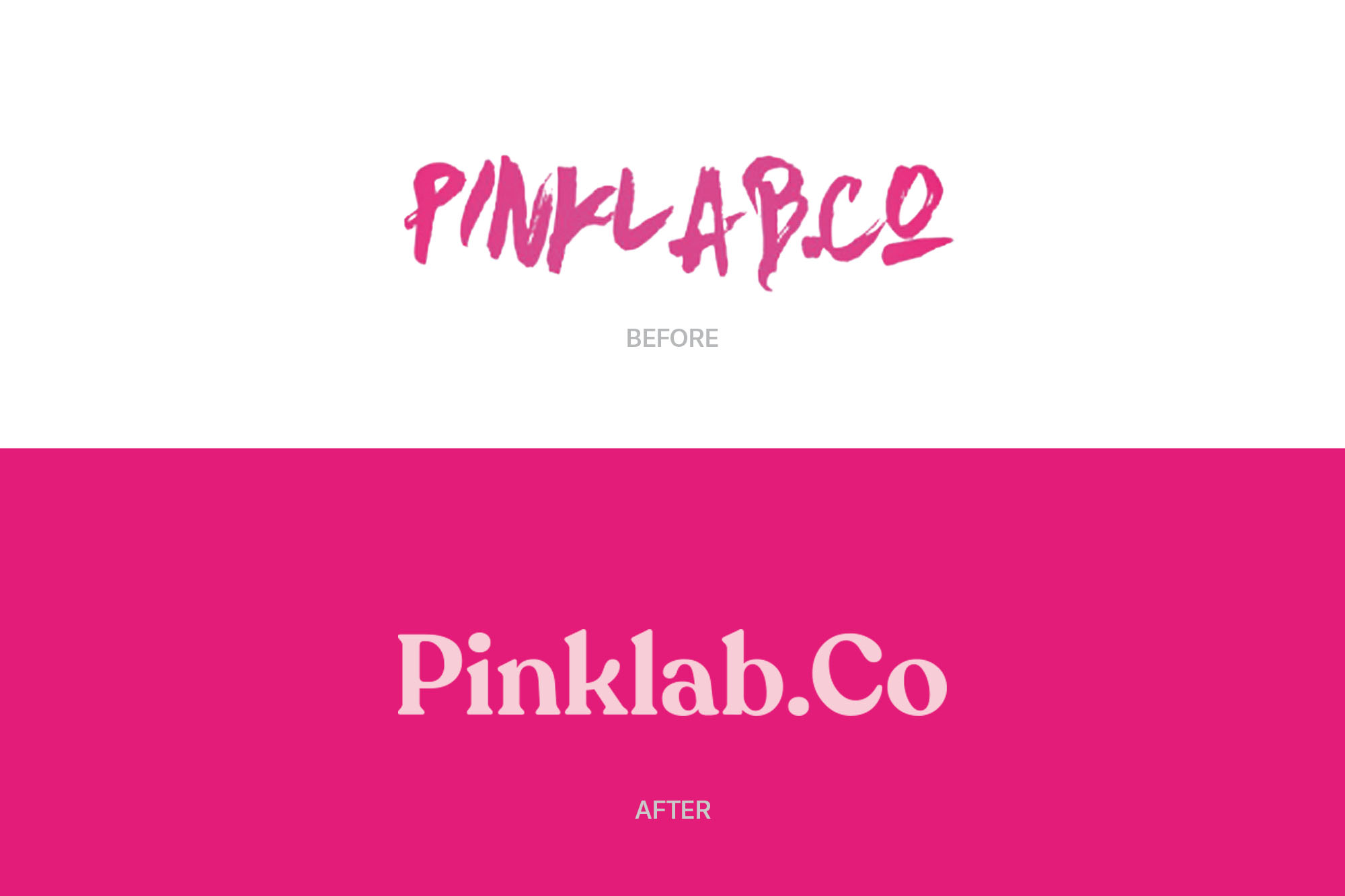
With a vision to expand its market reach internationally, Pinklab.Co wanted to turn its basic identity into the brand’s main foothold. An identity that is easily identified by customers, and strengthens the brand image. The solution we provide is to redesign the Pinklab.Co logo as the identity needs to get simplified, easy to read, and represent the character of the brand personality.
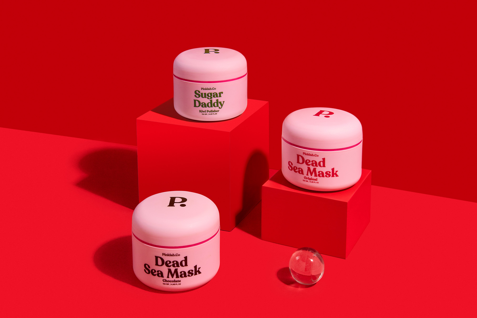
Widarto Impact redesigned the entire brand identity, visual strategy from the logo to all lines of packaging design. The goal of the rebranding that our team did was to strengthen the brand identity to make it easier for Pinklab.Co to connect with its target audiences.
The Challenge
Over time, Pinklab.Co experienced a lack of strength in its brand identity. Their identity had not been able to represent their vision, and was visually weak and unrecognizable.
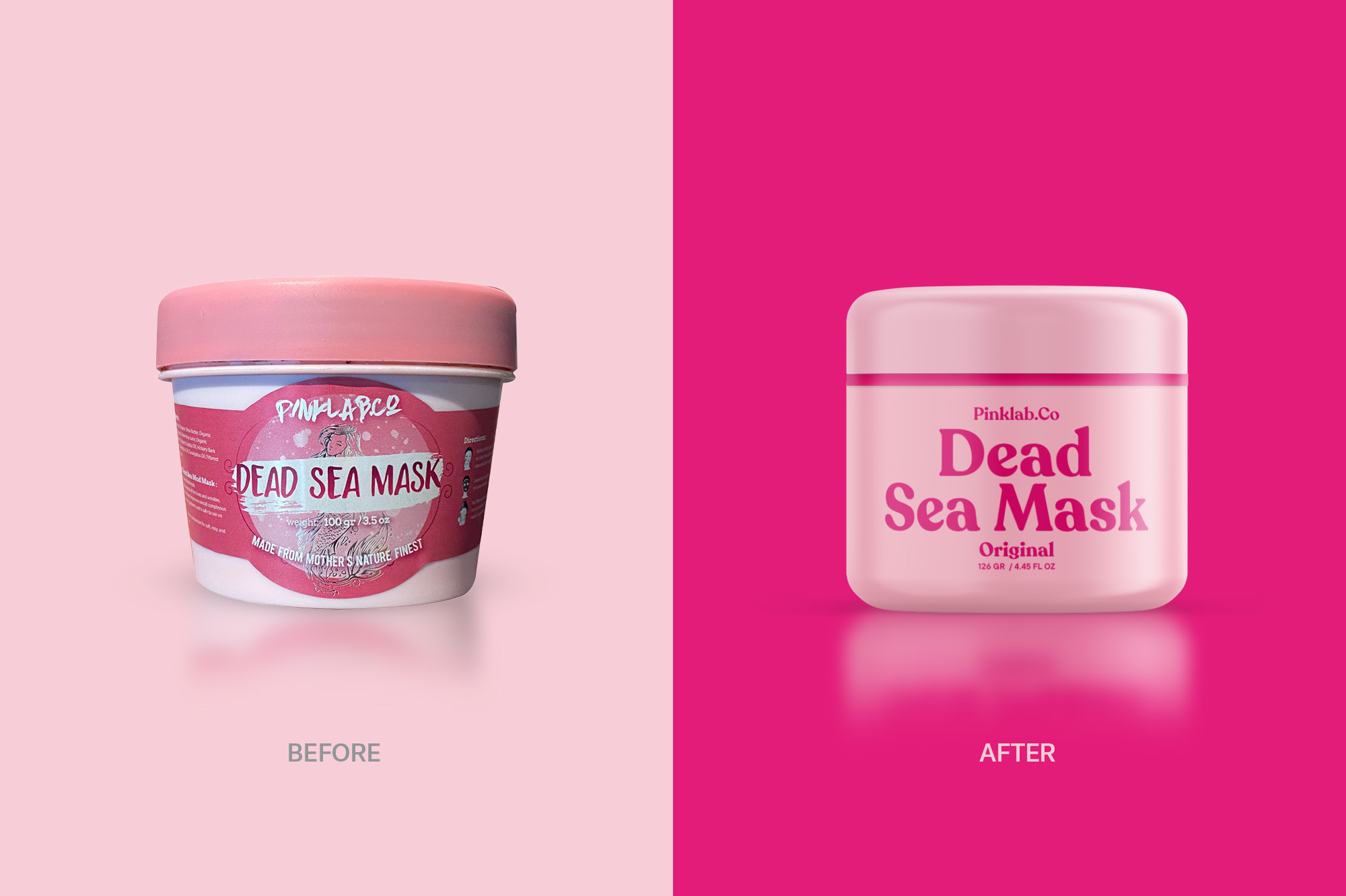
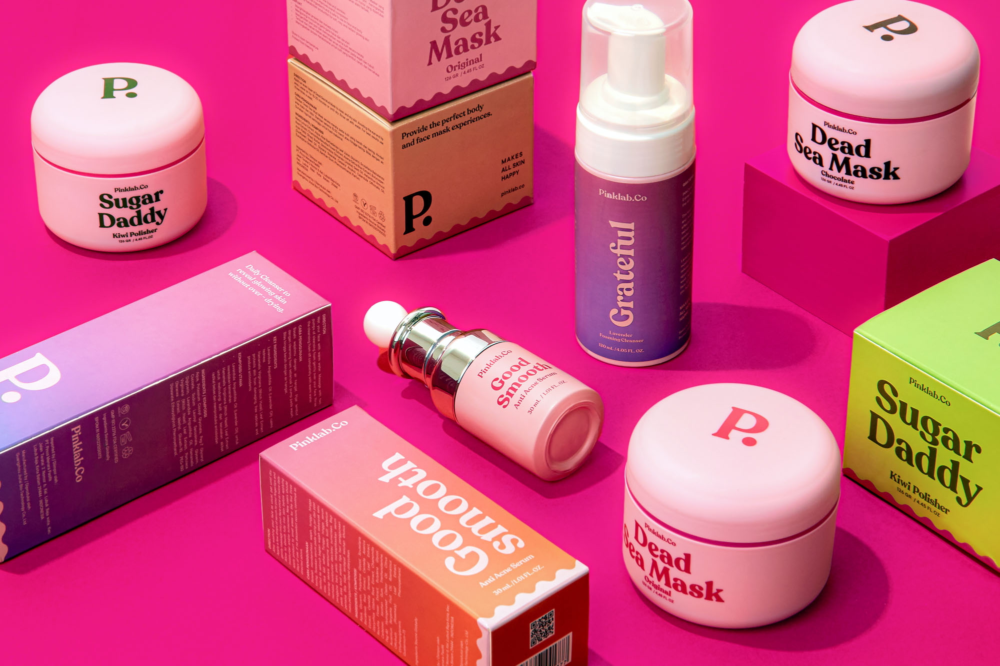
This also affected the overall packaging design line. Pinklab.Co wants to convey its products as premium products made from natural ingredients.
In terms of visual communication on social media, Pinklab.Co needs a new design style that has more consistency and unity in order to represent Pinklab.Co’s overall brand personality.
The Solution
We developed Pinklab.Co’s identity from the brand personality into a basis for a strong identity, which Pinklab.co’s identity must have a sense of; feminine, natural (based on ingredients), simple, youthful, and premium. For the logo, we chose a typeface that is dynamic, familiar yet fresh and modern. This is so that Pinklab.Co can be more flexible in every visual communication of the brand.
This identity will strengthen Pinklab.Co as a whole as a brand that provides the best quality, natural, and attractive products for the target audience.
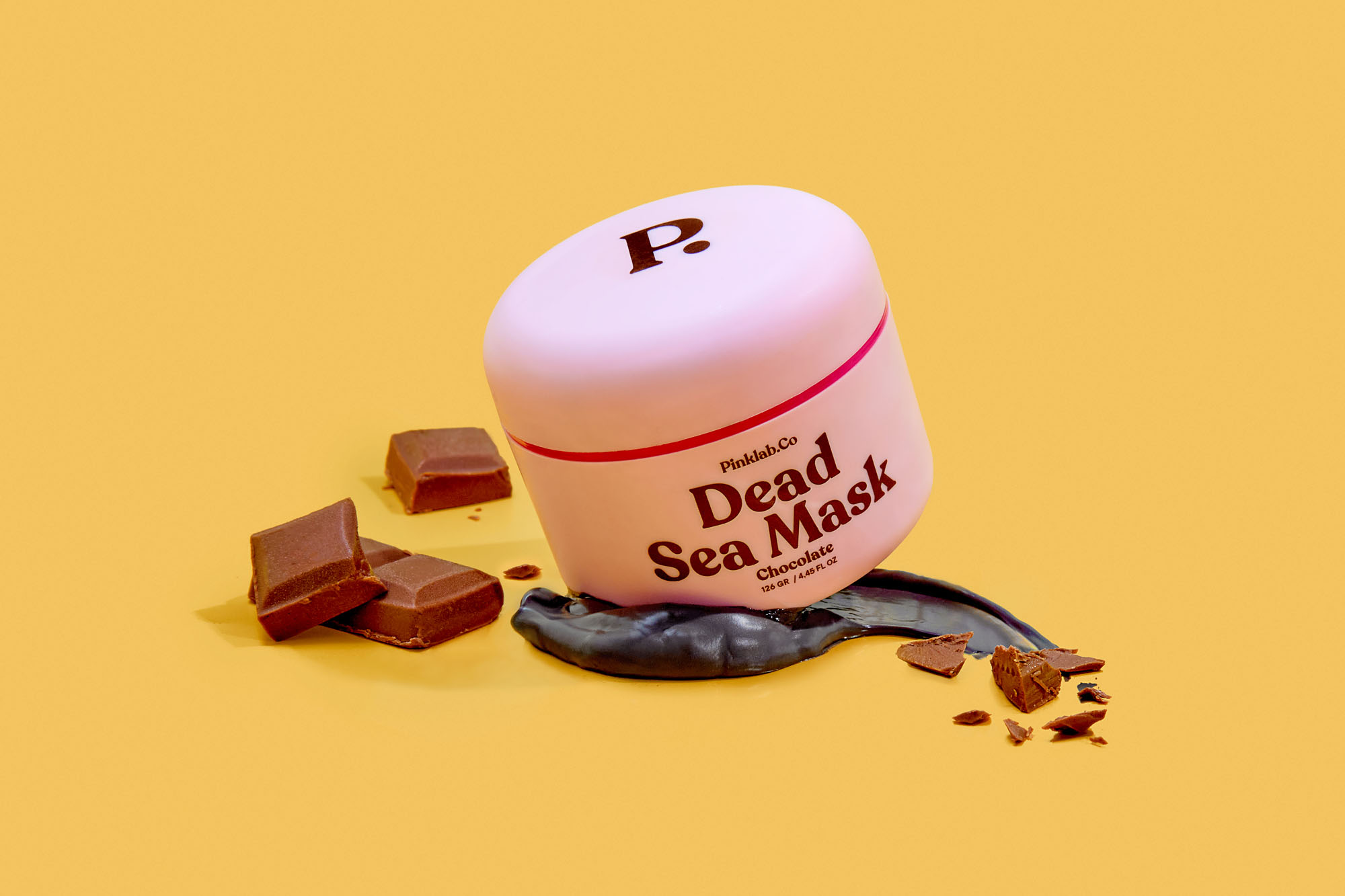
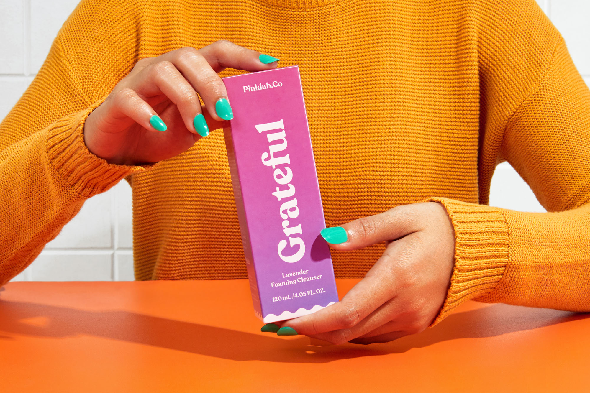
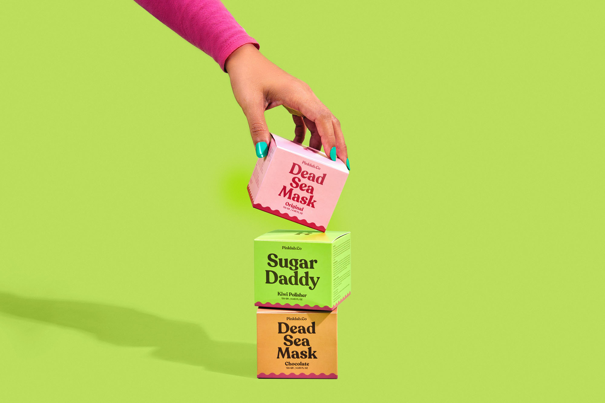
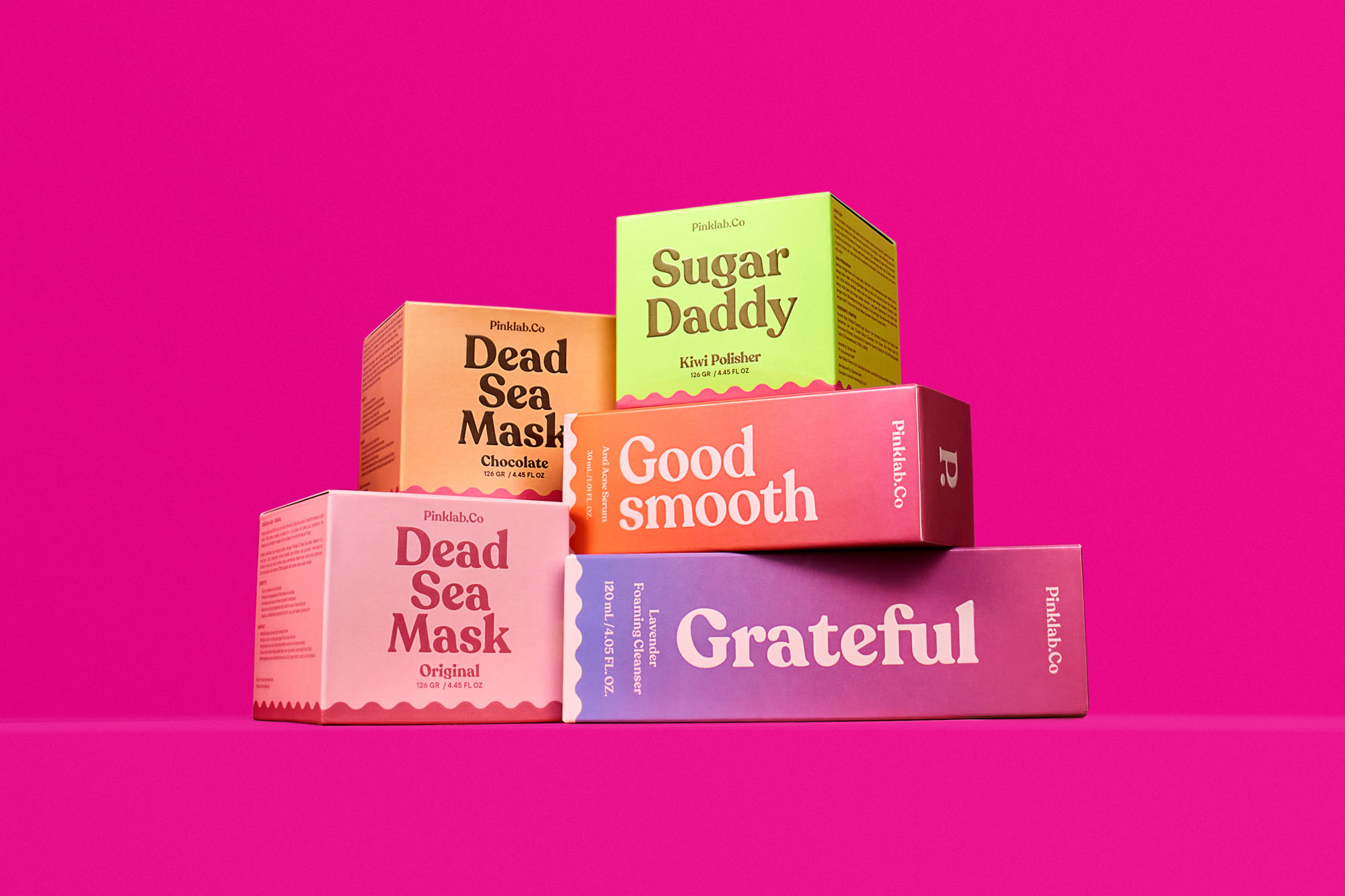
This simplification is also applied to Pinklab.Co’s product packaging line. Based on typography-style design, this makes it easier for Pinklab.Co to connect with the target audience, simple and clear.

CREDIT
- Agency/Creative: Widarto Impact
- Article Title: Pinklab.Co Rebranding Created by Widarto Impact
- Organisation/Entity: Agency
- Project Type: Packaging
- Project Status: Published
- Agency/Creative Country: Indonesia
- Agency/Creative City: Trenggalek
- Market Region: Asia
- Project Deliverables: Brand Guidelines, Brand Identity, Identity System, Logo Design, Packaging Design
- Format: Box, Jar, Tube
- Substrate: Plastic, Pulp Carton
- Industry: Health Care
- Keywords: Skincare Branding, Skincare Brand Identity, Skincare Packaging Design, Branding Agency New York, Branding Agency London, Branding Agency Jakarta, Branding Agency Surabaya, Branding Agency Riyadh, Branding Agency Dubai
-
Credits:
Creative Director: Eko Widarto
Graphic Designer: Renzy Rohmatillah
Photographer: Febriarta


