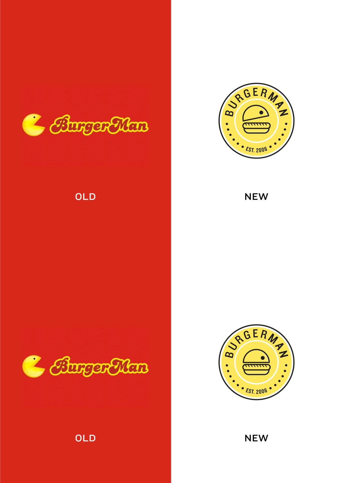
BurgerMan, Chennai’s first and favourite burger brand, was known for its iconic Pac-man faced red kiosks which dotted the city in 2006. What started off as small kiosks sprung up to 130+ outlets within 5 years. With over 5 million burgers sold in a span of 8 years across 8 cities, BurgerMan was the most loved excuse for a treat. The brand started off as a college project for its entrepreneur who used the iconic arcade game as the face for his playful and youthful brand.
A decade later, the brand decided to level up. They reinvented themselves by introducing healthy grilled burgers and eliminating fries and soda. The new improved BurgerMan decided to take a stance on conscious healthy eating and created a sustainable brand that was environment friendly. Their target audience remained the same, college going millennials and Gen Z-ers who couldn’t afford very expensive meals. Growing up with this iconic brand we wanted to retain its playful Pac-man characteristics which made it so distinct in the market and still give it an edge with today’s lingo that would appeal to the younger audience.
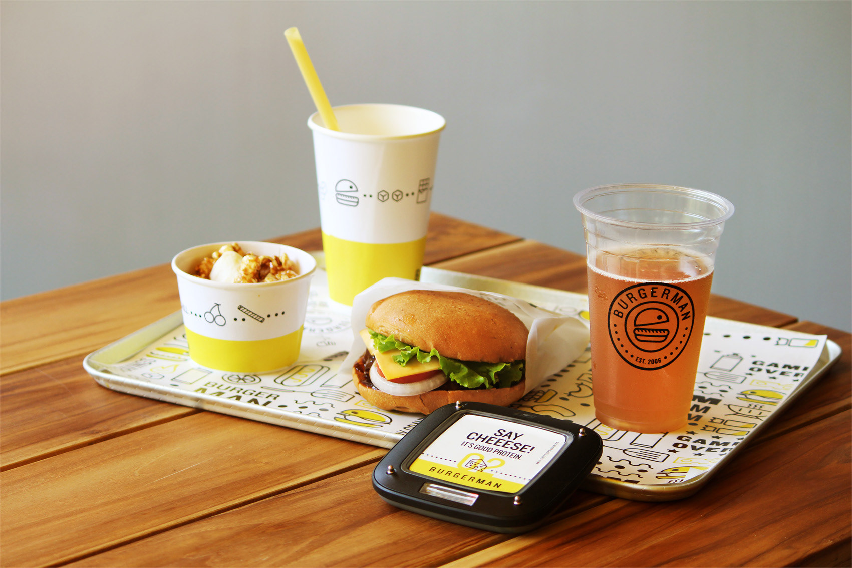
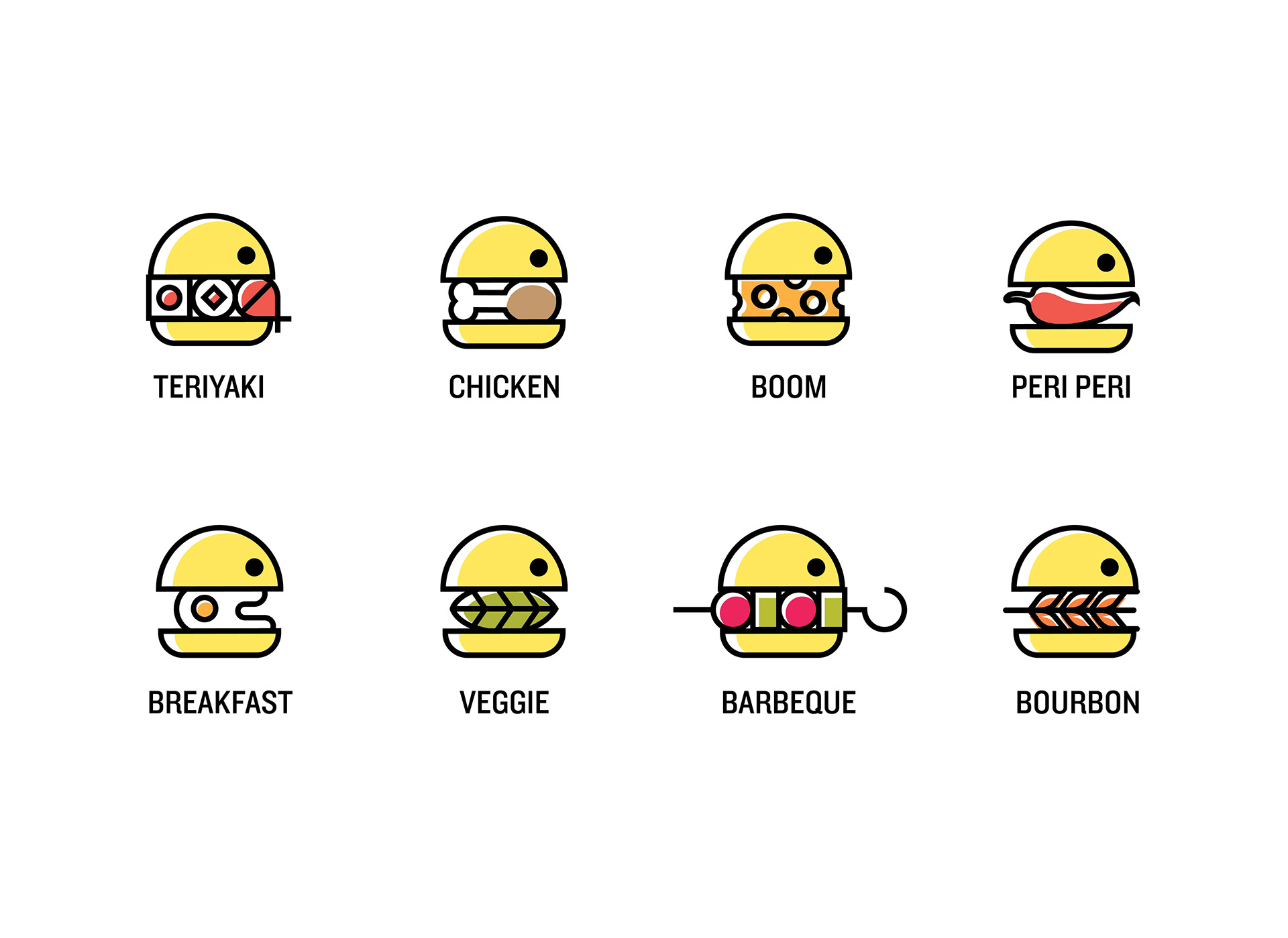
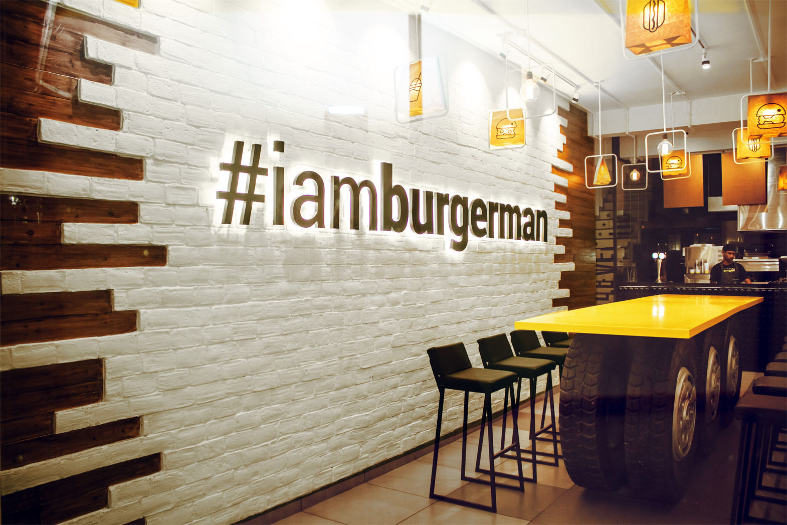
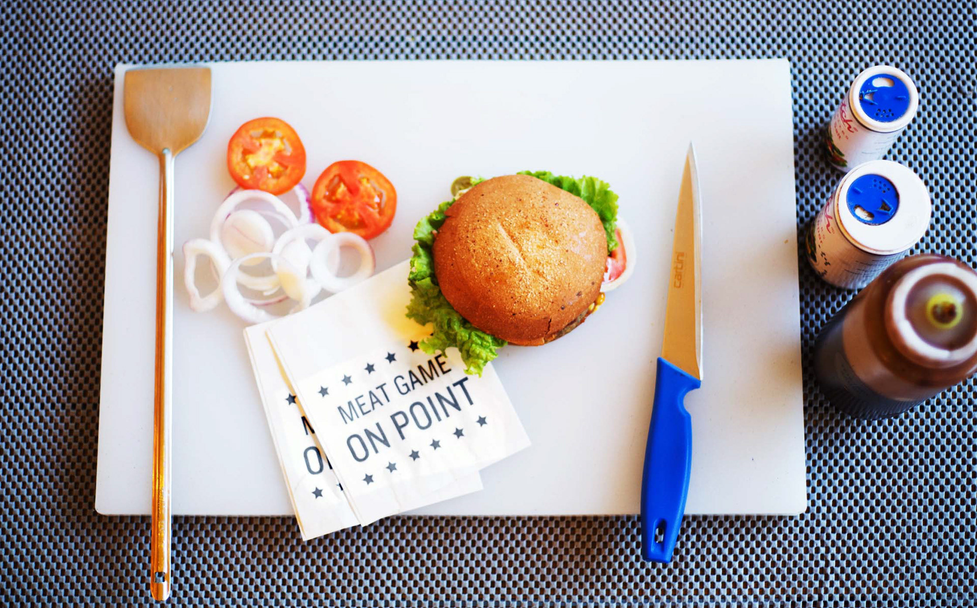
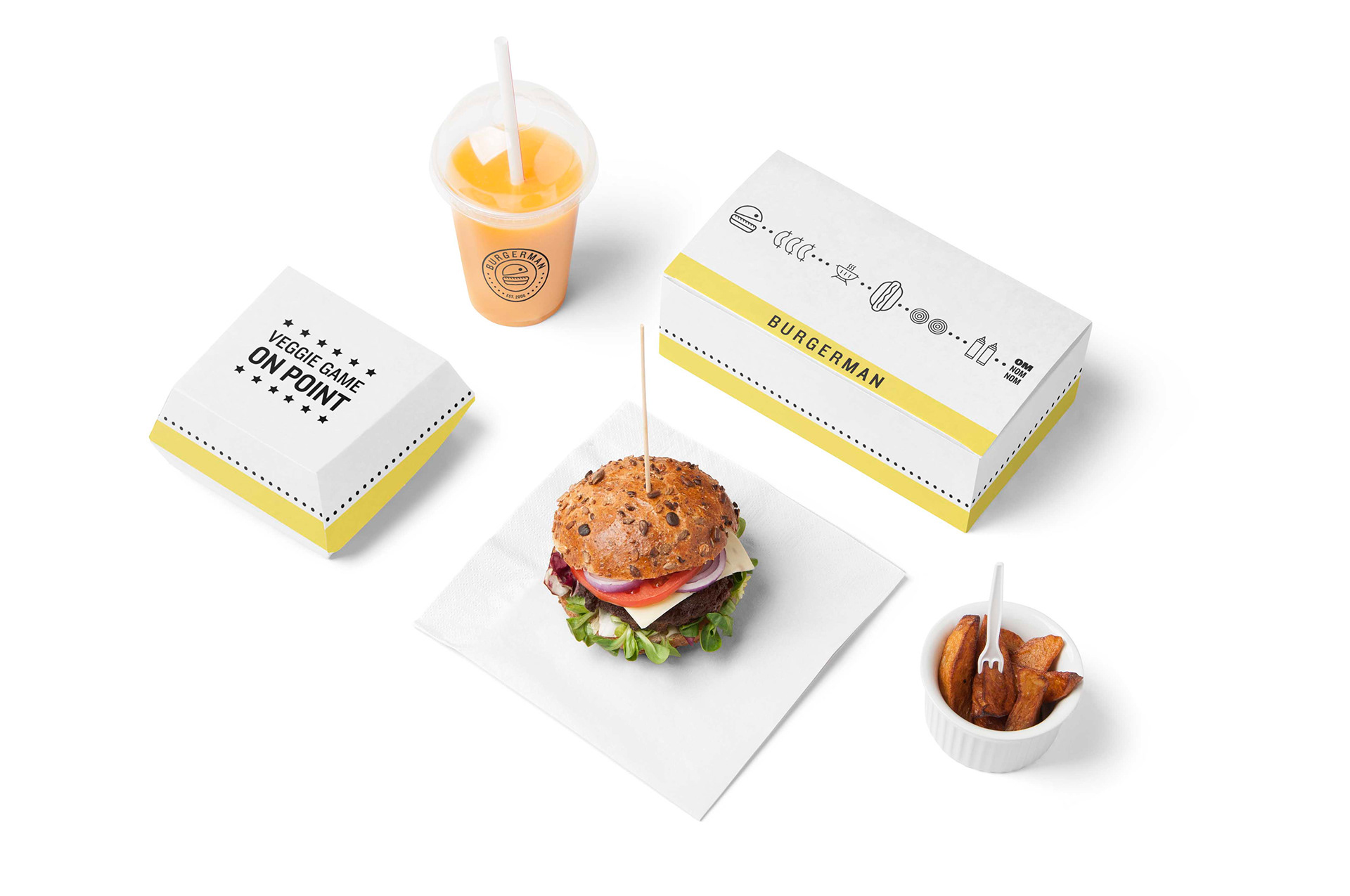
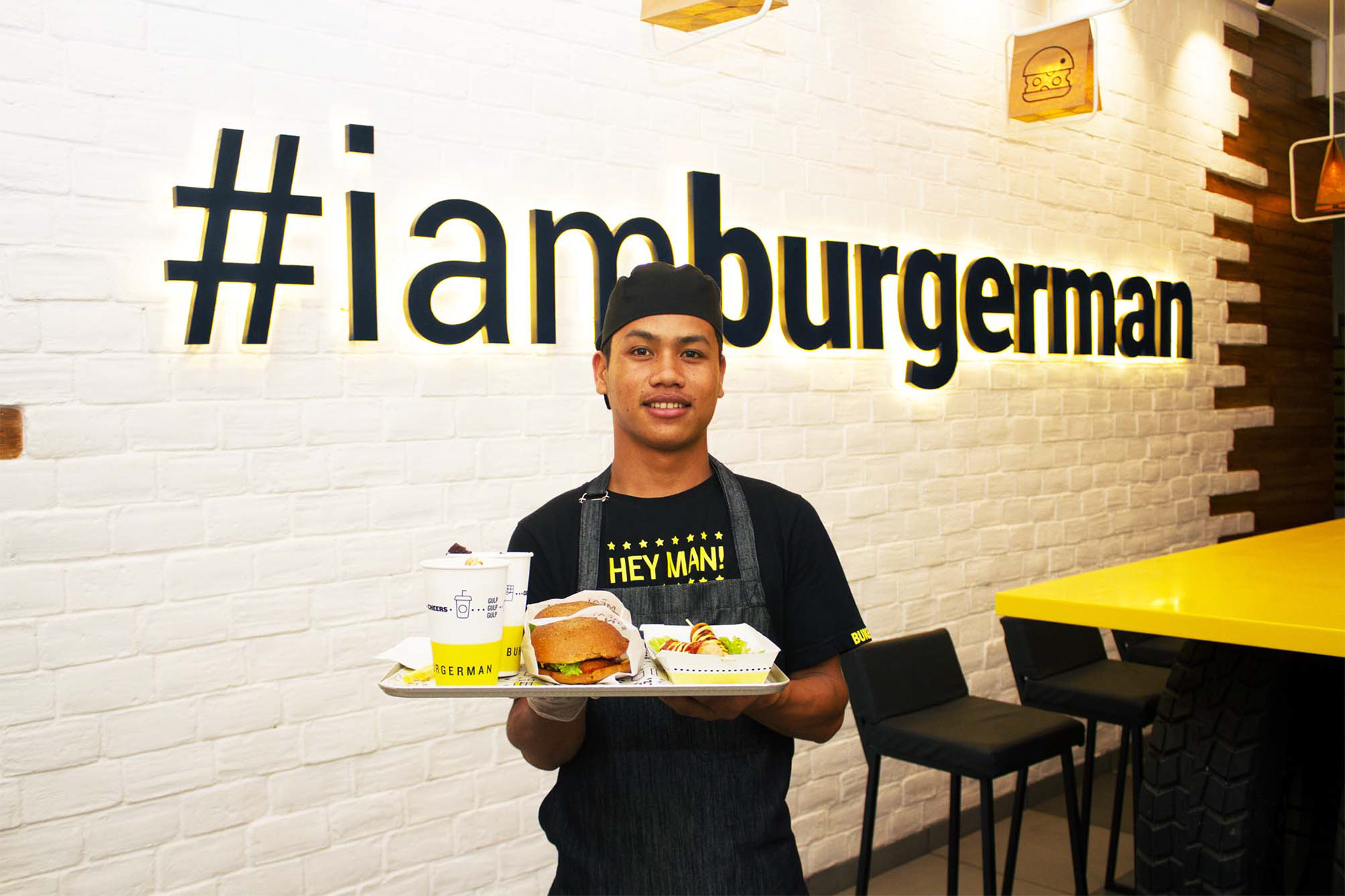
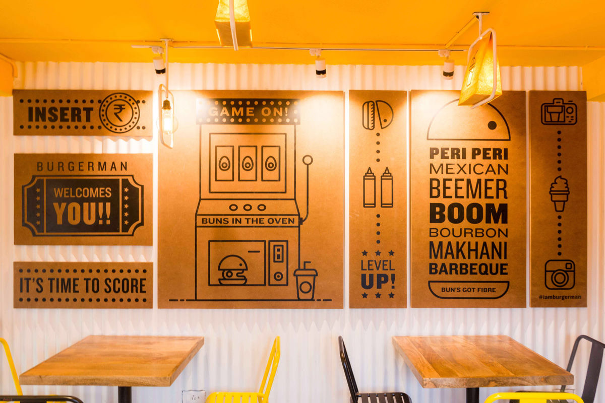
We decided to go for a very clean branding strategy highlighting the game across all branding collaterals. We modified a simple burger graphic to form a Pac-man as the main logo. This Burger/Pac-man was further used as iconography to highlight the various flavours that BurgerMan offers. From packaging to wall graphics, our Burger/Pac-man would hungrily gobble various types of ingredients to form a consistent brand language. The packaging is made out of biodegradable paper to be kind to the environment. To carry forward the new minimal strategy but still stay true to original brand – we retained the “yellow” from the previous design. This became our main brand colour, as red was oversaturated in the fast-food space. The colour yellow adds a fun and happy element to the brand which is exactly the kind of feeling we wanted to invoke when people stepped into the outlet. The tone of voice is casual, friendly and cheerful with staff uniforms, bottles, indoor signs etc., using phrases like “hey man” and “hot stuff”.
The resultant strategy created a lot of hype for the brand: people loved seeing their iconic brand back with the same character but with more refinement. The youth loved it especially because it was nostalgic to their childhood video games and they could relate to the slang used across the packaging and wall graphics.
CREDIT
- Agency/Creative: Pink Cheese Designs
- Article Title: Pink Cheese Designs Arcade Game Inspired Rebranding for Bugerman
- Organisation/Entity: Freelance, Published Commercial Design
- Project Type: Identity
- Agency/Creative Country: India
- Market Region: Asia
- Project Deliverables: Brand Architecture, Brand Redesign, Brand World, Graphic Design, Illustration, Packaging Design, Rebranding, Tone of Voice
- Industry: Food/Beverage
- Keywords: Burger, branding, Packaging design, graphics, illustration, fast food, restaurant


