


Part of the Jerónimo Martins group, Pingo Doce has more than 400 stores nationwide, leading the supermarket segment in Portugal and the Cash & Carry segment with the Recheio brand. In Poland, Biedronka is the largest Food Distribution Chain in the country, with 2.900 stores and, more recently, the group has started operating in Colombia, with the convenience stores Ara (Jerónimo Martins).
The challenge Pingo Doce launched for us was to develop a new image for the private label’s wine range. The goal was to reinforce the brand’s image and confidence in this category, giving it greater prominence on the shelf and attracting new consumers who value not only quality and price, but also a product’s image.
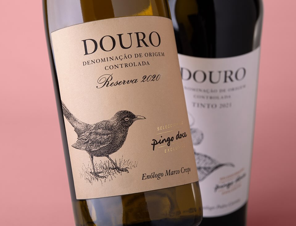
In the conception of the graphic identity, the presence of the Pingo Doce brand on the labels appears in the background as a seal of quality and confidence in this “Exclusive Selection” of wines produced across Portugal. The winemakers’ signatures reinforce Pingo Doce’s commitment to guarantee the authenticity of the wine style produced in each region, at the hands of those who know it best.
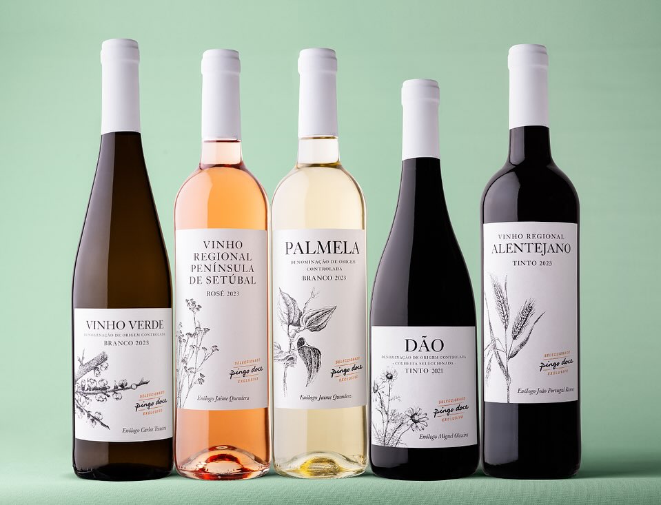
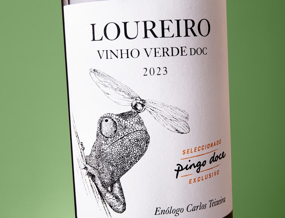
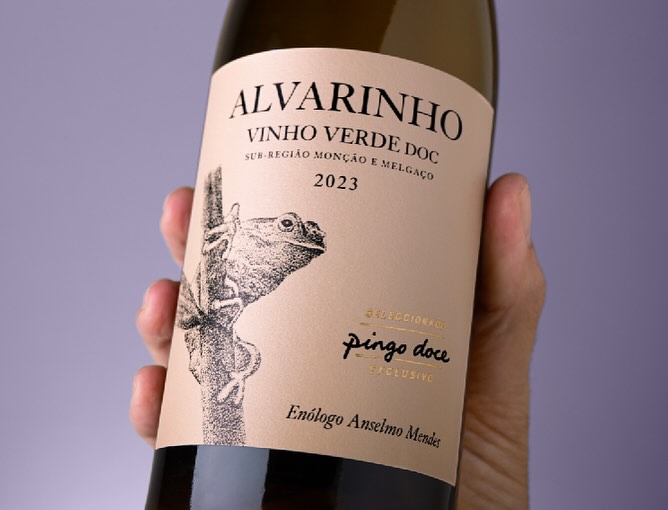
Inspired by Leonardo da Vinci’s quote, “Humanity will never devise an invention more beautiful, nor more simple than does nature”, the new image for Pingo Doce wines pays tribute to the small beings that live among the vines every day. Without coats of arms or ostentation, each label is a white canvas adorned with the beauty of simple things.
For this extensive range, we created a strong graphic narrative that connects with the consumer instantly, conveying closeness and confidence, in line with the Pingo Doce brand values: to democratize quality, in other words, to provide quality food products at competitive prices. With a clear and sleek visual message, this image showcases each wine’s characteristics and triggers the purchase of each bottle from this charming collection.
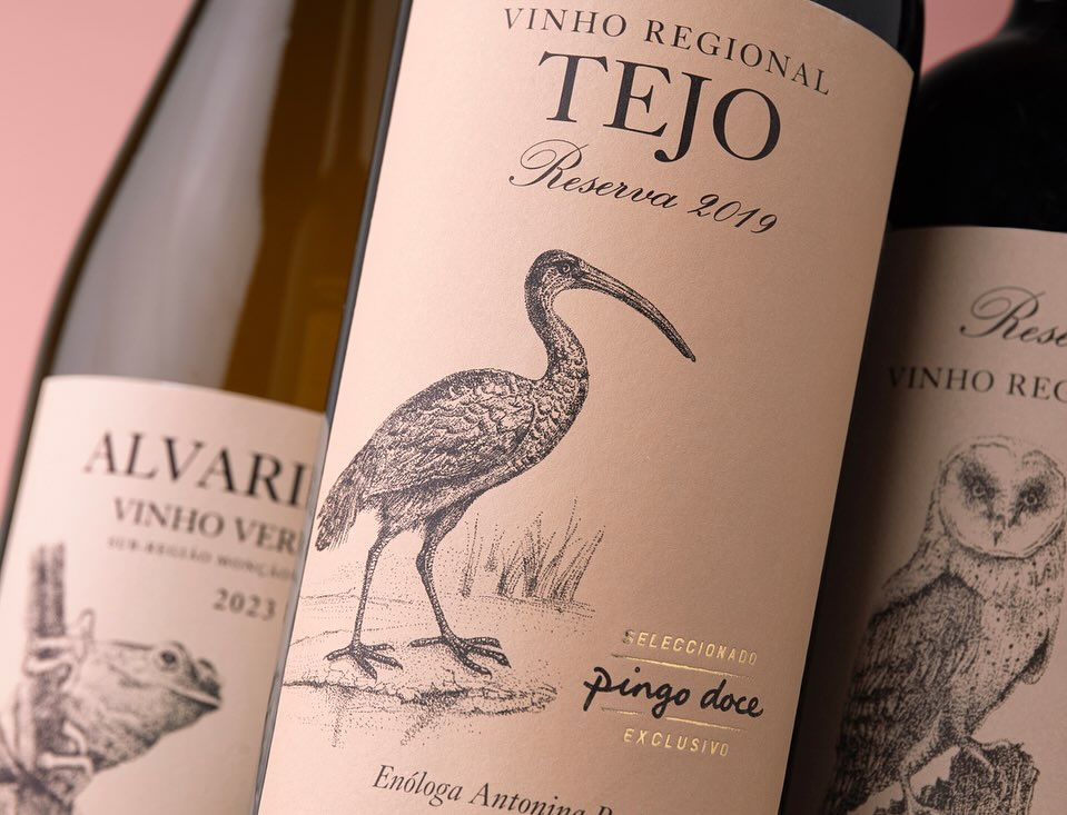
In the graphic communication of the Vintages (entry level) the region where the wine originates is the predominant feature on the labels. The plant illustrations represent the typical vegetation where the wine is produced and, for the Reserves, we chose the richness and beauty of the local fauna to adorn the labels and dignify the region.
CREDIT
- Agency/Creative: RitaRivotti
- Article Title: Pingo Doce Wines Redesign by RitaRivotti
- Organisation/Entity: Agency
- Project Type: Packaging
- Project Status: Published
- Agency/Creative Country: Portugal
- Agency/Creative City: Lisboa
- Market Region: Europe
- Project Deliverables: Label Design
- Format: Bottle
- Industry: Food/Beverage
- Keywords: #branding #identity #packagingdesign #ritarivotti #design #packaging
-
Credits:
CEO & Creative Director: Rita Rivotti
Creative Director: Pedro Roque


