


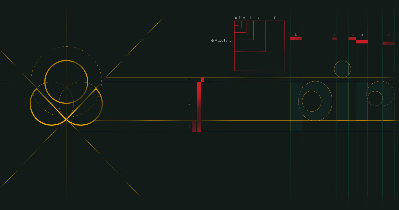
Pinane emerges as a meaningful extension of Knup Brasil’s ecosystem, bringing a renewed perspective to the stationery and office supplies market through a brand deeply anchored in Brazilian identity. More than a name, Pinane represents a conceptual bridge between origin and expression — a narrative that transforms raw material into culture, and function into purpose.
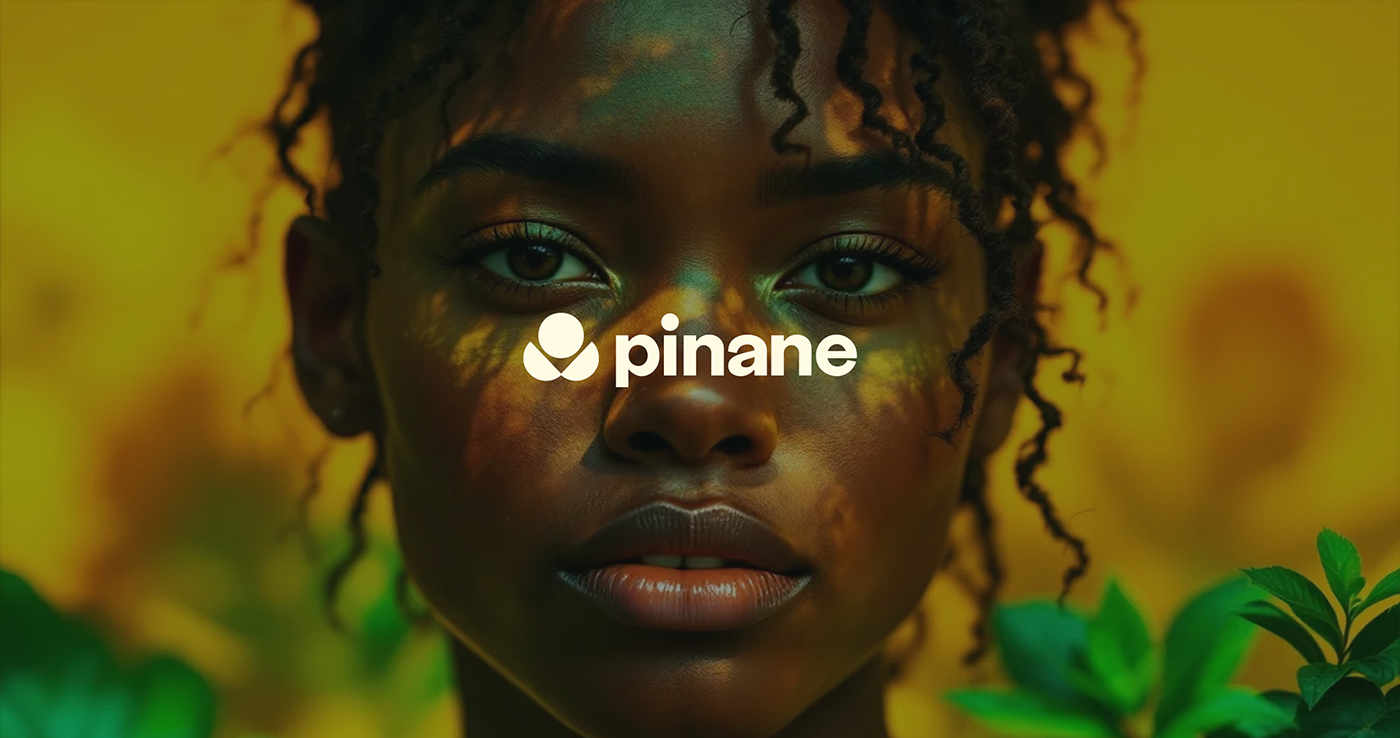
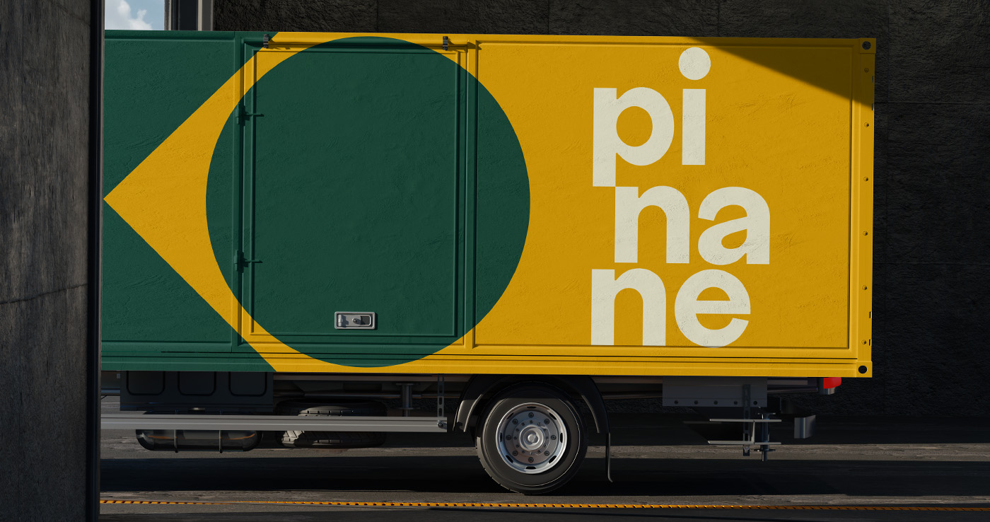
The name itself is the foundation of this story. “Pi,” derived from Pindó, symbolizes the palm tree — a native element whose fibers give rise to paper. It embodies strength, origin, and the essential connection to the land. This natural foundation is visually translated through the green tone in the brand’s identity, reinforcing its grounding in Brazilian flora and authenticity. “Nane,” inspired by Jenipapo, refers to the natural pigment traditionally used by Indigenous peoples to mark the body, celebrate rituals, and tell stories. It represents expression, permanence, and cultural voice — the mark that remains.
Together, these elements define Pinane as both the beginning and the outcome: the raw material and the final expression. The brand reflects the journey from nature to creation, from fiber to form, from silence to communication. It carries the symbolism of a starting point — a pure, authentic source — while also embracing its role as a medium for creativity and individuality.
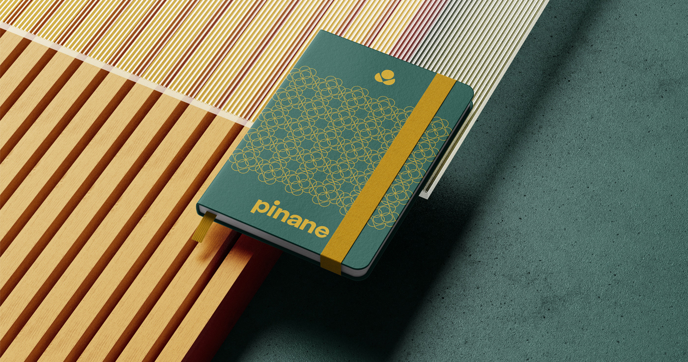
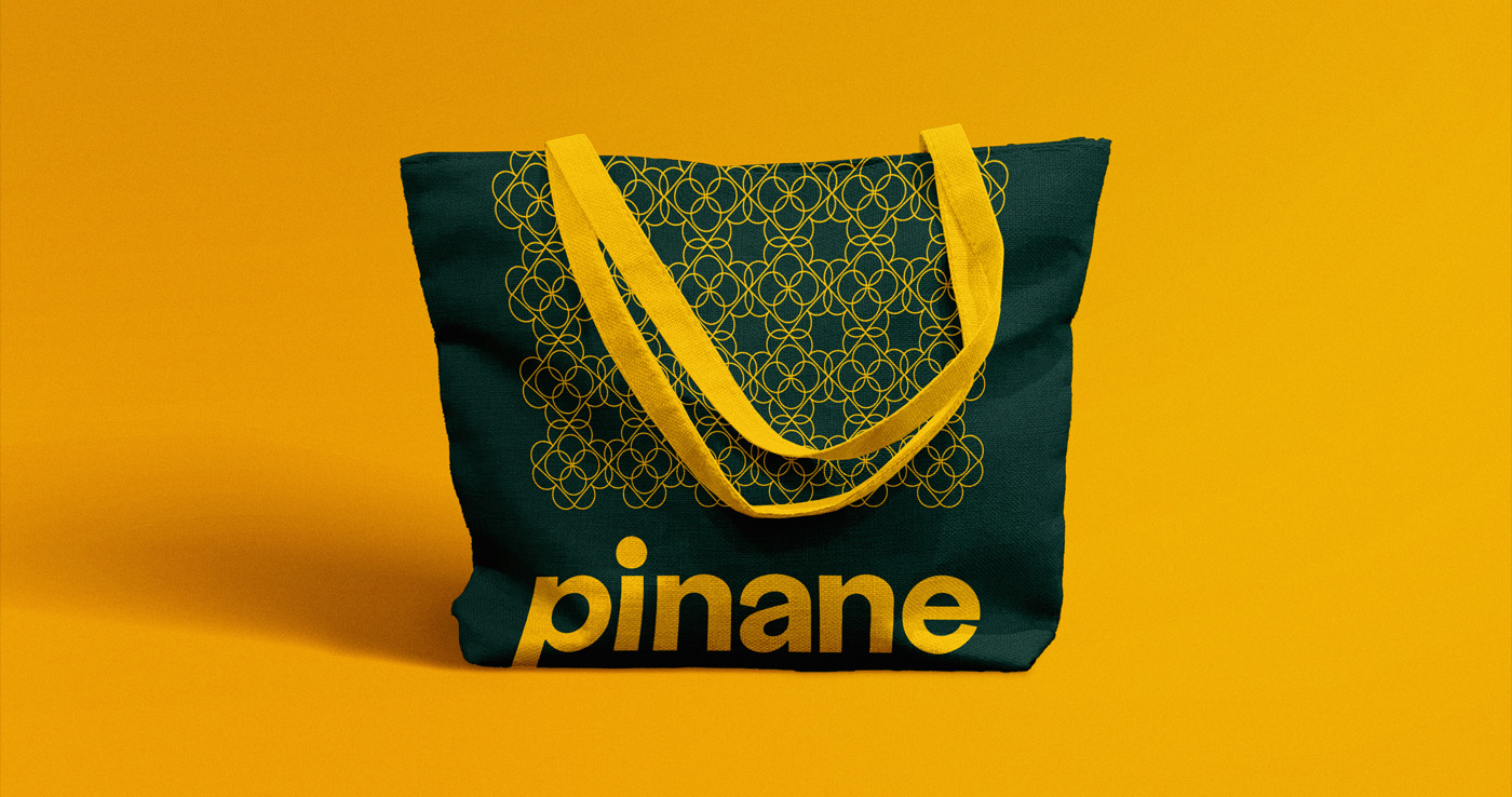
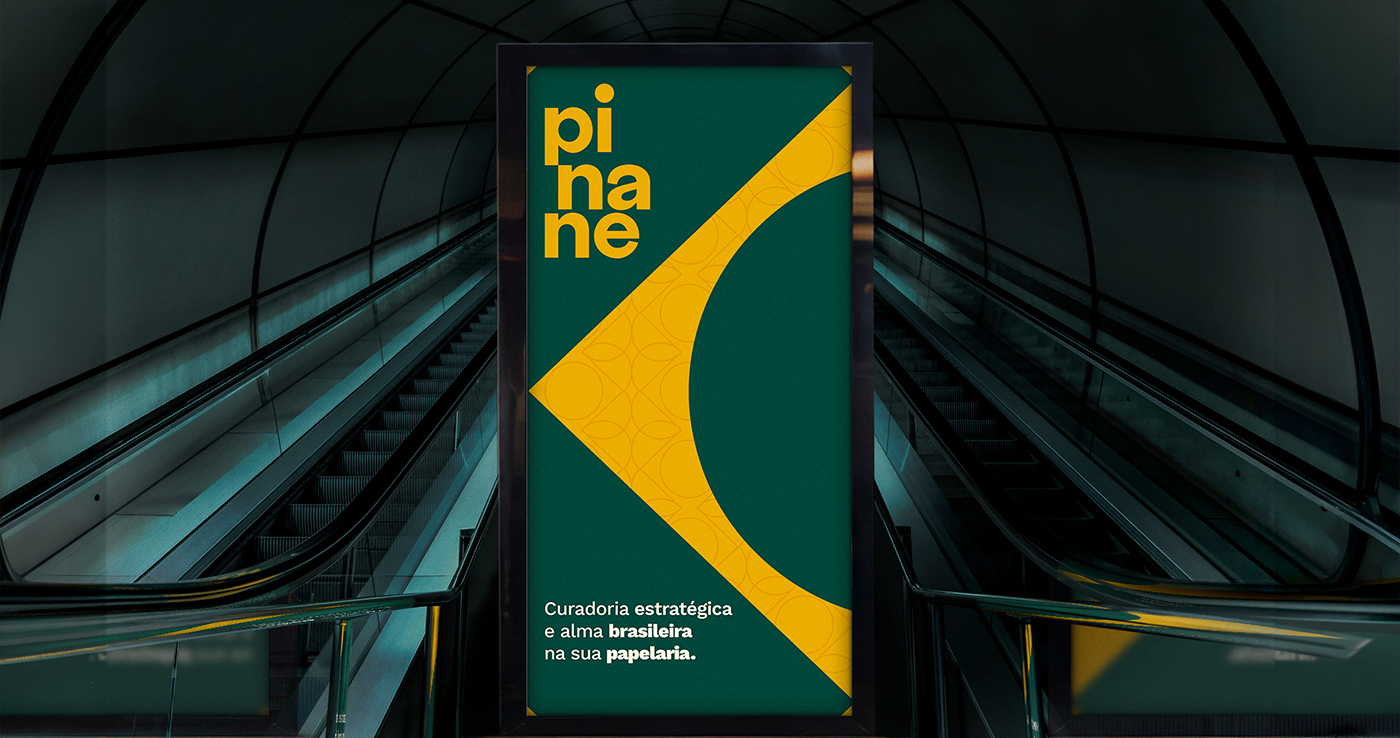
As an importer of stationery and office supplies, Pinane goes beyond functionality. It positions itself as a platform for expression, enabling people to write, design, organize, and communicate with intention. Every product becomes an extension of voice and identity, reinforcing the idea that tools of creation should carry meaning.
Rooted in Brazilian nature and culture, Pinane celebrates the richness, diversity, and vitality of its origins. It brings forward a narrative where design is not only aesthetic, but symbolic — where each element connects back to something greater: the land, the people, and their stories. In doing so, the brand establishes a unique positioning in the market, merging authenticity with contemporary relevance.
Pinane is not just a brand. It is a seed — one that grows from origin and blossoms into expression.


CREDIT
- Agency/Creative: Fabio Nasci
- Article Title: Pinane: Where Origin Becomes Expression — A Brazilian Identity Rooted in Nature and Culture
- Organisation/Entity: Agency
- Project Type: Identity
- Project Status: Published
- Agency/Creative Country: Brazil
- Agency/Creative City: São Paulo
- Market Region: South America
- Project Deliverables: Brand Design, Brand Mark, Brand Naming, Branding
- Industry: Retail
- Keywords: Brazil, culture, brand, country, origin
-
Credits:
Creative Director: Fábio Nasci
Creative Director: Daniel Alencar
Head Illustrator: Vitória Beltrame


