


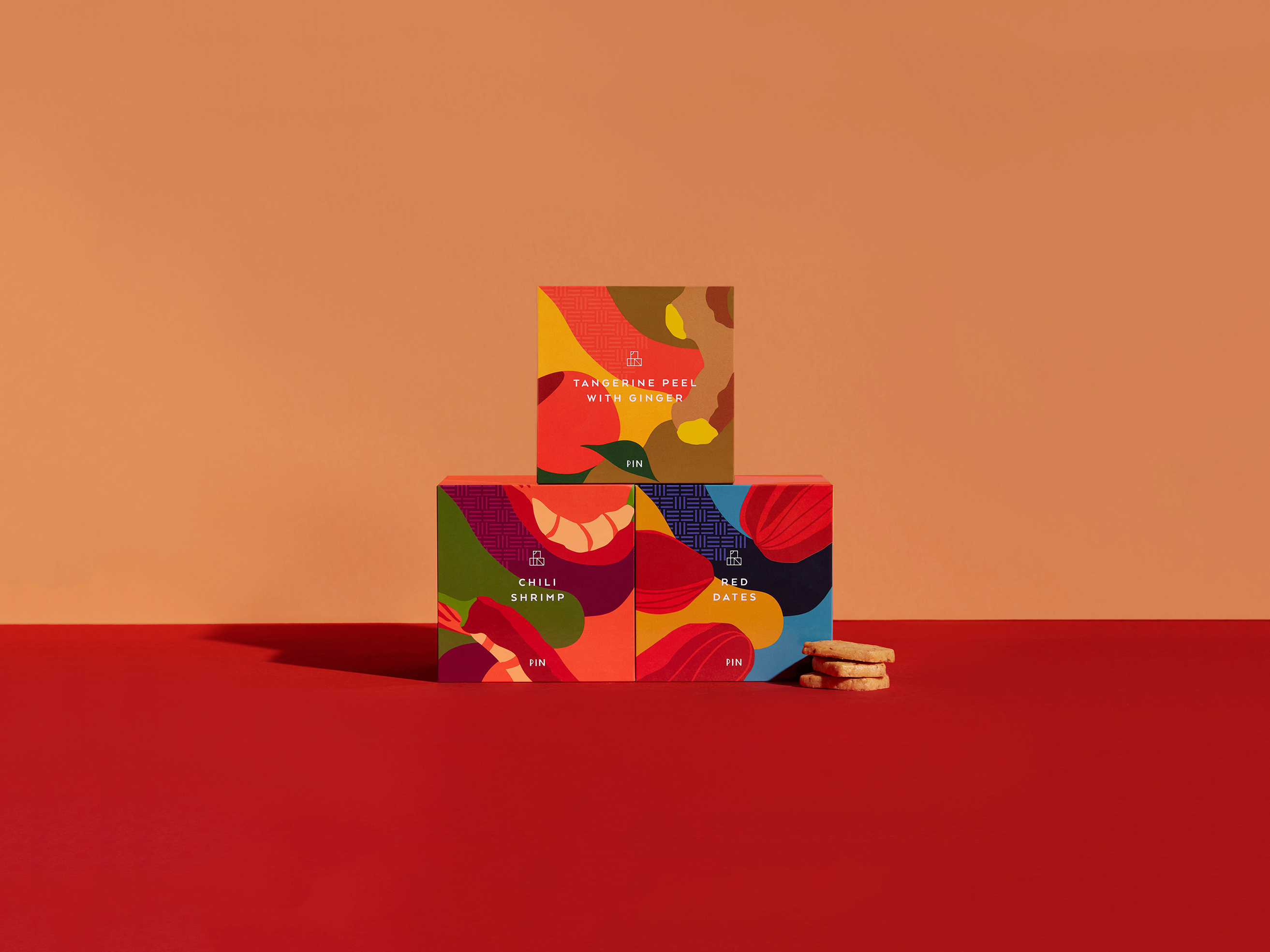
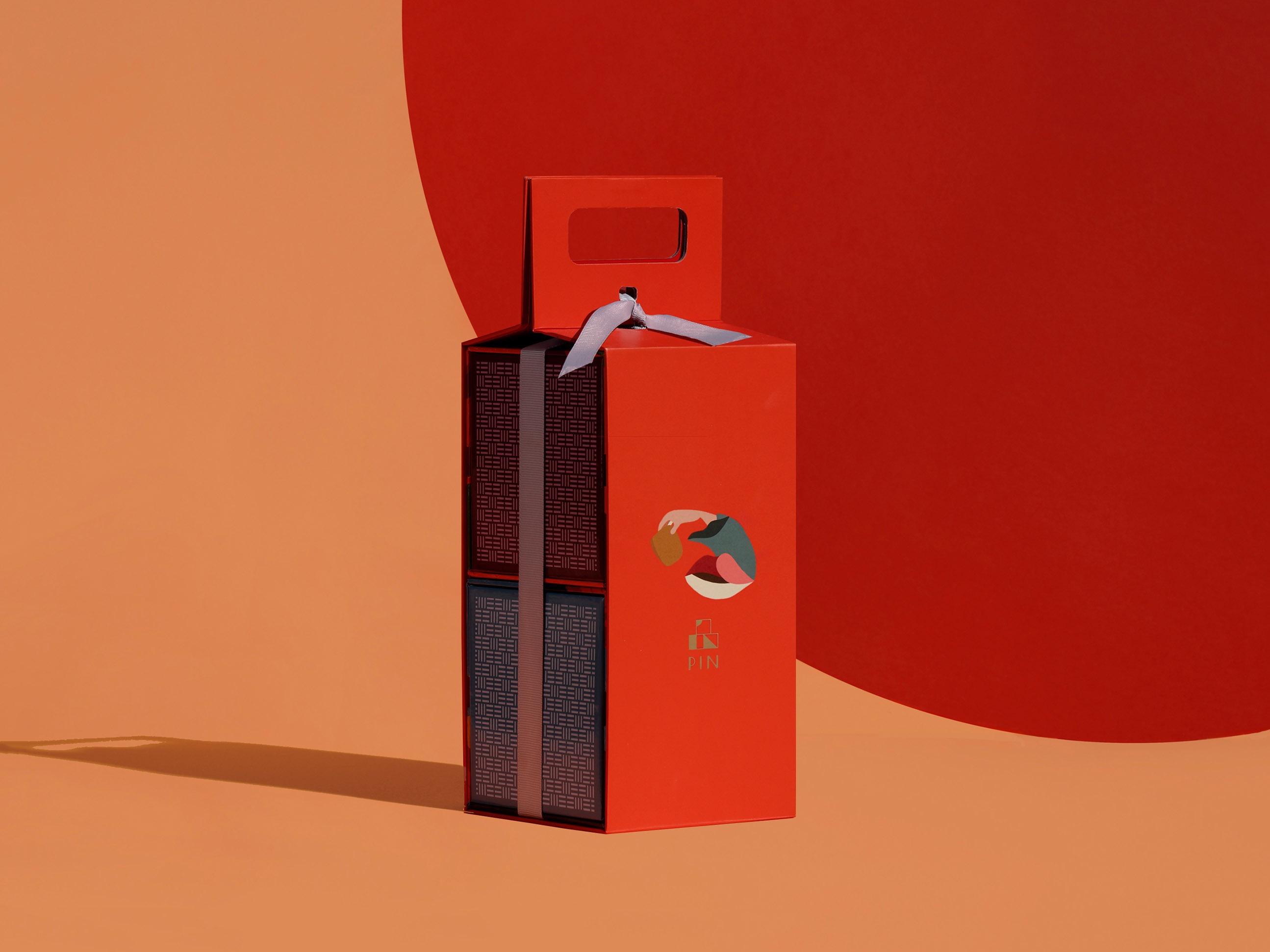
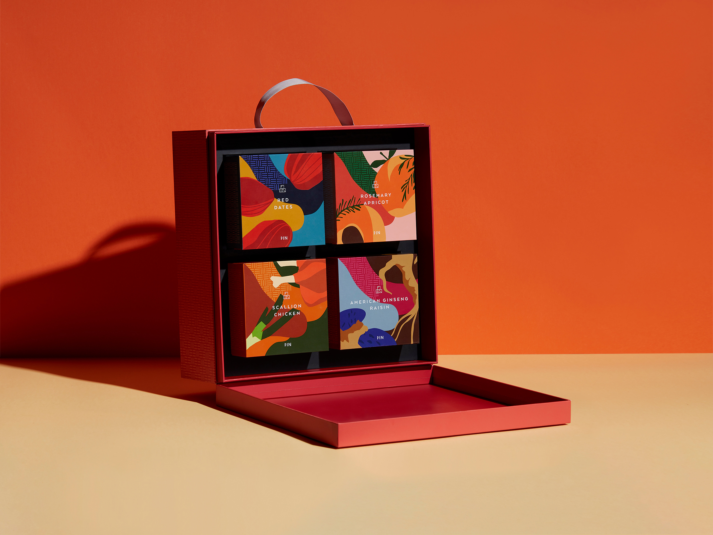
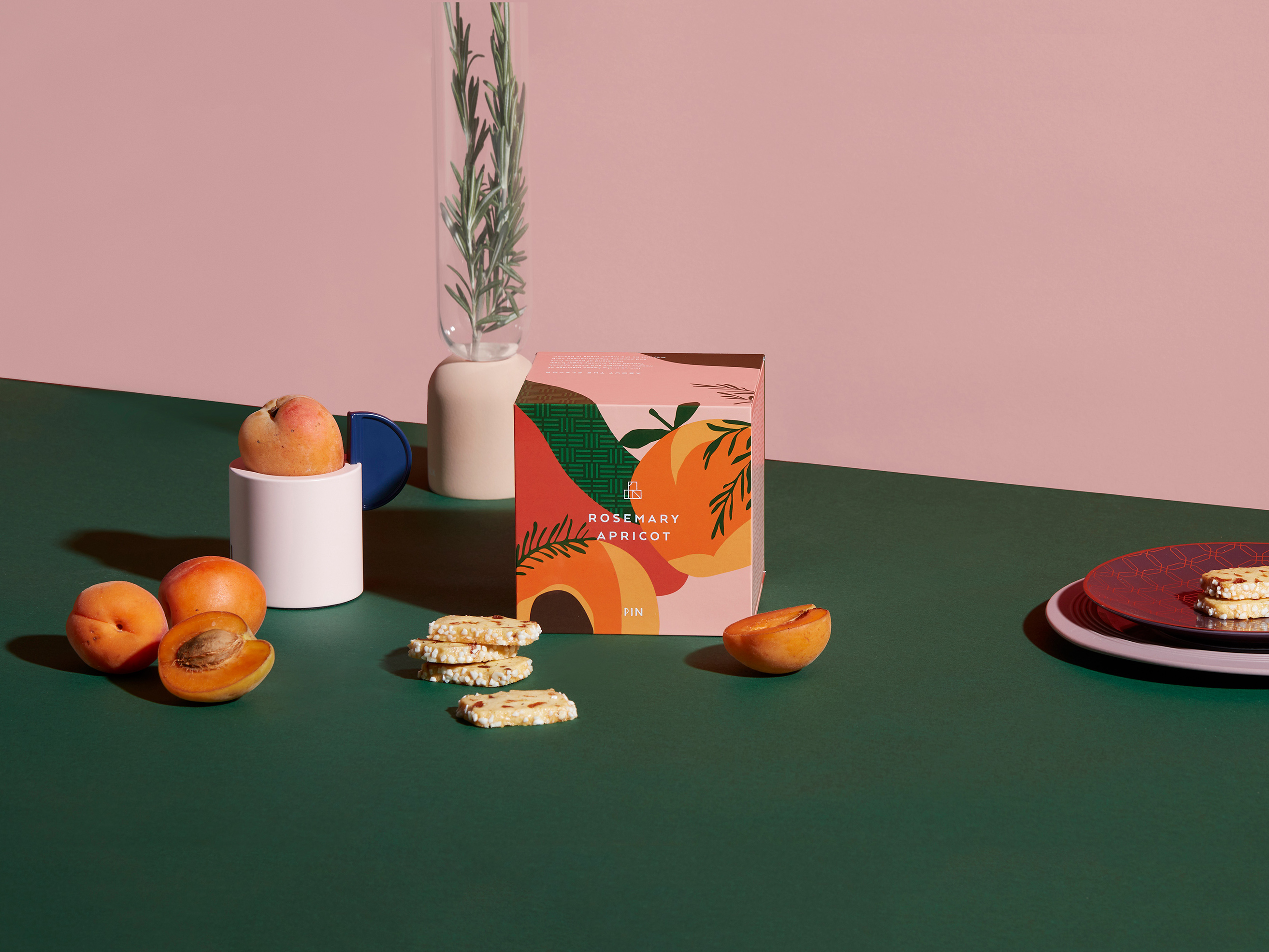
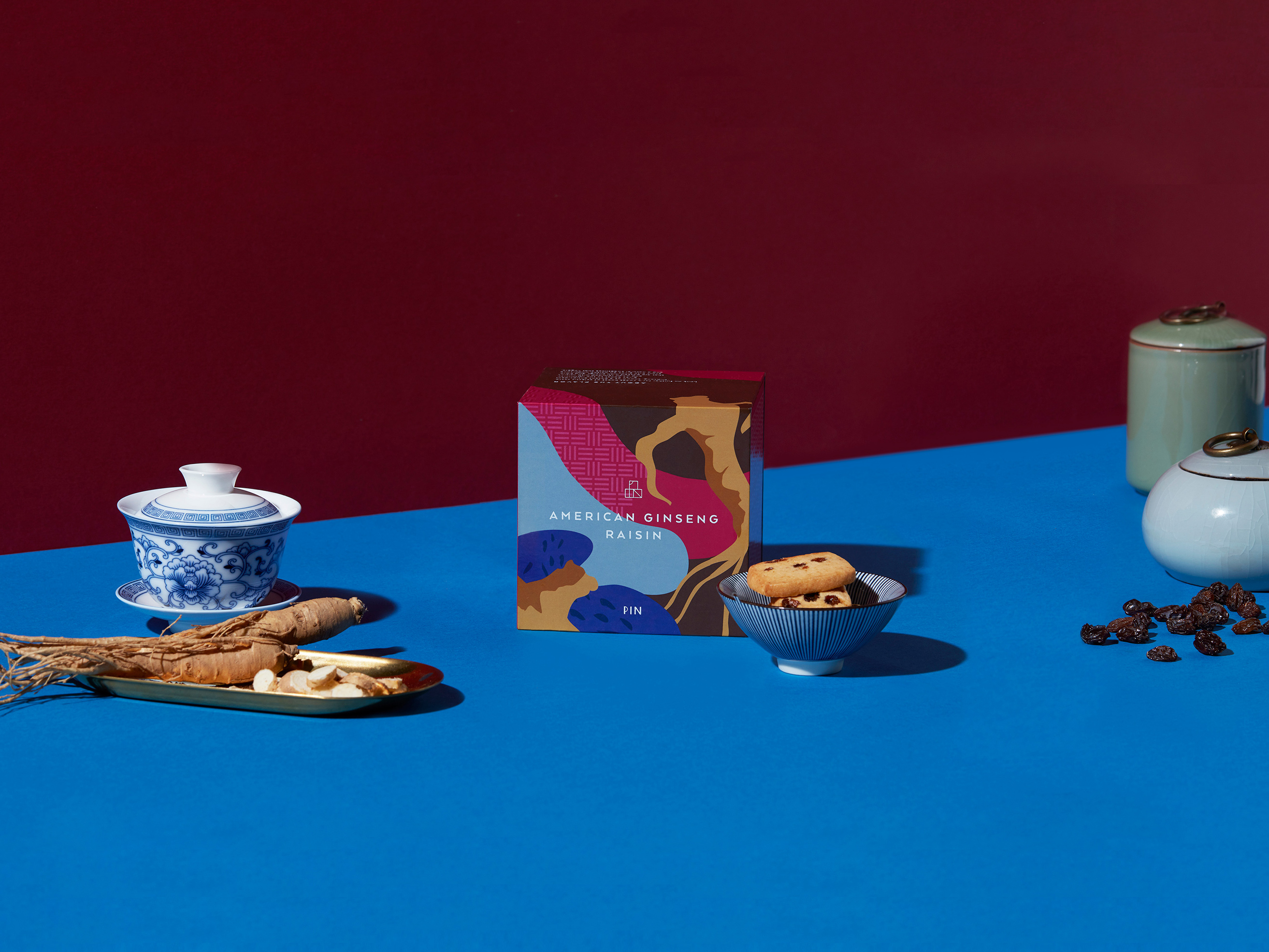
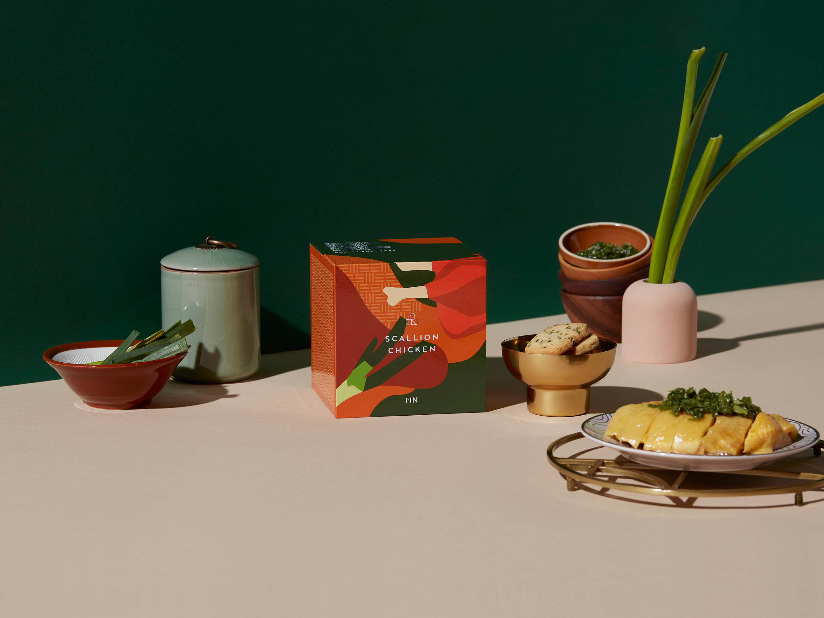
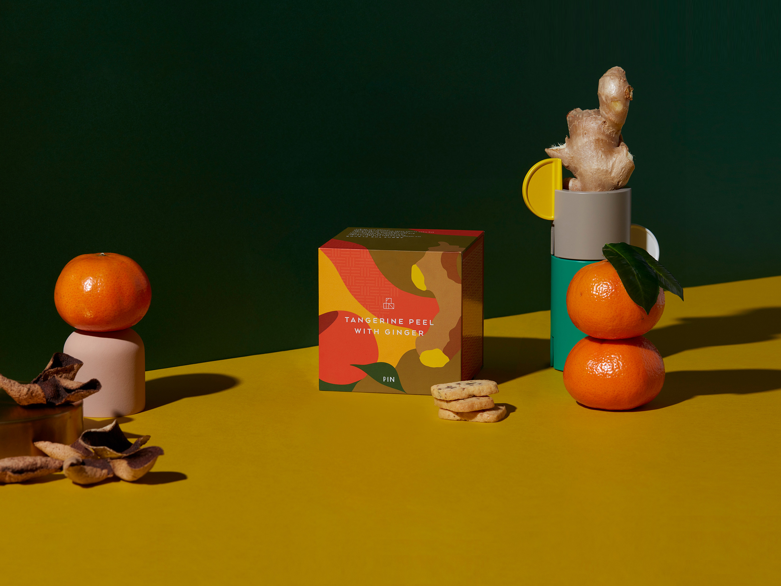
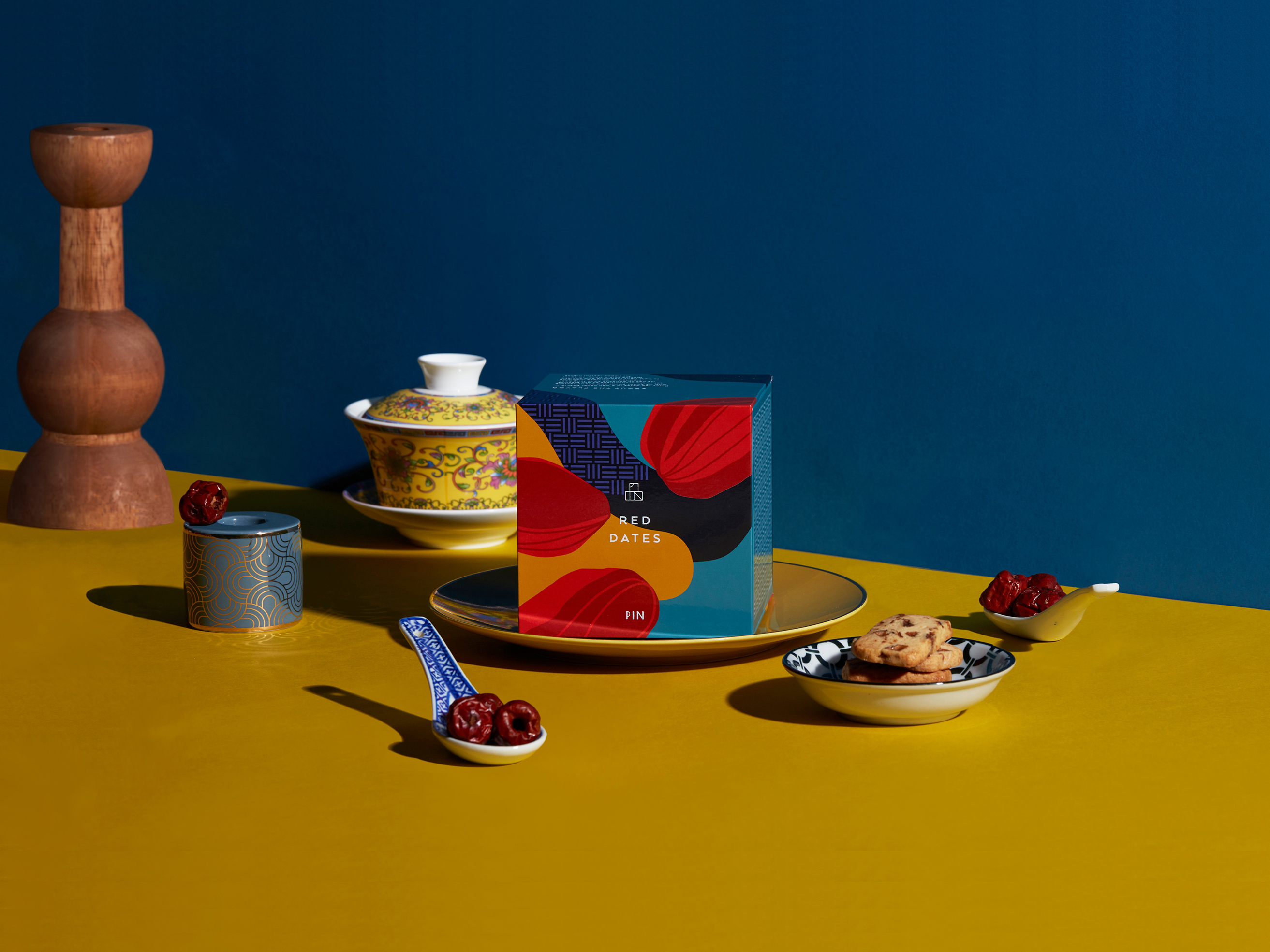
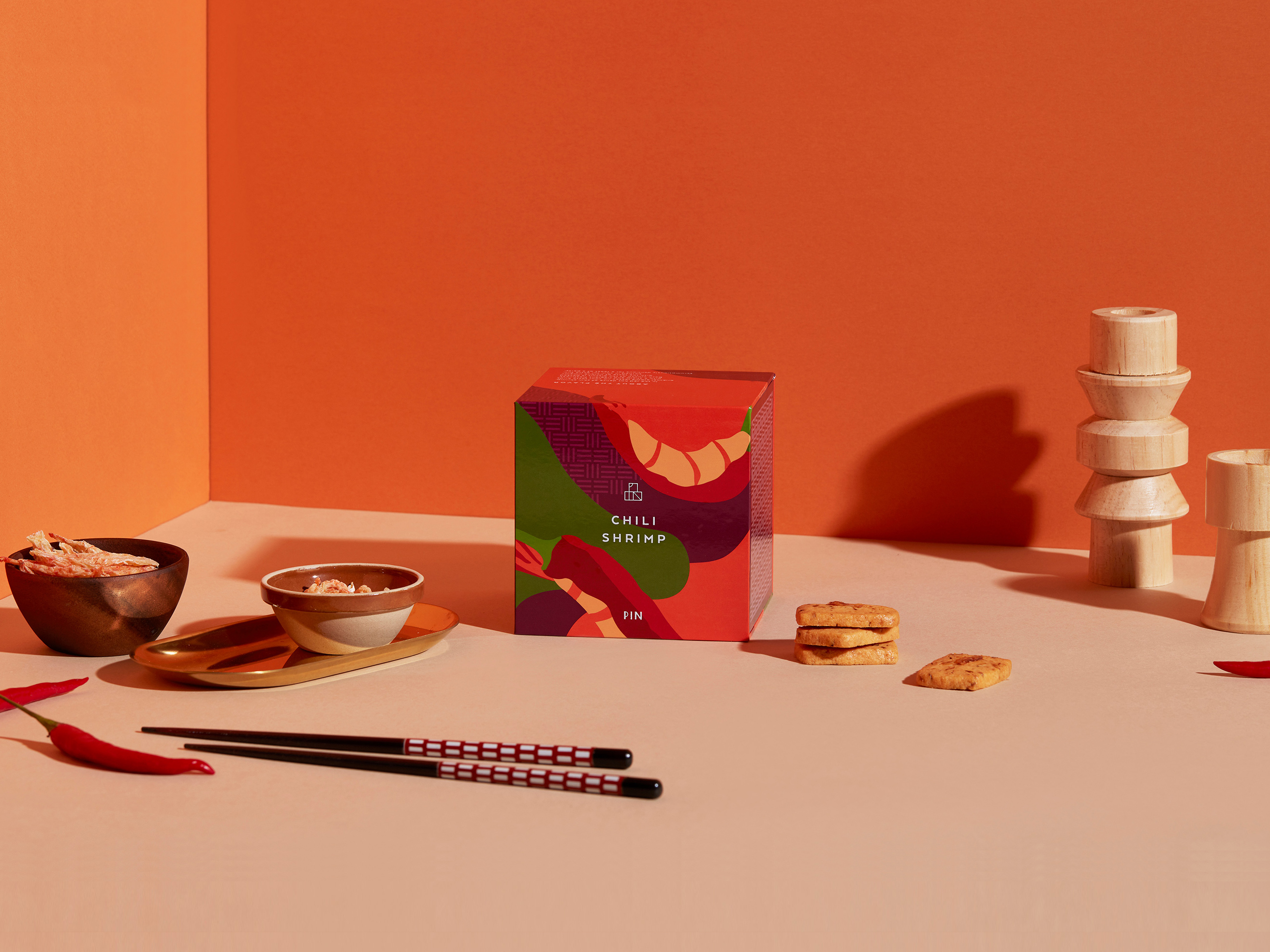
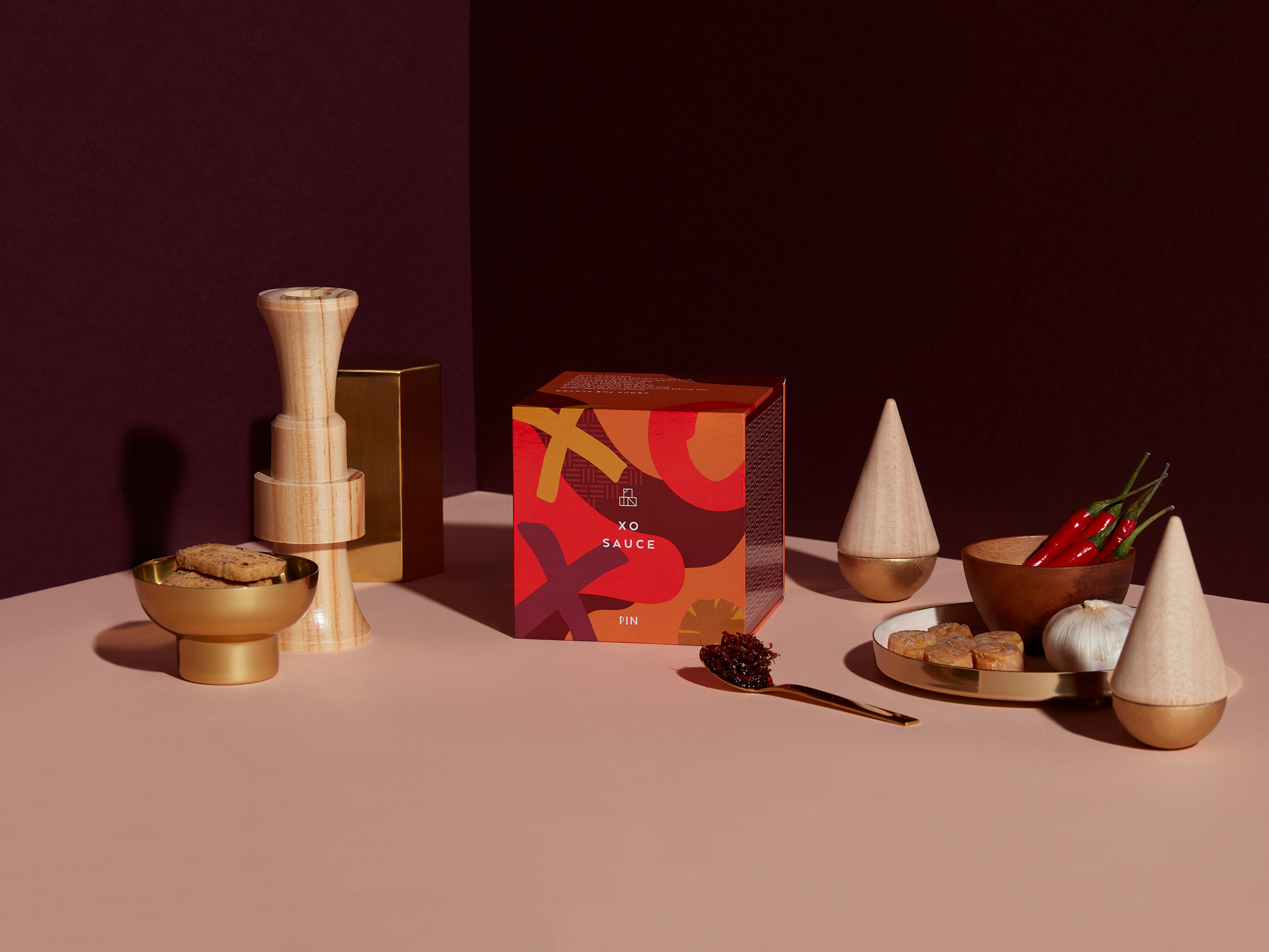
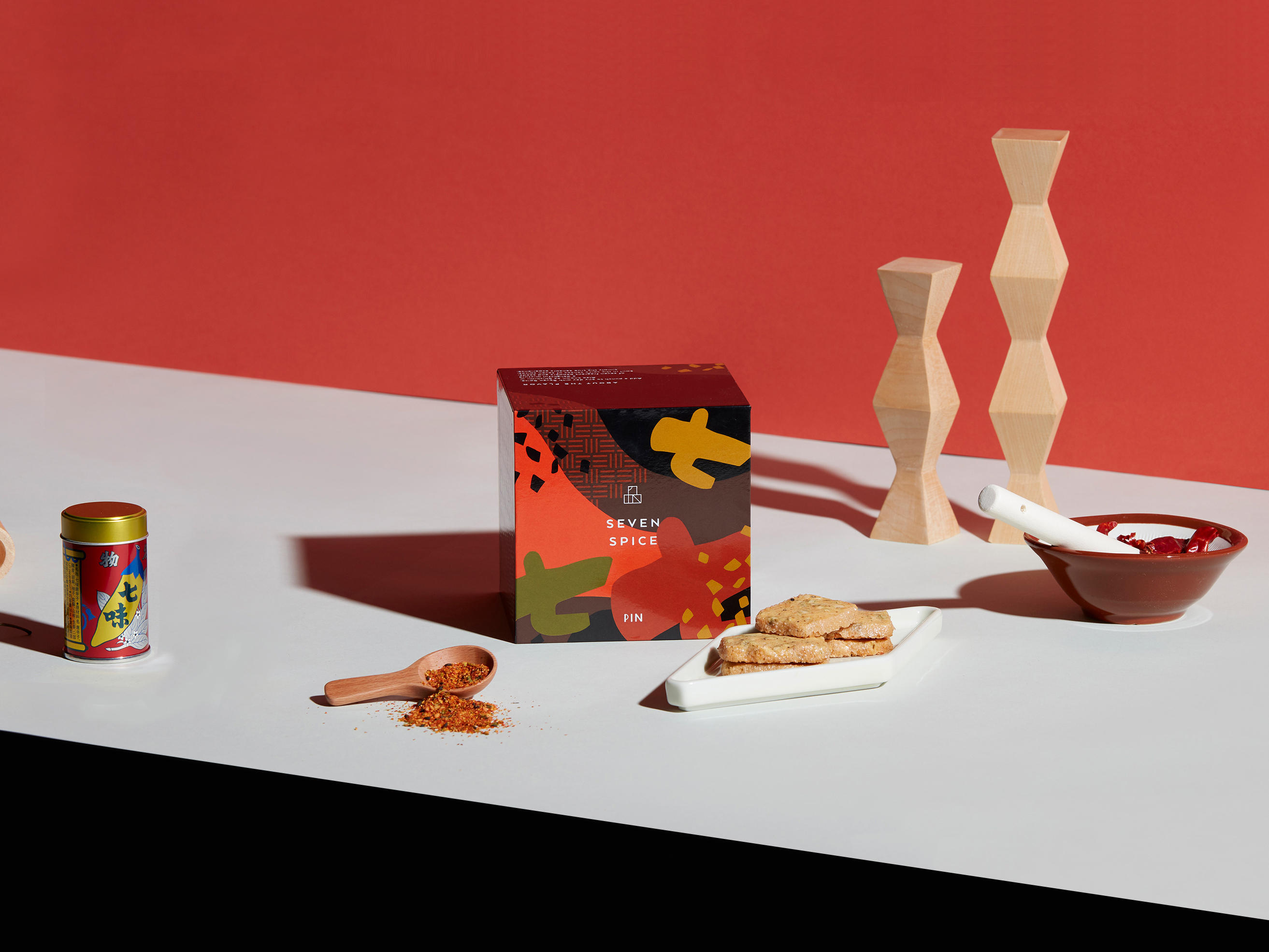
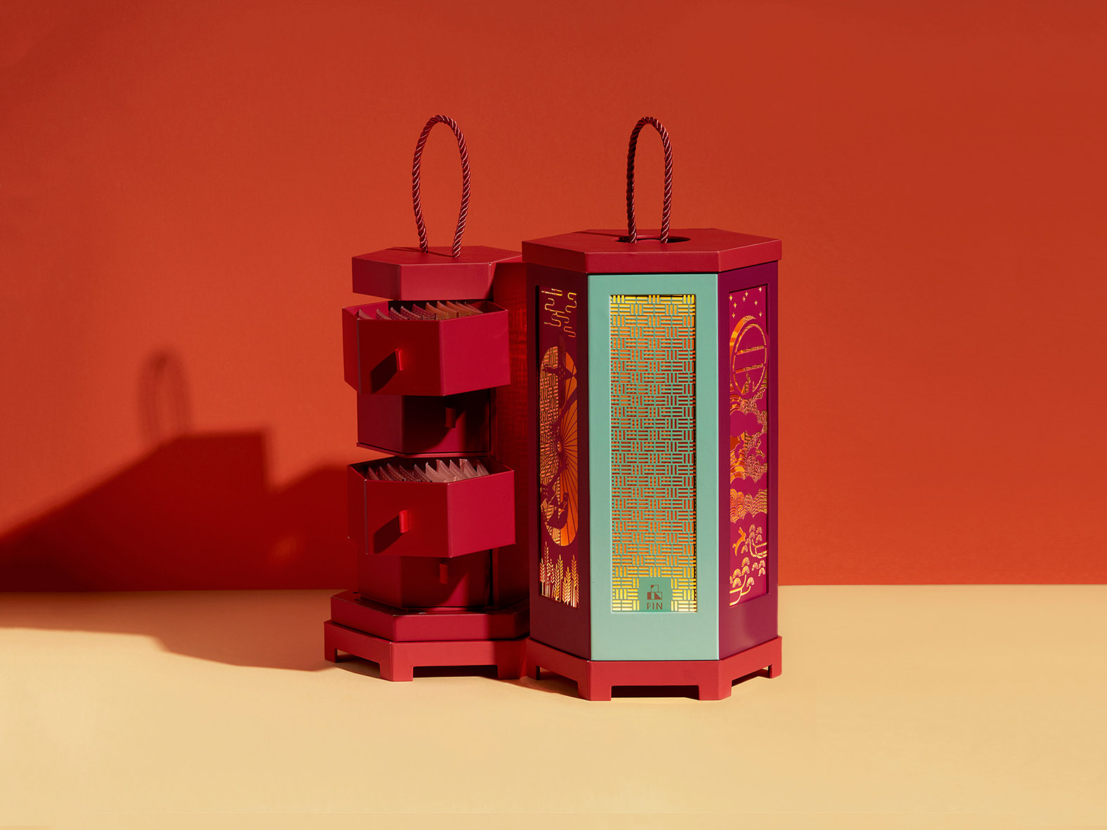
PIN is a creative cookies brand pioneering unique Asian flavours, from red dates, scallion chicken to chilli shrimps and more. PIN, in Chinese is written as ‘品’, which means ‘to savour’. Interestingly, the character visually looks like three stacked cubes, hence in the logo design, we placed the English characters PIN into the Chinese character 品 to make an emblem that reads simultaneously in both languages. In the series of 8 unique cookies flavours, the packaging designs extends the cube concept, on which ingredients are whimsically illustrated to take centre stage, bursting in colour and vibrancy. The duo giftbox takes form of the same stacked structure, similar to a traditional Asian lunchbox, revealing the embossed, knitted pattern at the side of the boxes, weaved together in a bamboo style, illustrating the brand name in style, celebrating this historical aspect of Asian culture.
CREDIT
- Agency/Creative: Ruth Chao Studio
- Article Title: Pin Cookies: To Savour
- Organisation/Entity: Agency, Published Commercial Design
- Project Type: Packaging
- Agency/Creative Country: Hong Kong
- Market Region: Asia
- Project Deliverables: Brand Creation, Brand Design, Brand Identity, Brand Redesign, Brand Strategy, Branding, Graphic Design, Identity System, Illustration, Packaging Design, Photography, Rebranding, Tone of Voice
- Format: Box
- Substrate: Pulp Paper


