


Pilot is an independent brand agency founded in 2004 in Toronto. We help organizations unlock new opportunities and then make them real with story-driven brands, experiences, and campaigns. That’s why the identity we created is all about our love of a good story. We wanted the Pilot brand itself to become the publisher of work tales, capturing the interesting aspects of the brand development process and the brand stories we created for clients. To find the right look and feel, we hunted through the history of visual storytelling from cave paintings through books to digital media.
The logotype features a minimalist design with an acute accent, a diacritical mark used over vowels to denote the stressed syllable in a word. Similarly, in branding, we identify and emphasize inherent features around which we build strategy and narrative.
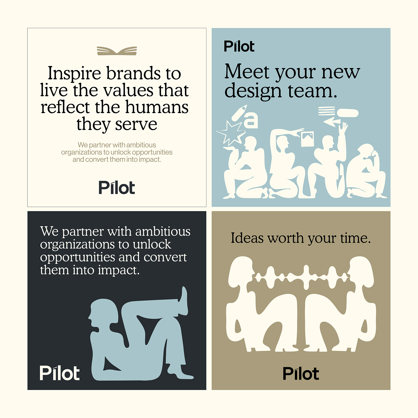
When it came to choosing a typeface for the brand, we initially chose one brimming with personality. Cooper Light, an old-style serif with low contrast and rounded terminals, seemed like the perfect option. It resonated with our identity, evoking the warm nostalgia of discovering a timeless novel in a family library and reading it for the first time. The second typeface, which contrasts with Cooper in both lettershape and feel, is Neue Haas Grotesque. This exceptional sans-serif shares the same origins as Helvetica but is crafted to remain as true as possible to its original shapes and spacing. It balances Cooper with a modern vibe, bringing a functionality that feels perfectly suited to tackling twenty-first-century challenges.
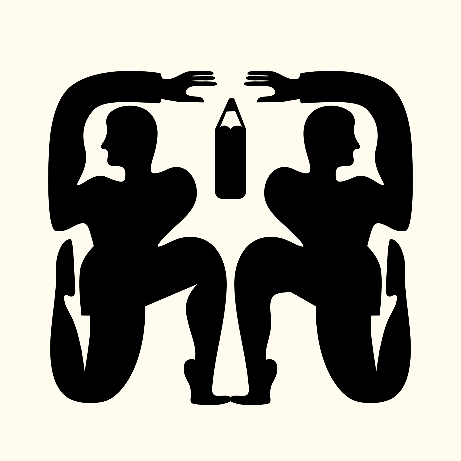
The identity introduces a series of illustrations. Instead of relying on literal representations, these imaginative and intentionally imperfect forms have a slight nod to ancestral tales and mythology. The illustrations are visually expressive, figurative, minimal, and have an ink-spot aesthetic. The symmetrical approach to their use is rooted in traditional visual storytelling, forming the basis for the entire asset system. The toolkit further expands to include iconography and illustrations, accompanied by a variety of storytelling techniques that can be applied across every application.
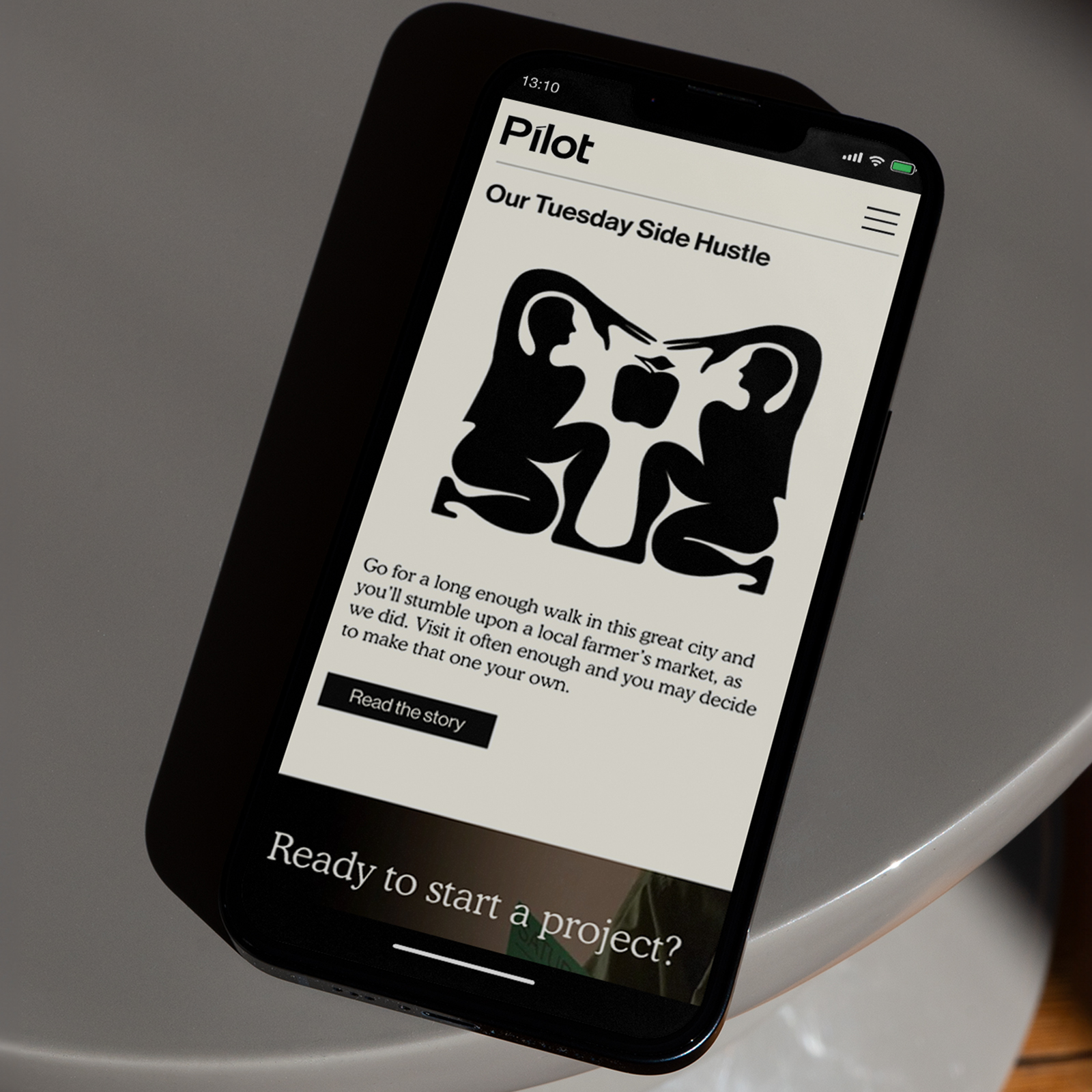
The website reinforces this storytelling approach with a menu bar designed to resemble a book spine, adding a tactile, literary feel to the digital experience. Further enriching the user journey, select case studies on the website are accompanied by audio conversations with clients, providing a more immersive narrative experience.


CREDIT
- Agency/Creative: Pilot PMR
- Article Title: Pilot PMR Showcases the Art of Visual Storytelling Through Thoughtful Branding
- Organisation/Entity: Agency
- Project Type: Identity
- Project Status: Published
- Agency/Creative Country: Canada
- Agency/Creative City: Toronto
- Market Region: North America
- Project Deliverables: Brand Design, Brand Identity, Illustration, Logo Design, Web Design
- Industry: Information
- Keywords: brand design, identity, illustration, logo design, web design
-
Credits:
Brand Architect / Founder & CEO: David Doze
Senior Designer: Nata Nagovitsyna
UX Director: James Beardmore
Graphic Designer: Jina Kang
Web Developer: Rocky Chung


