


Round egg buns a hand made rebranding !
Pierre de Belgique designs a radical visual identity for Round, a new eggbun restaurant in Paris
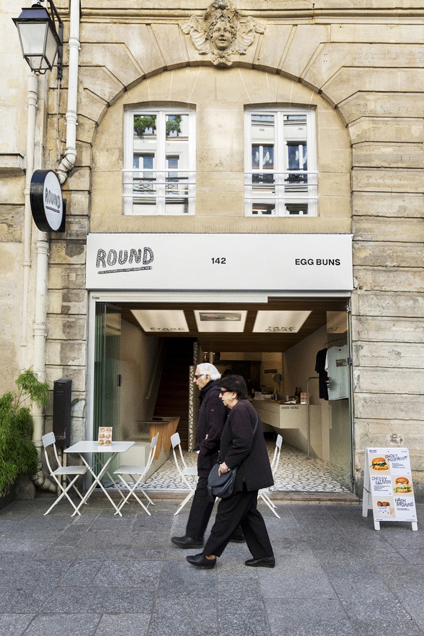
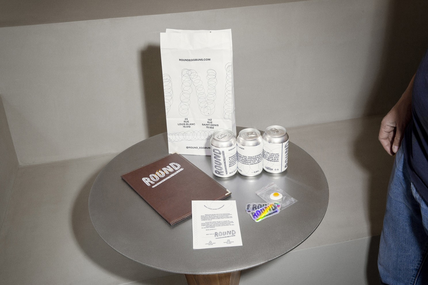
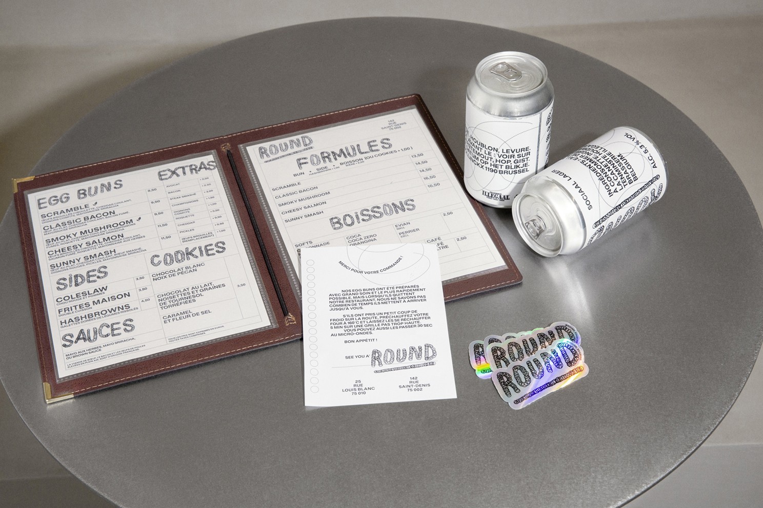
Paris-based Art Director Pierre de Belgique, known for his bold and typographically-driven approach, has designed the complete visual identity for Round, a newly opened restaurant in Paris specializing in eggbuns.
Founded by two skateboarding, food, and tattoo enthusiasts, Round offers more than just inventive street food it delivers a whole attitude. Pierre de Belgique was tasked with crafting an identity that would reflect the founders’ raw energy, rebellious spirit, and iconoclastic vision.
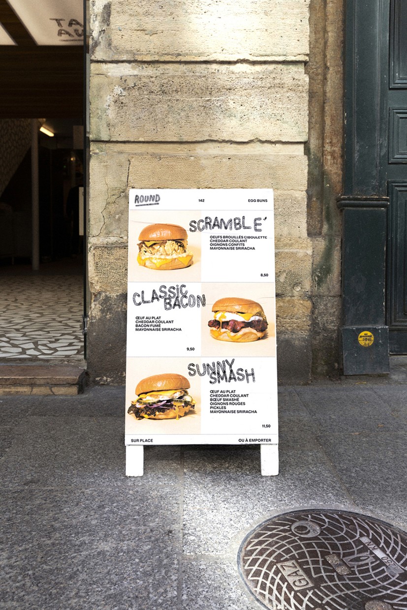
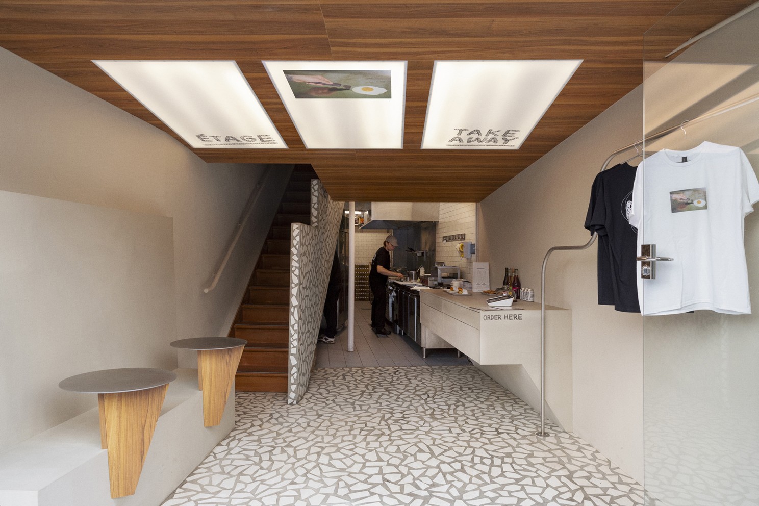
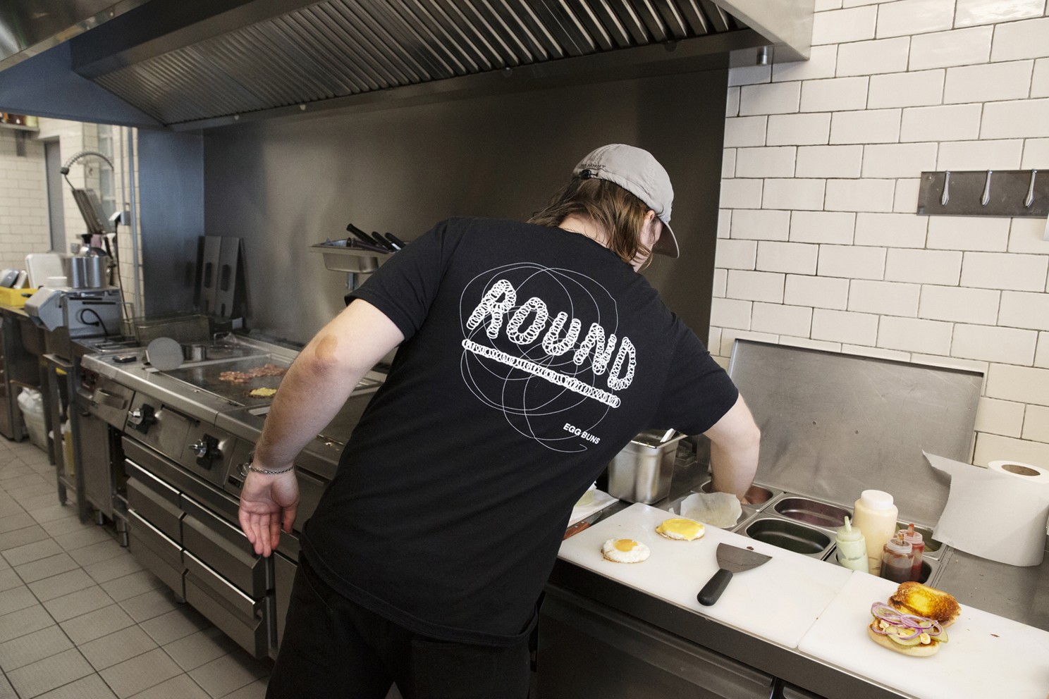
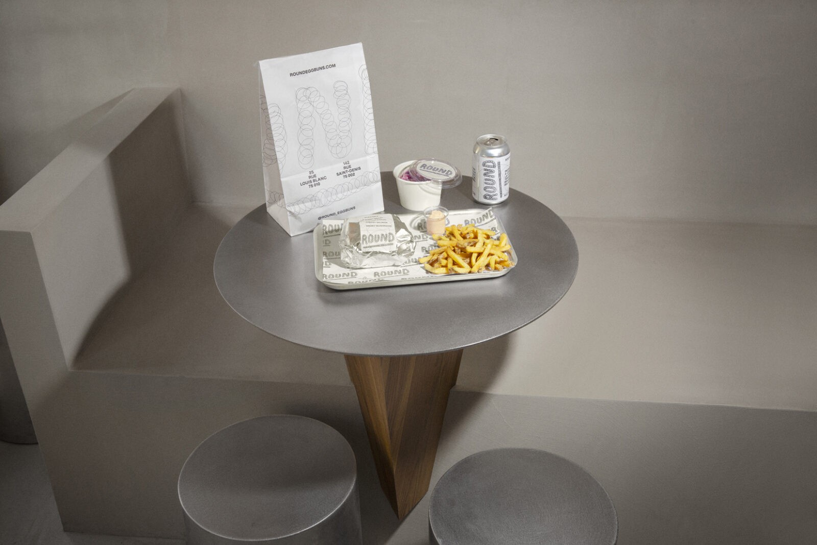
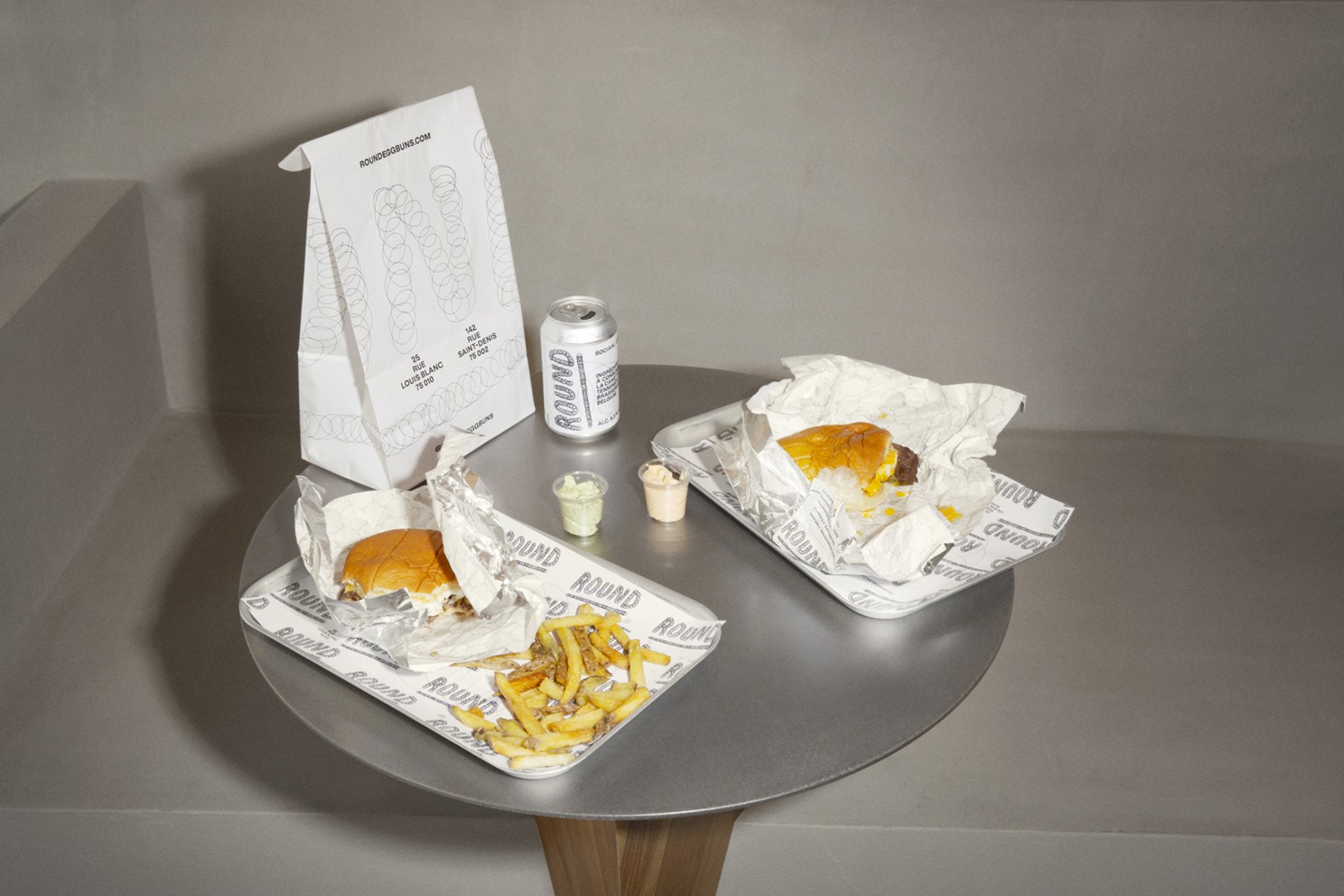
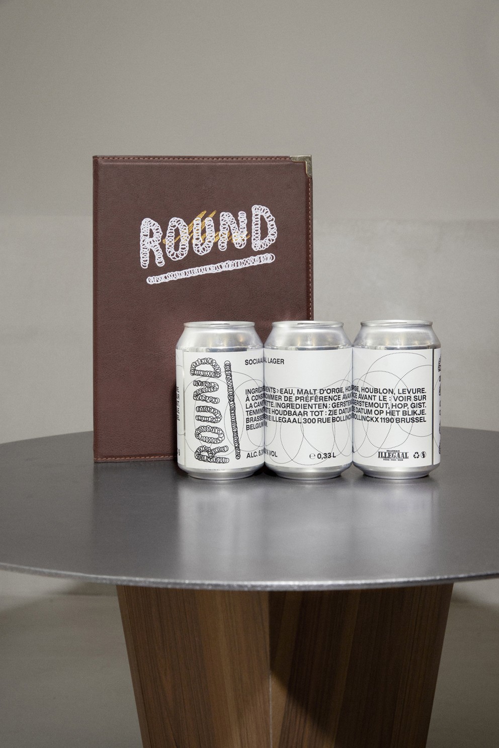
The result is a vibrant and unapologetic visual system that draws from skate culture, tattoo art, and graffiti. At the heart of the identity is a hand-drawn logo built around a circular motion referencing:
the whisking of eggs (central to the menu),
the curved movements of skaters in bowls and pipes,
and the skipping rope a subtle nod to boxing, the inspiration behind the name Round.
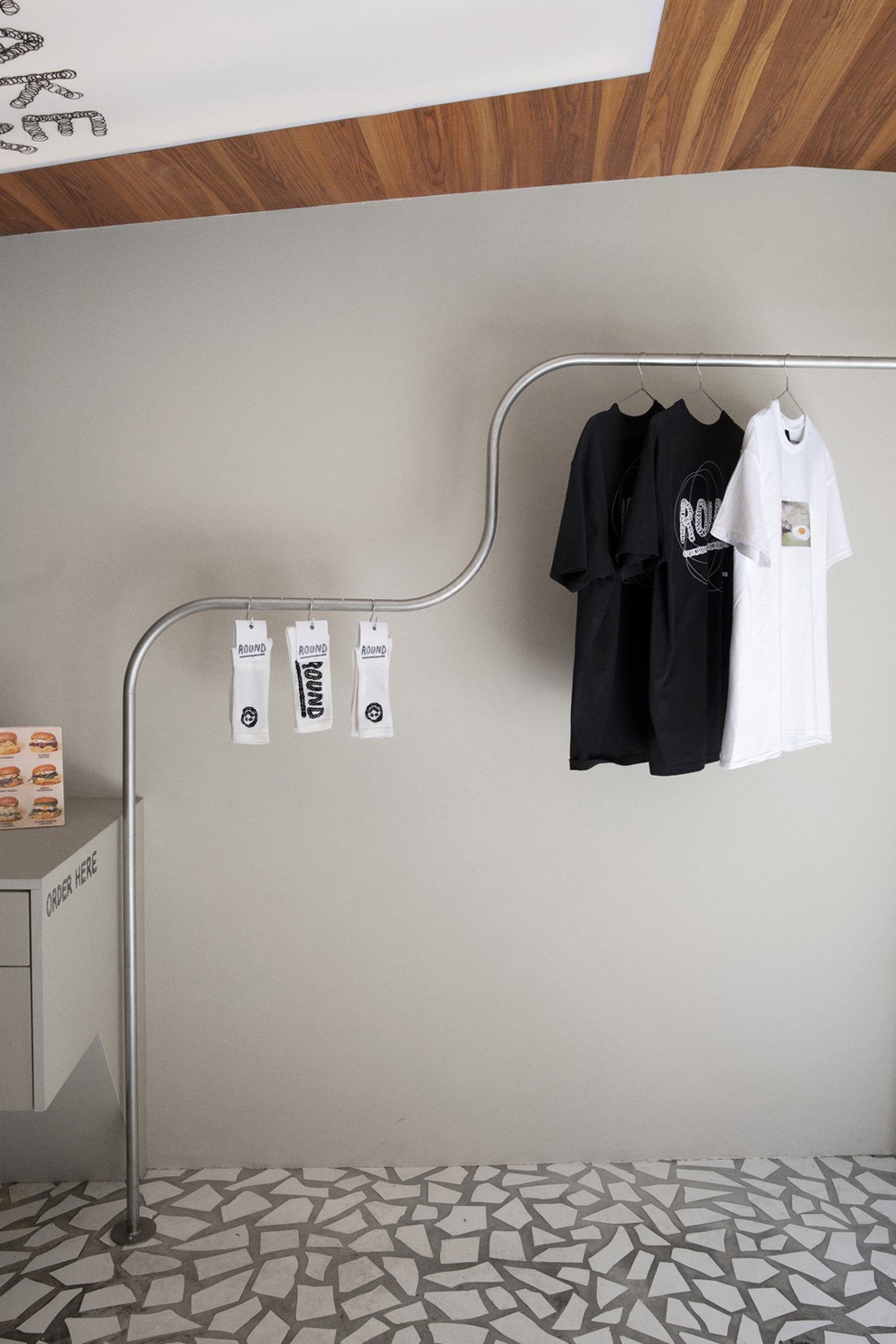
This visual language extends across the brand’s entire ecosystem: custom type design, hand-painted signage on-site, packaging, and merchandising (including T-shirts, socks, and more). The identity has resonated so strongly that one of the restaurant’s co-founders even had the typographic smiley tattooed on their calf — a sign of true brand ownership and engagement.
The project was documented in collaboration with photographer Jade Ambre.
CREDIT
- Agency/Creative: Pierre de Belgique
- Article Title: Pierre de Belgique Redefines Street Food Identity with Round in Paris
- Organisation/Entity: Freelance
- Project Type: Identity
- Project Status: Published
- Agency/Creative Country: France
- Agency/Creative City: Paris
- Market Region: Europe
- Project Deliverables: 2D Design, Animation
- Industry: Food/Beverage
- Keywords: #identity #branding #Handmadetype #graphicdesign #handmadebranding
-
Credits:
Designer: Pierre de Belgique


