


Task
The goal is to redesign and refresh the existing logo, finding a symbol that embodies the unique personality and creativity of the animation studio. Lemons Studio already had a classic lemon icon as their logo but aimed to be more creative and explore new visual directions. Additionally, the task involves developing a cohesive and significant brand identity that stands out in the industry.
Solutions
Lemons Studio make handcrafted animation videos, creating every character, movement, and frame from scratch without pre-made templates. The studio specializes in 2D, 3D, and frame-by-frame animations, each tailored to tell a unique story. The core idea behind the redesign was to highlight this handcrafted nature and the team’s dedication to their craft. Throughout the design process, we explored various directions in search of one significant symbol that could be the foundation for the brand identity.
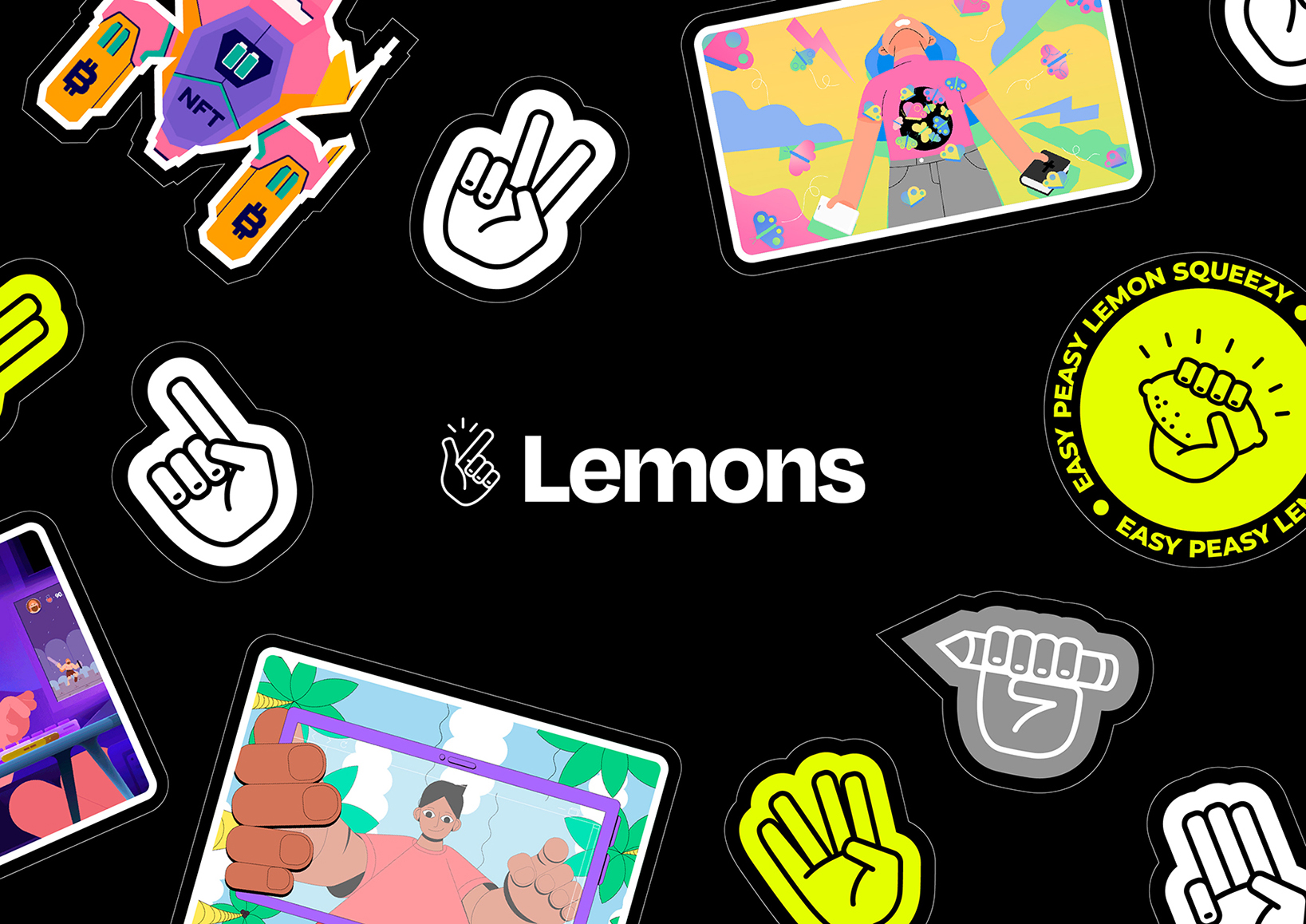
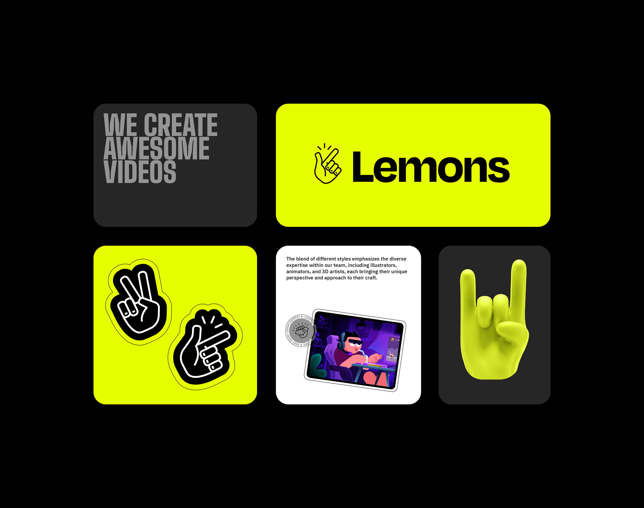
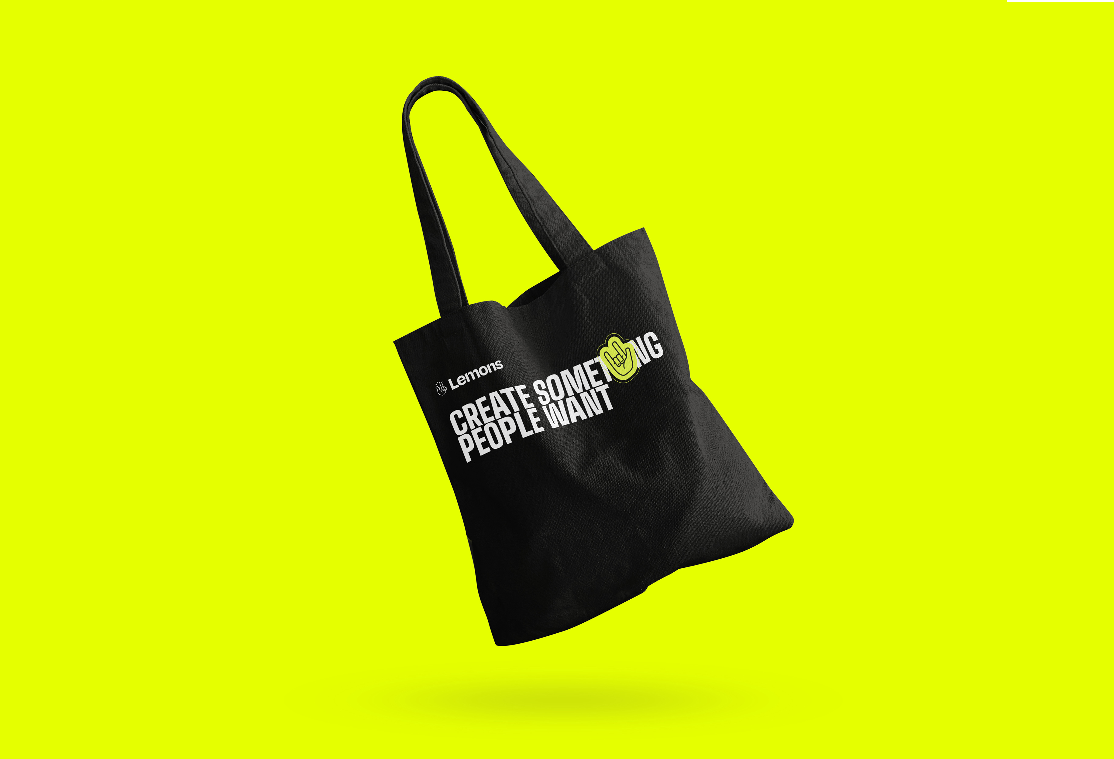
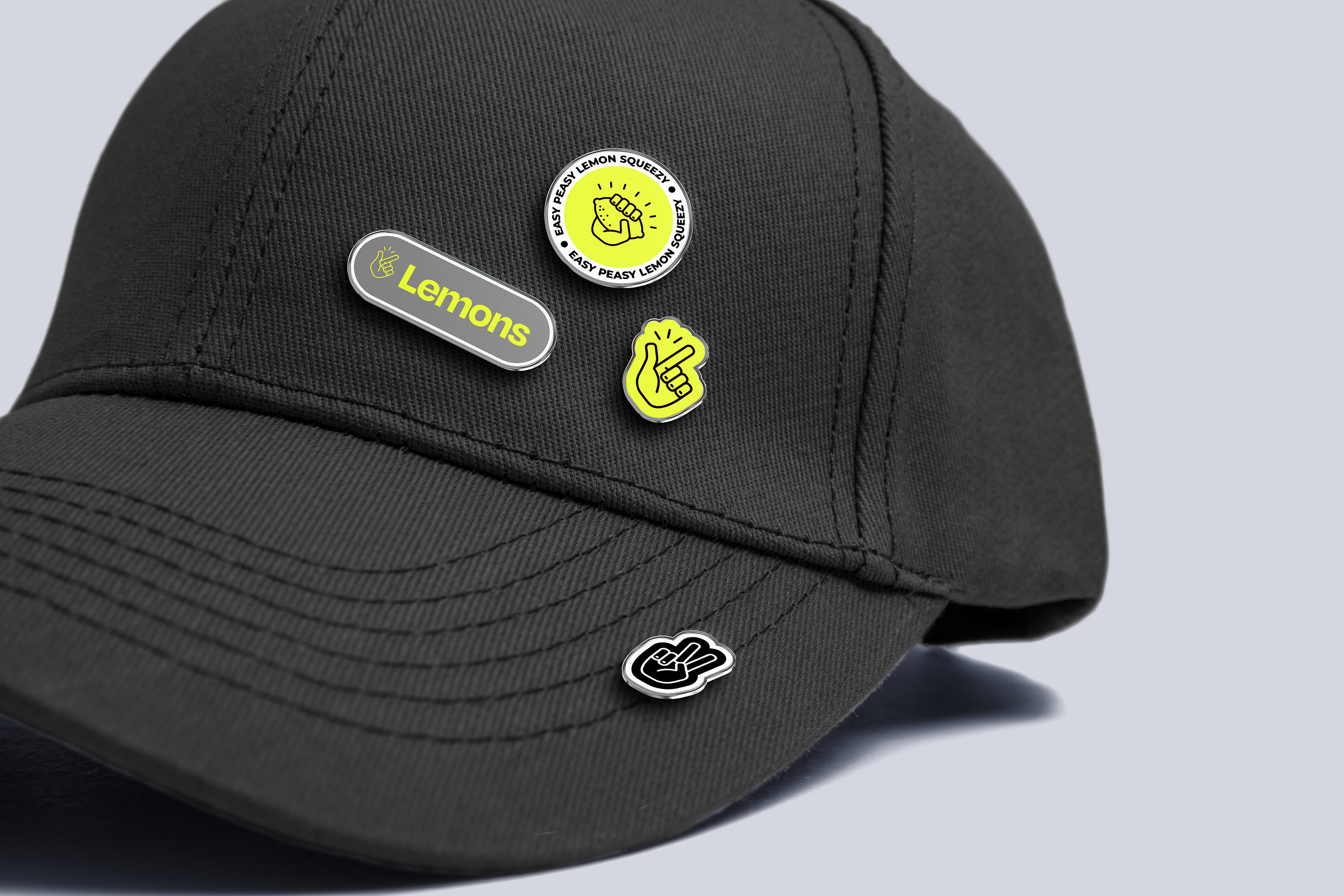
To symbolize handcrafted animation, hands became the central theme in both the logo and the overall brand identity. The chosen logo icon features a “snap” symbol, which not only represents significant visual movement but also conveys the meaning of “Exactly!” or “I got it!” – akin to the phrase “easy peasy lemon squeezy.” This snap symbol reflect the precision, creativity, and epiphany moments that characterize Lemons Studio’s work.
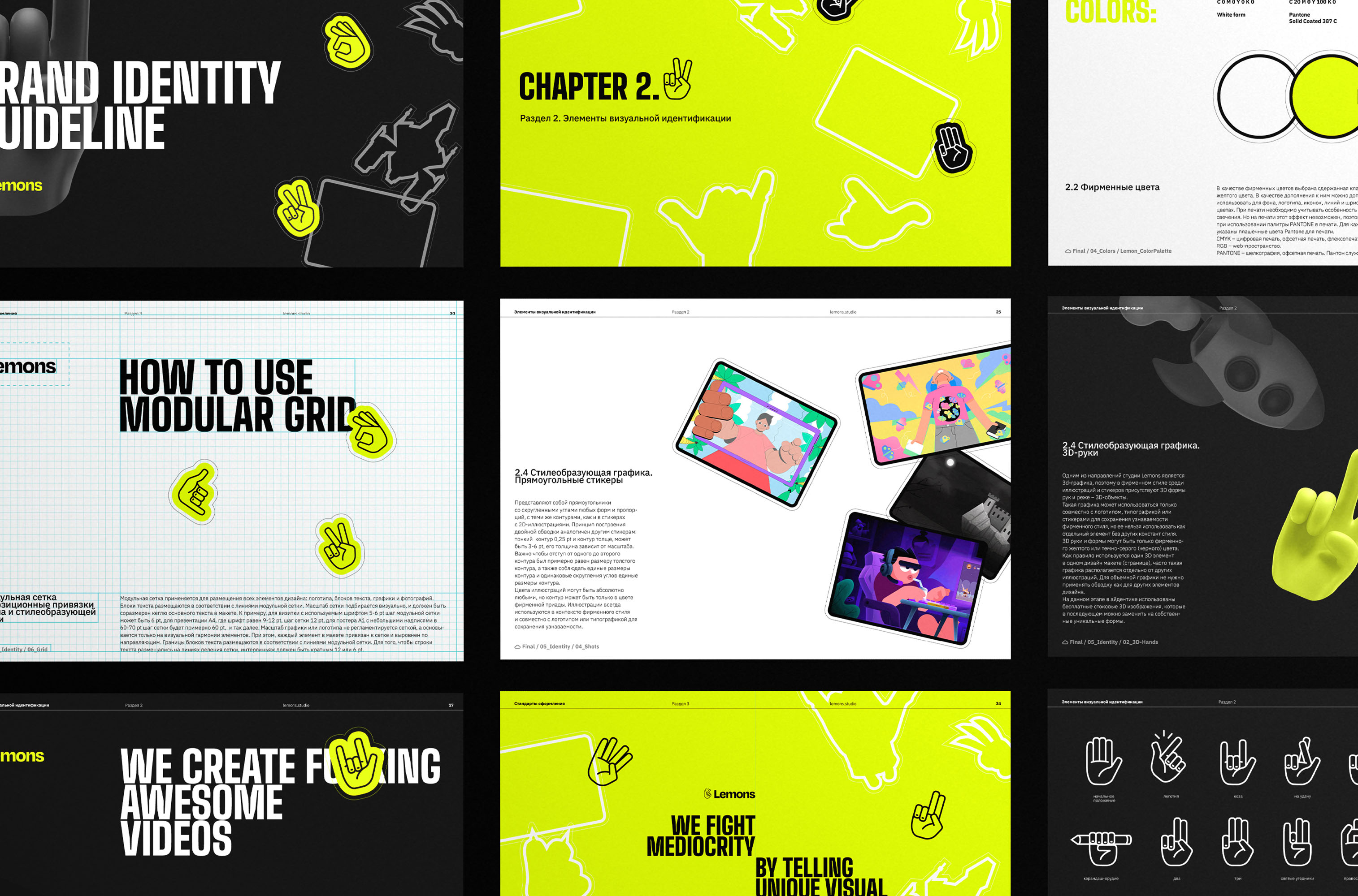
Building on the hand theme, we developed an icon system where the hand can take on various shapes and forms. In the corporate style, the hand can have absolutely different shapes. This flexibility allows the brand to visually express different facets of its personality. The brand style is designed to feel like a collection of stickers on a laptop, each representing a different story and aspect of the studio’s work.
We incorporated a variety of elements into the brand identity, including hand-drawn icons, frames from animations, characters, and illustration elements. This approach not only highlights the studio’s talents but also creates a rich and engaging visual language that can be used across various platforms.
The brand colors are a classic triad of white, gray, and black with a bright accent of neon lemon color, adding a vibrant touch that stands out.
To ensure consistency and ease of use, all branding elements were compiled into a brand guideline. This guideline simplifies the creation of additional assets such as websites, presentations, and marketing materials, ensuring a unified style and a strong brand presence.
The new logo and brand identity effectively communicate the Lemons studio’s unique approach to animation and its dedication to producing high-quality, original content.
CREDIT
- Agency/Creative: Pictograph Design Studio
- Article Title: Pictograph Design Studio Redesigns Lemons Logo and Brand Identity
- Organisation/Entity: Freelance
- Project Type: Identity
- Project Status: Published
- Agency/Creative Country: Lithuania
- Agency/Creative City: Vilnius
- Market Region: Europe
- Project Deliverables: Brand Guidelines, Identity System, Logo Design
- Industry: Entertainment
- Keywords: Logo and Identity for LEMONS animation studio
-
Credits:
Graphic Designer: Nastya Novikova


