It all started in a Singapore community garden of over 300 tropical herbs. Generation after generation observed and returned to the restorative powers of these plants. Straits Biopharma combined their rigorous science and the phytonutrients found in the herbs of traditional medicines into unique proprietary phytomedicinals. Phytor’s healing formulations are scientifically proven to make a difference to consumers wellness and restoring health,
NOAT partnered with Straits Biopharma to explore the competitive market, the semiotic codes of parallel medicinal and supplement categories to develop the Phytor’s brand’s positioning, naming, tone-of-voice, visual brand identity system, key visuals, and guidelines. Betsy Managing Partner at NOAT says “Consumers want the best of science and nature and understand that it is the most impactful way to better health. Technology used to harness natural power is an attractive proposition for today’s consumers. Which we are seeing in the growth and normalisation of biometrics. So, we were really excited to be a part of this brand creation.”
Going on to detail NOAT’s approach, Betsy continues; “It was important to define the potent duality of science and nature in the brand’s proposition. ‘Scientifically harnessing the restorative potency of nature and traditional formulas. From there we developed a tone of voice that reflected Phytor’s personality, as progressive scientists. Passionate, determined enablers with a strong, confident yet empathetic voice. Human, humble and authentic. It was important for us to relay Phytor’s understanding of the personal challenges of their consumers health journey yet encouraging to motivate and empowering to promote wellness. So, whilst expert, there is no pretension in its language.” When talking with the James, Creative Partner, he talked us through the creative exploration in detail:
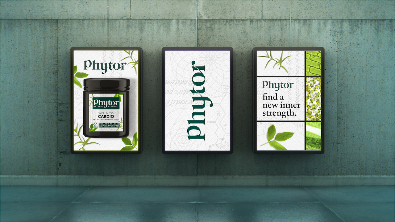
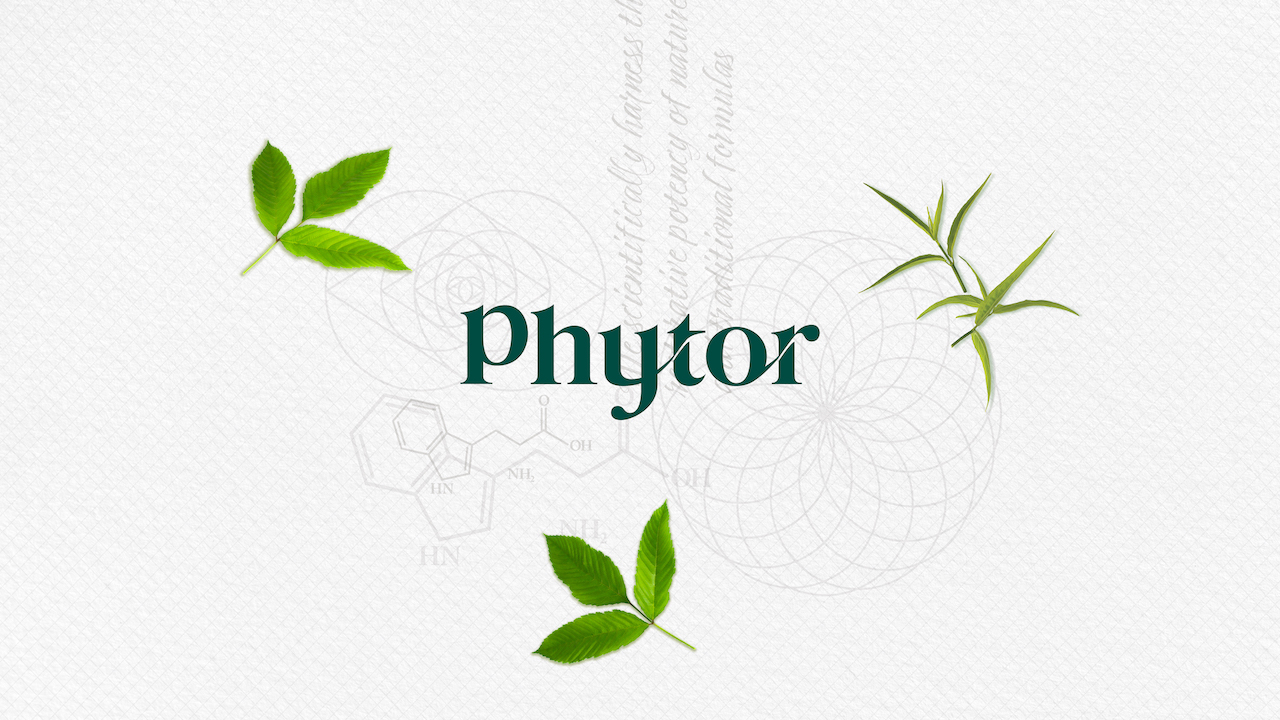
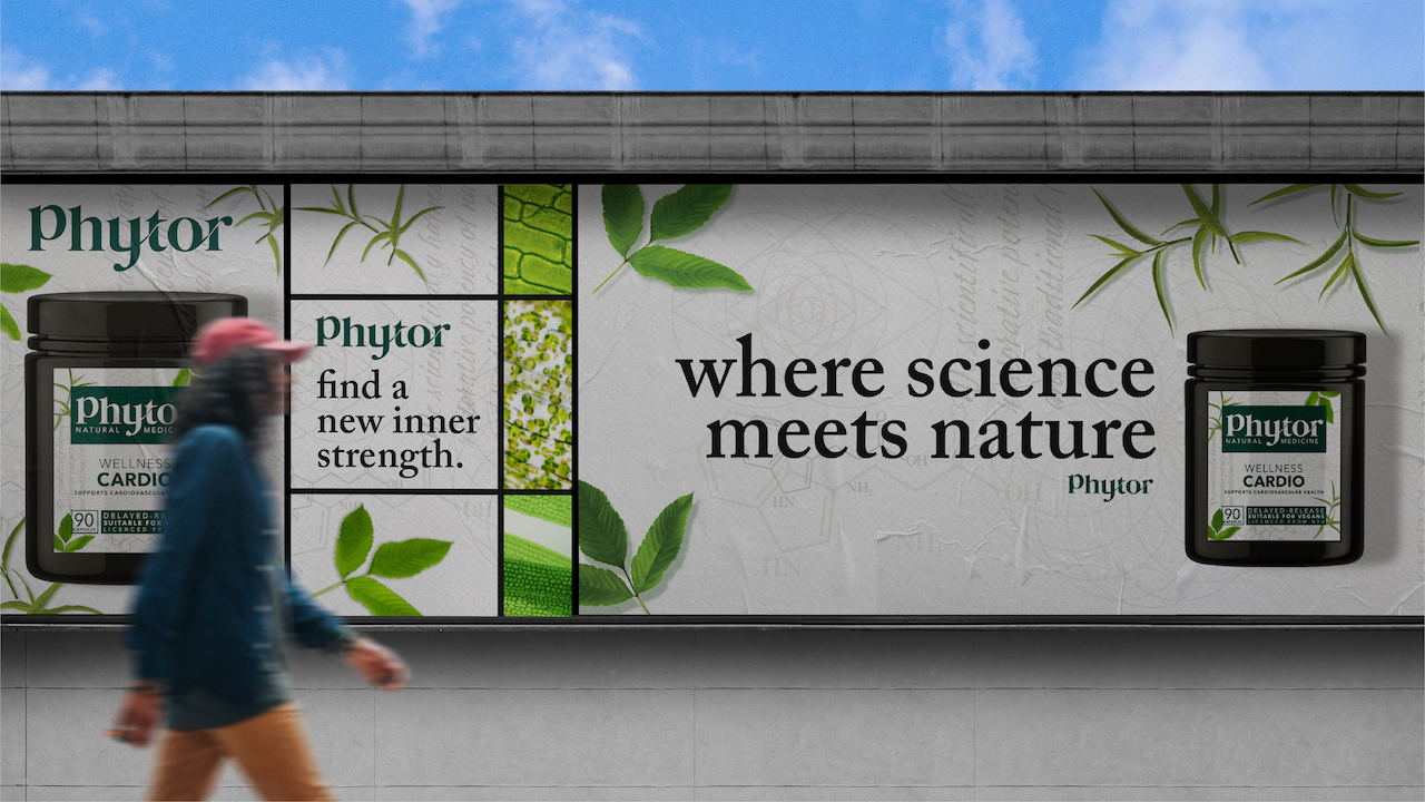
• Logo design: The Phytor wordmark uses the flowing forms of nature, intertwining letters are inspired by the vines of the gardens.
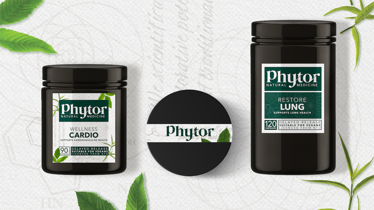
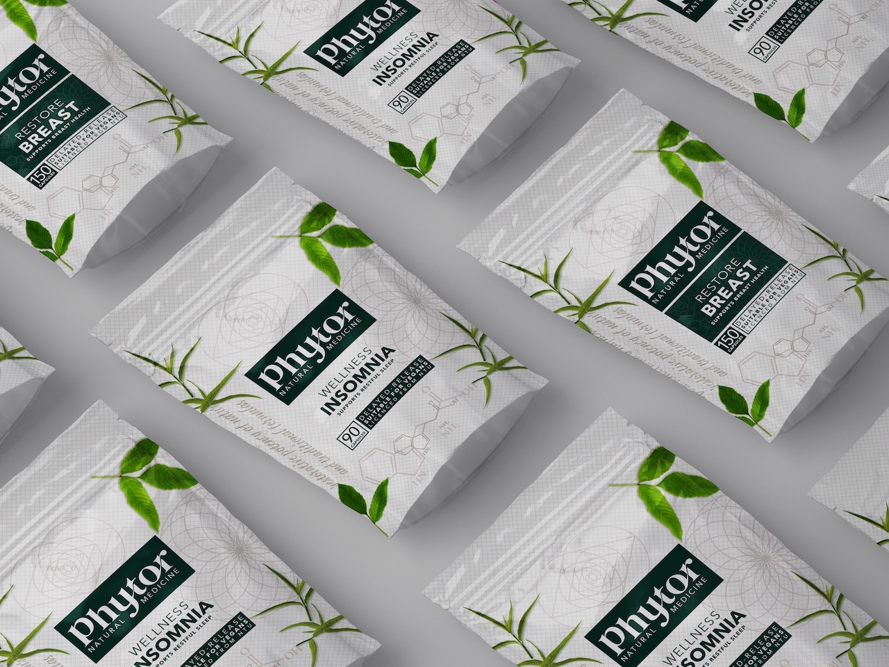
• Secondary Assets: Our key imagery is a mix of natural ingredients and the active ingredients from under the microscope, whilst our pattern, inspired by the Fibonacci sequence (the science in nature) is created using traditional formulaic symbols, tryptophan molecules and our brand purpose, handwritten on parchment paper with a diagonal grid; implicit of the modern science and centuries of traditional wisdom.
• Colour palette: Looking at emergent semiotic codes, we used a sophisticated colour palette of green, white, grey, and black to create a differentiating and distinct colour language evoking science, traditional formulas, and nature; Phytor’s core attributes.
• Packaging: This was achieved by using the real botanical ingredients alongside hard pharmaceutical codes. The packaging itself is constructed, akin to a periodic table, bringing forward the pharmaceutical language.
Phytor are now on a mission to help win the fight against chronic disease and target hormonal and metabolic imbalances, either to prevent or cure with their powerful phytomedicinals.
CREDIT
- Agency/Creative: NOAT
- Article Title: Phytor Powerful Phytomedicinals Brand Design
- Organisation/Entity: Agency
- Project Type: Identity
- Project Status: Published
- Agency/Creative Country: United Kingdom
- Agency/Creative City: Cheshire
- Market Region: Asia
- Project Deliverables: 2D Design, Brand Creation, Brand Design, Brand Guidelines, Brand Identity, Brand Naming, Brand Strategy, Brand Tone of Voice, Brand World, Branding, Copywriting, Design, Graphic Design, Identity System, Label Design, Logo Design, Packaging Design, Packaging Guidelines, Research, Typography
- Industry: Pharmaceutical
- Keywords: phytomedicinals, traditional medicine, science, herbs, nature, natural, wellness, restore
-
Credits:
Creative Partner: James Bebbington
Managing Partner: Betsy Bebbington
Strategist: Aimee Lewis


