


Phùng Ân Artisan – Elevating Vietnam’s Traditional Handicrafts.
Phùng Ân Artisan is a brand specializing in homeware, offering high-quality creative solutions to elevate your home. Inspired by local nature and Vietnamese culture, PAA combines contemporary aesthetics to deliver artisan-quality products. Expanding beyond, Phùng Ân Artisan is becoming a comprehensive gift solution provider, from design to manufacturing.
Renowned for their creativity and sustainability, Phùng Ân’s products harness various materials and techniques rooted in Vietnam’s traditional handicraft industry. With extensive experience in home decor, Phùng Ân adeptly preserves and revitalizes Vietnamese handicrafts, championing local artisans. Through their thoughtful homeware and gifts, Phùng Ân showcases the beauty of Vietnam’s heritage to the world.
Concept
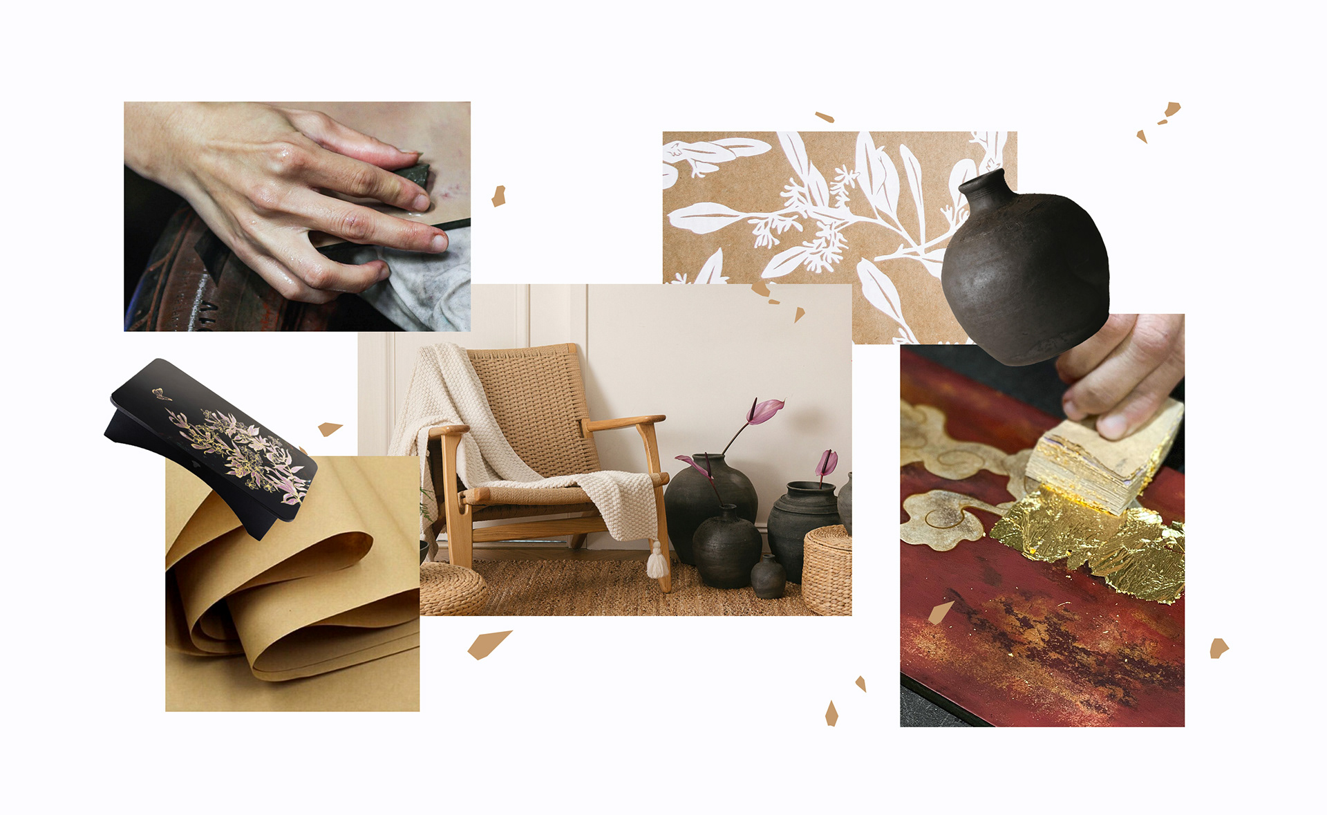
Phùng Ân collaborated with Layơ Lab to revitalize its brand, aiming to enhance and unify its visual identity system while affirming Phùng Ân’s professionalism, modernity, and creativity in its new image. Starting the research from the humble and everyday perspectives in the working process of experienced artisans and craft villages in Vietnam, we gathered a wealth of rich inspiration and materials for design concept ideation.
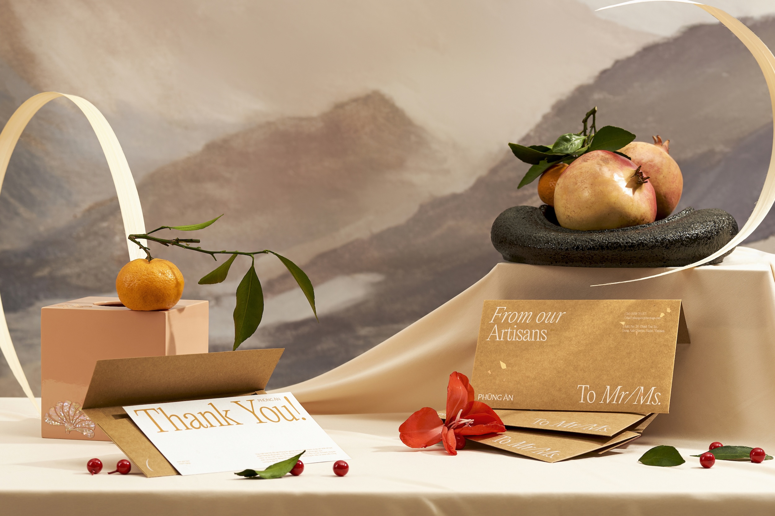
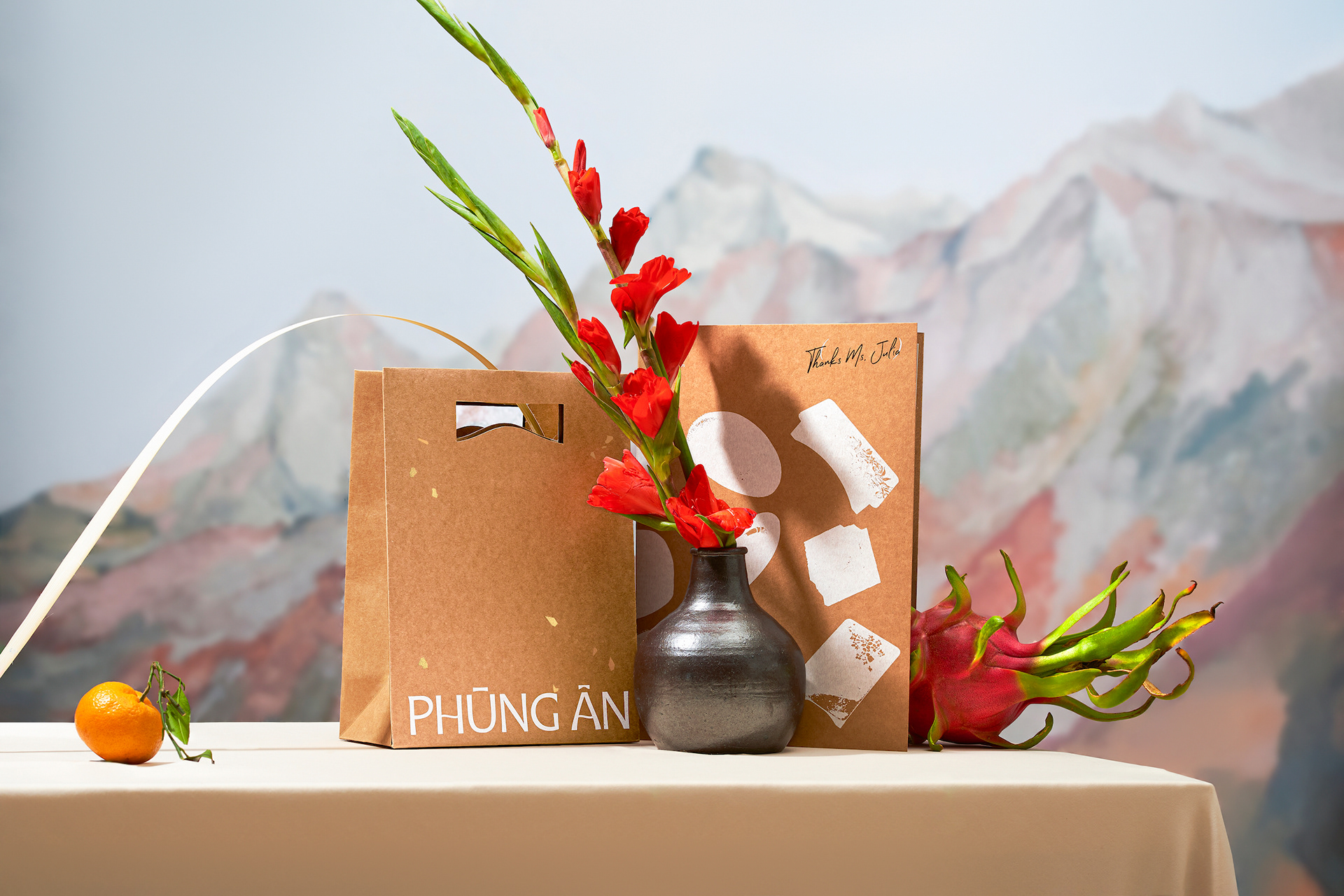
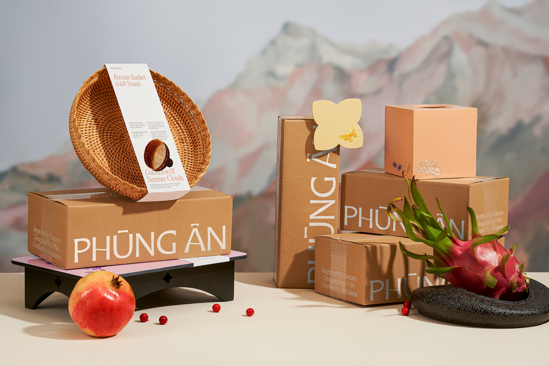
By combining traditional yellow hues (derived from traditional handicrafts: ochre soil, bamboo, ebony wood, and gilded paper) with modern eco-friendly Kraft paper, we sought to preserve and elevate the rustic and traditional nature of Vietnamese handicrafts. Additionally, these are primary materials used to package the exquisite handmade products, delivering to Phùng Ân’s customers. Therefore, they simultaneously honor the enduring value of Vietnamese craftsmanship and preserve cultural heritage for the future. From these thoughts, the design concept for Phùng Ân Artisan’s brand identity emerged: “present heritage of Vietnamese culture to the future”.
Visualization
To affirm the idea of sustainability and connection to traditional craftsmanship, the main visual element – “gold dust” is introduced, represented by random-shaped gold foil patches on the layout to integrate layers of imagery and content. “Gold Dust” not only symbolizes heritage but also enhances the value and sophistication of the products, reflecting the brand’s premium quality. The gold foil details of “Gold Dust” can be customized in size, space, and color, providing flexibility in application while emphasizing artistic and contemporary visions.
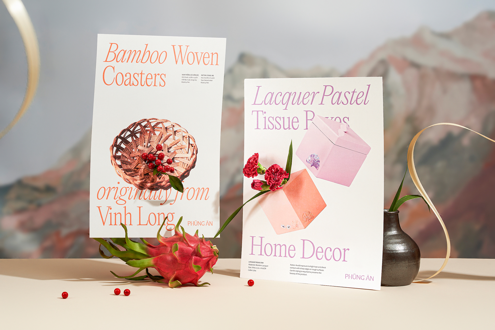
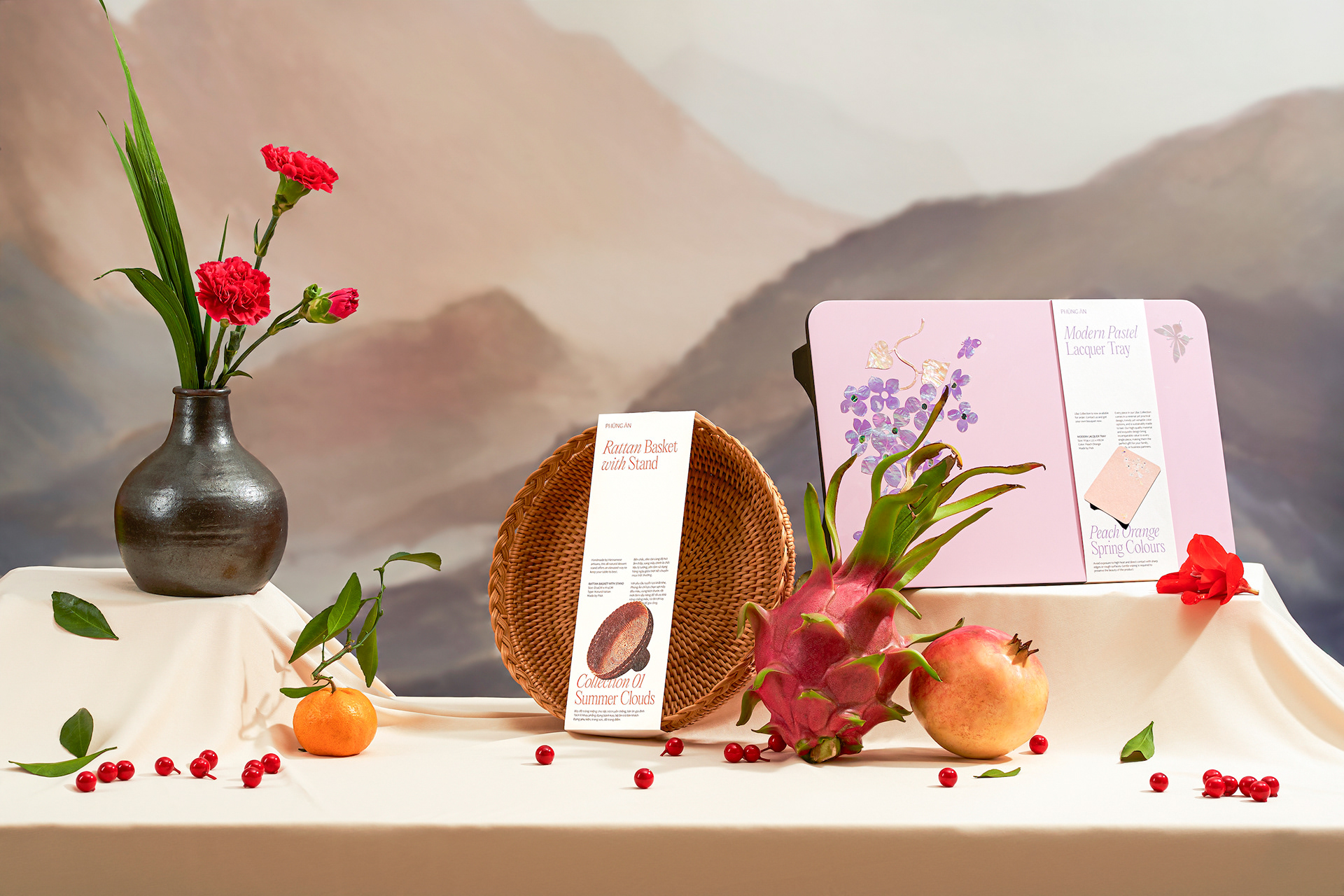
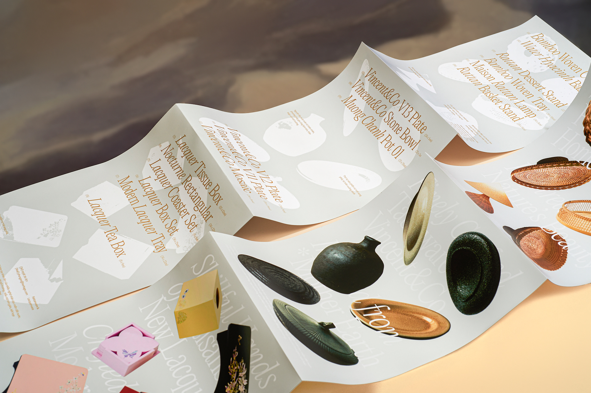
The product image system is also a key that sets the brand apart, with efficient and flexible interaction with high-contrast textual content. This not only showcases the craftsmanship and artistry of each product crafted by artisans but also serves as a self-advertising and sales tool for the brand. When displayed together, these products create a collection, highlighting the diverse beauty of Vietnamese handicrafts, while showcasing Phùng Ân’s product portfolio. In some cases, these images can be adjusted to black-and-white silhouettes to simplify the design.
Special Effects
To connect the traditional with modern artistry, and emphasize the brand’s sustainability spirit, the identity system of Phùng Ân Artisan incorporates handmade Kraft paper combined with white printing, creating a sense of modernity and sophistication. This solution not only helps save costs but also enhances design effectiveness, adding uniqueness to the brand. The “Gold Dust” effect on Kraft paper also brings a gentle, delicate, and meaningful feeling, showcasing the “heritage” aspect, as well as adding interest and contemporaneity to the design, introducing a new approach. Applying gold foil to both the text and the paper background also creates layers in the layout, giving depth to the design.
The text content is arranged vertically in layers and has a spacious layout, enhancing the minimalist look. The strong contrast typography system in a large space adds coherency and legibility to the whole content. The layout focuses on processing key information and delivering concise and direct messages to viewers. Additionally, combining italic style for Editorial New typeface emphasizes keywords, creating a distinctive and captivating style.
CREDIT
- Agency/Creative: Layơ Lab
- Article Title: Phùng Ân Artisan’s Sustainable and Artistic Rebrand by Layơ Lab
- Organisation/Entity: Agency
- Project Type: Identity
- Project Status: Published
- Agency/Creative Country: Vietnam
- Agency/Creative City: Ho Chi Minh City
- Market Region: Asia, Global
- Project Deliverables: Brand Design, Brand Experience, Brand Identity, Brand Redesign, Rebranding
- Industry: Retail
- Keywords: vietnam, branding, identity, contemporary
-
Credits:
Creative Director: Alex Dang
Designer: Truong Thanh, Danson Vu
Producer: Thanh Trung
Photography: Quynh Nguyen, Khoa Ngo


