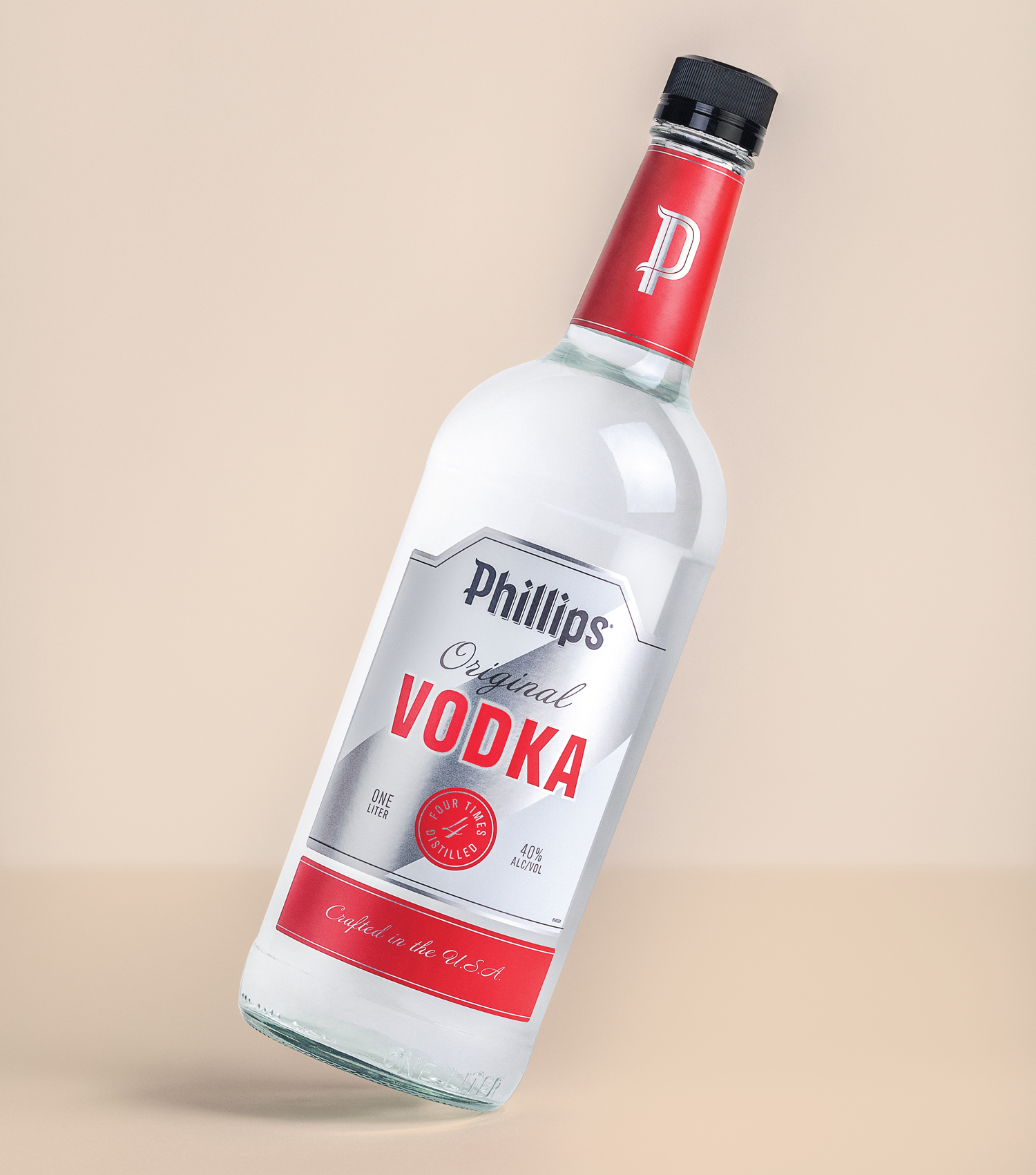
With a rich history spanning more than 100 years, five generations and hundreds of skus, the Phillips flagship brand presides over a broad range of innovative spirits. This redesign gives the brand portfolio a fresh look while retaining the likeability the brand enjoys as a “Midwest favorite.”
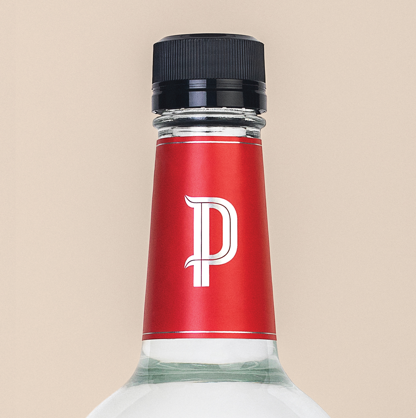
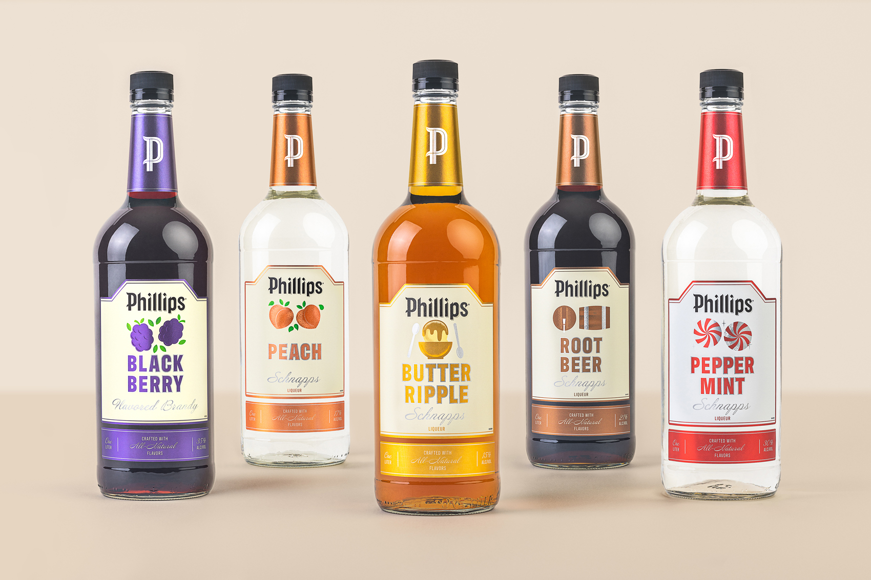
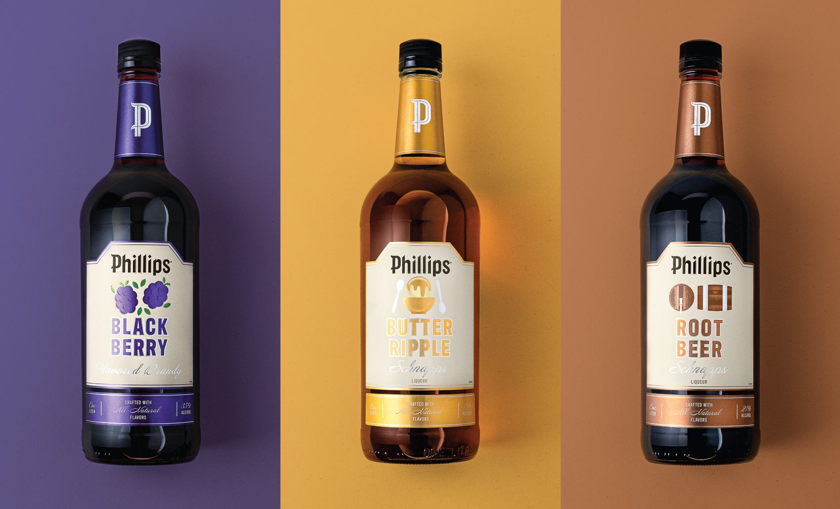
This new brand expression is built for flexibility, designed with a clear hierarchy that makes the expansion of innovative products easy to manage. Original core spirits use an updated, but classic look. Flavored spirits incorporate illustrations to enhance and differentiate flavors.
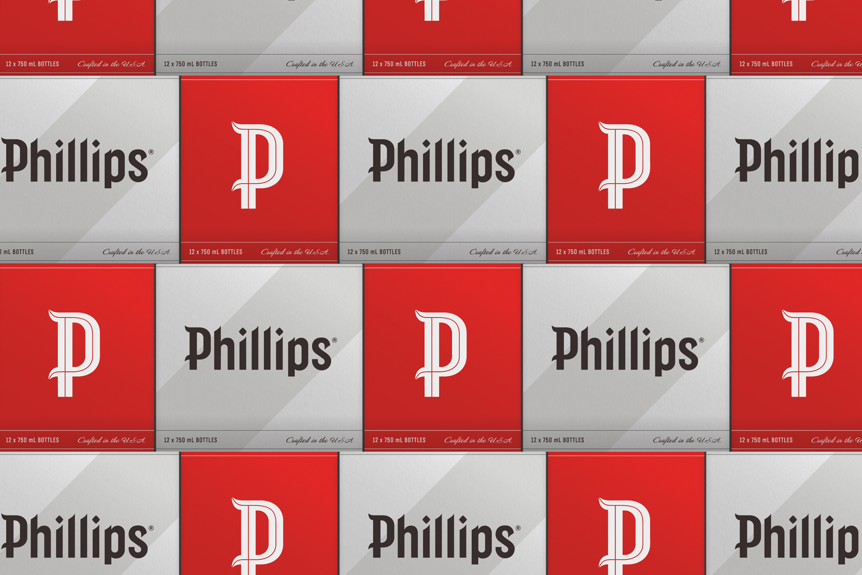
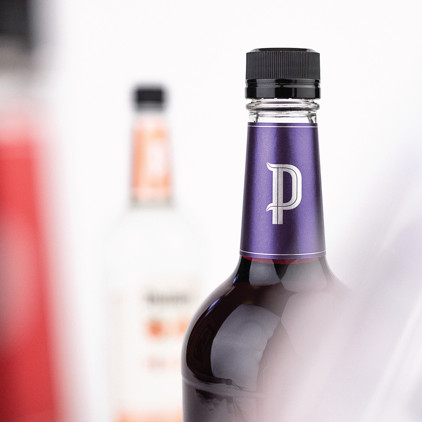
Together, they elevate the brand expression and make products easy to navigate on shelf, creating a portfolio that’s modern and familiar. From classic standards, to flavored liqueurs and ready-to-serve cocktails, the brand has a revitalized, more relevant presence on retail shelves.
CREDIT
- Agency/Creative: Cue
- Article Title: Phillips Distilling Co Branding
- Organisation/Entity: Agency
- Project Type: Identity
- Project Status: Published
- Agency/Creative Country: United States
- Agency/Creative City: Minneapolis
- Market Region: North America
- Project Deliverables: Brand Architecture, Brand Creation, Brand Design, Brand Guidelines, Brand Identity, Brand Mark, Brand Redesign, Branding, Graphic Design, Icon Design, Identity System, Illustration, Label Design, Lettering, Logo Design, Packaging Design, Packaging Guidelines, Rebranding, Retouching, Type Design, Typography, Writing
- Industry: Food/Beverage
- Keywords: spirits, vodka, schnapps, brandy, distillery, brand update, minneapolis, minnesota, midwest, heritage, history, alcohol
-
Credits:
Creative Director: Alan Colvin
Designer: Matt Erickson
Photographer: Cody Petts


