


This logo redesign project for the Philippines’ National Baseball Team draws deeply from one of the most recognizable and culturally rich visual references in the country: the signages of jeepneys. Jeepneys, long regarded as the “King of the Road,” carry not only passengers but also decades of typographic history—hand-painted letters, bold directional markers, expressive slanted strokes, and uniquely Filipino visual flair. These signages became the foundation of inspiration as we explored ways to craft a visual identity that feels unmistakably Pilipinas.
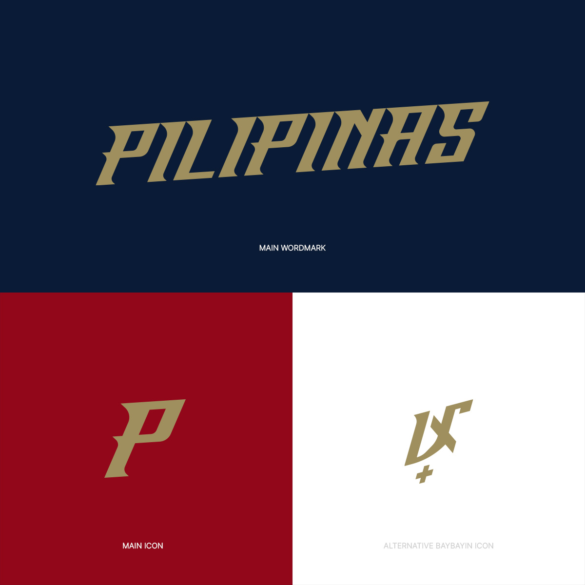
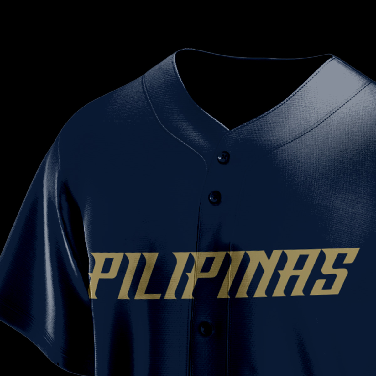
The main wordmark, as seen in the image, pulls heavily from the distinct rigidity and character of jeepney typography. During type research, we studied how jeepney signage letters often appear angular, sharp, and confident—shapes formed by fast brushstrokes and the functional need to be readable even from a moving vehicle. By integrating these qualities, the “PILIPINAS” wordmark achieves a strong, grounded look while still reflecting the handmade charm of Filipino street lettering.
The italicized form isn’t just stylistic—it intentionally mirrors motion. Jeepneys are always on the move, weaving swiftly through busy streets, and this sense of speed aligns perfectly with the playing style of the national team. Philippine baseball is defined by quick reads, sharp reactions, and explosive bursts of momentum. The slanted orientation reinforces this identity: a team that moves with purpose, urgency, and relentless forward drive.
For the icon, the design begins with a stylized letter “P,” mirroring the same angular, jeepney-inspired cuts of the wordmark. It is bold, compact, and instantly recognizable—ideal for patches, caps, and digital applications. But the system becomes even more meaningful with the addition of an alternate Baybayin version of “P.” This variant grounds the identity in pre-colonial Filipino roots, bridging modern sports branding with the country’s ancestral script. It expands the brand’s emotional and cultural resonance, offering a secondary mark that honors heritage while remaining cohesive with the main design language.
Together, the wordmark, main icon, and Baybayin icon form a unified identity system that celebrates speed, culture, craftsmanship, and national pride. It’s a visual statement that represents not only a team, but the enduring spirit of the Filipino people—moving forward, boldly and unmistakably.


CREDIT
- Agency/Creative: Arjay Hije
- Article Title: Philippine Baseball National Team Concept Logo Concept Redesign by Arjay Hije
- Organisation/Entity: Freelance
- Project Type: Identity
- Project Status: Non Published
- Agency/Creative Country: Philippines
- Agency/Creative City: Antipolo City
- Market Region: Asia, Global
- Project Deliverables: Brand Redesign, Logo Design, Type Design
- Industry: Entertainment
- Keywords: Sports, Logo, Redesign, Baseball
-
Credits:
Graphic Designer: Arjay Hije


