


Task: comprehensive development of the brand of unique for the Belarusian market A2 dairy products.
About the product: What is A2 milk and how does it differ from ordinary milk? The protein composition of natural cow’s milk contains two main types of beta-caseins: A1 and A2. Milk with a protein composition A1A2 or A1A1 is most often found on the market, although initially cows produced A2A2 milk in their natural environment, and A1 beta-casein arose in the process of artificial production of dairy breeds. Various studies have found out the connection between the A1 protein in milk and digestive discomfort, allergic reactions and other negative effects for some consumers. For the production of A2 milk, cows are specially selected and certified, and the protein composition of the collected milk is regularly checked.
Strategy: The project included the stages of desk and audience research, the development of a positioning strategy and the development of visual brand attributes. Key excerpts from the strategy: 1. potential consumers are skeptical about “milk improvements” and trust more familiar and understandable quality markers like naturalness; 2. consumers want to choose higher quality milk for themselves and their family, but do not see any fundamental differences between the offers on the market and do not understand the criteria for choosing “higher quality milk”; 3. The task of the new TM “Asablivae” is to show consumers that milk, improved by nature, natural and qualitatively different from the entire “shelf”, has appeared on the market
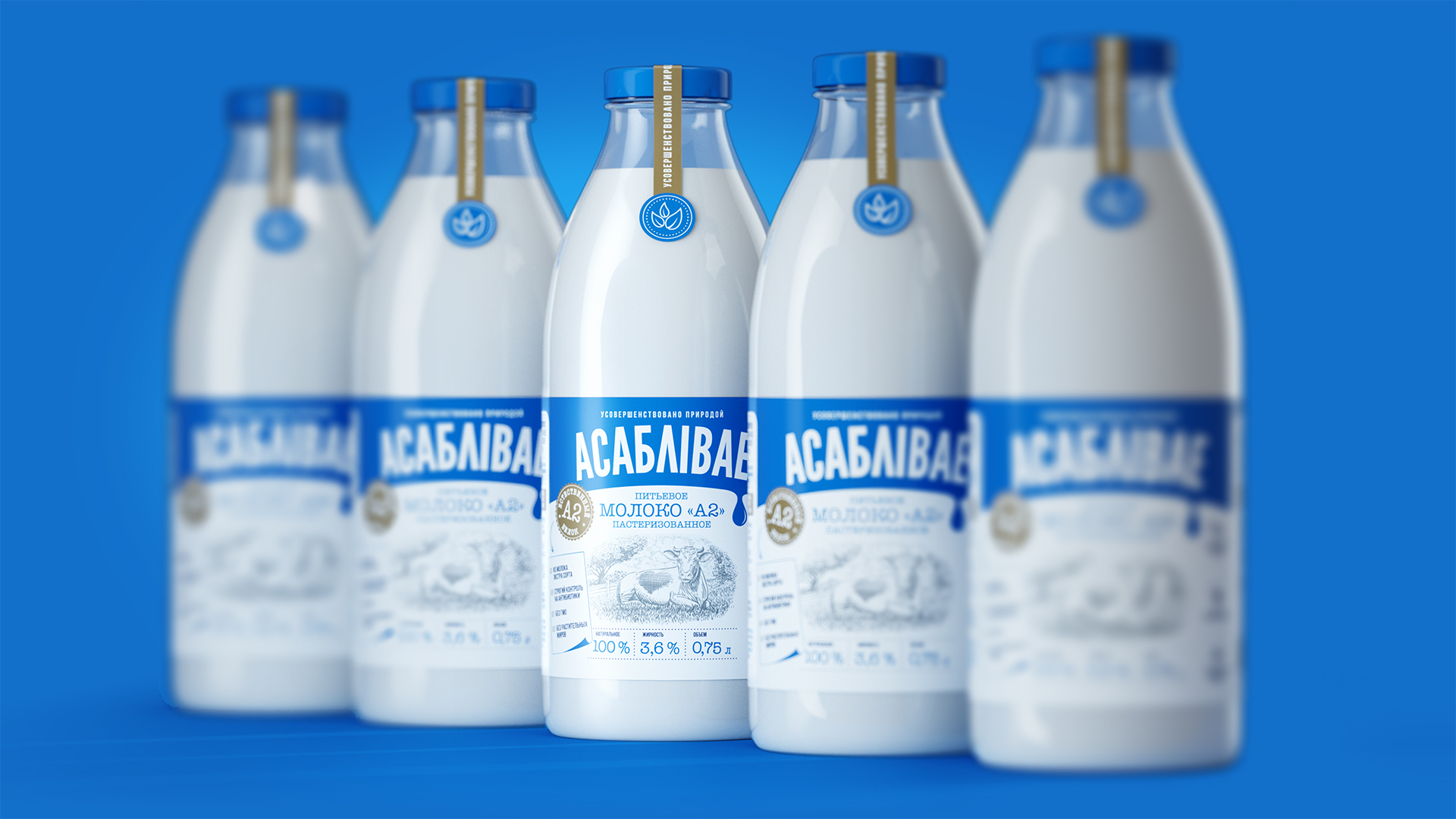
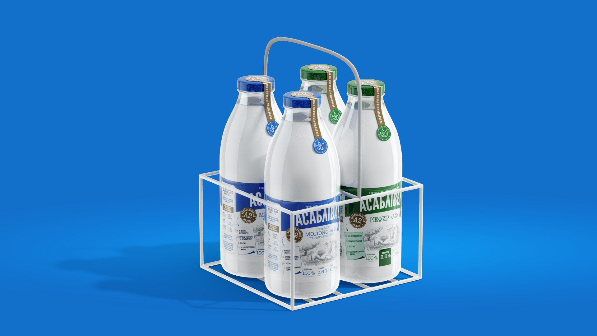
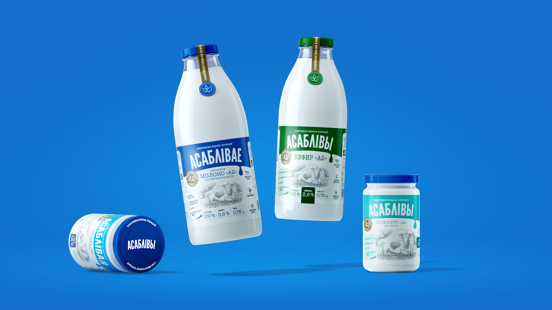
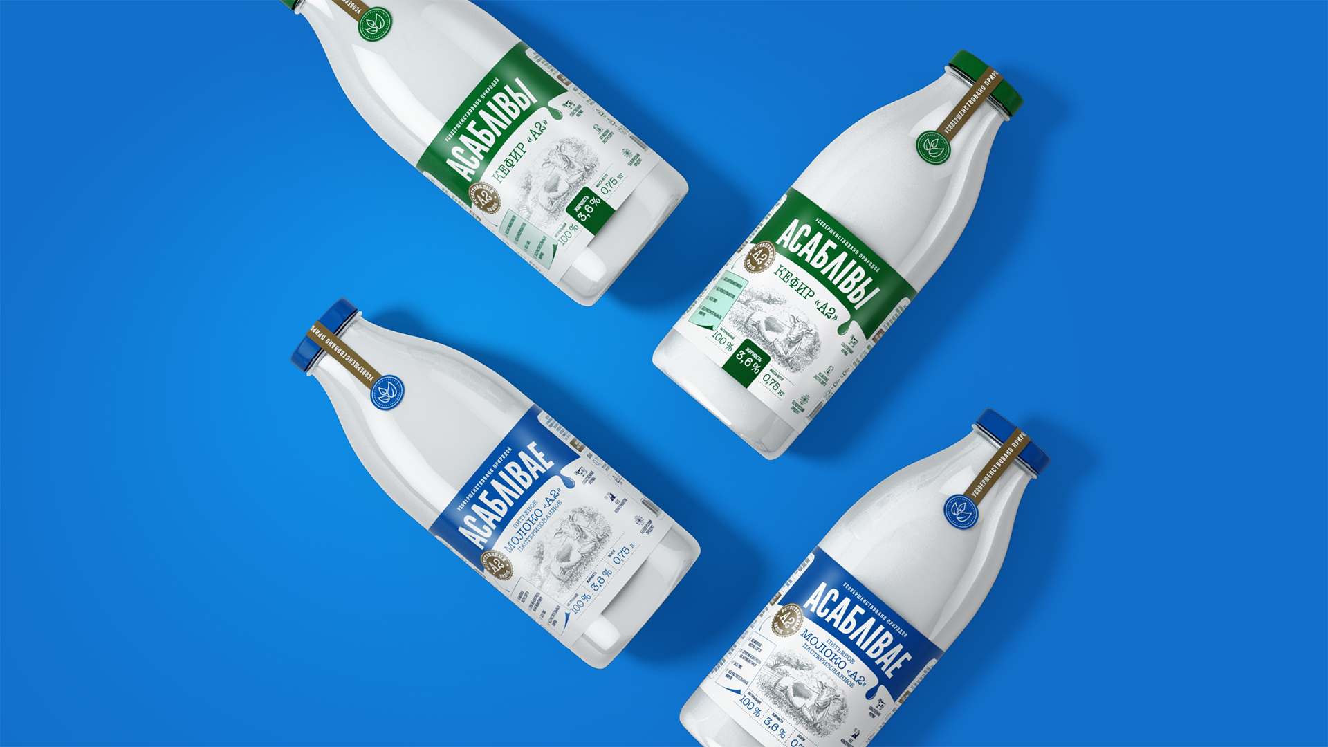
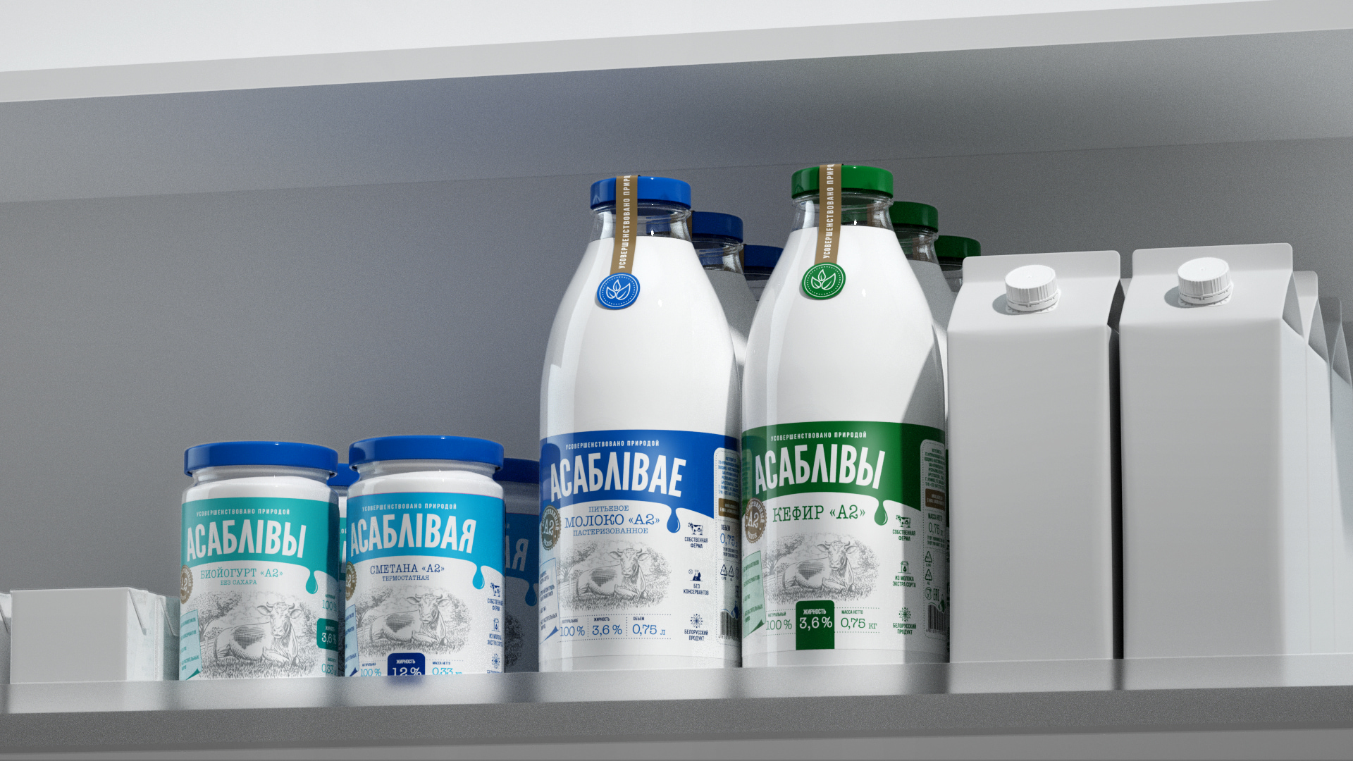
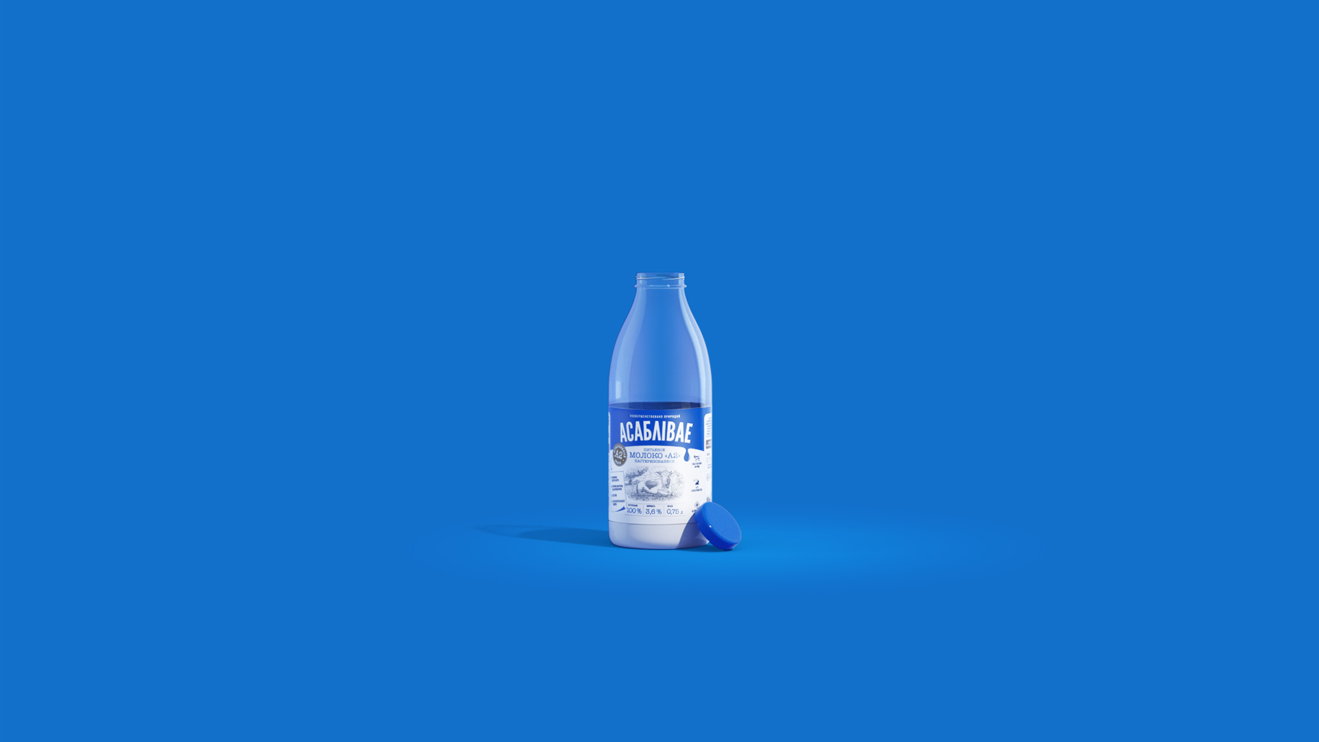
The idea: The name “Asablivae” (means “special” in belarussian) emphasizes the Belarusian production, which consumers trust, and focuses on the key USP of the product.
The design strategy adopted by the PG team in the project makes the packaging of TM “Asablivae” categorical, so that consumers can more easily perceive the “innovation” without fear and distrust. With the help of iconographic layout and a system of stamps, the information necessary for the consumer is reflected, creating the impression of a “safe” innovation. The font solution imitates a typewriter: it allows to add craftiness to the product and emphasizes the locality of production.

CREDIT
- Agency/Creative: PG Brand Reformging Company
- Article Title: PG Brand Reforming Developed a Brand and Packaging Design for Belarusian Dairy Products
- Organisation/Entity: Agency
- Project Type: Packaging
- Project Status: Published
- Agency/Creative Country: Poland
- Agency/Creative City: Warsaw
- Market Region: Europe
- Project Deliverables: Brand Creation, Brand Design, Brand Naming, Brand Strategy, Logo Design, Packaging Design, Research
- Format: Bottle, Jar
- Substrate: Glass Bottle, Glass Jar
- Industry: Food/Beverage
- Keywords: Diary Products, Packaging Design.
-
Credits:
Creative Director: Valentin Dukhnevich


