


Music, dance, drama, visual arts. Can one simple logo represent them all? This question took center stage as brand strategist and designer Solveig Petch collaborated with Norway-based Kulturskolen for alle to shape their new brand identity.
How do we communicate their vision, their mission, their personality — all that this complex and diverse organisation is and stands for — in one unified visual identity?
The answer to that first question is, of course, no. The answer to the second question is: we craft a purposefully simple, yet infinitely flexible, brand identity to act as a container for it all.
Situated in Northern Norway, this inter-municipal school of visual and performing arts serves residents of Alstahaug, Leirfjord, and Dønna. Seeking to refresh their visual identity, the school aimed to better showcase the quality and breadth of their offerings while appealing to potential sponsors from both public and private sectors. The brief? A professional, inclusive, vibrant, inspiring, and creative identity capable of resonating with a broad audience, from Abdul (6) to Agatha (75).
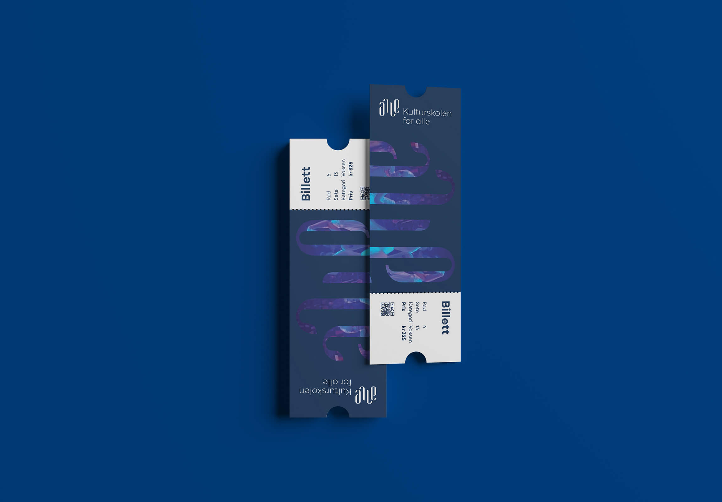
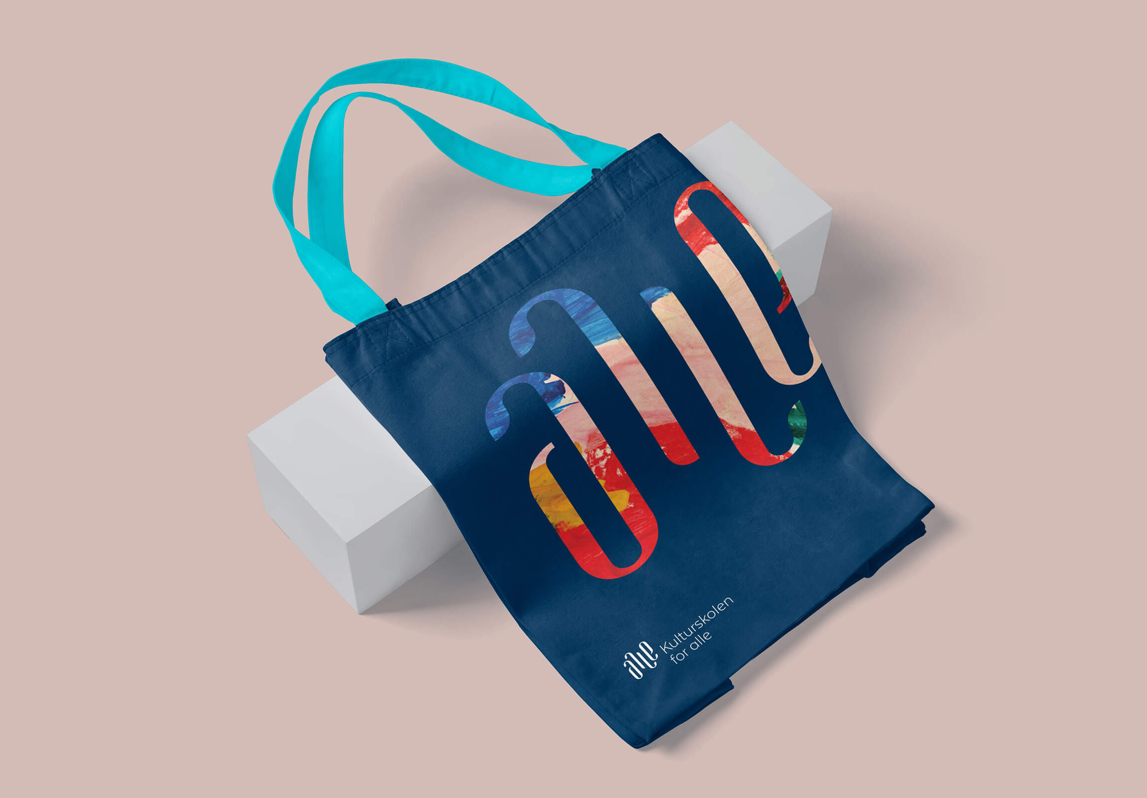
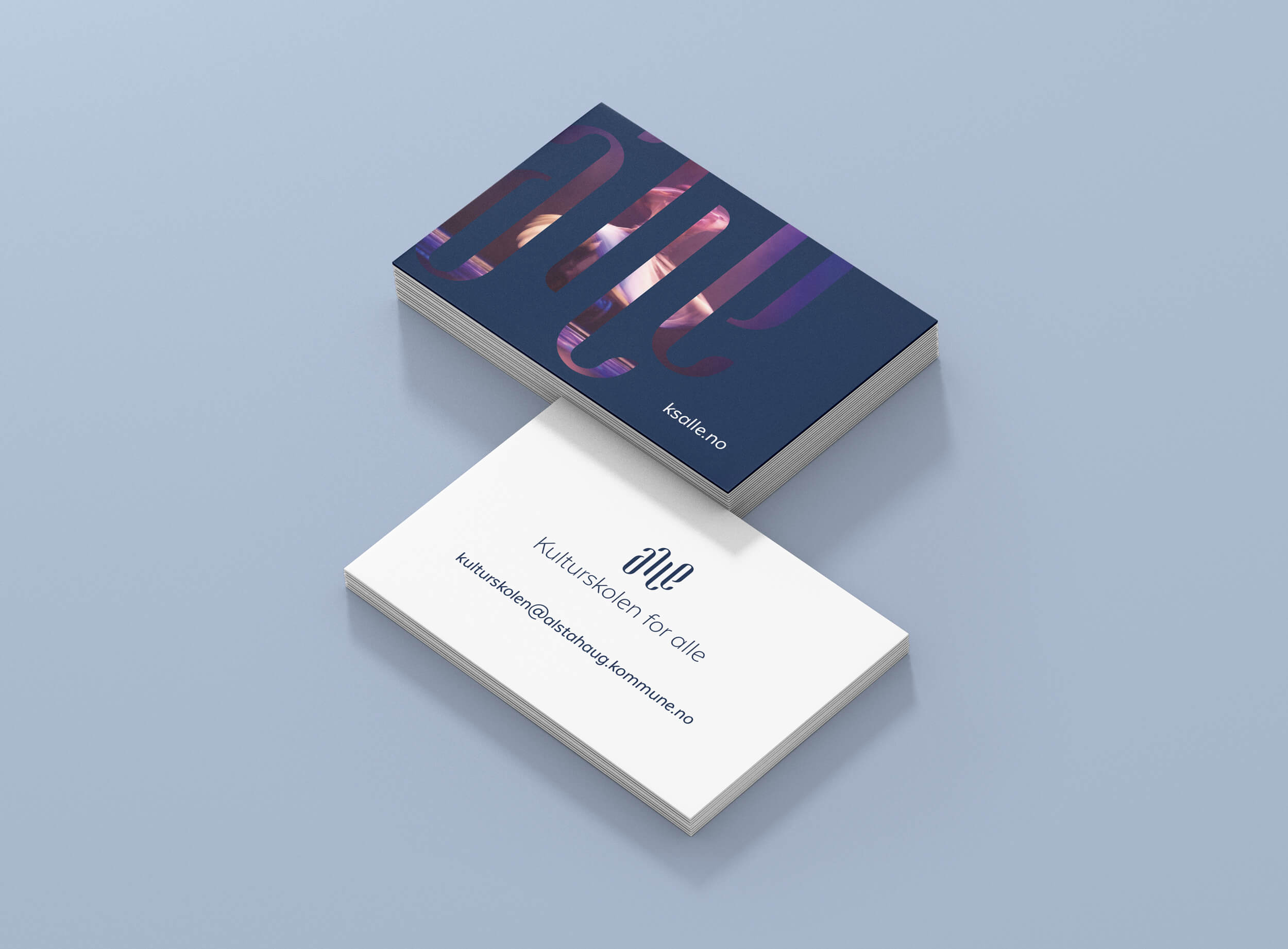
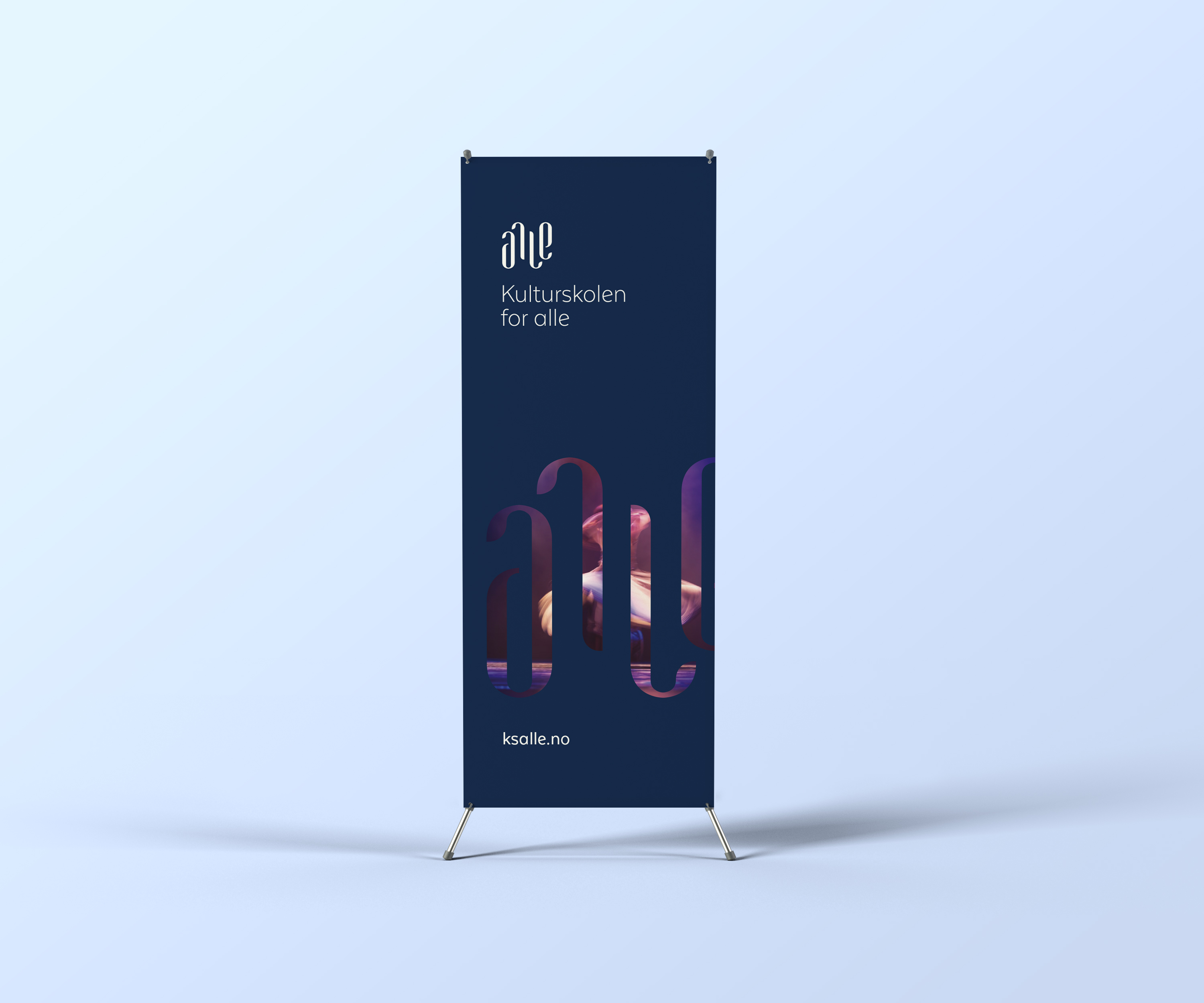
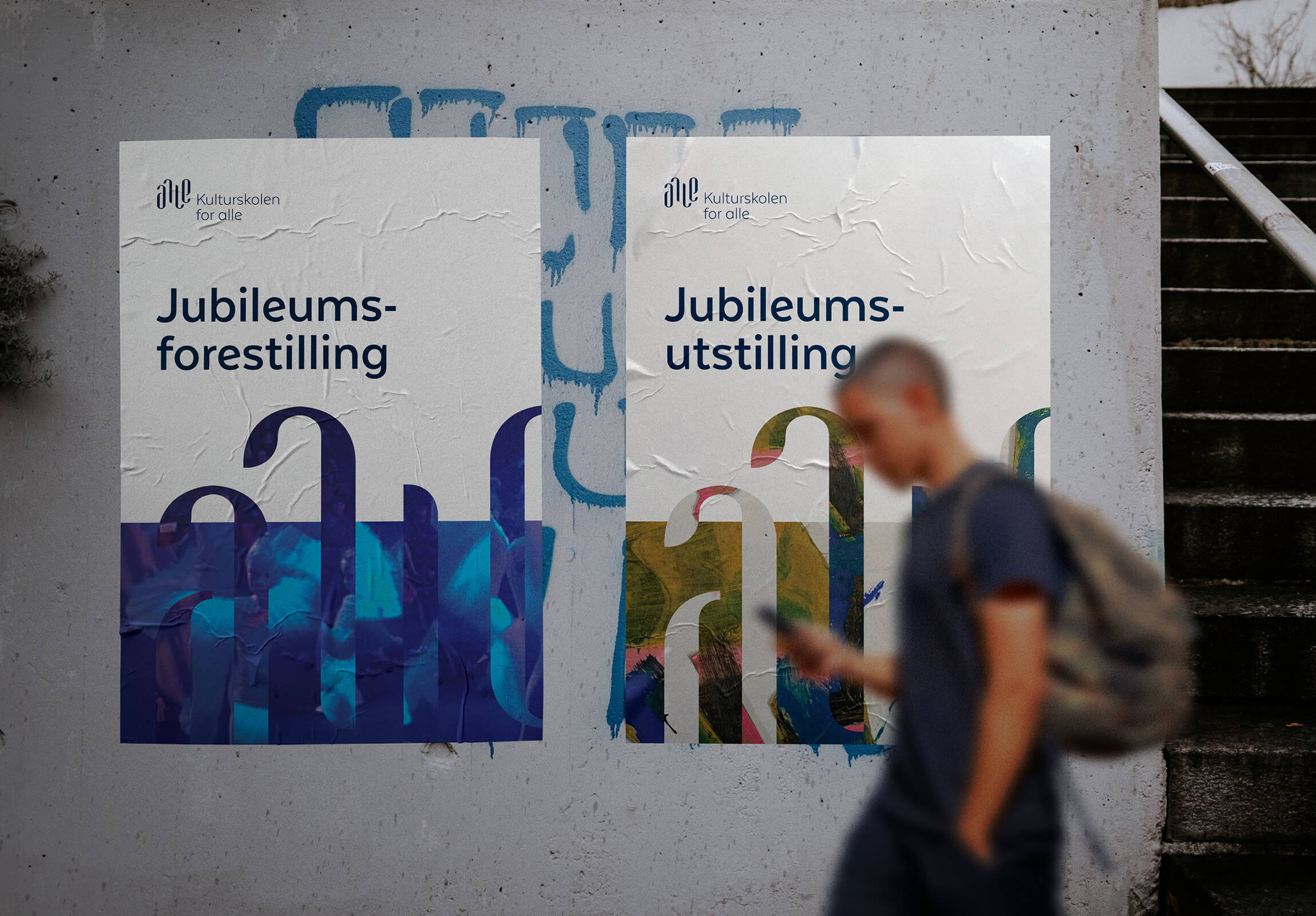
The entire brand identity revolves around the word “alle” (Norwegian for everyone). The stylised wordmark, while retaining legibility, boasts soft, organic letterforms that flow like an imaginary wave. This design element injects movement and emotion, echoing the ebb of the ocean, the rhythm of music, the grace of dance, and the stroke of a paintbrush on canvas. Adding an intriguing touch, the wordmark doubles as an ambigram.
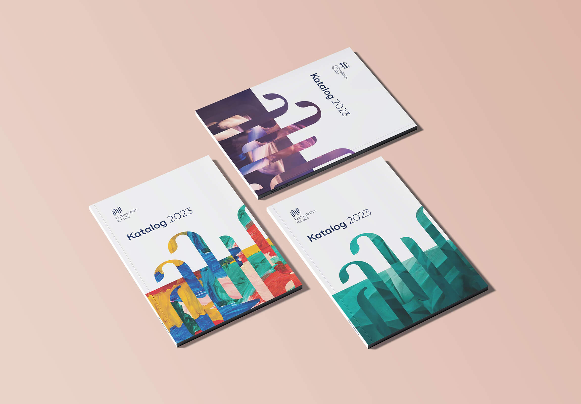
The ambigram becomes the star of the show when used as a decorative element. It’s literally filled to the brim with all the creativity that this school of visual & performing arts contains; student artwork, as well as photos from performances and concerts. This enables not only the organisation, but also the students and teachers, to claim ownership of the brand identity.
A thoughtfully crafted colour palette, anchored in two shades of blue, serves as a serene backdrop, allowing the vibrancy of the art to take the spotlight. Six vibrant accent colours inject pops of interest and contrast without overwhelming the overall aesthetic.
The typography strikes a balance — clean and simple, enhancing rather than competing with the bold imagery. A spin on the classic sans serif, Texta Alt introduces subtle details that infuse a touch of personality and create an inviting, friendly look.
Initially seeking only a new logo, the client received more — an entire visual identity. Distinctive, dynamic, and alive, with the flexibility to resonate across a broad audience without compromising the overarching brand expression.

CREDIT
- Agency/Creative: Petchy
- Article Title: Petchy Develops a Dynamic Rebrand for a School of Visual and Performing Arts
- Organisation/Entity: Freelance
- Project Type: Identity
- Project Status: Published
- Agency/Creative Country: Norway
- Agency/Creative City: FREI
- Market Region: Europe
- Project Deliverables: Brand Design, Brand Guidelines, Brand Identity, Brand Redesign, Brand Refinement, Brand Strategy, Branding, Graphic Design, Logo Design
- Industry: Education
- Keywords: branding, brand design, brand identity, culture, arts, education
-
Credits:
Brand strategist & designer: Solveig Petch


