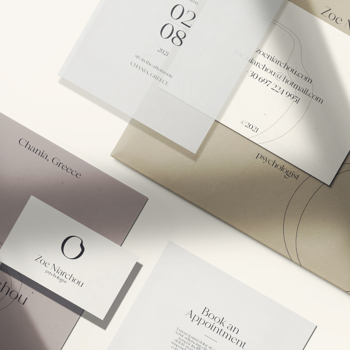
Zoe Niarchou is a psychologist and she approached me to create her corporate identity. Zoe is a very open and warm person with a very lively presence but nevertheless she is still very professional and takes her job very seriously. Her approach to psychotherapy is Daseinsanalysis which is an existentialist approach to psychoanalysis. More specifically Dasein means being-there in German. Her main request in the brief given to me was her branding to reflect her character and personality, both personally and professionally. So, I sent her a detailed questionnaire to get the necessary information to be able to work.
The basic idea around the creation of her corporate identity was to convey both her strict and professional character, but at the same time to project her sensibilities, her bright and open mind, as well as the wide range that characterize her as a personality. To achieve this, I used as a basic inspiration and reference Salvador Dali’s painting “The Persistence of Memory ” which is one of the most recognizable works of Surrealism. The well known surrealist piece introduced the image of the soft melting pocket watch which symbolizes relativity in Surrealism and also epitomizes Dalí’s theory of “softness” and “hardness”.
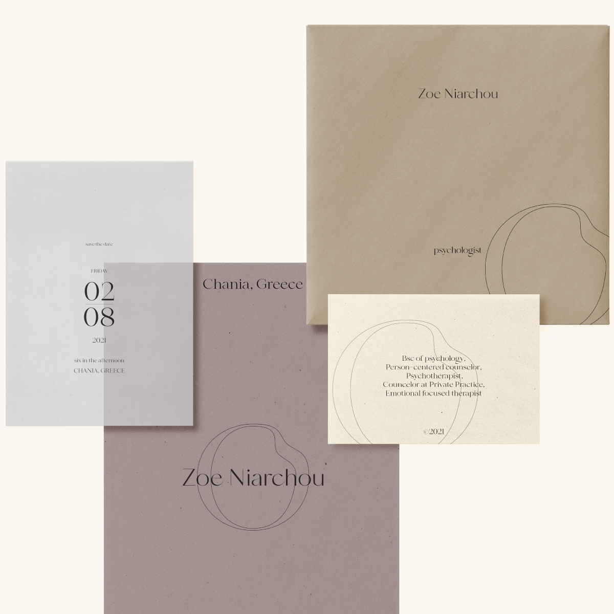
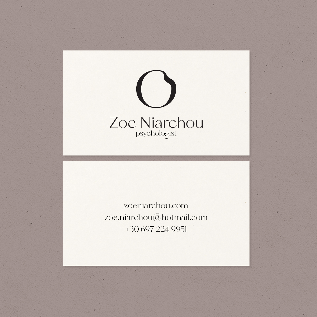
In a freer version of the “soft watch” of this painting, I used an “o” through the typography of the identity, which is a perfect circle. In order to bring the balance as desired, I caused a liquidity in this cycle, by altering one side of it. This is how I created the logo, the transition of which is shown in the corresponding animation.
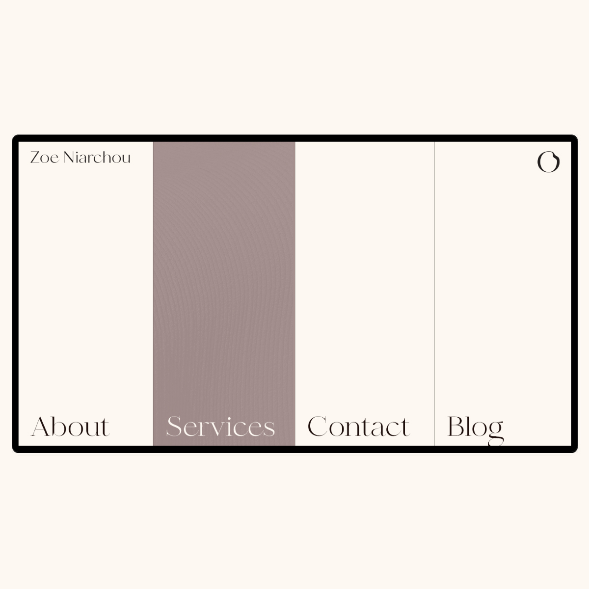
As for the typography, I wanted to use a font that has two different widths, therefore both required qualities. Nevertheless, I wanted it to have a contemporary character and to be able to stand on her own. The curves of this font are balanced with its peaks and give the initial request.
Finally, I wanted the color palette to follow and function in addition to all the previous elements of identity, which in themselves are quite strong with a special character. So I used the organic colors of paper and cardboard as well as a soft purple which is the favorite color of Zoe and also gives the necessary amount of intensity to the whole image.
CREDIT
- Agency/Creative: Candia Souranaki
- Article Title: Personal Identity for Dasein Psochologist Designed by Candia Souranaki
- Organisation/Entity: Freelance, Non Published Concept Design
- Project Type: Identity
- Agency/Creative Country: Greece
- Market Region: Europe
- Project Deliverables: Brand Creation, Brand Experience, Brand Guidelines, Brand Identity, Brand Refinement, Branding, Graphic Design, Identity System, Packaging Design, Research
- Industry: Public Utility
- Keywords: Personal Branding, Brand Identity, Corporate Identity, Psychology, Surrealism, Realism


