Challenge & Brief
The laundry category is one of the most competitive within FMCG, with supermarket shelves teaming with master brand and own-label ranges all shouting for consumers’ attention.
Persil wanted to revamp its Ultimate range to be more of an obvious trade up from its core products, while creating differentiation and stand out amongst its competitors globally. But most importantly consumers needed to be willing to pay more for the products.
Concept & Execution
To drive differentiation, it was clear we needed to own its iconic ‘splat’, and use it in a more impactful way. We also needed to look at the structure and architecture of its existing design system and revise it to show a clear difference between core and premium – to make it obvious why it’s worth paying more for.
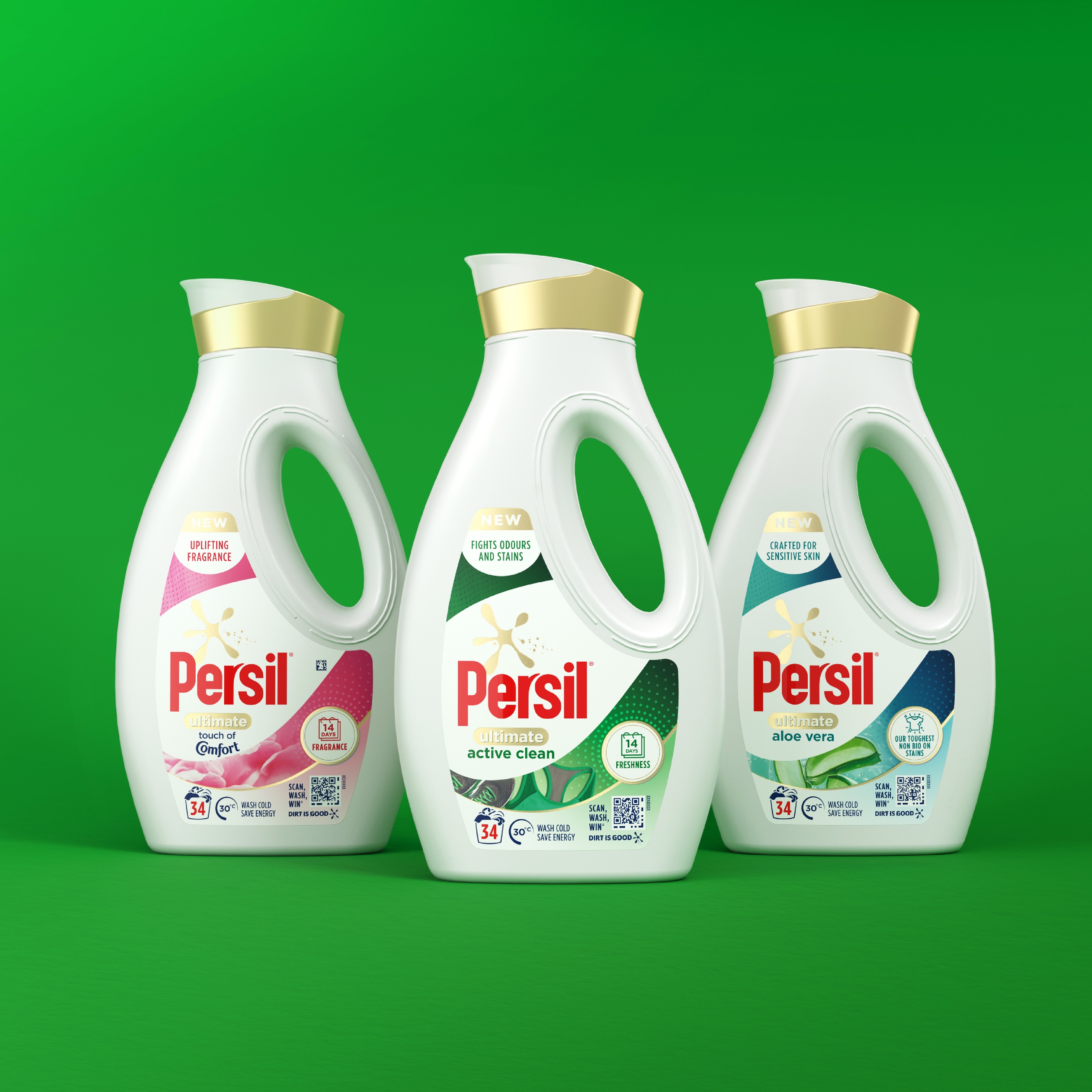
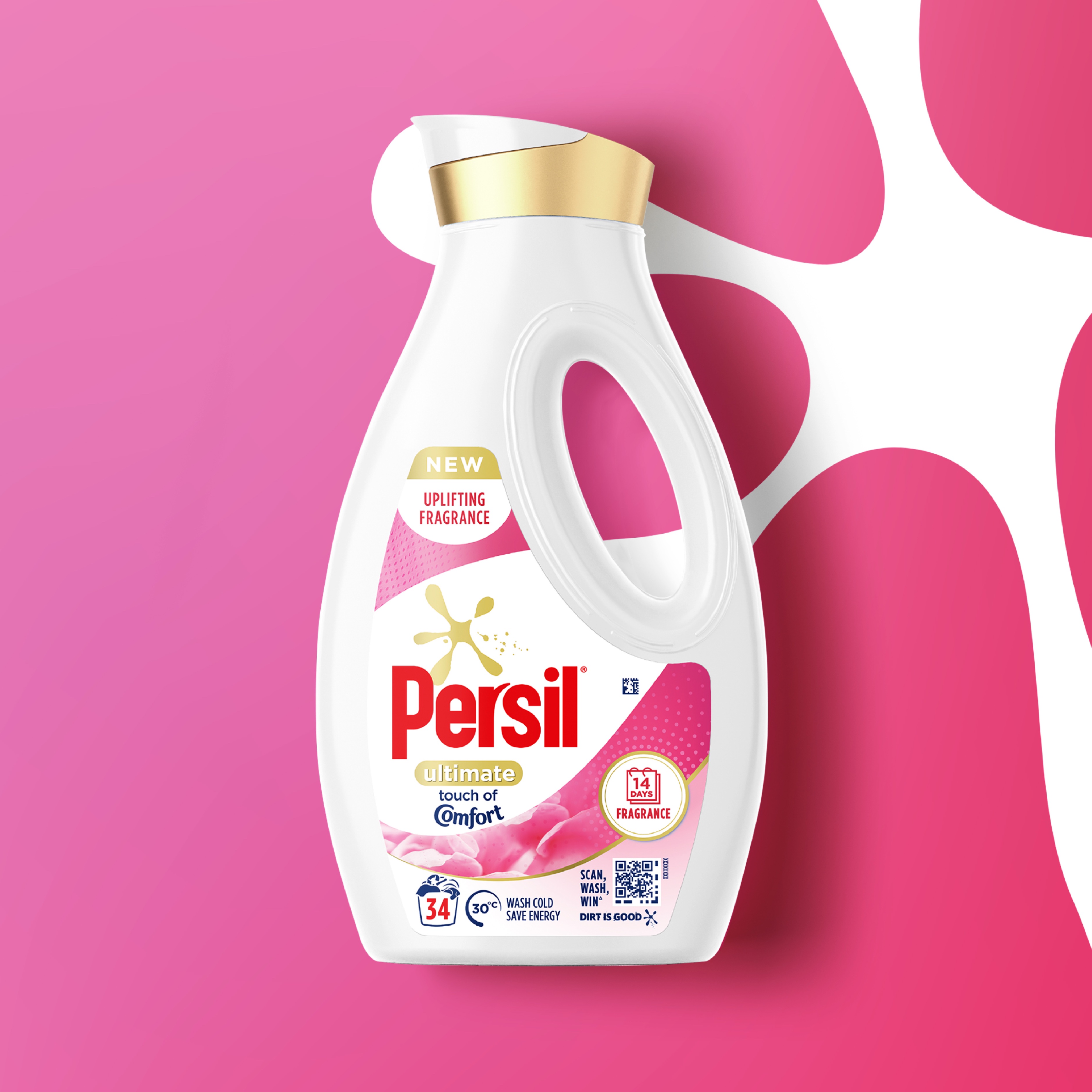
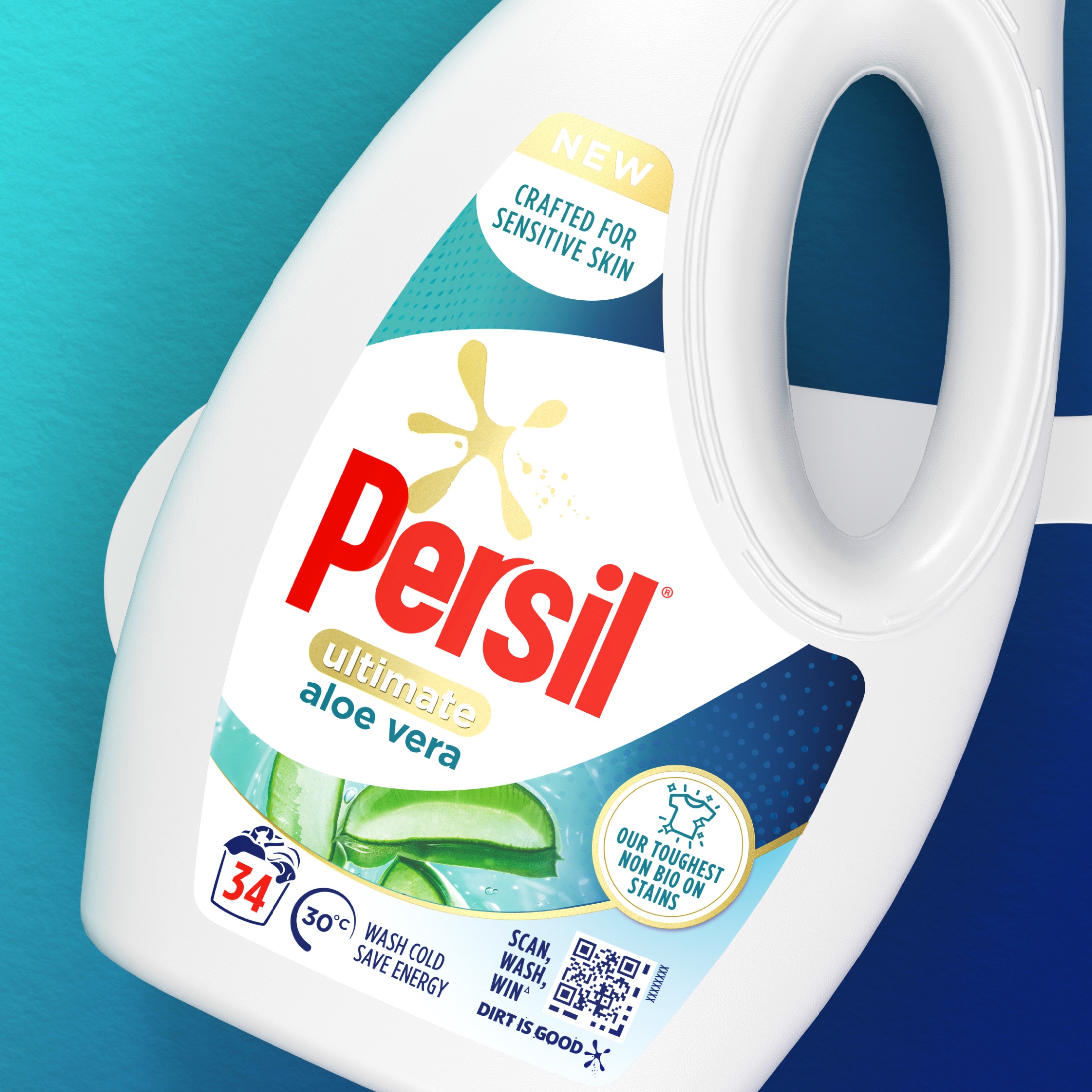
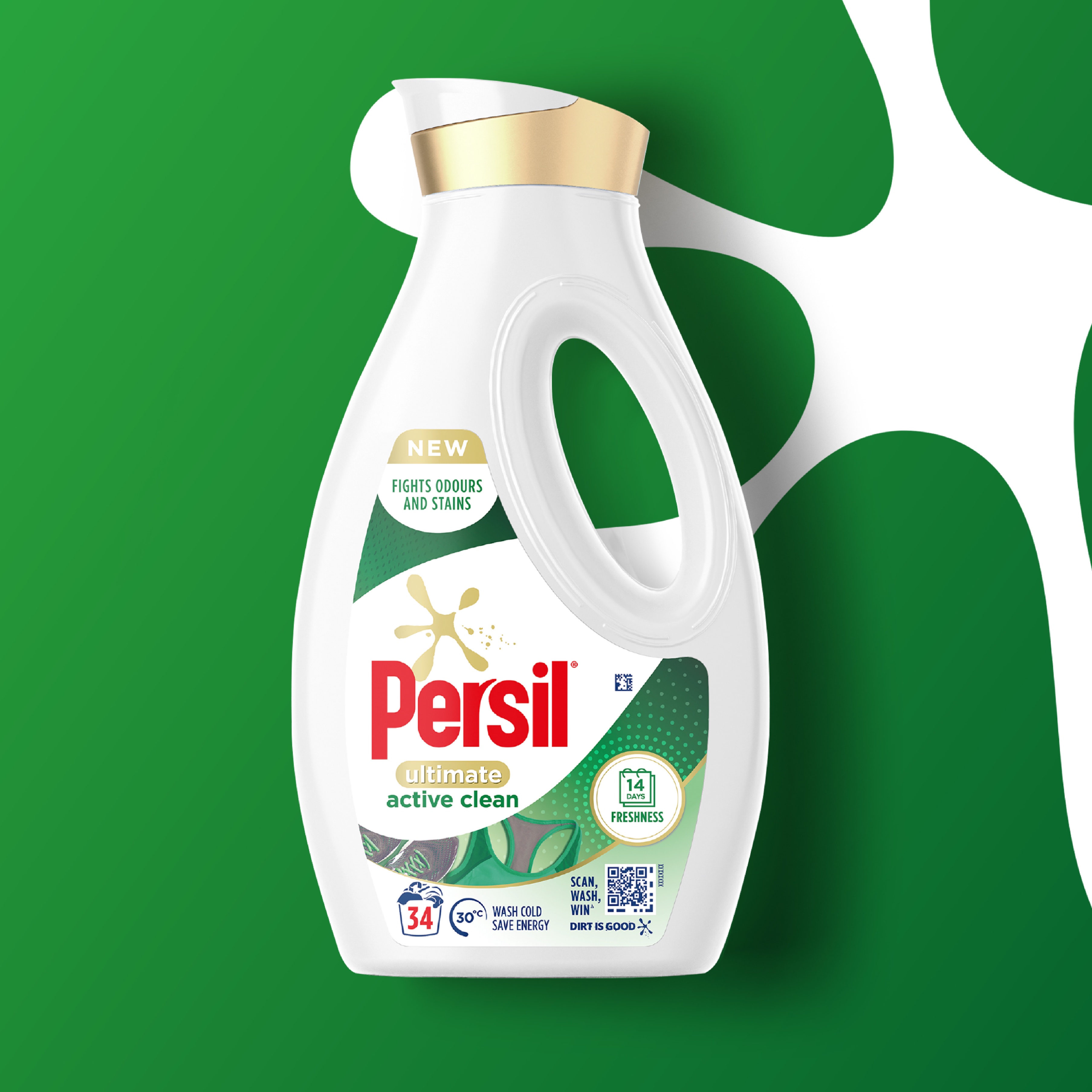
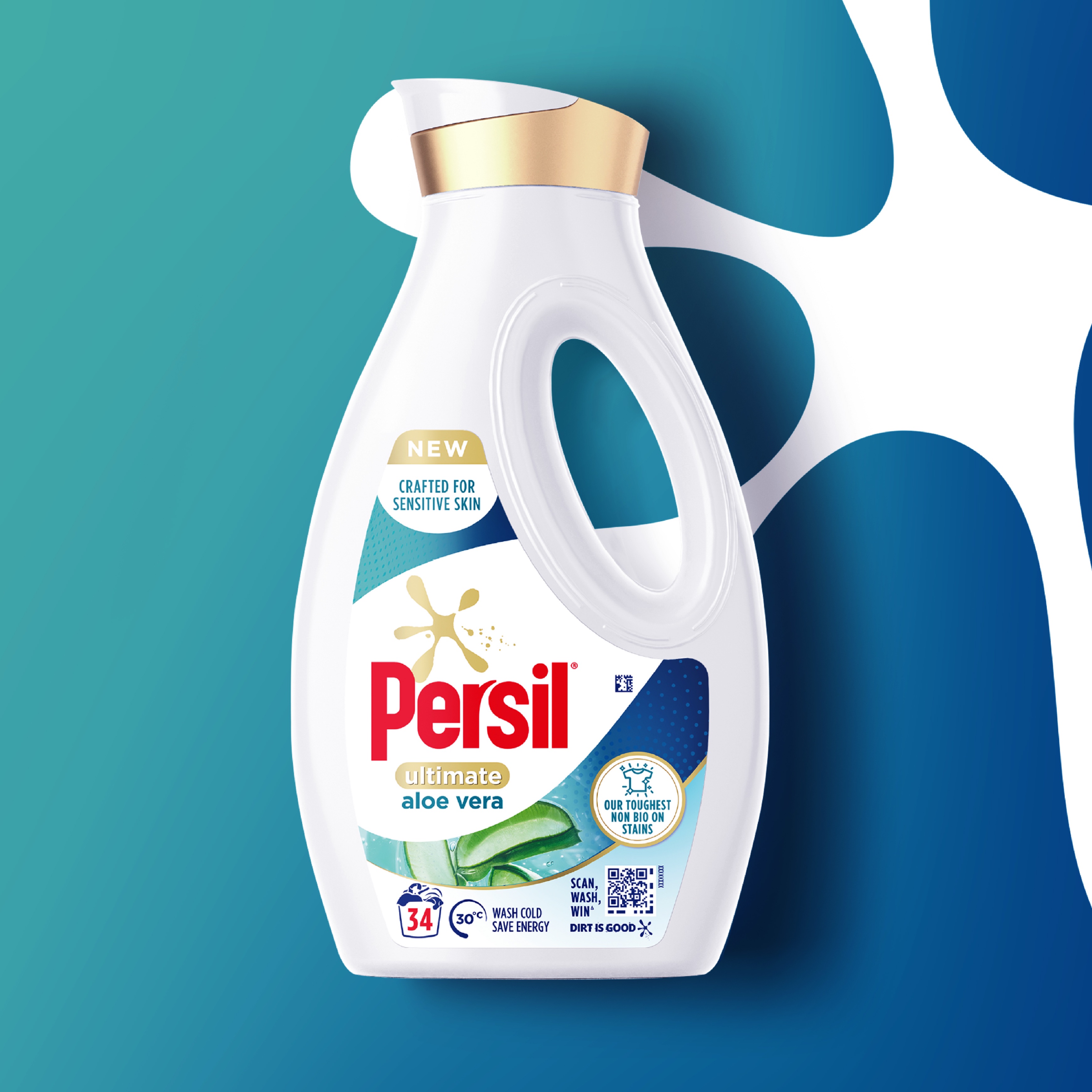
Our approach was to give the splat a greater purpose – to become the key to unlock the pack layout. The previous packs had a horizontal split that didn’t really mean anything. Now a bold crop of the splat acts as a prominent holding device for the Persil brand and product variants. The space outside of it provides ample room to differentiate between variants through photography, icons and clear benefit descriptors.
The circles and holding shapes are sympathetic to the splat and bring a sense of overall harmony to the pack. And a white bottle and elements of white in the splat highlight efficacy, while gold accents are a reassuring consumer shortcut for premium.
Results
We have effectively harnessed the power of Persil’s iconic splat to create a visually striking design system that elevates the brand’s Ultimate Range and sets it apart from core in a more ownable way.
The new system conveys enhanced clarity, effectively communicating the product’s superior efficacy and benefits, whilst upholding a cohesive, overarching master brand architecture.

CREDIT
- Agency/Creative: PB Creative
- Article Title: Persil Ultimate Elevating Persil’s Distinctive Splat to Clean Up in the Laundry Aisle
- Organisation/Entity: Agency
- Project Type: Packaging
- Project Status: Published
- Agency/Creative Country: United Kingdom
- Agency/Creative City: London
- Market Region: Global
- Project Deliverables: Packaging Design
- Format: Bottle
- Industry: Retail
- Keywords: WBDS Agency Design Awards 2023/24
- Keywords: Packaging Design, Product Redesign
-
Credits:
Senior Innovation Manager, Unilever: Stefania Valentini
Global Marketing Manager: Mairi Scott Dickins
Global Assistant Marketing Manager: Eva Penris


