


here’s a special kind of energy that comes with four companies, each with their own style and market presence, choosing to build something bigger and better together.
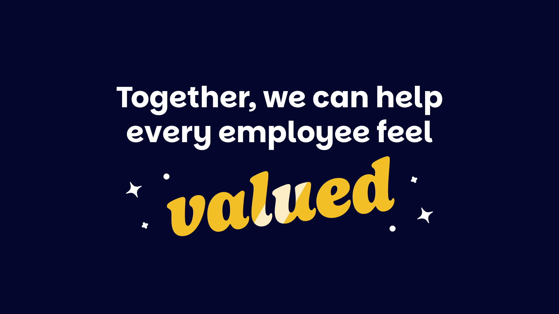
That’s where we found ourselves as Perkbox, Vivup, Let’s Connect, and TERC became the new Perkbox. A unified organisation built on the mission that every employee is valued, and one that carried more weight than anything a single brand could carry alone. The identity simply needed to match it.
Internally, we called the rebrand Project Elevate. The name felt right for what we were trying to do. It nodded to the hot air balloon logo that’s been part of Perkbox from the start, but also spoke to the idea of lifting something that was already strong.
It was a case of four brands and four ways of working coming together with the aim of helping organisations elevate their own cultures in a more unified, powerful way. It captured the scale of the work and the intent behind it – and gave everyone a shared way of describing the next chapter while we were building it.
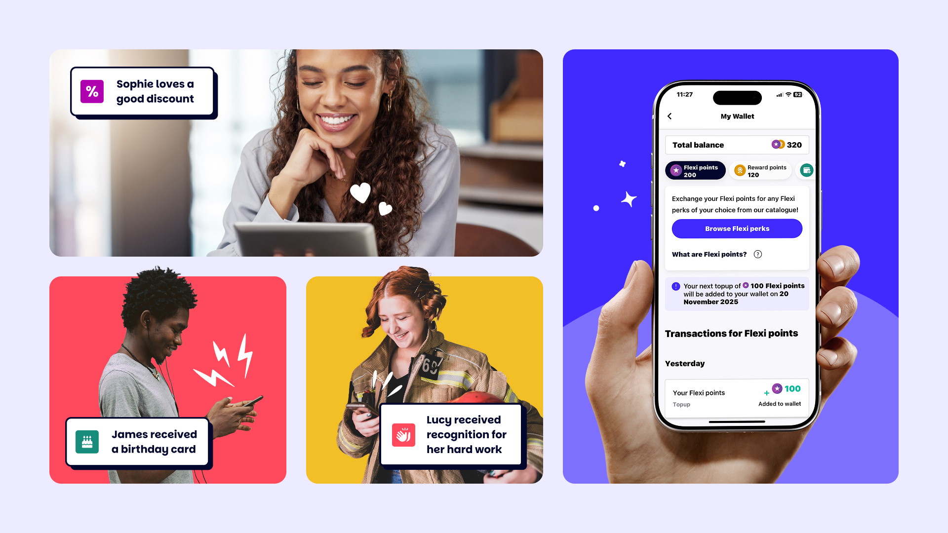
The organisation we were becoming needed a platform that could bring employee wellbeing, benefits, and engagement into one place. It had to make it easier for employers to care for their people, connect with them, and celebrate the moments that matter. It also needed to give employees a space to find support that felt meaningful to them, whether they needed help with money, their mental health, or just everyday perks that take a bit of pressure off.
There was no desire to abandon the past. Perkbox had years of equity behind it, and the name carried a familiarity people recognised. The balloon icon had a character of its own that clients knew well, and changing everything would have meant letting go of something that already worked. So the approach was clear: evolve the brand enough to unlock growth, without stripping away the parts people already trusted.
But before we made any decisions, we spent time listening. Positioning workshops helped us figure out how the merged organisation should talk about itself, while market research gave us a view of how people understood employee benefits. We also had to be mindful that different clients would respond to the rebrand in different ways.
For Vivup clients, this would be a completely new world – so it needed to feel welcoming rather than overwhelming. For Perkbox clients, anything too drastic risked unsettling people who were already familiar with the brand. We had to keep things consistent, and still give people something to get excited about.
Client feedback from charities, retailers, NHS trusts, and private sector employers showed how much expectations had shifted, and internal interviews revealed how hard it would be to create a single experience from four legacies. Together, they pointed to the same thing: the industry needed something more unified and more human than what had existed before. The rebrand had to rise to that.
The first step was shaping a tone of voice that felt like it came from real people – one that was warm, relaxed, and confident. We wanted it to have a sense of authenticity, especially when so much of what we read and interact with is influenced by AI, and in a space like HR where everything is fundamentally human.
It needed room for pop culture nods and a bit of wry humour, but also enough sensitivity for the more serious moments, and it had to feel more like thinking aloud than anything ultra-polished. Once that foundation was set, the visuals could grow around it.
Next up, we homed in on accessibility. WCAG 2.2 became the standard, which meant rethinking colour contrasts, visual hierarchy, and how type behaved at different sizes. It was a chance to build things back better and be considerate of the people using the platform. And it came pretty naturally to the team, thanks to Vivup’s public sector background where inclusivity is standard practice.
We developed our bespoke typeface, Perk Sans, in-house to match Perkbox’s new, confident, relaxed character. It’s a fork of Poppins and Parkinsans, and it’s a font that smiles – which felt right for a brand built around speaking to people the way you’d speak to a friend. It’s warm, easy to read, and gives the brand a more recognisable feel on-screen and in print, helping everything come together in a cleaner, more natural way.
Alongside the typography, we introduced Perkicons – a brand motif we coined and created ourselves. These small, expressive embellishments captured the moments at the heart of the employee experience: a sense of relief when someone gets access to wellbeing support, or a moment of joy when receiving recognition. They layer over our photography, which we reworked to feel softer, more natural, and more human, adding life, colour, movement, and expression. Perkicons work almost like an accent on a word; they’re a small detail that shapes the emphasis.
Next up, colour. The existing palette already had a strong place in people’s minds (Perkbox was known as a blue brand), so we didn’t want to lose that recognition or drift too far from what felt familiar. We kept the core palette but refined it to be more accessible, with Electric Indigo becoming the anchor shade: a bold, confident evolution of the blue people already knew. The colour update made everything feel bolder and more distinctive, yet still rooted in the palette clients already recognised.
The logo needed the same kind of attention. The balloon already had strong recognisability, so the aim wasn’t to reinvent it but to make sure it worked everywhere it needed to. We saw an opportunity to make it a little bolder and more defined, without losing any of the equity people already connected with. It had to hold its shape at full size and still be unmistakable when scaled right down.
We explored different routes and shared them with clients, which confirmed what we expected: the balloon was the element people connected with. Keeping it meant keeping that equity, while refining it just enough to sit comfortably inside the evolved identity.
Rolling out the brand became a real moment of unity for our team. Perkfest, our internal brand event, was the first time everyone could see the new identity in one place and get a feel for where we were heading. It helped people connect to the same future, which mattered a lot in a business shaped by different legacy brands.
Our external event (also called Perkfest) then opened things up to HR and people leaders, giving them an early look at the evolved brand and the unified platform taking shape. We brought our clients along with us – nothing was dropped on them out of the blue. Getting genuine buy-in was important to us, and involving people early made the shift feel reassuring rather than sudden.
The wider response to the rebrand carried that same momentum. Clients, partners, and people across the industry were genuinely excited, and it was clear the change landed in the way we’d hoped.
We channelled that energy into Employee Benefits Live 2025, where we took over the event and sparked an industry-wide buzz with our new branding. Around the same time, our brand video – showcasing our elevated look and enhanced platform – aired on Sky, giving the new Perkbox a moment in front of an audience well beyond our usual reach.
What the rebrand really changes is how cohesive everything feels. There’s one voice and one visual language running through everything now – from salary sacrifice benefits to mental health support – and it finally feels like the whole organisation is speaking the same language.
But it was never about turning Perkbox into something unrecognisable. It was about letting the identity grow to match the scale and ambition of a unified company that now supports nearly 7,500 organisations and more than four million employees. The platform’s clearer, the mission’s stronger, and the way we look and sound truly fit the organisation we’ve become.
Every employee deserves to feel valued – and the new Perkbox gives that belief a home.

CREDIT
- Agency/Creative: Perkbox
- Article Title: Perkbox: Elevating a Brand to Match a Unified Mission
- Organisation/Entity: In-House
- Project Type: Identity
- Project Status: Published
- Agency/Creative Country: United Kingdom
- Agency/Creative City: London
- Market Region: Global
- Project Deliverables: Advertising, Animation, Brand Architecture, Brand Creation, Brand Design, Brand Guidelines, Brand Identity, Brand Mark, Brand Redesign, Brand Refinement, Brand Rejuvenation, Brand Tone of Voice, Branding, Copywriting, Creative Direction, Design, Editing, Exhibition Design, GIF Animation, Graphic Design, Icon Design, Identity System, Logo Design, Rebranding, Tone of Voice
- Industry: Human Resources
- Keywords: Employee Benefits Solution
-
Credits:
Creative Design Lead: Llewellyn van Eeden
Head of Brand: Matt Freeman
Senior Graphic Designer: Alfredo Ferreira
Senior Graphic Designer: Oliver Chapman
Graphic Designer: Shannen Rooney
Graphic Designer: Reece Robson
Senior Copywriter: Sinead Murphy
Content Marketing Manager: Jess Du Plessis
VP of Marketing: James Arnall
Head of Product Marketing: Anna Opochinskaya
Marketing Manager: Maxine Coulton
Digital Marketing Manager: Gina Richard
Freelance Animator: Hanco Gerber


