


Peris is a pediatric dental clinic that provides significant services for its young patients. The clinic’s dental unit is located in the middle of a huge playground.
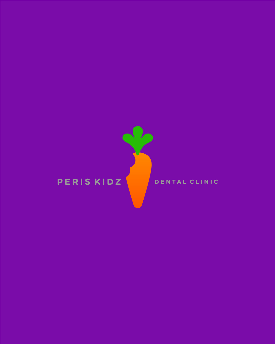
The goal was to create a memorable and playful visual identity that would appeal to children and their parents, centered around a bunny mascot representing the brand with bright, healthy teeth.
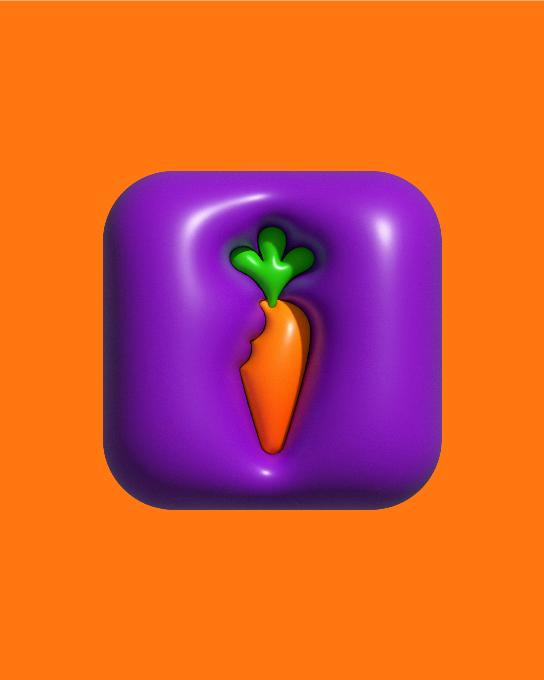
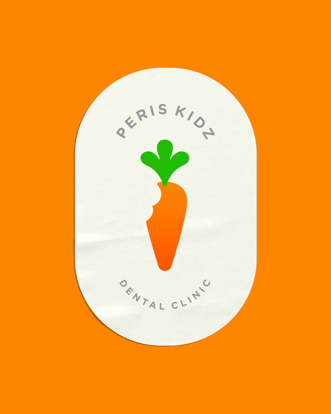
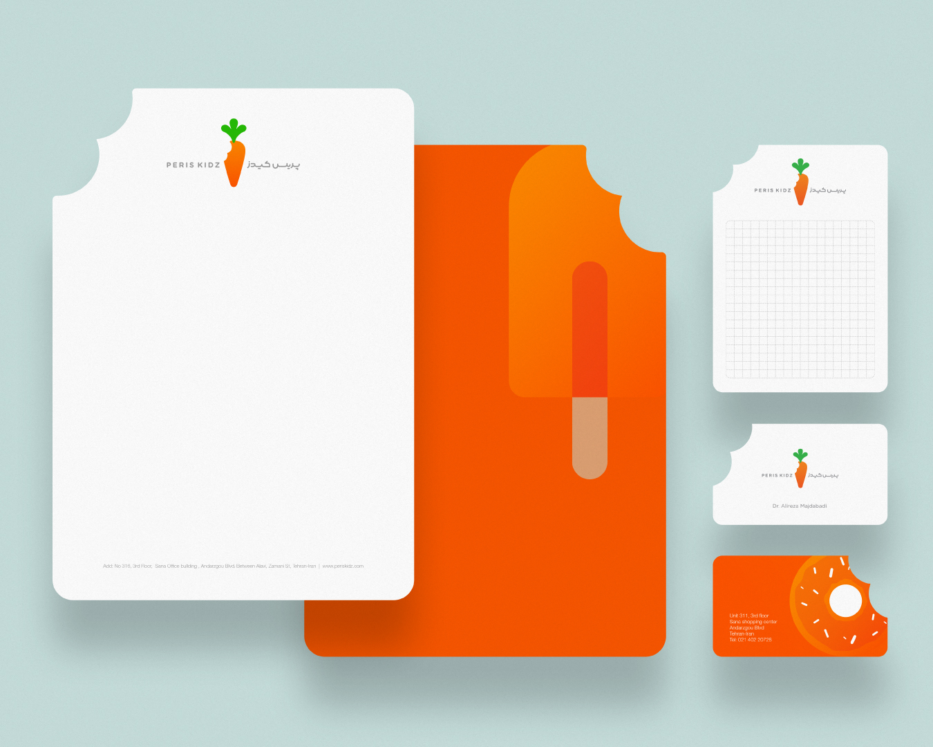
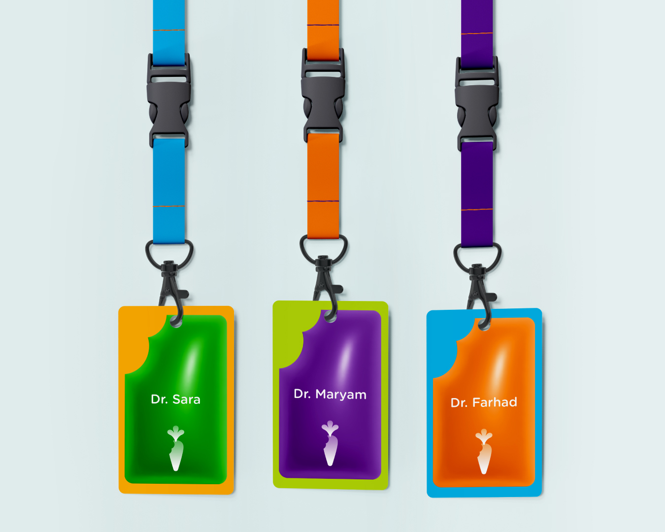
Rather than directly featuring the bunny in our brand design, we illustrated playful footprints of the character everywhere, conveying the idea that we can take a bite of anything we want and have fun while protecting our teeth. Using the unseen rabbit’s bite as a shape became one of the most important elements in this visual identity, featured across every touchpoint – both physically and visually. The playful bite even can be seen in all of our stationery and signage as a unique and lovely shape that represents our brand. It reminds children that though they can’t see our mascot, he is always there ready to take a bite and have fun, while still caring for his powerful and healthy teeth. These bite placeholders help reinforce our child-friendly approach of encouraging dental health through a whimsical unseen character whose magical bite conveys our message.
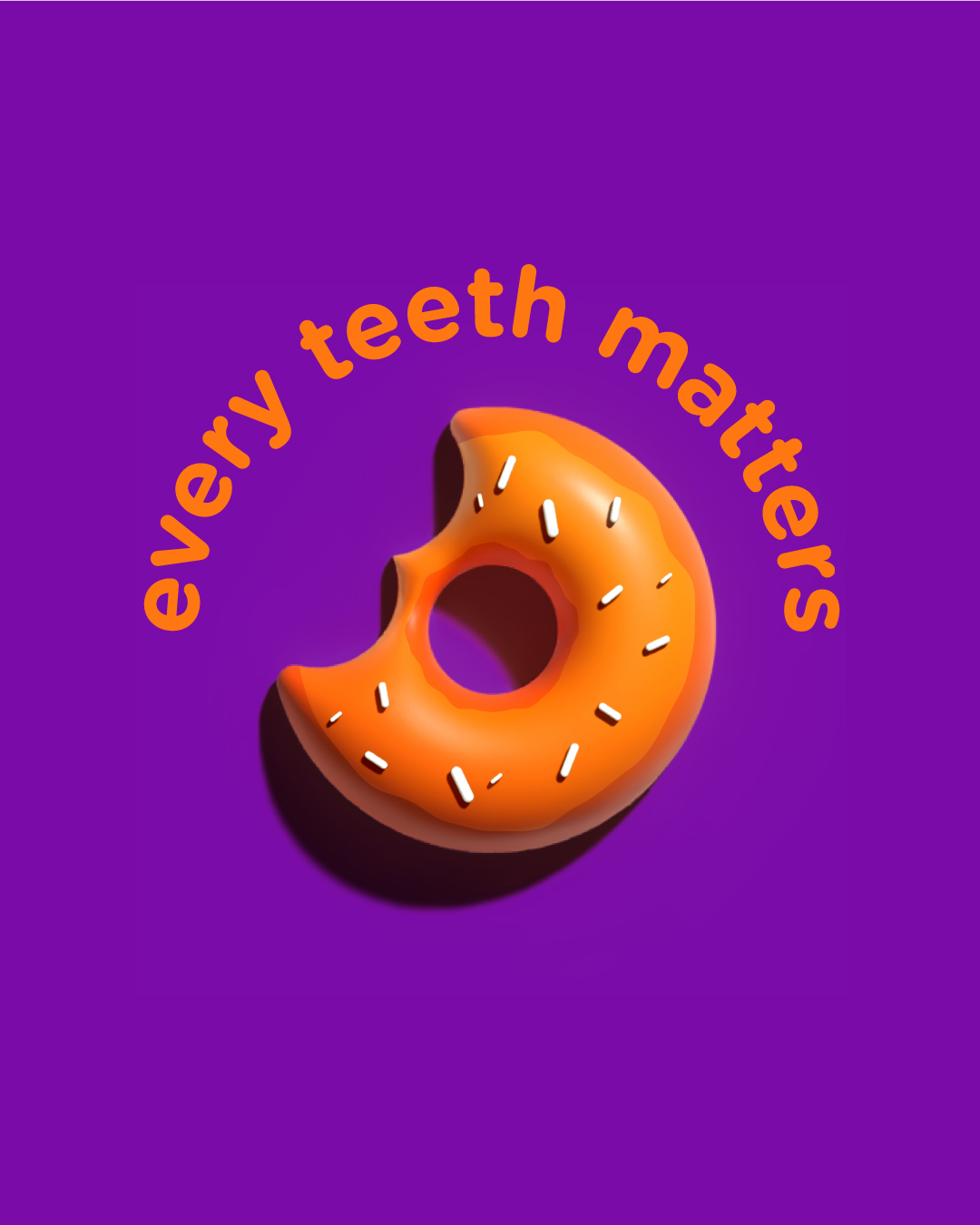
Instead of placing usual restrictions on eating sweets, we invited children to participate in safeguarding their oral health with us. A fun and eye-catching icon of colorful sweets and candy in the same bright orange as our logo represents this approach. Rather than completely prohibiting sugary treats, the icon prompts an open discussion about moderation and dental hygiene. The tempting candies remind kids that while an occasional sweet is alright, overindulgence can harm their teeth. This friendly icon invites children to enjoy childhood treats while still prioritizing brushing, flossing, and regular dental visits. It represents our mission to prevent tooth decay through education and positivity, not shame. The sweet icon thus helps us connect with young patients by using a beloved symbol of childhood joy to spread an uplifting message of balance and oral health.
These concepts helped us develop a variety of icons and visuals with a distinct, child-friendly approach.


CREDIT
- Agency/Creative: Sina Sankar Studio
- Article Title: Periskidz Dental Clinic
- Organisation/Entity: Freelance
- Project Type: Identity
- Project Status: Published
- Agency/Creative Country: Germany
- Agency/Creative City: Berlin
- Market Region: Middle East
- Project Deliverables: Art Direction, Brand Design, Creative Direction, Graphic Design, Icon Design, Logo Design
- Industry: Health Care
- Keywords: Dental, identity, carrot, Logodesign,
-
Credits:
Art Director: Sina Sankar


