” The Challenge:
Percept were asked to refresh the Mr Pisa Gelato brand. They wanted to redo their packaging design to better represent quality, establish a point of difference from the competition and ultimately increase sales. The new branding and packaging design needed to represent Mr Pisa as an authentic, yet innovative gelato brand, offering a premium quality product.
The Solution:
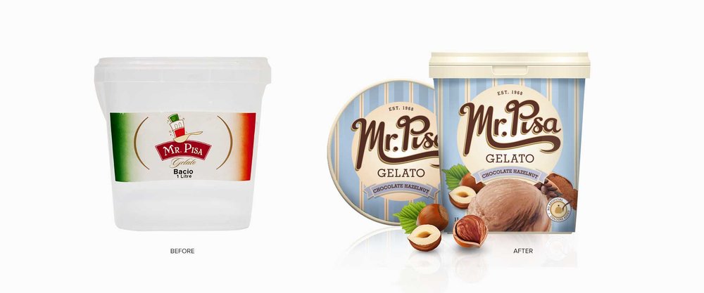
When evaluating the packaging redesign, Percept’s strategy was to reposition the brand to align with their desired premium positioning. The existing product was sold in clear plastic containers, which is problematic if the gelato crystallises, making it look unappealing.
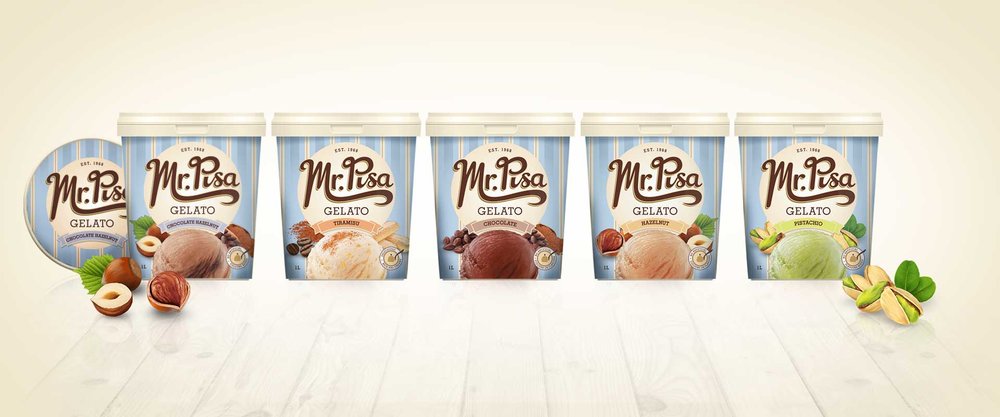
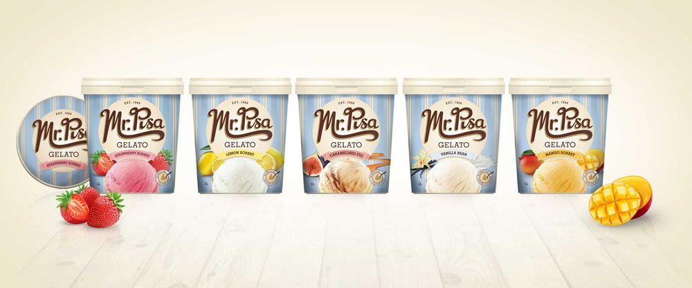
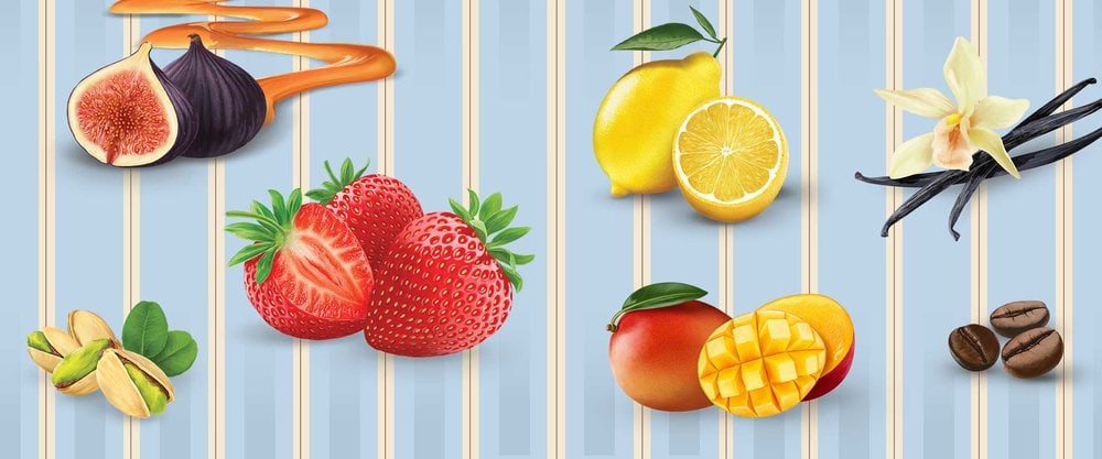
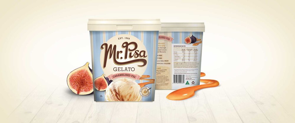
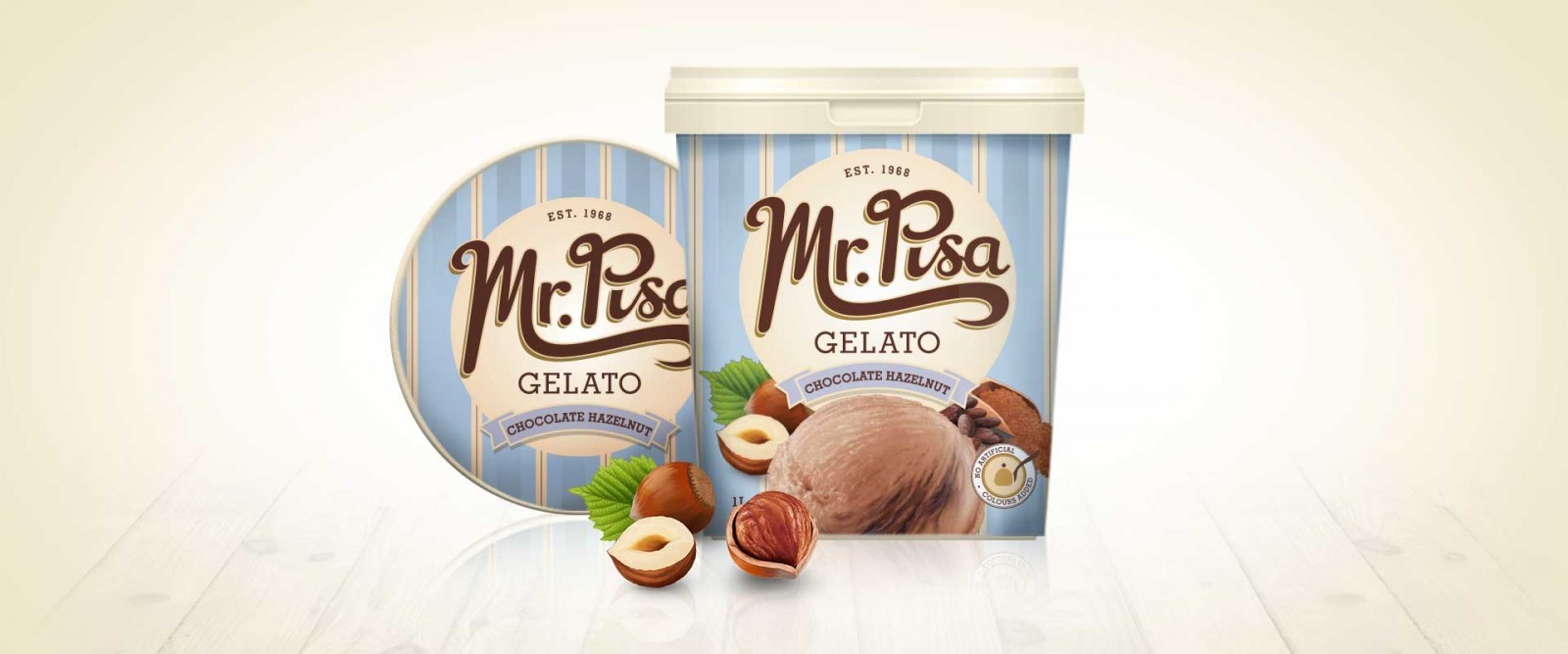
Our solution was to use cardboard tubs, solving the product presentation issues, whilst also adding to the authentic and traditional feel we were proposing for the brand. Product and ingredient renders were also commissioned to help to differentiate between each variety and visually represent the promise of flavour.
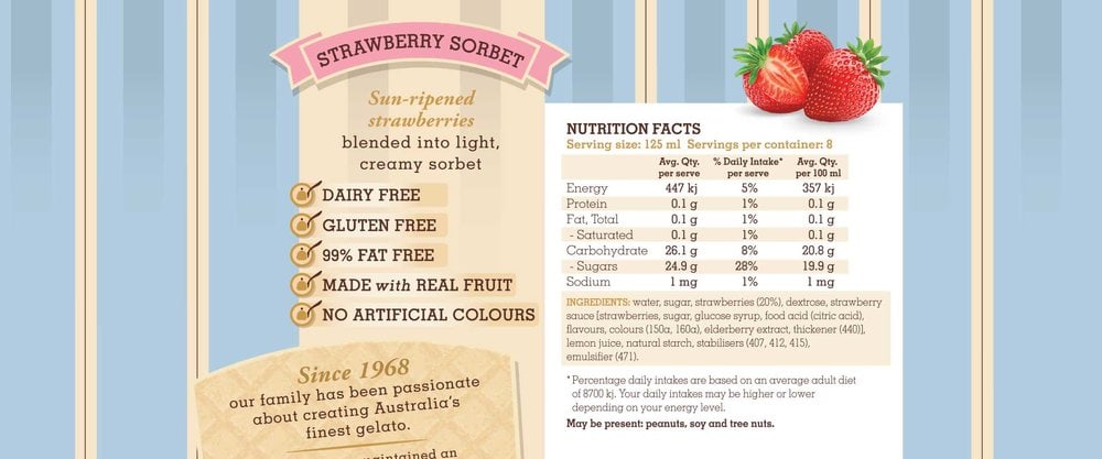
Mr Pisa has been making Gelato since 1968. To capture this heritage Percept hand-crafted the logotype to have a vintage, nostalgic aesthetic. Bold pastel blue stripes on pack give a nod to the original cart the family used when they first started selling gelato around Sydney Harbour.
This contemporary take on a classic style is visually striking and ownable by the brand whilst retaining an appetising appeal.”
