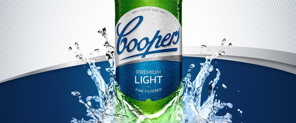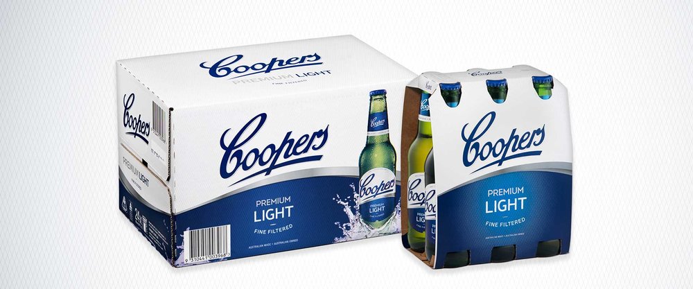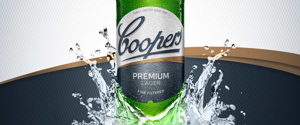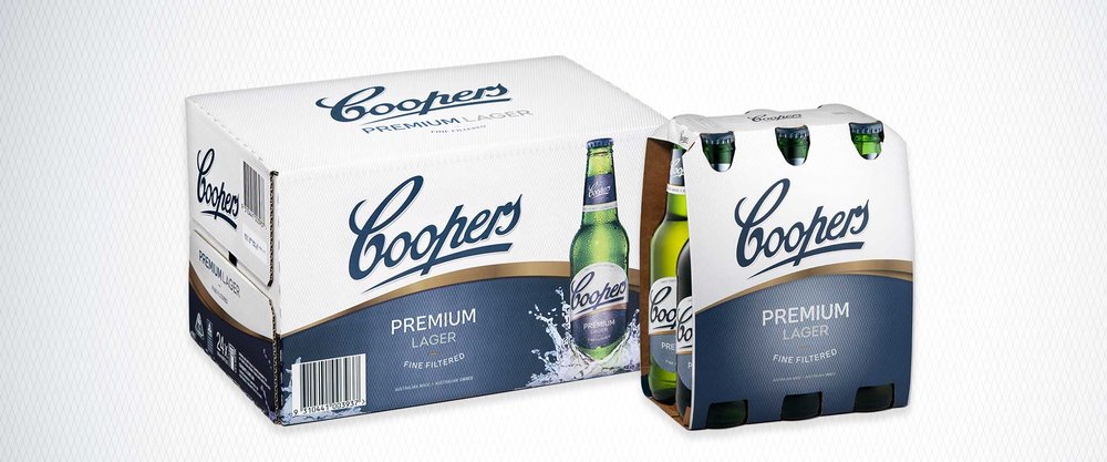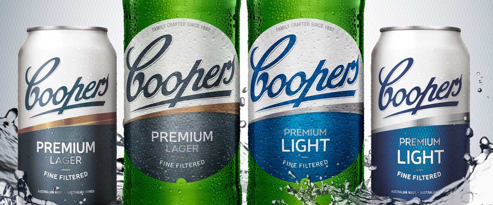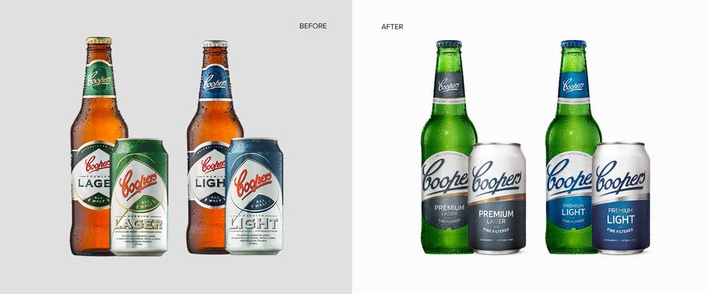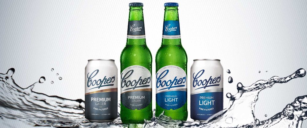
” The Challenge: Coopers Brewery wanted to improve the appeal of their premium lager and premium light beer, to make them more relevant in today’s market. The task was to create new labels and redesign the packaging for this existing beer range. The desired outcome was that the redesign would help boost market-share in a competitive environment of imported and domestic beers. The packaging redesign was to challenge consumers to reconsider Coopers as an option when presented as a choice among both Australian and International premium lager brands.The Solution: Percept was chosen as the successful packaging design agency after initial concepts were submitted for the redesign from three short-listed agencies in a paid pitch situation.After assessing the existing products and competitor landscape, Percept created a packaging redesign that elevates the Coopers signature, giving it hero status. The signature is underlined by a metallic foil swoosh and is tied back into the iconic Australian brand family by the familiar cross-hatch pattern detail which appears on other products from Coopers Brewery.The new brand-led label, is clean and sophisticated in style and now rivals well-recognised European lager brands. It features strong graphic devices and colour blocking, giving the products cut-through and shelf presence, whilst also achieving positive impact when in the hand of the consumer.The roll-out of this packaging redesign project included; bottle labels, crown seal, cans, clusters and cartons. Percept then went on to create the point of sale material for retail environments, including posters, A-frames, coasters, tap decals and tap talkers. ”
