Objective: Pepperika is an online Indian pickle business based in San Diego that targets young females, 20 to 40 years of age, who are looking for the delicious, mouthwatering, and healthy pickles to try, without the guilt of wasting large quantities of it. The objective of this project is to introduce a new brand strategy and create enthusiasm among the audience to try Indian pickles.
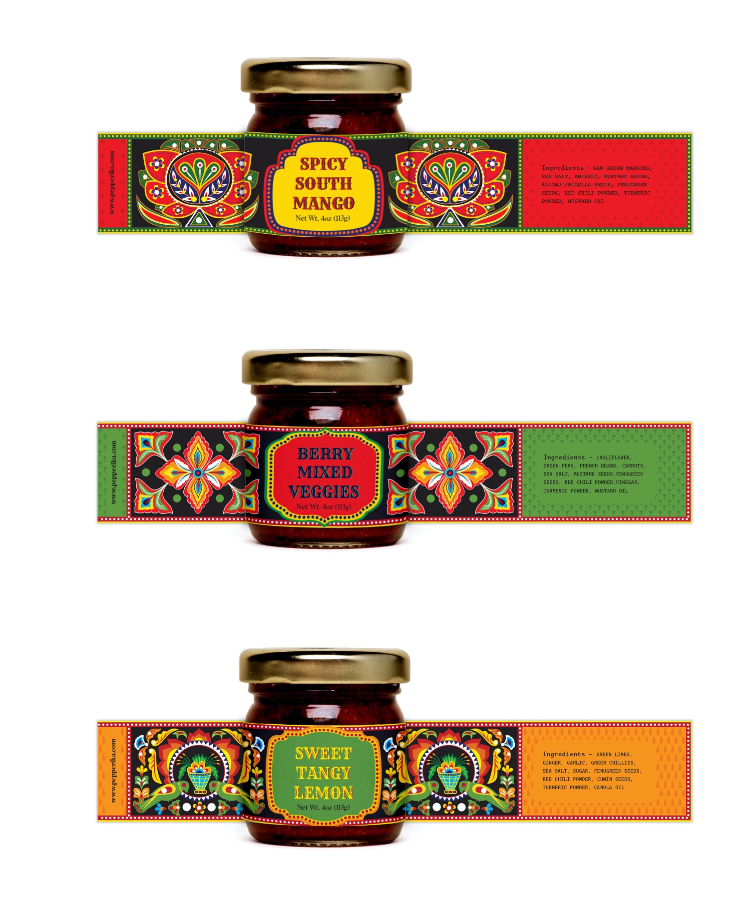
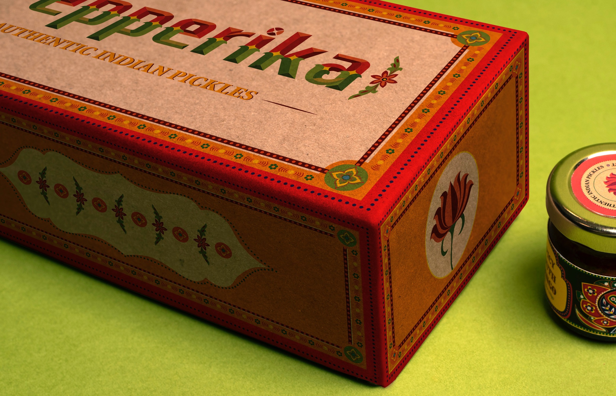
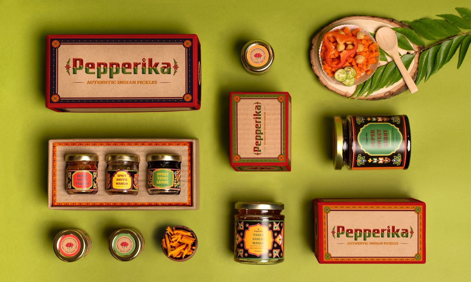
Approach: To target, the young female audiences, a carefully designed small package of three unique pickle varietals are introduced on the company website, in which customers can select three varieties of pickles according to their palettes and tastes. They can try it, taste it, and then can make a big purchase. The packaging of the box uses eco-friendly materials and bright colors vegan print. The inspiration of the pattern is from Indian truck art.
Truck art is a traditional folk art in India that decorates the trucks and gives its drivers a home away from home. For traditional folks who drive trucks, the connection to art is the key to communication. Through the art on their truck, they communicate where they’re from, whom they love, and what brings them joy. Their beautiful trucks are a representation of them on four wheels. Garnished in bold colors, designs, and symbols that hold meaning in their lives and so much more, these trucks bring a certain sparkle to the road. But it goes way beyond that: these trucks reflect the authenticity of culture throughout the country. The purpose of designing the pattern similar to the truck art is to bring the same authenticity in the pepperika brand.
The logo is custom-designed, which very well reflects the unique approach of the brand. The inspiration for the logo is from Ek Type foundry. It is a collaborative type design studio based in Mumbai, India, specializing in developing fonts across all Indian languages, many of which are multi-script.
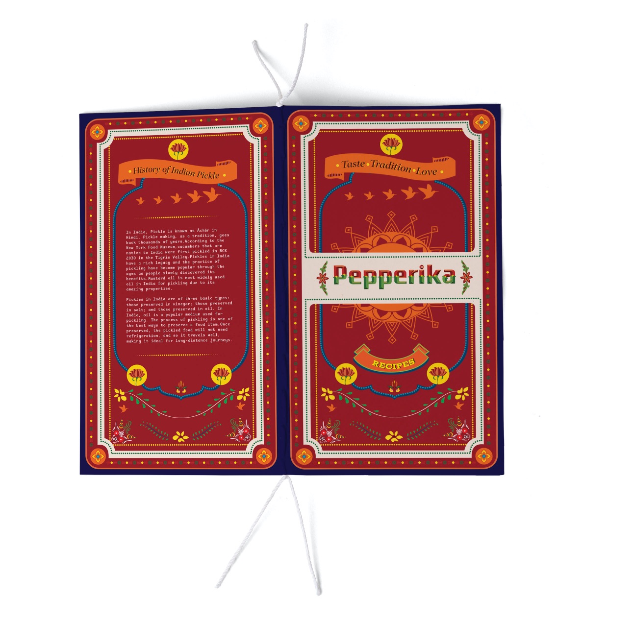
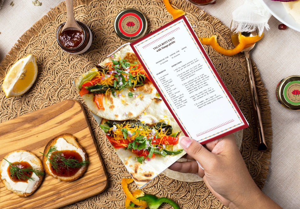
The labels use poynter font and adaptive monotype that reflect traditional values with a twist of modernism. The recipe book is also included in the packaging to familiarize customers with delicious food recipes made by pickles.
CREDIT
- Agency/Creative: Archana Verma
- Article Title: Pepperika Indian Pickles Packaging Design
- Organisation/Entity: Student
- Project Type: Packaging
- Project Status: Non Published
- Agency/Creative Country: United States
- Agency/Creative City: San Diego
- Market Region: North America
- Project Deliverables: Packaging Design
- Format: Box
- Substrate: Pulp Carton
- Industry: Food/Beverage
- Keywords: WBDS awards, Student
-
Credits:
Educational Institution: San Diego City College, San Diego California
Educator's Name: Min Choi


