The Essential Baking Company
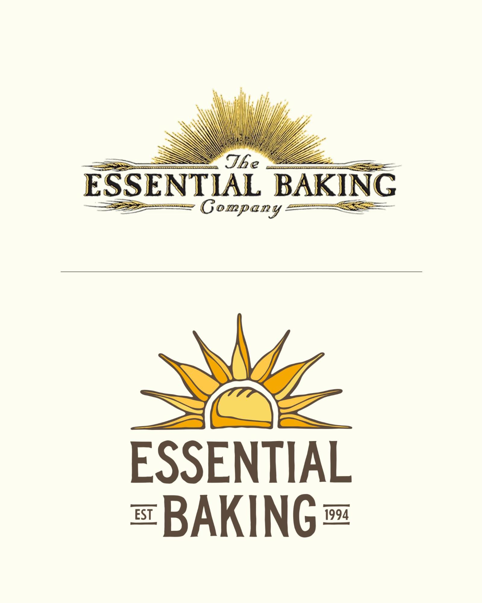
Since 1994, The Essential Baking Company has been a Seattle staple and a Pacific Northwest favorite for fresh, thoughtfully made bread. People People’s goal was to honor the brand’s more than 30-year heritage—rooted in founder George De Pasquale’s early days selling bread at the Fremont Farmers Market—while evolving its identity to resonate with a broader audience, including Millennial and Gen Z shoppers. The resulting design breaks through the “sea of sameness” in the bread aisle with a premium, artisanal look that emphasizes transparency, from clearly expressed ingredients to visual access to the bread itself.
Customers can now find the refreshed brand on fan favorites like Fremont Sourdough, baked with starters dating back 140 years. Ultimately, the rebrand carries forward the independent spirit of George’s original vision while giving The Essential Baking Company the tools to grow for the next 30 years.
Design Inspiration & Process:
The design process was heavily informed by focus group findings, which indicated that consumers felt the previous packaging was too generic and obscured the bread itself. People People drew inspiration from the brand’s origins at the Fremont Farmers Market and the organic beauty of the PNW. The result is a familiar yet fresh identity that feels human, hand-hewn, and packed with quintessential Seattle whimsy, rather than a robotic or mass-produced look.
Design Details:
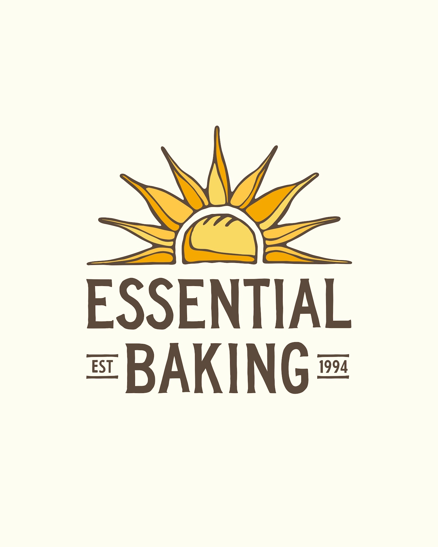
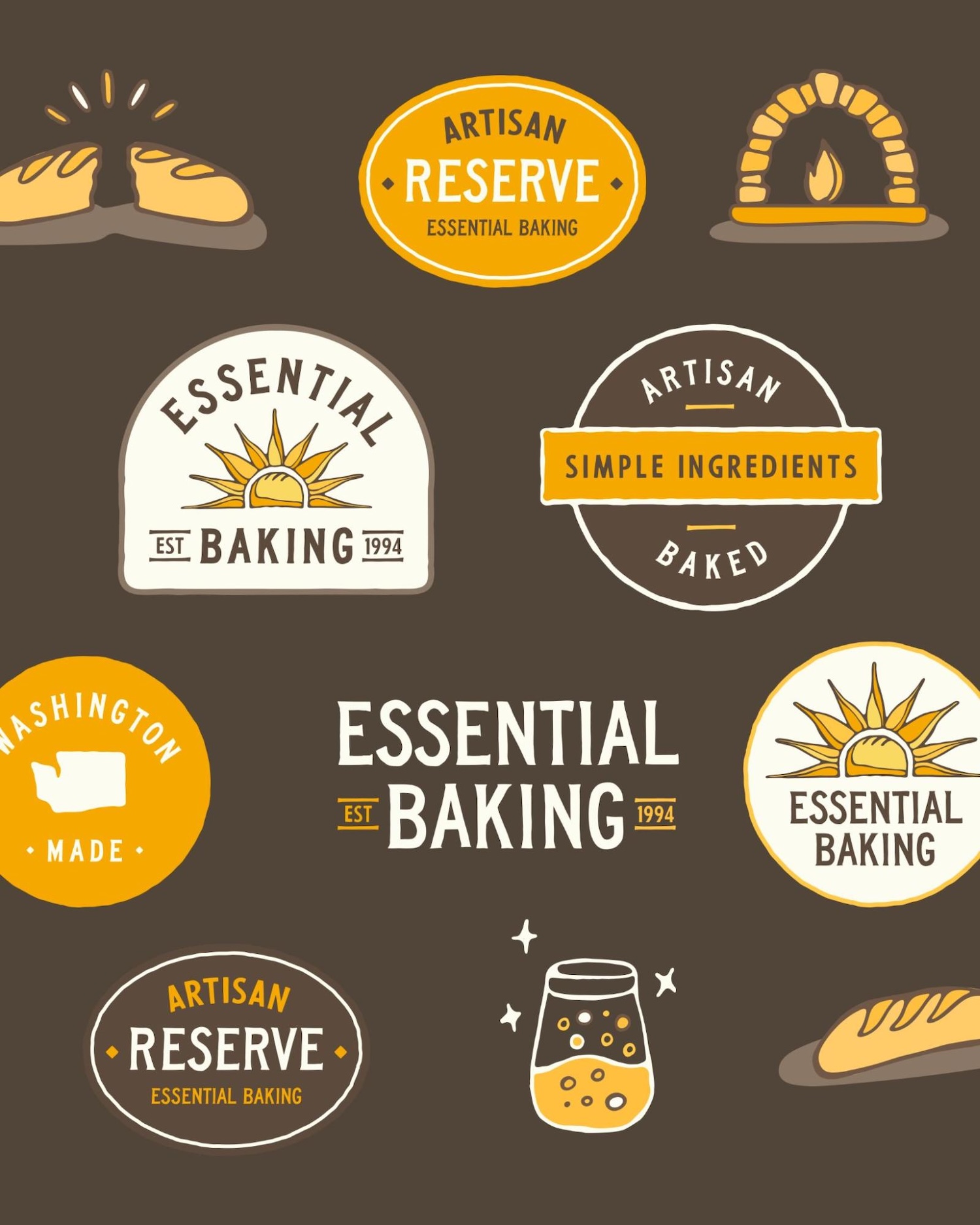
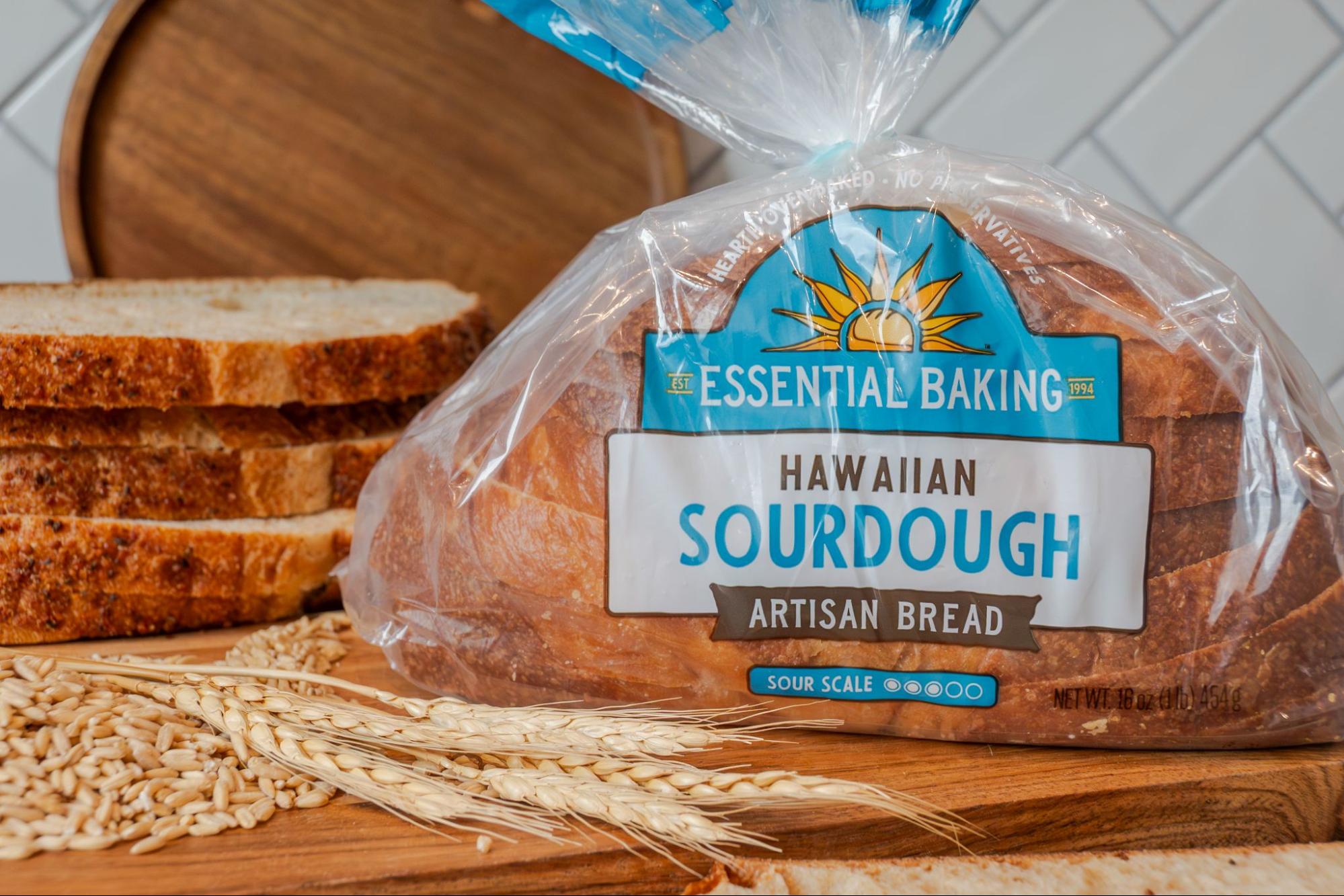
The new “Sunloaf” icon: A centerpiece of the new identity, this hand-drawn icon reinvents Essential Baking’s legacy “sun rays” into a clever brandmark that combines the sun’s warmth, the arch of a baker’s hearth, and a scored loaf of bread.
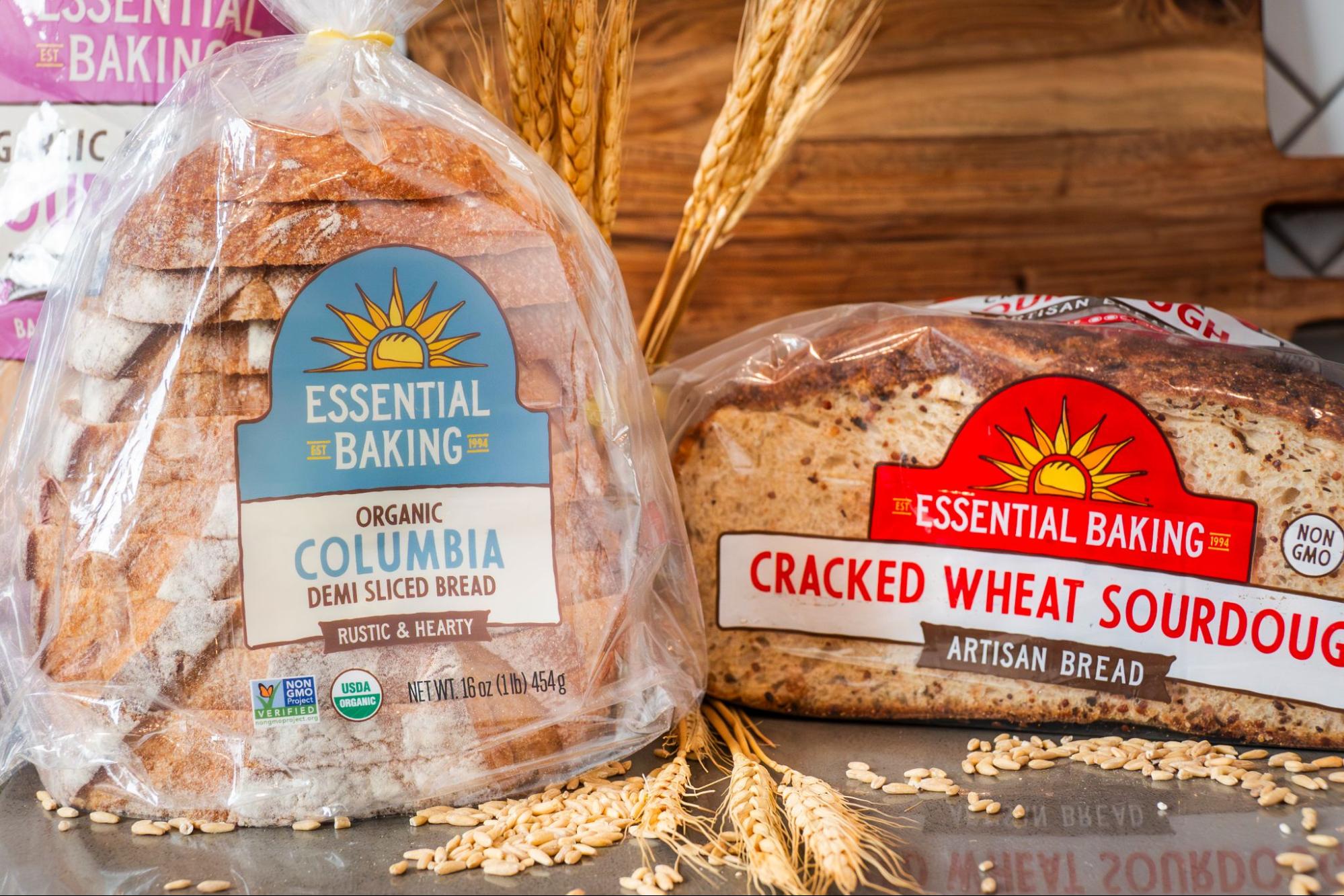
Color palette: The palette moves away from inconsistency toward a vibrant, earthy spectrum. Designers developed a robust color-coding system to help consumers navigate 20+ SKUs on the shelf (e.g., deep purple for Raisin Pecan, sunny yellow for Focaccia).
Typography: A balance of traditional and contemporary type. Highly legible, clean fonts with hand-touched details maintain an artisanal feel without sacrificing readability.
Packaging strategy: To address consumer feedback, designers reduced graphic sizes and utilized clear packaging to maximize bread visibility, letting the true star of the show shine through. Another key achievement was ensuring maximum visibility for vertical merchandising, adding labeling to both the front and bottom of the packaging so the brand is recognizable no matter how the grocer stocks the shelf. Custom illustrations underscore the sourdough baking process, a “Washington Made” seal to highlight local roots, and a “Sour Scale” to help customers choose their preferred flavor profile.
Beyond the bakery aisle: The new system was designed with maximum versatility in mind. Beyond the bread bags, the brand identity scales across delivery vans, team uniforms, and digital platforms.
Project Scope
Visual identity evolution: Completely reimagining Essential Baking’s 30-year-old heritage logo and developing modern brand assets for a scalable future.
Comprehensive packaging design: Overhaul for 20+ bread packaging SKUs, covering everything from their signature sourdoughs to specialty loaves.


CREDIT
- Agency/Creative: People People
- Article Title: People People Redesigns The Essential Baking Company With Earthy Color, Clean Type, and Human Hand Drawn Detail
- Organisation/Entity: Agency
- Project Type: Packaging
- Project Status: Published
- Agency/Creative Country: United States
- Agency/Creative City: Seattle
- Market Region: North America
- Project Deliverables: Packaging Design, Rebranding
- Format: Bag
- Industry: Food/Beverage
- Keywords: Baking Company Rebrand
-
Credits:
Creative Director: Sara Green
Sr. Designer & Illustrator: Noah Bell
Sr. Creative Producer: Justin Huguet
Photo Credit: People People


