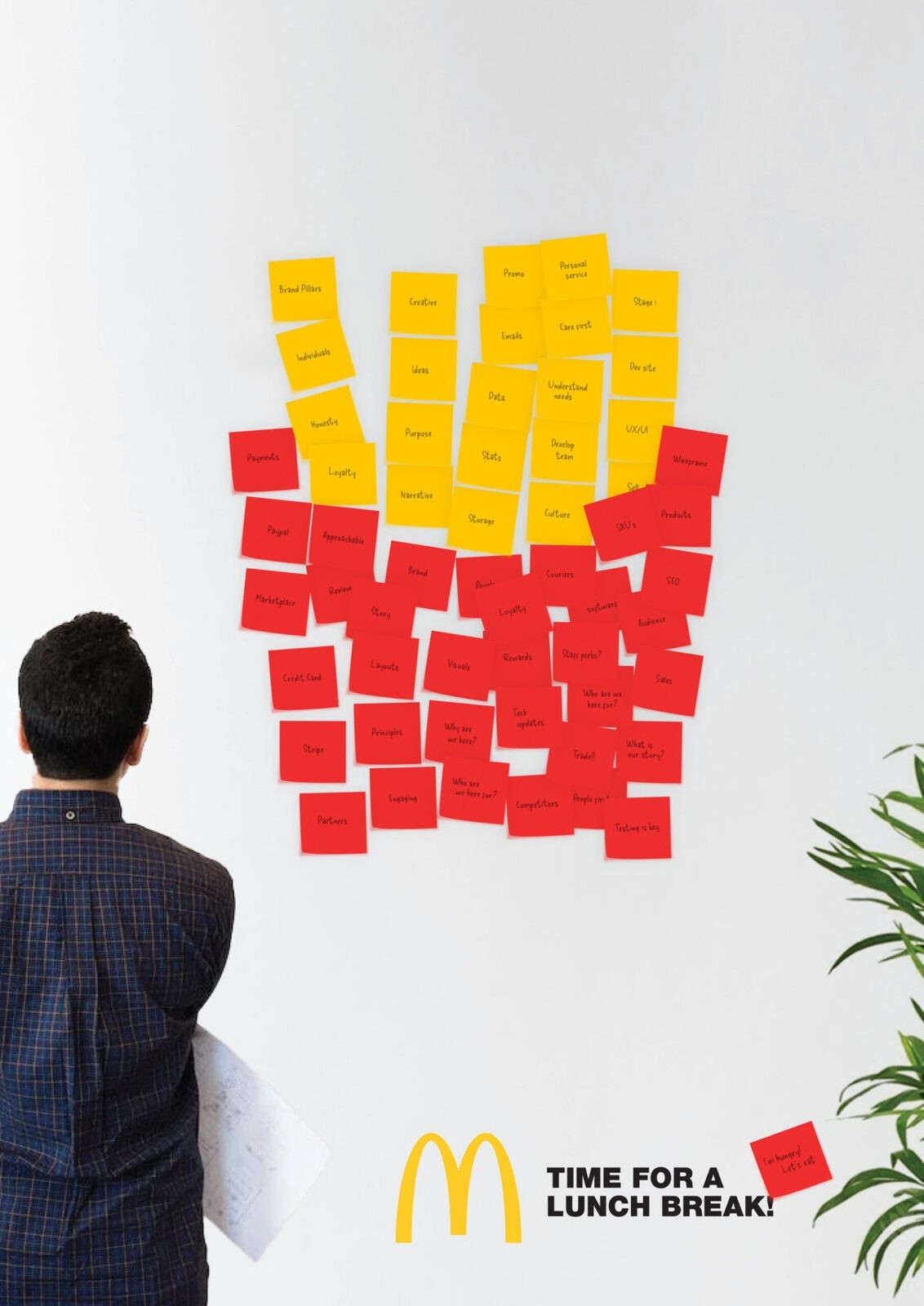
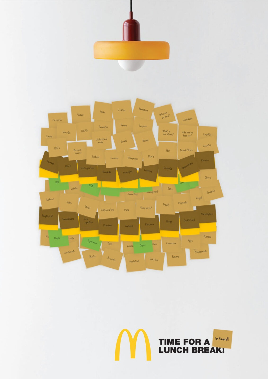
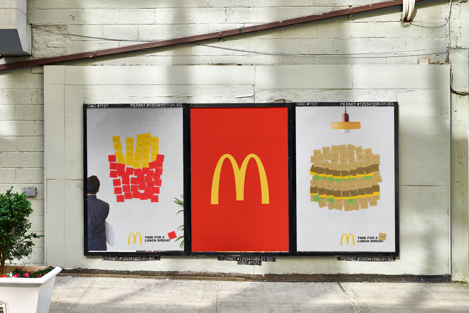
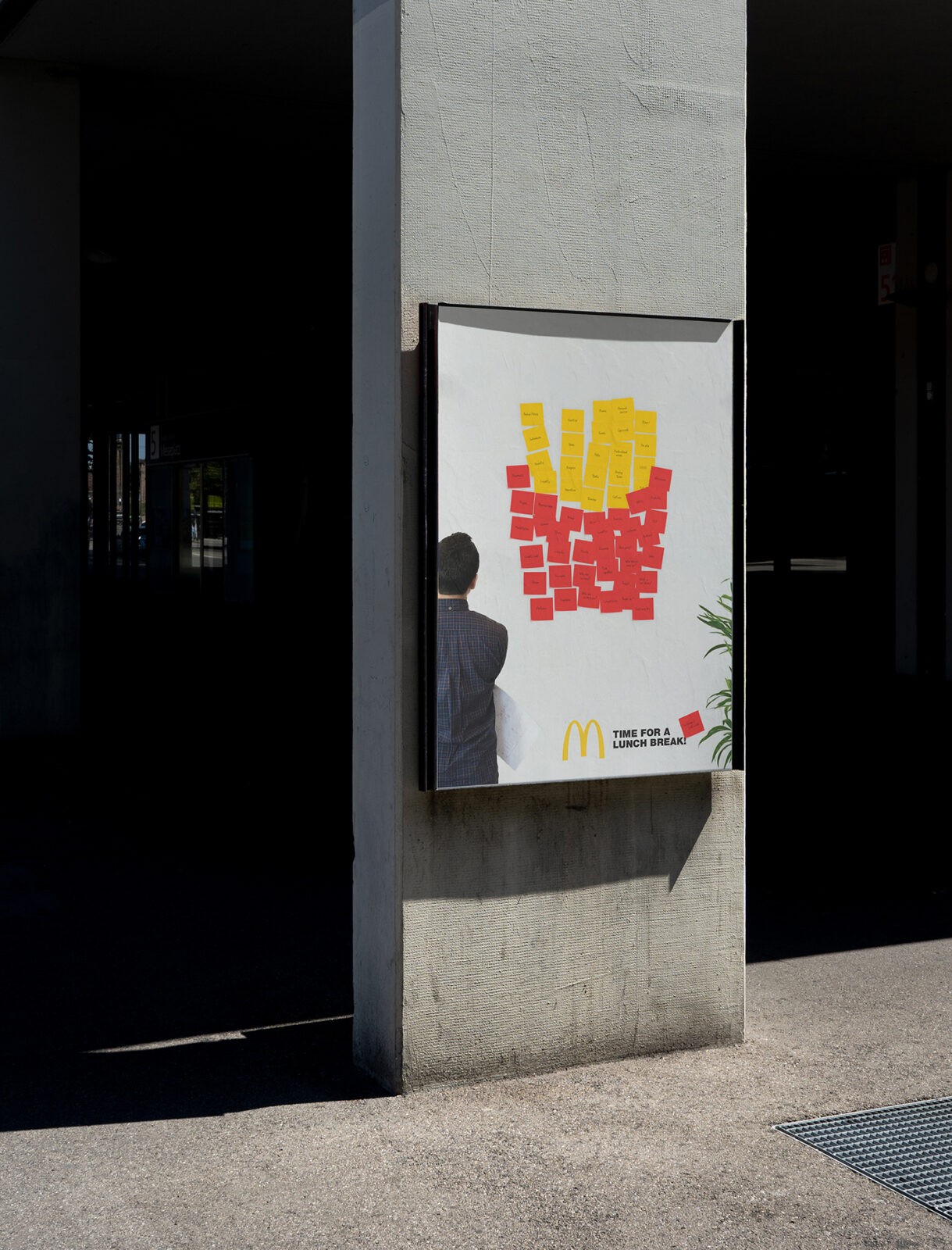
The idea stems from the observation that McDonald’s rarely promotes its offerings for corporate lunch breaks, something we felt would be a great opportunity to let creativity drive a visual campaign.
We decided to tackle this brief by leveraging a familiar office brainstorming technique—using post-it notes to generate ideas and visualise concepts, all stuck up on a wall for collab.
By leveraging this familiar and relatable office product, we aim to create a strong visual connection with our target audience. The vibrant colors and the collaborative nature of brainstorming sessions with post-it notes will serve as the foundation of our campaign, encouraging office workers to consider McDonald’s for their lunch break.
We based the concepts on a brainstorming session where post-it notes are placed on a wall, each note containing words and ideas related to a subject which is being discussed or planned, corporate life. This technique is often used in corporate environments, making it relatable to our target audience. Each note has a word related to a subject or project.
The various colors of the post-it notes were used to create a vibrant image representing a collective corporate mind at work. The arrangement and colors of the notes subconsciously formed imagery that prompts thoughts of a lunch break at McDonald’s; from the classic red box full of fries to a juicy burger. This visual metaphor serves as the centerpiece of the campaign.
By linking the familiar corporate practice of brainstorming with the vibrant, accessible appeal of McDonald’s, we aim to position McDonald’s as the go-to lunch destination for busy professionals looking to take a quick, enjoyable break from their workday.
This campaign creatively bridges the gap between corporate culture and fast food, using the visual language of the workplace to make a compelling case for McDonald’s as a convenient and refreshing lunch option.


CREDIT
- Agency/Creative: Pencil Studio
- Article Title: Pencil Studio’s Graphic Design Concept for McLunch Break
- Organisation/Entity: Agency
- Project Status: Non Published
- Agency/Creative Country: United Kingdom
- Agency/Creative City: Frome
- Keywords: WBDS Agency Design Awards 2024/25
- Keywords: WBDS Agency Design Awards 2024/25


