Every year it comes around, the dreaded Christmas mailer. Something that has always been seen as an agency’s opportunity to show off their wit and talent, unrestricted by anything but their creativity.
This year we had a focus on something somewhat less jolly than the normal cheerful, bright theme of the festive celebrations, but still a celebration nonetheless.
Christmas is often celebrated as the season of joy and perfection, but beneath the twinkling lights and carefully curated traditions lies a more honest reality. This year, we revived an idea that had been sitting idle—a concept that began as a doodle on paper but never fully came to life until now.
Our starting point was a simple insight: Christmas isn’t always the picture-perfect holiday it’s made out to be. The pressure to create the perfect festive experience often reveals the cracks in its glossy façade. Instead of shying away from this reality, we leaned into it, creating a unique and thought-provoking mailer for our clients.
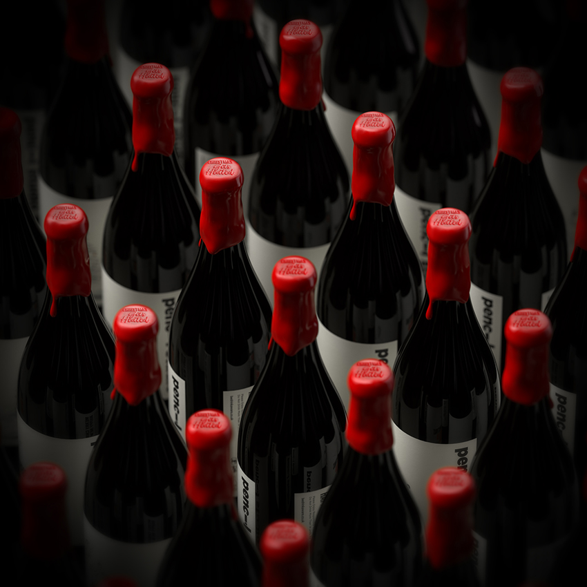
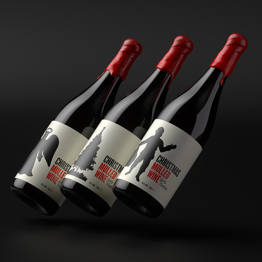
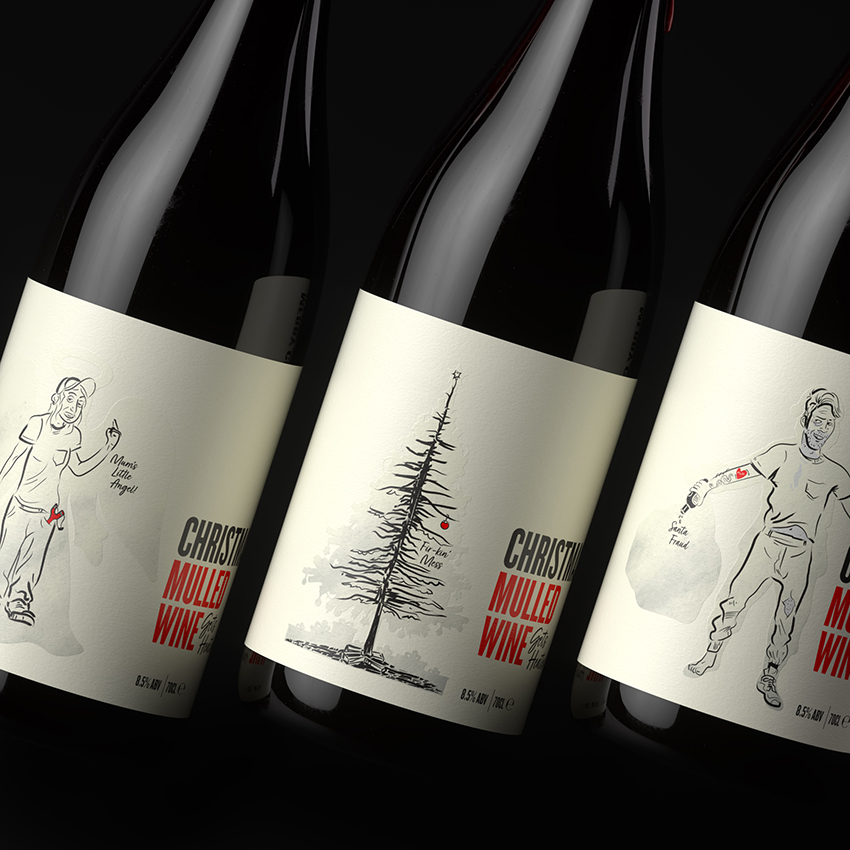
We sent them a bottle of mulled wine, a classic Christmas drink that embodies warmth and nostalgia. But the real magic of this mailer wasn’t in the bottle itself—it was in its label design. At first glance, the label showcased idyllic Christmas icons: Santa Claus, a Christmas tree, and angels. However, the story truly unfolded when the bottle was heated. The cheerful designs transformed, revealing the hidden realities of the season. Who really knows who’s behind the Santa costume? Christmas trees shed needles and make a mess, and children, as much as we love them, don’t always live up to their angelic reputations.
This transformation captured the dual nature of Christmas—its undeniable charm paired with its imperfect truths. By embracing the unvarnished side of the holiday, we created a mailer that not only delivered a thoughtful gift but also sparked meaningful reflection. It reminded our clients that even the less-than-perfect moments deserve celebration, because they’re what make the season real.


CREDIT
- Agency/Creative: Pencil Studio
- Article Title: Pencil Studio Captures the Dual Nature of Christmas with Heat-Activated Packaging
- Organisation/Entity: Agency
- Project Type: Packaging
- Project Status: Published
- Agency/Creative Country: United Kingdom
- Agency/Creative City: Frome
- Market Region: Europe
- Project Deliverables: Label Design, Packaging Design
- Format: Bottle
- Industry: Professional Services
- Keywords: WBDS Agency Design Awards 2025/26 , Packaging, Christmas, Heat Reative Ink
-
Credits:
Creative Director: Luke Manning
Illustrator: Chris Osment
3D Work: Martin Dyer


