


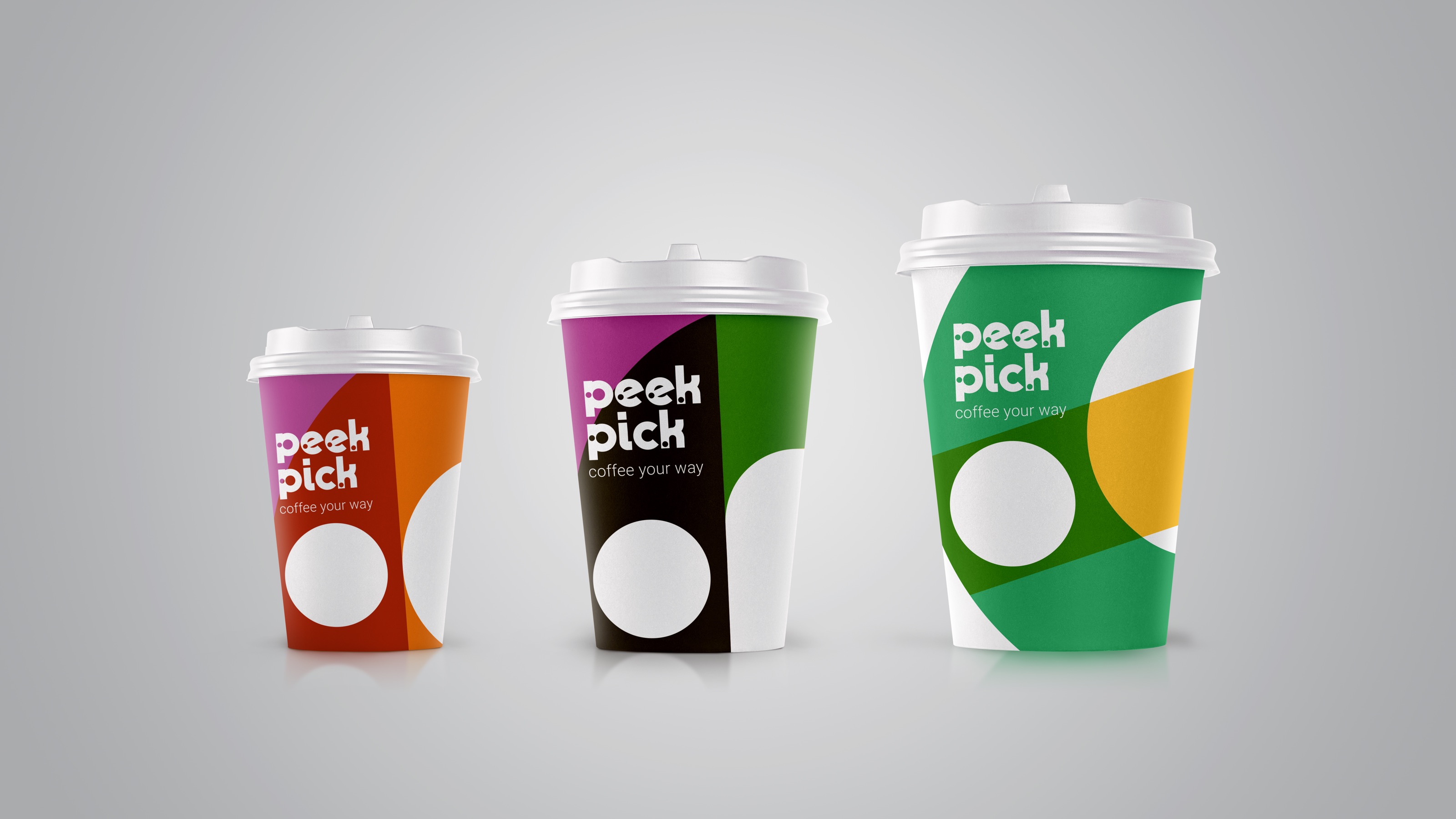
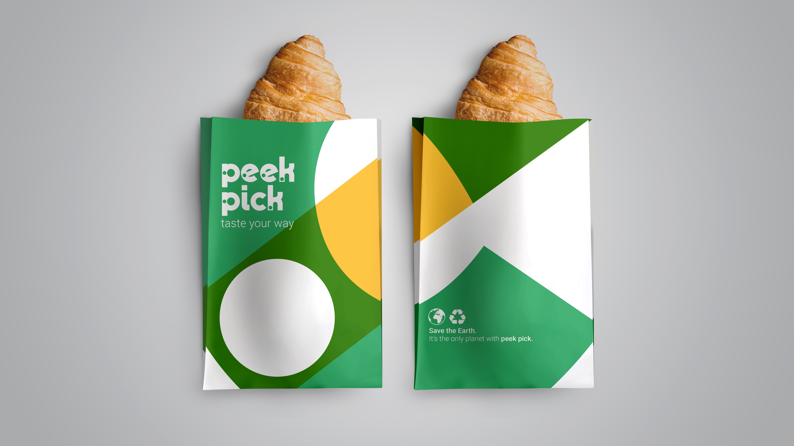
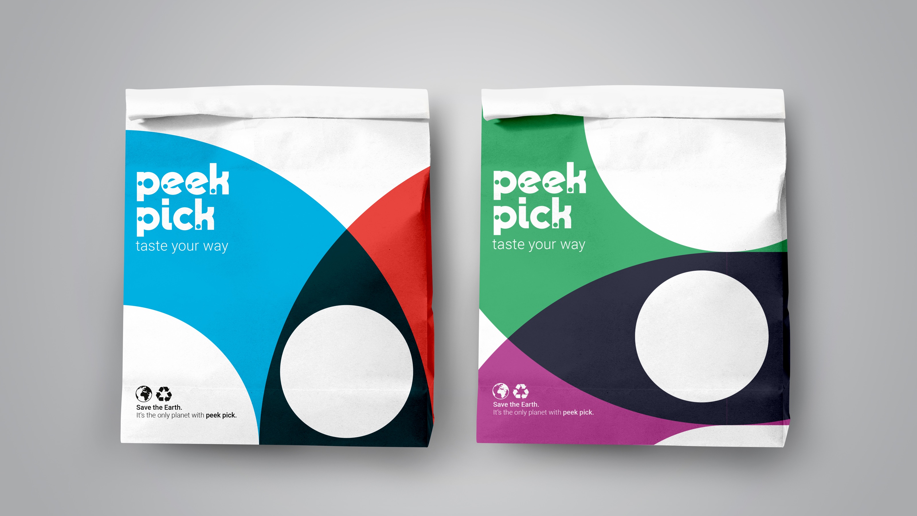
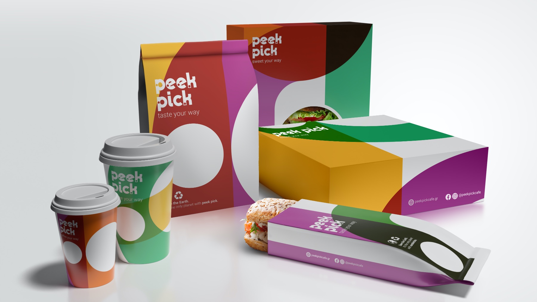
Our client, DL Café, needed a radical transformation to communicate its services/goods. We firstly considered its snacks and beverages as tasteful, routine breaking checkpoints within our busy day. Then, we translated this into what would be a new design philosophy. Peek Pick café was born to represent a delicious point of reference between train stations. Using minimal typology and basing it around the power of transportation symbols and street signs, we introduced the white dot as a visual representation of a rest stop, between stations. To signify different travel lines within the city we used differently colored lines that intersect and conclude their destination in the middle, forming the Peek Pick café logo.
CREDIT
- Agency/Creative: A.S. Strategy, Branding & Communication, A. Skaraki & Co
- Article Title: Peek Pick Cafe Branding
- Organisation/Entity: Agency
- Project Type: Identity
- Project Status: Published
- Agency/Creative Country: Greece
- Agency/Creative City: Kifisia
- Market Region: Europe
- Project Deliverables: Brand Design
- Industry: Hospitality
- Keywords: WBDS Awards, Agency
-
Credits:
Design Agency: A.S. Strategy, Branding & Communication, A. Skaraki & Co
FEEDBACK
Relevance: Solution/idea in relation to brand, product or service
Implementation: Attention, detailing and finishing of final solution
Presentation: Text, visualisation and quality of the presentation


