


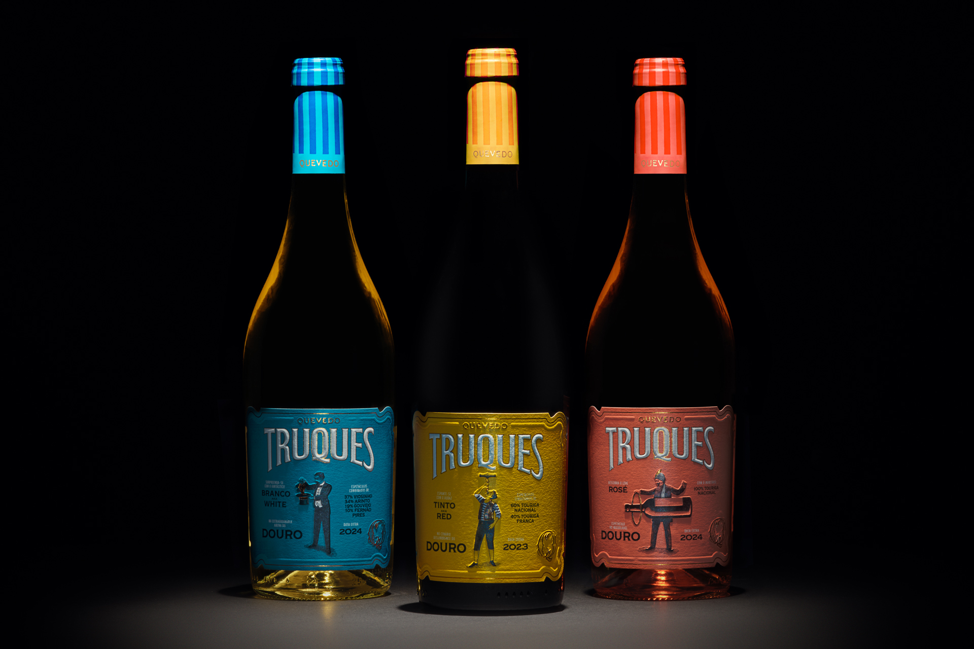
Truques (Portuguese for Tricks) is Quevedo Wines’ joyful tribute to the grand stage of the Douro Valley: a land of steep terraces, golden light, and centuries-old winemaking magic, and to the unforgettable performers that bring its spirit to life. Born from Quevedo’s passion for quality and love of doing things differently, Truques celebrates the wonder of the Douro in a fresh, surprising way. It’s part of a wide, carefully crafted range of wines that show just how playful and expressive this region can be — from timeless Ports to bold new creations. This collection is a performance by a trio of young, vibrant wines, each bursting with character. Inspired by the enchanting worlds of circus and magic — where joy, surprise, and celebration rule — Truques captures that same sense of wonder in every sip.
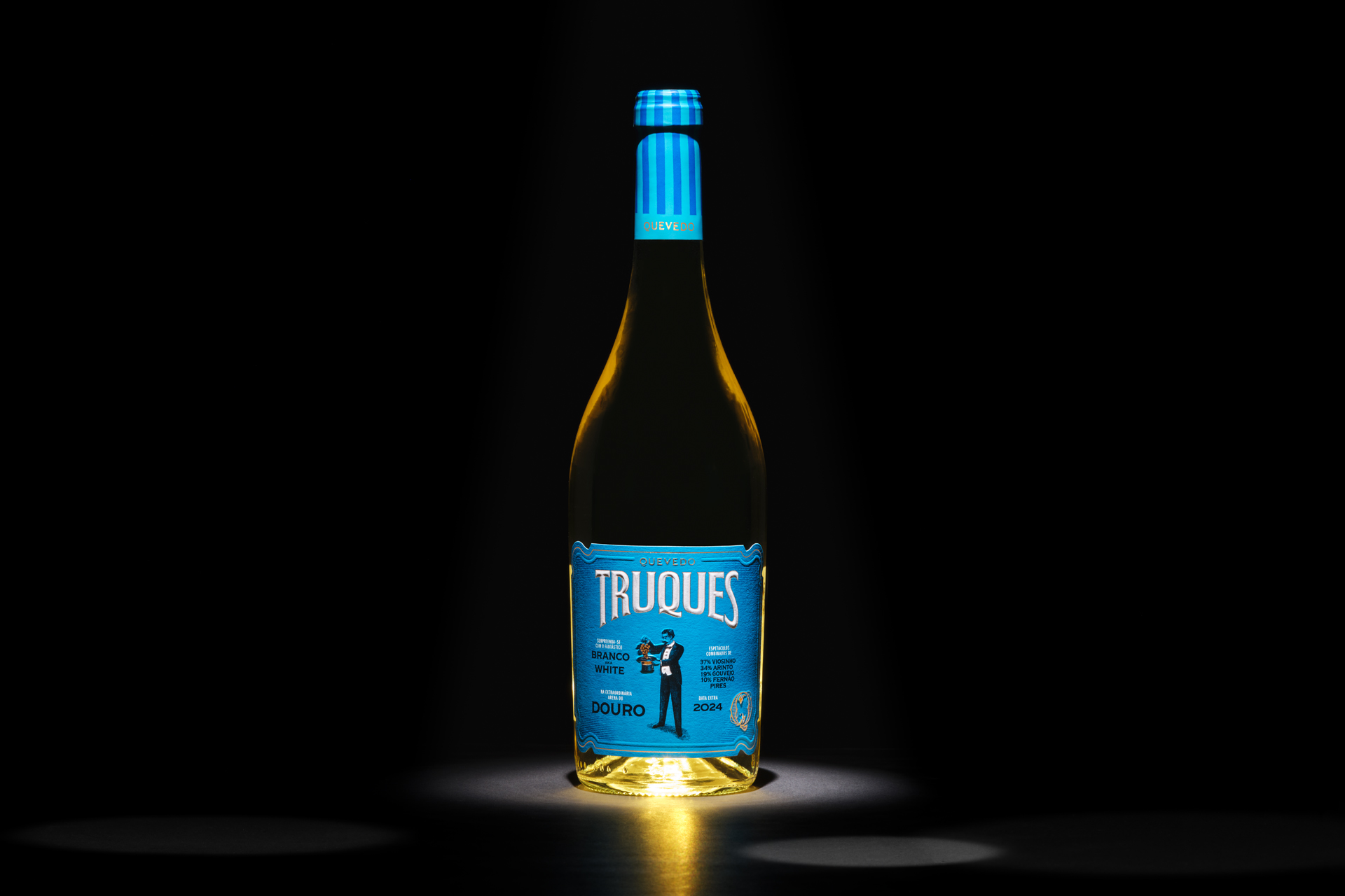
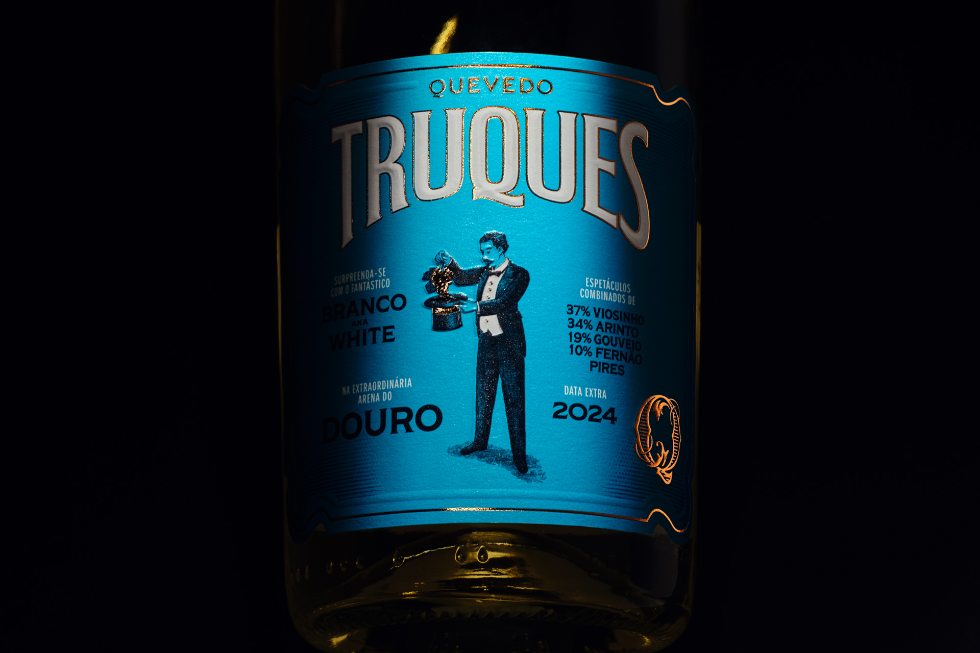
White dazzles with illusions, with freshness and complexity that unfolds like a magician’s trick. Its label captures depicts a magician pulling a generous bunch of grapes from a hat — a nod to the transformation that turns fruit into wine.
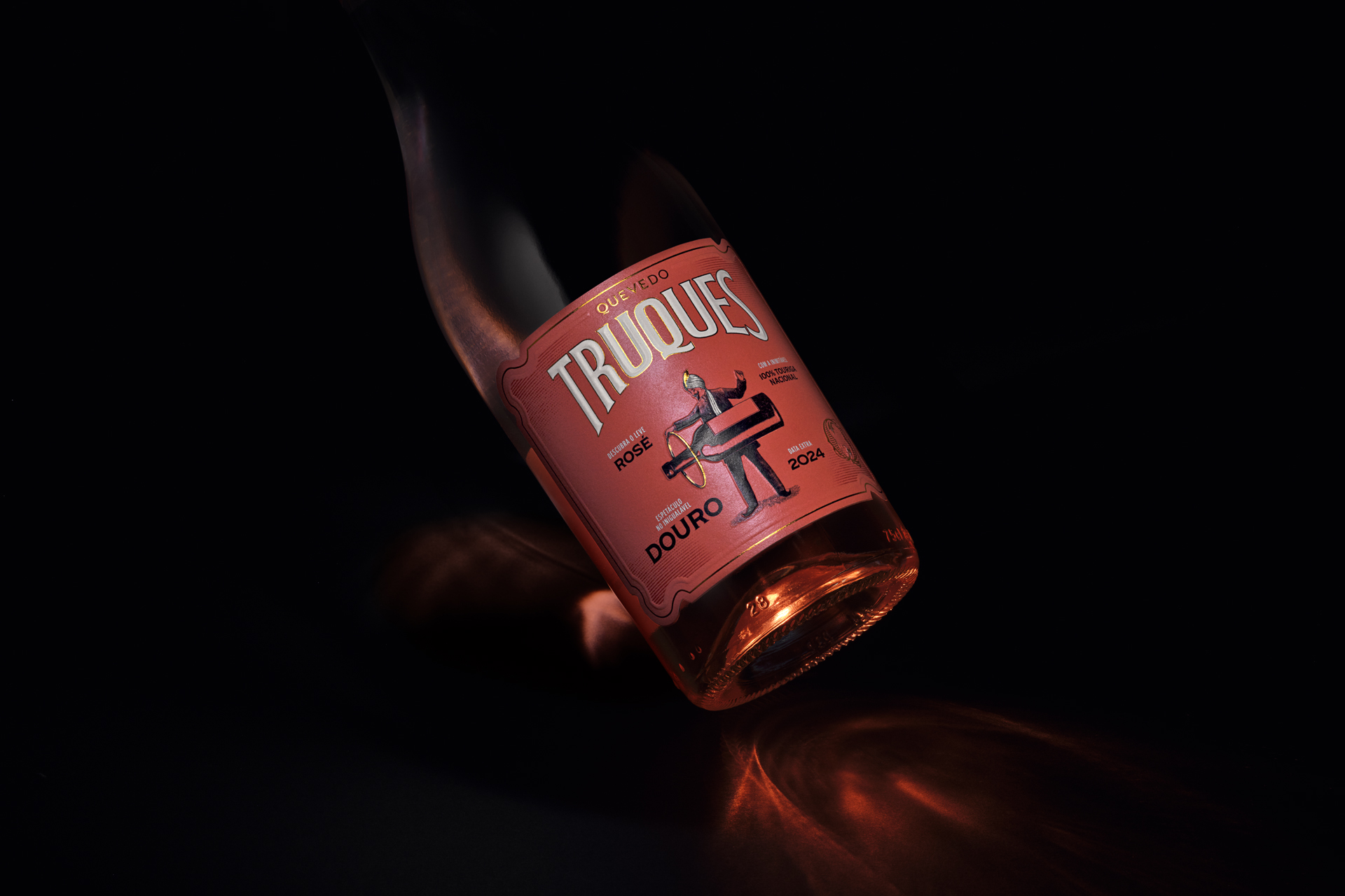
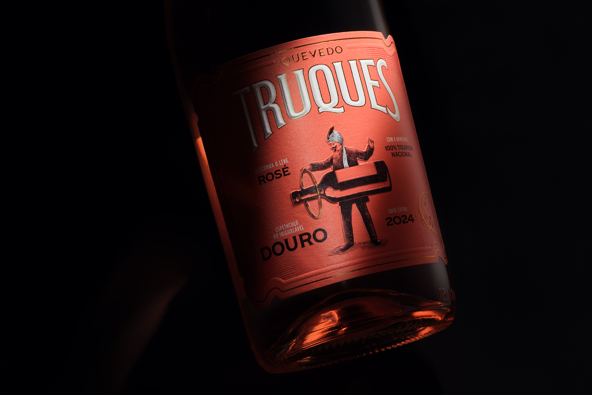
Rosé floats gracefully through the air with effortless lightness. The label takes us into an exotic world of enchantment, with a magician guiding a hoop around a levitating bottle, evoking the delicate balance of the wine inside.
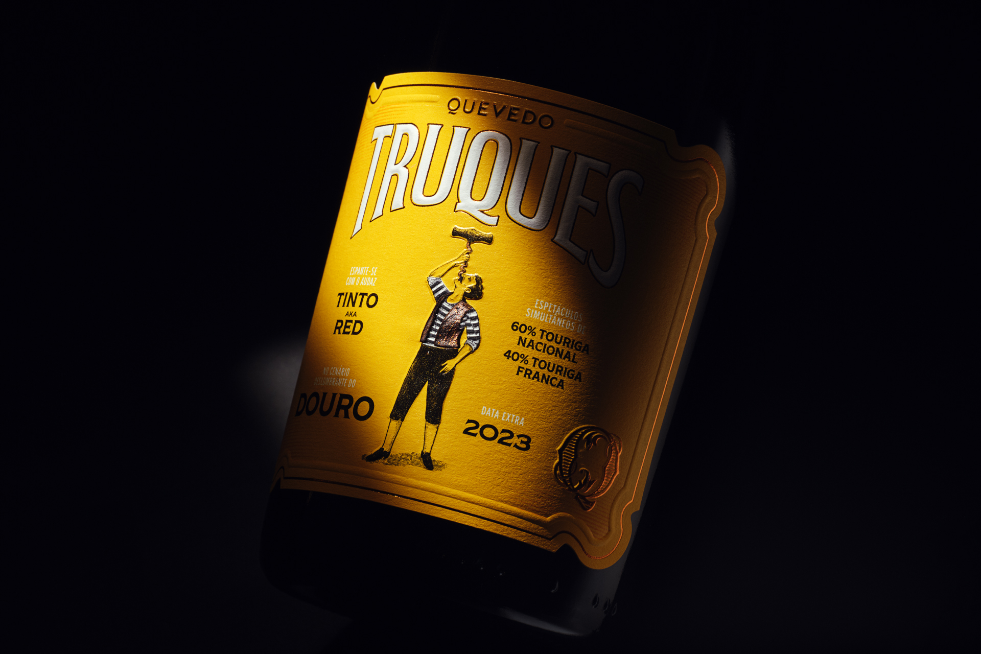
Red steals the spotlight with bold audacity and full-bodied charm. The label shows a daring a sword swallower performing the impossible — except this time, the “sword” is a corkscrew, a playful wink at the bold character and power of the wine.
So open a bottle, take your seat, and let the show begin — because Truques is more than a collection of wines. It’s a celebration of the magic that happens when craftsmanship, creativity, and a touch of mischief come together.

CREDIT
- Agency/Creative: Pedro Vareta Studio
- Article Title: Pedro Vareta Studio Sets the Stage for Quevedo’s Truques
- Organisation/Entity: Agency
- Project Type: Packaging
- Project Status: Published
- Agency/Creative Country: Portugal
- Agency/Creative City: Porto
- Market Region: Europe
- Project Deliverables: Brand Design, Brand Identity, Brand Naming, Brand Strategy, Illustration, Packaging Design
- Format: Bottle
- Industry: Food/Beverage
- Keywords: wine, douro, portugal
-
Credits:
Branding & Packaging Design: Pedro Vareta
Brand Strategy: Henri Sizaret (Brand Reveal)
Illustration: José Cardoso
Photography: Nuno Moreira


