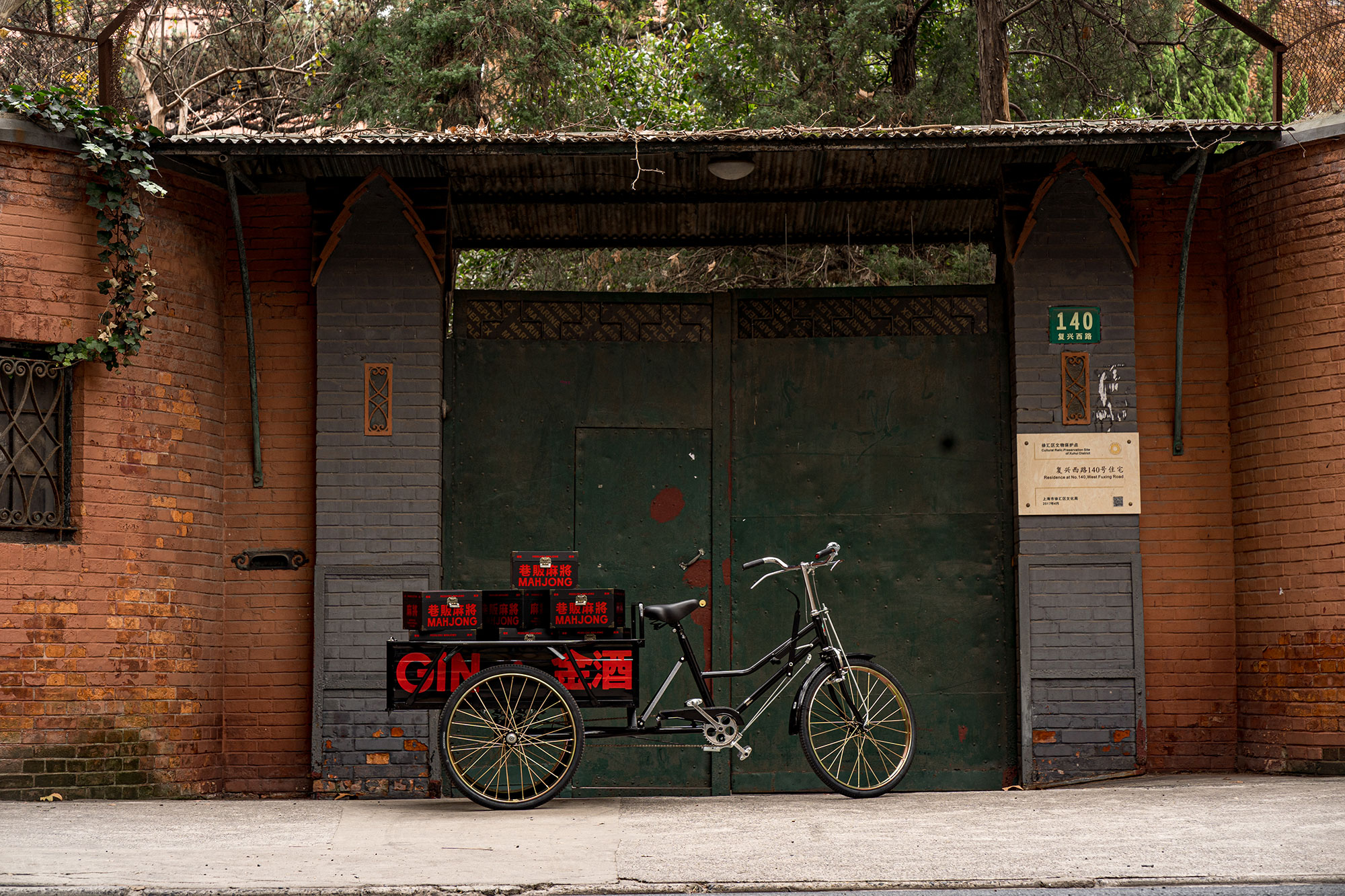
A Peddler is an adventurer, a creator, a harbinger of new ideas. Peddlers exist in the underground, where creativity takes place and new ideas take hold.
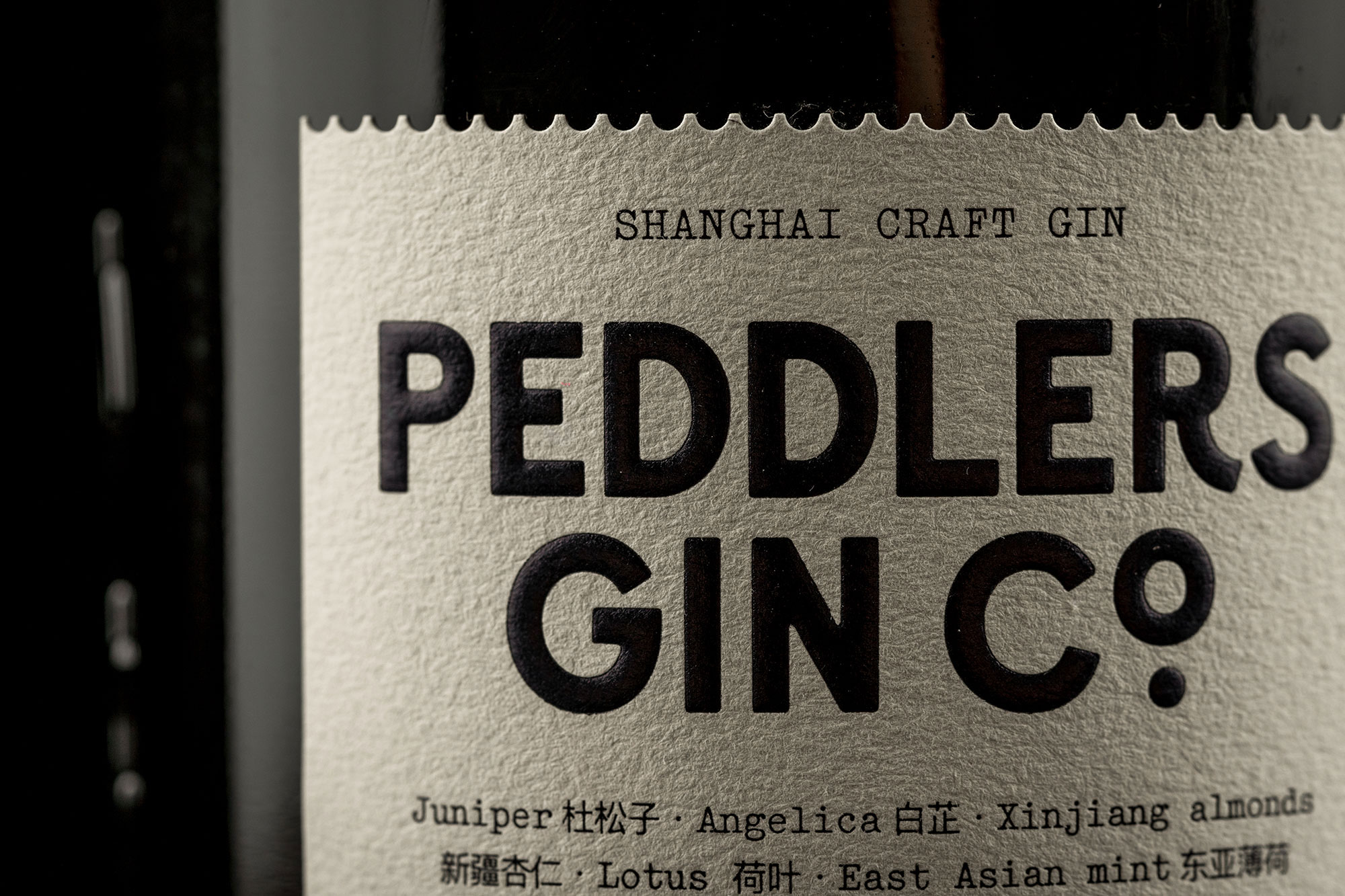
Born on the back streets of Shanghai, the hustle and bustle charm of the world’s biggest trading port was the perfect inspiration for a more adventurous gin; Peddlers is distilled with rare Eastern botanicals such as Sichuan pepper and Buddha’s hand.
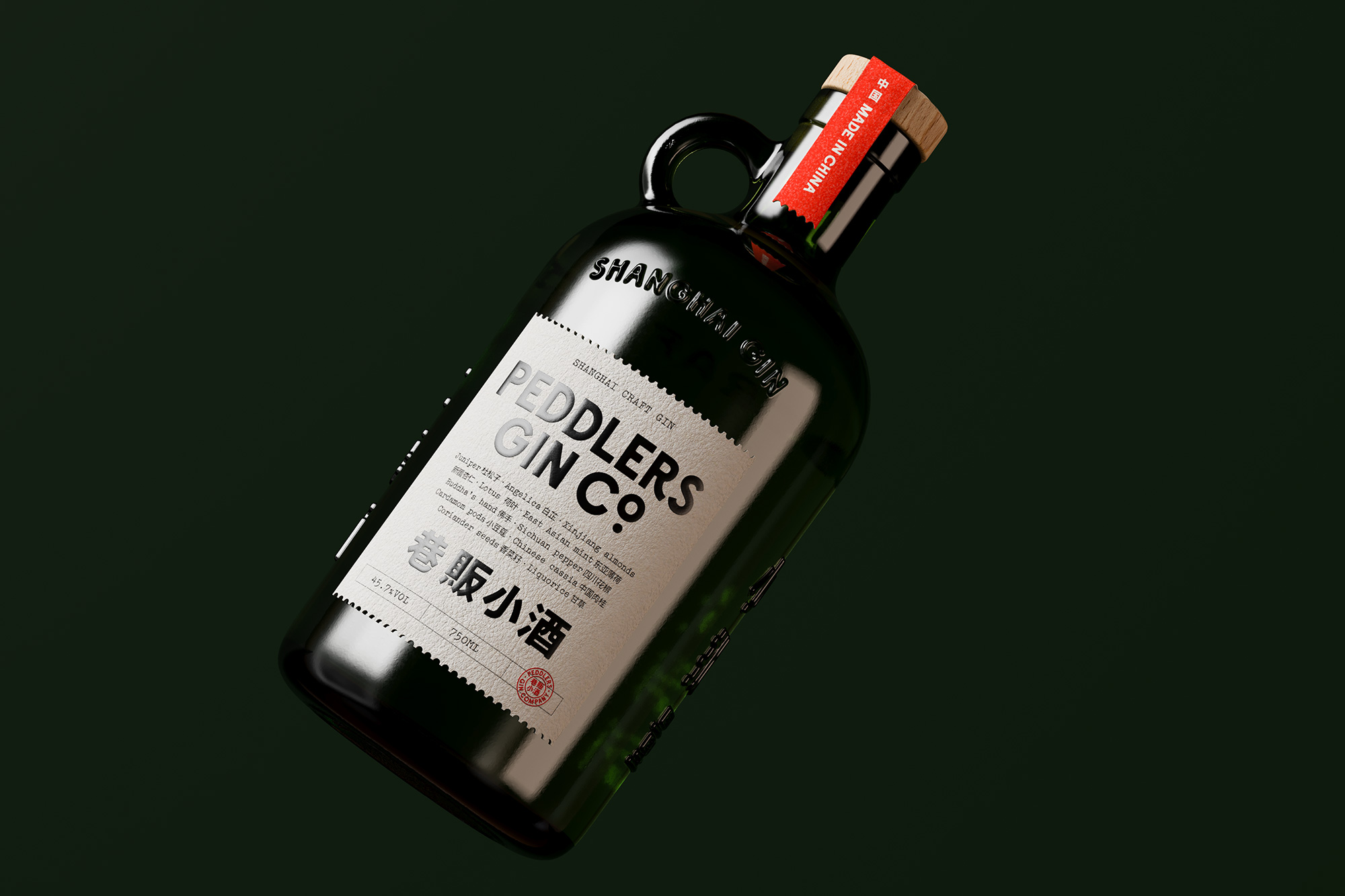
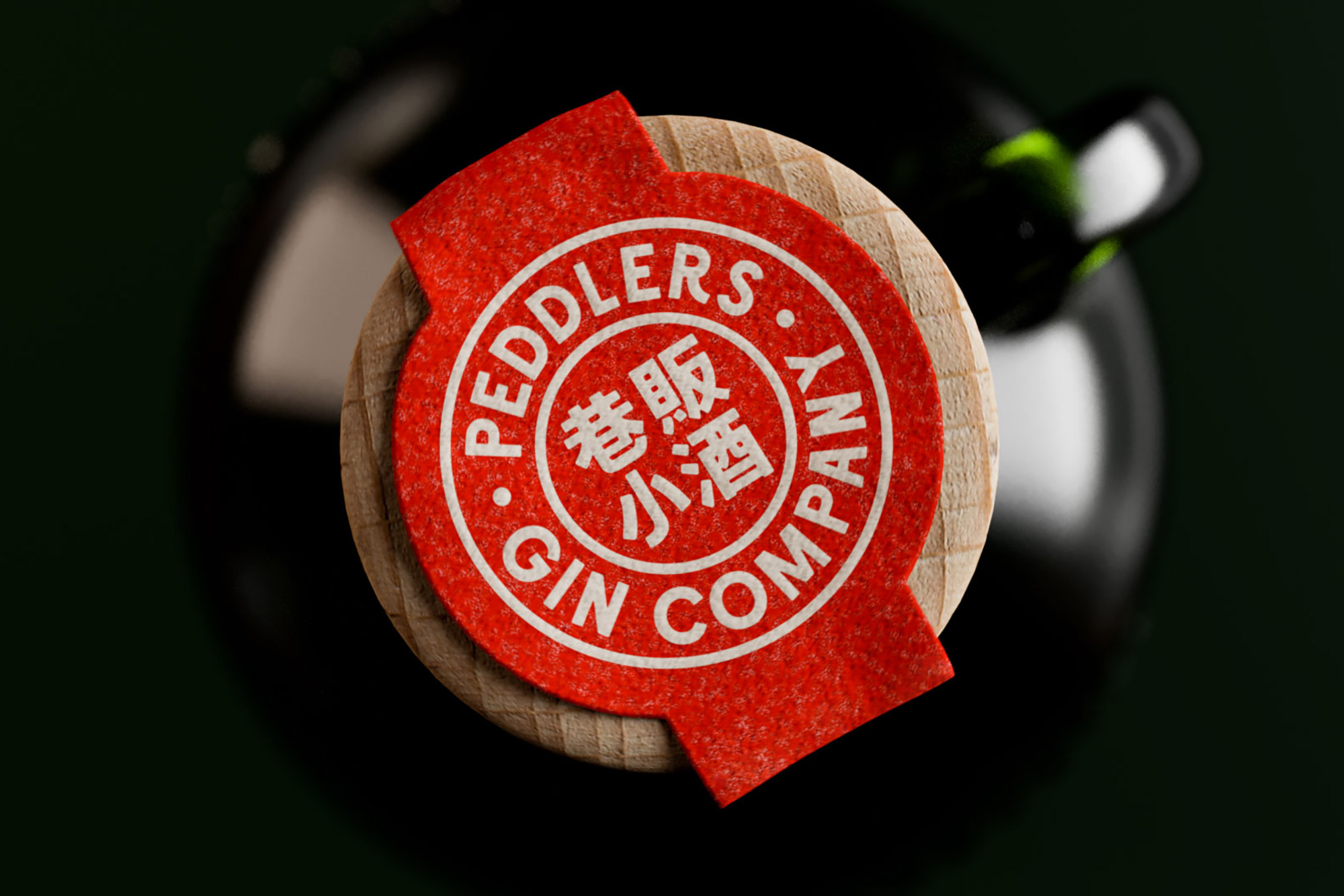
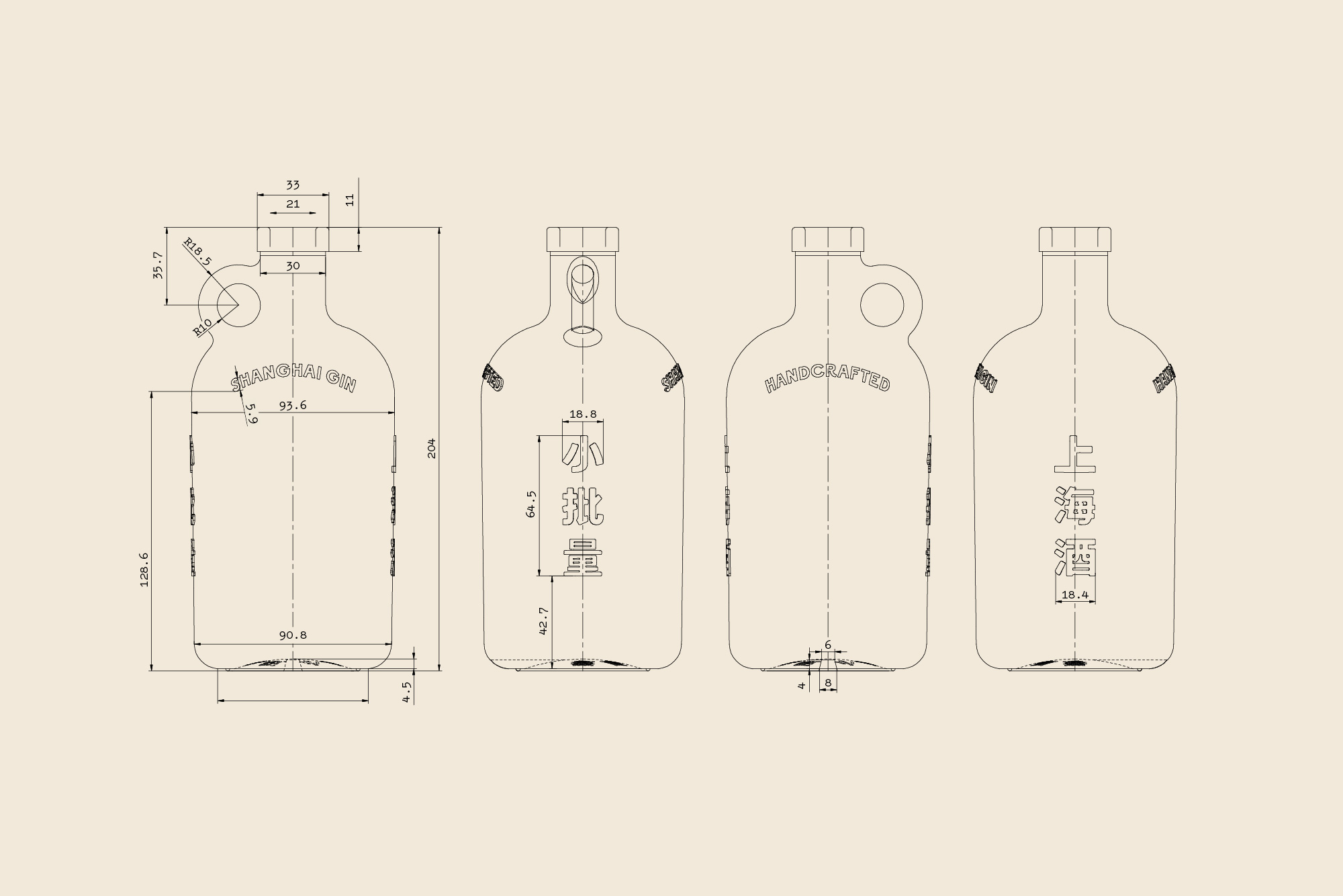
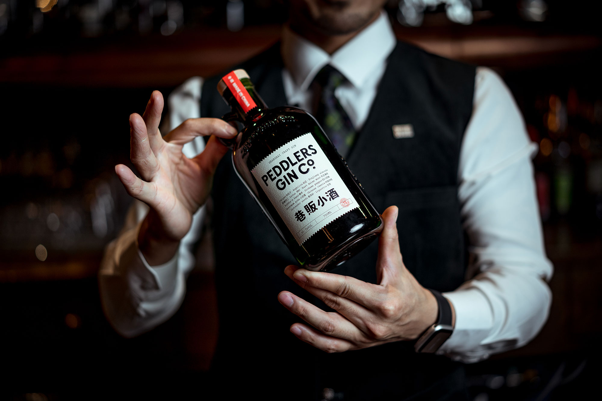
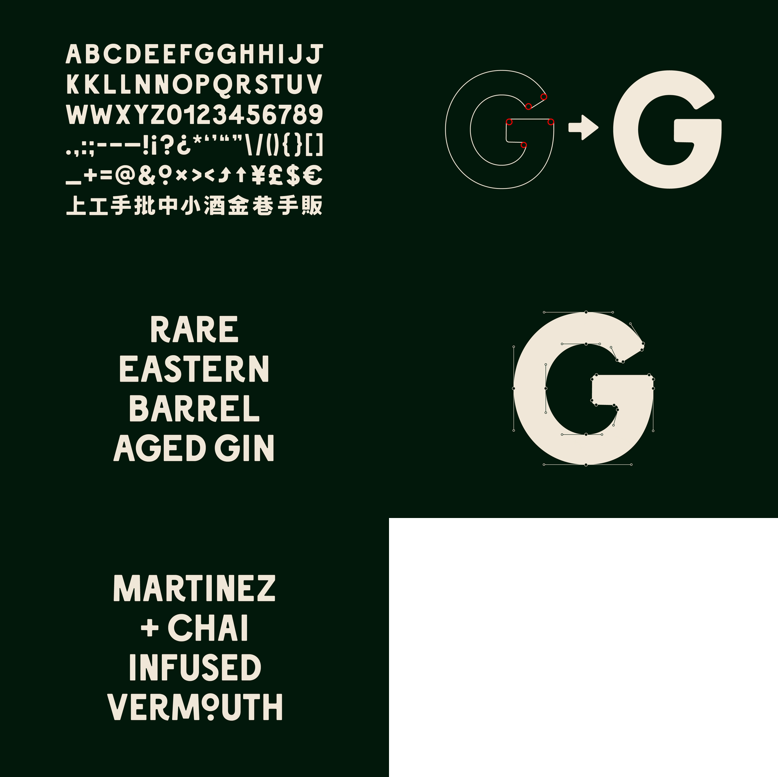
The custom bottle is the culmination of a three-year process from concept to creation. A distinctive apothecary shape with a curved body and rounded edges was inspired by the Shanghai peddlers of yesteryear. A functional ring on the left shoulder of the bottle was designed and tested for easy mobility and slinging cocktails in all environments, from speakeasies to street corners. In modern use, the feature can be played up in bars and activations through unique displays. Jade green, the Peddlers colour, is a symbol of purity in China and can be spotted on address plates in the alleyways of Shanghai. The bottle features Chinese and English engraving in the custom Peddlers typeface, representing pride in provenance and process.
In what was a challenging 2020 for the bar industry in China, Peddlers wanted to launch the new bottle by doing something unexpected and uplifting for the community that helped them grow as the country’s first craft gin.
So Peddlers sent hundreds of bartenders a branded antique key in a wax sealed envelope stamped with a Peddlers logo, and no other explanation. This created intrigue and buzz across social media and via word of mouth as bartenders tried to guess what the key might open.
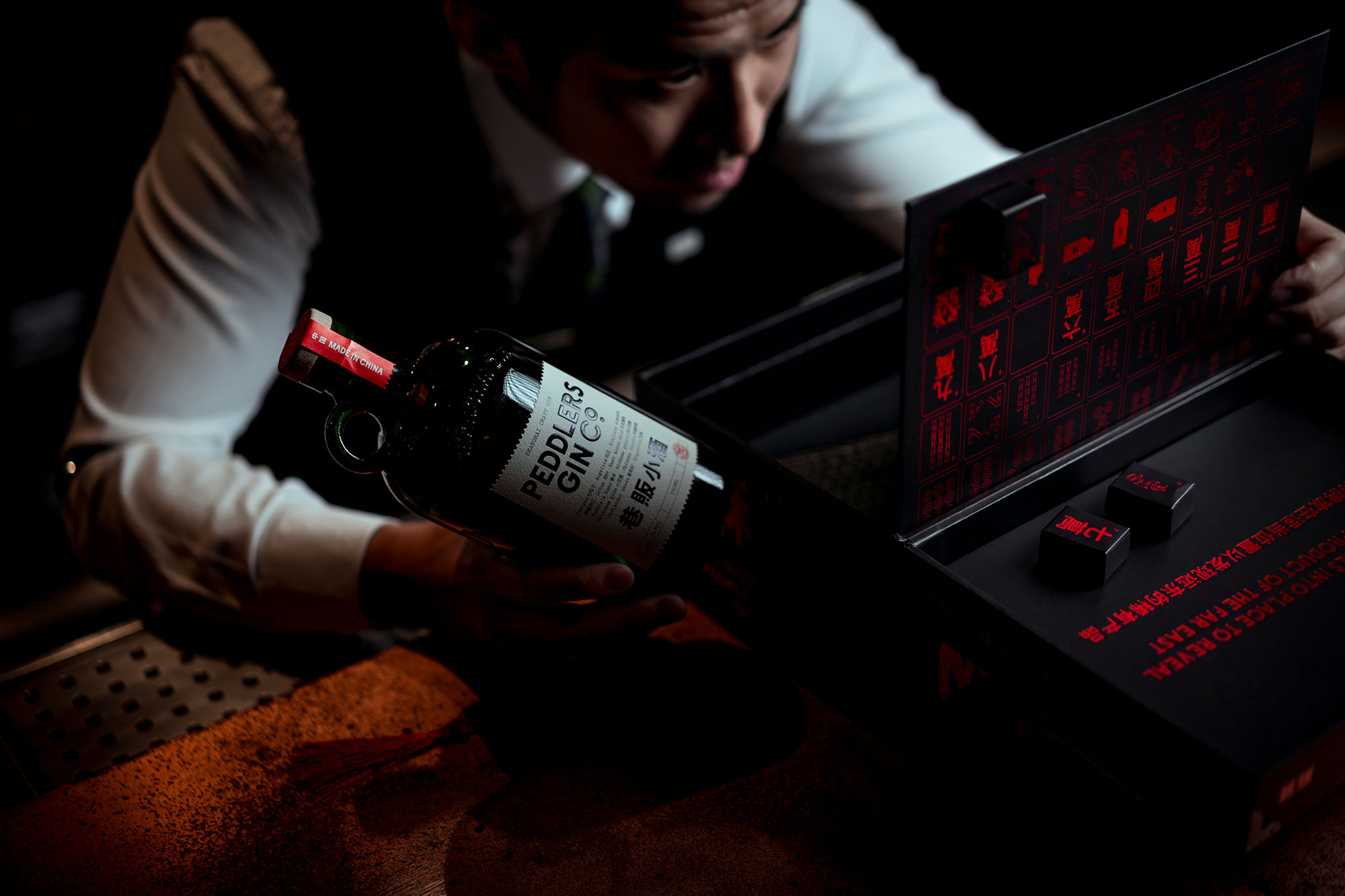
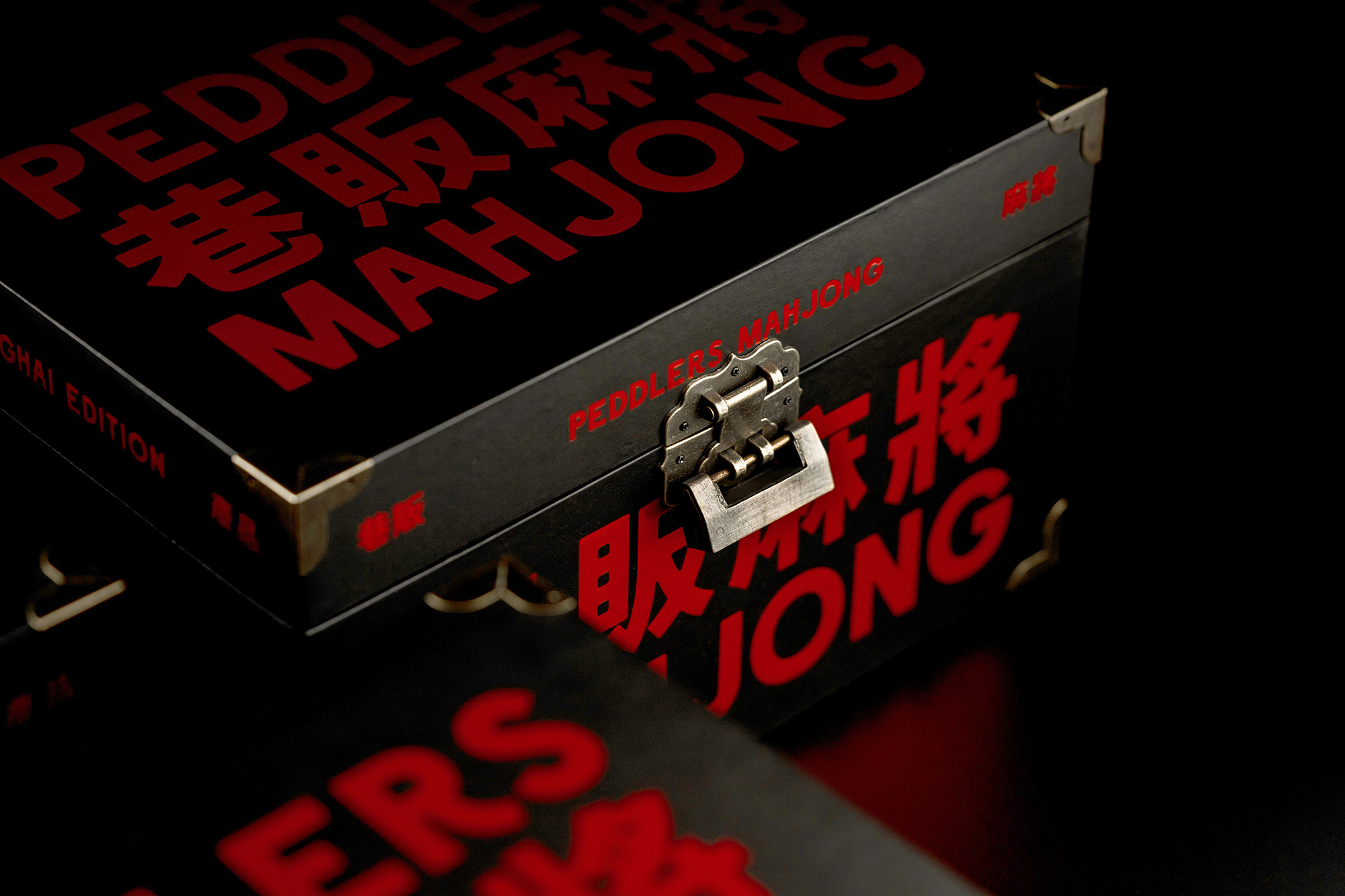
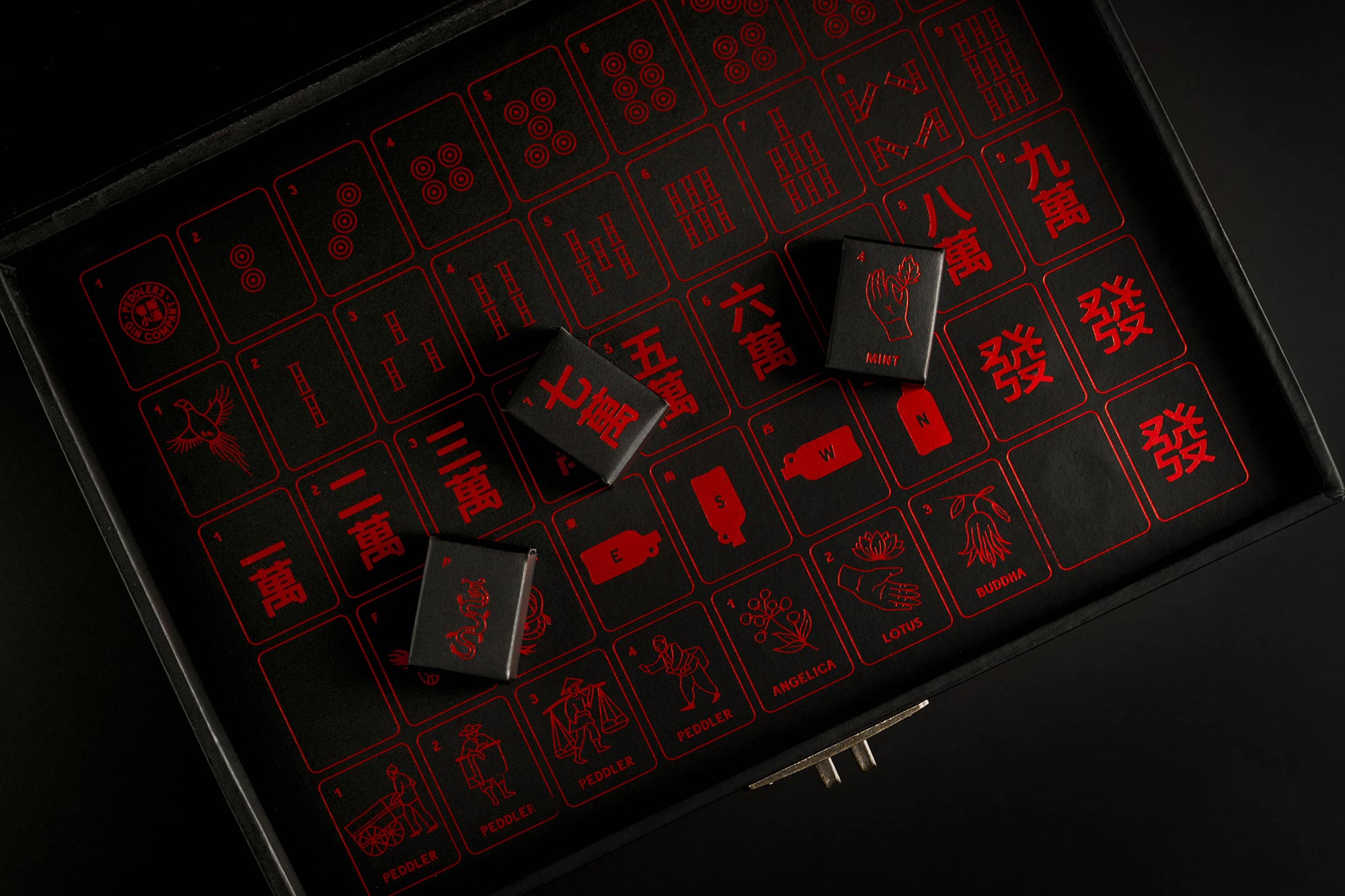
A week later, Peddlers sent a limited-edition mahjong box with the new bottle smuggled inside in a secret compartment. The key unlocked the box but the secret compartment could only be opened when completing the game of Peddlers Mahjong. This required the bartender to move the correct tiles into place with the final piece clicking to create a handle, which revealed the bottle via a trap door.
To coincide with the drop, Peddlers held mahjong related activations across the country to expand the audience of the release campaign. The key then also became an entry card into an exclusive members community called ‘The Company’.
Beyond the buzz among the core bartending audience, the campaign caused such a stir that retailers immediately started requesting to stock the new bottle and the boxes, with bottle pre-orders going far beyond the brand’s average weekly sales numbers.
CREDIT
- Agency/Creative: OMSE
- Article Title: Peddlers Gin Co Brand and Packaging Designed by OMSE
- Organisation/Entity: Agency, Published Commercial Design
- Project Type: Packaging
- Agency/Creative Country: United Kingdom
- Market Region: Asia
- Project Deliverables: Brand Creation, Brand Identity, Brand Strategy, Brand World, Branding, Packaging Design
- Format: Bottle, Box
- Substrate: Glass Bottle


