


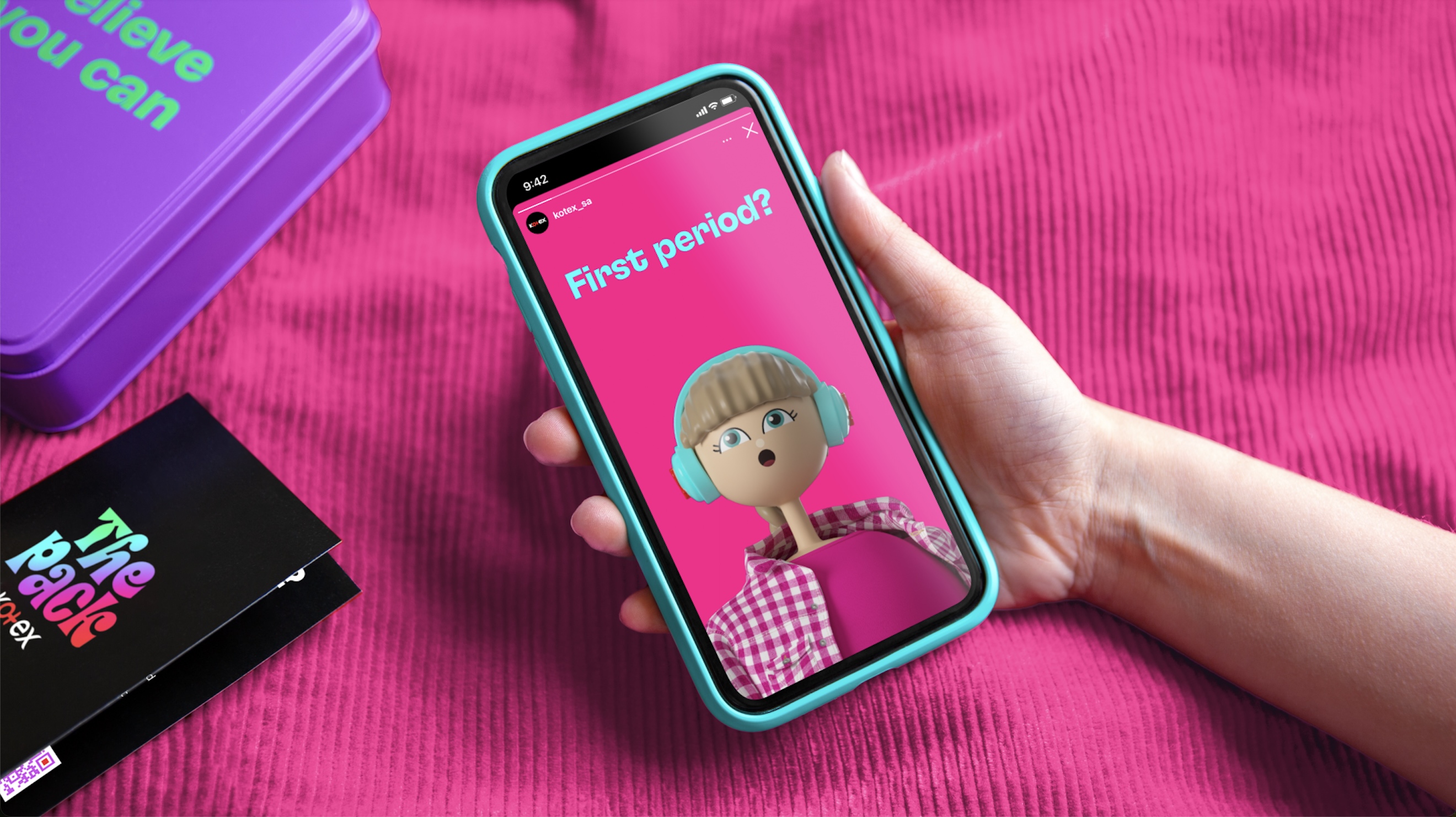
Pearlfisher has unveiled its design for The Pack by Kotex, a kit specifically designed to engage, empower and equip the next generation of tween girls at school in South Africa with the tools they need to manage their menstrual health.
Kotex, a trailblazing menstrual health brand under the Kimberly-Clark personal care portfolio, is leading the charge in revolutionising menstrual health in South Africa by empowering young girls with the information and support they need to flourish. Partnering with the Menstrual Health Management (MHM) school education program, Kotex is challenging taboos and misconceptions around menstrual health by inspiring a new generation of young women to embrace their period with self-assurance.
To take this education further, Kotex created a unique kit to equip girls at school with the tools they need to manage their menstrual health with pride. In order for The Pack to inspire its young female audience, its design needed to align with and communicate its empowering and confidence-boosting content and steer away from patronising connotations.
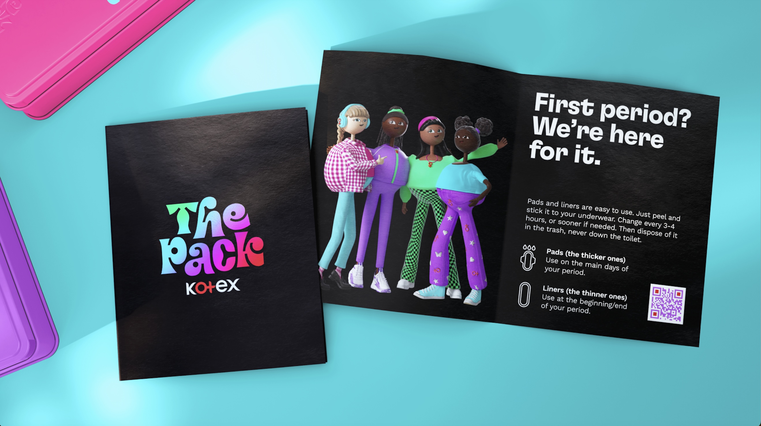
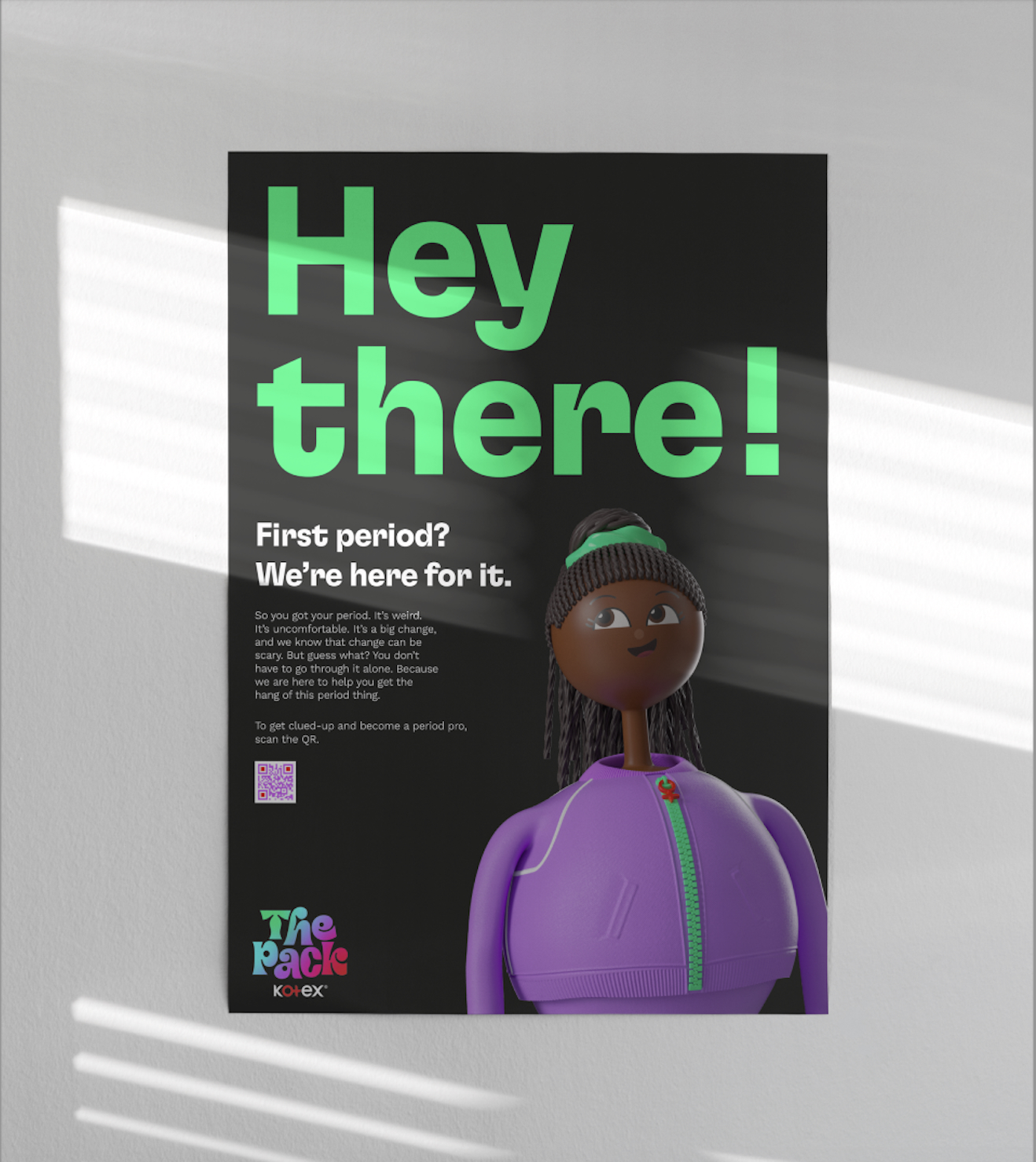
Pearlfisher’s modern design of The Pack avoids the stereotypical tween girl aesthetic filled with passive pastel pinks and “cutesy” doodles that feel dated and naive. Instead, The Pack comes alive with four distinct tins, each adorned with a unique design embodying one of four characters – Kiara, Thembeka, Amy, and Mia – who have been created to help guide the girls through their journey. Each character has her own unique personality, vibe, and style, offering a range of female identities to relate to from the fashion-forward Kiara to the bold and sporty Thembeka.
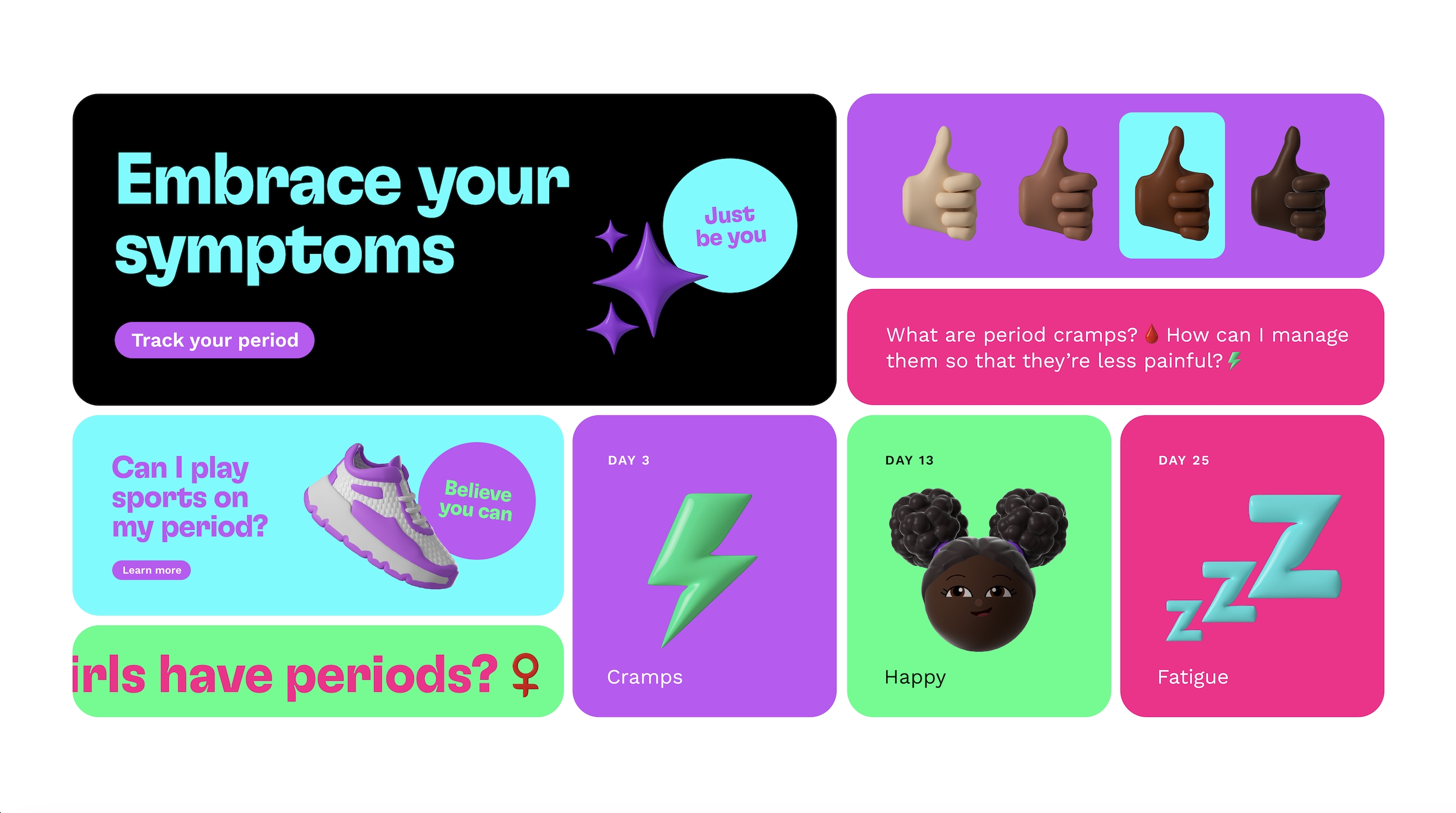
The Pack’s logo gradient is designed to celebrate the diversity and individuality of every girl, while also capturing the essence of a gamified aesthetic that resonates with the contemporary tween lifestyle. The colour palette features lively shades of purple, green, and blue, seamlessly integrating Kotex’s core brand colours into a dynamic and playful visual world. The exaggerated, bouncy logotype represents the distinctiveness of the four characters with a joyful style, while posters designed for intimate spaces like school toilets, where girls might need support the most, showcase the brand’s four optimistic characters, speaking with a reassuring tone of voice.
Jess Phillips, Creative Director at Pearlfisher said: “The Pack goes beyond the traditional functionality of fem-care to transform menstrual education into an engaging, empowering experience for girls navigating puberty. The design needed to reflect this, both to engage and empower this young generation and to help foster a sense of community and unity among students.
As a group that’s maturing at a faster rate than previous cohorts, young girls crave learning that’s relatable, fun, and informative. It was so important to create a design for The Pack that spoke to this generation in their language, facilitating community, dialogue, and empowerment among tweens who are aspiring to grow into Gen Z shoes.”
The Pack includes a parental guide that girls can share with their parents or guardians, fostering a trusting relationship as well as helping build brand loyalty. Additionally, the Kotex brand is all about inviting young girls to feel like they’re part of something bigger. The brand name itself is both metaphorical and literal. It represents not only the four relatable characters, but also the idea of being part of a pack: a community of girls who have each other’s backs and can help empower each other.
Alexis Rice, Head of Consumer Engagement at Kimberly-Clark: “Kotex’s commitment to menstrual health shines through with The Pack, shifting the conversation from an impersonal experience to a more approachable and personal one, rooted in empowerment. Through its engaging design elements and relatable characters, Kotex is at the forefront of being a credible expert and a contemporary brand that engages, interacts, and behaves in a way that young women can identify with and be proud to use.”
Kotex The Pack will officially be in schools and on shelves in South Africa in 2024.


CREDIT
- Agency/Creative: Pearlfisher
- Article Title: Pearlfisher Unveils Design of the Pack by Kotex: Reimagining Period Education for the Next Generation of Tween Girls in South Africa
- Organisation/Entity: Agency
- Project Type: Packaging
- Project Status: Published
- Agency/Creative Country: United Kingdom
- Agency/Creative City: London, New York
- Market Region: Africa
- Project Deliverables: Brand Identity, Brand Strategy, CGI
- Format: Tin
- Industry: Health Care
- Keywords: Menstrual health, education, brand strategy, visual identity, CGI, Pearlfisher, KOTEX
-
Credits:
Founding Partner and Group Chairman: Mike Branson
Founding Partner & Group Creative Director: Jonathan Ford
Creative Director: Jess Phillips
Client Director: Jack Sheehan
Designer: Kat Mellor
Strategy Director: Rosalind Michaluk
Junior Designer: Hannah Francis
Visualisation Director: Jody Gibbs


