


Tohum is an award-winning jewelry business created by Verda Alaton. Over the past 10 years, the brand has gone on a fascinating journey – growing from its artisanal origins in Istanbul to a highly sought-after international fashion brand. Born out of a deep passion for nature and culture, Tohum brings a bold new personal vision to jewelry, connecting us to what is truly valuable in life.
To define Tohum’s unique position in contemporary fashion, we created a complete experience that takes the brand forward as a natural luxury brand for everyone.
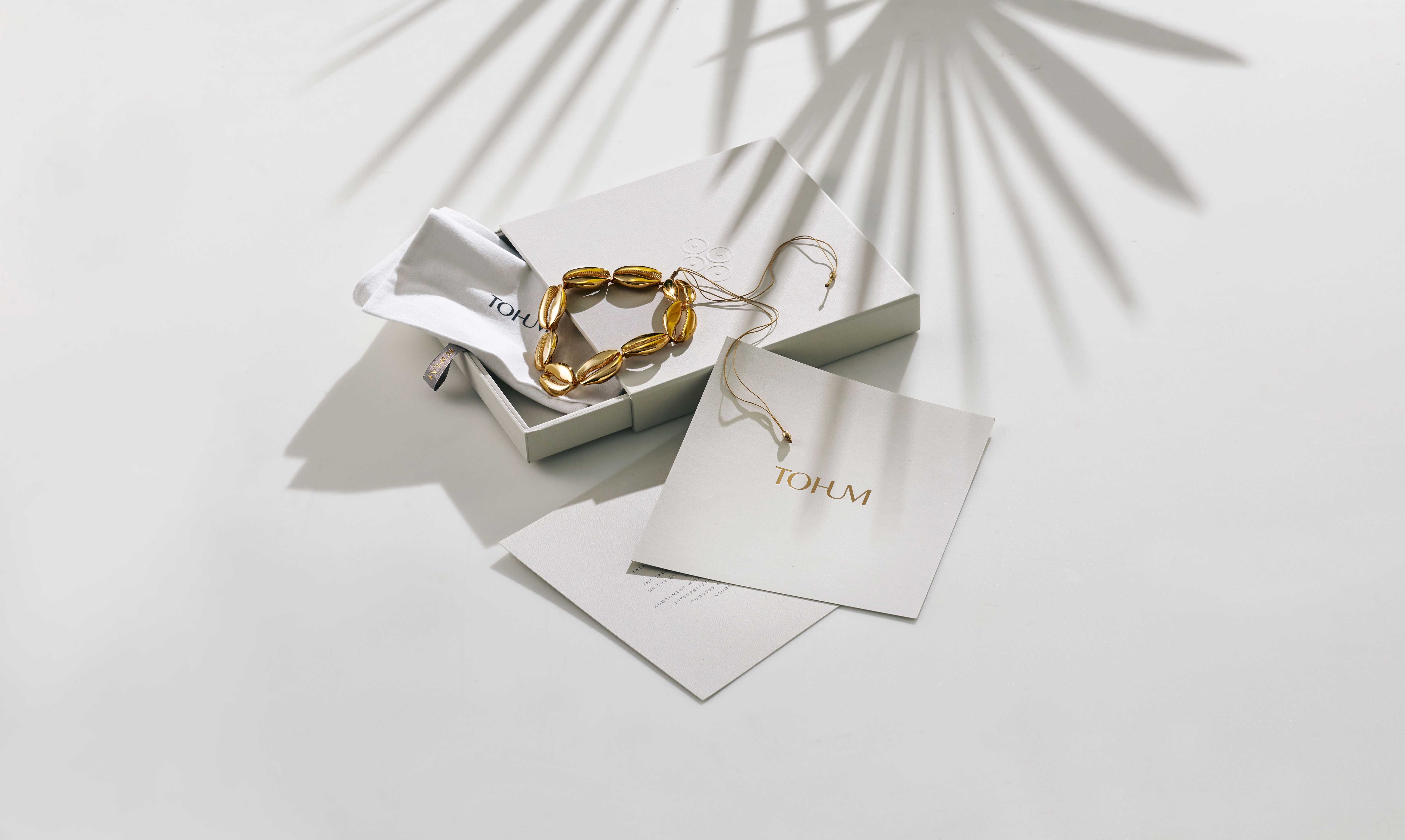
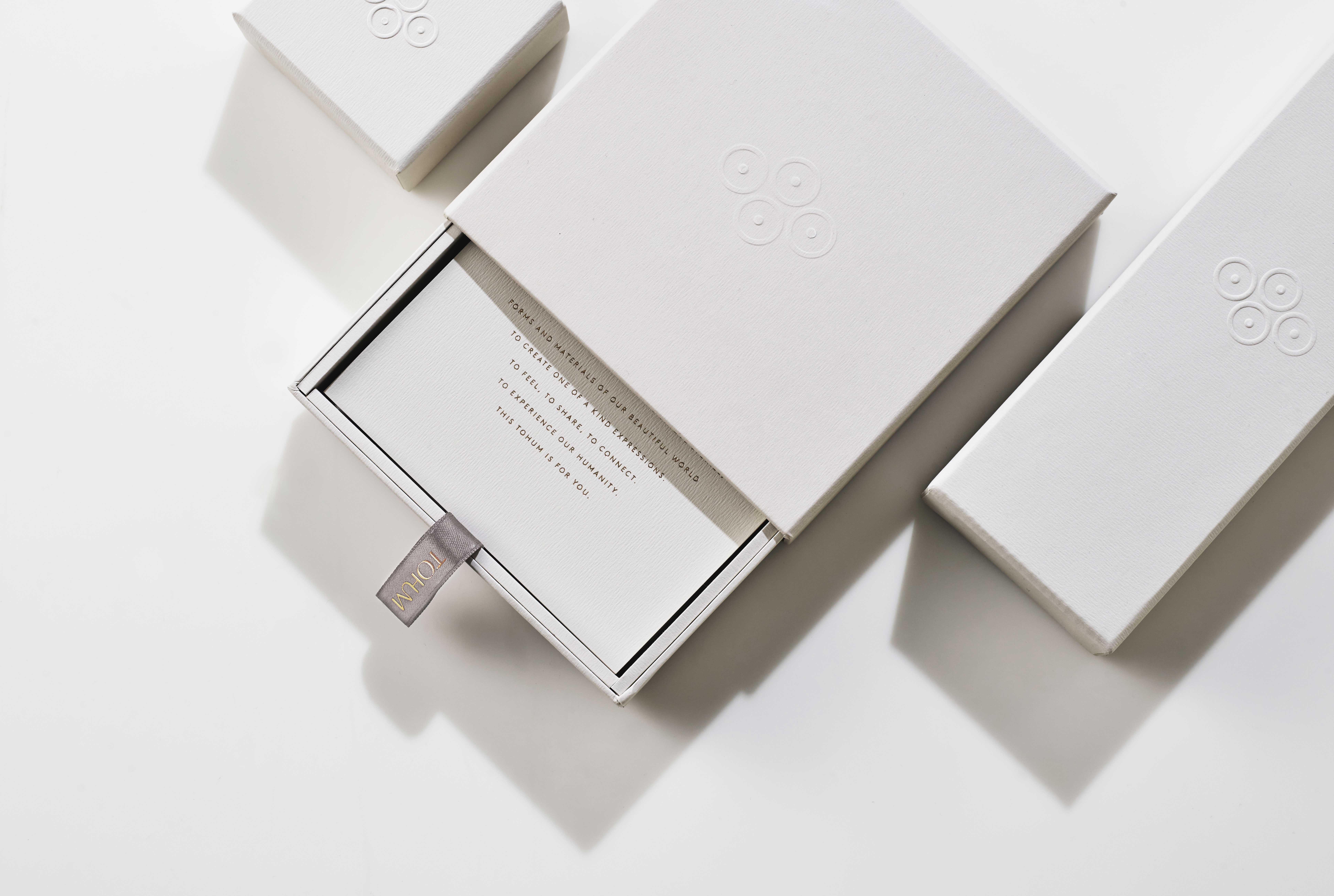
At the heart of Tohum is the timeless idea of connection – the desire to bring us closer to our origins and each other. Our new Tohum expression ‘To be Human’ captures this inspirational idea and takes it onto the world stage with an iconic identity that symbolises unity and embodies humanity.
Working in harmony with the Tohum design philosophy, we created an intuitive brand experience that first connects with the elegant simplicity of Tohum and then opens up into an expressive world where its exciting story unfolds, and bold collections come alive.
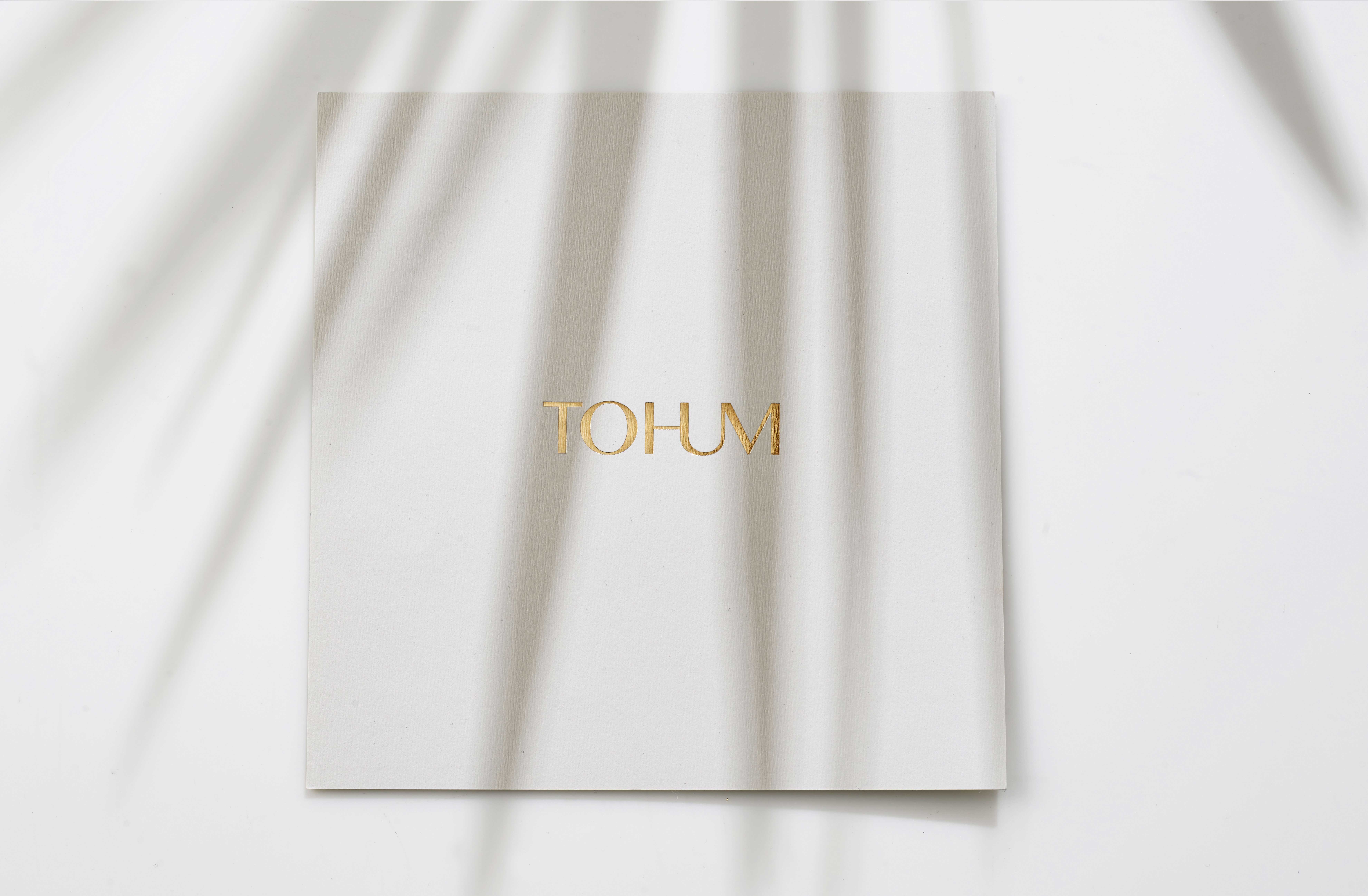
Reflecting the originality of Tohum designs, our wordmark brings together a strong sense of form and fluidity to create a seamless connection and to take Tohum forward as a natural luxury brand for everyone.
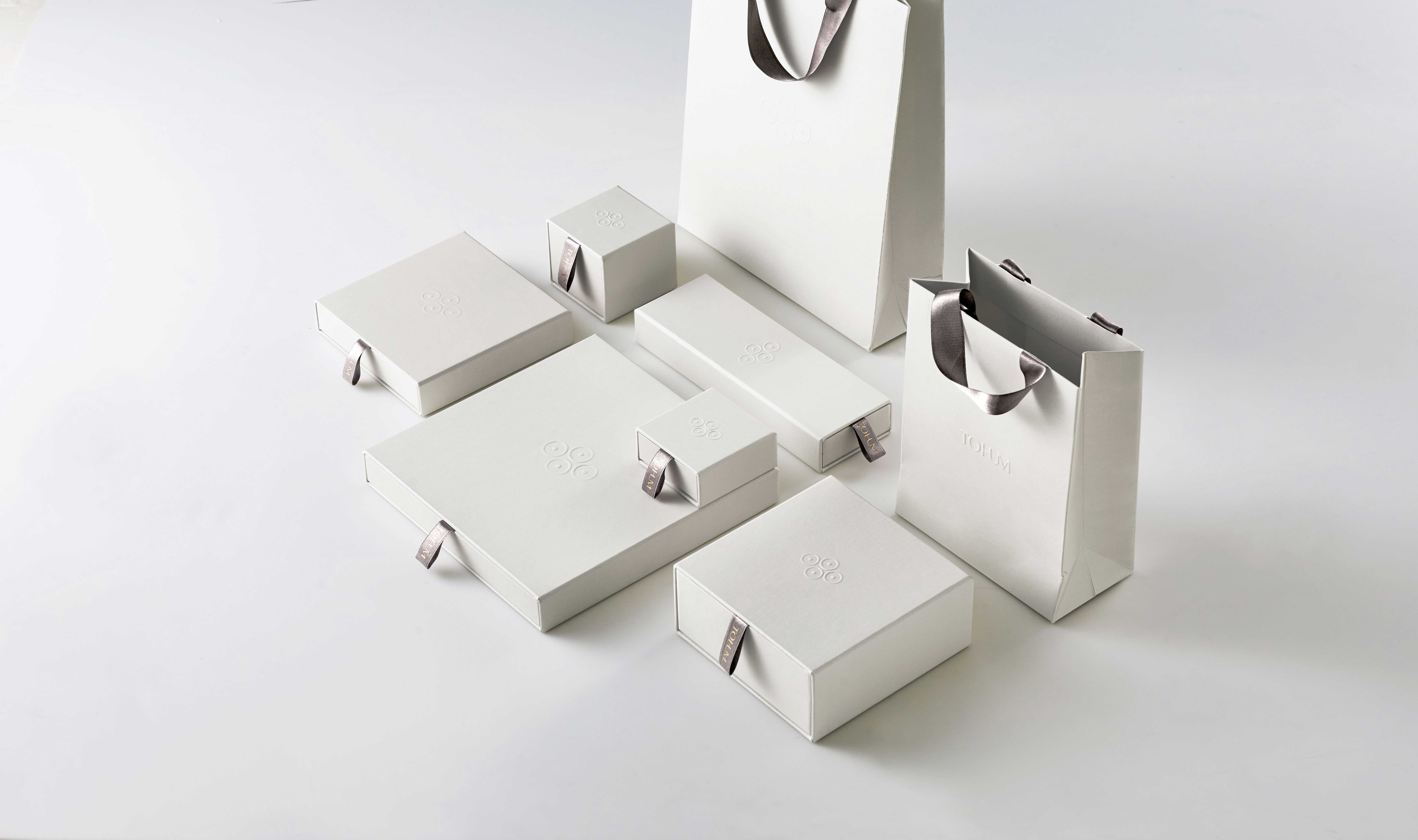
The elegant lettering – through its graceful posture and intertwining nature – evokes a feeling of continuity whilst crafting a sense of space, air and light reflected in the choice of a natural white, charcoal and gold palette. The new circle and dot symbol takes inspiration from ancient cultures and primitive African art forms, carrying meaning and all the values of the brand by expressing connection, continuity and the circular nature of life.
CREDIT
- Agency/Creative: Pearlfisher
- Article Title: Pearlfisher Creates New Packaging Design and Brand Identity for Tohum
- Organisation/Entity: Agency, Published Commercial Design
- Project Type: Packaging
- Agency/Creative Country: United Kingdom
- Market Region: Global
- Project Deliverables: Brand Experience, Brand Identity, Brand Refinement, Brand Rejuvenation, Brand Strategy, Branding, Identity System, Packaging Design
- Format: Box
- Substrate: Pulp Paper


