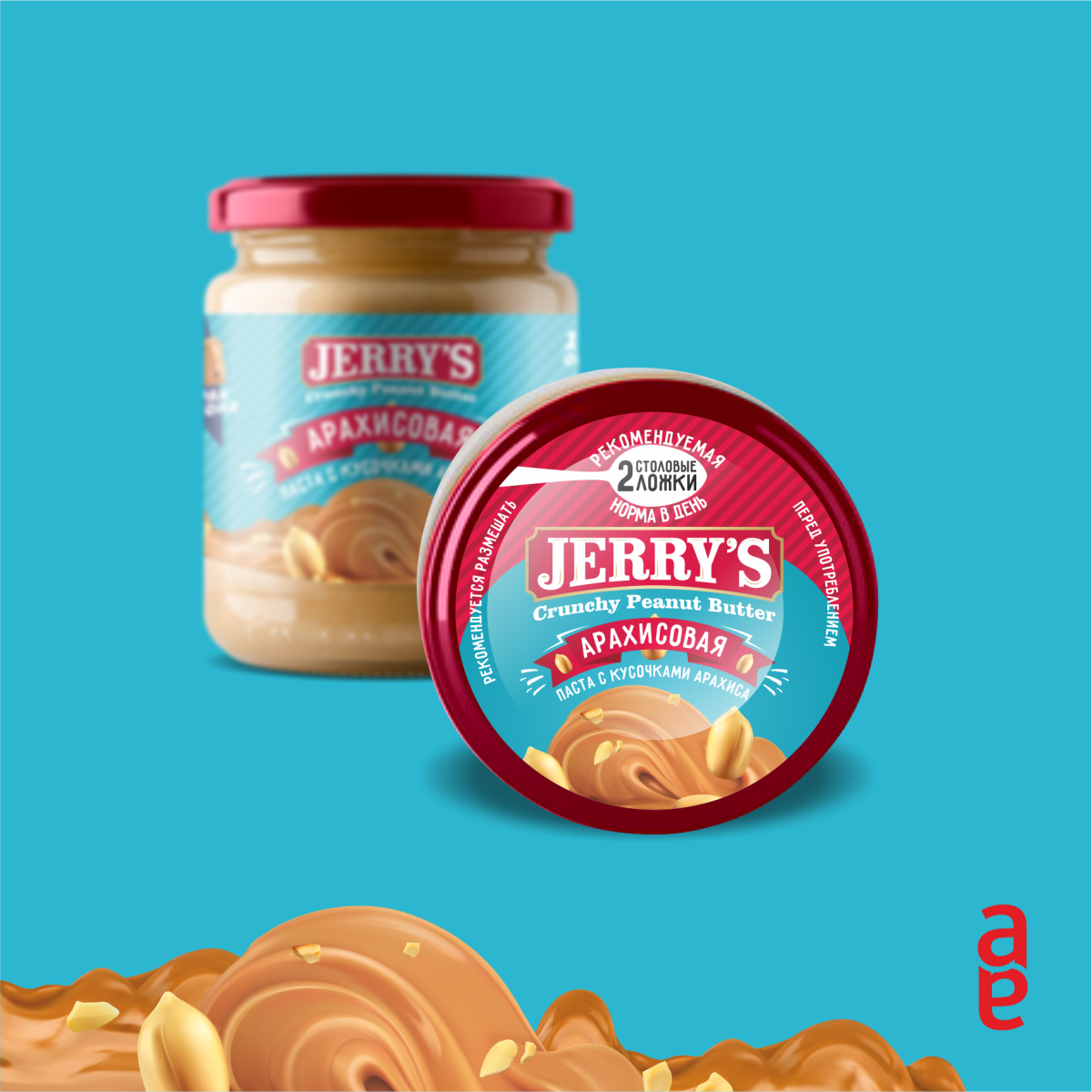
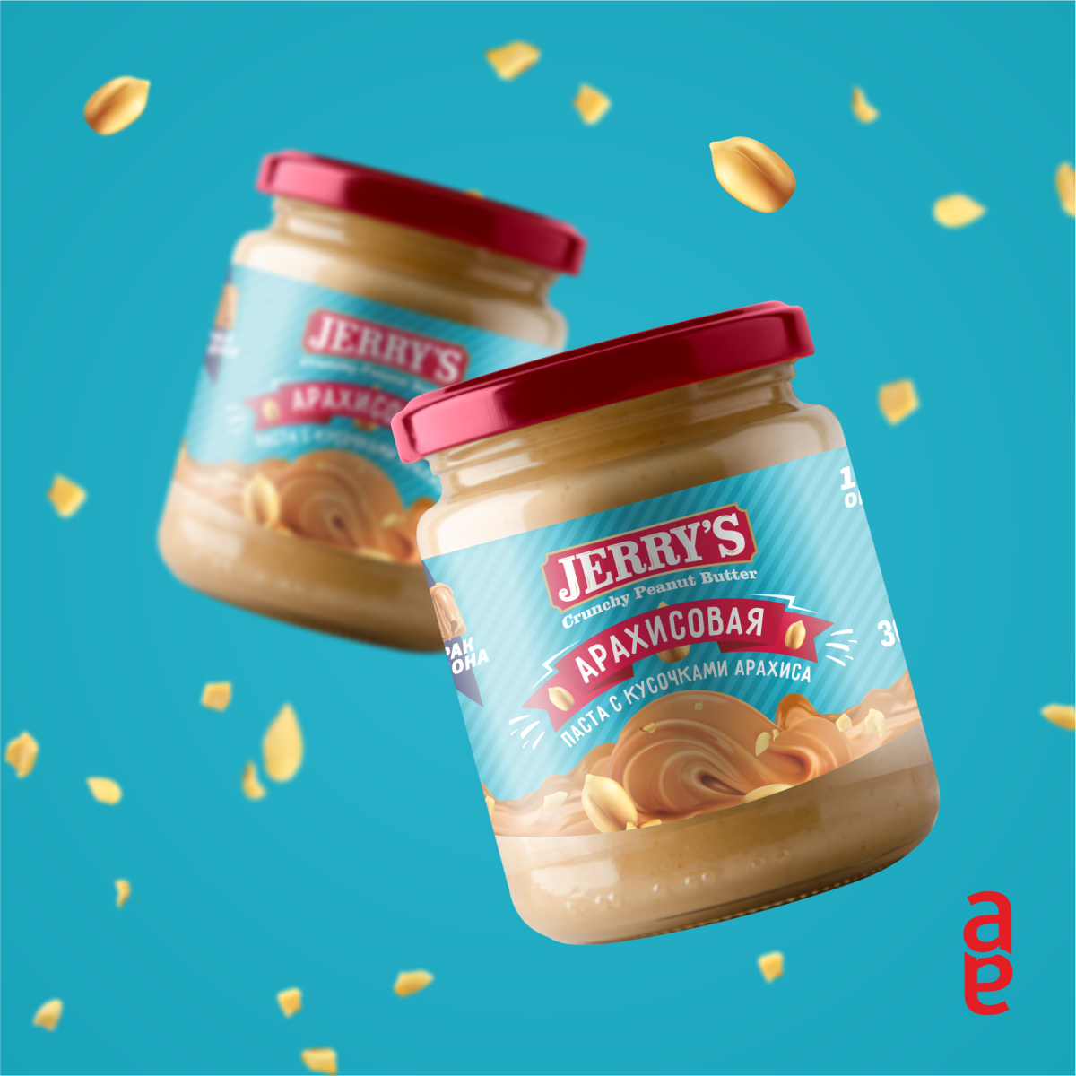
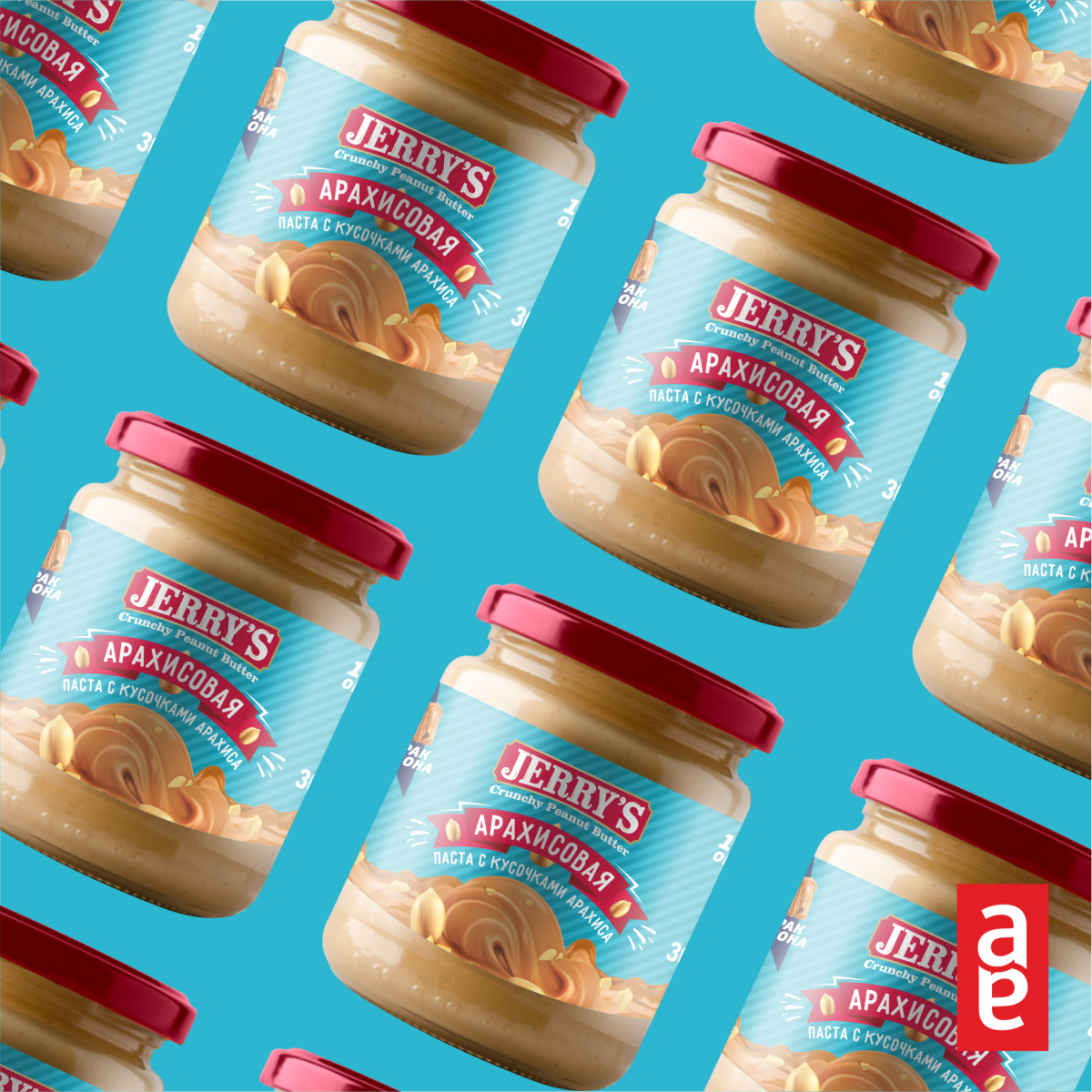
The goal was to display vintage American style in the logo and packaging design. The important point was that the peanut butter should be sold more expensive than the few analogues on the market.
The main consumer in the capital is people who have visited the United States, Americans and Europeans working in Tashkent, and a small group who have fallen in love with the taste and properties of the product.
Manufacturers and suppliers of peanut butter on the market did not use the old American style in the external filing, which predetermined the choice of direction in the design.
Manufacturers and suppliers of peanut butter on the market did not use the old American style in the external filing, which predetermined the choice of direction in the design.
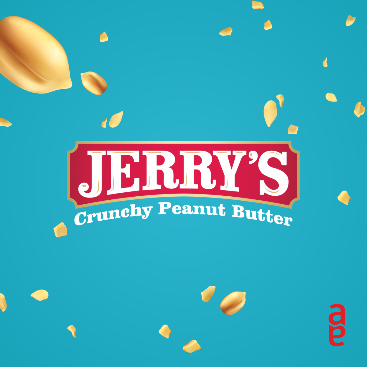
The Americanized name “JERRY’S” was chosen and the design was based on the same American vintage.
We decided to use two main colors, with a pleasant contrast. The design tried to display the “American product”.


CREDIT
- Agency/Creative: TBA ART Design
- Article Title: Peanut Butter Name and Packaging Creation
- Organisation/Entity: Agency, Non Published Concept Design
- Project Type: Packaging
- Agency/Creative Country: Uzbekistan
- Market Region: Asia
- Project Deliverables: Brand Creation, Packaging Design, Product Architecture, Product Naming, Research
- Format: Jar
- Substrate: Glass Jar, Metal


